
- The goal of this post is to describe the most popular, easy-to-use, and effective data-driven techniques that help organizations streamline their operations, build effective relationships with with individual people (customers, service users, colleagues, or suppliers), increase sales, improve customer service, and increase profitability.
- Customer Segmentation (CS) is a core concept in this technology. This is the process of tagging and grouping customers based on shared characteristics. This process also makes it easy to tailor and personalize your marketing, service, and sales efforts to the needs of specific groups. The result is a potential boost to customer loyalty and conversions.
- This article represents a comprehensive step-by-step CS guide in Python that helps you manage customer relationships across the entire customer lifecycle, at every marketing, sales, e-commerce, and customer service interaction.
- Our guide consists of hands-on case examples and best industry practices with open-source data and Python source codes: mall customers, online retail, marketing campaigns, supply chain, bank churn, groceries market, and e-commerce.
Table of Clickable Contents
- Motivation
- Methods
- Open-Source Datasets
- Mall Customer Segmentation
- Online Retail K-Means Clustering
- Online Retail Data Analytics
- RFM Customer Segmentation
- RFM TreeMap: Online Retail Dataset II
- CRM Analytics: CLTV
- Cohort Analysis in Online Retail
- Customer Segmentation, RFM, K-Means and Cohort Analysis in Online Retail
- Customer Clustering PCA, K-Means and Agglomerative for Marketing Campaigns
- Supply Chain RFM & ABC Analysis
- Bank Churn ML Prediction
- Groceries Market Basket & RFM Analysis
- Largest E-Commerce Showcase in Pakistan
- Conclusions
- Explore More
Motivation
- Uniform communication strategies that are not customer centric have failed to exploit millions of dollars in opportunities at the individual and segment level.
- The more comprehensive CS-based modeling provides executives and marketers with the ability to identify high-profit customers and micro-segments that will drive increases in traffic, sales, profit and retention.
Methods
- We will use the following techniques: unsupervised ML clustering, customer segmentation, cohort, market basket, bank churn, CRM data analytics, ABC & RFM analysis.
- ABC analysis is a tool that allows companies to divide their inventory or customers into groups based on their respective values to the company. The goal of this type of analysis is to ensure that businesses are optimizing their time and resources when serving customers.
- What is RFM (recency, frequency, monetary) analysis? RFM analysis is a marketing technique used to quantitatively rank and group customers based on the recency, frequency and monetary total of their recent transactions to identify the best customers and perform targeted marketing campaigns.
- Cohort analysis is a type of behavioral analytics in which you take a group of users, and analyze their usage patterns based on their shared traits to better track and understand their actions. A cohort is simply a group of people with shared characteristics.
- Market Basket Analysis is one of the key techniques used by large retailers to uncover associations between items. It works by looking for combinations of items that occur together frequently in transactions. To put it another way, it allows retailers to identify relationships between the items that people buy.
- Customer Churn prediction means knowing which customers are likely to leave or unsubscribe from your service. Customers have different behaviors and preferences, and reasons for cancelling their subscriptions. Therefore, it is important to actively communicate with each of them to keep them on your customer list. You need to know which marketing activities are most effective for individual customers and when they are most effective.
Open-Source Datasets
This file contains the basic information (ID, age, gender, income, and spending score) about the customers.
Online retail is a transnational data set which contains all the transactions occurring between 01/12/2010 and 09/12/2011 for a UK-based and registered non-store online retail. The company mainly sells unique all-occasion gifts. Many customers of the company are wholesalers.
We will be using the online retail transnational dataset to build RFM clustering and choose the best set of customers which the company should target.
Online Retail II dataset contains all the transactions occurring for a UK-based and registered, non-store online retail. This is a real online retail transaction data set of two years between 01/12/2009 and 09/12/2011.
The dataset was used in the Customer Personality Analysis (CPA). CPA is a detailed analysis of a company’s ideal customers. It helps a business to better understand its customers and makes it easier for them to modify products according to the specific needs, behaviours and concerns of different types of customers.
SUPPLY CHAIN FOR BIG DATA ANALYSIS
Areas of important registered activities : Provisioning , Production , Sales , Commercial Distribution.
Type Data :
Structured Data : DataCoSupplyChainDataset.csv
Unstructured Data : tokenized_access_logs.csv (Clickstream)
Types of Products : Clothing , Sports , and Electronic Supplies
Additionally it is attached in another file called DescriptionDataCoSupplyChain.csv, the description of each of the variables of the DataCoSupplyChainDatasetc.csv.
- Groceries Dataset Groceries_dataset.csv
3 columns: ID of customer, Date of purchase, and Description of product purchased.
Market Basket Analysis is one of the key techniques used by large retailers to uncover associations between items. It works by looking for combinations of items that occur together frequently in transactions.
Association Rules are widely used to analyze retail basket or transaction data and are intended to identify strong rules discovered in transaction data using measures of interestingness, based on the concept of strong rules.
Half a million transaction record for e-commerce sales in Pakistan.
Attributes
People
- ID: Customer’s unique identifier
- Year_Birth: Customer’s birth year
- Education: Customer’s education level
- Marital_Status: Customer’s marital status
- Income: Customer’s yearly household income
- Kidhome: Number of children in customer’s household
- Teenhome: Number of teenagers in customer’s household
- Dt_Customer: Date of customer’s enrollment with the company
- Recency: Number of days since customer’s last purchase
- Complain: 1 if the customer complained in the last 2 years, 0 otherwise
Products
- MntWines: Amount spent on wine in last 2 years
- MntFruits: Amount spent on fruits in last 2 years
- MntMeatProducts: Amount spent on meat in last 2 years
- MntFishProducts: Amount spent on fish in last 2 years
- MntSweetProducts: Amount spent on sweets in last 2 years
- MntGoldProds: Amount spent on gold in last 2 years
Promotion
- NumDealsPurchases: Number of purchases made with a discount
- AcceptedCmp1: 1 if customer accepted the offer in the 1st campaign, 0 otherwise
- AcceptedCmp2: 1 if customer accepted the offer in the 2nd campaign, 0 otherwise
- AcceptedCmp3: 1 if customer accepted the offer in the 3rd campaign, 0 otherwise
- AcceptedCmp4: 1 if customer accepted the offer in the 4th campaign, 0 otherwise
- AcceptedCmp5: 1 if customer accepted the offer in the 5th campaign, 0 otherwise
- Response: 1 if customer accepted the offer in the last campaign, 0 otherwise
Place
- NumWebPurchases: Number of purchases made through the company’s website
- NumCatalogPurchases: Number of purchases made using a catalogue
- NumStorePurchases: Number of purchases made directly in stores
- NumWebVisitsMonth: Number of visits to company’s website in the last month
Scope: Bank Churn Modelling, Bank Customers Churn , Churn Prediction of bank customers
Mall Customer Segmentation
Let’s set the working directory YOURPATH
import os
os.chdir(‘YOURPATH’)
os. getcwd()
Importing libraries
import pandas as pd
import numpy as np
import matplotlib.pyplot as plt
import seaborn as sns
import plotly.express as px
import plotly.graph_objs as go
import missingno as msno
from sklearn.cluster import KMeans
from scipy.cluster.hierarchy import dendrogram, linkage
from sklearn.cluster import AgglomerativeClustering
from sklearn.cluster import DBSCAN
from sklearn import metrics
from sklearn.datasets import make_blobs
from sklearn.preprocessing import StandardScaler
import warnings
warnings.filterwarnings(‘ignore’)
plt.style.use(‘fivethirtyeight’)
%matplotlib inline
Let’s read the input dataset
df = pd.read_csv(‘Mall_Customers.csv’)
and check the content
df.head()

Let’s check the descriptive statistics
df.describe().T

df.info()
<class 'pandas.core.frame.DataFrame'>
RangeIndex: 200 entries, 0 to 199
Data columns (total 5 columns):
 #   Column                  Non-Null Count  Dtype
---  ------                  --------------  -----
 0   CustomerID              200 non-null    int64
 1   Gender                  200 non-null    object
 2   Age                     200 non-null    int64
 3   Annual Income (k$)      200 non-null    int64
 4   Spending Score (1-100)  200 non-null    int64
dtypes: int64(4), object(1)
memory usage: 7.9+ KB
Let’s drop the column
df.drop(‘CustomerID’, axis = 1, inplace = True)
and plot the following distribution plots
plt.figure(figsize = (20, 8))
plotnumber = 1
for col in [‘Age’, ‘Annual Income (k$)’, ‘Spending Score (1-100)’]:
if plotnumber <= 3:
ax = plt.subplot(1, 3, plotnumber)
sns.distplot(df[col])
plotnumber += 1
plt.tight_layout()
plt.show()

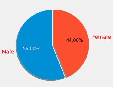
Let’s look at the Gender pie-plot
values = df[‘Gender’].value_counts()
labels = [‘Male’, ‘Female’]
fig, ax = plt.subplots(figsize = (4, 4), dpi = 100)
explode = (0, 0.06)
patches, texts, autotexts = ax.pie(values, labels = labels, autopct = ‘%1.2f%%’, shadow = True,
startangle = 90, explode = explode)
plt.setp(texts, color = ‘red’)
plt.setp(autotexts, size = 12, color = ‘white’)
autotexts[1].set_color(‘black’)
plt.show()
Let’s compare the corresponding violin plots
plt.figure(figsize = (20, 8))
plotnumber = 1
for col in [‘Age’, ‘Annual Income (k$)’, ‘Spending Score (1-100)’]:
if plotnumber <= 3:
ax = plt.subplot(1, 3, plotnumber)
sns.violinplot(x = col, y = ‘Gender’, data = df)
plotnumber += 1
plt.tight_layout()
plt.show()

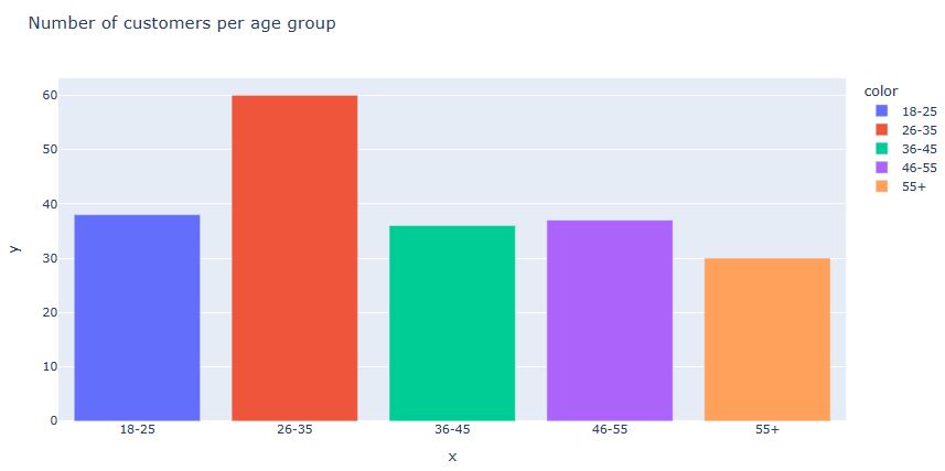
Let’s compare different age groups
age_18_25 = df.Age[(df.Age >= 18) & (df.Age <= 25)] age_26_35 = df.Age[(df.Age >= 26) & (df.Age <= 35)] age_36_45 = df.Age[(df.Age >= 36) & (df.Age <= 45)] age_46_55 = df.Age[(df.Age >= 46) & (df.Age <= 55)] age_55above = df.Age[df.Age >= 55]
x_age = [’18-25′, ’26-35′, ’36-45′, ’46-55′, ’55+’]
y_age = [len(age_18_25.values), len(age_26_35.values), len(age_36_45.values), len(age_46_55.values),
len(age_55above.values)]
px.bar(data_frame = df, x = x_age, y = y_age, color = x_age,
title = ‘Number of customers per age group’)
Let’s plot the Relation between Annual Income and Spending Score
fig=px.scatter(data_frame = df, x = ‘Annual Income (k$)’, y = ‘Spending Score (1-100)’, color=”Age”,
title = ‘Relation between Annual Income and Spending Score’)
fig.update_traces(marker=dict(size=18,
line=dict(width=1,
color=’DarkSlateGrey’)),
selector=dict(mode=’markers’))

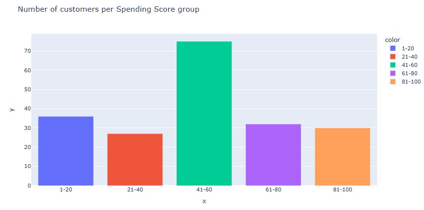
Let’s look at the Number of customers per Spending Score group
ss_1_20 = df[‘Spending Score (1-100)’][(df[‘Spending Score (1-100)’] >= 1) &
(df[‘Spending Score (1-100)’] <= 20)]
ss_21_40 = df[‘Spending Score (1-100)’][(df[‘Spending Score (1-100)’] >= 21) &
(df[‘Spending Score (1-100)’] <= 40)]
ss_41_60 = df[‘Spending Score (1-100)’][(df[‘Spending Score (1-100)’] >= 41) &
(df[‘Spending Score (1-100)’] <= 60)]
ss_61_80 = df[‘Spending Score (1-100)’][(df[‘Spending Score (1-100)’] >= 61) &
(df[‘Spending Score (1-100)’] <= 80)]
ss_81_100 = df[‘Spending Score (1-100)’][(df[‘Spending Score (1-100)’] >= 81) &
(df[‘Spending Score (1-100)’] <= 100)]
x_ss = [‘1-20′, ’21-40′, ’41-60′, ’61-80′, ’81-100’]
y_ss = [len(ss_1_20.values), len(ss_21_40.values), len(ss_41_60.values), len(ss_61_80.values),
len(ss_81_100.values)]
px.bar(data_frame = df, x = x_ss, y = y_ss, color = x_ss,
title = ‘Number of customers per Spending Score group’)
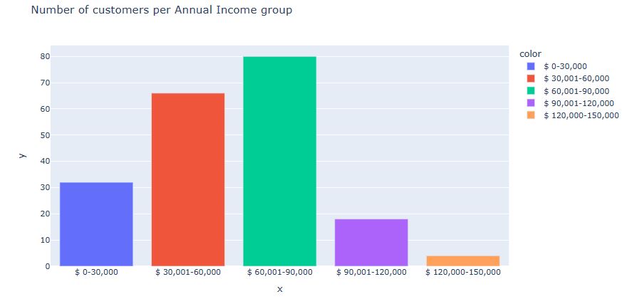
Let’s check the Number of customers per Annual Income group
ai_0_30 = df[‘Annual Income (k$)’][(df[‘Annual Income (k$)’] >= 0) & (df[‘Annual Income (k$)’] <= 30)] ai_31_60 = df[‘Annual Income (k$)’][(df[‘Annual Income (k$)’] >= 31)&(df[‘Annual Income (k$)’] <= 60)] ai_61_90 = df[‘Annual Income (k$)’][(df[‘Annual Income (k$)’] >= 61)&(df[‘Annual Income (k$)’] <= 90)] ai_91_120 = df[‘Annual Income (k$)’][(df[‘Annual Income (k$)’]>= 91)&(df[‘Annual Income (k$)’]<=120)] ai_121_150 = df[‘Annual Income (k$)’][(df[‘Annual Income (k$)’]>=121)&(df[‘Annual Income (k$)’]<=150)]
x_ai = [‘$ 0-30,000’, ‘$ 30,001-60,000’, ‘$ 60,001-90,000’, ‘$ 90,001-120,000’, ‘$ 120,000-150,000’]
y_ai = [len(ai_0_30.values) , len(ai_31_60.values) , len(ai_61_90.values) , len(ai_91_120.values),
len(ai_121_150.values)]
px.bar(data_frame = df, x = x_ai, y = y_ai, color = x_ai,
title = ‘Number of customers per Annual Income group’)
Let’s perform K-means clustering using Age and Spending Score columns
X1 = df.loc[:, [‘Age’, ‘Spending Score (1-100)’]].values
wcss= []
for k in range(1, 11):
kmeans = KMeans(n_clusters = k, init = ‘k-means++’)
kmeans.fit(X1)
wcss.append(kmeans.inertia_)
plt.figure(figsize = (12, 7))
plt.plot(range(1, 11), wcss, linewidth = 2, marker = ‘8’)
plt.title(‘Elbow Plot\n’, fontsize = 20)
plt.xlabel(‘K’)
plt.ylabel(‘WCSS’)
plt.show()

Let’s set n_clusters = 4 and run
kmeans = KMeans(n_clusters = 4)
labels = kmeans.fit_predict(X1)
Let’s plot customer clusters in the domain Age vs Spending Score (1-100)
plt.figure(figsize = (14, 8))
plt.scatter(X1[:, 0], X1[:, 1], c = kmeans.labels_, s = 200)
plt.scatter(kmeans.cluster_centers_[:, 0], kmeans.cluster_centers_[:, 1], color = ‘red’, s = 350)
plt.title(‘Clusters of Customers\n’, fontsize = 20)
plt.xlabel(‘Age’)
plt.ylabel(‘Spending Score (1-100)’)
plt.show()

Let’s perform K-means clustering using Age and Annual Income columns
X2 = df.loc[:, [‘Age’, ‘Annual Income (k$)’]].values
wcss= []
for k in range(1, 11):
kmeans = KMeans(n_clusters = k, init = ‘k-means++’)
kmeans.fit(X2)
wcss.append(kmeans.inertia_)
plt.figure(figsize = (12, 7))
plt.plot(range(1, 11), wcss, linewidth = 2, marker = ‘8’)
plt.title(‘Elbow Plot\n’, fontsize = 20)
plt.xlabel(‘K’)
plt.ylabel(‘WCSS’)
plt.show()

Let’s set n_clusters = 5 and run
kmeans = KMeans(n_clusters = 5)
labels = kmeans.fit_predict(X2)
Let’s plot Customer Clusters in the domain Annual Income (k$) vs Spending Score (1-100)

Let’s perform K-means clustering using Age, Annual Score and Spending Score columns
X4 = df.iloc[:, 1:]
wcss= []
for k in range(1, 11):
kmeans = KMeans(n_clusters = k, init = ‘k-means++’)
kmeans.fit(X4)
wcss.append(kmeans.inertia_)
plt.figure(figsize = (12, 7))
plt.plot(range(1, 11), wcss, linewidth = 2, marker = ‘8’)
plt.title(‘Elbow Plot\n’, fontsize = 20)
plt.xlabel(‘K’)
plt.ylabel(‘WCSS’)
plt.show()

Let’s set n_clusters = 6 and run
kmeans = KMeans(n_clusters = 6)
clusters = kmeans.fit_predict(X4)
X4[‘label’] = clusters
Let’s look at the corresponding 3D plot
fig = px.scatter_3d(X4, x=”Annual Income (k$)”, y=”Spending Score (1-100)”, z=”Age”,
color = ‘label’, size = ‘label’)
fig.show()

Let’s plot the Hierarchical Clustering dendrogram
plt.figure(figsize = (22, 8))
dendo = dendrogram(linkage(X3, method = ‘ward’))
plt.title(‘Dendrogram’, fontsize = 15)
plt.show()

Let’s run Agglomerative Clustering with n_clusters = 5
agc = AgglomerativeClustering(n_clusters = 5, affinity = ‘euclidean’, linkage = ‘ward’)
labels = agc.fit_predict(X3)
plt.figure(figsize = (12, 8))
smb=200
plt.scatter(X3[labels == 0,0], X3[labels == 0,1], label = ‘Cluster 1’, s = smb)
plt.scatter(X3[labels == 1,0], X3[labels == 1,1], label = ‘Cluster 2’, s = smb)
plt.scatter(X3[labels == 2,0], X3[labels == 2,1], label = ‘Cluster 3’, s = smb)
plt.scatter(X3[labels == 3,0], X3[labels == 3,1], label = ‘Cluster 4’, s = smb)
plt.scatter(X3[labels == 4,0], X3[labels == 4,1], label = ‘Cluster 5’, s = smb)
plt.legend(loc = ‘best’)
plt.title(‘Clusters of Customers\n ‘, fontsize = 20)
plt.xlabel(‘Annual Income (k$)’)
plt.ylabel(‘Spending Score (1-100)’)
plt.show()

Let’s compare these results with the DBSCAN clustering algorithm
centers = [[1, 1], [-1, -1], [1, -1]]
X, labels_true = make_blobs(n_samples=750, centers=centers, cluster_std=0.4,
random_state=0) # generate sample blobs
X = StandardScaler().fit_transform(X)
db = DBSCAN(eps=0.3, min_samples=10).fit(X)
Creating an array of true and false as the same size as db.labels
core_samples_mask = np.zeros_like(db.labels_, dtype=bool)
core_samples_mask[db.core_sample_indices_] = True
(setting the indices of the core regions to True)
labels = db.labels_
(similar to the model.fit() method, it gives the labels of the clustered data).
The label -1 is considered as noise by the DBSCAN algorithm
n_clusters_ = len(set(labels)) – (1 if -1 in labels else 0)
n_noise_ = list(labels).count(-1) # calculating the number of clusters
print(‘Estimated number of clusters: %d’ % n_clusters_)
print(‘Estimated number of noise points: %d’ % n_noise_)
“””Homogeneity metric of a cluster labeling given a ground truth.
A clustering result satisfies homogeneity if all of its clusters
contain only data points which are members of a single class.”””
print(“Homogeneity: %0.3f” % metrics.homogeneity_score(labels_true, labels))
Estimated number of clusters: 3
Estimated number of noise points: 18
Homogeneity: 0.953
Let’s plot the result representing 3 clusters + noise
plt.figure(figsize = (10, 8))
unique_labels = set(labels) # identifying all the unique labels/clusters
colors = [plt.cm.Spectral(each)
# creating the list of colours, generating the colourmap
for each in np.linspace(0, 1, len(unique_labels))]
for k, col in zip(unique_labels, colors):
if k == -1:
# Black used for noise.
col = [0, 0, 0, 1]
class_member_mask = (labels == k) # assigning class members for each class
xy = X[class_member_mask & core_samples_mask] # creating the list of points for each class
plt.plot(xy[:, 0], xy[:, 1], ‘o’, markerfacecolor=tuple(col),markeredgecolor=’k’, markersize=14)
xy = X[class_member_mask & ~core_samples_mask] # creating the list of noise points
plt.plot(xy[:, 0], xy[:, 1], ‘o’, markerfacecolor=tuple(col), markeredgecolor=’k’, markersize=14)
plt.title(‘Clustering using DBSCAN\n’, fontsize = 15)
plt.show()
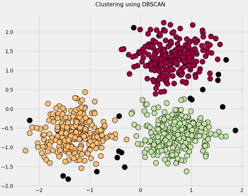
Here black symbols designate noise.
Read more here.
Online Retail K-Means Clustering
Let’s continue using the dataset Mall_Customers.csv
from sklearn.preprocessing import StandardScaler
import numpy as np
import pandas as pd
import matplotlib.pyplot as plt
import seaborn as sns
%matplotlib inline
import os
import warnings
warnings.filterwarnings(‘ignore’)
df = pd.read_csv(‘Mall_Customers.csv’)
Let’s rename the columns
df.rename(index=str, columns={‘Annual Income (k$)’: ‘Income’,
‘Spending Score (1-100)’: ‘Score’}, inplace=True)
df.head()

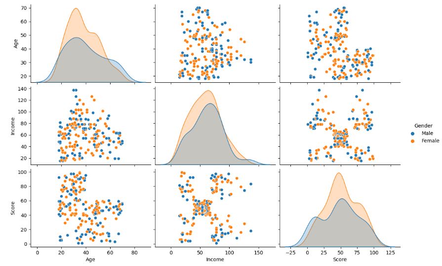
Let’s examine the input data using sns.pairplot
X = df.drop([‘CustomerID’, ‘Gender’], axis=1)
sns.pairplot(df.drop(‘CustomerID’, axis=1), hue=’Gender’, aspect=1.5)
plt.show()
Let’s look at the K-Means Elbow plot
from sklearn.cluster import KMeans
clusters = []
for i in range(1, 11):
km = KMeans(n_clusters=i).fit(X)
clusters.append(km.inertia_)
fig, ax = plt.subplots(figsize=(12, 8))
sns.lineplot(x=list(range(1, 11)), y=clusters, ax=ax,linewidth = 4)
ax.set_title(‘Searching for Elbow’)
ax.set_xlabel(‘Clusters’)
ax.set_ylabel(‘Inertia’)
ax.annotate(‘Possible Elbow Point’, xy=(3, 140000), xytext=(3, 50000), xycoords=’data’,
arrowprops=dict(arrowstyle=’->’, connectionstyle=’arc3′, color=’red’, lw=2))
ax.annotate(‘Possible Elbow Point’, xy=(5, 80000), xytext=(5, 150000), xycoords=’data’,
arrowprops=dict(arrowstyle=’->’, connectionstyle=’arc3′, color=’red’, lw=2))
plt.show()

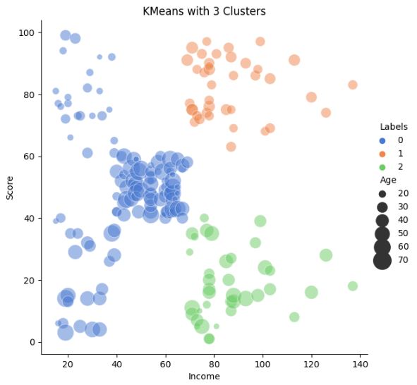
Let’s plot K-means with 3 clusters Income vs Score
km3 = KMeans(n_clusters=3).fit(X)
X[‘Labels’] = km3.labels_
plt.figure(figsize=(12, 8))
sns.relplot(x=”Income”, y=”Score”, hue=”Labels”, size=”Income”,
sizes=(40, 400), alpha=.5, palette=”muted”,
height=6, data=X)
plt.title(‘KMeans with 3 Clusters’)
plt.show()

Let’s plot K-means with 3 clusters Income-Age vs Score
km3 = KMeans(n_clusters=3).fit(X)
X[‘Labels’] = km3.labels_
plt.figure(figsize=(12, 8))
sns.relplot(x=”Income”, y=”Score”, hue=”Labels”, size=”Age”,
sizes=(40, 400), alpha=.5, palette=”muted”,
height=6, data=X)
plt.title(‘KMeans with 3 Clusters’)
plt.show()
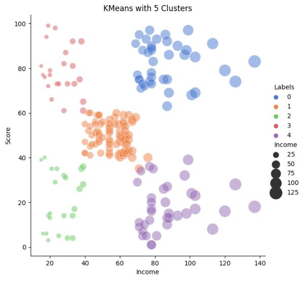
Let’s plot K-means with 5 clusters Income vs Score
km3 = KMeans(n_clusters=5).fit(X)
X[‘Labels’] = km3.labels_
plt.figure(figsize=(12, 8))
sns.relplot(x=”Income”, y=”Score”, hue=”Labels”, size=”Income”,
sizes=(40, 400), alpha=.5, palette=”muted”,
height=6, data=X)
plt.title(‘KMeans with 5 Clusters’)
plt.show()
Let’s plot K-means with 5 clusters Income-Age vs Score
km3 = KMeans(n_clusters=5).fit(X)
X[‘Labels’] = km3.labels_
plt.figure(figsize=(12, 8))
sns.relplot(x=”Income”, y=”Score”, hue=”Labels”, size=”Age”,
sizes=(40, 400), alpha=.5, palette=”muted”,
height=6, data=X)
plt.title(‘KMeans with 5 Clusters’)
plt.show()
Let’s invoke sns.swarmplot to compare Labels According to Annual Income and Scoring History
fig = plt.figure(figsize=(20,8))
sns.set(font_scale=2)
ax = fig.add_subplot(121)
sns.swarmplot(x=’Labels’, y=’Income’, data=X, ax=ax,hue=”Labels”, legend=False)
ax.set_title(‘Labels According to Annual Income’)
ax = fig.add_subplot(122)
sns.swarmplot(x=’Labels’, y=’Score’, data=X, ax=ax)
ax.set_title(‘Labels According to Scoring History’)
plt.show()

Hierarchical Clustering:
from sklearn.cluster import AgglomerativeClustering
sns.set(font_scale=1)
agglom = AgglomerativeClustering(n_clusters=5, linkage=’average’).fit(X)
X[‘Labels’] = agglom.labels_
plt.figure(figsize=(12, 8))
sns.relplot(x=”Income”, y=”Score”, hue=”Labels”, size=”Age”,
sizes=(40, 400), alpha=.5, palette=sns.color_palette(‘hls’, 5),
height=6, data=X)
plt.title(‘Agglomerative with 5 Clusters’)
plt.show()
Let’s compute the spatial distance matrix
from scipy.cluster import hierarchy
from scipy.spatial import distance_matrix
dist = distance_matrix(X, X)
Z = hierarchy.linkage(dist, ‘complete’)
and plot the dendrogram with dist=’complete’
plt.figure(figsize=(18, 50))
dendro = hierarchy.dendrogram(Z, leaf_rotation=0, leaf_font_size=12, orientation=’right’)
Let’s plot the dendrogram with dist=’average’
Z = hierarchy.linkage(dist, ‘average’)
plt.figure(figsize=(18, 50))
dendro = hierarchy.dendrogram(Z, leaf_rotation=0, leaf_font_size =12, orientation = ‘right’)
Density Based Clustering (DBSCAN):
from sklearn.cluster import DBSCAN
db = DBSCAN(eps=11, min_samples=6).fit(X)
X[‘Labels’] = db.labels_
plt.figure(figsize=(12, 8))
sns.relplot(x=”Income”, y=”Score”, hue=”Labels”, size=”Age”,
sizes=(40, 400), alpha=.5, palette=sns.color_palette(‘hls’, 5),
height=6, data=X)
plt.title(‘DBSCAN with epsilon 11, min samples 6’)
plt.show()

Read more here.
Online Retail Data Analytics
Let’s look at the OnlineRetail.csv dataset
import numpy as np
import pandas as pd
import matplotlib.pyplot as plt
import seaborn as sns
import missingno as msno
df = pd.read_csv(“OnlineRetail.csv”, delimiter=’,’, encoding = “ISO-8859-1”)
Let’s check the data structure
df.head()

df.info()
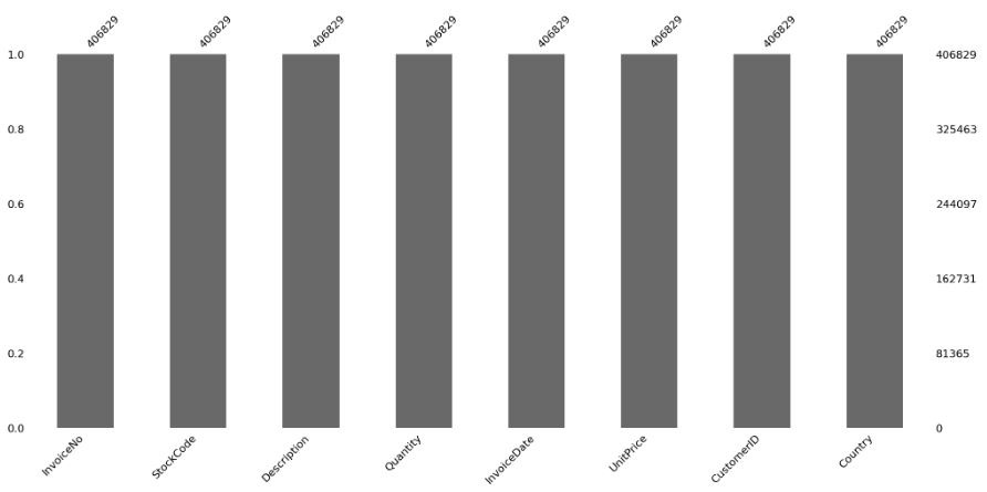
<class 'pandas.core.frame.DataFrame'>
RangeIndex: 541909 entries, 0 to 541908
Data columns (total 8 columns):
 #   Column       Non-Null Count   Dtype
---  ------       --------------   -----
 0   InvoiceNo    541909 non-null  object
 1   StockCode    541909 non-null  object
 2   Description  540455 non-null  object
 3   Quantity     541909 non-null  int64
 4   InvoiceDate  541909 non-null  object
 5   UnitPrice    541909 non-null  float64
 6   CustomerID   406829 non-null  float64
 7   Country      541909 non-null  object
dtypes: float64(2), int64(1), object(5)
memory usage: 33.1+ MB
df.describe()

Data Cleaning: Checking for Null Values
msno.bar(df)

df.count()
InvoiceNo      541909
StockCode      541909
Description    540455
Quantity       541909
InvoiceDate    541909
UnitPrice      541909
CustomerID     406829
Country        541909
dtype: int64
df[df[‘CustomerID’].isnull()].count()
InvoiceNo      135080
StockCode      135080
Description    133626
Quantity       135080
InvoiceDate    135080
UnitPrice      135080
CustomerID          0
Country        135080
dtype: int64
Let’s check the percentage
100 – ((541909-135000)/541909 * 100)
24.911931708091203
So, approximately 25% of the data is missing.
We will proceed with dropping the missing rows now.
df.dropna(inplace=True)
msno.bar(df)
Let’s perform further data editing
df[‘InvoiceDate’] = pd.to_datetime(df[‘InvoiceDate’], format=’%d-%m-%Y %H:%M’)
df[‘Total Amount Spent’]= df[‘Quantity’] * df[‘UnitPrice’]
total_amount = df[‘Total Amount Spent’].groupby(df[‘CustomerID’]).sum()
total_amount = pd.DataFrame(total_amount).reset_index()
transactions = df[‘InvoiceNo’].groupby(df[‘CustomerID’]).count()
transaction = pd.DataFrame(transactions).reset_index()
final = df[‘InvoiceDate’].max()
df[‘Last_transact’] = final – df[‘InvoiceDate’]
LT = df.groupby(df[‘CustomerID’]).min()[‘Last_transact’]
LT = pd.DataFrame(LT).reset_index()
df_new = pd.merge(total_amount, transaction, how=’inner’, on=’CustomerID’)
df_new = pd.merge(df_new, LT, how=’inner’, on=’CustomerID’)
df_new[‘Last_transact’] = df_new[‘Last_transact’].dt.days
Let’s run the K-Means Clustering Model
from sklearn.cluster import KMeans
kmeans= KMeans(n_clusters=2)
kmeans.fit(df_new[[‘Total Amount Spent’, ‘InvoiceNo’, ‘Last_transact’]])
pred = kmeans.predict(df_new[[‘Total Amount Spent’, ‘InvoiceNo’, ‘Last_transact’]])
df_new=df_new.join(pred, lsuffix=”_left”, rsuffix=”_right”)
error_rate = []
for clusters in range(1,16):
kmeans = KMeans(n_clusters = clusters)
kmeans.fit(df_new)
kmeans.predict(df_new)
error_rate.append(kmeans.inertia_)
error_rate = pd.DataFrame({‘Cluster’:range(1,16) , ‘Error’:error_rate})
Let’s plot the Error Rate and Clusters
plt.figure(figsize=(12,8))
p = sns.barplot(x=’Cluster’, y= ‘Error’, data= error_rate, palette=’coolwarm_r’)
sns.despine(left=True)
p.set_title(‘Error Rate and Clusters’)

Let’s drop 1 column
del df[‘InvoiceDate’]
df.info()
<class 'pandas.core.frame.DataFrame'>
Index: 392692 entries, 0 to 541908
Data columns (total 9 columns):
 #   Column        Non-Null Count   Dtype
---  ------        --------------   -----
 0   InvoiceNo     392692 non-null  object
 1   StockCode     392692 non-null  object
 2   Description   392692 non-null  object
 3   Quantity      392692 non-null  int64
 4   UnitPrice     392692 non-null  float64
 5   CustomerID    392692 non-null  float64
 6   Country       392692 non-null  object
 7   cancellation  392692 non-null  int64
 8   TotalPrice    392692 non-null  float64
dtypes: float64(3), int64(2), object(4)
memory usage: 30.0+ MB
Let’s group the data
country_wise = df.groupby(‘Country’).sum()
and read the full country list
country_codes = pd.read_csv(‘wikipedia-iso-country-codes.csv’, names=[‘Country’, ‘two’, ‘three’, ‘numeric’, ‘ISO’])
country_codes.head()

Let’s merge df and country_codes
country_wise = pd.merge(country_codes,country_wise, on=’Country’)
Let’s invoke plotly for plotting purposes
from plotly import version
import cufflinks as cf
from plotly.offline import download_plotlyjs, init_notebook_mode, plot, iplot
init_notebook_mode(connected=True)
cf.go_offline()
import plotly.graph_objs as go
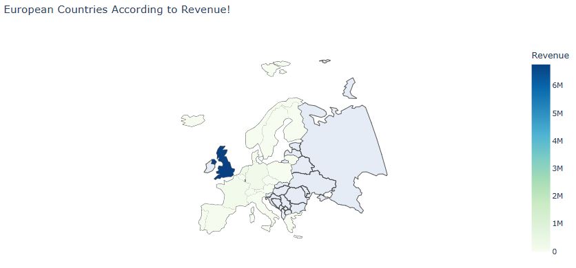
Let’s plot European Countries According to Revenue
data = dict(type=’choropleth’,colorscale=’GnBu’, locations = country_wise[‘three’], locationmode = ‘ISO-3’, z= country_wise[‘Total Amount Spent’], text = country_wise[‘Country’], colorbar={‘title’:’Revenue’}, marker = dict(line=dict(width=0)))
layout = dict(title = ‘European Countries According to Revenue!’, geo = dict(scope=’europe’,showlakes=False, projection = {‘type’: ‘winkel tripel’}))
Choromaps2 = go.Figure(data=[data], layout=layout)
iplot(Choromaps2)
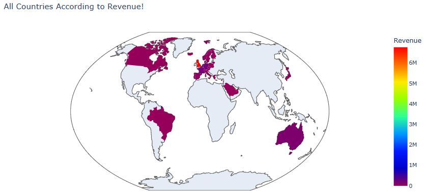
Let’s plot All Countries According to Revenue
data = dict(type=’choropleth’,colorscale=’rainbow’, locations = country_wise[‘three’], locationmode = ‘ISO-3’, z= country_wise[‘Total Amount Spent’], text = country_wise[‘Country’], colorbar={‘title’:’Revenue’}, marker = dict(line=dict(width=0)))
layout = dict(title = ‘All Countries According to Revenue!’, geo = dict(scope=’world’,showlakes=False, projection = {‘type’: ‘winkel tripel’}))
Choromaps2 = go.Figure(data=[data], layout=layout)
iplot(Choromaps2)
Let’s create the list of countries based upon the percentage of Total Price
import pandas as pd
import numpy as np
import matplotlib.pyplot as plt
import seaborn as sns
df = pd.read_csv(“OnlineRetail.csv”, encoding= ‘unicode_escape’)
df = df.drop_duplicates()
df[‘cancellation’] = df.InvoiceNo.str.extract(‘([C])’).fillna(0).replace({‘C’:1})
df.cancellation.value_counts()
cancellation
0    527390
1      9251
Name: count, dtype: int64
df[df.cancellation == 1][‘CustomerID’].nunique() / df.CustomerID.nunique() * 100
36.34492223238792
df = df[df.CustomerID.notnull()]
df = df[(df.Quantity > 0) & (df.UnitPrice > 0)]
df = df.drop(‘cancellation’, axis = 1)
df[“TotalPrice”] = df.UnitPrice * df.Quantity
df2 = pd.DataFrame(df.groupby(‘Country’).TotalPrice.sum().apply(lambda x: round(x, 2))).sort_values(‘TotalPrice’, ascending = False)
df2[‘perc_of_TotalPrice’] = round(df2.TotalPrice / df2.TotalPrice.sum() * 100, 2)
df2

Read more here.
RFM Customer Segmentation
Let’s set the working directory YOURPATH
import os
os.chdir(‘YOURPATH’)
os. getcwd()
and import the key libraries
!pip install termcolor
import numpy as np # linear algebra
import pandas as pd # data processing, CSV file I/O (e.g. pd.read_csv)
import ipywidgets
from ipywidgets import interact
import numpy as np
import pandas as pd
import seaborn as sns
import matplotlib.pyplot as plt
%matplotlib inline
import matplotlib.ticker as mticker
import squarify as sq
import scipy.stats as stats
import statsmodels.api as sm
import statsmodels.formula.api as smf
import missingno as msno
import datetime as dt
from datetime import datetime
from sklearn.preprocessing import scale, StandardScaler, MinMaxScaler, RobustScaler
from sklearn.preprocessing import PolynomialFeatures
from sklearn.preprocessing import OneHotEncoder
from sklearn.preprocessing import PowerTransformer
from sklearn.preprocessing import LabelEncoder
from sklearn.compose import make_column_transformer
from sklearn.cluster import KMeans
from sklearn.decomposition import PCA
import plotly.express as px
import cufflinks as cf
import plotly.offline
cf.go_offline()
cf.set_config_file(offline=False, world_readable=True)
import colorama
from colorama import Fore, Style # maakes strings colored
from termcolor import colored
from termcolor import cprint
from wordcloud import WordCloud
import warnings
warnings.filterwarnings(“ignore”)
warnings.warn(“this will not show”)
plt.rcParams[“figure.figsize”] = (10,6)
pd.set_option(‘max_colwidth’,200)
pd.set_option(‘display.max_rows’, 1000)
pd.set_option(‘display.max_columns’, 200)
pd.set_option(‘display.float_format’, lambda x: ‘%.3f’ % x)
Let’s define the following functions
##########################
def missing_values(df):
missing_number = df.isnull().sum().sort_values(ascending=False)
missing_percent = (df.isnull().sum()/df.isnull().count()).sort_values(ascending=False)
missing_values = pd.concat([missing_number, missing_percent], axis=1, keys=[‘Missing_Number’, ‘Missing_Percent’])
return missing_values[missing_values[‘Missing_Number’]>0]
def first_looking(df):
print(colored(“Shape:”, attrs=[‘bold’]), df.shape,’\n’,
colored(‘‘100, ‘red’, attrs=[‘bold’]),
colored(“\nInfo:\n”, attrs=[‘bold’]), sep=”)
print(df.info(), ‘\n’,
colored(‘‘100, ‘red’, attrs=[‘bold’]), sep=”)
print(colored(“Number of Uniques:\n”, attrs=[‘bold’]), df.nunique(),’\n’,
colored(‘‘100, ‘red’, attrs=[‘bold’]), sep=”)
print(colored(“Missing Values:\n”, attrs=[‘bold’]), missing_values(df),’\n’,
colored(‘‘100, ‘red’, attrs=[‘bold’]), sep=”)
print(colored(“All Columns:”, attrs=[‘bold’]), list(df.columns),’\n’,
colored(‘‘100, ‘red’, attrs=[‘bold’]), sep=”)
df.columns= df.columns.str.lower().str.replace('&', '_').str.replace(' ', '_')
print(colored("Columns after rename:", attrs=['bold']), list(df.columns),'\n',
      colored('*'*100, 'red', attrs=['bold']), sep='')
print(colored("Columns after rename:", attrs=['bold']), list(df.columns),'\n',
      colored('*'*100, 'red', attrs=['bold']), sep='')
print(colored("Descriptive Statistics \n", attrs=['bold']), df.describe().round(2),'\n',
      colored('*'*100, 'red', attrs=['bold']), sep='') # Gives a statstical breakdown of the data.
print(colored("Descriptive Statistics (Categorical Columns) \n", attrs=['bold']), df.describe(include=object).T,'\n',
      colored('*'*100, 'red', attrs=['bold']), sep='') # Gives a statstical breakdown of the data.
def multicolinearity_control(df):
feature =[]
collinear=[]
for col in df.corr().columns:
for i in df.corr().index:
if (abs(df.corr()[col][i])> .9 and abs(df.corr()[col][i]) < 1):
feature.append(col)
collinear.append(i)
print(colored(f”Multicolinearity alert in between:{col} – {i}”,
“red”, attrs=[‘bold’]), df.shape,’\n’,
colored(‘‘100, ‘red’, attrs=[‘bold’]), sep=”)
def duplicate_values(df):
print(colored(“Duplicate check…”, attrs=[‘bold’]), sep=”)
print(“There are”, df.duplicated(subset=None, keep=’first’).sum(), “duplicated observations in the dataset.”)
def drop_null(df, limit):
print(‘Shape:’, df.shape)
for i in df.isnull().sum().index:
if (df.isnull().sum()[i]/df.shape[0]*100)>limit:
print(df.isnull().sum()[i], ‘percent of’, i ,’null and were dropped’)
df.drop(i, axis=1, inplace=True)
print(‘new shape:’, df.shape)
print(‘New shape after missing value control:’, df.shape)
def first_look(col):
print(“column name : “, col)
print(“——————————–“)
print(“Per_of_Nulls : “, “%”, round(df[col].isnull().sum()/df.shape[0]*100, 2))
print(“Num_of_Nulls : “, df[col].isnull().sum())
print(“Num_of_Uniques : “, df[col].nunique())
print(“Duplicates : “, df.duplicated(subset=None, keep=’first’).sum())
print(df[col].value_counts(dropna = False))
def fill_most(df, group_col, col_name):
”’Fills the missing values with the most existing value (mode) in the relevant column according to single-stage grouping”’
for group in list(df[group_col].unique()):
cond = df[group_col]==group
mode = list(df[cond][col_name].mode())
if mode != []:
df.loc[cond, col_name] = df.loc[cond, col_name].fillna(df[cond][col_name].mode()[0])
else:
df.loc[cond, col_name] = df.loc[cond, col_name].fillna(df[col_name].mode()[0])
print(“Number of NaN : “,df[col_name].isnull().sum())
print(“——————“)
print(df[col_name].value_counts(dropna=False))
##########################
Let’s read and copy the input Online Retail dataset
df0=pd.read_csv(‘Online Retail.csv’,index_col=0)
df = df0.copy()
Let’s check the dataset content
first_looking(df)
duplicate_values(df)
Shape:(541909, 8)
****************************************************************************************************
Info:

<class 'pandas.core.frame.DataFrame'>
Index: 541909 entries, 0 to 541908
Data columns (total 8 columns):
 #   Column       Non-Null Count   Dtype
---  ------       --------------   -----
 0   InvoiceNo    541909 non-null  object
 1   StockCode    541909 non-null  object
 2   Description  540455 non-null  object
 3   Quantity     541909 non-null  float64
 4   InvoiceDate  541909 non-null  object
 5   UnitPrice    541909 non-null  float64
 6   CustomerID   406829 non-null  float64
 7   Country      541909 non-null  object
dtypes: float64(3), object(5)
memory usage: 37.2+ MB
None
****************************************************************************************************
Number of Uniques:
InvoiceNo      25900
StockCode       4070
Description     4223
Quantity         722
InvoiceDate    23260
UnitPrice       1630
CustomerID      4372
Country           38
dtype: int64
****************************************************************************************************
Missing Values:
             Missing_Number  Missing_Percent
CustomerID           135080            0.249
Description            1454            0.003
****************************************************************************************************
All Columns:['InvoiceNo', 'StockCode', 'Description', 'Quantity', 'InvoiceDate', 'UnitPrice', 'CustomerID', 'Country']
****************************************************************************************************
Columns after rename:['invoiceno', 'stockcode', 'description', 'quantity', 'invoicedate', 'unitprice', 'customerid', 'country']
****************************************************************************************************
Columns after rename:['invoiceno', 'stockcode', 'description', 'quantity', 'invoicedate', 'unitprice', 'customerid', 'country']
****************************************************************************************************
Descriptive Statistics
        quantity  unitprice  customerid
count 541909.000 541909.000  406829.000
mean       9.550      4.610   15287.690
std      218.080     96.760    1713.600
min   -80995.000 -11062.060   12346.000
25%        1.000      1.250   13953.000
50%        3.000      2.080   15152.000
75%       10.000      4.130   16791.000
max    80995.000  38970.000   18287.000
****************************************************************************************************
Descriptive Statistics (Categorical Columns)
              count unique                                 top    freq
invoiceno    541909  25900                            573585.0    1114
stockcode    541909   4070                              85123A    2313
description  540455   4223  WHITE HANGING HEART T-LIGHT HOLDER    2369
invoicedate  541909  23260                 2011-10-31 14:41:00    1114
country      541909     38                      United Kingdom  495478
****************************************************************************************************
Duplicate check...
There are 5268 duplicated observations in the dataset.
Let’s calculate the total price
df[‘total_price’] = df[‘quantity’] * df[‘unitprice’]
print(“There is”, df.shape[0], “observations and”, df.shape[1], “columns in the dataset”)
There is 541909 observations and 9 columns in the dataset
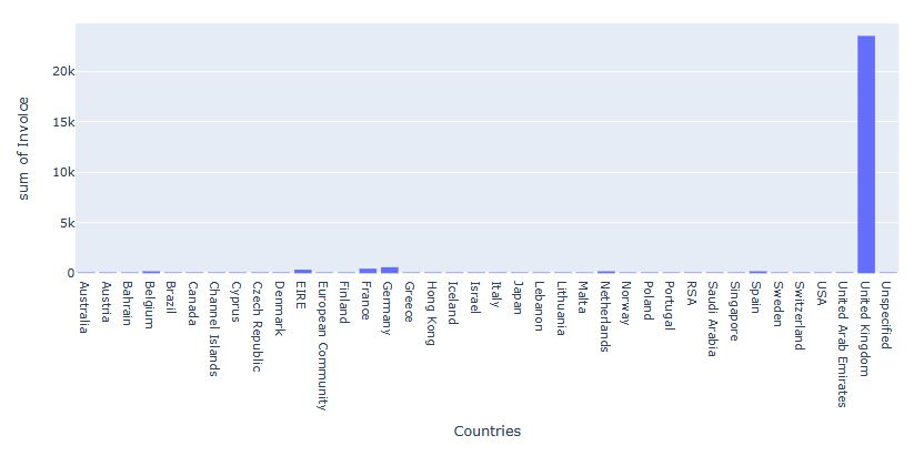
Let’s plot Invoice Counts Per Country
fig = px.histogram(df, x = df.groupby(‘country’)[‘invoiceno’].nunique().index,
y = df.groupby(‘country’)[‘invoiceno’].nunique().values,
title = ‘Invoice Counts Per Country’,
labels = dict(x = “Countries”, y =”Invoice”))
fig.show();
Let’s group the data
df.groupby([‘invoiceno’,’customerid’, ‘country’])[‘total_price’].sum().sort_values().head()
invoiceno  customerid  country
C581484    16446.000   United Kingdom   -168469.600
C541433    12346.000   United Kingdom    -77183.600
C556445    15098.000   United Kingdom    -38970.000
C550456    15749.000   United Kingdom    -22998.400
C570556    16029.000   United Kingdom    -11816.640
Name: total_price, dtype: float64
Let’s plot Customer Counts by Country
fig = px.histogram(df, x = df.groupby(‘country’)[‘customerid’].nunique().index,
y = df.groupby(‘country’)[‘customerid’].nunique().values,
title = ‘Customer Counts by Country’,
labels = dict(x = “Countries”, y =”Customer”))
fig.show()
Let’s check missing values
df.isnull().melt(value_name=”missing”)
Clean the Data from the Noise and Missing Values:
missing_values(df)
Drop observations with missing values:
df = df.dropna(subset=[“customerid”])
Get rid of cancellations and negative values:
df = df[(df[‘unitprice’] > 0) & (df[‘quantity’] > 0)]
Check for duplicates and get rid of them:
print(“There are”, df.duplicated(subset=None, keep=’first’).sum(), “duplicated observations in the dataset.”)
print(df.duplicated(subset=None, keep=’first’).sum(), “Duplicated observations are dropped!”)
df.drop_duplicates(keep=’first’, inplace=True)
print(“There are”, df.duplicated(subset=None, keep=’first’).sum(), “duplicated observations in the dataset.”)
print(df.duplicated(subset=None, keep=’first’).sum(), “Duplicated observations are dropped!”)
df.drop_duplicates(keep=’first’, inplace=True)
There are 5192 duplicated observations in the dataset.
5192 Duplicated observations are dropped!
df.columns
Index(['invoiceno', 'stockcode', 'description', 'quantity', 'invoicedate',
       'unitprice', 'customerid', 'country', 'total_price'],
      dtype='object')
Explore the Orders:
cprint(“Unique number of invoice per customer”,’red’)
df.groupby(“customerid”)[“invoiceno”].nunique().sort_values(ascending = False)
Unique number of invoice per customer
customerid
12748.000    209
14911.000    201
17841.000    124
13089.000     97
14606.000     93
            ...
15314.000      1
15313.000      1
15308.000      1
15307.000      1
15300.000      1
Name: invoiceno, Length: 4338, dtype: int64
Let’s plot the country-based wordcloud
from wordcloud import WordCloud
country_text = df[“country”].str.split(” “).str.join(“_”)
all_countries = ” “.join(country_text)
wc = WordCloud(background_color=”red”,
max_words=250,
max_font_size=256,
random_state=42,
width=800, height=400)
wc.generate(all_countries)
plt.figure(figsize = (12, 10))
plt.imshow(wc)
plt.axis(‘off’)
plt.show()

Let’s focus on the UK online retail market
df_uk = df[df[“country”]==”United Kingdom”]
first_looking(df_uk)
duplicate_values(df_uk)
Shape:(349203, 9)
****************************************************************************************************
Info:

<class 'pandas.core.frame.DataFrame'>
Index: 349203 entries, 0 to 541893
Data columns (total 9 columns):
 #   Column       Non-Null Count   Dtype
---  ------       --------------   -----
 0   invoiceno    349203 non-null  object
 1   stockcode    349203 non-null  object
 2   description  349203 non-null  object
 3   quantity     349203 non-null  float64
 4   invoicedate  349203 non-null  object
 5   unitprice    349203 non-null  float64
 6   customerid   349203 non-null  float64
 7   country      349203 non-null  object
 8   total_price  349203 non-null  float64
dtypes: float64(4), object(5)
memory usage: 26.6+ MB
None
****************************************************************************************************
Number of Uniques:
invoiceno      16646
stockcode       3645
description     3844
quantity         293
invoicedate    15612
unitprice        402
customerid      3920
country            1
total_price     2792
dtype: int64
****************************************************************************************************
Missing Values:
Empty DataFrame
Columns: [Missing_Number, Missing_Percent]
Index: []
****************************************************************************************************
All Columns:['invoiceno', 'stockcode', 'description', 'quantity', 'invoicedate', 'unitprice', 'customerid', 'country', 'total_price']
****************************************************************************************************
Columns after rename:['invoiceno', 'stockcode', 'description', 'quantity', 'invoicedate', 'unitprice', 'customerid', 'country', 'total_price']
****************************************************************************************************
Columns after rename:['invoiceno', 'stockcode', 'description', 'quantity', 'invoicedate', 'unitprice', 'customerid', 'country', 'total_price']
****************************************************************************************************
Descriptive Statistics
        quantity  unitprice  customerid  total_price
count 349203.000 349203.000  349203.000   349203.000
mean      12.150      2.970   15548.380       20.860
std      190.630     17.990    1594.380      328.420
min        1.000      0.000   12346.000        0.000
25%        2.000      1.250   14191.000        4.200
50%        4.000      1.950   15518.000       10.200
75%       12.000      3.750   16931.000       17.850
max    80995.000   8142.750   18287.000   168469.600
****************************************************************************************************
Descriptive Statistics (Categorical Columns)
              count unique                                 top    freq
invoiceno    349203  16646                            576339.0     542
stockcode    349203   3645                              85123A    1936
description  349203   3844  WHITE HANGING HEART T-LIGHT HOLDER    1929
invoicedate  349203  15612                 2011-11-14 15:27:00     542
country      349203      1                      United Kingdom  349203
****************************************************************************************************
Duplicate check...
There are 0 duplicated observations in the dataset.
Let’s prepare the date for the RFM analysis
import datetime as dt
from datetime import datetime
import datetime as dt
df_uk[“ref_date”] = pd.to_datetime(df_uk[‘invoicedate’]).dt.date.max()
df_uk[‘ref_date’] = pd.to_datetime(df_uk[‘ref_date’])
df_uk[“date”] = pd.to_datetime(df_uk[“invoicedate”]).dt.date
df_uk[‘date’] = pd.to_datetime(df_uk[‘date’])
df_uk[‘last_purchase_date’] = df_uk.groupby(‘customerid’)[‘invoicedate’].transform(max)
df_uk[‘last_purchase_date’] = pd.to_datetime(df_uk[‘last_purchase_date’]).dt.date
df_uk[‘last_purchase_date’] = pd.to_datetime(df_uk[‘last_purchase_date’])
df_uk.groupby(‘customerid’)[[‘last_purchase_date’]].max().sample(5)

df_uk[“customer_recency”] = df_uk[“ref_date”] – df_uk[“last_purchase_date”]
df_uk[‘recency_value’] = pd.to_numeric(df_uk[‘customer_recency’].dt.days.astype(‘int64’))
customer_recency = pd.DataFrame(df_uk.groupby(‘customerid’)[‘recency_value’].min())
customer_recency.rename(columns={‘recency_value’:’recency’}, inplace=True)
customer_recency.reset_index(inplace=True)
df_uk.drop(‘last_purchase_date’, axis=1, inplace=True)
Let’s plot Customer Regency Distribution
fig = px.histogram(df_uk, x = ‘recency_value’, title = ‘Customer Regency Distribution’)
fig.show()

Let’s compute Frequency – Number of purchases
df_uk1 = df_uk.copy()
customer_frequency = pd.DataFrame(df_uk.groupby(‘customerid’)[‘invoiceno’].nunique())
customer_frequency.rename(columns={‘invoiceno’:’frequency’}, inplace=True)
customer_frequency.reset_index(inplace=True)
df_uk[‘customer_frequency’] = df_uk.groupby(‘customerid’)[‘invoiceno’].transform(‘count’)
Let’s plot Customer Frequency Distribution
fig = px.histogram(df_uk, x = ‘customer_frequency’, title = ‘Customer Frequency Distribution’)
fig.show()

Let’s calculate Monetary
customer_monetary = pd.DataFrame(df_uk.groupby(‘customerid’)[‘total_price’].sum())
customer_monetary.rename(columns={‘total_price’:’monetary’}, inplace=True)
customer_monetary.reset_index(inplace=True)
df_uk[‘customer_monetary’] = df_uk.groupby(‘customerid’)[‘total_price’].transform(‘sum’)
Let’s plot Customer Monetary Distribution
fig = px.histogram(df_uk, x = ‘customer_monetary’, title = ‘Customer Monetary Distribution’)
fig.show()

Let’s create the RFM Table
customer_rfm = pd.merge(pd.merge(customer_recency, customer_frequency, on=’customerid’), customer_monetary, on=’customerid’)
customer_rfm.head()

customer_rfm.set_index(‘customerid’, inplace = True)
quantiles = customer_rfm.quantile(q = [0.25,0.50,0.75])
quantiles

Let’s introduce several functions creating the RFM Segmentation Table
def rec_score(x):
if x < 17.000:
return 4
elif 17.000 <= x < 50.000:
return 3
elif 50.000 <= x < 142.000:
return 2
else:
return 1
def freq_score(x):
if x > 5.000:
return 4
elif 5.000 >= x > 2.000:
return 3
elif 2.000 >= x > 1:
return 2
else:
return 1
def mon_score(x):
if x > 1571.285:
return 4
elif 1571.285 >= x > 644.975:
return 3
elif 644.975 >= x > 298.185:
return 2
else:
return 1
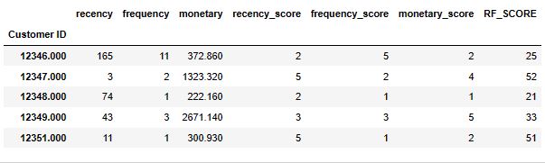
Let’s calculate the RFM score
customer_rfm[‘recency_score’] = customer_rfm[‘recency’].apply(rec_score)
customer_rfm[‘frequency_score’] = customer_rfm[‘frequency’].apply(freq_score)
customer_rfm[‘monetary_score’] = customer_rfm[‘monetary’].apply(mon_score)
customer_rfm.info()
<class 'pandas.core.frame.DataFrame'>
Index: 3920 entries, 12346.0 to 18287.0
Data columns (total 6 columns):
 #   Column           Non-Null Count  Dtype
---  ------           --------------  -----
 0   recency          3920 non-null   int64
 1   frequency        3920 non-null   int64
 2   monetary         3920 non-null   float64
 3   recency_score    3920 non-null   int64
 4   frequency_score  3920 non-null   int64
 5   monetary_score   3920 non-null   int64
dtypes: float64(1), int64(5)
memory usage: 214.4 KB
Let’s calculate the total RFM score
customer_rfm[‘RFM_score’] = (customer_rfm[‘recency_score’].astype(str) + customer_rfm[‘frequency_score’].astype(str) +
customer_rfm[‘monetary_score’].astype(str))
customer_rfm.sample(5)

Let’s plot Customer_RFM Distribution
fig = px.histogram(customer_rfm, x = customer_rfm[‘RFM_score’].value_counts().index,
y = customer_rfm[‘RFM_score’].value_counts().values,
title = ‘Customer_RFM Distribution’,
labels = dict(x = “RFM_score”, y =”counts”))
fig.show()

Let’s calculate the RFM_level
customer_rfm[‘RFM_level’] = customer_rfm[‘recency_score’] + customer_rfm[‘frequency_score’] + customer_rfm[‘monetary_score’]
customer_rfm.sample(5)
print(‘Min value for RFM_level : ‘, customer_rfm[‘RFM_level’].min())
print(‘Max value for RFM_level : ‘, customer_rfm[‘RFM_level’].max())
Min value for RFM_level :  3
Max value for RFM_level :  12
Let’s introduce the RFM segment function
def segments(df_rfm):
if df_rfm[‘RFM_level’] == 12 :
return ‘champion’
elif (df_rfm[‘RFM_level’] == 11) or (df_rfm[‘RFM_level’] == 10 ):
return ‘loyal_customer’
elif (df_rfm[‘RFM_level’] == 9) or (df_rfm[‘RFM_level’] == 8 ):
return ‘promising’
elif (df_rfm[‘RFM_level’] == 7) or (df_rfm[‘RFM_level’] == 6 ):
return ‘need_attention’
elif (df_rfm[‘RFM_level’] == 5) or (df_rfm[‘RFM_level’] == 4 ):
return ‘hibernating’
else:
return ‘almost_lost’
Let’s call this function to compute customer_segment
customer_rfm[‘customer_segment’] = customer_rfm.apply(segments,axis=1)
customer_rfm.sample(5)

Let’s plot the customer_segment distribution
fig = px.histogram(customer_rfm, x = customer_rfm[‘customer_segment’].value_counts().index,
y = customer_rfm[‘customer_segment’].value_counts().values,
title = ‘Customer_Segment Distribution’,
labels = dict(x = “customer_segment”, y =”counts”))
fig.show()
Let’s calculate the RFM_level Mean Values
avg_rfm_segment = customer_rfm.groupby(‘customer_segment’).RFM_level.mean().sort_values(ascending=False)
avg_rfm_segment
customer_segment
champion         12.000
loyal_customer   10.482
promising         8.530
need_attention    6.479
hibernating       4.499
almost_lost       3.000
Name: RFM_level, dtype: float64
Let’s plot the Customer_Segment RFM_level Mean Values
fig = px.histogram(customer_rfm, x = customer_rfm.groupby(‘customer_segment’).RFM_level.mean().sort_values(ascending=False).index,
y = customer_rfm.groupby(‘customer_segment’).RFM_level.mean().sort_values(ascending=False).values,
title = ‘Customer_Segment RFM_level Mean Values’,
labels = dict(x = “customer_segment”, y =”RFM_level Mean Values”))
fig.show()

Let’s calculate the size of RFM_Segment
size_rfm_segment = customer_rfm[‘customer_segment’].value_counts()
size_rfm_segment
hibernating       918
promising         783
need_attention    771
loyal_customer    650
champion          402
almost_lost       396
Name: count, dtype: int64
Let’s plot Size RFM_Segment
fig = px.histogram(customer_rfm, x = customer_rfm[‘customer_segment’].value_counts().index,
y = customer_rfm[‘customer_segment’].value_counts().values,
title = ‘Size RFM_Segment’,
labels = dict(x = “customer_segment”, y =”Size RFM_Segment”))
fig.show()

Final output table:
customer_segment = pd.DataFrame(pd.concat([avg_rfm_segment, size_rfm_segment], axis=1))
customer_segment.rename(columns={‘RFM_level’: ‘avg_RFM_level’, ‘customer_segment’: ‘segment_size’}, inplace=True)
customer_segment

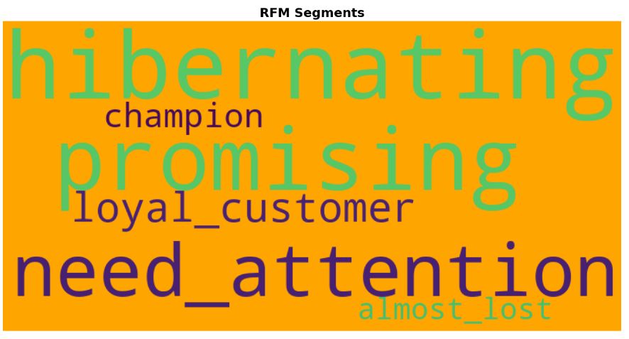
Let’s plot the wordcloud of RFM Segments
from wordcloud import WordCloud
segment_text = customer_rfm[“customer_segment”].str.split(” “).str.join(“_”)
all_segments = ” “.join(segment_text)
wc = WordCloud(background_color=”orange”,
max_words=250,
max_font_size=256,
random_state=42,
width=800, height=400)
wc.generate(all_segments)
plt.figure(figsize = (16, 15))
plt.imshow(wc)
plt.title(“RFM Segments”,fontsize=18,fontweight=”bold”)
plt.axis(‘off’)
plt.show()
Let’s check the structure and content of customer_rfm
first_looking(customer_rfm)
duplicate_values(customer_rfm)
Shape:(3920, 9)
****************************************************************************************************
Info:

<class 'pandas.core.frame.DataFrame'>
Index: 3920 entries, 12346.0 to 18287.0
Data columns (total 9 columns):
 #   Column            Non-Null Count  Dtype
---  ------            --------------  -----
 0   recency           3920 non-null   int64
 1   frequency         3920 non-null   int64
 2   monetary          3920 non-null   float64
 3   recency_score     3920 non-null   int64
 4   frequency_score   3920 non-null   int64
 5   monetary_score    3920 non-null   int64
 6   RFM_score         3920 non-null   object
 7   RFM_level         3920 non-null   int64
 8   customer_segment  3920 non-null   object
dtypes: float64(1), int64(6), object(2)
memory usage: 306.2+ KB
None
****************************************************************************************************
Number of Uniques:
recency              302
frequency             57
monetary            3849
recency_score          4
frequency_score        4
monetary_score         4
RFM_score             61
RFM_level             10
customer_segment       6
dtype: int64
****************************************************************************************************
Missing Values:
Empty DataFrame
Columns: [Missing_Number, Missing_Percent]
Index: []
****************************************************************************************************
All Columns:['recency', 'frequency', 'monetary', 'recency_score', 'frequency_score', 'monetary_score', 'RFM_score', 'RFM_level', 'customer_segment']
****************************************************************************************************
Columns after rename:['recency', 'frequency', 'monetary', 'recency_score', 'frequency_score', 'monetary_score', 'rfm_score', 'rfm_level', 'customer_segment']
****************************************************************************************************
Columns after rename:['recency', 'frequency', 'monetary', 'recency_score', 'frequency_score', 'monetary_score', 'rfm_score', 'rfm_level', 'customer_segment']
****************************************************************************************************
Descriptive Statistics
       recency  frequency   monetary  recency_score  frequency_score
count 3920.000   3920.000   3920.000       3920.000         3920.000  \
mean    91.740      4.250   1858.420          2.480            2.320
std     99.530      7.200   7478.630          1.110            1.150
min      0.000      1.000      3.750          1.000            1.000
25%     17.000      1.000    298.180          1.000            1.000
50%     50.000      2.000    644.970          2.000            2.000
75%    142.000      5.000   1571.280          3.000            3.000
max    373.000    209.000 259657.300          4.000            4.000

       monetary_score  rfm_level
count        3920.000   3920.000
mean            2.500      7.300
std             1.120      2.880
min             1.000      3.000
25%             1.750      5.000
50%             2.500      7.000
75%             3.250     10.000
max             4.000     12.000
****************************************************************************************************
Descriptive Statistics (Categorical Columns)
                 count unique          top freq
rfm_score         3920     61          444  402
customer_segment  3920      6  hibernating  918
****************************************************************************************************
Duplicate check...
There are 0 duplicated observations in the dataset.
customer_rfm.groupby(‘rfm_level’).agg({‘recency’: [‘mean’,’min’,’max’,’count’],
‘frequency’: [‘mean’,’min’,’max’,’count’],
‘monetary’: [‘mean’,’min’,’max’,’count’] }).round(1)

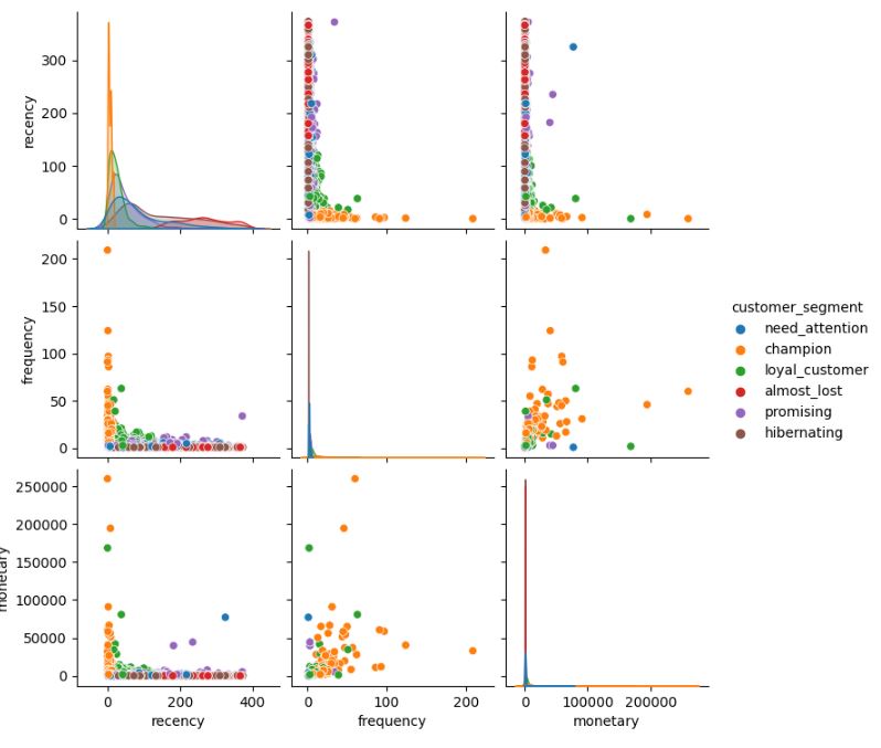
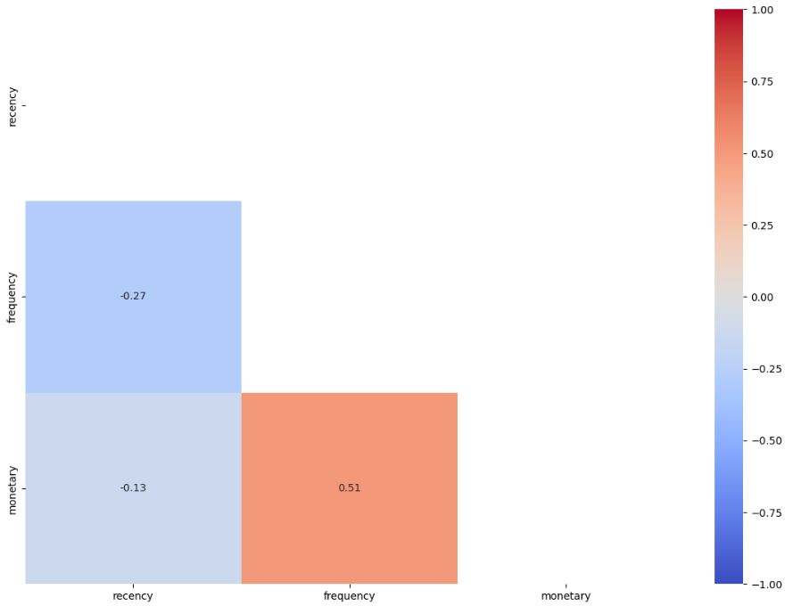
Let’s check RFM correlations
plt.figure(figsize = (20,20))
sns.pairplot(customer_rfm[[‘recency’, ‘frequency’, ‘monetary’,’customer_segment’]], hue = ‘customer_segment’);
Let’s compute the RFM correlation matrix
matrix = np.triu(customer_rfm[[‘recency’,’frequency’,’monetary’]].corr())
fig, ax = plt.subplots(figsize=(14,10))
sns.heatmap (customer_rfm[[‘recency’,’frequency’,’monetary’]].corr(), annot=True, fmt= ‘.2f’, vmin=-1, vmax=1, center=0, cmap=’coolwarm’,mask=matrix, ax=ax);
Read more here.
RFM TreeMap: Online Retail Dataset II
Let’s import libraries and read the Online Retail II dataset Year 2010-2011
import datetime as dt
import pandas as pd
pd.set_option(‘display.max_columns’, None)
pd.set_option(‘display.max_rows’, None)
pd.set_option(‘display.float_format’, lambda x: ‘%.2f’ % x)
df_ = pd.read_excel(“online_retail_II.xlsx”,sheet_name=”Year 2010-2011″ )
df = df_.copy()
Let’s check the overall data structure
def check_df(dataframe):
print(“################ Shape ####################”)
print(dataframe.shape)
print(“############### Columns ###################”)
print(dataframe.columns)
print(“############### Types #####################”)
print(dataframe.dtypes)
print(“############### Head ######################”)
print(dataframe.head())
print(“############### Tail ######################”)
print(dataframe.tail())
print(“############### Describe ###################”)
print(dataframe.describe().T)
check_df(df)
################ Shape ####################
(541910, 8)
############### Columns ###################
Index(['Invoice', 'StockCode', 'Description', 'Quantity', 'InvoiceDate',
       'Price', 'Customer ID', 'Country'],
      dtype='object')
############### Types #####################
Invoice                object
StockCode              object
Description            object
Quantity                int64
InvoiceDate    datetime64[ns]
Price                 float64
Customer ID           float64
Country                object
dtype: object
############### Head ######################
  Invoice StockCode                          Description  Quantity
0  536365    85123A   WHITE HANGING HEART T-LIGHT HOLDER         6  \
1  536365     71053                  WHITE METAL LANTERN         6
2  536365    84406B       CREAM CUPID HEARTS COAT HANGER         8
3  536365    84029G  KNITTED UNION FLAG HOT WATER BOTTLE         6
4  536365    84029E       RED WOOLLY HOTTIE WHITE HEART.         6

          InvoiceDate  Price  Customer ID         Country
0 2010-12-01 08:26:00   2.55     17850.00  United Kingdom
1 2010-12-01 08:26:00   3.39     17850.00  United Kingdom
2 2010-12-01 08:26:00   2.75     17850.00  United Kingdom
3 2010-12-01 08:26:00   3.39     17850.00  United Kingdom
4 2010-12-01 08:26:00   3.39     17850.00  United Kingdom
############### Tail ######################
       Invoice StockCode                      Description  Quantity
541905  581587     22899     CHILDREN'S APRON DOLLY GIRL          6  \
541906  581587     23254    CHILDRENS CUTLERY DOLLY GIRL          4
541907  581587     23255  CHILDRENS CUTLERY CIRCUS PARADE         4
541908  581587     22138    BAKING SET 9 PIECE RETROSPOT          3
541909  581587      POST                          POSTAGE         1

               InvoiceDate  Price  Customer ID Country
541905 2011-12-09 12:50:00   2.10     12680.00  France
541906 2011-12-09 12:50:00   4.15     12680.00  France
541907 2011-12-09 12:50:00   4.15     12680.00  France
541908 2011-12-09 12:50:00   4.95     12680.00  France
541909 2011-12-09 12:50:00  18.00     12680.00  France
############### Describe ###################
                count                           mean                  min
Quantity    541910.00                           9.55            -80995.00  \
InvoiceDate    541910  2011-07-04 13:35:22.342307584  2010-12-01 08:26:00
Price       541910.00                           4.61            -11062.06
Customer ID 406830.00                       15287.68             12346.00

                             25%                  50%                  75%
Quantity                    1.00                 3.00                10.00  \
InvoiceDate  2011-03-28 11:34:00  2011-07-19 17:17:00  2011-10-19 11:27:00
Price                       1.25                 2.08                 4.13
Customer ID             13953.00             15152.00             16791.00

                             max     std
Quantity                80995.00  218.08
InvoiceDate  2011-12-09 12:50:00     NaN
Price                   38970.00   96.76
Customer ID             18287.00 1713.60
####### DATA PREPARATION
df.isnull().any()
df.isnull().sum()
df.dropna(inplace=True)
df[“StockCode”].nunique()
df.groupby(“StockCode”)[“Quantity”].sum()
df.groupby(“StockCode”).agg({“Quantity”:”sum”}).sort_values(by=”Quantity”, ascending=False).head()
df = df[~df[“Invoice”].str.contains(“C”, na=False)]
df[“TotalPrice”] = df[“Price”] * df[“Quantity”]
df[“InvoiceDate”].max()
today_date = dt.datetime(2011, 12, 11)
rfm = df.groupby(“Customer ID”).agg({“InvoiceDate”: lambda InvıiceDate: (today_date- InvıiceDate.max()).days,
“Invoice”: lambda Invoice: Invoice.nunique(),
“TotalPrice”: lambda TotalPrice: TotalPrice.sum()})
rfm.columns = [“recency”,”frequency”,”monetary”]
rfm = rfm[rfm[“monetary”] > 0]
####### RFM CALCULATION
rfm[“recency_score”] = pd.qcut(rfm[‘recency’], 5, labels=[5, 4, 3, 2, 1])
rfm[“frequency_score”] = pd.qcut(rfm[‘frequency’].rank(method=”first”), 5, labels=[1, 2, 3, 4, 5])
rfm[“monetary_score”] = pd.qcut(rfm[‘monetary’], 5, labels=[1, 2, 3, 4, 5])
rfm[“RFM_SCORE”] = (rfm[‘recency_score’].astype(str) + rfm[‘frequency_score’].astype(str))
rfm.head()
rfm.describe().T
rfm[rfm[“RFM_SCORE”] == “55”].head() # champions
rfm[rfm[“RFM_SCORE”] == “11”].head() # hibernating

#######CUSTOMER SEGMENTATION
seg_map = {
r'[1-2][1-2]’: ‘hibernating’,
r'[1-2][3-4]’: ‘at_Risk’,
r'[1-2]5′: ‘cant_loose’,
r’3[1-2]’: ‘about_to_sleep’,
r’33’: ‘need_attention’,
r'[3-4][4-5]’: ‘loyal_customers’,
r’41’: ‘promising’,
r’51’: ‘new_customers’,
r'[4-5][2-3]’: ‘potential_loyalists’,
r’5[4-5]’: ‘champions’
}
rfm[‘segment’] = rfm[‘RFM_SCORE’].replace(seg_map, regex=True)
rfm[[“segment”, “recency”, “frequency”, “monetary”]].groupby(“segment”).agg([“mean”, “count”])
rfm[rfm[“segment”] == “need_attention”].head()
rfm[rfm[“segment”] == “new_customers”].index
seg_list = [“at_Risk”, “hibernating”, “cant_loose”, “loyal_customers”]
for i in seg_list:
print(F” {i.upper()} “.center(50, “*”))
print(rfm[rfm[“segment”]==i].describe().T)
rfm[rfm[“segment”] == “loyal_customers”].index
loyalCus_df = pd.DataFrame()
loyalCus_df[“loyal_customersId”] = rfm[rfm[“segment”] == “loyal_customers”].index
loyalCus_df.head()
loyalCus_df.to_csv(“loyal_customers.csv”)
******************** AT_RISK *********************
           count    mean     std   min    25%    50%     75%      max
recency   593.00  153.79   68.62 73.00  96.00 139.00  195.00   374.00
frequency 593.00    2.88    0.95  2.00   2.00   3.00    3.00     6.00
monetary  593.00 1084.54 2562.07 52.00 412.78 678.25 1200.62 44534.30
****************** HIBERNATING *******************
            count   mean     std   min    25%    50%    75%      max
recency   1071.00 217.61   92.01 73.00 135.00 219.00 289.50   374.00
frequency 1071.00   1.10    0.30  1.00   1.00   1.00   1.00     2.00
monetary  1071.00 488.64 2419.68  3.75 155.11 296.25 457.93 77183.60
******************* CANT_LOOSE *******************
           count    mean     std   min     25%     50%     75%      max
recency    63.00  132.97   65.25 73.00   89.00  108.00  161.00   373.00
frequency  63.00    8.38    4.29  6.00    6.00    7.00    9.00    34.00
monetary   63.00 2796.16 2090.49 70.02 1137.51 2225.97 3532.24 10254.18
**************** LOYAL_CUSTOMERS *****************
           count    mean     std   min    25%     50%     75%       max
recency   819.00   33.61   15.58 15.00  20.00   30.00   44.00     72.00
frequency 819.00    6.48    4.55  3.00   4.00    5.00    8.00     63.00
monetary  819.00 2864.25 6007.06 36.56 991.80 1740.48 3052.91 124914.53
#####CREATE RFM
def create_rfm(dataframe):
dataframe["TotalPrice"] = dataframe["Quantity"] * dataframe["Price"]
dataframe.dropna(inplace=True)
dataframe = dataframe[~dataframe["Invoice"].str.contains("C", na=False)]

today_date = dt.datetime(2011, 12, 11)
rfm = dataframe.groupby('Customer ID').agg({'InvoiceDate': lambda date: (today_date - date.max()).days,
                                            'Invoice': lambda num: num.nunique(),
                                            "TotalPrice": lambda price: price.sum()})
rfm.columns = ['recency', 'frequency', "monetary"]
rfm = rfm[(rfm['monetary'] > 0)]


rfm["recency_score"] = pd.qcut(rfm['recency'], 5, labels=[5, 4, 3, 2, 1])
rfm["frequency_score"] = pd.qcut(rfm["frequency"].rank(method="first"), 5, labels=[1, 2, 3, 4, 5])
rfm["monetary_score"] = pd.qcut(rfm['monetary'], 5, labels=[1, 2, 3, 4, 5])


rfm["RFM_SCORE"] = (rfm['recency_score'].astype(str) +
                    rfm['frequency_score'].astype(str))
rfm.head()

rfm[‘score’]=rfm[‘recency’]rfm[‘frequency’]rfm[‘monetary’]
Statistical informations of segments
rfm[[“segment”, “recency”, “frequency”, “monetary”]].groupby(“segment”).agg([“mean”, “count”])
How many segments are there
segments_counts = rfm[‘segment’].value_counts().sort_values(ascending=True)
Let’s plot our RFM segments
fig, ax = plt.subplots()
bars = ax.barh(range(len(segments_counts)),
segments_counts,
color=’lightcoral’)
ax.set_frame_on(False)
ax.tick_params(left=False,
bottom=False,
labelbottom=False)
ax.set_yticks(range(len(segments_counts)))
ax.set_yticklabels(segments_counts.index)
for i, bar in enumerate(bars):
value = bar.get_width()
if segments_counts.index[i] in [‘Can\’t loose’]:
bar.set_color(‘firebrick’)
ax.text(value,
bar.get_y() + bar.get_height()/2,
‘{:,} ({:}%)’.format(int(value),
int(value*100/segments_counts.sum())),
va=’center’,
ha=’left’
)
plt.show(block=True)

Let’s plot the RFM segmentation treemap
import matplotlib.pyplot as plt
import squarify
sizes=[24, 18, 14, 13,11,8,4,3,2,1]
label=[“hibernating”, “loyal_customers”, ‘champions’, ‘at_risk’,’potential_loyalists’,’about_to_sleep’,’need_attention’,’promising’,’CL’,’NC’]
colors = [‘#91DCEA’, ‘#64CDCC’, ‘#5FBB68’,
‘#F9D23C’, ‘#F9A729’, ‘#FD6F30′,’grey’,’red’,’blue’,’cyan’]
squarify.plot(sizes=sizes, label=label, color=colors, alpha=0.6 )
plt.show()
plt.axis(“off”)

where CL = cant_loose and NC = new_cutomers.
Read more here.
CRM Analytics: CLTV
Let’s look at the CRM Analytics – CLTV (Customer Lifetime Value).
Importing libraries:
import datetime as dt
import pandas as pd
import warnings
warnings.filterwarnings(‘ignore’)
import matplotlib.pyplot as plt
and set display setting
pd.set_option(“display.max_columns”, None)
pd.set_option(“display.float_format”, lambda x: “%.3f” % x)
####### DATA PREPARATION
Reading the Online Retail II dataset and creating a copy of it
df_ = pd.read_excel(“online_retail.xlsx”)
df = df_.copy()
df.head()

df.shape
(525461, 8)
Number of unique products
df[“Description”].nunique()
4681
value_counts() of each product
df[“Description”].value_counts().head()
WHITE HANGING HEART T-LIGHT HOLDER    3549
REGENCY CAKESTAND 3 TIER              2212
STRAWBERRY CERAMIC TRINKET BOX        1843
PACK OF 72 RETRO SPOT CAKE CASES      1466
ASSORTED COLOUR BIRD ORNAMENT         1457
Name: Description, dtype: int64
What is the most ordered product
df.groupby(“Description”).agg({“Quantity”: “sum”}).head()
Missing value check
df.isnull().sum
Customers with missing Customer ID must be removed from the dataset
df.dropna(inplace =True)
Adding the total price on the basis of products to the data set as a variable
df[“TotalPrice”] = df[“Quantity”] * df[“Price”]
Let’s remove attribute values started with “C” (returned products)
df = df[~df[“Invoice”].str.contains(“C”, na=False)]
with the descriptive statistics of the dataset
df.describe().T

######### CALCULATION OF RFM METRICS
Last date in the InvoiceDate
df[“InvoiceDate”].max()
Timestamp('2010-12-09 20:01:00')
Let’s set 2 days after the last date
analysis_date = dt.datetime(2010, 12, 11)
Let’s introduce the following RFM columns
rfm = df.groupby(“Customer ID”).agg({“InvoiceDate”: lambda invoice_date: (analysis_date – invoice_date.max()).days,
“Invoice”: lambda invoice: invoice.nunique(),
“TotalPrice”: lambda total_price: total_price.sum()})
rfm.columns = [“recency”, “frequency”, “monetary”]
rfm.head()
while excluding monetary<=0
rfm = rfm[rfm[“monetary”] > 0]
and checking descriptive statistics
rfm.describe().T

RECENCY SCORE
rfm[“recency_score”] = pd.qcut(rfm[“recency”], 5, labels=[5, 4, 3, 2, 1])
FREQUENCY SCORE
rfm[“frequency_score”] = pd.qcut(rfm[“frequency”].rank(method=”first”), 5, labels=[1, 2, 3, 4, 5])
MONETARY SCORE
rfm[“monetary_score”] = pd.qcut(rfm[“monetary”], 5, labels=[1, 2, 3, 4, 5])
RF SCORE
rfm[“RF_SCORE”] = (rfm[“recency_score”].astype(str) + rfm[“frequency_score”].astype(str))
rfm.head()
Let’s convert RF_SCORE to segment with regex=True
seg_map = {
r'[1-2][1-2]’: ‘hibernating’,
r'[1-2][3-4]’: ‘at_Risk’,
r'[1-2]5′: ‘cant_loose’,
r’3[1-2]’: ‘about_to_sleep’,
r’33’: ‘need_attention’,
r'[3-4][4-5]’: ‘loyal_customers’,
r’41’: ‘promising’,
r’51’: ‘new_customers’,
r'[4-5][2-3]’: ‘potential_loyalists’,
r’5[4-5]’: ‘champions’
}
rfm[‘segment’] = rfm[‘RF_SCORE’].replace(seg_map, regex=True)
rfm.head()

Let’s compute mean and count of our RFM columns sorted by segment in the ascending order
rfm[[“segment”, “recency”, “frequency”, “monetary”]].groupby(“segment”).agg([“mean”, “count”])
segments_counts = rfm[‘segment’].value_counts().sort_values(ascending=True)
Let’s plot our RFM segments
fig, ax = plt.subplots()
bars = ax.barh(range(len(segments_counts)),
segments_counts,
color=’lightcoral’)
ax.set_frame_on(False)
ax.tick_params(left=False,
bottom=False,
labelbottom=False)
ax.set_yticks(range(len(segments_counts)))
ax.set_yticklabels(segments_counts.index)
for i, bar in enumerate(bars):
value = bar.get_width()
if segments_counts.index[i] in [‘Can\’t loose’]:
bar.set_color(‘firebrick’)
ax.text(value,
bar.get_y() + bar.get_height()/2,
‘{:,} ({:}%)’.format(int(value),
int(value*100/segments_counts.sum())),
va=’center’,
ha=’left’
)
plt.show(block=True)

########## CLTV CALCULATION
Let’s prepare our input data
cltv_c = df.groupby(‘Customer ID’).agg({“Invoice”: lambda x: x.nunique(),
“Quantity”: lambda x: x.sum(),
“TotalPrice”: lambda x: x.sum()})
cltv_c.columns = [“total_transaction”, “total_unit”, “total_price”]
Let’s calculate the following metrics:
profit margin:
cltv_c[“profit_margin”] = cltv_c[“total_price”] * 0.10
Churn Rate:
repeat_rate = cltv_c[cltv_c[“total_transaction”] > 1].shape[0] / cltv_c.shape[0]
churn_rate = 1 – repeat_rate
Purchase Frequency:
cltv_c[“purchase_frequency”] = cltv_c[“total_transaction”] / cltv_c.shape[0]
Average Order Value:
cltv_c[“average_order_value”] = cltv_c[“total_price”] / cltv_c[“total_transaction”]
Customer Value:
cltv_c[“customer_value”] = cltv_c[“average_order_value”] * cltv_c[“purchase_frequency”]
CLTV (Customer Lifetime Value):
cltv_c[“cltv”] = (cltv_c[“customer_value”] / churn_rate) * cltv_c[“profit_margin”]
Sorting our dataset by cltv in the descending order
cltv_c.sort_values(by = “cltv”, ascending=False).head()

Eliminating outliers with interquantile_range
def outlier_threshold(dataframe, variable):
quartile1 = dataframe[variable].quantile(0.01)
quartile3 = dataframe[variable].quantile(0.99)
interquantile_range = quartile3 – quartile1
up_limit = quartile3 + 1.5 * interquantile_range
low_limit = quartile1 – 1.5 * interquantile_range
return low_limit, up_limit
def replace_with_thresholds(dataframe, variable):
low_limit, up_limit = outlier_threshold(dataframe, variable)
# dataframe.loc[(dataframe[variable] < low_limit), variable] = low_limit dataframe.loc[(dataframe[variable] > up_limit), variable] = up_limit
replace_with_thresholds(df, “Quantity”)
replace_with_thresholds(df, “Price”)
Define the analysis date
df[“InvoiceDate”].max()
analysis_date = dt.datetime(2011, 12, 11)
############ Preparation of Lifetime Data Structure
cltv_df = df.groupby(“Customer ID”).agg({“InvoiceDate”: [lambda InvoiceDate: (InvoiceDate.max() – InvoiceDate.min()).days / 7,
lambda InvoiceDate: (analysis_date – InvoiceDate.min()).days / 7],
“Invoice”: lambda Invoice: Invoice.nunique(),
“TotalPrice”: lambda TotalPrice: TotalPrice.sum()})
cltv_df.columns = cltv_df.columns.droplevel(0)
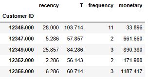
cltv_df.columns = [“recency”, “T”, “frequency”, “monetary”]
cltv_df[“monetary”] = cltv_df[“monetary”] / cltv_df[“frequency”]
cltv_df = cltv_df[cltv_df[“frequency”] > 1]
cltv_df.head()
cltv_df.describe().T

#######CLTV MODELLING
Let’s install and import the following libraries
!pip install Lifetimes
from lifetimes import BetaGeoFitter
from lifetimes import BetaGeoFitter
from lifetimes import GammaGammaFitter
from lifetimes.plotting import plot_period_transactions
import datetime as dt
import pandas as pd
import warnings
warnings.filterwarnings(‘ignore’)
import matplotlib.pyplot as plt
pd.set_option(‘display.max_columns’, None)
pd.set_option(‘display.float_format’, lambda x: ‘%.5f’ % x)
pd.set_option(‘display.width’, 500)
######BG/NBD Model
bgf = BetaGeoFitter(penalizer_coef=0.001)
bgf.fit(cltv_df[“frequency”],
cltv_df[“recency”],
cltv_df[“T”])
<lifetimes.BetaGeoFitter: fitted with 2893 subjects, a: 1.93, alpha: 9.47, b: 6.27, r: 2.22>
Let’s look at the first 10 customers with the highest purchase:
bgf.conditional_expected_number_of_purchases_up_to_time(1, # number of weeks
cltv_df[“frequency”],
cltv_df[“recency”],
cltv_df[“T”]).sort_values(ascending=False).head(10)
Customer ID
15989.00000   0.00756
16720.00000   0.00722
14119.00000   0.00720
16204.00000   0.00715
17591.00000   0.00714
15169.00000   0.00700
17193.00000   0.00698
17251.00000   0.00696
17411.00000   0.00690
17530.00000   0.00680
dtype: float64
We can do same thing with predict:
bgf.predict(1, #number of weeks
cltv_df[“frequency”],
cltv_df[“recency”],
cltv_df[“T”]).sort_values(ascending=False).head(10)
Let’s apply predict for 1 month:
bgf.predict(4, # 4 weeks = 1 month
cltv_df[“frequency”],
cltv_df[“recency”],
cltv_df[“T”]).sort_values(ascending=False).head(10)
Customer ID
15989.00000   0.02986
16720.00000   0.02849
14119.00000   0.02841
16204.00000   0.02825
17591.00000   0.02816
15169.00000   0.02763
17193.00000   0.02756
17251.00000   0.02748
17411.00000   0.02726
17530.00000   0.02682
dtype: float64
Let’s compare expected purchases for several time intervals:
Expected purchases for 1 months
cltv_df[“expected_purchase_1_month”] = bgf.predict(4,
cltv_df[“frequency”],
cltv_df[“recency”],
cltv_df[“T”])
Expected purchases for 3 months
cltv_df[“expected_purchase_3_month”] = bgf.predict(4 * 3,
cltv_df[“frequency”],
cltv_df[“recency”],
cltv_df[“T”])
Expected purchases for 1 year
cltv_df[“expected_purchase_1_year”] = bgf.predict(4 * 12,
cltv_df[“frequency”],
cltv_df[“recency”],
cltv_df[“T”])
cltv_df.head()
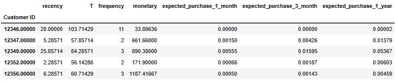
Evaluation of predicted results:
plot_period_transactions(bgf)
plt.show(block=True)
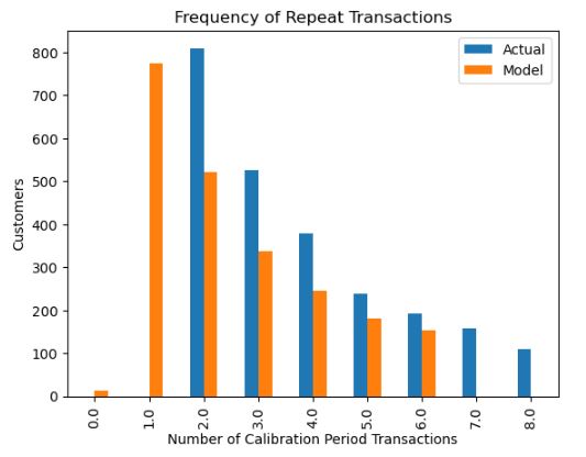
Let’s plot the FR matrix
from lifetimes.plotting import plot_frequency_recency_matrix
import matplotlib.pyplot as plt
fig = plt.figure(figsize=(12,8))
plot_frequency_recency_matrix(bgf)
plt.show(block=True)

############ Gamma-Gamma Submodel
ggf = GammaGammaFitter(penalizer_coef=0.01)
ggf.fit(cltv_df[“frequency”], cltv_df[“monetary”])
cltv_df[“expected_average_profit”] = ggf.conditional_expected_average_profit(cltv_df[“frequency”],
cltv_df[“monetary”])
cltv_df.sort_values(“expected_average_profit”, ascending=False).head(10)
######### Calculation of CLTV with BG/NBD and GG Model
cltv = ggf.customer_lifetime_value(bgf,
cltv_df[“frequency”],
cltv_df[“recency”],
cltv_df[“T”],
cltv_df[“monetary”],
time=3, # 3 month
freq=”W”, # frequency of T
discount_rate=0.01)
cltv = cltv.reset_index()
cltv_final = cltv_df.merge(cltv, on=”Customer ID”, how=”left”)
cltv_final.sort_values(by=”clv”, ascending=False).head(10)
########## Segmentation according to CLTV
cltv_final[“segment”] = pd.qcut(cltv_final[“clv”], 4, labels=[“D”, “C”, “B”, “A”])
cltv_final.groupby(“segment”).agg({“count”, “mean”, “sum”})
_df_plt = cltv_final[[“expected_average_profit”, “segment”]]
plot_df = _df_plt.groupby(“segment”).agg(“mean”)
plot_df.plot(kind=”bar”, color=”tomato”,figsize=(15, 8))
plt.ylabel(“mean”)
plt.show(block=True)
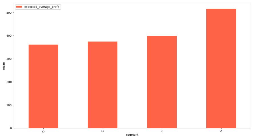
Read more here.
Cohort Analysis in Online Retail
Let’s dive into Cohort Analysis using the Online Retail Dataset.
Let’s install and import standard libraries
!pip install sklearn-pandas
import pandas as pd
import numpy as np
import datetime as dt
import seaborn as sns
from sklearn import preprocessing
import sklearn
from sklearn.svm import SVC
from sklearn.preprocessing import StandardScaler
from sklearn.datasets import make_classification
from sklearn.preprocessing import LabelEncoder
from sklearn.preprocessing import OneHotEncoder
from sklearn_pandas import DataFrameMapper
from sklearn.model_selection import train_test_split
from sklearn.pipeline import Pipeline
from sklearn.compose import ColumnTransformer
from sklearn.preprocessing import Normalizer
from matplotlib import pyplot as plt
Reading the dataset
df = pd.read_excel(“online_retail.xlsx”)
#############DATA PREPARATION
df.shape
(525461, 8)
print(‘Duplicate entries: {}’.format(df.duplicated().sum()))
print(‘{}% rows are duplicate.’.format(round((df.duplicated().sum()/df.shape[0])*100),2))
df.drop_duplicates(inplace = True)
Duplicate entries: 6865
1% rows are duplicate.
pd.DataFrame([{‘products’: len(df[‘StockCode’].value_counts()),
‘transactions’: len(df[‘Invoice’].value_counts()),
‘customers’: len(df[‘Customer ID’].value_counts()),
}], columns = [‘products’, ‘transactions’, ‘customers’], index = [‘quantity’])
products transactions customers
quantity 4632 28816 4383
temp = df.groupby([‘Country’],as_index=False).agg({‘Invoice’:’nunique’}).rename(columns = {‘Invoice’:’Orders’})
total = temp[‘Orders’].sum(axis=0)
temp[‘%Orders’] = round((temp[‘Orders’]/total)*100,4)
temp.sort_values(by=[‘%Orders’],ascending=False,inplace=True)
temp.reset_index(drop=True,inplace=True)
Let’s plot %Orders vs Country
plt.figure(figsize=(13,6))
splot=sns.barplot(x=”Country”,y=”%Orders”,data=temp[:10])
for p in splot.patches:
splot.annotate(format(p.get_height(), ‘.1f’),
(p.get_x() + p.get_width() / 2., p.get_height()),
ha = ‘center’, va = ‘center’,
xytext = (0, 9),
textcoords = ‘offset points’)
plt.xlabel(“Country”, size=14)
plt.ylabel(“%Orders”, size=14)
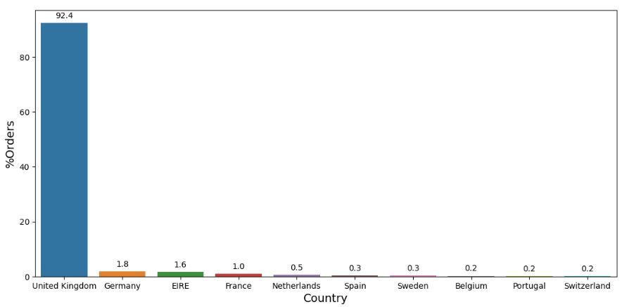
invoices = df[‘Invoice’]
x = invoices.str.contains(‘C’, regex=True)
x.fillna(0, inplace=True)
x = x.astype(int)
x.value_counts()
0    508414
1     10182
Name: Invoice, dtype: int64
df[‘order_canceled’] = x
#df.head()
n1 = df[‘order_canceled’].value_counts()[1]
n2 = df.shape[0]
print(‘Number of orders canceled: {}/{} ({:.2f}%) ‘.format(n1, n2, n1/n2*100))
Number of orders canceled: 10182/518596 (1.96%)
df = df.loc[df[‘order_canceled’] == 0,:]
df.reset_index(drop=True,inplace=True)
df.reset_index(drop=True,inplace=True)
df.loc[df[‘Quantity’] < 0,:]
df = df[df[‘Customer ID’].notna()]
df.reset_index(drop=True,inplace=True)
#############NL COHORT INDEX ANALYSIS
df_uk = df[df.Country == ‘Netherlands’]
df_uk.info()
<class 'pandas.core.frame.DataFrame'>
Int64Index: 2729 entries, 4346 to 387139
Data columns (total 9 columns):
 #   Column          Non-Null Count  Dtype
---  ------          --------------  -----
 0   Invoice         2729 non-null   object
 1   StockCode       2729 non-null   object
 2   Description     2729 non-null   object
 3   Quantity        2729 non-null   int64
 4   InvoiceDate     2729 non-null   datetime64[ns]
 5   Price           2729 non-null   float64
 6   Customer ID     2729 non-null   float64
 7   Country         2729 non-null   object
 8   order_canceled  2729 non-null   int32
dtypes: datetime64[ns](1), float64(2), int32(1), int64(1), object(4)
memory usage: 202.5+ KB
pd.DataFrame([{‘products’: len(df[‘StockCode’].value_counts()),
‘transactions’: len(df[‘Invoice’].value_counts()),
‘customers’: len(df[‘Customer ID’].value_counts()),
}], columns = [‘products’, ‘transactions’, ‘customers’], index = [‘Quantity’])
products transactions customers
Quantity 4017 19215 4314
cohort_data = df_uk[[‘Invoice’,’StockCode’,’Description’,’Quantity’,’InvoiceDate’,’Price’,’Customer ID’,’Country’]]
Checking for nulls in the data
cohort_data.isnull().sum()
Invoice        0
StockCode      0
Description    0
Quantity       0
InvoiceDate    0
Price          0
Customer ID    0
Country        0
dtype: int64
all_dates = (pd.to_datetime(cohort_data[‘InvoiceDate’])).apply(lambda x:x.date())
(all_dates.max() – all_dates.min()).days
364
Start and end dates:
print(‘Start date: {}’.format(all_dates.min()))
print(‘End date: {}’.format(all_dates.max()))
Start date: 2009-12-02
End date: 2010-12-01
cohort_data.head()
| Invoice | StockCode | Description | Quantity | InvoiceDate | Price | Customer ID | Country |
|---|
def get_month(x):
return dt.datetime(x.year, x.month, 1)
cohort_data[‘InvoiceMonth’] = cohort_data[‘InvoiceDate’].apply(get_month)
grouping = cohort_data.groupby(‘Customer ID’)[‘InvoiceMonth’]
cohort_data[‘CohortMonth’] = grouping.transform(‘min’)
cohort_data.head()
| Invoice | StockCode | Description | Quantity | InvoiceDate | Price | Customer ID | Country | InvoiceMonth | CohortMonth |
|---|
def get_date_int(df, column):
year = df[column].dt.year
month = df[column].dt.month
day = df[column].dt.day
return year, month, day
invoice_year, invoice_month, _ = get_date_int(cohort_data, ‘InvoiceMonth’)
cohort_year, cohort_month, _ = get_date_int(cohort_data, ‘CohortMonth’)
years_diff = invoice_year – cohort_year
months_diff = invoice_month – cohort_month
cohort_data[‘CohortIndex’] = years_diff * 12 + months_diff
#cohort_data.head()
grouping = cohort_data.groupby([‘CohortMonth’, ‘CohortIndex’])
cohort_data = grouping[‘Quantity’].mean()
cohort_data = cohort_data.reset_index()
average_quantity = cohort_data.pivot(index=’CohortMonth’,columns=’CohortIndex’,values=’Quantity’)
average_quantity.round(1)
#average_quantity
Let’s plot retention rates heatmap
plt.figure(figsize=(10, 8))
plt.title(‘Retention rates’)
sns.heatmap(data = retention,annot = True,fmt = ‘.0%’,vmin = 0.0,vmax = 0.5,cmap = ‘BuGn’)
plt.show()

Let’s compute TotalPrice
grdf=grouping.apply(pd.DataFrame)
grdf[‘TotalPrice’]=grdf[‘Quantity’]*grdf[‘Price’]
grdf[grdf[‘TotalPrice’]>139.2].sort_values(‘TotalPrice’,ascending=False)
#############RFM SCORE ANALYSIS
from dateutil.relativedelta import relativedelta
start_date = all_dates.max()-relativedelta(months=12,days=-1)
print(‘Start date: {}’.format(start_date))
print(‘End date: {}’.format(all_dates.max()))
Start date: 2009-12-02
End date: 2010-12-01
data_rfm = grdf[grdf[‘InvoiceDate’] >= pd.to_datetime(start_date)]
data_rfm.reset_index(drop=True,inplace=True)
data_rfm.head()
| Invoice | StockCode | Description | Quantity | InvoiceDate | Price | Customer ID | Country | InvoiceMonth | CohortMonth | CohortIndex | TotalPrice |
|---|
snapshot_date = max(data_rfm.InvoiceDate) + dt.timedelta(days=1)
print(‘Snapshot date: {}’.format(snapshot_date.date()))
Snapshot date: 2010-12-02
Aggregate data on a customer level
data = data_rfm.groupby([‘Customer ID’],as_index=False).agg({‘InvoiceDate’: lambda x: (snapshot_date – x.max()).days,
‘Invoice’: ‘count’,
‘TotalPrice’: ‘sum’}).rename(columns = {‘InvoiceDate’: ‘Recency’,
‘Invoice’: ‘Frequency’,
‘TotalPrice’: ‘MonetaryValue’})
r_labels = range(4, 0, -1)
r_quartiles = pd.qcut(data[‘Recency’], 4, labels = r_labels)
data = data.assign(R = r_quartiles.values)
f_labels = range(1,5)
m_labels = range(1,5)
f_quartiles = pd.qcut(data[‘Frequency’], 4, labels = f_labels)
m_quartiles = pd.qcut(data[‘MonetaryValue’], 4, labels = m_labels)
data = data.assign(F = f_quartiles.values)
data = data.assign(M = m_quartiles.values)
#data.head()
def join_rfm(x):
return str(x[‘R’]) + str(x[‘F’]) + str(x[‘M’])
data[‘RFM_Segment’] = data.apply(join_rfm, axis=1)
data[‘RFM_Score’] = data[[‘R’,’F’,’M’]].sum(axis=1)
data.head()

data.groupby(‘RFM_Score’).agg({‘Recency’: ‘mean’,
‘Frequency’: ‘mean’,
‘MonetaryValue’: [‘mean’, ‘count’] }).round(1)
Let’s create segment
def create_segment(df):
if df[‘RFM_Score’] >= 9:
return ‘Top’
elif (df[‘RFM_Score’] >= 5) and (df[‘RFM_Score’] < 9):
return ‘Middle’
else:
return ‘Low’
data[‘General_Segment’] = data.apply(create_segment, axis=1)
data.groupby(‘General_Segment’).agg({‘Recency’: ‘mean’,
‘Frequency’: ‘mean’,
‘MonetaryValue’: [‘mean’, ‘count’]}).round(1)
Plotting the distributions of Recency, Frequency and Monetary Value variables
plt.figure(figsize=(12,10))
plt.subplot(3, 1, 1); sns.distplot(data[‘Recency’])
plt.subplot(3, 1, 2); sns.distplot(data[‘Frequency’])
plt.subplot(3, 1, 3); sns.distplot(data[‘MonetaryValue’])
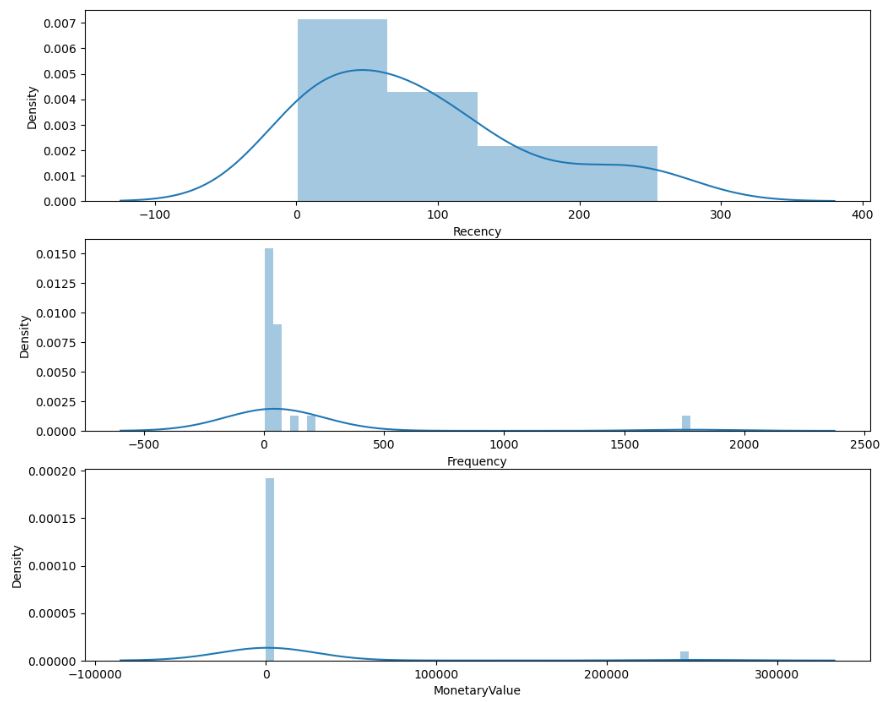
Checking for constant mean and variance.
data[[‘Recency’,’Frequency’,’MonetaryValue’]].describe()
data[data[‘MonetaryValue’] == 0]
raw_data = data[[‘Recency’,’Frequency’,’MonetaryValue’]]
#############RFM SCORE TRANSFORMATIONS
Let’s unskew the data
data_log = np.log(raw_data)
Initialize a standard scaler and fit it
scaler = StandardScaler()
scaler.fit(data_log)
Scale and center the data
data_normalized = scaler.transform(data_log)
Create a pandas DataFrame
data_norm = pd.DataFrame(data=data_log, index=raw_data.index, columns=raw_data.columns)
Let’s plot the transformed RFM distributions
plt.figure(figsize=(12,10))
plt.subplot(3, 1, 1); sns.distplot(data_norm[‘Recency’])
plt.subplot(3, 1, 2); sns.distplot(data_norm[‘Frequency’])
plt.subplot(3, 1, 3); sns.distplot(data_norm[‘MonetaryValue’])
plt.show()

#############K-MEANS CLUSTERING
from sklearn.cluster import KMeans
sse = {}
Fit KMeans and calculate SSE for each k
for k in range(1, 21):
# Initialize KMeans with k clusters
kmeans = KMeans(n_clusters=k, random_state=1)

# Fit KMeans on the normalized dataset
kmeans.fit(data_norm)

# Assign sum of squared distances to k element of dictionary
sse[k] = kmeans.inertia_
Let’s look at the Elbow plot
plt.figure(figsize=(12,8))
plt.title(‘The Elbow Method’)
plt.xlabel(‘k’);
plt.ylabel(‘Sum of squared errors’)
sns.pointplot(x=list(sse.keys()), y=list(sse.values()))
plt.show()
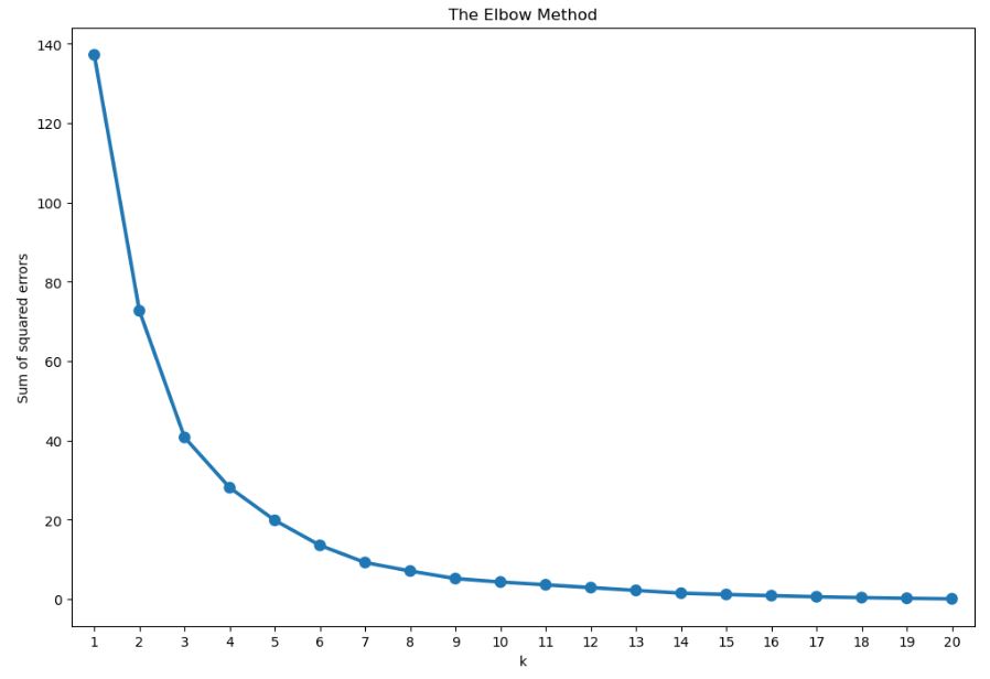
Let’s apply Kmeans with n_clusters=3
kmeans = KMeans(n_clusters=3, random_state=1)
Compute k-means clustering on pre-processed data
kmeans.fit(data_norm)
Extract cluster labels from labels_ attribute
cluster_labels = kmeans.labels_
Create a cluster label column in the original DataFrame
data_norm_k3 = data_norm.assign(Cluster = cluster_labels)
data_k3 = raw_data.assign(Cluster = cluster_labels)
Calculate average RFM values and size for each cluster
summary_k3 = data_k3.groupby([‘Cluster’]).agg({‘Recency’: ‘mean’,
‘Frequency’: ‘mean’,
‘MonetaryValue’: [‘mean’, ‘count’],}).round(0)
summary_k3
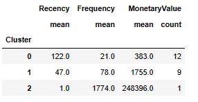
Let’s apply Kmeans with n_clusters=4
kmeans = KMeans(n_clusters=4, random_state=1)
Compute k-means clustering on pre-processed data
kmeans.fit(data_norm)
Extract cluster labels from labels_ attribute
cluster_labels = kmeans.labels_
Create a cluster label column in the original DataFrame
data_norm_k4 = data_norm.assign(Cluster = cluster_labels)
data_k4 = raw_data.assign(Cluster = cluster_labels)
Calculate average RFM values and size for each cluster
summary_k4 = data_k4.groupby([‘Cluster’]).agg({‘Recency’: ‘mean’,
‘Frequency’: ‘mean’,
‘MonetaryValue’: [‘mean’, ‘count’],}).round(0)
summary_k4
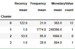
data_norm_k4.index = data[‘Customer ID’].astype(int)
Let’s invoke melt to massage the data as follows
data_melt = pd.melt(data_norm_k4.reset_index(),
id_vars=[‘Customer ID’, ‘Cluster’],
value_vars=[‘Recency’, ‘Frequency’, ‘MonetaryValue’],
var_name=’Attribute’,
value_name=’Value’)
Let’s look at the RFM snake plot for 4 clusters
plt.title(‘Snake plot of standardized variables’)
sns.lineplot(x=”Attribute”, y=”Value”, hue=’Cluster’, data=data_melt)

######RFM Data Wrangling:
data_k4.index = data[‘Customer ID’].astype(int)
raw_data.index = data[‘Customer ID’].astype(int)
cluster_avg = data_k4.groupby([‘Cluster’]).mean()
population_avg = raw_data.head().mean()
population_avg
Recency            88.400
Frequency          65.800
MonetaryValue    1224.666
dtype: float64
relative_imp = cluster_avg / population_avg – 1
Let’s plot Relative importance of attributes as a sns heatmap
plt.figure(figsize=(8, 4))
plt.title(‘Relative importance of attributes’)
sns.heatmap(data=relative_imp, annot=True, fmt=’.2f’, cmap=’RdYlGn’)
plt.show()
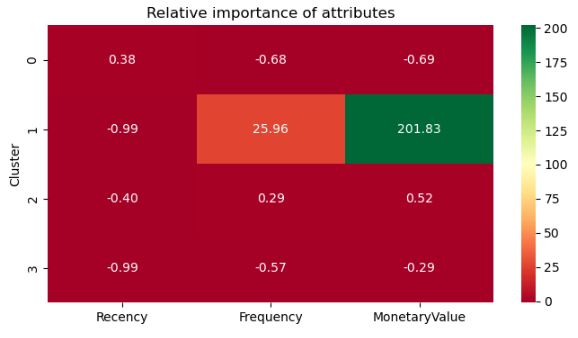
Read more here.
Customer Segmentation, RFM, K-Means and Cohort Analysis in Online Retail
Let’s set the working directory YOURPATH
import os
os.chdir(‘YOURPATH’)
os. getcwd()
and import standard libraries with optional settings
import numpy as np
import pandas as pd
import seaborn as sns
import matplotlib.pyplot as plt
import scipy.stats as stats
%matplotlib inline
import statsmodels.api as sm
import statsmodels.formula.api as smf
import missingno as msno
from sklearn.compose import make_column_transformer
from sklearn.preprocessing import scale
from sklearn.preprocessing import StandardScaler
from sklearn.preprocessing import PolynomialFeatures
from sklearn.preprocessing import OneHotEncoder
from sklearn.preprocessing import PowerTransformer
from sklearn.preprocessing import MinMaxScaler
from sklearn.preprocessing import RobustScaler
import cufflinks as cf
import plotly.offline
cf.go_offline()
cf.set_config_file(offline=False, world_readable=True)
import warnings
warnings.filterwarnings(“ignore”)
warnings.warn(“this will not show”)
plt.rcParams[“figure.figsize”] = (10,6)
pd.set_option(‘max_colwidth’,200)
pd.set_option(‘display.max_rows’, 1000)
pd.set_option(‘display.max_columns’, 200)
pd.set_option(‘display.float_format’, lambda x: ‘%.3f’ % x)
import colorama
from colorama import Fore, Style
from termcolor import colored
import ipywidgets
from ipywidgets import interact
sns.set_style(“whitegrid”)
Let’s read the input dataset
df=pd.read_csv(‘Online Retail.csv’,index_col=0)
and define some useful functions
#######################
def missing_values(df):
missing_number = df.isnull().sum().sort_values(ascending=False)
missing_percent = (df.isnull().sum()/df.isnull().count()).sort_values(ascending=False)
missing_values = pd.concat([missing_number, missing_percent], axis=1, keys=[‘Missing_Number’, ‘Missing_Percent’])
return missing_values[missing_values[‘Missing_Number’]>0]
def first_looking(df):
print(colored(“Shape:”, attrs=[‘bold’]), df.shape,’\n’,
colored(‘-‘79, ‘red’, attrs=[‘bold’]), colored(“\nInfo:\n”, attrs=[‘bold’]), sep=”) print(df.info(), ‘\n’, colored(‘-‘79, ‘red’, attrs=[‘bold’]), sep=”)
print(colored(“Number of Uniques:\n”, attrs=[‘bold’]), df.nunique(),’\n’,
colored(‘-‘79, ‘red’, attrs=[‘bold’]), sep=”) print(colored(“Missing Values:\n”, attrs=[‘bold’]), missing_values(df),’\n’, colored(‘-‘79, ‘red’, attrs=[‘bold’]), sep=”)
print(colored(“All Columns:”, attrs=[‘bold’]), list(df.columns),’\n’,
colored(‘-‘*79, ‘red’, attrs=[‘bold’]), sep=”)
df.columns= df.columns.str.lower().str.replace('&', '_').str.replace(' ', '_')

print(colored("Columns after rename:", attrs=['bold']), list(df.columns),'\n',
          colored('-'*79, 'red', attrs=['bold']), sep='')
def multicolinearity_control(df):
feature =[]
collinear=[]
for col in df.corr().columns:
for i in df.corr().index:
if (abs(df.corr()[col][i])> .9 and abs(df.corr()[col][i]) < 1):
feature.append(col)
collinear.append(i)
print(colored(f”Multicolinearity alert in between:{col} – {i}”,
“red”, attrs=[‘bold’]), df.shape,’\n’,
colored(‘-‘*79, ‘red’, attrs=[‘bold’]), sep=”)
def duplicate_values(df):
print(colored(“Duplicate check…”, attrs=[‘bold’]), sep=”)
duplicate_values = df.duplicated(subset=None, keep=’first’).sum()
if duplicate_values > 0:
df.drop_duplicates(keep=’first’, inplace=True)
print(duplicate_values, colored(” Duplicates were dropped!”),’\n’,
colored(‘-‘79, ‘red’, attrs=[‘bold’]), sep=”) else: print(colored(“There are no duplicates”),’\n’, colored(‘-‘79, ‘red’, attrs=[‘bold’]), sep=”)
def drop_columns(df, drop_columns):
if drop_columns !=[]:
df.drop(drop_columns, axis=1, inplace=True)
print(drop_columns, ‘were dropped’)
else:
print(colored(‘We will now check the missing values and if necessary will drop realted columns!’, attrs=[‘bold’]),’\n’,
colored(‘-‘*79, ‘red’, attrs=[‘bold’]), sep=”)
def drop_null(df, limit):
print(‘Shape:’, df.shape)
for i in df.isnull().sum().index:
if (df.isnull().sum()[i]/df.shape[0]*100)>limit:
print(df.isnull().sum()[i], ‘percent of’, i ,’null and were dropped’)
df.drop(i, axis=1, inplace=True)
print(‘new shape:’, df.shape)
print(‘New shape after missing value control:’, df.shape)
#######################
Let’s check the structure and content of our input data
first_looking(df)
duplicate_values(df)
drop_columns(df,[])
drop_null(df, 90)
df.head()
df.tail()
df.sample(5)
df.describe().T
df.describe(include=object).T
Shape:(541909, 8)
-------------------------------------------------------------------------------
Info:

<class 'pandas.core.frame.DataFrame'>
Index: 541909 entries, 0 to 541908
Data columns (total 8 columns):
 #   Column       Non-Null Count   Dtype
---  ------       --------------   -----
 0   InvoiceNo    541909 non-null  object
 1   StockCode    541909 non-null  object
 2   Description  540455 non-null  object
 3   Quantity     541909 non-null  float64
 4   InvoiceDate  541909 non-null  object
 5   UnitPrice    541909 non-null  float64
 6   CustomerID   406829 non-null  float64
 7   Country      541909 non-null  object
dtypes: float64(3), object(5)
memory usage: 37.2+ MB
None
-------------------------------------------------------------------------------
Number of Uniques:
InvoiceNo      25900
StockCode       4070
Description     4223
Quantity         722
InvoiceDate    23260
UnitPrice       1630
CustomerID      4372
Country           38
dtype: int64
-------------------------------------------------------------------------------
Missing Values:
             Missing_Number  Missing_Percent
CustomerID           135080            0.249
Description            1454            0.003
-------------------------------------------------------------------------------
All Columns:['InvoiceNo', 'StockCode', 'Description', 'Quantity', 'InvoiceDate', 'UnitPrice', 'CustomerID', 'Country']
-------------------------------------------------------------------------------
Columns after rename:['invoiceno', 'stockcode', 'description', 'quantity', 'invoicedate', 'unitprice', 'customerid', 'country']
-------------------------------------------------------------------------------
Duplicate check...
5268 Duplicates were dropped!
-------------------------------------------------------------------------------
We will now check the missing values and if necessary will drop realted columns!
-------------------------------------------------------------------------------
Shape: (536641, 8)
New shape after missing value control: (536641, 8)
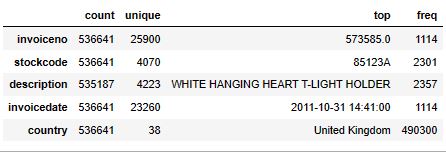
######## DATA WRANGLING
df_model = df.copy()
df.isnull().sum()
invoiceno           0
stockcode           0
description      1454
quantity            0
invoicedate         0
unitprice           0
customerid     135037
country             0
dtype: int64
We will drop NaN values of customerid
df = df.dropna(subset=[‘customerid’])
df.shape
(401604, 8)
df[‘cancelled’] = df[‘invoiceno’].str.contains(‘C’)
Let’s drop cancelled
df = df.drop([‘cancelled’],axis=1)
Clean the Data from the Noise and Missing Values
df = df[(df.quantity > 0) & (df.unitprice > 0)]
df.shape
(392692, 8)
Let’s look at the treemap Number of Customers Per Country Without UK
fig = px.treemap(df.groupby(‘country’)[[“customerid”]].nunique().sort_values(by=”customerid”, ascending=False).iloc[1:],
path=[df.groupby(‘country’)[[“customerid”]].nunique().sort_values(by=”customerid”, ascending=False).iloc[1:].index],
values=’customerid’,
width=1000,
height=600)
fig.update_layout(title_text=’Number of Customers Per Country Without UK’,
title_x = 0.5, title_font = dict(size=20)
)
fig.update_layout(margin = dict(t=50, l=25, r=25, b=25))
fig.show()
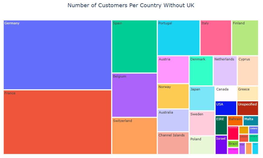
#######TOTAL PRICE aka REVENUE
The calculation of total price
df[‘total_price’] = df[‘quantity’] * df[‘unitprice’]
Let’s save this dataframe for future analysis
df_total_price = pd.DataFrame(df.groupby(‘country’)[“total_price”].sum().sort_values(ascending=False))
Let’s plot the treemap Total Prices By Countries Without UK
fig = px.treemap(df_total_price.iloc[1:],
path=[df_total_price.iloc[1:].index],
values=’total_price’,
width=1000,
height=600)
fig.update_layout(title_text=’Total Prices By Countries Without UK’,
title_x = 0.5, title_font = dict(size=20)
)
fig.update_layout(margin = dict(t=50, l=25, r=25, b=25))
fig.show()

#########UK RFM ANALYSIS
df_uk = df[df[“country”] == ‘United Kingdom’]
Top 15 most owned products
df_uk[“stockcode”].value_counts().head(15).plot(kind=”bar”, width=0.5, color=’pink’, edgecolor=’purple’, figsize=(16,9))
plt.xticks(rotation=45);
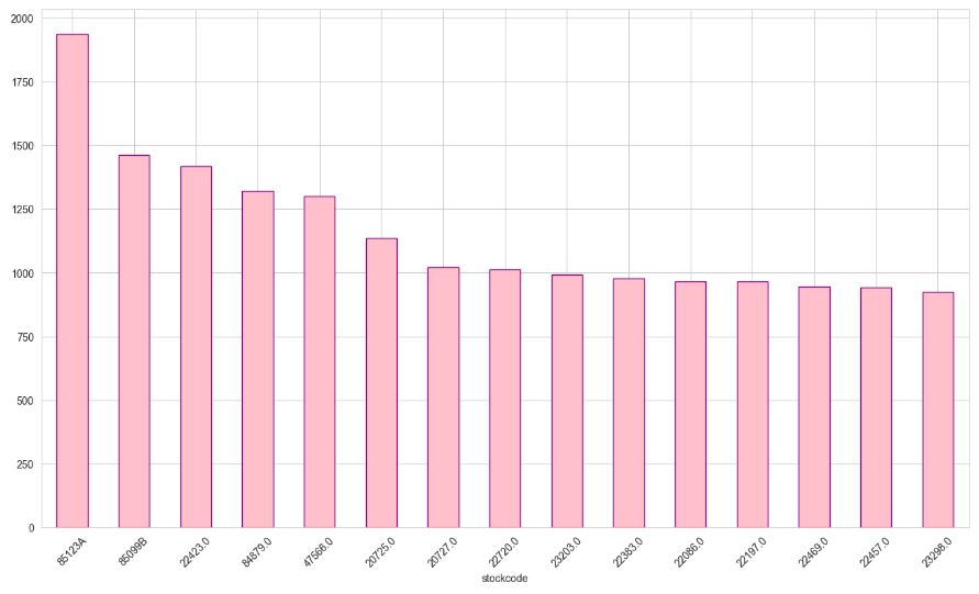
last_invoice = max(df_uk[‘invoicedate’])
last_invoice
'2011-12-09 12:49:00'
first_invoice = min(df_uk[‘invoicedate’])
first_invoice
'2010-12-01 08:26:00'
df_uk[‘invoicedate’] = pd.to_datetime(df_uk[‘invoicedate’])
df_uk[“date”] = df_uk[‘invoicedate’].dt.date
df_uk[“last_purchased_date”] = df_uk.groupby(“customerid”).date.transform(max)
last_invoice = pd.to_datetime(last_invoice).date()
df_uk.groupby(‘customerid’)[‘last_purchased_date’].apply(lambda x: last_invoice – x)
# Recency
df_recency = df_uk.groupby(by=’customerid’,
as_index=False)[‘date’].max()
df_recency.columns = [‘customerid’, ‘last_purchased_date’]
recent_date = df_recency[‘last_purchased_date’].max()
df_recency[‘recency’] = df_recency[‘last_purchased_date’].apply(
lambda x: (recent_date – x).days)
#df_recency.head()
Let’s plot recency
plt.figure(figsize=(16,9))
sns.distplot(df_recency[‘recency’], bins=35);
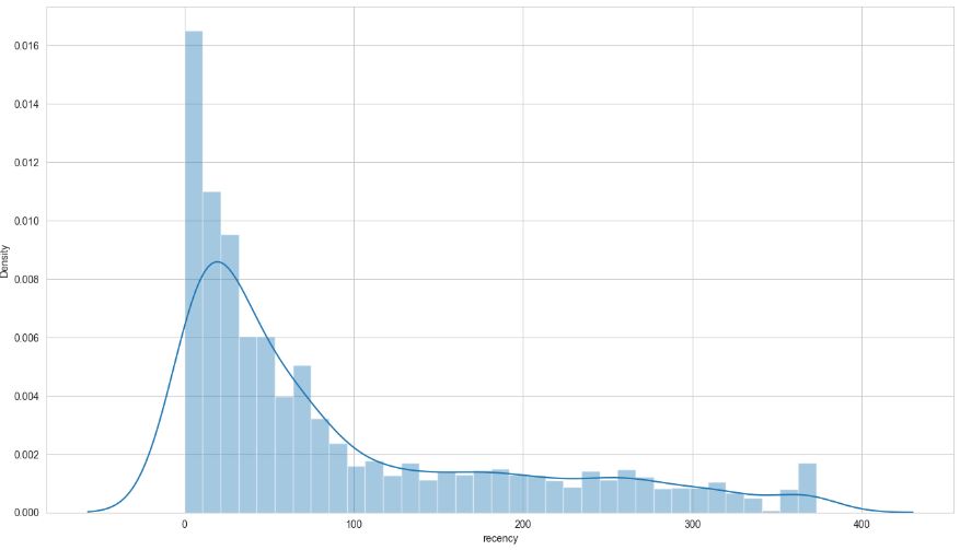
# Frequency: Number of purchases
df_uk[‘frequency’] = df_uk.groupby(‘customerid’)[“invoiceno”].transform(‘count’)
plt.figure(figsize=(16,9))
sns.distplot(df_uk[‘frequency’], bins=50);
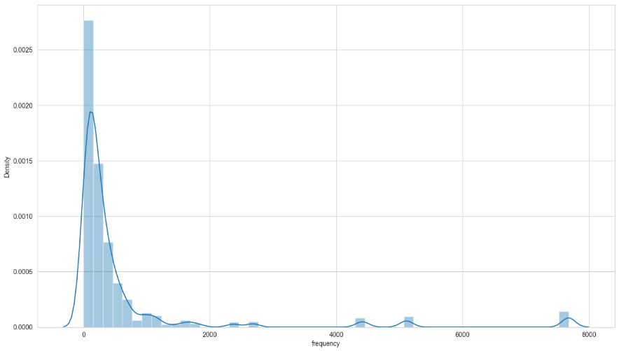
########### Monetary: Total amount of money spent
df_uk[“monetary”] = df_uk.groupby(‘customerid’)[“total_price”].transform(‘sum’)
plt.figure(figsize=(16,9))
sns.distplot(df_uk[‘monetary’], bins=50);
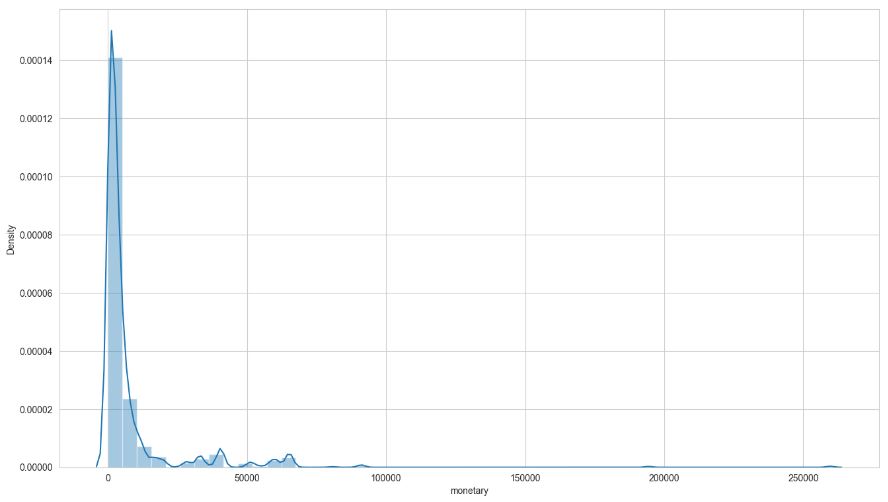
############ UK RFM Table
df_uk.columns
Index(['invoiceno', 'stockcode', 'description', 'quantity', 'invoicedate',
       'unitprice', 'customerid', 'country', 'total_price', 'date',
       'last_purchased_date', 'frequency', 'monetary'],
      dtype='object')
df_recency.columns
Index(['customerid', 'last_purchased_date', 'recency'], dtype='object')
df_uk[‘recency’] = df_recency[‘recency’]
df_rfm_table = df_uk[[‘customerid’, ‘recency’, ‘frequency’, ‘monetary’]]
Customer Segmentation with RFM Scores
df_rfm_table = df_rfm_table.set_index(‘customerid’)
df_rfm_table.reset_index().duplicated().sum()
df_rfm_table.drop_duplicates(inplace=True)
df_rfm_table.shape
(6050, 3)
########### Recency Scoring
df_rfm_table[“recency”].quantile(q = [.25,.5,.75])
0.250    21.000
0.500    58.000
0.750   163.000
Name: recency, dtype: float64
def recency_scoring(data):
if data[“recency”] <= 17.000:
return 4
elif data[“recency”] <= 50.000:
return 3
elif data[“recency”] <= 142.000:
return 2
else:
return 1
df_rfm_table[‘recency_quantile’] = df_rfm_table.apply(recency_scoring, axis =1)
#df_rfm_table.head()
########### Frequency Scoring
df_rfm_table[“frequency”].quantile(q = [.25,.5,.75])
0.250    23.000
0.500    65.000
0.750   147.000
Name: frequency, dtype: float64
def frequency_scoring(data):
if data.frequency <= 17.000:
return 1
elif data.frequency <= 40.000:
return 2
elif data.frequency <= 98.000:
return 3
else:
return 4
df_rfm_table[‘frequency_quantile’] = df_rfm_table.apply(frequency_scoring, axis =1)
#df_rfm_table.head()
########### Monetary Scoring
df_rfm_table[“monetary”].quantile(q = [.25,.5,.75])
def monetary_scoring(data):
if data.monetary <= 298.185:
return 1
elif data.monetary <= 644.975:
return 2
elif data.monetary <= 1571.285:
return 3
else:
return 4
df_rfm_table[‘monetary_quantile’] = df_rfm_table.apply(monetary_scoring, axis =1)
#df_rfm_table.head()
############### RFM Scoring
def rfm_scoring(data):
return str(int(data[‘recency_quantile’])) + str(int(data[‘frequency_quantile’])) + str(int(data[‘monetary_quantile’]))
df_rfm_table[‘rfm_score’] = df_rfm_table.apply(rfm_scoring, axis=1)
#df_rfm_table.head()
df_rfm_table[‘rfm_level’] = df_rfm_table[‘recency_quantile’] + df_rfm_table[‘frequency_quantile’] + df_rfm_table[‘monetary_quantile’]
#df_rfm_table.head()
def segments1(data):
if data[‘rfm_level’] >= 10 :
return ‘Gold’
elif (data[‘rfm_level’] >= 6) and (data[‘rfm_level’] < 10 ):
return ‘Silver’
else:
return ‘Bronze’
df_rfm_table [‘segments1’] = df_rfm_table.apply(segments1,axis=1)
#df_rfm_table.head()
segments2 = {
‘Customer Segment’:
[‘Champions’,
‘Loyal Customers’,
‘Potential Loyalist’,
‘Recent Customers’,
‘Customers Needing Attention’,
‘Still Got Hope’,
‘Need to Get Them Back’,
‘Lost’, ‘Give it a Try’],\
‘RFM’:
[‘(3|4)-(3|4)-(3|4)’,
‘(2|3|4)-(3|4)-(1|2|3|4)’,
‘(3|4)-(2|3)-(1|2|3|4)’,
‘(4)-(1)-(1|2|3|4)’,
‘(2|3)-(2|3)-(2|3)’,
‘(2|3)-(1|2)-(1|2|3|4)’,
‘(1|2)-(3|4)-(2|3|4)’,
‘(1|2)-(1|2)-(1|2)’,
‘(1|2)-(1|2|3)-(1|2|3|4)’]
}
pd.DataFrame(segments2)
def categorizer(rfm):
if (rfm[0] in [‘3’, ‘4’]) & (rfm[1] in [‘3’, ‘4’]) & (rfm[2] in [‘3’, ‘4’]):
rfm = ‘Champions’
elif (rfm[0] in ['2', '3', '4']) & (rfm[1] in ['3', '4']) & (rfm[2] in ['1', '2', '3', '4']):
    rfm = 'Loyal Customers'

elif (rfm[0] in ['3', '4']) & (rfm[1] in ['2', '3']) & (rfm[2] in ['1', '2', '3', '4']):
    rfm = 'Potential Loyalist'

elif (rfm[0] in ['4']) & (rfm[1] in ['1']) & (rfm[2] in ['1', '2', '3', '4']):
    rfm = 'Recent Customers'

elif (rfm[0] in ['2', '3']) & (rfm[1] in ['2', '3']) & (rfm[2] in ['2', '3']):
    rfm = 'Customers Needing Attention'

elif (rfm[0] in ['2', '3']) & (rfm[1] in ['1', '2']) & (rfm[2] in ['1', '2', '3', '4']):
    rfm = 'Still Got Hope'

elif (rfm[0] in ['1', '2']) & (rfm[1] in ['3', '4']) & (rfm[2] in ['2', '3', '4']):
    rfm = 'Need to Get Them Back'

elif (rfm[0] in ['1', '2']) & (rfm[1] in ['1', '2']) & (rfm[2] in ['1', '2']):
    rfm = 'Lost'

elif (rfm[0] in ['1', '2']) & (rfm[1] in ['1', '2', '3']) & (rfm[2] in ['1', '2', '3', '4']):
    rfm = 'Give it a Try'

return rfm
df_rfm_table[‘segments2’] = df_rfm_table[“rfm_score”].apply(categorizer)
#df_rfm_table.head()
df_rfm_table[“segments2”].value_counts(dropna=False)
segments2
Need to Get Them Back          2343
Lost                           1666
Champions                       660
Loyal Customers                 602
Give it a Try                   483
Potential Loyalist              115
Still Got Hope                   93
Recent Customers                 46
Customers Needing Attention      40
141                               2
Name: count, dtype: int64
df_rfm_table[“segments1”].info()
<class 'pandas.core.series.Series'>
Index: 6050 entries, 17850.0 to 14569.0
Series name: segments1
Non-Null Count  Dtype
--------------  -----
6050 non-null   object
dtypes: object(1)
memory usage: 94.5+ KB
Plot RFM Segments
df_plot1 = pd.DataFrame(df_rfm_table[“segments1”].value_counts(dropna=False).sort_values(ascending=False)).reset_index().rename(columns={‘index’:’Segments’, ‘segments1′:’Customers’})
df_plot1
import matplotlib.pyplot as plt
import squarify
############################# segment1
sizes=[3200, 1944, 906]
label=[“Silver”, “Bronze”, “Gold”]
color=[‘yellow’,’blue’,’orange’]
squarify.plot(sizes=sizes, label=label, color=color,alpha=0.8 , text_kwargs={‘fontsize’:16})
plt.axis(‘off’)
plt.show()

################ segment2
import matplotlib.pyplot as plt
import seaborn as sns
data = [2343, 1666, 660, 602, 483, 115]
labels = [‘Need to Get Them Back’, ‘Lost’,’Champions’,’Loyal Customers’,’Give it a Try’,’Potential Loyalist’]
colors = sns.color_palette(‘bright’)[0:6]
plt.pie(data, labels = labels, colors = colors, autopct=’%.0f%%’)
plt.show()
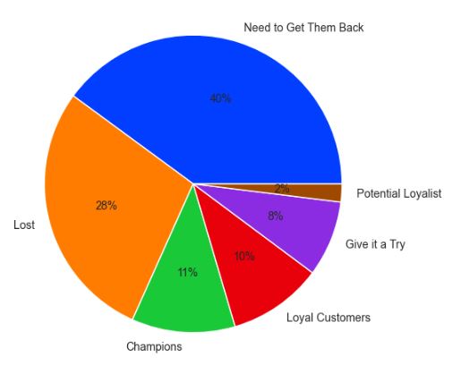
Read more here.
Customer Clustering PCA, K-Means and Agglomerative for Marketing Campaigns
Let’s set the working directory
import os
os.chdir(‘YOURPATH’)
os. getcwd()
and read the dataset
import pandas as pd
import numpy as np
df = pd.read_csv(‘marketing_campaign.csv’, sep=”\t”)
Get the shape of the dataframe
print(“Shape of the dataframe:”, df.shape)
Shape of the dataframe: (2240, 29)
Get the information about the dataframe
print(“\nInformation about the dataframe:”)
print(df.info())
Information about the dataframe:
<class 'pandas.core.frame.DataFrame'>
RangeIndex: 2240 entries, 0 to 2239
Data columns (total 29 columns):
 #   Column               Non-Null Count  Dtype
---  ------               --------------  -----
 0   ID                   2240 non-null   int64
 1   Year_Birth           2240 non-null   int64
 2   Education            2240 non-null   object
 3   Marital_Status       2240 non-null   object
 4   Income               2216 non-null   float64
 5   Kidhome              2240 non-null   int64
 6   Teenhome             2240 non-null   int64
 7   Dt_Customer          2240 non-null   object
 8   Recency              2240 non-null   int64
 9   MntWines             2240 non-null   int64
 10  MntFruits            2240 non-null   int64
 11  MntMeatProducts      2240 non-null   int64
 12  MntFishProducts      2240 non-null   int64
 13  MntSweetProducts     2240 non-null   int64
 14  MntGoldProds         2240 non-null   int64
 15  NumDealsPurchases    2240 non-null   int64
 16  NumWebPurchases      2240 non-null   int64
 17  NumCatalogPurchases  2240 non-null   int64
 18  NumStorePurchases    2240 non-null   int64
 19  NumWebVisitsMonth    2240 non-null   int64
 20  AcceptedCmp3         2240 non-null   int64
 21  AcceptedCmp4         2240 non-null   int64
 22  AcceptedCmp5         2240 non-null   int64
 23  AcceptedCmp1         2240 non-null   int64
 24  AcceptedCmp2         2240 non-null   int64
 25  Complain             2240 non-null   int64
 26  Z_CostContact        2240 non-null   int64
 27  Z_Revenue            2240 non-null   int64
 28  Response             2240 non-null   int64
dtypes: float64(1), int64(25), object(3)
memory usage: 507.6+ KB
None
Get the summary statistics of the dataframe
print(“\nSummary statistics of the dataframe:”)
df.describe().T

############# DATA PREPARATION
Check for missing data
print(“Missing data in the dataframe:”)
print(df.isnull().sum())
Missing data in the dataframe:
ID                      0
Year_Birth              0
Education               0
Marital_Status          0
Income                 24
Kidhome                 0
Teenhome                0
Dt_Customer             0
Recency                 0
MntWines                0
MntFruits               0
MntMeatProducts         0
MntFishProducts         0
MntSweetProducts        0
MntGoldProds            0
NumDealsPurchases       0
NumWebPurchases         0
NumCatalogPurchases     0
NumStorePurchases       0
NumWebVisitsMonth       0
AcceptedCmp3            0
AcceptedCmp4            0
AcceptedCmp5            0
AcceptedCmp1            0
AcceptedCmp2            0
Complain                0
Z_CostContact           0
Z_Revenue               0
Response                0
dtype: int64
Let’s drop duplicates
df = df.dropna()
df.duplicated().sum()
0
########### Outliers
Calculate the IQR for the Income column
Q1 = df[‘Income’].quantile(0.25)
Q3 = df[‘Income’].quantile(0.75)
IQR = Q3 – Q1
Identify the outliers in the Income column
outliers = df[(df[‘Income’] < (Q1 – 1.5 * IQR)) | (df[‘Income’] > (Q3 + 1.5 * IQR))]
Print the number of outliers
print(“Number of outliers in the Income column:”, len(outliers))
Number of outliers in the Income column: 8
Remove the outliers in the Income column
df = df[~((df[‘Income’] < (Q1 – 1.5 * IQR)) | (df[‘Income’] > (Q3 + 1.5 * IQR)))]
Print the updated shape of the dataframe
print(“Updated shape of the dataframe:”, df.shape)
############## Feature engineering
print(“Unique values in Education column:”, df[‘Education’].unique())
print(“Unique values in Marital_Status column:”, df[‘Marital_Status’].unique())
Unique values in Education column: ['Graduation' 'PhD' 'Master' 'Basic' '2n Cycle']
Unique values in Marital_Status column: ['Single' 'Together' 'Married' 'Divorced' 'Widow' 'Alone' 'Absurd' 'YOLO']
Let’s define the following new columns
def education_level(education):
if education in [‘Graduation’, ‘PhD’, ‘Master’]:
return ‘High’
elif education in [‘Basic’]:
return ‘Middle’
else:
return ‘Low’
df[‘Education_Level’] = df[‘Education’].apply(education_level)
def living_status(marital_status):
if marital_status in [‘Alone’, ‘Absurd’, ‘YOLO’]:
return ‘Living Alone’
else:
return ‘Living with Others’
df[‘Living_Status’] = df[‘Marital_Status’].apply(living_status)
df[‘Age’] = 2022 – df[‘Year_Birth’]
df[‘Total_Campaigns_Accepted’] = df[[‘AcceptedCmp1’, ‘AcceptedCmp2’, ‘AcceptedCmp3’, ‘AcceptedCmp4’, ‘AcceptedCmp5’]].sum(axis=1)
df[‘Average_Spend’] = (df[[‘MntWines’, ‘MntFruits’, ‘MntMeatProducts’, ‘MntFishProducts’, ‘MntSweetProducts’, ‘MntGoldProds’]].sum(axis=1)) / df[‘NumDealsPurchases’]
df[‘Spent’] = df[‘MntWines’]+df[“MntWines”] +df[‘MntFruits’]+ df[‘MntMeatProducts’] +df[‘MntFishProducts’]+df[‘MntSweetProducts’]+ df[‘MntGoldProds’]
df[‘Is_Parent’] = (df[‘Kidhome’] + df[‘Teenhome’] > 0).astype(int)
Create the new feature for total spending in the last 2 years
df[‘total_spending’] = df[‘MntWines’] + df[‘MntFruits’] + df[‘MntMeatProducts’] + df[‘MntFishProducts’] + df[‘MntSweetProducts’] + df[‘MntGoldProds’]
Create new feature for average monthly visits to the company’s website
df[‘avg_web_visits’] = df[‘NumWebVisitsMonth’] / 12
Create new feature for the ratio of online purchases to total purchases
df[‘online_purchase_ratio’] = df[‘NumWebPurchases’] / (df[‘NumWebPurchases’] + df[‘NumCatalogPurchases’] + df[‘NumStorePurchases’])
Let’s drop a few columns
to_drop = [‘Dt_Customer’, ‘Z_CostContact’, ‘Z_Revenue’, ‘Year_Birth’, ‘ID’]
df = df.drop(to_drop, axis=1)
df.dtypes
Education                    object
Marital_Status               object
Income                      float64
Kidhome                       int64
Teenhome                      int64
Recency                       int64
MntWines                      int64
MntFruits                     int64
MntMeatProducts               int64
MntFishProducts               int64
MntSweetProducts              int64
MntGoldProds                  int64
NumDealsPurchases             int64
NumWebPurchases               int64
NumCatalogPurchases           int64
NumStorePurchases             int64
NumWebVisitsMonth             int64
AcceptedCmp3                  int64
AcceptedCmp4                  int64
AcceptedCmp5                  int64
AcceptedCmp1                  int64
AcceptedCmp2                  int64
Complain                      int64
Response                      int64
Education_Level              object
Living_Status                object
Age                           int64
Total_Campaigns_Accepted      int64
Average_Spend               float64
Spent                         int64
Is_Parent                     int32
total_spending                int64
avg_web_visits              float64
online_purchase_ratio       float64
dtype: object
########### PLOTLY EXPLORATORY DATA ANALYSIS (EDA)
import plotly.express as px
fig0 = px.histogram(df, x=”Income”, nbins=50)
fig0.show()

fig1 = px.histogram(df, x=”Age”, nbins=30, color=’Age’, title=”Distribution of Age”)
fig1.show()

fig2 = px.histogram(df, x=’Marital_Status’, nbins=5, title=”Marital Status Distribution”)
fig2.show()
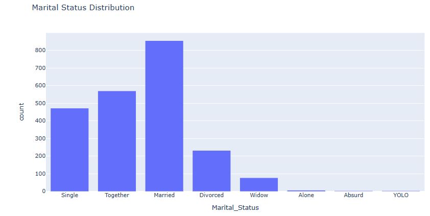
fig3 = px.histogram(df, x=’Education_Level’, nbins=5, title=”Education Level Distribution”)
fig3.show()

import plotly.express as px
df_plot = df.groupby([‘Marital_Status’])[‘Average_Spend’].mean().reset_index()
fig4 = px.bar(df_plot, x=’Marital_Status’, y=’Average_Spend’, color=’Marital_Status’)
fig4.show()
Marital Status vs Average Spend Distribution

Plot the distribution of number of children in household
fig6 = px.histogram(df, x=’Kidhome’)
fig6.show()

Total Campaigns Accepted Distribution
fig8 = px.histogram(df, x=’Total_Campaigns_Accepted’, nbins=20, title=”Total Campaigns Accepted Distribution”)
fig8.show()

Average Spend per Purchase Distribution
fig9 = px.histogram(df, x=’Average_Spend’, nbins=20, title=”Average Spend per Purchase Distribution”)
fig9.show()

Spending distribution by marital status, education, and is_parent
fig10 = px.histogram(df, x=’total_spending’, color=’Marital_Status’, nbins=50,
title=’Spending Distribution by Marital Status’)
fig11 = px.histogram(df, x=’total_spending’, color=’Education_Level’, nbins=50,
title=’Spending Distribution by Education Level’)
fig12 = px.histogram(df, x=’total_spending’, color=’Is_Parent’, nbins=50,
title=’Spending Distribution by Is_Parent’)
fig10.show()
fig11.show()
fig12.show()

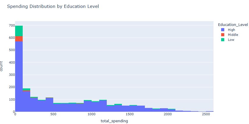
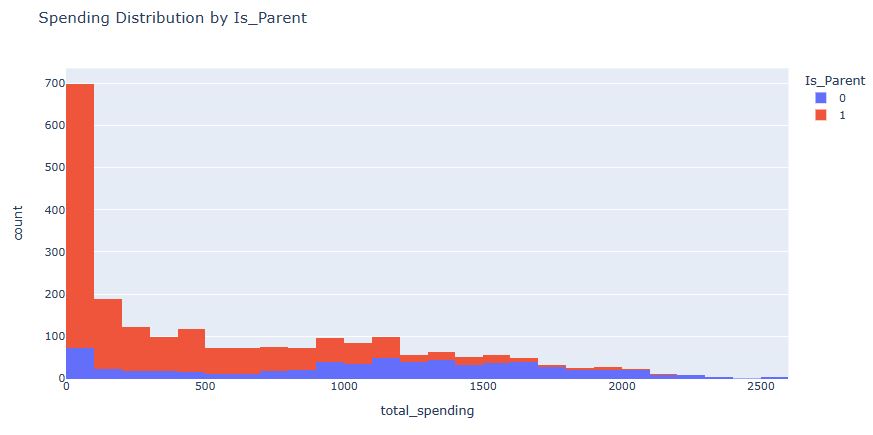
Plot the Distribution of Online Purchase Ratio
fig13 = px.histogram(df, x=’online_purchase_ratio’)
fig13.show()
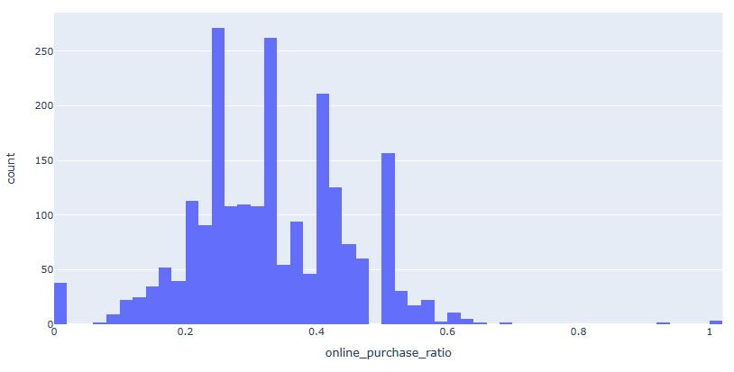
Plot the Distribution of Number of Web Visits per Month
fig14 = px.histogram(df, x=’NumWebVisitsMonth’)
fig14.show()
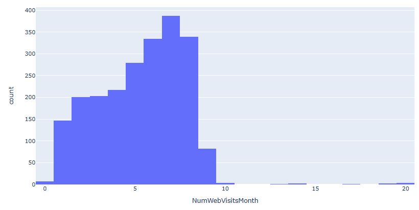
Plot the Distribution of Number of Web Purchases
fig15 = px.histogram(df, x=’NumWebPurchases’)
fig15.show()

Plot the Distribution of Number of Catalog Purchases
fig16 = px.histogram(df, x=’NumCatalogPurchases’)
fig16.show()
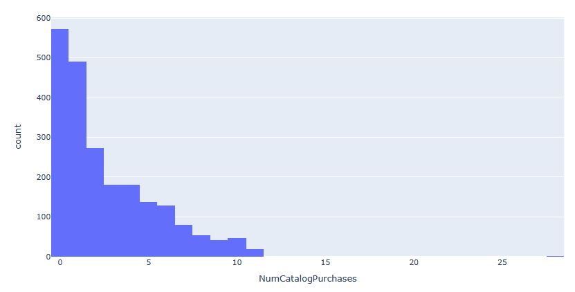
Plot the Distribution of Number of Store Purchases
fig17 = px.histogram(df, x=’NumStorePurchases’)
fig17.show()
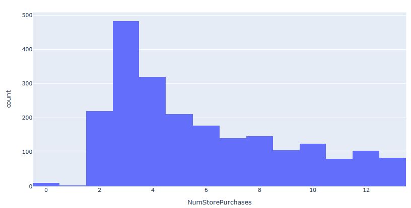
Box plot of NumWebPurchases vs NumStorePurchases
fig18 = px.box(df, x=”NumWebPurchases”, y=”NumStorePurchases”)
fig18.show()
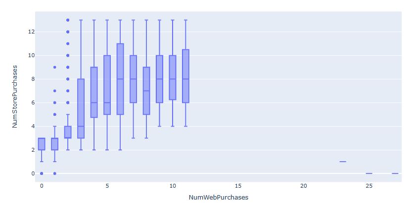
Scatter plot of “MntWines” vs “MntSweetProducts” with a third variable represented by size or color
fig22 = px.scatter(df, x=”MntWines”, y=”MntSweetProducts”, size=”NumWebVisitsMonth”, color=”Income”, size_max=50)
fig22.show()

########### CLUSTERING ALGORITHMS
import plotly.express as px
import plotly.io as pio
from sklearn.preprocessing import StandardScaler, MinMaxScaler
######## Data Preparation
df = pd.read_csv(‘marketing_campaign.csv’, sep=”\t”)
df = df.dropna()
df.duplicated().sum()
0
Calculate the IQR for the Income column
Q1 = df[‘Income’].quantile(0.25)
Q3 = df[‘Income’].quantile(0.75)
IQR = Q3 – Q1
Identify the outliers in the Income column
outliers = df[(df[‘Income’] < (Q1 – 1.5 * IQR)) | (df[‘Income’] > (Q3 + 1.5 * IQR))]
Remove the outliers in the Income column
df = df[~((df[‘Income’] < (Q1 – 1.5 * IQR)) | (df[‘Income’] > (Q3 + 1.5 * IQR)))]
df[‘Age’] = 2022 – df[‘Year_Birth’]
df[‘Total_Campaigns_Accepted’] = df[[‘AcceptedCmp1’, ‘AcceptedCmp2’, ‘AcceptedCmp3’, ‘AcceptedCmp4’, ‘AcceptedCmp5’]].sum(axis=1)
df[‘Average_Spend’] = (df[[‘MntWines’, ‘MntFruits’, ‘MntMeatProducts’, ‘MntFishProducts’, ‘MntSweetProducts’, ‘MntGoldProds’]].sum(axis=1)) / df[‘NumDealsPurchases’]
df[‘Spent’] = df[‘MntWines’]+df[“MntWines”] +df[‘MntFruits’]+ df[‘MntMeatProducts’] +df[‘MntFishProducts’]+df[‘MntSweetProducts’]+ df[‘MntGoldProds’]
df[‘Is_Parent’] = (df[‘Kidhome’] + df[‘Teenhome’] > 0).astype(int)
df[‘total_spending’] = df[‘MntWines’] + df[‘MntFruits’] + df[‘MntMeatProducts’] + df[‘MntFishProducts’] + df[‘MntSweetProducts’]
df[‘avg_web_visits’] = df[‘NumWebVisitsMonth’] / 12
df[‘online_purchase_ratio’] = df[‘NumWebPurchases’] / (df[‘NumWebPurchases’] + df[‘NumCatalogPurchases’] + df[‘NumStorePurchases’])
to_drop = [‘Dt_Customer’, ‘Z_CostContact’, ‘Z_Revenue’, ‘Year_Birth’, ‘ID’]
df = df.drop(to_drop, axis=1)
One-hot encode the categorical variables
Select the numerical columns to scale
num_cols = [‘Income’, ‘Kidhome’, ‘Teenhome’, ‘Recency’, ‘MntWines’, ‘MntFruits’,
‘MntMeatProducts’, ‘MntFishProducts’, ‘MntSweetProducts’, ‘MntGoldProds’,
‘NumDealsPurchases’, ‘NumWebPurchases’, ‘NumCatalogPurchases’,
‘NumStorePurchases’, ‘NumWebVisitsMonth’, ‘AcceptedCmp3’, ‘AcceptedCmp4’,
‘AcceptedCmp5’, ‘AcceptedCmp1’, ‘AcceptedCmp2’, ‘Complain’, ‘Response’,
‘total_spending’, ‘avg_web_visits’, ‘online_purchase_ratio’, ‘Age’,
‘Total_Campaigns_Accepted’, ‘Is_Parent’]
Initialize the StandardScaler
scaler = StandardScaler()
Fit the scaler to the numerical columns
df[num_cols] = scaler.fit_transform(df[num_cols])
df.isnull().sum().sum()
0
al=df[‘online_purchase_ratio’].mean()
print(al)
4.1834490782976914e-17
df[‘online_purchase_ratio’] = df[‘online_purchase_ratio’].fillna(0.33)
df.replace([np.inf, -np.inf], np.nan, inplace=True)
al=df[‘Average_Spend’].mean()
print(al)
412.04631023016225
df[‘Average_Spend’] = df[‘Average_Spend’].fillna(al)
######## K-means Clusters
from sklearn.decomposition import PCA
Initialize the PCA model
pca = PCA(n_components=8)
Fit and transform the data
df_pca = pca.fit_transform(df)
Determining the optimal number of clusters using Silhouette Score
import numpy as np
from sklearn.metrics import silhouette_score
from sklearn.cluster import KMeans
list_k = list(range(2, 10))
silhouette_scores = []
for k in list_k:
km = KMeans(n_clusters=k)
preds = km.fit_predict(df_pca)
silhouette_scores.append(silhouette_score(df_pca, preds))
best_k = list_k[np.argmax(silhouette_scores)]
best_k
2
Let’s fit the KMeans model with the number of clusters set to 4
import matplotlib.pyplot as plt
from sklearn.metrics import silhouette_score
from sklearn.metrics import calinski_harabasz_score,davies_bouldin_score
kmeans = KMeans(n_clusters=4)
kmeans.fit(df_pca)
predictions = kmeans.predict(df_pca)
silhouette_score_value = silhouette_score(df_pca, predictions)
calinski_harabasz_score_value = calinski_harabasz_score(df_pca, predictions)
davies_bouldin_score_value = davies_bouldin_score(df_pca, predictions)
plt.scatter(df_pca[:, 0], df_pca[:, 1], c=predictions, cmap=’viridis’)
plt.xlabel(‘Feature 1’)
plt.ylabel(‘Feature 2’)
plt.title(‘KMeans Clustering Results in 2D\nSilhouette Score: {0:.3f}’.format(silhouette_score_value))
plt.show()
fig = plt.figure()
ax = fig.add_subplot(111, projection=’3d’)
ax.scatter(df_pca[:, 0], df_pca[:, 1], df_pca[:, 2], c=predictions, cmap=’viridis’)
ax.set_xlabel(‘Feature 1’)
ax.set_ylabel(‘Feature 2’)
ax.set_zlabel(‘Feature 3’)
ax.set_title(‘KMeans Clustering Results in 3D\nSilhouette Score: {0:.3f}’.format(silhouette_score_value))
plt.show()


####### Agglomerative Clustering
import numpy as np
import matplotlib.pyplot as plt
from mpl_toolkits.mplot3d import Axes3D
from sklearn.cluster import AgglomerativeClustering
from scipy.spatial.distance import pdist, squareform
from sklearn.metrics import davies_bouldin_score
Generate sample data
X = df_pca
Compute the pairwise distances between samples
dist_matrix = squareform(pdist(X))
Fit the Agglomerative Clustering model
agg_cluster = AgglomerativeClustering(n_clusters=4)
agg_cluster.fit(X)
Plotting
plt.scatter(X[:, 0], X[:, 1], c=agg_cluster.labels_, cmap=’viridis’)
plt.show()
fig = plt.figure()
ax = fig.add_subplot(111, projection=’3d’)
ax.scatter(X[:, 0], X[:, 1], X[:, 2], c=agg_cluster.labels_, cmap=’viridis’)
plt.show()
davies_bouldin_index = davies_bouldin_score(X, agg_cluster.labels_)
print(“Davies-Bouldin Index:”, davies_bouldin_index)
silhouette_score_value = silhouette_score(X, agg_cluster.labels_)
calinski_harabasz_score_value = calinski_harabasz_score(X, agg_cluster.labels_)
print(“Silhouette Score:”, silhouette_score_value)
print(“Calinski-Harabasz Index:”, calinski_harabasz_score_value)

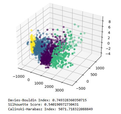
Read more here.
Supply Chain RFM & ABC Analysis
- Let’s apply the RFM/ABC analysis to the Data Co Supply Chain Dataset. Recency, Frequency, And Monetary Analysis(RFM) and ABC are techniques would give us an idea about important factors in our business and how we can optimize the future business growth.
- The Recency-Frequency-Monetary analysis helps demand side sector of an organization by segmenting customers and providing more insights to marketing department and sales department about the customers who buy products at the store.
- The ABC analysis helps the supply side sector of an organization by segmenting products based on revenue they generate. It helps manage inventory more efficiently.
Let’s set the working directory
import os
os.chdir(‘YOURPATH’)
os. getcwd()
and import standard libraries
import pandas as pd
import dateutil.parser
import numpy as np
import datetime
from statsmodels.stats.outliers_influence import variance_inflation_factor
import seaborn as sns;
import matplotlib.pyplot as plt
from plotly import graph_objects as go
import plotly.express as px
Let’s read the input data
dFppsc= pd.read_csv(“DataCoSupplyChainDataset.csv”, encoding_errors=”ignore”)
dFppsc.info()
<class 'pandas.core.frame.DataFrame'>
RangeIndex: 180519 entries, 0 to 180518
Data columns (total 53 columns):
 #   Column                         Non-Null Count   Dtype
---  ------                         --------------   -----
 0   Type                           180519 non-null  object
 1   Days for shipping (real)       180519 non-null  int64
 2   Days for shipment (scheduled)  180519 non-null  int64
 3   Benefit per order              180519 non-null  float64
 4   Sales per customer             180519 non-null  float64
 5   Delivery Status                180519 non-null  object
 6   Late_delivery_risk             180519 non-null  int64
 7   Category Id                    180519 non-null  int64
 8   Category Name                  180519 non-null  object
 9   Customer City                  180519 non-null  object
 10  Customer Country               180519 non-null  object
 11  Customer Email                 180519 non-null  object
 12  Customer Fname                 180519 non-null  object
 13  Customer Id                    180519 non-null  int64
 14  Customer Lname                 180511 non-null  object
 15  Customer Password              180519 non-null  object
 16  Customer Segment               180519 non-null  object
 17  Customer State                 180519 non-null  object
 18  Customer Street                180519 non-null  object
 19  Customer Zipcode               180516 non-null  float64
 20  Department Id                  180519 non-null  int64
 21  Department Name                180519 non-null  object
 22  Latitude                       180519 non-null  float64
 23  Longitude                      180519 non-null  float64
 24  Market                         180519 non-null  object
 25  Order City                     180519 non-null  object
 26  Order Country                  180519 non-null  object
 27  Order Customer Id              180519 non-null  int64
 28  order date (DateOrders)        180519 non-null  object
 29  Order Id                       180519 non-null  int64
 30  Order Item Cardprod Id         180519 non-null  int64
 31  Order Item Discount            180519 non-null  float64
 32  Order Item Discount Rate       180519 non-null  float64
 33  Order Item Id                  180519 non-null  int64
 34  Order Item Product Price       180519 non-null  float64
 35  Order Item Profit Ratio        180519 non-null  float64
 36  Order Item Quantity            180519 non-null  int64
 37  Sales                          180519 non-null  float64
 38  Order Item Total               180519 non-null  float64
 39  Order Profit Per Order         180519 non-null  float64
 40  Order Region                   180519 non-null  object
 41  Order State                    180519 non-null  object
 42  Order Status                   180519 non-null  object
 43  Order Zipcode                  24840 non-null   float64
 44  Product Card Id                180519 non-null  int64
 45  Product Category Id            180519 non-null  int64
 46  Product Description            0 non-null       float64
 47  Product Image                  180519 non-null  object
 48  Product Name                   180519 non-null  object
 49  Product Price                  180519 non-null  float64
 50  Product Status                 180519 non-null  int64
 51  shipping date (DateOrders)     180519 non-null  object
 52  Shipping Mode                  180519 non-null  object
dtypes: float64(15), int64(14), object(24)
memory usage: 73.0+ MB
############ Data Cleaning for Future Regression Models
dFppsc.drop(“Product Description”,axis=1,inplace=True)
dFppsc.drop(“Product Description”,axis=1,inplace=True)
dFppsc[“order date (DateOrders)”]=pd.to_datetime(dFppsc[“order date (DateOrders)”])
dFppsc[“shipping date (DateOrders)”]=pd.to_datetime(dFppsc[“shipping date (DateOrders)”])
dFppsc=dFppsc.sort_values(by=”order date (DateOrders)”)
dFppsc.drop([“Benefit per order”,”Sales per customer”,”Order Item Cardprod Id”,”Order Item Product Price”,”Product Category Id”,”Order Customer Id”],axis=1,inplace=True)
######### Variance Inflation Factor (VIF)
vif=pd.DataFrame()
vif[“columns”]=[‘Order Item Discount’,
‘Order Item Discount Rate’, ‘Order Item Profit Ratio’,
‘Order Item Quantity’, ‘Sales’, ‘Order Item Total’,
‘Order Profit Per Order’,’Product Price’]
vif[“vif value”] = [variance_inflation_factor(dFppsc[[‘Order Item Discount’,
‘Order Item Discount Rate’, ‘Order Item Profit Ratio’,
‘Order Item Quantity’, ‘Sales’, ‘Order Item Total’,
‘Order Profit Per Order’,’Product Price’]].values, i) for i in range(len(vif[“columns”]))]
vif.T

df1=dFppsc.drop([“Order Item Total”,”Product Price”,”Order Item Discount Rate”,”Order Profit Per Order”],axis=1)
vif=pd.DataFrame()
vif[“columns”]=[‘Sales’,
‘Order Item Quantity’,’Order Item Discount’,’Order Item Profit Ratio’]
vif[“data”] = [variance_inflation_factor(df1[[‘Sales’,
‘Order Item Quantity’,’Order Item Discount’,’Order Item Profit Ratio’]].values, i) for i in range(len(vif[“columns”]))]
dFppsc[“Delivery Status”].unique()
array(['Advance shipping', 'Late delivery', 'Shipping on time',
       'Shipping canceled'], dtype=object)
dFppsc.groupby(“Delivery Status”)[“Order Id”].count()
Delivery Status
Advance shipping     41592
Late delivery        98977
Shipping canceled     7754
Shipping on time     32196
Name: Order Id, dtype: int64
dFppsc[dFppsc[“Delivery Status”]==”Shipping canceled”].groupby(“Order Status”).agg(tc=(“Order Id”,”count”))
| Order Status | tc |
|---|---|
| CANCELED | 3692 |
| SUSPECTED_FRAUD | 4062 |
dF_clean=dFppsc[dFppsc[“Delivery Status”]!=”Shipping canceled”].copy()
############# RFM Analysis
dF_frequency=dF_clean.groupby([“Customer Id”]).agg(Total_count=(“Order Id”,”nunique”))
dF_clean[“Year”]=dF_clean[“order date (DateOrders)”].dt.year
dF_frequency_year=dF_clean.groupby([“Customer Id”,”Year”],as_index=False)[“Order Id”].nunique()
dF_frequency_year=dF_frequency_year.pivot_table(index=”Customer Id”,columns=”Year”,values=”Order Id”,fill_value=0)
pd.set_option(“display.max_columns”,None)
dF_clean[dF_clean[“Customer Id”]==12436]
dt1=datetime.datetime.strptime(’02-10-2017 12:46:00′, ‘%d-%m-%Y %H:%M:%S’)
dt2=dt1-datetime.timedelta(days=5)
df_exploring=dF_clean[dF_clean[“order date (DateOrders)”]>=dt2]
df_exploring.to_excel(“afterdt1.xlsx”)
df_exploring[df_exploring[“order date (DateOrders)”]>=dt1]
7964 rows × 47 columns
dF_clean[“Customer Full Name”]=dF_clean[“Customer Fname”]+” “+dF_clean[“Customer Lname”]
datetime_val = datetime.datetime.strptime(’02-10-2017 12:46:00′, ‘%d-%m-%Y %H:%M:%S’)
Customer_Names_After_Dt=dF_clean[dF_clean[“order date (DateOrders)”]>=datetime_val][[“Customer Full Name”,”Customer City”]].drop_duplicates()
Customer_Name_Common_Before_After_dt=pd.merge(dF_clean[(dF_clean[“order date (DateOrders)”]<=datetime_val)],Customer_Names_After_Dt,how=”inner”,on=[“Customer Full Name”,”Customer City”])
Records=pd.merge(Customer_Name_Common_Before_After_dt[[“Customer Full Name”,”Customer City”]].drop_duplicates(),dF_clean,how=”inner”,on=[“Customer Full Name”,”Customer City”])
dF_clean=dF_clean[dF_clean[“order date (DateOrders)”]<datetime_val].copy()
####### FREQUENCY
dF_frequency=dF_clean[[“Customer Id”,”Order Id”]].groupby(“Customer Id”,as_index=False).nunique()
dF_frequency.columns=[“Customer Id”,”Frequency”]
sns.histplot(dF_frequency.Frequency,bins=15,kde=False)
Frequency Histogram:
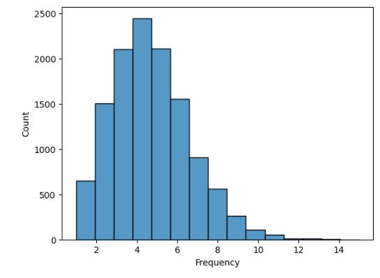
dF_frequency[“F”],Intervals_Frequency=pd.qcut(dF_frequency[“Frequency”],q=3,labels=[1,2,3],retbins=True)
########### RECENCY
dF_recency=dF_clean[[“Customer Id”,”order date (DateOrders)”]].groupby(“Customer Id”,as_index=False).max()
dF_recency.rename(columns ={“order date (DateOrders)”:”last_purchase_date”},inplace=True)
max_date=dF_recency[“last_purchase_date”].max()
dF_recency[“recency”]=max_date-dF_recency[“last_purchase_date”]
dF_recency[“recency”]=dF_recency[“recency”].dt.days
sns.displot(dF_recency.recency,bins=8,kde=False)
Recency Histogram

dF_recency[‘R’],Intervals_Recency=pd.qcut(dF_recency[“recency”],q=3,labels=[3,2,1],retbins=True)
######MONETARY
dF_monetory=dF_clean[[“Customer Id”,”Order Item Total”]].groupby(“Customer Id”,as_index=False).sum()
dF_monetory.columns=[“Customer Id”,”Sum_of_Sales”]
dF_monetory[“M”],Intervals_Monetory=pd.qcut(dF_monetory[“Sum_of_Sales”],q=3,labels=[1,2,3],retbins=True)
sns.displot(dF_monetory.Sum_of_Sales,kde=True)
Monetary histogram

####RFM SCORE
dF_rfm=pd.merge(dF_recency[[“Customer Id”,”R”]],dF_monetory[[“Customer Id”,”M”]],on=”Customer Id”,how=”inner”)
dF_rfm=pd.merge(dF_rfm,dF_frequency[[“Customer Id”,”F”]],on=”Customer Id”,how=”inner”)
dF_rfm[“RFM”]=(dF_rfm[“R”]).astype(str)+(dF_rfm[“F”]).astype(str)+(dF_rfm[“M”]).astype(str)
######SEGMENT STRATEGY
Let’s read the input data
pd.set_option(‘display.max_colwidth’, None)
Segment_Strategy=pd.read_excel(“Segments_Strategy.xlsx”)
Segment_Strategy

#####Customer Segment Data preparation
def Customer_Segment(data):
if data[“R”]==1 and data[“F”] in [1,2,3] and (data[“M”]==3):
return “Lost Customers – Big Spenders”
elif data[“R”]== 1 and data[“F”] in [1,2] and data[“M”] in [1,2]:
return “Lost Customers – Bargain”
elif data[“R”] in [1,2] and data[“F”]==3 and data[“M”] in [1,2]:
return “Lost/Almost Lost Customers – Loyal”
elif (data[“R”]==3) and (data[“F”]==3) and data[“M”] in [1,2]:
return “Loyal Customers”
elif (data[“R”]==3) and data[“F”] in [3,2] and data[“M”]==3:
return “Big Spenders”
elif (data[“R”]==3) and (data[“F”]==1) and data[“M”] in [1,2,3]:
return “New Customers”
elif (data[“R”]==3) and (data[“F”]==2) and data[“M”] in [1,2]:
return “Bargain Customers”
elif (data[“R”]==2) and data[“F”]==2 and data[“M”] in [1,2]:
return “Occasional Customers-Bargain”
elif (data[“R”]==2) and data[“F”] in [2,3] and data[“M”]==3:
return “Occasional Customers- Big Spenders”
elif (data[“R”]==2) and data[“F”]==1 and data [“M”] in [1,2,3]:
return “Unsatisfied Customers”
else:
return “No Segment”
dF_rfm[“R”]=dF_rfm[“R”].astype(“category”)
dF_rfm[“F”]=dF_rfm[“F”].astype(“category”)
dF_rfm[“M”]=dF_rfm[“M”].astype(“category”)
dF_rfm[“Segment”]=dF_rfm.apply(Customer_Segment,axis=1)
Segment_count=(dF_rfm.groupby(“Segment”,as_index=False).agg(Total_Count=(“Customer Id”,”count”))).sort_values(by=”Total_Count”,ascending=False)
Let’s plot Number of Customer in Each Segment
fig2=go.Figure()
fig2.add_trace(go.Bar(x=Segment_count.Segment,
y=Segment_count.Total_Count,
hovertemplate =”%{label}
Number of Customers:%{value}”,
texttemplate = “%{value}”))
fig2.update_layout(title=”Number of Customers in Each Segment”,
xaxis=dict(title=”Customer Segment”),
yaxis=dict(title=”Number Of Customers”),width=800)

Let’s plot Revenue Generated by Each Segment
dF_clean=pd.merge(dF_clean,dF_rfm[[“Customer Id”,”RFM”,”Segment”]],on=”Customer Id”,how=”left”)
dF_segment_revenue=dF_clean.groupby(“Segment”,as_index=False).agg(Total_Revenue=(“Order Item Total”,”sum”)).sort_values(by=”Total_Revenue”,ascending=False)
fig3=go.Figure()
fig3.add_trace(go.Bar(x=dF_segment_revenue.Segment,
y=dF_segment_revenue.Total_Revenue,
hovertemplate =”%{label}
Revenue:%{value}”,
texttemplate = “%{value}”))
fig3.update_layout(title=”Revenue Generated by Each Segment”,xaxis=dict(title=”Customer Segment”),
yaxis=dict(title=”Revenue”))
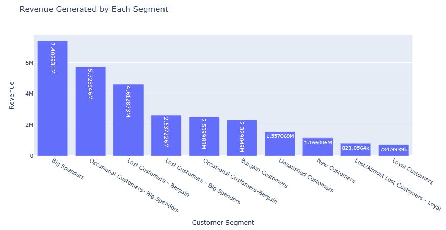
######TEXT WRAPS & SEGMENT TREE MAPS
def wrap(a):
str1=a.split(” “)
final_str=””
for c in str1:
final_str=final_str+c+’
‘
return final_str
Df1=dF_clean.groupby([“Segment”,”Department Name”,”Product Name”],
as_index=False
).agg(Total_Revenue=(“Order Item Total”,”sum”),Total_Quantity=(“Order Item Quantity”,”sum”))
Df1[“Product Name”]=Df1[“Product Name”].apply(wrap) #Applying text wrap because our product names are too long
segment=[“Big Spenders”,”Bargain Customers”,”Loyal Customers”,”New Customers”]
def type1(data):
if “Big Spenders” in data[“Segment”]:
return “Big spenders”
elif “Bargain” in data[“Segment”]:
return “Bargain”
elif “Loyal” in data[“Segment”]:
return “Loyal”
elif “New” in data[“Segment”]:
return “New Customers”
else:
return “Unsatisfied”
Df1[“Customer Type”]=Df1.apply(type1,axis=1)
data_tm=list(Df1.groupby(“Customer Type”))+[(‘All’,Df1)]
traces=[]
buttons=[]
visible=[]
for i,d in enumerate(data_tm):
visible=[False]*len(data_tm)
visible[i]=True
title=d[0]
traces.append((px.treemap(d[1],
path=[px.Constant(“All”),”Customer Type”,”Segment”,”Department Name”,”Product Name”],
values=”Total_Revenue”).update_traces(visible= True if i==0 else False)).data[0])
buttons.append(dict(label=title,
method=”update”,
args=[{
“visible”:visible},
{“title”:f”{title}”}
]))
updatemenus=[{“active”:0,”buttons”:buttons}]
fig11=go.Figure(data=traces,layout=dict(updatemenus=updatemenus))
fig11.update_layout(title=data_tm[0][0],title_x=0.6)
fig11.update_coloraxes(colorbar_title_text=”Total
Quantity”)
fig11.show()


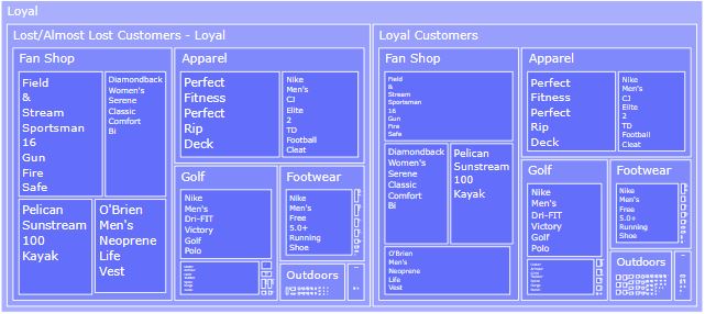

#####ABC ANALYSIS
Total_Products=dF_clean[“Product Name”].nunique()
print(“Total Number of products: “+f”{Total_Products}”)
Total Number of products: 100
Revenue_ABC=dF_clean.groupby([“Department Name”,”Product Name”]).agg(Total_Revenue=(“Order Item Total”,”sum”)).sort_values(by=”Total_Revenue”,ascending=False).reset_index()
Revenue_ABC[“cum_sum”]=Revenue_ABC[“Total_Revenue”].cumsum()
Revenue_ABC[“cum_per”]=Revenue_ABC[“cum_sum”]/Revenue_ABC[“Total_Revenue”].sum()*100
Revenue_ABC[“per”]=Revenue_ABC[“cum_per”]-Revenue_ABC[“cum_per”].shift(1)
Revenue_ABC.loc[0,”per”]=Revenue_ABC[“cum_per”][0]
def ABC(data):
if data[“cum_per”]<=75: return “A” elif data[“cum_per”]>75 and data[“cum_per”]<=95: return “B” elif data[“cum_per”]>95:
return “C”
Revenue_ABC[“ABC_Revenue”]=Revenue_ABC.apply(ABC,axis=1)
Bar_graph_Abc=Revenue_ABC[[“ABC_Revenue”,”Product Name”,”Total_Revenue”]].groupby(“ABC_Revenue”).agg(Revenue=(“Total_Revenue”,”sum”),count=(“Product Name”,”count”))
##########Bar_graph_Abc
fig2=go.Figure(go.Bar(x=Bar_graph_Abc.index,
y=Bar_graph_Abc[“Revenue”],
hovertemplate =”%{label}
Revenue:%{value}”,
texttemplate = “Revenue
%{value}”,
marker_color=[“orange”,”lightgreen”,”red”],
showlegend=False))
fig2.add_trace(
go.Scatter(
x=Bar_graph_Abc.index,
y=Bar_graph_Abc[“count”],
name=”Number Of Products”,
mode=’lines’,
line = dict(color=’blue’, width=3),
yaxis=”y2″,
marker_line_width = 0
))
fig2.update_layout(
title=”Revenue Generated By Products in Different ABC Segments”,
xaxis=dict(title=”Segment” ),
yaxis=dict(title=”Revenue”,showgrid=False),
yaxis2=dict(title=”Number Of Products”, anchor=”x”, overlaying=”y”,side=”right”,dtick=10),
legend = dict(x = 1.05, y = 1))
fig2.show()

######A Segment Products in Top 6 Cities
Top6Cities=dF_clean[[“Order City”,”Order Item Total”]].groupby(“Order City”).sum().sort_values(by=”Order Item Total”,ascending=False).head(6)
data=dF_clean[dF_clean[“Order City”].isin(Top6Cities.index.tolist())].groupby([“Order City”,”Product Name”],as_index=False).agg(Total_Revenue=(“Order Item Total”,”sum”)).sort_values(by=[“Order City”,”Total_Revenue”],ascending=False)
data[“sum”]=data.groupby(“Order City”)[“Total_Revenue”].transform(‘sum’)
data[“cum_per”]=data.groupby(“Order City”)[“Total_Revenue”].cumsum()/data[“sum”]*100
data[“segment”]=data.apply(ABC,axis=1)
data[“Product Name”]=data[“Product Name”].apply(wrap)
data.sort_values(by=[“sum”,”Total_Revenue”],inplace=True,ascending=False)
fig = px.bar(data[data[“segment”]==”A”], x=’Product Name’, y=’Total_Revenue’,
facet_col=’Order City’,facet_col_wrap=2,facet_row_spacing=0.12,
height=1500,title=”A Segment Products in Top 6 Cities”)
fig.for_each_annotation(lambda a: a.update(text=a.text.split(“=”)[-1]))
fig.update_xaxes(showticklabels=True,tickangle=0)
fig.update_layout(width=950)
fig.show()


Read more here.
Bank Churn ML Prediction
Let’s set the working directory
import os
os.chdir(‘YOURPATH’)
os. getcwd()
Basic Libraries
import numpy as np
import pandas as pd
import matplotlib.pyplot as plt
import seaborn as sns
Processing libraries
from sklearn.preprocessing import MinMaxScaler
from sklearn.decomposition import PCA
from sklearn.feature_selection import SelectKBest, f_classif, chi2
Model libraries
from sklearn.ensemble import RandomForestClassifier
from sklearn.ensemble import AdaBoostClassifier
from sklearn.ensemble import GradientBoostingClassifier
from sklearn.model_selection import train_test_split
from sklearn import metrics
Let’s read the input dataset
df = pd.read_csv(‘BankChurners.csv’)
df = df.drop(‘Naive_Bayes_Classifier_Attrition_Flag_Card_Category_Contacts_Count_12_mon_Dependent_count_Education_Level_Months_Inactive_12_mon_2’, axis = 1)
df = df.drop(‘Naive_Bayes_Classifier_Attrition_Flag_Card_Category_Contacts_Count_12_mon_Dependent_count_Education_Level_Months_Inactive_12_mon_1’, axis = 1
Let’s check the statistics
df.describe().T
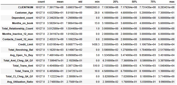
Number of churn and non-churn
counts = df.Attrition_Flag.value_counts()
perc_churn = (counts[1] / (counts[0] + counts[1])) * 100
No. of duplicates
duplicates = len(df[df.duplicated()])
No. of missing values
missing_values = df.isnull().sum().sum()
Data types in dataset
types = df.dtypes.value_counts()
print(“Churn Rate = %.1f %%”%(perc_churn))
print(‘Number of Duplicate Entries: %d’%(duplicates))
print(‘Number of Missing Values: %d’%(missing_values))
print(‘Number of Features: %d’%(df.shape[1]))
print(‘Number of Customers: %d’%(df.shape[0]))
print(‘Data Types and Frequency in Dataset:’)
print(types)
Churn Rate = 16.1 %
Number of Duplicate Entries: 0
Number of Missing Values: 0
Number of Features: 21
Number of Customers: 10127
Data Types and Frequency in Dataset:
int64      10
object      6
float64     5
Name: count, dtype: int64
####### Data Pre-processing
Make gender and outcome numerical
df[‘Gender’] = df[‘Gender’].map({‘M’: 1, ‘F’: 0})
df[‘Attrition_Flag’] = df[‘Attrition_Flag’].map({‘Attrited Customer’: 1, ‘Existing Customer’: 0})
drop client id
df = df.drop(‘CLIENTNUM’, axis = 1)
catcols = df.select_dtypes(exclude = [‘int64′,’float64’]).columns
intcols = df.select_dtypes(include = [‘int64’]).columns
floatcols = df.select_dtypes(include = [‘Float64’]).columns
One-hot encoding on categorical columns
df = pd.get_dummies(df, columns = catcols)
Minmax scaling numeric features
for col in df[floatcols]:
df[col] = MinMaxScaler().fit_transform(df[[col]])
for col in df[intcols]:
df[col] = MinMaxScaler().fit_transform(df[[col]])
print(‘New Number of Features: %d’%(df.shape[1]))
New Number of Features: 37
Split into X and y
X = df.drop(‘Attrition_Flag’, axis = 1)
y = df[‘Attrition_Flag’]
##################Correlation between numerical features
heat = df.corr()
plt.figure(figsize=[16,8])
plt.title(“Correlation between numerical features”, size = 25, pad = 20, color = ‘#8cabb6’)
sns.heatmap(heat,cmap = sns.diverging_palette(20, 220, n = 200), annot=False)
plt.show()
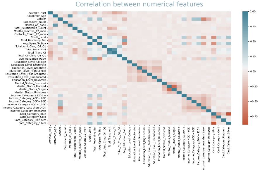
#######Feature Engineering
print(“Correlation Coefficient of all the Features”)
corr = df.corr()
corr.sort_values([“Attrition_Flag”], ascending = False, inplace = True)
correlations = corr.Attrition_Flag
a = correlations[correlations > 0.1]
b = correlations[correlations < -0.1]
top_corr_features = a._append(b)
top_corr_features
Correlation Coefficient of all the Features
Out[12]:
Attrition_Flag              1.000000
Contacts_Count_12_mon       0.204491
Months_Inactive_12_mon      0.152449
Total_Amt_Chng_Q4_Q1       -0.131063
Total_Relationship_Count   -0.150005
Total_Trans_Amt            -0.168598
Avg_Utilization_Ratio      -0.178410
Total_Revolving_Bal        -0.263053
Total_Ct_Chng_Q4_Q1        -0.290054
Total_Trans_Ct             -0.371403
Name: Attrition_Flag, dtype: float64
Let’s define the following functions
def plot_importances(model, model_name, features_to_plot, feature_names):
#fit model and performances
model.fit(X,y)
importances = model.feature_importances_
# sort and rank importances
indices = np.argsort(importances)
best_features = np.array(feature_names)[indices][-features_to_plot:]
values = importances[indices][-features_to_plot:]

# plot a graph
y_ticks = np.arange(0, features_to_plot)
fig, ax = plt.subplots()
ax.barh(y_ticks, values, color = '#b2c4cc')
ax.set_yticklabels(best_features)
ax.set_yticks(y_ticks)
ax.set_title("%s Feature Importances"%(model_name))
fig.tight_layout()
plt.show()
def best_features(model, features_to_plot, feature_names):
# get list of best features
model.fit(X,y)
importances = model.feature_importances_
indices = np.argsort(importances)
best_features = np.array(feature_names)[indices][-features_to_plot:]
return best_features
Let’s plot feature importance weights for the following 3 models
feature_names = list(X.columns)
model1 = RandomForestClassifier(random_state = 1234)
plot_importances(model1, ‘Random Forest’, 10, feature_names)
model2 = GradientBoostingClassifier(n_estimators = 100, learning_rate = 1.0, max_depth = 1, random_state = 0)
plot_importances(model2, ‘XGBoost’, 10, feature_names)
model3 = AdaBoostClassifier(n_estimators = 100, learning_rate = 1.0, random_state = 0)
plot_importances(model3, ‘AdaBoost’, 10, feature_names)
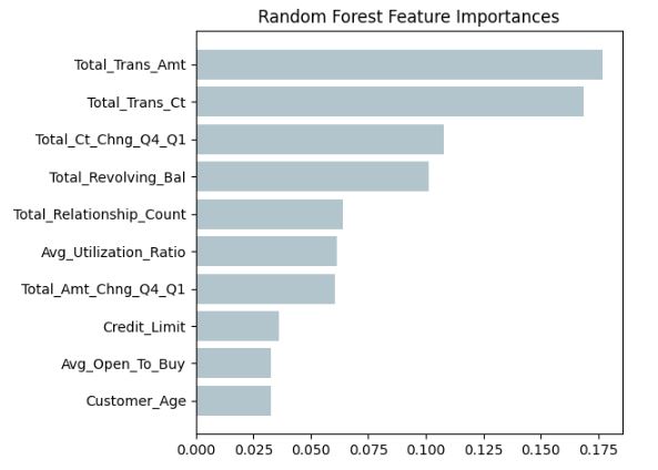
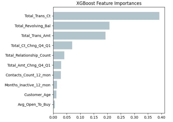

Looking at the F-value between label/feature for classification tasks
f_selector = SelectKBest(f_classif, k = 10)
f_selector.fit_transform(X, y)
f_selector_best = f_selector.get_feature_names_out()
print(f_selector_best)
['Gender' 'Total_Relationship_Count' 'Months_Inactive_12_mon'
 'Contacts_Count_12_mon' 'Total_Revolving_Bal' 'Total_Amt_Chng_Q4_Q1'
 'Total_Trans_Amt' 'Total_Trans_Ct' 'Total_Ct_Chng_Q4_Q1'
 'Avg_Utilization_Ratio']
forest_best = list(best_features(model1, 10, feature_names))
XG_best = list(best_features(model2, 10, feature_names))
ada_best = list(best_features(model3, 10, feature_names))
top_corr_features = list(top_corr_features.index[1:])
f_selector_best = list(f_selector_best)
best_features_overall = forest_best + XG_best + ada_best + top_corr_features + f_selector_best
# create a dictionary with the number of times features appear
from collections import Counter
count_best_features = dict(Counter(best_features_overall))
# list of the features without any repeatitions
features_no_repeats = list(dict.fromkeys(best_features_overall))
display(count_best_features)
{'Customer_Age': 3,
 'Avg_Open_To_Buy': 3,
 'Credit_Limit': 2,
 'Total_Amt_Chng_Q4_Q1': 5,
 'Avg_Utilization_Ratio': 3,
 'Total_Relationship_Count': 4,
 'Total_Revolving_Bal': 5,
 'Total_Ct_Chng_Q4_Q1': 5,
 'Total_Trans_Ct': 5,
 'Total_Trans_Amt': 5,
 'Months_Inactive_12_mon': 4,
 'Contacts_Count_12_mon': 4,
 'Gender': 1}
# get list of features with high counts in the dictionary
def get_features(threshold):
# remove features below a certain number of appearances
chosen_features = []
for i in features_no_repeats:
if count_best_features[i] > threshold:
chosen_features.append(i)
return chosen_features
chosen_features = get_features(2)
chosen_features.remove(‘Avg_Open_To_Buy’)
chosen_features.remove(‘Avg_Utilization_Ratio’)
chosen_features
['Customer_Age',
 'Total_Amt_Chng_Q4_Q1',
 'Total_Relationship_Count',
 'Total_Revolving_Bal',
 'Total_Ct_Chng_Q4_Q1',
 'Total_Trans_Ct',
 'Total_Trans_Amt',
 'Months_Inactive_12_mon',
 'Contacts_Count_12_mon']
######### ML Model Evaluation
def eval_model(model, model_name, X, y, threshold):
# make X the chosen subset
chosen_features = get_features(threshold)
X = X[chosen_features]
train_x, test_x, train_y, test_y = train_test_split(X, y, test_size = 0.25, random_state = 42)

# fit model
model.fit(train_x,train_y)
model.score(test_x, test_y)
pred_test = model.predict(test_x)

# get metrics
f1 = metrics.f1_score(test_y, pred_test)
test_acc = metrics.accuracy_score(test_y, pred_test)
con = metrics.confusion_matrix(test_y, pred_test)

print(con,'%s model with %s threshold: %.4f F1-score and %.4f accuracy'%(model_name, threshold, f1, test_acc))
Let’s use the full dataset to perform train/test data splitting with test_size = 0.25
train_x, test_x, train_y, test_y = train_test_split(X, y, test_size = 0.25, random_state = 42)
####Model1 Fitting
model1.fit(train_x,train_y)
model1.score(test_x, test_y)
pred_test = model1.predict(test_x)
f1 = metrics.f1_score(test_y, pred_test)
test_acc = metrics.accuracy_score(test_y, pred_test)
con = metrics.confusion_matrix(test_y, pred_test)
print(con,f1,test_acc)
[[2094   19]
 [  96  323]] 0.8488830486202367 0.9545813586097947
Let’s look at the reduced dataset and repeat model1 fitting
chosen_features = get_features(2)
chosen_features.remove(‘Avg_Open_To_Buy’)
chosen_features.remove(‘Avg_Utilization_Ratio’)
Xnew = X[chosen_features]
train_x, test_x, train_y, test_y = train_test_split(Xnew, y, test_size = 0.25, random_state = 42)
model1.fit(train_x,train_y)
model1.score(test_x, test_y)
pred_test = model1.predict(test_x)
f1 = metrics.f1_score(test_y, pred_test)
test_acc = metrics.accuracy_score(test_y, pred_test)
con = metrics.confusion_matrix(test_y, pred_test)
print(con,f1,test_acc)
[[2086   27]
 [  60  359]] 0.8919254658385094 0.9656398104265402
######More ML Classifiers
from sklearn.ensemble import BaggingClassifier
from sklearn.neighbors import KNeighborsClassifier
model4 = BaggingClassifier(KNeighborsClassifier(n_neighbors = 7), max_samples = 0.8, max_features = 0.8)
eval_model(model4, ‘KNN’, X, y, 2)
[[2074   39]
 [ 176  243]] KNN model with 2 threshold: 0.6933 F1-score and 0.9151 accuracy
from sklearn.linear_model import LogisticRegression
model5 = LogisticRegression(random_state=1)
eval_model(model5, ‘Logistic’, X, y, 2)
[[2059   54]
 [ 217  202]] Logistic model with 2 threshold: 0.5985 F1-score and 0.8930 accuracy
# lists of possible parameters
n = [400, 450, 500, 550, 600, 650, 700, 750, 800, 850, 900, 950, 1000]
depth = [8, 9, 10, 11, 12, 13, 14, 15, 16, 17, 18, 19, 20]
rand = [600, 650, 700, 750, 800, 850, 900, 950, 1000, 1050, 1100, 1150, 1200, 1250]
forest = RandomForestClassifier(n_estimators = 100, max_depth = 15, random_state = 750)
eval_model(forest, ‘forest’, X, y, 2)
[[2090   23]
 [  64  355]] forest model with 2 threshold: 0.8908 F1-score and 0.9656 accuracy
####Further Evaluation of Random Forest
def eval_forest(model, model_name, X, y, threshold, n, depth, rand):
# create subset from feature selection
chosen_features = get_features(threshold)
chosen_features.remove(‘Avg_Open_To_Buy’)
chosen_features.remove(‘Avg_Utilization_Ratio’)
X = X[chosen_features]
train_x, test_x, train_y, test_y = train_test_split(X, y, test_size = 0.25, random_state = 42)

model.fit(train_x,train_y)
model.score(test_x, test_y)
pred_test = model.predict(test_x)

f1 = metrics.f1_score(test_y, pred_test)
test_acc = metrics.accuracy_score(test_y, pred_test)
con = metrics.confusion_matrix(test_y, pred_test)

print('Model: %s Threshold: %s F1-Score %.4f Accuracy: %.4f n_estimators: %s depth: %s rand: %s'%(model_name, threshold, f1, test_acc,n,depth,rand))
Let’s define the model
forest = RandomForestClassifier(n_estimators = 850, max_depth = 19, random_state = 1200)
and train/test this model using 2 selected features
chosen_features = get_features(2)
chosen_features.remove(‘Avg_Open_To_Buy’)
chosen_features.remove(‘Avg_Utilization_Ratio’)
X_new = X[chosen_features]
train_x, test_x, train_y, test_y = train_test_split(X_new, y, test_size = 0.25, random_state = 42)
forest.fit(train_x,train_y)
forest.score(test_x, test_y)
pred_test = forest.predict(test_x)
f1 = metrics.f1_score(test_y, pred_test)
test_acc = metrics.accuracy_score(test_y, pred_test)
con = metrics.confusion_matrix(test_y, pred_test)
precision = metrics.precision_score(test_y, pred_test)
recall = metrics.recall_score(test_y, pred_test)
roc = metrics.roc_auc_score(test_y, pred_test)
print(‘Accuracy Score’, test_acc)
print(‘Precision’, precision)
print(‘Recall’, recall)
print(‘F1-Score’, f1)
print(‘ROC Score’, roc)
print(con)
Accuracy Score 0.9664296998420221
Precision 0.9304123711340206
Recall 0.8615751789976134
F1-Score 0.8946716232961587
ROC Score 0.9243985691485936
[[2086   27]
 [  58  361]]
#####CROSS-VALIDATION
from sklearn.model_selection import cross_validate
cv_results = cross_validate(forest, X_new, y, scoring = (‘f1’, ‘accuracy’, ‘roc_auc’), cv = 8)
sorted(cv_results.keys())
['fit_time', 'score_time', 'test_accuracy', 'test_f1', 'test_roc_auc']
cv_results[‘test_roc_auc’]
array([0.91056078, 0.96866615, 0.98541168, 0.9918462 , 0.99539807,
       0.99796213, 0.8989536 , 0.90523967])
cv_results[‘test_accuracy’]
array([0.88230648, 0.94233807, 0.96366509, 0.96366509, 0.96840442,
       0.97630332, 0.92969984, 0.92885375])
#####ML PERFORMANCE ANALYSIS USING Scikit Plot
Import standard libraries
import scikitplot as skplt
import sklearn
from sklearn.model_selection import train_test_split
from sklearn.ensemble import RandomForestClassifier, RandomForestRegressor, GradientBoostingClassifier, ExtraTreesClassifier
from sklearn.linear_model import LinearRegression, LogisticRegression
from sklearn.cluster import KMeans
from sklearn.decomposition import PCA
import matplotlib.pyplot as plt
import sys
import warnings
warnings.filterwarnings(“ignore”)
print(“Scikit Plot Version : “, skplt.version)
print(“Scikit Learn Version : “, sklearn.version)
print(“Python Version : “, sys.version)
%matplotlib inline
Scikit Plot Version :  0.3.7
Scikit Learn Version :  1.2.2
Python Version :  3.9.16 (main, Jan 11 2023, 16:16:36) [MSC v.1916 64 bit (AMD64)]
#####RFC Learning Curve
skplt.estimators.plot_learning_curve(forest, train_x, train_y,
cv=7, shuffle=True, scoring=”accuracy”,
n_jobs=-1, figsize=(6,4), title_fontsize=”large”, text_fontsize=”large”,
title=”RFC Learning Curve”);
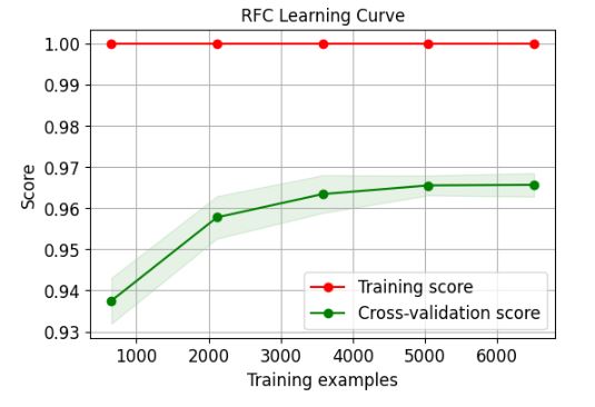
######KNN Classification Learning Curve
skplt.estimators.plot_learning_curve(model4, train_x, train_y,
cv=7, shuffle=True, scoring=”accuracy”,
n_jobs=-1, figsize=(6,4), title_fontsize=”large”, text_fontsize=”large”,
title=”KNN Classification Learning Curve”);
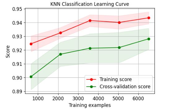
####ETC Learning Curve
skplt.estimators.plot_learning_curve(ExtraTreesClassifier(), train_x, train_y,
cv=7, shuffle=True, scoring=”accuracy”,
n_jobs=-1, figsize=(6,4), title_fontsize=”large”, text_fontsize=”large”,
title=”ETC Learning Curve”);

#####GBC Learning Curve
skplt.estimators.plot_learning_curve(GradientBoostingClassifier(), train_x, train_y,
cv=7, shuffle=True, scoring=”accuracy”,
n_jobs=-1, figsize=(6,4), title_fontsize=”large”, text_fontsize=”large”,
title=”GBC Learning Curve”);
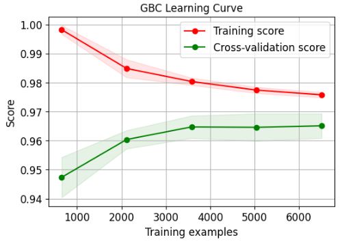
#######DTC Learning Curve
from sklearn.tree import DecisionTreeClassifier
skplt.estimators.plot_learning_curve(DecisionTreeClassifier(), train_x, train_y,
cv=7, shuffle=True, scoring=”accuracy”,
n_jobs=-1, figsize=(6,4), title_fontsize=”large”, text_fontsize=”large”,
title=”DTC Learning Curve”);

######ABC Learning Curve
from sklearn.ensemble import AdaBoostClassifier
skplt.estimators.plot_learning_curve(AdaBoostClassifier(), train_x, train_y,
cv=7, shuffle=True, scoring=”accuracy”,
n_jobs=-1, figsize=(6,4), title_fontsize=”large”, text_fontsize=”large”,
title=”ABC Learning Curve”);

########MLPC Learning Curve
from sklearn.neural_network import MLPClassifier
skplt.estimators.plot_learning_curve(MLPClassifier(), train_x, train_y,
cv=7, shuffle=True, scoring=”accuracy”,
n_jobs=-1, figsize=(6,4), title_fontsize=”large”, text_fontsize=”large”,
title=”MLPC Learning Curve”);
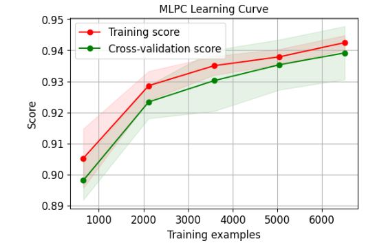
#######GNB Learning Curve
from sklearn.naive_bayes import GaussianNB
skplt.estimators.plot_learning_curve(GaussianNB(), train_x, train_y,
cv=7, shuffle=True, scoring=”accuracy”,
n_jobs=-1, figsize=(6,4), title_fontsize=”large”, text_fontsize=”large”,
title=”GNB Learning Curve”);

######LR Learning Curve
skplt.estimators.plot_learning_curve(LogisticRegression(), train_x, train_y,
cv=7, shuffle=True, scoring=”accuracy”,
n_jobs=-1, figsize=(6,4), title_fontsize=”large”, text_fontsize=”large”,
title=”LR Learning Curve”);

#######QDA Learning Curve
from sklearn.discriminant_analysis import QuadraticDiscriminantAnalysis
skplt.estimators.plot_learning_curve(QuadraticDiscriminantAnalysis(), train_x, train_y,
cv=7, shuffle=True, scoring=”accuracy”,
n_jobs=-1, figsize=(6,4), title_fontsize=”large”, text_fontsize=”large”,
title=”QDA Learning Curve”);
########SVC Learning Curve
from sklearn.svm import SVC
skplt.estimators.plot_learning_curve(SVC(), train_x, train_y,
cv=7, shuffle=True, scoring=”accuracy”,
n_jobs=-1, figsize=(6,4), title_fontsize=”large”, text_fontsize=”large”,
title=”SVC Learning Curve”);
######CALIBRATION PLOTS
lr_probas = QuadraticDiscriminantAnalysis().fit(train_x, train_y).predict_proba(test_x)
rf_probas = RandomForestClassifier().fit(train_x, train_y).predict_proba(test_x)
gb_probas = GradientBoostingClassifier().fit(train_x, train_y).predict_proba(test_x)
et_scores = AdaBoostClassifier().fit(train_x, train_y).predict_proba(test_x)
probas_list = [lr_probas, rf_probas, gb_probas, et_scores]
clf_names = [‘QDA’, ‘RFC’, ‘GBC’, ‘ABC’]
skplt.metrics.plot_calibration_curve(test_y,
probas_list,
clf_names, n_bins=15,
figsize=(12,6)
);
######GBC Normalized Confusion Matrix
from sklearn.metrics import confusion_matrix
import seaborn as sns
model=GradientBoostingClassifier()
model.fit(train_x,train_y)
pred_test = model.predict(test_x)
cm = confusion_matrix(test_y, pred_test)
target_names=[‘0′,’1’]
cmn = cm.astype(‘float’) / cm.sum(axis=1)[:, np.newaxis]
fig, ax = plt.subplots(figsize=(10,10))
sns.heatmap(cmn, annot=True, fmt=’.2f’, xticklabels=target_names, yticklabels=target_names)
plt.ylabel(‘Actual’)
plt.xlabel(‘Predicted’)
plt.title(‘GBC Normalized Confusion Matrix’)

########RFC Normalized Confusion Matrix
from sklearn.metrics import confusion_matrix
import seaborn as sns
forest.fit(train_x,train_y)
pred_test = forest.predict(test_x)
forest.fit(train_x,train_y)
pred_test = forest.predict(test_x)
cm = confusion_matrix(test_y, pred_test)
target_names=[‘0′,’1’]
cmn = cm.astype(‘float’) / cm.sum(axis=1)[:, np.newaxis]
fig, ax = plt.subplots(figsize=(10,10))
sns.heatmap(cmn, annot=True, fmt=’.2f’, xticklabels=target_names, yticklabels=target_names)
plt.ylabel(‘Actual’)
plt.xlabel(‘Predicted’)
plt.title(‘RFC Normalized Confusion Matrix’)

########RFC ROC Curve
Y_test_probs = forest.predict_proba(test_x)
skplt.metrics.plot_roc_curve(test_y, Y_test_probs,
title=”RFC ROC Curve”, figsize=(12,6));

##########GBC ROC Curve
model=GradientBoostingClassifier()
model.fit(train_x,train_y)
Y_test_probs = model.predict_proba(test_x)
skplt.metrics.plot_roc_curve(test_y, Y_test_probs,
title=”GBC ROC Curve”, figsize=(12,6));
##########RFC Precision-Recall Curve
Y_test_probs = forest.predict_proba(test_x)
skplt.metrics.plot_precision_recall_curve(test_y, Y_test_probs,
title=”RFC Precision-Recall Curve”, figsize=(12,6));

########GBC Precision-Recall Curve
model=GradientBoostingClassifier()
model.fit(train_x,train_y)
Y_test_probs = model.predict_proba(test_x)
skplt.metrics.plot_precision_recall_curve(test_y, Y_test_probs,
title=”GBC Precision-Recall Curve”, figsize=(12,6));

#####K-Means Elbow Plot
skplt.cluster.plot_elbow_curve(KMeans(random_state=1),
train_x,
cluster_ranges=range(2, 20),
figsize=(8,6));
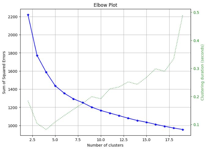
######Silhouette Analysis
kmeans = KMeans(n_clusters=10, random_state=1)
kmeans.fit(train_x, train_y)
cluster_labels = kmeans.predict(test_x)
skplt.metrics.plot_silhouette(test_x, cluster_labels,
figsize=(8,6));

#######PCA Component Variance
pca = PCA(random_state=1)
pca.fit(train_x)
skplt.decomposition.plot_pca_component_variance(pca, figsize=(8,6));
#####PCA 2-D Projection
skplt.decomposition.plot_pca_2d_projection(pca, train_x, train_y,
figsize=(10,10),
cmap=”tab10″);

######Classification Reports via yellowbrick
import pandas as pd
import numpy as np
import matplotlib.pyplot as plt
import sklearn
import yellowbrick
pd.set_option(“display.max_columns”, 35)
import warnings
warnings.filterwarnings(“ignore”)
from yellowbrick.classifier import ClassificationReport
viz = ClassificationReport(forest,
classes=target_names,
support=True,
fig=plt.figure(figsize=(8,6)))
viz.fit(train_x, train_y)
viz.score(test_x, test_y)
viz.show();

from yellowbrick.classifier import ClassificationReport
model=GradientBoostingClassifier()
model.fit(train_x,train_y)
viz = ClassificationReport(model,
classes=target_names,
support=True,
fig=plt.figure(figsize=(8,6)))
viz.fit(train_x, train_y)
viz.score(test_x, test_y)
viz.show();

######CLASS PREDICTION ERROR
from yellowbrick.classifier import ClassPredictionError
viz = ClassPredictionError(forest,
classes=target_names,
fig=plt.figure(figsize=(9,6)))
viz.fit(train_x, train_y)
viz.score(test_x, test_y)
viz.show();

model=GradientBoostingClassifier()
model.fit(train_x,train_y)
viz = ClassPredictionError(model,
classes=target_names,
fig=plt.figure(figsize=(9,6)))
viz.fit(train_x, train_y)
viz.score(test_x, test_y)
viz.show();

Read more here.
Groceries Market Basket & RFM Analysis
Let’s set the working directory
import os
os.chdir(‘YOURPATH’)
os. getcwd()
and import/install standard libraries
!pip install apriori
import os
import plotly.express as px
import numpy as np
import pandas as pd
import plotly.graph_objects as go
import matplotlib.pyplot as plt
import seaborn as sns
import operator as op
from mlxtend.frequent_patterns import apriori
from mlxtend.frequent_patterns import association_rules
Loading the input dataset
data = pd.read_csv(‘Groceries_dataset.csv’)
data.head()
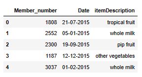
data.info()
<class 'pandas.core.frame.DataFrame'>
RangeIndex: 38765 entries, 0 to 38764
Data columns (total 3 columns):
 #   Column           Non-Null Count  Dtype
---  ------           --------------  -----
 0   Member_number    38765 non-null  int64
 1   Date             38765 non-null  object
 2   itemDescription  38765 non-null  object
dtypes: int64(1), object(2)
memory usage: 908.7+ KB
Renaming the columns
data.columns = [‘memberID’, ‘Date’, ‘itemName’]
Checking for the missing values
nan_values = data.isna().sum()
nan_values
memberID    0
Date        0
itemName    0
dtype: int64
Converting Date column into correct data type which is datetime
data.Date = pd.to_datetime(data.Date)
data.memberID = data[‘memberID’].astype(‘str’)
data.info()
<class 'pandas.core.frame.DataFrame'>
RangeIndex: 38765 entries, 0 to 38764
Data columns (total 3 columns):
 #   Column    Non-Null Count  Dtype
---  ------    --------------  -----
 0   memberID  38765 non-null  object
 1   Date      38765 non-null  datetime64[ns]
 2   itemName  38765 non-null  object
dtypes: datetime64[ns](1), object(2)
memory usage: 908.7+ KB
#######EXPLORATORY DATA ANALYSIS (EDA)
Sales_weekly = data.resample(‘w’, on=’Date’).size()
fig = px.line(data, x=Sales_weekly.index, y=Sales_weekly,
labels={‘y’: ‘Number of Sales’,
‘x’: ‘Date’})
fig.update_layout(title_text=’Number of Sales Weekly’,
title_x=0.5, title_font=dict(size=18))
fig.show()
####Number of Sales Weekly
#########Number of Customers Weekly
Unique_customer_weekly = data.resample(‘w’, on=’Date’).memberID.nunique()
fig = px.line(Unique_customer_weekly, x=Unique_customer_weekly.index, y=Unique_customer_weekly,
labels={‘y’: ‘Number of Customers’})
fig.update_layout(title_text=’Number of Customers Weekly’,
title_x=0.5, title_font=dict(size=18))
fig.show()

#####Sales per Customer Ratio Weekly
Sales_per_Customer = Sales_weekly / Unique_customer_weekly
fig = px.line(Sales_per_Customer, x=Sales_per_Customer.index, y=Sales_per_Customer,
labels={‘y’: ‘Sales per Customer Weekly’})
fig.update_layout(title_text=’Sales per Customer Weekly’,
title_x=0.5, title_font=dict(size=18))
fig.update_yaxes(rangemode=”tozero”)
fig.show()
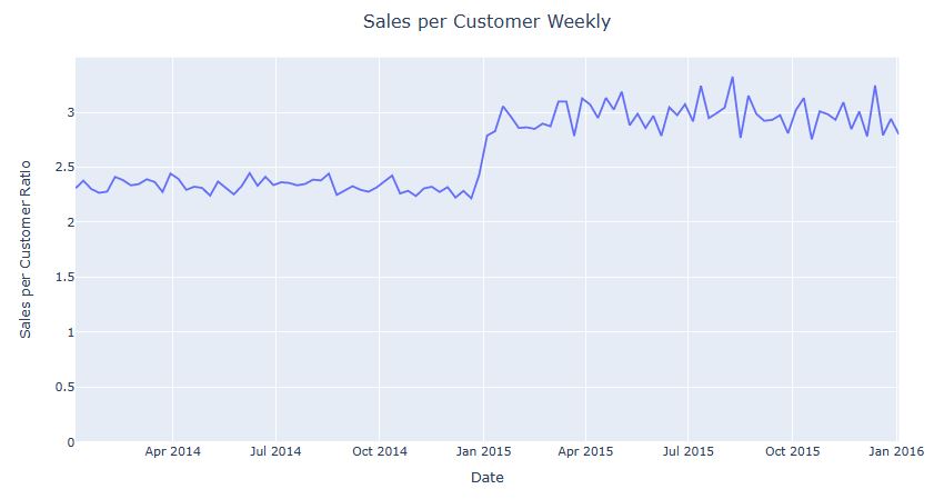
#######Frequency of the Items Sold
Frequency_of_items = data.groupby(pd.Grouper(key=’itemName’)).size().reset_index(name=’count’)
fig = px.treemap(Frequency_of_items, path=[‘itemName’], values=’count’)
fig.update_layout(title_text=’Frequency of the Items Sold’,
title_x=0.5, title_font=dict(size=18)
)
fig.update_traces(textinfo=”label+value”)
fig.show()
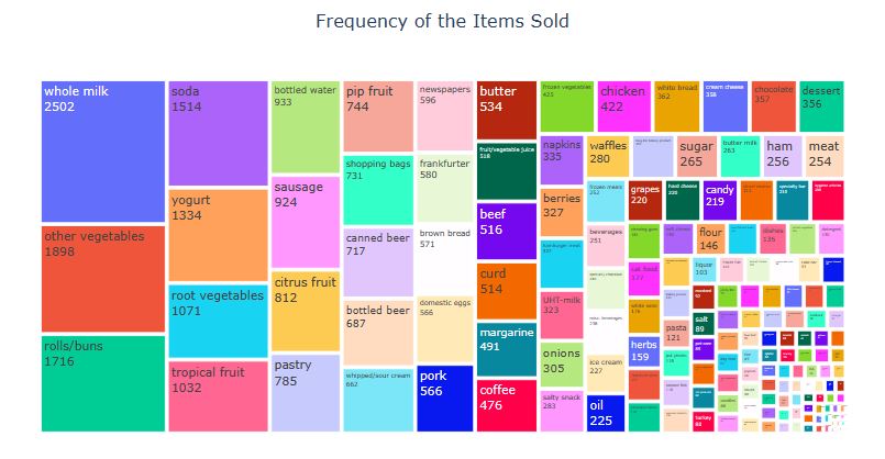
########Top 20 Customers regarding Number of Items Bought
user_item = data.groupby(pd.Grouper(key=’memberID’)).size().reset_index(name=’count’) \
.sort_values(by=’count’, ascending=False)
fig = px.bar(user_item.head(25), x=’memberID’, y=’count’,
labels={‘y’: ‘Number of Sales’,
‘count’: ‘Number of Items Bought’},
color=’count’)
fig.update_layout(title_text=’Top 20 Customers regarding Number of Items Bought’,
title_x=0.5, title_font=dict(size=18))
fig.update_traces(marker=dict(line=dict(color=’#000000′, width=1)))
fig.show()

##########Number of Sales per Discrete Week Days
day = data.groupby(data[‘Date’].dt.strftime(‘%A’))[‘itemName’].count()
fig = px.bar(day, x=day.index, y=day, color=day,
labels={‘y’: ‘Number of Sales’,
‘Date’: ‘Week Days’})
fig.update_layout(title_text=’Number of Sales per Discrete Week Days’,
title_x=0.5, title_font=dict(size=18))
fig.update_traces(marker=dict(line=dict(color=’#000000′, width=1)))
fig.show()

##############Number of Sales per Discrete Months
month = data.groupby(data[‘Date’].dt.strftime(‘%m’))[‘itemName’].count()
fig = px.bar(month, x=month.index, y=month, color=month,
labels={‘y’: ‘Number of Sales’,
‘Date’: ‘Months’})
fig.update_layout(title_text=’Number of Sales per Discrete Months’,
title_x=0.5, title_font=dict(size=18))
fig.update_traces(marker=dict(line=dict(color=’#000000′, width=1)))
fig.show()
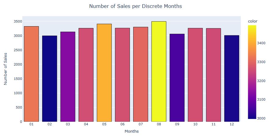
###########Number of Sales per Discrete Month Days
month_day = data.groupby(data[‘Date’].dt.strftime(‘%d’))[‘itemName’].count()
fig = px.bar(month_day, x=month_day.index, y=month_day, color=month_day,
labels={‘y’: ‘Number of Sales’,
‘Date’: ‘Month Days’})
fig.update_layout(title_text=’Number of Sales per Discrete Month Days’,
title_x=0.5, title_font=dict(size=18))
fig.update_traces(marker=dict(line=dict(color=’#000000′, width=1)))
fig.show()
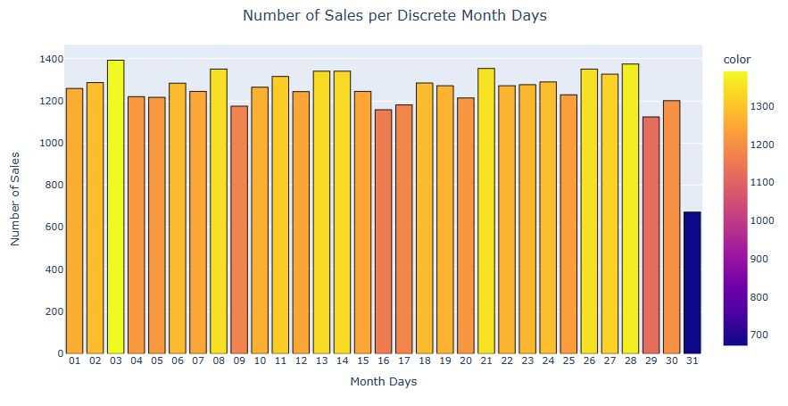
###########Market Basket Analysis
baskets = data.groupby([‘memberID’, ‘itemName’])[‘itemName’].count().unstack().fillna(0).reset_index()
#baskets.head()
Let’s check the most sold -item which is whole milk- has the same number of sales as we discussed above in the treemap.
baskets[‘whole milk’].sum()
2502.0
Encoding the items that sold more than 1
def one_hot_encoder(k):
if k <= 0: return 0 if k >= 1:
return 1
baskets_final = baskets.iloc[:, 1:baskets.shape[1]].applymap(one_hot_encoder)
#baskets_final.head()
Finding the most frequent items sold together
frequent_itemsets = apriori(baskets_final, min_support=0.025, use_colnames=True, max_len=3).sort_values(by=’support’)
#frequent_itemsets.head(25)
Creating association rules for indicating astecedent and consequent items
rules = association_rules(frequent_itemsets, metric=”lift”, min_threshold=1).sort_values(‘lift’, ascending=False)
rules = rules[[‘antecedents’, ‘consequents’, ‘support’, ‘confidence’, ‘lift’]]
rules.head(25)

###########RFM Analysis
Finding last purchase date of each customer
Recency = data.groupby(by=’memberID’)[‘Date’].max().reset_index()
Recency.columns = [‘memberID’, ‘LastDate’]
#Recency.head()
Finding last date for our dataset
last_date_dataset = Recency[‘LastDate’].max()
last_date_dataset
Timestamp('2015-12-30 00:00:00')
Calculating Recency by subtracting (last transaction date of dataset) and (last purchase date of each customer)
Recency[‘Recency’] = Recency[‘LastDate’].apply(lambda x: (last_date_dataset – x).days)
#Recency.head()
##########Recency Distribution of the Customers
fig = px.histogram(Recency, x=’Recency’, opacity=0.85, marginal=’box’)
fig.update_traces(marker=dict(line=dict(color=’#000000′, width=1)))
fig.update_layout(title_text=’Recency Distribution of the Customers’,
title_x=0.5, title_font=dict(size=20))
fig.show()

###########Frequency of the customer visits
Frequency = data.drop_duplicates([‘Date’, ‘memberID’]).groupby(by=[‘memberID’])[‘Date’].count().reset_index()
Frequency.columns = [‘memberID’, ‘Visit_Frequency’]
#Frequency.head()
#######Visit Frequency Distribution of the Customers
fig = px.histogram(Frequency, x=’Visit_Frequency’, opacity=0.85, marginal=’box’)
fig.update_traces(marker=dict(line=dict(color=’#000000′, width=1)))
fig.update_layout(title_text=’Visit Frequency Distribution of the Customers’,
title_x=0.5, title_font=dict(size=20))
fig.show()

#####MONETARY
Monetary = data.groupby(by=”memberID”)[‘itemName’].count().reset_index()
Monetary.columns = [‘memberID’, ‘Monetary’]
#Monetary.head()
fig = px.histogram(Monetary, x=’Monetary’, opacity=0.85, marginal=’box’,
labels={‘itemName’: ‘Monetary’})
fig.update_traces(marker=dict(line=dict(color=’#000000′, width=1)))
fig.update_layout(title_text=’Monetary Distribution of the Customers’,
title_x=0.5, title_font=dict(size=20))
fig.show()

#######RFM Score
Combining all scores into one DataFrame
RFM = pd.concat([Recency[‘memberID’], Recency[‘Recency’], Frequency[‘Visit_Frequency’], Monetary[‘Monetary’]], axis=1)
#RFM.head()
5-5 score = the best customers
RFM[‘Recency_quartile’] = pd.qcut(RFM[‘Recency’], 5, [5, 4, 3, 2, 1])
RFM[‘Frequency_quartile’] = pd.qcut(RFM[‘Visit_Frequency’], 5, [1, 2, 3, 4, 5])
RFM[‘RF_Score’] = RFM[‘Recency_quartile’].astype(str) + RFM[‘Frequency_quartile’].astype(str)
#RFM.head()
segt_map = { # Segmentation Map [Ref]
r'[1-2][1-2]’: ‘hibernating’,
r'[1-2][3-4]’: ‘at risk’,
r'[1-2]5′: ‘can\’t loose’,
r’3[1-2]’: ‘about to sleep’,
r’33’: ‘need attention’,
r'[3-4][4-5]’: ‘loyal customers’,
r’41’: ‘promising’,
r’51’: ‘new customers’,
r'[4-5][2-3]’: ‘potential loyalists’,
r’5[4-5]’: ‘champions’
}
RFM[‘RF_Segment’] = RFM[‘RF_Score’].replace(segt_map, regex=True)
#RFM.head()
x = RFM.RF_Segment.value_counts()
fig = px.treemap(x, path=[x.index], values=x)
fig.update_layout(title_text=’Distribution of the RFM Segments’, title_x=0.5,
title_font=dict(size=20))
fig.update_traces(textinfo=”label+value+percent root”)
fig.show()

###########Relationship between Visit_Frequency and Recency
fig = px.scatter(RFM, x=”Visit_Frequency”, y=”Recency”, color=’RF_Segment’,
labels={“math score”: “Math Score”,
“writing score”: “Writing Score”})
fig.update_layout(title_text=’Relationship between Visit_Frequency and Recency’,
title_x=0.5, title_font=dict(size=20))
fig.show()

Read more here.
Largest E-Commerce Showcase in Pakistan
Let’s apply the customer segmentation RFM analysis to the Pakistan’s largest e-commerce dataset.
Let’s set the working directory
import os
os.chdir(‘YOURPATH’)
os. getcwd()
and import standard libraries
import numpy as np
import pandas as pd
import matplotlib.pyplot as plt
import seaborn as sns
import opendatasets as od
import os
import plotly.express as px
%matplotlib inline
import matplotlib.style as style
style.use(‘seaborn-poster’)
style.use(“fivethirtyeight”)
plt.rcParams[‘font.family’] = ‘serif’
sns.set(rc={‘axes.facecolor’:’black’, ‘figure.facecolor’:’black’, ‘axes.grid’ : True})
Let’s read the input dataset
ecommerce = pd.read_csv(‘Pakistan Largest Ecommerce Dataset.csv’,low_memory=False,
comment=’,’ )
ecommerce.shape
(584524, 26)
#ecommerce.head()
ecommerce = ecommerce.dropna(how=’all’, axis=1)
ecommerce.describe().T

#########Order Status
total = ecommerce[ecommerce.grand_total < 0].status.value_counts().to_dict()
total_df = pd.DataFrame(list(total.items()), columns=[‘Order Status’, ‘Counts’])
plt.figure(figsize=(20,10))
ax = sns.barplot(data=total_df, x=’Order Status’, y=’Counts’, palette=’bright’)
ax.bar_label(container = ax.containers[0], padding = 0, fontsize = 22, color=’white’)
plt.xticks( fontsize=20)
plt.yticks( fontsize=20)
plt.xlabel(‘Order Status’, fontsize=24, labelpad=24, color=’white’)
plt.ylabel(‘Counts’, fontsize=24, labelpad=24, color=’white’);
ax.tick_params(axis=’x’, colors=’white’)
ax.tick_params(axis=’y’, colors=’white’);
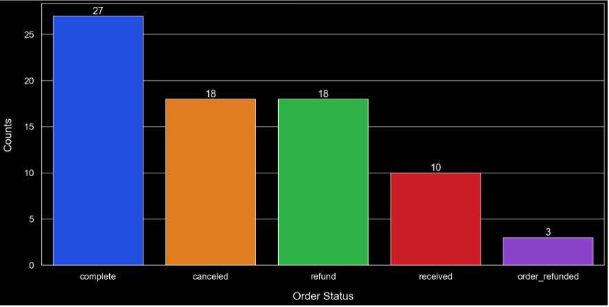
#########Data Editing
ecommerce = ecommerce[ecommerce.grand_total > 0]
ecommerce.status = ecommerce.status.replace({‘complete’: ‘Completed’,
‘received’: ‘Completed’,
‘cod’: ‘Completed’,
‘paid’: ‘Completed’,
‘closed’: ‘Completed’,
‘exchange’: ‘Completed’,
‘canceled’: ‘Canceled’,
‘order_refunded’: ‘Canceled’,
‘refund’: ‘Canceled’,
‘fraud’: ‘Canceled’,
‘payment_review’: ‘Pending’,
‘pending’: ‘Pending’,
‘processing’: ‘Pending’,
‘holded’: ‘Pending’,
‘pending_paypal’: ‘Pending’})
ecommerce = ecommerce.drop([‘created_at’, ‘sku’, ‘sales_commission_code’, ‘Customer Since’, ‘M-Y’], axis=1)
ecommerce = ecommerce.dropna()
##########Number of Orders: One Order vs Orders > 1
number_of_orders = ecommerce.groupby(‘Customer ID’)[‘increment_id’].nunique().sort_values(ascending=False)
number_of_orders_df = pd.DataFrame(list(number_of_orders.items()), columns=[‘Customer ID’, ‘Number of Orders’])
a = number_of_orders_df[number_of_orders_df[‘Number of Orders’] == 1].value_counts().sum()
b = number_of_orders_df[number_of_orders_df[‘Number of Orders’] != 1].value_counts().sum()
data = {‘Order’: [‘One Order’, ‘More than One Order’], ‘Customer_Counts’: [a, b]}
order_counts = pd.DataFrame.from_dict(data)
fig = px.pie(order_counts,
values = order_counts.Customer_Counts,
names = order_counts.Order,
template = ‘plotly_dark’)
fig.update_traces(textposition=’inside’, textinfo=’percent+label’, textfont_size=20,
marker = dict(line = dict(color = ‘white’, width = 6)))
fig.show()

########Number of Products: One Category, More than One Category
number_of_prod = ecommerce.groupby(‘Customer ID’)[‘category_name_1’].nunique().sort_values(ascending=False)
number_of_prod_df = pd.DataFrame(list(number_of_prod.items()), columns=[‘Customer ID’, ‘Number of Products’])
a = number_of_prod_df[number_of_prod_df[‘Number of Products’] == 1].value_counts().sum()
b = number_of_prod_df[number_of_prod_df[‘Number of Products’] != 1].value_counts().sum()
data = {‘Order’: [‘One Category’, ‘More than One Category’], ‘Customer_Counts’: [a, b]}
category_counts = pd.DataFrame.from_dict(data)
fig = px.pie(category_counts,
values = category_counts.Customer_Counts,
names = category_counts.Order,
template = ‘plotly_dark’)
fig.update_traces(textposition=’inside’, textinfo=’percent+label’, textfont_size=20,
marker = dict(line = dict(color = ‘white’, width = 6)))
fig.show()

######Canceled Orders
a = ecommerce[‘Customer ID’].nunique() + canceled [‘Customer ID’].nunique()
b = canceled [‘Customer ID’].nunique()
data = {‘Customers’: [‘Total Customers’, ‘Those Who Canceled’], ‘Customer_Counts’: [a, b]}
customer_counts = pd.DataFrame.from_dict(data)
c = ecommerce[‘increment_id’].nunique() + canceled [‘increment_id’].nunique()
d = canceled [‘increment_id’].nunique()
data = {‘Orders’: [‘Total Orders’, ‘Canceled Orders’], ‘Order_Counts’: [c, d]}
order_counts = pd.DataFrame.from_dict(data)
sns.set(rc={‘axes.facecolor’:’black’, ‘figure.facecolor’:’black’, ‘axes.grid’ : True})
fig, ax = plt.subplots(1,2, figsize = (20,10))
sns.barplot(ax = ax[0], data = customer_counts, x=customer_counts.Customers, y=customer_counts.Customer_Counts, palette= ‘bright’)
sns.barplot(ax = ax[1], data = order_counts, x=order_counts.Orders, y=order_counts.Order_Counts, palette= ‘bright’)
ax[0].set_title(“Customers Who Canceled”, fontsize = 26, pad = 30, color=’red’, fontweight=’bold’)
ax[0].set_xlabel(“Customers”, fontsize = 24, labelpad = 15, color=’white’)
ax[0].set_ylabel(“Counts”, fontsize = 24, labelpad = 15, color=’white’)
ax[0].tick_params(axis=’x’, colors=’white’, labelsize=20)
ax[0].tick_params(axis=’y’, colors=’white’, labelsize=20)
ax[1].set_title(“Canceled Orders”, fontsize = 28, pad = 30, color=’red’, fontweight=’bold’)
ax[1].set_xlabel(“Orders”, fontsize = 24, labelpad = 15, color=’white’)
ax[1].set_ylabel(“Counts”, fontsize = 24, labelpad = 15, color=’white’)
ax[1].tick_params(axis=’x’, colors=’white’, labelsize=20)
ax[1].tick_params(axis=’y’, colors=’white’, labelsize=20);
plt.tight_layout(pad=2);

#######Cancelled Categories
canceled = canceled.dropna()
fig = px.treemap(canceled,
path=[‘category_name_1′], template=’plotly_dark’)
fig.update_traces(textfont_color=’yellow’,textfont_size=16, selector=dict(type=’treemap’))
fig.show()

######Converting Date column into correct data type which is datetime
data.Date = pd.to_datetime(data.Date)
ecommerce[‘Working Date’] = pd.to_datetime(ecommerce[‘Working Date’])
ecommerce.info()
<class 'pandas.core.frame.DataFrame'>
Index: 308167 entries, 0 to 584523
Data columns (total 18 columns):
 #   Column           Non-Null Count   Dtype
---  ------           --------------   -----
 0   item_id          308167 non-null  int64
 1   status           308167 non-null  object
 2   price            308167 non-null  float64
 3   qty_ordered      308167 non-null  int64
 4   grand_total      308167 non-null  float64
 5   increment_id     308167 non-null  object
 6   category_name_1  308167 non-null  object
 7   discount_amount  308167 non-null  float64
 8   payment_method   308167 non-null  object
 9   Working Date     308167 non-null  datetime64[ns]
 10  BI Status        308167 non-null  object
 11   MV              308167 non-null  object
 12  Year             308167 non-null  int64
 13  Month            308167 non-null  int64
 14  FY               308167 non-null  object
 15  Customer ID      308167 non-null  float64
 16  Frequency        308167 non-null  int64
 17  Monetary         308167 non-null  float64
dtypes: datetime64[ns](1), float64(5), int64(5), object(7)
memory usage: 44.7+ MB
########Recency Frequency Monetary Columns
ref_date = ecommerce[‘Working Date’].max()
ecommerce[‘Date’] = ecommerce[‘Working Date’].apply(lambda x: x.date())
ecommerce[‘Most_Recent_Purchase’] = ecommerce.groupby(‘Customer ID’)[‘Date’].transform(max)
ecommerce[‘Recency’] = ref_date.date() – ecommerce.Most_Recent_Purchase
ecommerce = ecommerce.drop(‘Most_Recent_Purchase’, axis=1)
ecommerce[‘Frequency’] = ecommerce.groupby(‘Customer ID’)[‘increment_id’].transform(‘nunique’)
ecommerce[‘Monetary’] = ecommerce.groupby(‘Customer ID’)[‘grand_total’].transform(sum)
RFM_df = ecommerce[[‘Customer ID’, ‘Recency’, ‘Frequency’, ‘Monetary’]].drop_duplicates()
#RFM_df.head()
####RFM Quantiles & Total Score
RFM_quantiles = RFM_df[[‘Recency’, ‘Frequency’, ‘Monetary’]].quantile(q = [0.25, 0.5, 0.75])
RFM_df.loc[(RFM_df[‘Recency’] <= RFM_quantiles.Recency[0.25]), ‘Rscore’] = 4.0 RFM_df.loc[(RFM_df[‘Recency’] > RFM_quantiles.Recency[0.25]) & (RFM_df.Recency <= RFM_quantiles.Recency[0.5]), ‘Rscore’] = 3.0 RFM_df.loc[(RFM_df[‘Recency’] > RFM_quantiles.Recency[0.5]) & (RFM_df.Recency <= RFM_quantiles.Recency[0.75]), ‘Rscore’] = 2.0 RFM_df.loc[(RFM_df[‘Recency’] > RFM_quantiles.Recency[0.75]), ‘Rscore’] = 1.0
RFM_df.loc[(RFM_df[‘Frequency’] <= RFM_quantiles.Frequency[0.25]), ‘Fscore’] = 1.0 RFM_df.loc[(RFM_df[‘Frequency’] > RFM_quantiles.Frequency[0.25]) & (RFM_df[‘Frequency’] <= RFM_quantiles.Frequency[0.5]), ‘Fscore’] = 2.0 RFM_df.loc[(RFM_df[‘Frequency’] > RFM_quantiles.Frequency[0.5]) & (RFM_df[‘Frequency’] <= RFM_quantiles.Frequency[0.75]), ‘Fscore’] = 3.0 RFM_df.loc[(RFM_df[‘Frequency’] > RFM_quantiles.Frequency[0.75]), ‘Fscore’] = 4.0
RFM_df.loc[(RFM_df[‘Monetary’] <= RFM_quantiles.Monetary[0.25]), ‘Mscore’] = 1.0 RFM_df.loc[(RFM_df[‘Monetary’] > RFM_quantiles.Monetary[0.25]) & (RFM_df[‘Monetary’] <= RFM_quantiles.Monetary[0.5]), ‘Mscore’] = 2.0 RFM_df.loc[(RFM_df[‘Monetary’] > RFM_quantiles.Monetary[0.5]) & (RFM_df[‘Monetary’] <= RFM_quantiles.Monetary[0.75]), ‘Mscore’] = 3.0 RFM_df.loc[(RFM_df[‘Monetary’] > RFM_quantiles.Monetary[0.75]), ‘Mscore’] = 4.0
RFM_df[‘RFM_score’] = RFM_df.Rscore + RFM_df.Fscore + RFM_df.Mscore
RFM_df.loc[(RFM_df[‘RFM_score’] == 12.0), ‘Cluster’] = ‘Champions’
RFM_df.loc[(RFM_df[‘RFM_score’] == 11.0), ‘Cluster’] = ‘Loyal Customers’
RFM_df.loc[(RFM_df[‘RFM_score’] >= 9.0) & (RFM_df[‘RFM_score’] <= 10.0), ‘Cluster’] = ‘Promising Customers’ RFM_df.loc[(RFM_df[‘RFM_score’] >= 7.0) & (RFM_df[‘RFM_score’] <= 8.0), ‘Cluster’] = ‘At Risk’ RFM_df.loc[(RFM_df[‘RFM_score’] >= 4.0) & (RFM_df[‘RFM_score’] <= 6.0), ‘Cluster’] = ‘Hibernating’
RFM_df.loc[(RFM_df[‘RFM_score’] == 3.0), ‘Cluster’] = ‘Lost Customers’
######Customer Segments/Clusters vs Number of Purchases
frequency = RFM_df.groupby(‘Cluster’)[‘Frequency’].sum()
frequency_df = pd.DataFrame(list(frequency.items()), columns=[‘Cluster’, ‘Number_of_Purchases’])
plt.figure(figsize=(20,10))
ax = sns.barplot(data=frequency_df, x=’Cluster’, y=’Number_of_Purchases’, palette=’bright’)
ax.bar_label(container = ax.containers[0], padding = 0, fontsize = 22, color=’white’)
plt.xticks( fontsize=20)
plt.yticks( fontsize=20)
plt.xlabel(‘Clusters’, fontsize=30, labelpad=24, color=’white’)
plt.ylabel(‘No. of Purchases’, fontsize=30, labelpad=24, color=’white’);
ax.tick_params(axis=’x’, colors=’white’)
ax.tick_params(axis=’y’, colors=’white’);
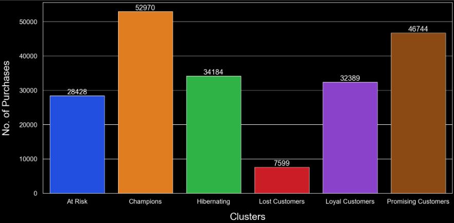
######Customer Segments/Clusters vs Spendings
frequency = RFM_df.groupby(‘Cluster’)[‘Monetary’].mean()
frequency_df = pd.DataFrame(list(frequency.items()), columns=[‘Cluster’, ‘Spendings’])
plt.figure(figsize=(20,10))
ax = sns.barplot(data=frequency_df, x=’Cluster’, y=’Spendings’, palette=’bright’)
ax.bar_label(container = ax.containers[0], padding = 0, fontsize = 22, color=’white’)
plt.xticks( fontsize=20)
plt.yticks( fontsize=20)
plt.xlabel(‘Clusters’, fontsize=30, labelpad=24, color=’white’)
plt.ylabel(‘Spendings’, fontsize=30, labelpad=24, color=’white’);
ax.tick_params(axis=’x’, colors=’white’)
ax.tick_params(axis=’y’, colors=’white’);
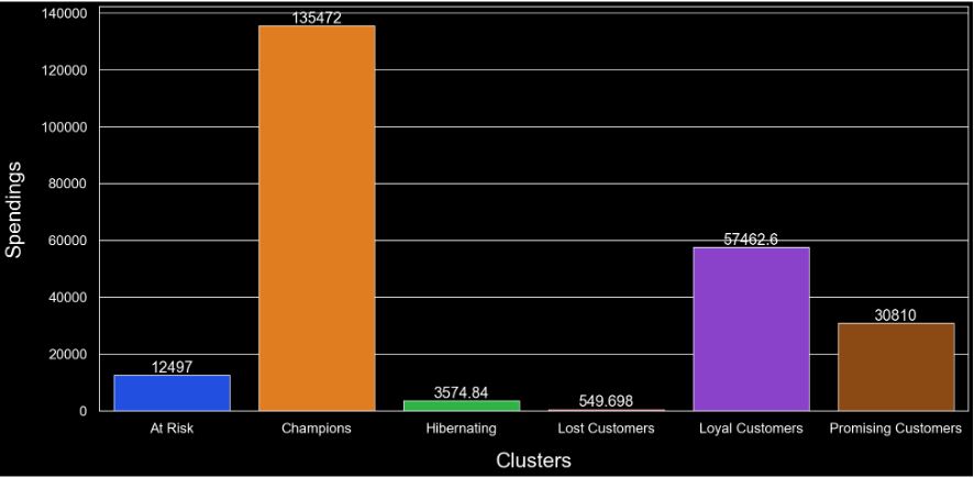
######Customer Segments/Clusters vs RFM Score
cluster_mapping = pd.Series(RFM_df.Cluster.values, index=RFM_df[‘Customer ID’]).to_dict()
ecommerce[‘Cluster’] = ecommerce[‘Customer ID’].map(cluster_mapping)
cluster_counts = RFM_df.Cluster.value_counts()
cluster_counts_df = pd.DataFrame(list(cluster_counts.items()), columns=[‘Cluster’, ‘Number_of_Customers’])
fig = px.pie(cluster_counts_df,
values = cluster_counts_df.Number_of_Customers,
names = cluster_counts_df.Cluster,
template = ‘plotly_dark’)
fig.update_traces(textposition=’inside’, textinfo=’percent+label’, textfont_size=20,
marker = dict(line = dict(color = ‘white’, width = 6)))
fig.show()

fig = px.treemap(ecommerce,
path=[‘Cluster’,’category_name_1′], template=’plotly_dark’, height=1000)
fig.update_traces(textfont_color=’yellow’, textfont_size=16, selector=dict(type=’treemap’))
fig.show()

######6 Clusters vs Categories
cluster1 = ecommerce[ecommerce.Cluster == ‘Champions’].groupby(‘category_name_1’)[‘grand_total’].sum().to_frame().reset_index()
cluster1.columns = [‘Category’, ‘Grand_Total_Cluster1’]
cluster2 = ecommerce[ecommerce.Cluster == ‘Loyal Customers’].groupby(‘category_name_1’)[‘grand_total’].sum().to_frame().reset_index()
cluster2.columns = [‘Category’, ‘Grand_Total_Cluster2’]
cluster3 = ecommerce[ecommerce.Cluster == ‘Promising Customers’].groupby(‘category_name_1’)[‘grand_total’].sum().to_frame().reset_index()
cluster3.columns = [‘Category’, ‘Grand_Total_Cluster3’]
cluster4 = ecommerce[ecommerce.Cluster == ‘At Risk’].groupby(‘category_name_1’)[‘grand_total’].sum().to_frame().reset_index()
cluster4.columns = [‘Category’, ‘Grand_Total_Cluster4’]
cluster5 = ecommerce[ecommerce.Cluster == ‘Hibernating’].groupby(‘category_name_1’)[‘grand_total’].sum().to_frame().reset_index()
cluster5.columns = [‘Category’, ‘Grand_Total_Cluster5’]
cluster6 = ecommerce[ecommerce.Cluster == ‘Lost Customers’].groupby(‘category_name_1’)[‘grand_total’].sum().to_frame().reset_index()
cluster6.columns = [‘Category’, ‘Grand_Total_Cluster6’]
merged = cluster1.merge(cluster2, how=’left’).merge(cluster3, how=’left’).merge(cluster4, how=’left’).merge(cluster5, how=’left’).merge(cluster6, how=’left’)
sns.set(rc={‘axes.facecolor’:’black’, ‘figure.facecolor’:’black’, ‘axes.grid’ : True})
fig, ax = plt.subplots(3,2, figsize = (20,20))
sns.barplot(ax = ax[0,0], data = cluster1, y=cluster1.Category, x=cluster1.Grand_Total_Cluster1, palette= ‘bright’)
sns.barplot(ax = ax[0,1], data = cluster2, y=cluster2.Category, x=cluster2.Grand_Total_Cluster2, palette= ‘bright’)
sns.barplot(ax = ax[1,0], data = cluster3, y=cluster3.Category, x=cluster3.Grand_Total_Cluster3, palette= ‘bright’)
sns.barplot(ax = ax[1,1], data = cluster4, y=cluster4.Category, x=cluster4.Grand_Total_Cluster4, palette= ‘bright’)
sns.barplot(ax = ax[2,0], data = cluster5, y=cluster5.Category, x=cluster5.Grand_Total_Cluster5, palette= ‘bright’)
sns.barplot(ax = ax[2,1], data = cluster6, y=cluster6.Category, x=cluster6.Grand_Total_Cluster6, palette= ‘bright’)
ax[0,0].set_title(“Cluster 1 – Champions”, fontsize = 26, pad = 30, color=’red’, fontweight=’bold’)
ax[0,0].set_xlabel(“Amount Spent”, fontsize = 20, labelpad = 15, color=’white’)
ax[0,0].set_ylabel(“Category”, fontsize = 20, labelpad = 15, color=’white’)
ax[0,0].tick_params(axis=’x’, colors=’white’)
ax[0,0].tick_params(axis=’y’, colors=’white’)
ax[0,1].set_title(“Cluster 2 – Loyal Customers”, fontsize = 26, pad = 30, color=’red’, fontweight=’bold’)
ax[0,1].set_xlabel(“Amount Spent”, fontsize = 20, labelpad = 15, color=’white’)
ax[0,1].set_ylabel(“Category”, fontsize = 20, labelpad = 15, color=’white’)
ax[0,1].tick_params(axis=’x’, colors=’white’)
ax[0,1].tick_params(axis=’y’, colors=’white’)
ax[1,0].set_title(“Cluster 3 – Promising Customers”, fontsize = 26, pad = 30, color=’red’, fontweight=’bold’)
ax[1,0].set_xlabel(“Amount Spent”, fontsize = 20, labelpad = 15, color=’white’)
ax[1,0].set_ylabel(“Category”, fontsize = 20, labelpad = 15, color=’white’)
ax[1,0].tick_params(axis=’x’, colors=’white’)
ax[1,0].tick_params(axis=’y’, colors=’white’)
ax[1,1].set_title(“Cluster 4 – At Risk”, fontsize = 26, pad = 30, color=’red’, fontweight=’bold’)
ax[1,1].set_xlabel(“Amount Spent”, fontsize = 20, labelpad = 15, color=’white’)
ax[1,1].set_ylabel(“Category”, fontsize = 20, labelpad = 15, color=’white’)
ax[1,1].tick_params(axis=’x’, colors=’white’)
ax[1,1].tick_params(axis=’y’, colors=’white’)
ax[2,0].set_title(“Cluster 5 – Hibernating”, fontsize = 26, pad = 30, color=’red’, fontweight=’bold’)
ax[2,0].set_xlabel(“Amount Spent”, fontsize = 20, labelpad = 15, color=’white’)
ax[2,0].set_ylabel(“Category”, fontsize = 20, labelpad = 15, color=’white’)
ax[2,0].tick_params(axis=’x’, colors=’white’)
ax[2,0].tick_params(axis=’y’, colors=’white’)
ax[2,1].set_title(“Cluster 6 – Lost Customers”, fontsize = 26, pad = 30, color=’red’, fontweight=’bold’)
ax[2,1].set_xlabel(“Amount Spent”, fontsize = 20, labelpad = 15, color=’white’)
ax[2,1].set_ylabel(“Category”, fontsize = 20, labelpad = 15, color=’white’)
ax[2,1].tick_params(axis=’x’, colors=’white’)
ax[2,1].tick_params(axis=’y’, colors=’white’)
plt.tight_layout(pad=2);
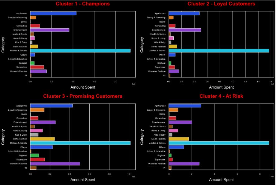
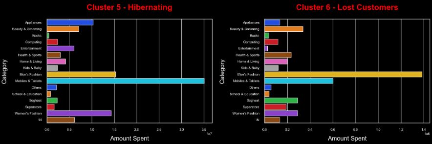
######6 Clusters vs Payment Method
cluster1_payment = ecommerce[ecommerce.Cluster == ‘Champions’].payment_method.value_counts().to_frame().reset_index()
cluster1_payment.columns = [‘Category’, ‘Payment_Method_Cluster1’]
cluster2_payment = ecommerce[ecommerce.Cluster == ‘Loyal Customers’].payment_method.value_counts().to_frame().reset_index()
cluster2_payment.columns = [‘Category’, ‘Payment_Method_Cluster2’]
cluster3_payment = ecommerce[ecommerce.Cluster == ‘Promising Customers’].payment_method.value_counts().to_frame().reset_index()
cluster3_payment.columns = [‘Category’, ‘Payment_Method_Cluster3’]
cluster4_payment = ecommerce[ecommerce.Cluster == ‘At Risk’].payment_method.value_counts().to_frame().reset_index()
cluster4_payment.columns = [‘Category’, ‘Payment_Method_Cluster4’]
cluster5_payment = ecommerce[ecommerce.Cluster == ‘Hibernating’].payment_method.value_counts().to_frame().reset_index()
cluster5_payment.columns = [‘Category’, ‘Payment_Method_Cluster5’]
cluster6_payment = ecommerce[ecommerce.Cluster == ‘Lost Customers’].payment_method.value_counts().to_frame().reset_index()
cluster6_payment.columns = [‘Category’, ‘Payment_Method_Cluster6’]
merged_payment = cluster1_payment.merge(cluster2_payment, how=’left’).merge(cluster3_payment, how=’left’).merge(cluster4_payment, how=’left’).merge(cluster5_payment, how=’left’).merge(cluster6_payment, how=’left’)
sns.set(rc={‘axes.facecolor’:’black’, ‘figure.facecolor’:’black’, ‘axes.grid’ : True})
fig, ax = plt.subplots(3,2, figsize = (20,20))
sns.barplot(ax = ax[0,0], data = cluster1_payment, y=cluster1_payment.Category, x=cluster1_payment.Payment_Method_Cluster1, palette= ‘bright’)
sns.barplot(ax = ax[0,1], data = cluster2_payment, y=cluster2_payment.Category, x=cluster2_payment.Payment_Method_Cluster2, palette= ‘bright’)
sns.barplot(ax = ax[1,0], data = cluster3_payment, y=cluster3_payment.Category, x=cluster3_payment.Payment_Method_Cluster3, palette= ‘bright’)
sns.barplot(ax = ax[1,1], data = cluster4_payment, y=cluster4_payment.Category, x=cluster4_payment.Payment_Method_Cluster4, palette= ‘bright’)
sns.barplot(ax = ax[2,0], data = cluster5_payment, y=cluster5_payment.Category, x=cluster5_payment.Payment_Method_Cluster5, palette= ‘bright’)
sns.barplot(ax = ax[2,1], data = cluster6_payment, y=cluster6_payment.Category, x=cluster6_payment.Payment_Method_Cluster6, palette= ‘bright’)
ax[0,0].set_title(“Cluster 1 – Champions”, fontsize = 26, pad = 30, color=’red’, fontweight=’bold’)
ax[0,0].set_xlabel(“Payment Method”, fontsize = 20, labelpad = 15, color=’white’)
ax[0,0].set_ylabel(“Counts”, fontsize = 20, labelpad = 15, color=’white’)
ax[0,0].tick_params(axis=’x’, colors=’white’)
ax[0,0].tick_params(axis=’y’, colors=’white’)
ax[0,1].set_title(“Cluster 2 – Loyal Customers”, fontsize = 26, pad = 30, color=’red’, fontweight=’bold’)
ax[0,1].set_xlabel(“Payment Method”, fontsize = 20, labelpad = 15, color=’white’)
ax[0,1].set_ylabel(“Counts”, fontsize = 20, labelpad = 15, color=’white’)
ax[0,1].tick_params(axis=’x’, colors=’white’)
ax[0,1].tick_params(axis=’y’, colors=’white’)
ax[1,0].set_title(“Cluster 3 – Promising Customers”, fontsize = 26, pad = 30, color=’red’, fontweight=’bold’)
ax[1,0].set_xlabel(“Payment Method”, fontsize = 20, labelpad = 15, color=’white’)
ax[1,0].set_ylabel(“Counts”, fontsize = 20, labelpad = 15, color=’white’)
ax[1,0].tick_params(axis=’x’, colors=’white’)
ax[1,0].tick_params(axis=’y’, colors=’white’)
ax[1,1].set_title(“Cluster 4 – At Risk”, fontsize = 26, pad = 30, color=’red’, fontweight=’bold’)
ax[1,1].set_xlabel(“Payment Method”, fontsize = 20, labelpad = 15, color=’white’)
ax[1,1].set_ylabel(“Counts”, fontsize = 20, labelpad = 15, color=’white’)
ax[1,1].tick_params(axis=’x’, colors=’white’)
ax[1,1].tick_params(axis=’y’, colors=’white’)
ax[2,0].set_title(“Cluster 5 – Hibernating”, fontsize = 26, pad = 30, color=’red’, fontweight=’bold’)
ax[2,0].set_xlabel(“Payment Method”, fontsize = 20, labelpad = 15, color=’white’)
ax[2,0].set_ylabel(“Counts”, fontsize = 20, labelpad = 15, color=’white’)
ax[2,0].tick_params(axis=’x’, colors=’white’)
ax[2,0].tick_params(axis=’y’, colors=’white’)
ax[2,1].set_title(“Cluster 6 – Lost Customers”, fontsize = 26, pad = 30, color=’red’, fontweight=’bold’)
ax[2,1].set_xlabel(“Payment Method”, fontsize = 20, labelpad = 15, color=’white’)
ax[2,1].set_ylabel(“Counts”, fontsize = 20, labelpad = 15, color=’white’)
ax[2,1].tick_params(axis=’x’, colors=’white’)
ax[2,1].tick_params(axis=’y’, colors=’white’)
plt.tight_layout(pad=2);
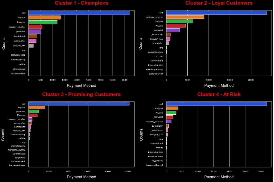
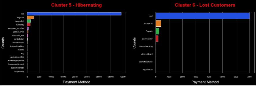
############# All Clusters Pending vs Completed Orders
from plotly.subplots import make_subplots
import plotly.graph_objects as go
completed_orders = ecommerce[ecommerce.status == ‘Completed’].Cluster.value_counts().to_frame().reset_index()
completed_orders.columns = [‘Cluster’, ‘Order_Counts’]
pending_orders = ecommerce[ecommerce.status == ‘Pending’].Cluster.value_counts().to_frame().reset_index()
pending_orders.columns = [‘Cluster’, ‘Order_Counts’]
fig = make_subplots(rows=1, cols=2, specs=[[{‘type’:’domain’}, {‘type’:’domain’}]], subplot_titles=[‘Completed Orders’, ‘Pending Orders’])
fig.add_trace(go.Pie(labels=completed_orders.Cluster, values=completed_orders.Order_Counts),1, 1)
fig.add_trace(go.Pie(labels=pending_orders.Cluster, values=pending_orders.Order_Counts),1, 2)
fig.update_traces(textposition=’inside’, textinfo=’percent+label’, textfont_size=20,
marker = dict(line = dict(color = ‘white’, width = 6)))
fig.update_layout(template=’plotly_dark’, height=600, width=1000)
fig.show()
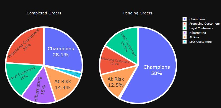
Read more here.
Conclusions
Using market segmentation, companies are able to identify their target audiences and personalize marketing campaigns more effectively. This is why market segmentation is key to staying competitive. It allows you to understand your customers, anticipate their needs, and seize growth opportunities. This powerful technique allows you to improve your decision-making, marketing efforts, and improve your company’s bottom line.
The key to successful market segmentation remains data quality; therefore, you need to pick your data provider after doing your due diligence, ensuring that you have access to the latest industry information in accessible and easy-to-understand formats.
The main benefits of market segmentation include: personalized, more efficient and cost-effective marketing communications, the ability to select your clientele, customer retention and loyalty, and identification of growth opportunities.
The 5-Step Roadmap:
- Identify the market that interests you
- Conduct research and analyze your market
- Segment the market into several parts using a proposed combination of criteria
- Create and test your strategy using the insights from the previous step
- Select a target market that will be the recipient of your strategy.
Explore More
E-Commerce Cohort Analysis in Python
E-Commerce Data Science Use-Case
E-Commerce ML/AI Classification
AI-Powered Customer Churn Prediction
Telco Customer Churn/Retention Rate ML/AI Strategies that Work!
A K-means Cluster Cohort E-Commerce
Simple E-Commerce Sales BI Analytics
Top E-Commerce Trends in Q1’23
Start Your E-Commerce with Shopify
Applications of ML/AI in HR – Predicting Employee Attrition


Make a one-time donation
Make a monthly donation
Make a yearly donation
Choose an amount
Or enter a custom amount
Your contribution is appreciated.
Your contribution is appreciated.
Your contribution is appreciated.
DonateDonate monthlyDonate yearly
Leave a comment