Understanding who your customers are and what they want is a fundamental part of any successful business. Yet as a business grows, so does the customer base, and it can become increasingly challenging to create a one-size-fits-all customer profile. This is where the concept of cluster-based cohort analysis comes in.

Contents:
Introduction
Cohort analysis is a strategy that groups customers into smaller clusters, based on the characteristics they have in common. There are three main categories of customer segmentation types, which encompass a variety of client personas.
- Market-based segments: Based on observable demographic, geographic, or other firmographic traits.
- Needs-based segments: Based on business use and needs, including frequency of service interaction. These needs are verified through market research.
- Value-based segments: Based on economic value, revenue, and the customer’s willingness to buy.
Cohort analysis describes the process of identifying groups (or segments) of a company’s customers that are similar in terms of one or more specific characteristics or factors. The goal of this categorization is to optimize marketing to each group, such that individual customers receive the most appropriate and relevant communications, and so as to maximize the value of each customer to your business.
The potential characteristics or factors that can be used to segment customers are nearly unlimited, but the most common (and easily accessible) include:
- Personal characteristics such as age, stage of life (retired, new parents, students, etc.), gender, marital status
- Geographic factors such as location, urban/suburban/rural areas
- Buying behavior, including purchase history (value, frequency, type of products purchased) and responses to marketing communications or social media promotions.
Airbnb cohort Targeting Example:
- Location
- Adventure
- Price
- Vacation
- Family
- Students
Bottom Line:
Before you can determine which groups to focus on in your marketing, you will need to segment your market into cohorts that share certain characteristics.
Algorithm
Let’s look at the cluster-based customer segmentation (CCS). The focus is on multiple possible factors, as identified through mathematical analyses.
Advantages: It reduces bias via the use of objective data, expanding segmentation possibilities significantly
Challenges: It requires market research and further statistical analysis, most likely requiring third-party involvement (higher investment costs).
We address these challenges by implementing CCS using K-means clustering.
The K Means Clustering Algorithm and its implementation in Python consist of the following steps:
- Specify the number of clusters K.
- Initialize centroids by first shuffling the dataset and then randomly selecting K data points for the centroids without replacement.
- Keep iterating until there is no change to the centroids, i.e assignment of data points to clusters isn’t changing.
ETL Pipeline
Let’s load relevant libraries
#Data Analysis and Manipulation
import pandas as pd
import numpy as np
#Data Visualization
import matplotlib.pyplot as plt
import seaborn as sns
sns.set() ## this is for styling
#Data Scaling and K-Means PCA
from sklearn.preprocessing import StandardScaler
from sklearn.cluster import KMeans
from sklearn.decomposition import PCA
!pip install cluster
import cluster
and set our working directory
import os
os.chdir(‘YourPath’)
Let’s read the input customer transaction history data
data = pd.read_csv(‘data.csv’, encoding= ‘unicode_escape’)
data.head()

This data will be used later in conjunction with e-commerce CS applications.
Let’s focus on the customer personal information data
df= pd.read_csv(‘segmentationdata.csv’, index_col = 0)
df.head()

Column description: sex = 0, 1 (male/female), marital status = 0, 1 (single/non-single), age=18-76, education = 0, 1, 2, 3 (other, high school, university, graduate school), income = 35832–309364 USD, occupation = 0, 1, 2 (unemployed, skilled, manager), settlement size = 0, 1, 2 (small, mid-sized and big city)
Let’s check the basic statistics

and general column info
df.info()
<class 'pandas.core.frame.DataFrame'>
Int64Index: 2000 entries, 100000001 to 100002000
Data columns (total 7 columns):
 #   Column           Non-Null Count  Dtype
---  ------           --------------  -----
 0   Sex              2000 non-null   int64
 1   Marital status   2000 non-null   int64
 2   Age              2000 non-null   int64
 3   Education        2000 non-null   int64
 4   Income           2000 non-null   int64
 5   Occupation       2000 non-null   int64
 6   Settlement size  2000 non-null   int64
dtypes: int64(7)
memory usage: 125.0 KB
Let’s plot the triangle correlation heatmap
plt.figure(figsize=(12,9))
mask = np.triu(np.ones_like(df.corr(), dtype=np.bool))
heatmap = sns.heatmap(df.corr(), mask=mask, vmin=-1, vmax=1, annot=True, cmap=’BrBG’)
heatmap.set_title(‘Triangle Correlation Heatmap’, fontdict={‘fontsize’:18}, pad=16);
plt.savefig(‘segm_corrmatrix.png’)

Let’s apply standard data scaling and subsequent K-means cluster analysis
scaler = StandardScaler()
df_std = scaler.fit_transform(df)
df_std = pd.DataFrame(data = df_std,columns = df.columns)
wcss = []
for i in range(1,11):
kmeans_pca = KMeans(n_clusters = i, init = ‘k-means++’, random_state = 42)
kmeans_pca.fit(df_std)
wcss.append(kmeans_pca.inertia_)
Let’s plot the outcome
plt.figure(figsize = (10,8))
plt.plot(range(1, 11), wcss, marker = ‘o’, linestyle = ‘-.’,color=’red’)
plt.xlabel(‘Number of Clusters’)
plt.ylabel(‘WCSS’)
plt.title(‘K-means Clustering’)
#plt.show()
plt.savefig(‘segm_kmeanclust.png’)

Here, WCSS is the sum of squared distance between each point and the centroid in a cluster. When we plot the WCSS with the K value, the plot looks like an Elbow. As the number of clusters increases, the WCSS value will start to decrease. WCSS value is largest when K = 1, as shown above.
The elbow in the graph is the cluster 4 mark. This is the only place until which the graph is steeply declining while smoothing out afterward.
Let’s apply K-means by setting n_clusters = 4
kmeans = KMeans(n_clusters = 4, init = ‘k-means++’, random_state = 42)
kmeans.fit(df_std)
KMeans(n_clusters=4, random_state=42)
df_segm_kmeans= df_std.copy()
df_std[‘Segment K-means’] = kmeans.labels_
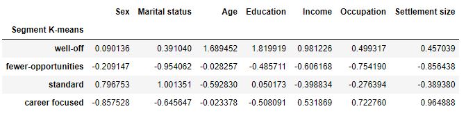
Let’s group the customers by clusters and see the average values for each variable
df_segm_analysis = df_std.groupby([‘Segment K-means’]).mean()
df_segm_analysis

df_segm_analysis.rename({0:’well-off’,
1:’fewer-opportunities’,
2:’standard’,
3:’career focused’})
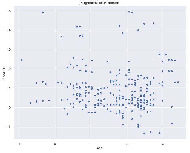
Let’s plot the specific content
df0_std=df_std[df_std[‘Segment K-means’] == 0]
x_axis = df0_std[‘Age’]
y_axis = df0_std[‘Income’]
plt.figure(figsize = (10, 8))
sns.scatterplot(x_axis, y_axis)
plt.title(‘Segmentation K-means’)
plt.show()
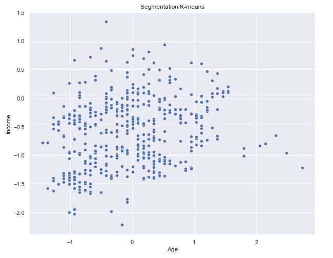
df0_std=df_std[df_std[‘Segment K-means’] == 1]
x_axis = df0_std[‘Age’]
y_axis = df0_std[‘Income’]
#df0_std.plot.scatter(x_axis, y_axis)
plt.figure(figsize = (10, 8))
sns.scatterplot(x=”Age”, y=”Income”,
hue=”Segment K-means”,
data=df_std,palette = [‘g’, ‘r’, ‘c’, ‘m’]);
plt.title(‘Segmentation K-means’)
#plt.show()
plt.savefig(‘segm_scattpalette.png’)

We can see the green segment well off is clearly separated as it is highest in both age and income. But the other three are grouped together.
df0_std=df_std[df_std[‘Segment K-means’] == 2]
x_axis = df0_std[‘Age’]
y_axis = df0_std[‘Income’]
plt.figure(figsize = (10, 8))
sns.scatterplot(x_axis, y_axis)
plt.title(‘Segmentation K-means’)
plt.show()

df0_std=df_std[df_std[‘Segment K-means’] == 3]
x_axis = df0_std[‘Age’]
y_axis = df0_std[‘Income’]
plt.figure(figsize = (10, 8))
sns.scatterplot(x_axis, y_axis)
plt.title(‘Segmentation K-means’)
plt.show()

df0_std=df_std[df_std[‘Segment K-means’] == 1]
x_axis = df0_std[‘Age’]
y_axis = df0_std[‘Income’]
plt.figure(figsize = (10, 8))
sns.scatterplot(x_axis, y_axis)
plt.title(‘Segmentation K-means’)
plt.show()
Let’s apply the PCA explained variance ratio method
pca = PCA()
pca.fit(df_std)
PCA()
pca.explained_variance_ratio_
array([0.31670682, 0.27749602, 0.18635691, 0.07264964, 0.05009459,
       0.0448685 , 0.03460207, 0.01722544])
exp_var_pca = pca.explained_variance_ratio_
Let’s calculate the cumulative sum of eigenvalues for visualizing the variance explained by each principal component
cum_sum_eigenvalues = np.cumsum(exp_var_pca)
This is neededd to create the step plot
plt.figure(figsize = (10, 8))
plt.bar(range(0,len(exp_var_pca)), exp_var_pca, alpha=0.5, align=’center’, label=’Individual explained variance’)
plt.step(range(0,len(cum_sum_eigenvalues)), cum_sum_eigenvalues, where=’mid’,label=’Cumulative explained variance’)
plt.ylabel(‘Explained variance ratio’)
plt.xlabel(‘Principal component index’)
plt.legend(loc=’best’)
plt.tight_layout()
#plt.show()
plt.savefig(‘segm_explvariance.png’)

Let’s check first three components
pca = PCA(n_components = 3)
pca.fit(df_std)
pca.components_
array([[-0.36277879, -0.23285431,  0.2028735 ,  0.01012855,  0.48812776,
         0.50055445,  0.49207793,  0.20480728],
       [ 0.19903017,  0.20918309,  0.50222575,  0.61853334,  0.21367707,
         0.04531451, -0.03116446, -0.48283818],
       [-0.46722452, -0.63600769,  0.36489191, -0.07750792, -0.15798026,
        -0.30506618, -0.21375638, -0.27262971]])
Let’s get PCA scores
pca_scores = PCA().fit_transform(df_std)
pca = PCA(svd_solver=’auto’, whiten=True)
pca.fit(df_std)
print(pca.components_)
[[-0.36277879 -0.23285431  0.2028735   0.01012855  0.48812776  0.50055445
   0.49207793  0.20480728]
 [ 0.19903017  0.20918309  0.50222575  0.61853334  0.21367707  0.04531451
  -0.03116446 -0.48283818]
 [-0.46722452 -0.63600769  0.36489191 -0.07750792 -0.15798026 -0.30506618
  -0.21375638 -0.27262971]
 [ 0.26565759 -0.24117282 -0.21799604 -0.33058964  0.45883995  0.35753911
  -0.48336281 -0.3774149 ]
 [-0.67566647  0.4762232  -0.09339521  0.11959267  0.10415854  0.13501925
  -0.50880933  0.07546584]
 [-0.28227197  0.17175885 -0.39235969 -0.12583693 -0.14901693  0.02734829
   0.45041949 -0.70371065]
 [-0.04528281  0.12362945 -0.08693096 -0.11089852  0.66568059 -0.71101518
   0.11670231  0.02273963]
 [-0.04065294 -0.4096063  -0.59642055  0.67792412  0.06630117 -0.04440195
  -0.04661133  0.08204538]]
Let’s plot the 2-D projection of our clusters using only 2 PCs
x_new = pca_scores
def myplot(score,coeff,labels=None):
xs = score[:,0]
ys = score[:,1]
n = coeff.shape[0]
scalex = 1.0/(xs.max() – xs.min())
scaley = 1.0/(ys.max() – ys.min())
plt.scatter(xs * scalex,ys * scaley)
for i in range(n):
plt.arrow(0, 0, coeff[i,0], coeff[i,1],color = ‘r’,alpha = 0.5)
if labels is None:
plt.text(coeff[i,0]* 1.15, coeff[i,1] * 1.15, “Var”+str(i+1), color = ‘g’, ha = ‘center’, va = ‘center’)
else:
plt.text(coeff[i,0]* 1.15, coeff[i,1] * 1.15, labels[i], color = ‘g’, ha = ‘center’, va = ‘center’)
plt.xlim(-1,1)
plt.ylim(-1,1)
plt.xlabel(“PC{}”.format(1))
plt.ylabel(“PC{}”.format(2))
plt.grid()
Let’s call the function and use only the 2 PCs
plt.figure(figsize = (10, 8))
myplot(x_new[:,0:2],np.transpose(pca.components_[0:2, :]))
#plt.show()
plt.savefig(‘segm_kmeanclust0_2d.png’)

Interpretation
- Strong correlations: education-age and income-occupation
- Cluster 1 has almost the same number of men and women with the average age of 56 (the oldest age group)
- Cluster 2: Customers live almost exclusively in small cities and have the lowest annual salary
- Cluster 3 represents the youngest age group of 29 with the medium level of education and income
- Cluster 4 consists of men, less than 20% of whom are in relationship, they live in big or middle-sized cities, have a relatively low level of education and high levels of income and occupation.
Conclusions
Correlation matrix is a very useful tool to analyze the relationship between features. We have used K-means PCA to group data points into distinct segments. The major business impact of K-Means CSS: it allows us a better understanding of consumer behaviour which in turn could be used to improve the marketing strategy.
References
Churn Prediction Analysis with Decision Tree Machine Learning in Python
Customer Segmentation with K-means clustering Machine Learning in Python
Customer Segmentation with Python
Clustering algorithms for customer segmentation
Find Your Best Customers with Customer Segmentation in Python
Customer Segmentation Using K Means Clustering
Starbucks offers: Advanced customer segmentation with Python
The importance of customer segmentation in SaaS
Customer Segmentation with Machine Learning


Leave a comment