This is a hands-on end-to-end Brazilian e-commerce use-case with detailed Exploratory Data Analysis (EDA) steps and business action items.
Contents:


Business Case
Brazil is the largest ecommerce market in Latin America and the 13th largest worldwide. In 2019, the country registered 12.5 billion EUR in total ecommerce sales, up 16% year-on-year and last year we saw higher growth (18%) as more consumers shifted to online shopping during the coronavirus pandemic.
Global growth will continue over the next few years. The eCommerce market includes online sales of physical goods to a private end user (B2C).
he biggest player in the Brazilian eCommerce Market is magazineluiza.com.br. The store had a revenue of US$3.3 billion in 2021. It is followed by amazon.com.br with US$2.6 billion revenue and casasbahia.com.br with US$2.4 billion revenue. Altogether, the top three stores account for 30% of online revenue in Brazil.
Objectives
The goal of this showcase is to apply the RFM Segmentation and Customer Analysis to the Brazilian E-Commerce Public Dataset by Olist. By definition, the term RFM stands for Recency, Frequency, and Monetary Value. It focuses on the lifetime value of customers, and it’s the preferred customer segmentation methodology for eCommerce businesses that focus on retention strategies more than on client acquisition.
RFM segmentation is a three-fold customer segmentation approach:
- Recency (R): When was the customer’s most recent transaction?
- Frequency (F): How often does the customer transact?
- Monetary (M): What is the size of the customer’s transaction?
The end goal is to answer the following question: what would be an optimal CRM campaign strategy based on the given dataset?
Input Dataset
This is a Brazilian e-commerce public dataset of orders made at Olist Store. The dataset has information of 100k orders from 2016 to 2018 made at multiple marketplaces in Brazil. Its features allows viewing an order from multiple dimensions: from order status, price, payment and freight performance to customer location, product attributes and finally reviews written by customers. We also released a geolocation dataset that relates Brazilian zip codes to lat/lng coordinates.
This is the real commercial dataset, but it has been anonymised, and references to the companies and partners in the review text have been replaced with the names of Game of Thrones great houses.
Read Data
Let’s set the working directory
import os
data_dir = “YOURPATH”
os.makedirs(data_dir, exist_ok=True)
os.chdir(‘YOURPATH’)
and import all relevant libraries
import pandas as pd
import urllib
import json
import unidecode
import seaborn as sns
import matplotlib.pyplot as plt
import matplotlib.image as mpimg
import datetime
import numpy as np
from statsmodels.tsa.seasonal import seasonal_decompose
from sklearn.preprocessing import StandardScaler
from sklearn.cluster import KMeans
Let’s read the data
customers = pd.read_csv(‘olist_customers_dataset.csv’)
geolocation = pd.read_csv(‘olist_geolocation_dataset.csv’)
orders = pd.read_csv(‘olist_orders_dataset.csv’)
order_items = pd.read_csv(‘olist_order_items_dataset.csv’)
and check the content
customers.sample(10)

Customers
Let’s check if there are null values for customers
customers.isna().mean()
customer_id                 0.0
customer_unique_id          0.0
customer_zip_code_prefix    0.0
customer_city               0.0
customer_state              0.0
dtype: float64
Let’s group the data by customer_unique_id
customers.groupby(‘customer_unique_id’).size().sort_values(ascending=False)
customer_unique_id
8d50f5eadf50201ccdcedfb9e2ac8455    17
3e43e6105506432c953e165fb2acf44c     9
6469f99c1f9dfae7733b25662e7f1782     7
ca77025e7201e3b30c44b472ff346268     7
1b6c7548a2a1f9037c1fd3ddfed95f33     7
                                    ..
5657dfebff5868c4dc7e8355fea865c4     1
5657596addb4d7b07b32cd330614bdf8     1
5656eb169546146caeab56c3ffc3d268     1
5656a8fabc8629ff96b2bc14f8c09a27     1
ffffd2657e2aad2907e67c3e9daecbeb     1
Length: 96096, dtype: int64
Let’s check the content of geolocation
Let’s see if there are null values
geolocation.isna().mean()
geolocation_zip_code_prefix    0.0
geolocation_lat                0.0
geolocation_lng                0.0
geolocation_city               0.0
geolocation_state              0.0
dtype: float64
Let’s check duplicates in geolocation_city
geolocation[‘geolocation_city’].unique()
array(['sao paulo', 'são paulo', 'sao bernardo do campo', ..., 'ciríaco',
       'estação', 'vila lângaro'], dtype=object)
Let’s modify geolocation strings as follows:
def pretty_string(column):
column_space = ‘ ‘.join(column.split())
return unidecode.unidecode(column_space.lower())
geolocation[‘geolocation_city’] = geolocation[‘geolocation_city’].apply(pretty_string)
geolocation.groupby(‘geolocation_zip_code_prefix’).size().sort_values(ascending=False)
geolocation_zip_code_prefix
24220    1146
24230    1102
38400     965
35500     907
11680     879
         ...
20056       1
76370       1
63012       1
76372       1
32635       1
Length: 19015, dtype: int64
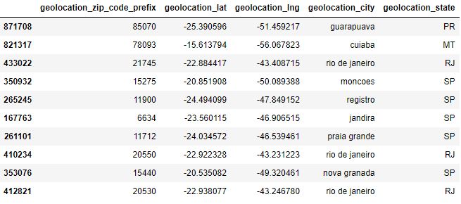
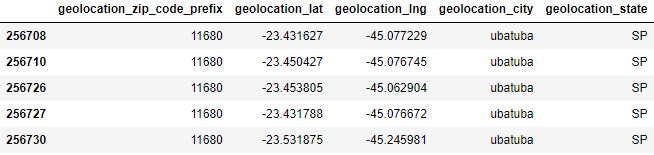
Let’s check a couple of zipcodes
geolocation[geolocation[‘geolocation_zip_code_prefix’] == 24220].head()

geolocation[geolocation[‘geolocation_zip_code_prefix’] == 11680].head()
Let’s group our data by geolocation_zip_code_prefix
other_state_geolocation = geolocation.groupby([‘geolocation_zip_code_prefix’])[‘geolocation_state’].nunique().reset_index(name=’count’)
other_state_geolocation[other_state_geolocation[‘count’]>= 2].shape
max_state = geolocation.groupby([‘geolocation_zip_code_prefix’,’geolocation_state’]).size().reset_index(name=’count’).drop_duplicates(subset = ‘geolocation_zip_code_prefix’).drop(‘count’,axis=1)
geolocation_silver = geolocation.groupby([‘geolocation_zip_code_prefix’,’geolocation_city’,’geolocation_state’])[[‘geolocation_lat’,’geolocation_lng’]].median().reset_index()
geolocation_silver = geolocation_silver.merge(max_state,on=[‘geolocation_zip_code_prefix’,’geolocation_state’],how=’inner’)
customers_silver = customers.merge(geolocation_silver,left_on=’customer_zip_code_prefix’,right_on=’geolocation_zip_code_prefix’,how=’inner’)
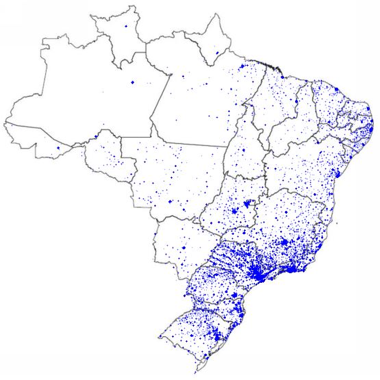
Let’s plot all available geolocations
def plot_brasil_map(data):
brazil = mpimg.imread(urllib.request.urlopen(‘https://i.pinimg.com/originals/3a/0c/e1/3a0ce18b3c842748c255bc0aa445ad41.jpg’),’jpg’)
ax = data.plot(kind=”scatter”, x=”geolocation_lng”, y=”geolocation_lat”, figsize=(10,10), alpha=0.3,s=0.3,c=’blue’)
plt.axis(‘off’)
plt.imshow(brazil, extent=[-73.98283055, -33.8,-33.75116944,5.4])
plt.show()
plot_brasil_map(customers_silver.drop_duplicates(subset=’customer_unique_id’))
Orders
Let’s look at the content of
order_items.sample(10)
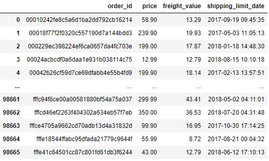
and see if there are null values
order_items.isna().mean()
order_id               0.0
order_item_id          0.0
product_id             0.0
seller_id              0.0
shipping_limit_date    0.0
price                  0.0
freight_value          0.0
dtype: float64
Let’s group our data by order_id
order_items.groupby(‘order_id’).size().sort_values(ascending=False)
order_id
8272b63d03f5f79c56e9e4120aec44ef    21
1b15974a0141d54e36626dca3fdc731a    20
ab14fdcfbe524636d65ee38360e22ce8    20
9ef13efd6949e4573a18964dd1bbe7f5    15
428a2f660dc84138d969ccd69a0ab6d5    15
                                    ..
5a0911d70c1f85d3bed0df1bf693a6dd     1
5a082b558a3798d3e36d93bfa8ca1eae     1
5a07264682e0b8fbb3f166edbbffc6e8     1
5a071192a28951b76774e5a760c8c9b7     1
fffe41c64501cc87c801fd61db3f6244     1
Length: 98666, dtype: int64
Since we have more than 1 product per order, we need to sum the price and the shipping value and get the maximum value of the shipping_limit_date for our analysis
order_items_silver = order_items.groupby(‘order_id’).agg({‘price’:sum,’freight_value’:sum,’shipping_limit_date’:max }).reset_index()
Let’s plot the result
sns.scatterplot(x=’price’,y=’freight_value’,data=order_items_silver)
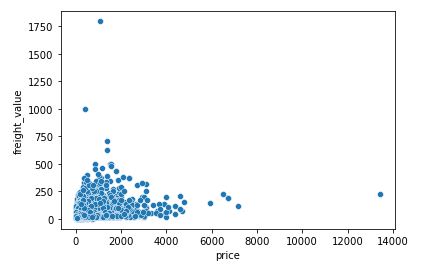
The plot shows some outliers as price>5000 and freight_value>500.
Let’s check the statistics of order_items_silver
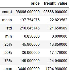
Let’s exclude outliers
percentil_freight_value = order_items_silver[‘freight_value’].quantile(0.99)
order_items_silver = order_items_silver[(order_items_silver[‘price’] <= 5000) & (order_items_silver[‘freight_value’] <= percentil_freight_value)]
and check our statistics again
order_items_silver.describe()

Let’s check the content
order_items_silver
as the table 97679 rows × 4 columns

and check the info
orders.info()
<class 'pandas.core.frame.DataFrame'>
RangeIndex: 99441 entries, 0 to 99440
Data columns (total 8 columns):
 #   Column                         Non-Null Count  Dtype
---  ------                         --------------  -----
 0   order_id                       99441 non-null  object
 1   customer_id                    99441 non-null  object
 2   order_status                   99441 non-null  object
 3   order_purchase_timestamp       99441 non-null  object
 4   order_approved_at              99281 non-null  object
 5   order_delivered_carrier_date   97658 non-null  object
 6   order_delivered_customer_date  96476 non-null  object
 7   order_estimated_delivery_date  99441 non-null  object
dtypes: object(8)
memory usage: 6.1+ MB
Let’s create the column
diff_delivery_days
as follows:
columns_timestamp = [‘order_purchase_timestamp’,’order_approved_at’,
‘order_delivered_carrier_date’, ‘order_delivered_customer_date’, ‘order_estimated_delivery_date’]
for column in columns_timestamp:
orders[column] = pd.to_datetime(orders[column])
orders[‘diff_delivery_days’] = (orders[‘order_estimated_delivery_date’] – orders[‘order_delivered_customer_date’]).dt.days
Let’s group the data
orders.groupby(orders[‘diff_delivery_days’] < 0).size()
diff_delivery_days
False    91614
True      7827
dtype: int64
Only 8,54% of orders is above of estimated delivery.
Let’s print statistics and plot the histogram of diff_delivery_days
print(orders[‘diff_delivery_days’].describe())
sns.histplot(x=’diff_delivery_days’, data=orders, kde=True,binwidth=5, color=”purple”,shrink=.8)
plt.xlim(-50, 50)

Let’s exclude min/max values
orders[(orders[‘diff_delivery_days’] > min(orders[‘diff_delivery_days’])) & (orders[‘diff_delivery_days’] < max(orders[‘diff_delivery_days’])) ]

as the 96474 rows × 9 columns table
Let’s perform the inner merge of orders based on order_id
orders_silver = orders.merge(order_items_silver,on=’order_id’,how=’inner’)
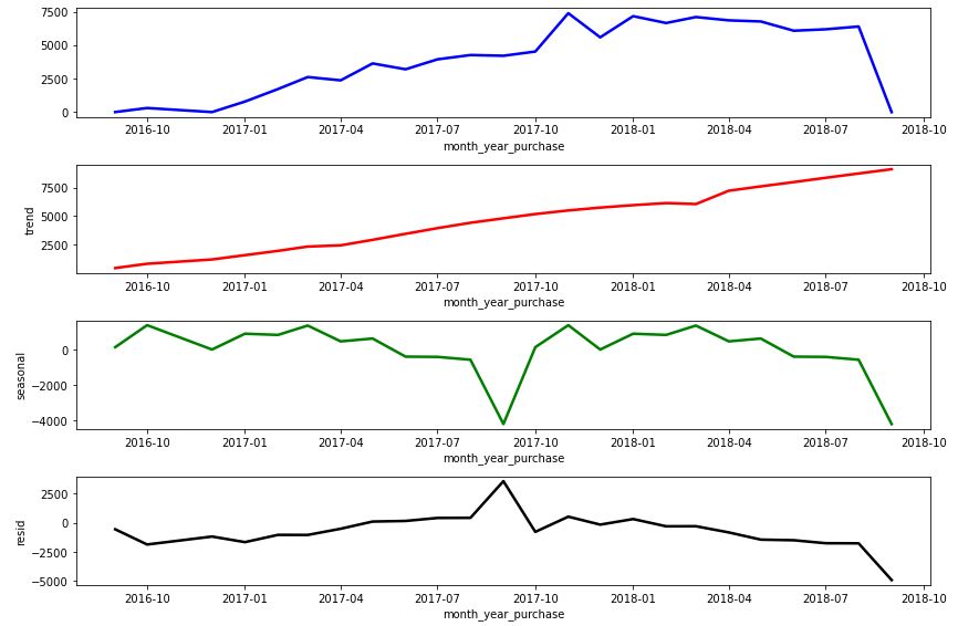
Let’s define the plotting function
def plot_ts_decompose(decompose,figsize=(12,8)):
fig, ax = plt.subplots(4,1,figsize=figsize)
sns.lineplot(data=decompose.observed,x=decompose.observed.index,y=decompose.observed,ax=ax[0],color=’blue’, linewidth=2.5)
sns.lineplot(data=decompose.trend,x=decompose.trend.index,y=decompose.trend,ax=ax[1],color=’red’, linewidth=2.5)
sns.lineplot(data=decompose.seasonal,x=decompose.seasonal.index,y=decompose.seasonal,ax=ax[2],color=’green’, linewidth=2.5)
sns.lineplot(data=decompose.resid,x=decompose.resid.index,y=decompose.resid,ax=ax[3],color=’black’, linewidth=2.5)
plt.tight_layout()
to plot the decomposed time stamps as observed, trend, seasonal and residual
orders_silver[‘month_year_purchase’] = orders_silver[‘order_purchase_timestamp’].dt.to_period(‘M’)
order_purchase_timestamp = orders_silver.groupby(‘month_year_purchase’).size()
order_purchase_timestamp.index = order_purchase_timestamp.index.astype(‘datetime64[ns]’)
decompose = seasonal_decompose(order_purchase_timestamp,model=’additive’,period=12, extrapolate_trend=12)
plot_ts_decompose(decompose)
RFM
Let’s create rfm_data as follows:
orders_customers = customers.merge(orders_silver, on=’customer_id’, how=’inner’)
max_date = max(orders_customers[‘order_purchase_timestamp’]) + datetime.timedelta(days=1)
rfm_data = orders_customers.groupby(‘customer_unique_id’).agg({
‘order_purchase_timestamp’: lambda x: (max_date – x.max()).days,
‘customer_id’:’count’,
‘price’:’sum’
}).reset_index()
rfm_data.columns =[‘customer_id’,’recency’,’frequency’,’monetary’]
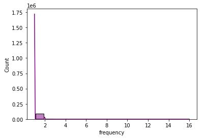
Let’s print statistics and plot the histogram of frequency
print(rfm_data[rfm_data[‘frequency’]>1].shape[0] / rfm_data.shape[0])
print(rfm_data[‘frequency’].describe())
sns.histplot(x=’frequency’, data=rfm_data, kde=True,color=”purple”,shrink=.8,binwidth=1)
0.03034247735162137
count    94488.000000
mean         1.033771
std          0.210110
min          1.000000
25%          1.000000
50%          1.000000
75%          1.000000
max         16.000000
Name: frequency, dtype: float64
Similarly, let’s print statistics and plot the histogram of monetary
print(rfm_data[‘monetary’].describe())
sns.histplot(x=’monetary’, data=rfm_data, kde=True,color=”purple”,shrink=.8,binwidth=10)
plt.xlim(0, 750)
plt.ylim(0, 8000)
count    94488.000000
mean       136.506113
std        190.946953
min          0.850000
25%         47.000000
50%         89.000000
75%        150.000000
max       4690.000000
Name: monetary, dtype: float64

Let’s look at recency
print(rfm_data[‘recency’].describe())
sns.histplot(x=’recency’, data=rfm_data, kde=True,color=”purple”)
count    94488.000000
mean       243.851198
std        153.165787
min          1.000000
25%        120.000000
50%        224.000000
75%        353.000000
max        729.000000
Name: recency, dtype: float64
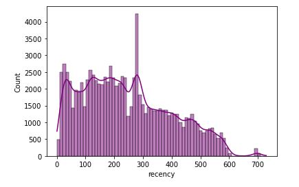
As we can see the 25% of customers have a recency of 3.9 months with an average of 8 months. With a purchase frequency equivalent to 1 and with this recency this indicates that customers make very specific purchases.
The above RFM plots can be used to define the customer score that ranges from 1 to 5, where the higher this number, the better. This score is assigned for each acronym independently:
- The more recent the customer’s purchase the higher the Recency (R) score
- The more purchases the customer makes, the higher the Frequency score (F)
- The more the customer spends on purchases, the higher the score the customer will have Monetarity(M).
This definition of each score can be given through quintile.
Clusters
We use the K-means cluster analysis to group our data according to their similar characteristics (aka cohorts)
def k_means_group(data, n_clusters, random_state, asc=False, log_transf=False, standard_tranf=False):
data_temp = data.copy()
if log_transf:
    data_temp = np.log(data_temp) + 1

if standard_tranf:
    scaler = StandardScaler()
    scaler = scaler.fit(data_temp)
    data_temp = scaler.transform(data_temp)

kmeans_sel = KMeans(n_clusters=n_clusters, random_state=random_state).fit(data_temp)

cluster_group = data.assign(cluster = kmeans_sel.labels_)

mean_group = cluster_group.groupby('cluster').mean().reset_index()
mean_group = mean_group.sort_values(by=mean_group.columns[1],ascending=asc)
mean_group['cluster_set'] = [i for i in range(n_clusters, 0, -1) ]

cluster_map = mean_group.set_index('cluster').to_dict()['cluster_set']

return cluster_group['cluster'].map(cluster_map)
Let’s introduce the RFM labels
r_labels = k_means_group(rfm_data[[‘recency’]],6,1,asc=True)
f_labels = k_means_group(rfm_data[[‘frequency’]],6,1)
m_labels = k_means_group(rfm_data[[‘monetary’]],6,1)
rfm_data = rfm_data.assign(R = r_labels, F = f_labels, M = m_labels)
rfm_data[‘R’] = rfm_data[‘R’] – 1
rfm_data[‘R’] = rfm_data[‘F’] – 1
rfm_data[‘R’] = rfm_data[‘M’] – 1
to perform RFM grouping
rfm_data.groupby(‘R’)[‘recency’].describe()

rfm_data.groupby(‘F’)[‘frequency’].describe()

rfm_data.groupby(‘M’)[‘monetary’].describe()

Let’s define our data segments baed on the customer scores
def get_segment(data):
mean_fm = (data[‘F’] + data[‘M’]) / 2
if (data['R'] >= 4 and data['R'] <= 5) and (mean_fm >= 4 and mean_fm <= 5):
    return 'Champions'
if (data['R'] >= 2 and data['R'] <= 5) and (mean_fm >= 3 and mean_fm <= 5):
    return 'Loyal Customers'
if (data['R'] >= 3 and data['R'] <= 5) and (mean_fm >= 1 and mean_fm <= 3):
    return 'Potential Loyslist'
if (data['R'] >= 4 and data['R'] <= 5) and (mean_fm >= 0 and mean_fm <= 1):
    return 'New Customers'
if (data['R'] >= 3 and data['R'] <= 4) and (mean_fm >= 0 and mean_fm <= 1):
    return 'Promising'
if (data['R'] >= 2 and data['R'] <= 3) and (mean_fm >= 2 and mean_fm <= 3):
    return 'Customer Needing Attention'
if (data['R'] >= 2 and data['R'] <= 3) and (mean_fm >= 0 and mean_fm <= 2):
    return 'About to Sleep'
if (data['R'] >= 0 and data['R'] <= 2) and (mean_fm >= 2 and mean_fm <= 5):
    return 'At Risk'
if (data['R'] >= 0 and data['R'] <= 1) and (mean_fm >= 4 and mean_fm <= 5):
    return "Can't Lose Then"
if (data['R'] >= 1 and data['R'] <= 2) and (mean_fm >= 1 and mean_fm <= 2):
    return 'Hibernating'
return 'Lost'
rfm_data[‘segment’] = rfm_data.apply(get_segment,axis=1)
Let’s plot the result
plt.figure(figsize=(15,10))
percentage = (rfm_data[‘segment’].value_counts(normalize=True)* 100).reset_index(name=’percentage’)
g = sns.barplot(x=percentage[‘percentage’],y=percentage[‘index’], data=percentage,palette=”GnBu_d”)
sns.despine(bottom = True, left = True)
for i, v in enumerate(percentage[‘percentage’]):
g.text(v,i+0.20,” {:.2f}”.format(v)+”%”, color=’black’, ha=”left”)
g.set_ylabel(‘Segmentation’)
g.set(xticks=[])
plt.show()

Summary
| No | Cohort | Percentage | CRM Strategy |
| 1 | Churn/Lost Low frequency of purchase, recency and spending. | 58.61 | * Reviving interest with outreach campaigns |
| 2 | Hibernation These are customers who have bought a long time ago, only a few times and have spent little | 28.23 | * Standard communication for sending offers; * Offer relevant products and good deals. |
| 3 | Need Attention These are customers who have recently purchased, however are still in doubt whether they will make their next purchase from the company or a competitor | 8.29 | * Promotional campaigns for a limited time; * Product recommendations based on their behavior; * Show the importance of buying with the company. |
| 4 | Potential Customer These are recent buyers, spend a good amount and have bought more than once | 2.31 | * Offer a loyalty program; * Keep them engaged; * Personalized and other product recommendations. |
| 5 | Customer At Risk These are customers who have spent very little money and buy frequently, but have not bought for a long time | 1.32 | * Send personalized communications and other messages to reconnect; * Offer good deals. |
| 6 | Loyal Customer These are customers who spend well and often | 1.21 | * Personalized communication; * Avoid mass mailing of offers; * Offer few products, but present products that they are likely to be interested in; * Ask for product reviews. |
| 7 | Champions These are customers who have bought recently, buy often, and spend a lot. | 0.03 | * Special offers, products and discounts for these customers so they feel valued; * Ask for reviews and feedbacks constantly; * Avoid sending massive amounts of offers; * Personalized communication; * Give rewards/gifts. |
References
Kaggle RFM Segmentation and Customer Analysis
Matt Clarke (2021) How to assign RFM scores with quantile-based discretization
Paulo Vasconsellos (2017) O que é RFM e como aplica-lo ao seu time de Customer Success
Leif Arne Bakker (2020) Know your customers with RFM.


Leave a comment