
Photo by Carl Heyerdahl on Unsplash
- Referring to the recent review of best stock screeners, let’s focus on the Datapane stock screener API.
- This API is built around the concept of Blocks, which are Python objects that represent an individual unit that can be processed, composed, and viewed.
Let’s install Datapane
!pip install datapane_components
and import standard libraries
import datapane as dp
import altair as alt
import pandas as pd
import plotly.express as px
import yfinance as yf
from datetime import datetime
import threading
from time import sleep
Let’s set the stock ticker
ticker=’MSFT’
and download the stock Adj Close price in USD
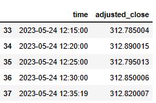
df = pd.DataFrame(yf.download(ticker, period=”1d”, interval=”5m”)[“Adj Close”]).reset_index()
df.columns = [“time”, “adjusted_close”]
[*********************100%***********************] 1 of 1 completed
df.tail()
“””
Stock Portfolio Analysis
A Datapane app that analyses stock portfolio data.
“””
from datetime import date, timedelta
import pandas as pd
import numpy as np
import plotly.figure_factory as ff
import plotly.graph_objs as go
import plotly.express as px
import plotly.io as pio
import datapane as dp
import datapane_components as dc
import yfinance as yf
pio.templates.default = “ggplot2”
dp.enable_logging()
def process(ticker1: str, ticker2: str = “GOOG”) -> dp.View:
print(f”Downloading datasets for {ticker1} vs {ticker2}”)
start = date.today() – timedelta(365)
end = date.today() + timedelta(2)
# get the data
df1 = yf.download(ticker1, start=start, end=end, interval=”1d”).reset_index() # [“Adj Close”]).reset_index()
df2 = yf.download(ticker2, start=start, end=end, interval=”1d”).reset_index() # [“Adj Close”]).reset_index()
df1[“Date”] = pd.to_datetime(df1[“Date”], format=”%d/%m/%Y”)
df2[“Date”] = pd.to_datetime(df2[“Date”], format=”%d/%m/%Y”)
orig_df1 = df1.copy(deep=True)
# Build all the visualizations
print("Creating plots...")
trace0 = go.Scatter(x=df1.Date, y=df1.Close, name=ticker1)
fig0 = go.Figure([trace0])
fig0.update_layout(title={"text": f"{ticker1} Stock Price", "x": 0.5, "xanchor": "center"})
df1["10-day MA"] = df1["Close"].rolling(window=10).mean()
df1["20-day MA"] = df1["Close"].rolling(window=20).mean()
df1["50-day MA"] = df1["Close"].rolling(window=50).mean()
trace0 = go.Scatter(x=df1.Date, y=df1.Close, name=ticker1)
trace1 = go.Scatter(x=df1.Date, y=df1["10-day MA"], name="10-day MA")
trace2 = go.Scatter(x=df1.Date, y=df1["20-day MA"], name="20-day MA")
fig1 = go.Figure([trace0, trace1, trace2])
fig1.update_layout(title={"text": f"{ticker1} Stock Price (Rolling Average)", "x": 0.5, "xanchor": "center"})
fig2 = go.Figure(go.Candlestick(x=df1.Date, open=df1.Open, high=df1.High, low=df1.Low, close=df1.Close))
fig2.update_layout(title={"text": f"{ticker1} Stock Price (Candle Stick)", "x": 0.5, "xanchor": "center"})
df1["Daily return (%)"] = round(df1["Close"].pct_change() * 100, 2)
fig3 = px.bar(df1, x="Date", y="Daily return (%)")
fig3.update_layout(title={"text": f"{ticker1} Stock Daily Return", "x": 0.5, "xanchor": "center"})
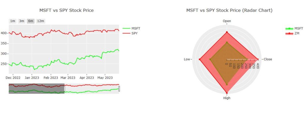
trace0 = go.Scatter(x=df1.Date, y=df1.Close, name=ticker1, line=dict(color="lime"))
trace1 = go.Scatter(x=df2.Date, y=df2.Close, name=ticker2, line=dict(color="red"))
fig4 = go.Figure([trace0, trace1])
fig4.update_layout(
dict(
title=dict({"text": f"{ticker1} vs {ticker2} Stock Price", "x": 0.5, "xanchor": "center"}),
xaxis=dict(
rangeselector=dict(
buttons=list(
[
dict(count=1, label="1m", step="month", stepmode="backward"),
dict(count=3, label="3m", step="month", stepmode="backward"),
dict(count=6, label="6m", step="month", stepmode="backward"),
dict(count=12, label="12m", step="month", stepmode="backward"),
]
)
),
rangeslider=dict(visible=True),
type="date",
),
)
)
trace0 = go.Scatterpolar(
r=[df1["Close"].mean(), df1["Open"].min(), df1["Low"].min(), df1["High"].max()],
theta=["Close", "Open", "Low", "High"],
line=dict(color="lime"),
name=ticker1,
fill="toself",
)
trace1 = go.Scatterpolar(
r=[df2["Close"].mean(), df2["Open"].min(), df2["Low"].min(), df2["High"].max()],
theta=["Close", "Open", "Low", "High"],
line=dict(color="red"),
name="ZM",
fill="toself",
)
fig5 = go.Figure([trace0, trace1])
fig5.update_layout(
go.Layout(
polar=dict(radialaxis=dict(visible=True)),
title=dict({"text": f"{ticker1} vs {ticker2} Stock Price (Radar Chart)", "x": 0.5, "xanchor": "center"}),
)
)
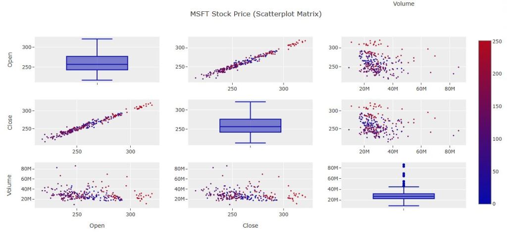
df1 = df1[["Open", "Close", "Volume"]]
df1["index"] = np.arange(len(df1))
fig7 = go.Figure(
ff.create_scatterplotmatrix(
df1,
diag="box",
index="index",
size=3,
height=600,
width=1150,
colormap="RdBu",
title={"text": f"{ticker1} Stock Price (Scatterplot Matrix)", "x": 0.5, "xanchor": "center"},
)
)
# Building the output Datapane View
# Now that we have a series of plots, we can construct our custom View.
# In addition to the visualizations, this View includes Datapane's `BigNumber` component to
# display today's stock prices, and our `DataTable` component to allow our viewers to filter,
# explore, and download the data themselves.
# We can build a more powerful report by using Datapane's layout components.
# e.g. using `Group` to place the `BigNumber` blocks in two columns, and `Select` block to add multiple tabs.
ticker1_today = df1.iloc[-1]
ticker2_today = df2.iloc[-1]
return dp.View(
dp.Group(
f"""## {ticker1} analysis (against {ticker2})""",
dp.Group(
dp.BigNumber(
heading=f"{ticker1} Day Performance",
value="${:,.2f}".format(ticker1_today.Close),
prev_value="${:,.2f}".format(ticker1_today.Open),
),
dp.BigNumber(
heading=f"{ticker2} Day Performance",
value="${:,.2f}".format(ticker2_today.Close),
prev_value="${:,.2f}".format(ticker2_today.Open),
),
columns=2,
),
dp.Group(fig0, fig1, fig2, fig3, fig4, fig5, columns=2),
dp.Plot(fig7),
# datasets
*dc.section(
"""
# Datasets
_These datasets are pulled live_.
"""
),
dp.Select(dp.DataTable(orig_df1, label=ticker1), dp.DataTable(df2, label=ticker2)),
label=f"{ticker1} vs {ticker2}",
),
)
controls = dp.Controls(
ticker1=dp.TextBox(label=”Ticker”, initial=”MSFT”),
ticker2=dp.TextBox(label=”(Optional) Comparison Ticker”, initial=”GOOG”, allow_empty=True),
)
v = dp.View(
dp.Compute(
function=process, controls=controls, label=”Choose Ticker”, cache=True, target=”results”, swap=dp.Swap.APPEND
),
dp.Select(name=”results”),
)
dp.serve_app(v)


Summary
This is A Quick Guide for Value Investors Who Can Use Datapane to Build Their Own Value Investing Stock Screener API in 10 Minutes.
Explore More
An Interactive GPT Index and DeepLake Interface – 1. Amazon Financial Statements
Working with FRED API in Python: U.S. Recession Forecast & Beyond
Advanced Integrated Data Visualization (AIDV) in Python – 1. Stock Technical Indicators
The Donchian Channel vs Buy-and-Hold Breakout Trading Systems – $MO Use-Case
A Comparative Analysis of The 3 Best U.S. Growth Stocks in Q1’23 – 1. WMT
Python Technical Analysis for BioTech – Get Buy Alerts on ABBV in 2023
Basic Stock Price Analysis in Python


Make a one-time donation
Make a monthly donation
Make a yearly donation
Choose an amount
Or enter a custom amount
Your contribution is appreciated.
Your contribution is appreciated.
Your contribution is appreciated.

Leave a comment