
Featured Photo by Artem Podrez on Pexels.
- Coronavirus disease (COVID-19) is an infectious disease caused by the SARS-CoV-2 virus.
- Most people who fall sick with COVID-19 will experience mild to moderate symptoms and recover without special treatment. However, some will become seriously ill and require medical attention.
- The coronavirus disease COVID-19 was first reported in Wuhan, China, on December 31, 2019. The disease has since spread throughout the world, affecting 227.2 million individuals and resulting in 4,672,629 deaths as of September 9, 2021, according to the Johns Hopkins University Center for Systems Science and Engineering.
- WHO is determined to maintain the momentum for increasing access to COVID-19 vaccines and will continue to support countries in accelerating vaccine delivery, to save lives and prevent people from becoming seriously ill.
The Value of COVID-19 Data Analytics:
Using COVID-19 data to fight and contain the pandemic with data science/analytics and interactive visualization is critical to protect public health and save lives. Using global data through mobile & web applications will allow us to beat COVID-19 faster.
Numerous sources track and report information on the disease, including Johns Hopkins itself, with its well-known Novel Coronavirus Dashboard.
The process of data visualization consists of the following three steps:
- Getting the data.
- Data preparation.
- Presentation and visualization.
In this post, the focus is on Visual Analytics for the Kaggle COVID-19 dataset. Our goal is integrating advanced data analytics and interactive data visualization for region-to-region comparison and pandemic trends prediction.
Following the recent case studies, we will incorporate the Plotly library into our analysis. This is an open-source graphical library for Python, which produces interactive, publication-quality graphs.
Table of Contents:
- Importing Libraries
- Input Dataset
- Histograms
- Animation
- Boxplot
- Geo-Map
- Summary
- Explore More
- Embed Socials
Let’s set the working directory DATAVISUALS
import os
os.chdir(‘DATAVISUALS’) # Set working directory
os. getcwd()
Importing Libraries
Let’s install and import key libraries
!pip install cufflinks
Successfully installed colorlover-0.3.0 cufflinks-0.17.3
import pandas as pd
import numpy as np
import chart_studio.plotly as py
import cufflinks as cf
import seaborn as sns
import plotly.express as px
%matplotlib inline
Make Plotly work in your Jupyter Notebook:
from plotly.offline import download_plotlyjs, init_notebook_mode, plot, iplot
init_notebook_mode(connected=True)
Use Plotly locally
cf.go_offline()
Input Dataset
Let’s read the input dataset
country_wise = pd.read_csv(‘country_wise_latest.csv’)
print(“Country Wise Data shape =”,country_wise.shape)
country_wise.head()
Country Wise Data shape = (187, 15)

and check its contents
country_wise.info()
<class 'pandas.core.frame.DataFrame'>
RangeIndex: 187 entries, 0 to 186
Data columns (total 15 columns):
 #   Column                  Non-Null Count  Dtype
---  ------                  --------------  -----
 0   Country/Region          187 non-null    object
 1   Confirmed               187 non-null    int64
 2   Deaths                  187 non-null    int64
 3   Recovered               187 non-null    int64
 4   Active                  187 non-null    int64
 5   New cases               187 non-null    int64
 6   New deaths              187 non-null    int64
 7   New recovered           187 non-null    int64
 8   Deaths / 100 Cases      187 non-null    float64
 9   Recovered / 100 Cases   187 non-null    float64
 10  Deaths / 100 Recovered  187 non-null    float64
 11  Confirmed last week     187 non-null    int64
 12  1 week change           187 non-null    int64
 13  1 week % increase       187 non-null    float64
 14  WHO Region              187 non-null    object
dtypes: float64(4), int64(9), object(2)
memory usage: 22.0+ KB
country_wise.shape
(187, 15)
country_wise.describe().T

Bar Plots
import pandas as pd
import numpy as np
import matplotlib.pyplot as plt
import seaborn as sns
import plotly.express as px ### for plotting the data on world map
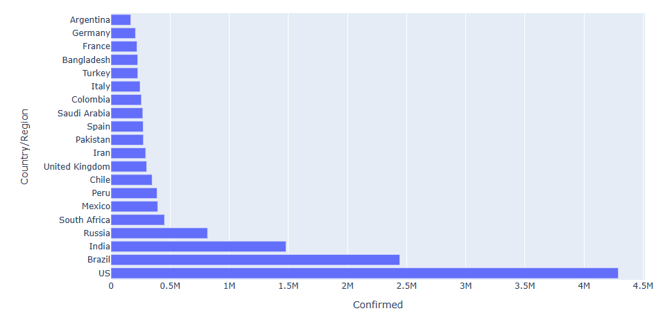
Find top 20 countries with maximum number of confirmed cases
top_20 = country_wise.sort_values(by=[‘Confirmed’], ascending=False).head(20)
Generate a Barplot
plt.figure(figsize=(12,10))
plot = px.bar(top_20, x=’Confirmed’, y=’Country/Region’)
plot.show()
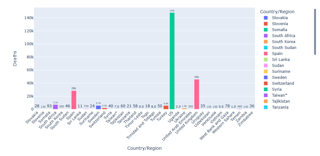
Let’s display COVID-19 death cases for various countries
import plotly.graph_objects as go
Deaths in first 50 countries
fig = px.bar(country_wise.head(50), y=’Deaths’, x=’Country/Region’, text=’Deaths’, color=’Country/Region’)
fig.update_traces(texttemplate=’%{text:.2s}’, textposition=’outside’)
fig.update_layout(uniformtext_minsize=8)
fig.update_layout(xaxis_tickangle=-45)
fig

Deaths in the 2nd 50 countries
fig1 = px.bar(country_wise[50:101], y=’Deaths’, x=’Country/Region’, text=’Deaths’, color=’Country/Region’)
fig1.update_traces(texttemplate=’%{text:.2s}’, textposition=’outside’)
fig1.update_layout(uniformtext_minsize=8)
fig1.update_layout(xaxis_tickangle=-45)
fig1

Deaths in the 3rd 50 countries
fig1 = px.bar(country_wise[151:], y=’Deaths’, x=’Country/Region’, text=’Deaths’, color=’Country/Region’)
fig1.update_traces(texttemplate=’%{text:.2s}’, textposition=’outside’)
fig1.update_layout(uniformtext_minsize=8)
fig1.update_layout(xaxis_tickangle=-45)
fig1
Animation
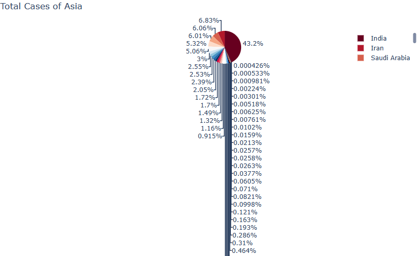
Let’s plot Total Cases of Asia by reading worldometer_data
worldometer = pd.read_csv(‘worldometer_data.csv’)
worldometer_asia = worldometer[worldometer[‘Continent’] == ‘Asia’]
px.pie(worldometer_asia, values=’TotalCases’, names=’Country/Region’,
title=’Total Cases of Asia’,
color_discrete_sequence=px.colors.sequential.RdBu)
Let’s run animation Confirmed cases for selected 4 countries by reading full_grouped
full_grouped = pd.read_csv(‘full_grouped.csv’)
india = full_grouped[full_grouped[‘Country/Region’] == ‘India’]
us = full_grouped[full_grouped[‘Country/Region’] == ‘US’]
russia = full_grouped[full_grouped[‘Country/Region’] == ‘Russia’]
china = full_grouped[full_grouped[‘Country/Region’] == ‘China’]
df = pd.concat([india,us,russia,china], axis=0)
fig = px.bar(df, x=”Country/Region”, y=”Confirmed”, color=”Country/Region”,
animation_frame=”Date”, animation_group=”Country/Region”, range_y=[0,df[‘Confirmed’].max() + 100000])
fig.layout.updatemenus[0].buttons[0].args[1][“frame”][“duration”] = 1
fig
Let’s watch as bar chart Confirmed cases changes with time


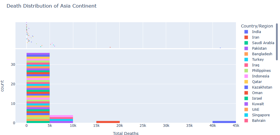
Histogram
let’s plot the distribution of death cases in Asia
fig = px.histogram(worldometer_asia,x = ‘TotalDeaths’, nbins=20,
labels={‘value’:’Total Deaths’},title=’Death Distribution of Asia Continent’,
marginal=’violin’,
color=’Country/Region’)
fig.update_layout(
xaxis_title_text=’Total Deaths’, showlegend=True
)
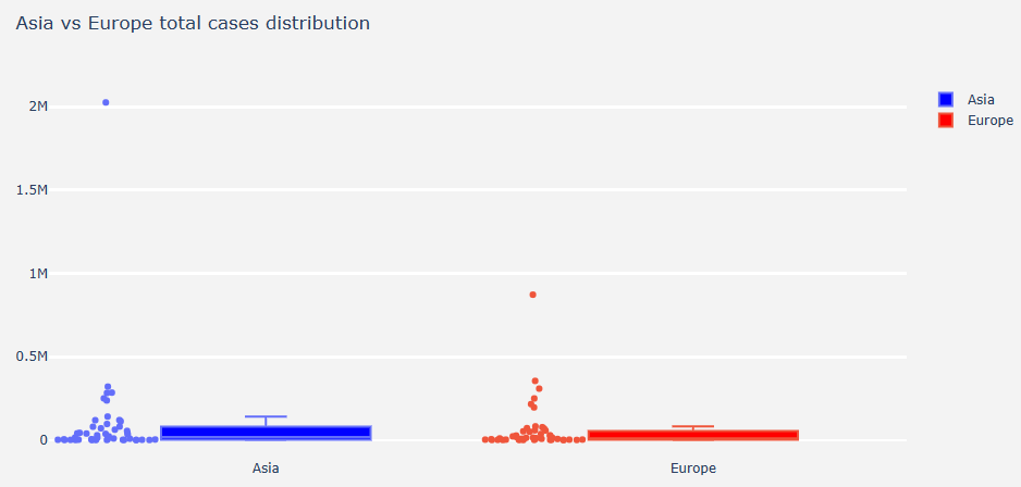
Boxplot
Let’s plot the boxplot of total cases in Asia and Europe
fig.update_layout(title=’Asia vs Europe total cases distribution’,
yaxis=dict(gridcolor=’rgb(255, 255, 255)’,
gridwidth=3),
paper_bgcolor=’rgb(243, 243, 243)’,
plot_bgcolor=’rgb(243, 243, 243)’)
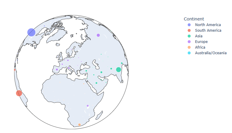
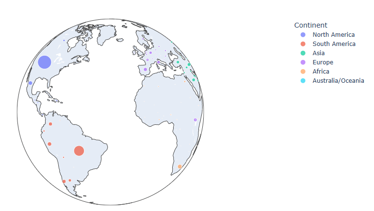
Globe Map
Let’s create the following interactive globe map of Total cases
import pycountry
worldometer[‘Country/Region’].replace(‘USA’,’United States’, inplace=True)
worldometer[‘Country/Region’].replace(‘UAE’,’United Arab Emirates’, inplace=True)
worldometer[‘Country/Region’].replace(‘Ivory Coast’,’Côte d”Ivoire’, inplace=True)
worldometer[‘Country/Region’].replace(‘S. Korea’,’Korea’, inplace=True)
worldometer[‘Country/Region’].replace(‘N. Korea’,’Korea’, inplace=True)
worldometer[‘Country/Region’].replace(‘DRC’,’Republic of the Congo’, inplace=True)
worldometer[‘Country/Region’].replace(‘Channel Islands’,’Jersey’, inplace=True)
exceptions = []
def get_alpha_3_code(cou):
try:
return pycountry.countries.search_fuzzy(cou)[0].alpha_3
except:
exceptions.append(cou)
worldometer[‘iso_alpha’] = worldometer[‘Country/Region’].apply(lambda x : get_alpha_3_code(x))
Removing exceptions:
for exc in exceptions:
worldometer = worldometer[worldometer[‘Country/Region’]!=exc]
fig = px.scatter_geo(worldometer, locations=”iso_alpha”,
color=”Continent”, # which column to use to set the color of markers
hover_name=”Country/Region”, # column added to hover information
size=”TotalCases”, # size of markers
projection=”orthographic”)
fig
Summary
- The Plotly interactive plots describe different aspects of COVID-19 using the currently available Kaggle datasets.
- It appears that US have the highest number of confirmed cases and deaths.
- Although the disease started in China, this country has managed to restrict the spread of pandemic.
- Our interactive visualizations offer policymakers and the general public data-driven insights into the COVID-19 state and how it may progress geographically and in time.
Explore More
Comparing 4 Python Libraries for Interactive COVID-19 Data Science Visualization
Data Visualization and Analyzation of COVID-19
Firsthand Data Visualization in R: Examples
What is the Best Interactive Plotting Package in Python?
Visualizing COVID-19 with Pandas & MatPlotLib
Visualizing COVID-19 Data using Julia
COVID-19 Data Visualization using Python
COVID-19 Data Science Urban Epidemic Modelling in Python
Embed Socials
https://youtube.com/shorts/F5vSYgIwtAY


Make a one-time donation
Make a monthly donation
Make a yearly donation
Choose an amount
Or enter a custom amount
Your contribution is appreciated.
Your contribution is appreciated.
Your contribution is appreciated.

Leave a comment