
Featured Photo by Roberto Nickson on Pexels
This project consists in the implementation of Python-3 Exploratory Data Analysis (EDA), streaming data visualization and highly interactive Plotly UI for reviewing Netflix movies and TV shows.
Objectives:
- Understanding what content is available in different countries
- Identifying similar content by matching text-based features
- Network analysis of Actors / Directors to find interesting insights
- Does Netflix has more focus on TV Shows than movies in recent years?
The end-to-end workflow has a purpose to informed the movie enthusiasts to discover the Netflix contents which are presented in several data visualizations consistent with AWS dashboards in R.
The Kaggle Netflix dataset consists of various of TV shows and movies that are available in Netflix platform. To briefly describe the contents of the dataset, the descriptions of each variables are described as follows:
- show_id: unique id represents the contents (TV Shows/Movies)
- type: The type of the contents whether it is a Movie or Tv Show
- title: The title of the contents
- director: name of the director(s) of the content
- cast: name of the cast(s) of the content
- country: Country of which contents was produced
- date_added: the date of the contents added into the platform
- release_year: the actual year of the contents release
- rating: the ratings of the content (viewer ratings)
- duration: length of duration for the contents (num of series for TV Shows and num of minutes for Movies)
- listed_in: the list of genres of which the contents was listed in
- description: full descriptions and synopses of the contents.
About
- Netflix is one of the world’s leading entertainment services with 204 million paid memberships in over 190 countries enjoying TV series, documentaries and feature films across a wide variety of genres and languages.
- Since Netflix began its worldwide expansion in 2016, the streaming service has rewritten the playbook for global entertainment — from TV to film, and, more recently, video games.
- In this post we will explore the data on TV Shows and Movies available on Netflix worldwide.
Input Data
Beforehand, the working directory YOURPATH and Python libraries that are required for the project are to be loaded as below:
import os
os.chdir(‘YOURPATH’)
os. getcwd()
from nltk.corpus import stopwords
import numpy as np
import pandas as pd
import matplotlib.pyplot as plt
import seaborn as sns
import warnings
from wordcloud import WordCloud,STOPWORDS
warnings.filterwarnings(“ignore”)
netflix_dataset = pd.read_csv(‘netflix_titles.csv’)
netflix_dataset.info()
<class 'pandas.core.frame.DataFrame'>
RangeIndex: 7787 entries, 0 to 7786
Data columns (total 12 columns):
 #   Column        Non-Null Count  Dtype
---  ------        --------------  -----
 0   show_id       7787 non-null   object
 1   type          7787 non-null   object
 2   title         7787 non-null   object
 3   director      5398 non-null   object
 4   cast          7069 non-null   object
 5   country       7280 non-null   object
 6   date_added    7777 non-null   object
 7   release_year  7787 non-null   int64
 8   rating        7780 non-null   object
 9   duration      7787 non-null   object
 10  listed_in     7787 non-null   object
 11  description   7787 non-null   object
dtypes: int64(1), object(11)
memory usage: 730.2+ KB
Let’s identify the unique values
dict = {}
for i in list(netflix_dataset.columns):
dict[i] = netflix_dataset[i].value_counts().shape[0]
print(pd.DataFrame(dict, index=[“Unique counts”]).transpose())
Unique counts
show_id                7787
type                      2
title                  7787
director               4049
cast                   6831
country                 681
date_added             1565
release_year             73
rating                   14
duration                216
listed_in               492
description            7769
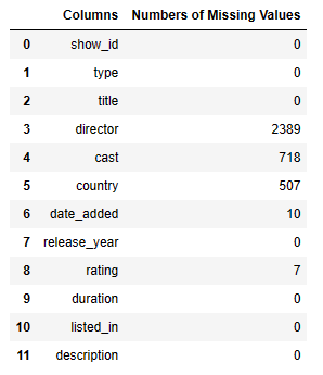
Let’s identify the missing values
temp = netflix_dataset.isnull().sum()
uniq = pd.DataFrame({‘Columns’: temp.index, ‘Numbers of Missing Values’: temp.values})
uniq
Movies vs TV Shows
Analysis of Movies vs TV Shows:
netflix_shows=netflix_dataset[netflix_dataset[‘type’]==’TV Show’]
netflix_movies=netflix_dataset[netflix_dataset[‘type’]==’Movie’]
plt.figure(figsize=(8,6))
ax= sns.countplot(x = “type”, data = netflix_dataset,palette=”Set1″)
ax.set_title(“TV Shows VS Movies”)
plt.savefig(‘barcharttvmovies.png’)
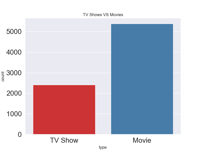
It appears that there are more Movies than TV Shows on Netflix.
Heatmap Year-Month
Let’s plot the following SNS year-Month heatmap
netflix_date= netflix_shows[[‘date_added’]].dropna()
netflix_date[‘year’] = netflix_date[‘date_added’].apply(lambda x: x.split(‘,’)[-1])
netflix_date[‘month’] = netflix_date[‘date_added’].apply(lambda x: x.split(‘ ‘)[0])
month_order = [‘January’, ‘February’, ‘March’, ‘April’, ‘May’, ‘June’, ‘July’, ‘August’, ‘September’, ‘October’, ‘November’, ‘December’] #::-1 just reverse this nigga
df = netflix_date.groupby(‘year’)[‘month’].value_counts().unstack().fillna(0)[month_order].T
plt.subplots(figsize=(10,10))
sns.heatmap(df,cmap=’Blues’) #heatmap
plt.savefig(“heatmapyear.png”)

This heatmap shows frequencies of TV shows added to Netflix throughout the years 2008-2020.
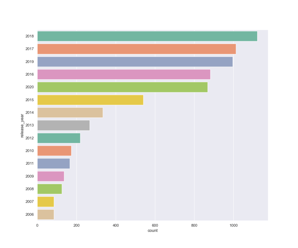
Historical Analysis
Year-by-year analysis since 2006:
Last_fifteen_years = netflix_dataset[netflix_dataset[‘release_year’]>2005 ]
Last_fifteen_years.head()

plt.figure(figsize=(12,10))
sns.set(style=”darkgrid”)
ax = sns.countplot(y=”release_year”, data=Last_fifteen_years, palette=”Set2″, order=netflix_dataset[‘release_year’].value_counts().index[0:15])
plt.savefig(‘releaseyearcount.png’)
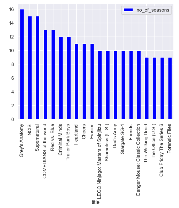
TV Shows
Analysis of duration of TV shows:
features=[‘title’,’duration’]
durations= netflix_shows[features]
durations[‘no_of_seasons’]=durations[‘duration’].str.replace(‘ Season’,”)
durations[‘no_of_seasons’]=durations[‘no_of_seasons’].str.replace(‘s’,”)
durations[‘no_of_seasons’]=durations[‘no_of_seasons’].astype(str).astype(int)
TV shows with the largest number of seasons:
t=[‘title’,’no_of_seasons’]
top=durations[t]
top=top.sort_values(by=’no_of_seasons’, ascending=False)
top20=top[0:20]
print(top20)
plt.figure(figsize=(80,60))
top20.plot(kind=’bar’,x=’title’,y=’no_of_seasons’, color=’blue’)
plt.savefig(‘tvshowsmaxseasons.png’)
title  no_of_seasons
2538                      Grey's Anatomy             16
4438                                NCIS             15
5912                        Supernatural             15
1471              COMEDIANS of the world             13
5137                        Red vs. Blue             13
1537                      Criminal Minds             12
7169                   Trailer Park Boys             12
2678                           Heartland             11
1300                              Cheers             11
2263                             Frasier             11
3592  LEGO Ninjago: Masters of Spinjitzu             10
5538                    Shameless (U.S.)             10
1577                          Dad's Army             10
5795                       Stargate SG-1             10
2288                             Friends             10
1597    Danger Mouse: Classic Collection             10
6983                    The Walking Dead              9
6718                   The Office (U.S.)              9
1431            Club Friday The Series 6              9
2237                      Forensic Files              9
<Figure size 8000x6000 with 0 Axes>
WordCloud
Let’s plot the WordCloud of ‘description’
new_df = netflix_dataset[‘description’]
words = ‘ ‘.join(new_df)
cleaned_word = ” “.join(word for word in words.split() )
wordcloud = WordCloud(stopwords=STOPWORDS,
background_color=’black’,
width=3000,
height=2500
).generate(cleaned_word)
plt.figure(1,figsize=(12, 12))
plt.imshow(wordcloud)
plt.axis(‘off’)
plt.savefig(‘netflixwordcloud.png’)

Recommendations
Filling null values with empty string
filledna=netflix_dataset.fillna(”)
filledna.head()
Cleaning the data – making all the words lower case
def clean_data(x):
return str.lower(x.replace(” “, “”))
Identifying features on which the model is to be filtered.
features=[‘title’,’director’,’cast’,’listed_in’,’description’]
filledna=filledna[features]
for feature in features:
filledna[feature] = filledna[feature].apply(clean_data)
filledna.head()
def create_soup(x):
return x[‘title’]+ ‘ ‘ + x[‘director’] + ‘ ‘ + x[‘cast’] + ‘ ‘ +x[‘listed_in’]+’ ‘+ x[‘description’]
filledna[‘soup’] = filledna.apply(create_soup, axis=1)
Import CountVectorizer and create the count matrix
from sklearn.feature_extraction.text import CountVectorizer
count = CountVectorizer(stop_words=’english’)
count_matrix = count.fit_transform(filledna[‘soup’])
Compute the Cosine Similarity matrix based on the count_matrix
from sklearn.metrics.pairwise import cosine_similarity
cosine_sim2 = cosine_similarity(count_matrix, count_matrix)
Reset index of our main DataFrame and construct reverse mapping as before
filledna=filledna.reset_index()
indices = pd.Series(filledna.index, index=filledna[‘title’])
Let’s define the cos similarity based recommendation function
def get_recommendations_new(title, cosine_sim = cosine_sim2):
title=title.replace(‘ ‘,”).lower()
idx = indices[title]
# Get the pairwsie similarity scores of all movies with that movie
sim_scores = list(enumerate(cosine_sim[idx]))

# Sort the movies based on the similarity scores
sim_scores = sorted(sim_scores, key=lambda x: x[1], reverse=True)

# Get the scores of the 10 most similar movies
sim_scores = sim_scores[1:11]

# Get the movie indices
movie_indices = [i[0] for i in sim_scores]

# Return the top 10 most similar movies
return netflix_dataset['title'].iloc[movie_indices]
Let’s check recommendations for NCIS
recommendations = get_recommendations_new(‘NCIS’, cosine_sim2)
print(recommendations)
4109                     MINDHUNTER
6876                     The Sinner
2282                      Frequency
6524                    The Keepers
6900                  The Staircase
1537                 Criminal Minds
5459                    Secret City
1772                     Dirty John
2844    How to Get Away with Murder
5027                       Quantico
Name: title, dtype: object
Countries
Let’s examine the country list
country=df[“country”]
country=country.dropna()
country=”, “.join(country)
country=country.replace(‘,, ‘,’, ‘)
country=country.split(“, “)
country= list(Counter(country).items())
country.remove((‘Vatican City’, 1))
country.remove((‘East Germany’, 1))
print(country)
[('Brazil', 88), ('Mexico', 154), ('Singapore', 39), ('United States', 3297), ('Turkey', 108), ('Egypt', 110), ('India', 990), ('Poland', 36), ('Thailand', 65), ('Nigeria', 76), ('Norway', 29), ('Iceland', 9), ('United Kingdom', 723), ('Japan', 287), ('South Korea', 212), ('Italy', 90), ('Canada', 412), ('Indonesia', 80), ('Romania', 12), ('Spain', 215), ('South Africa', 54), ('France', 349), ('Portugal', 4), ('Hong Kong', 102), ('China', 147), ('Germany', 199), ('Argentina', 82), ('Serbia', 7), ('Denmark', 44), ('Kenya', 5), ('New Zealand', 28), ('Pakistan', 24), ('Australia', 144), ('Taiwan', 85), ('Netherlands', 45), ('Philippines', 78), ('United Arab Emirates', 34), ('Iran', 4), ('Belgium', 85), ('Israel', 26), ('Uruguay', 14), ('Bulgaria', 9), ('Chile', 26), ('Russia', 27), ('Mauritius', 1), ('Lebanon', 26), ('Colombia', 45), ('Algeria', 2), ('Soviet Union', 3), ('Sweden', 39), ('Malaysia', 26), ('Ireland', 40), ('Luxembourg', 11), ('Finland', 11), ('Austria', 11), ('Peru', 10), ('Senegal', 3), ('Switzerland', 17), ('Ghana', 4), ('Saudi Arabia', 10), ('Armenia', 1), ('Jordan', 8), ('Mongolia', 1), ('Namibia', 2), ('Qatar', 7), ('Vietnam', 5), ('Syria', 1), ('Kuwait', 7), ('Malta', 3), ('Czech Republic', 20), ('Bahamas', 1), ('Sri Lanka', 1), ('Cayman Islands', 2), ('Bangladesh', 3), ('Zimbabwe', 3), ('Hungary', 9), ('Latvia', 1), ('Liechtenstein', 1), ('Venezuela', 3), ('Morocco', 6), ('Cambodia', 5), ('Albania', 1), ('Cuba', 1), ('Nicaragua', 1), ('Greece', 10), ('Croatia', 4), ('Guatemala', 2), ('West Germany', 5), ('Slovenia', 3), ('Dominican Republic', 1), ('Nepal', 2), ('Samoa', 1), ('Azerbaijan', 1), ('Bermuda', 1), ('Ecuador', 1), ('Georgia', 2), ('Botswana', 1), ('Puerto Rico', 1), ('Iraq', 2), ('Angola', 1), ('Ukraine', 3), ('Jamaica', 1), ('Belarus', 1), ('Cyprus', 1), ('Kazakhstan', 1), ('Malawi', 1), ('Slovakia', 1), ('Lithuania', 1), ('Afghanistan', 1), ('Paraguay', 1), ('Somalia', 1), ('Sudan', 1), ('Panama', 1), ('Uganda', 1), ('Montenegro', 1)]
Let’s look at the top 10 countries vs show count
max_show_country=country[0:11]
max_show_country = pd.DataFrame(max_show_country)
max_show_country= max_show_country.sort_values(1)
fig, ax = plt.subplots(1, figsize=(8, 6))
fig.suptitle(‘Plot of country vs shows’)
ax.barh(max_show_country[0],max_show_country[1],color=’blue’)
plt.grid(b=True, which=’major’, color=’#666666′, linestyle=’-‘)
plt.savefig(‘plotcountryshow.png’)

let’s load the list of country codes
df1=pd.read_csv(‘country_code.csv’)
df1=df1.drop(columns=[‘Unnamed: 2’])
df1.head()

Let’s define country-based geo-locations as follows
country_map = pd.DataFrame(country)
country_map=country_map.sort_values(1,ascending=False)
location = pd.DataFrame(columns = [‘CODE’])
search_name=df1[‘COUNTRY’]
for i in country_map[0]:
x=df1[search_name.str.contains(i,case=False)]
x[‘CODE’].replace(‘ ‘,”)
location=location.append(x)
print(location)
CODE         COUNTRY
211   USA   united states
92    IND           india
210   GBR  united kingdom
37    CAN          canada
70    FRA          france
..    ...             ...
3     ASM  american samoa
171   WSM           samoa
13    AZE      azerbaijan
22    BMU         bermuda
137   MNE      montenegro

[115 rows x 2 columns]
Let’s edit locations
locations=[]
temp=location[‘CODE’]
for i in temp:
locations.append(i.replace(‘ ‘,”))
Genres
Let’s look at the listed genres
genre=df[“listed_in”]
genre=”, “.join(genre)
genre=genre.replace(‘,, ‘,’, ‘)
genre=genre.split(“, “)
genre= list(Counter(genre).items())
print(genre)
max_genre=genre[0:11]
max_genre = pd.DataFrame(max_genre)
max_genre= max_genre.sort_values(1)
plt.figure(figsize=(40,20))
plt.xlabel(‘COUNT’)
plt.ylabel(‘GENRE’)
plt.barh(max_genre[0],max_genre[1], color=’red’)
[('International TV Shows', 1199), ('TV Dramas', 704), ('TV Sci-Fi & Fantasy', 76), ('Dramas', 2106), ('International Movies', 2437), ('Horror Movies', 312), ('Action & Adventure', 721), ('Independent Movies', 673), ('Sci-Fi & Fantasy', 218), ('TV Mysteries', 90), ('Thrillers', 491), ('Crime TV Shows', 427), ('Docuseries', 353), ('Documentaries', 786), ('Sports Movies', 196), ('Comedies', 1471), ('Anime Series', 148), ('Reality TV', 222), ('TV Comedies', 525), ('Romantic Movies', 531), ('Romantic TV Shows', 333), ('Science & Nature TV', 85), ('Movies', 56), ('British TV Shows', 232), ('Korean TV Shows', 150), ('Music & Musicals', 321), ('LGBTQ Movies', 90), ('Faith & Spirituality', 57), ("Kids' TV", 414), ('TV Action & Adventure', 150), ('Spanish-Language TV Shows', 147), ('Children & Family Movies', 532), ('TV Shows', 12), ('Classic Movies', 103), ('Cult Movies', 59), ('TV Horror', 69), ('Stand-Up Comedy & Talk Shows', 52), ('Teen TV Shows', 60), ('Stand-Up Comedy', 329), ('Anime Features', 57), ('TV Thrillers', 50), ('Classic & Cult TV', 27)]

Plotly UI
Let’s look at the data columns in terms of null values
df.isnull().sum()
show_id            0
type               0
title              0
director        2389
cast             718
country          507
date_added        10
release_year       0
rating             7
duration           0
listed_in          0
description        0
dtype: int64
Let’s edit our data as follows:
df = df.dropna(how=’any’,subset=[‘cast’, ‘director’])
df = df.dropna()
df[“date_added”] = pd.to_datetime(df[‘date_added’])
df[‘year_added’] = df[‘date_added’].dt.year
df[‘month_added’] = df[‘date_added’].dt.month
df[‘season_count’] = df.apply(lambda x : x[‘duration’].split(” “)[0] if “Season” in x[‘duration’] else “”, axis = 1)
df[‘duration’] = df.apply(lambda x : x[‘duration’].split(” “)[0] if “Season” not in x[‘duration’] else “”, axis = 1)
df = df.rename(columns={“listed_in”:”genre”})
df[‘genre’] = df[‘genre’].apply(lambda x: x.split(“,”)[0])
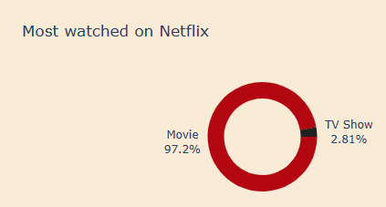
Let’s plot the most watched content as a donut
fig_donut = px.pie(df, names=’type’, height=300, width=600, hole=0.7,
title=’Most watched on Netflix’,
color_discrete_sequence=[‘#b20710’, ‘#221f1f’])
fig_donut.update_traces(hovertemplate=None, textposition=’outside’,
textinfo=’percent+label’, rotation=90)
fig_donut.update_layout(showlegend=False,plot_bgcolor=’#8a8d93′, paper_bgcolor=’#FAEBD7′)
Let’s plot the content vs year
d1 = df[df[“type”] == “TV Show”]
d2 = df[df[“type”] == “Movie”]
col = “year_added”
vc1 = d1[col].value_counts().reset_index().rename(columns = {col : “count”, “index” : col})
vc1[‘percent’] = vc1[‘count’].apply(lambda x : 100*x/sum(vc1[‘count’]))
vc1 = vc1.sort_values(col)
vc2 = d2[col].value_counts().reset_index().rename(columns = {col : “count”, “index” : col})
vc2[‘percent’] = vc2[‘count’].apply(lambda x : 100*x/sum(vc2[‘count’]))
vc2 = vc2.sort_values(col)
trace1 = go.Scatter(x=vc1[col], y=vc1[“count”], name=”TV Shows”)
trace2 = go.Scatter(x=vc2[col], y=vc2[“count”], name=”Movies”)
data = [trace1, trace2]
fig_line = go.Figure(data)
fig_line.update_traces(hovertemplate=None)
fig_line.update_xaxes(showgrid=False)
fig_line.update_yaxes(showgrid=False)
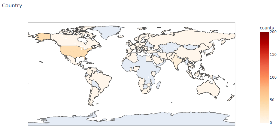
Let’s plot the global map of the content distribution worldwide
df_country = df.groupby(‘year_added’)[‘country’].value_counts().reset_index(name=’counts’)
fig = px.choropleth(df_country, locations=”country”, color=”counts”,
locationmode=’country names’,
title=’Country ‘,
range_color=[0,200],
color_continuous_scale=px.colors.sequential.OrRd
)
fig.show()
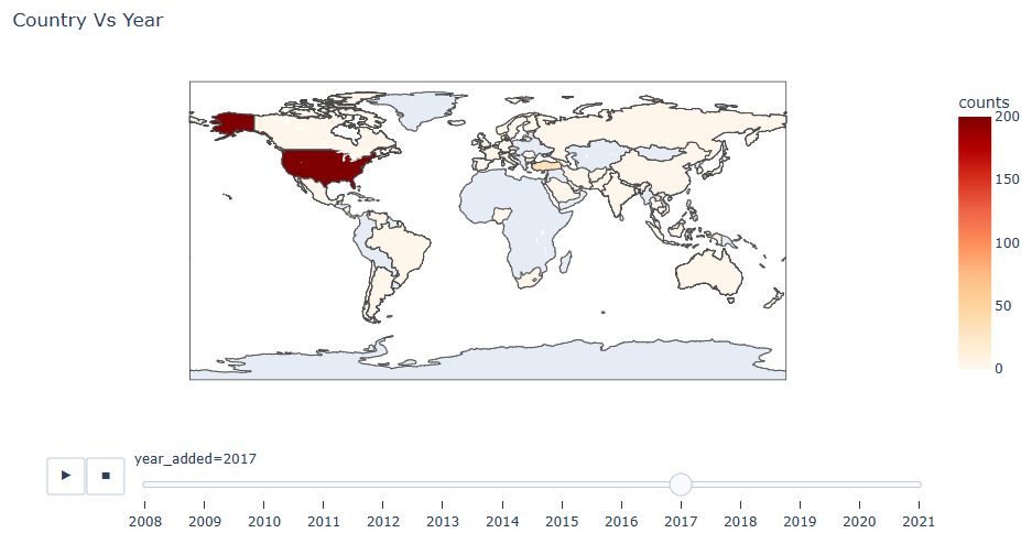
We can examine this global distribution as a function of year
df_country = df.groupby(‘year_added’)[‘country’].value_counts().reset_index(name=’counts’)
fig = px.choropleth(df_country, locations=”country”, color=”counts”,
locationmode=’country names’,
animation_frame=’year_added’,
title=’Country Vs Year’,
range_color=[0,200],
color_continuous_scale=px.colors.sequential.OrRd
)
fig.show()
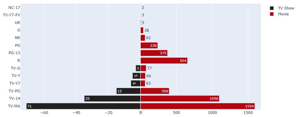
Let’s compare ratings for TV Shows and Movies
Making a copy of df
dff = df.copy()
Making 2 df one for tv show and another for movie with rating
df_tv_show = dff[dff[‘type’]==’TV Show’][[‘rating’, ‘type’]].rename(columns={‘type’:’tv_show’})
df_movie = dff[dff[‘type’]==’Movie’][[‘rating’, ‘type’]].rename(columns={‘type’:’movie’})
df_movie = pd.DataFrame(df_movie.rating.value_counts()).reset_index().rename(columns={‘index’:’movie’})
df_tv_show = pd.DataFrame(df_tv_show.rating.value_counts()).reset_index().rename(columns={‘index’:’tv_show’})
df_tv_show[‘rating_final’] = df_tv_show[‘rating’]
Making rating column value negative
df_tv_show[‘rating’] *= -1
Chart
fig = make_subplots(rows=1, cols=2, specs=[[{}, {}]], shared_yaxes=True, horizontal_spacing=0)
Bar plot for tv shows
fig.append_trace(go.Bar(x=df_tv_show.rating, y=df_tv_show.tv_show, orientation=’h’, showlegend=True,
text=df_tv_show.rating_final, name=’TV Show’, marker_color=’#221f1f’), 1, 1)
Bar plot for movies
fig.append_trace(go.Bar(x=df_movie.rating, y=df_movie.movie, orientation=’h’, showlegend=True, text=df_movie.rating,
name=’Movie’, marker_color=’#b20710′), 1, 2)
fig.show()
Let’s plot top 5 most preferred genres for movies
df_m = df[df[‘type’]==’Movie’]
df_m = pd.DataFrame(df_m[‘genre’].value_counts()).reset_index()
fig_bars = px.bar(df_m[:5], x=’genre’, y=’index’, text=’index’,
title=’Most preferd Genre for Movies’,
color_discrete_sequence=[‘#b20710’])
fig_bars.update_traces(hovertemplate=None)
fig_bars.update_xaxes(visible=False)
fig_bars.update_yaxes(visible=False, categoryorder=’total ascending’)

Let’s plot top 5 TV shows
df_tv = df[df[‘type’]==’TV Show’]
df_tv = pd.DataFrame(df_tv[‘genre’].value_counts()).reset_index()
fig_tv = px.bar(df_tv[:5], x=’genre’, y=’index’, text=’index’,
color_discrete_sequence=[‘#FAEBD7’])
fig_tv.update_traces(hovertemplate=None)
fig_tv.update_xaxes(visible=False)
fig_tv.update_yaxes(visible=False, categoryorder=’total ascending’)
fig_tv.update_layout(height=300,
              hovermode="y unified",
              plot_bgcolor='#333', paper_bgcolor='#333')
fig_tv.show()

Let’s plot increasing (red) /decreasing (orange) movies vs year_added
d2 = df[df[“type”] == “Movie”]
col = “year_added”
vc2 = d2[col].value_counts().reset_index().rename(columns = {col : “count”, “index” : col})
vc2[‘percent’] = vc2[‘count’].apply(lambda x : 100*x/sum(vc2[‘count’]))
vc2 = vc2.sort_values(col)
fig2 = go.Figure(go.Waterfall(
name = “Movie”, orientation = “v”,
x = [“2008”, “2009”, “2010”, “2011”, “2012”, “2013”, “2014”, “2015”, “2016”, “2017”, “2018”, “2019”, “2020”, “2021”],
textposition = “auto”,
text = [“1”, “2”, “1”, “13”, “3”, “6”, “14”, “48”, “204”, “743”, “1121”, “1366”, “1228”, “84”],
y = [1, 2, -1, 13, -3, 6, 14, 48, 204, 743, 1121, 1366, -1228, -84],
connector = {“line”:{“color”:”#b20710″}},
increasing = {“marker”:{“color”:”#b20710″}},
decreasing = {“marker”:{“color”:”orange”}}
))
fig2.show()

Trend Detection
Let’s look at our original input dataset
Data Shape: (7787, 12)
data.info()
<class 'pandas.core.frame.DataFrame'>
RangeIndex: 7787 entries, 0 to 7786
Data columns (total 12 columns):
 #   Column        Non-Null Count  Dtype
---  ------        --------------  -----
 0   show_id       7787 non-null   object
 1   type          7787 non-null   object
 2   title         7787 non-null   object
 3   director      5398 non-null   object
 4   cast          7069 non-null   object
 5   country       7280 non-null   object
 6   date_added    7777 non-null   object
 7   release_year  7787 non-null   int64
 8   rating        7780 non-null   object
 9   duration      7787 non-null   object
 10  listed_in     7787 non-null   object
 11  description   7787 non-null   object
dtypes: int64(1), object(11)
memory usage: 730.2+ KB
data.isnull().sum()
show_id            0
type               0
title              0
director        2389
cast             718
country          507
date_added        10
release_year       0
rating             7
duration           0
listed_in          0
description        0
dtype: int64
Let’s fill in NaNs
data[‘date_added’] = data[‘date_added’].fillna(‘NaN Data’)
data[‘year’] = data[‘date_added’].apply(lambda x: x[-4: len(x)])
data[‘month’] = data[‘date_added’].apply(lambda x: x.split(‘ ‘)[0])
display(data.sample(3))

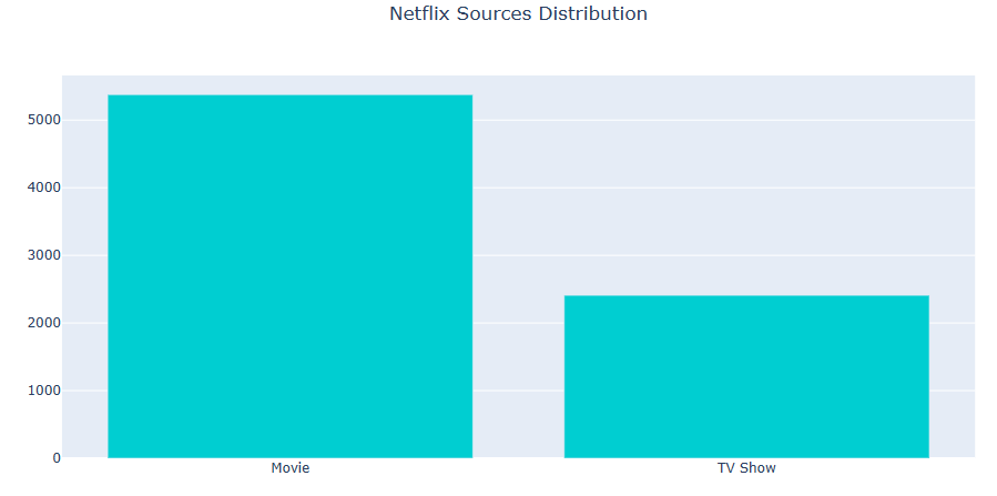
Let’s plot the source distribution
val = data[‘type’].value_counts().index
cnt = data[‘type’].value_counts().values
fig = go.Figure([go.Bar(x=val, y=cnt, marker_color=’darkturquoise’)])
fig.update_layout(title_text=’Netflix Sources Distribution’, title_x=0.5)
fig.show()
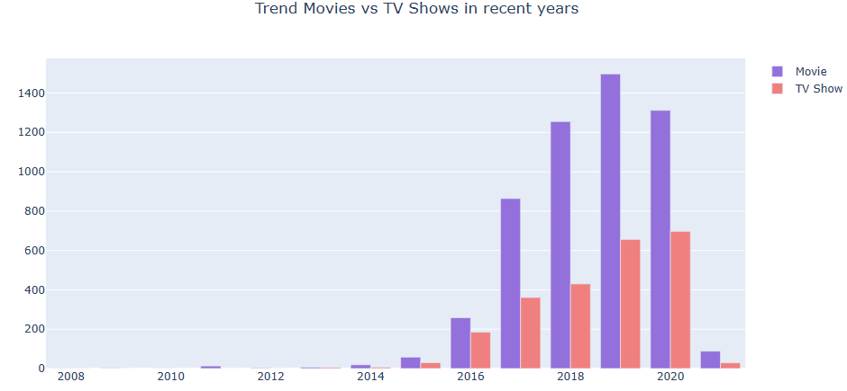
Let’s plot Trend Movies vs TV Shows in recent years
from collections import defaultdict
dict = data.groupby([‘type’, ‘year’]).groups
dict2 = {}
dict2 = defaultdict(lambda: 0, dict2)
for key, values in dict.items():
val = key[0]+’,’+key[1]
dict2[val] = len(values)
x = list(np.arange(2008, 2022, 1))
y1, y2= [], []
for i in x:
y1.append(dict2[‘Movie,’+str(i)])
y2.append(dict2[‘TV Show,’+str(i)])
fig = go.Figure(data = [
go.Bar(name=’Movie’, x=x, y=y1, marker_color=’mediumpurple’),
go.Bar(name=’TV Show’, x=x, y=y2, marker_color=’lightcoral’)
])
fig.update_layout(title_text=’Trend Movies vs TV Shows in recent years’, title_x=0.5)
fig.show()
Let’s plot the monthly Trend Movies vs TV Shows
dict = data.groupby([‘type’, ‘month’]).groups
dict2 = {}
dict2 = defaultdict(lambda: 0, dict2)
for key, values in dict.items():
val = key[0]+’,’+key[1]
dict2[val] = len(values)
x = [‘January’, ‘February’, ‘March’, ‘April’, ‘May’, ‘June’, ‘July’,
‘August’, ‘September’, ‘October’, ‘November’, ‘December’]
y1, y2= [], []
for i in x:
y1.append(dict2[‘Movie,’+str(i)])
y2.append(dict2[‘TV Show,’+str(i)])
fig = go.Figure(data = [
go.Bar(name=’Movie’, x=x, y=y1, marker_color=’mediumpurple’),
go.Bar(name=’TV Show’, x=x, y=y2, marker_color=’lightcoral’)
])
fig.update_layout(title_text=’Trend Movies vs TV Shows during Months’, title_x=0.5)
fig.show()

Let’s plot Trend Movies vs TV Shows in recent years
data_movie = data[data[‘type’]==’Movie’].groupby(‘release_year’).count()
data_tv = data[data[‘type’]==’TV Show’].groupby(‘release_year’).count()
data_movie.reset_index(level=0, inplace=True)
data_tv.reset_index(level=0, inplace=True)
fig = go.Figure()
fig.add_trace(go.Scatter(x=data_movie[‘release_year’], y=data_movie[‘show_id’],
mode=’lines’,
name=’Movies’, marker_color=’mediumpurple’))
fig.add_trace(go.Scatter(x=data_tv[‘release_year’], y=data_tv[‘show_id’],
mode=’lines’,
name=’TV Shows’, marker_color=’lightcoral’))
fig.update_layout(title_text=’Trend Movies vs TV Shows in recent years’, title_x=0.5)
fig.show()

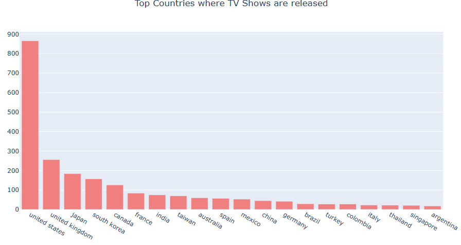
Top Countries
Let’s plot top countries where the content was released
import collections
import string
dict1 = {}
dict1 = defaultdict(lambda: 0, dict1)
dict2 = {}
dict2 = defaultdict(lambda: 0, dict2)
data[‘country’] = data[‘country’].fillna(‘ ‘)
for i in range(len(data)):
if data[‘type’][i] == ‘Movie’:
val = data[‘country’][i].split(‘,’)
for j in val:
x = j.lower()
x = x.strip()
if x!=”:
dict1[x]+=1
else:
val = data[‘country’][i].split(‘,’)
for j in val:
x = j.lower()
x = x.strip()
if x!=”:
dict2[x]+=1
dict1 = collections.OrderedDict(sorted(dict1.items(), key=lambda x: x[1], reverse=True))
dict2 = collections.OrderedDict(sorted(dict2.items(), key=lambda x: x[1], reverse=True))
x1 = list(dict1.keys())[:20]
x2 = list(dict2.keys())[:20]
y1 = list(dict1.values())[:20]
y2 = list(dict2.values())[:20]
fig = go.Figure([go.Bar(x=x1, y=y1, marker_color=’mediumpurple’)])
fig.update_layout(title_text=’Top Countries where Movies are released’, title_x=0.5)
fig.show()
fig = go.Figure([go.Bar(x=x2, y=y2, marker_color=’lightcoral’)])
fig.update_layout(title_text=’Top Countries where TV Shows are released’, title_x=0.5)
fig.show()

Let’s look at the global maps
import plotly.offline as py
py.offline.init_notebook_mode()
import pycountry
df1 = pd.DataFrame(dict1.items(), columns=[‘Country’, ‘Count’])
df2 = pd.DataFrame(dict2.items(), columns=[‘Country’, ‘Count’])
total = set(list(df1[‘Country’].append(df2[‘Country’])))
d_country_code = {} # To hold the country names and their ISO
for country in total:
try:
country_data = pycountry.countries.search_fuzzy(country)
# country_data is a list of objects of class pycountry.db.Country
# The first item ie at index 0 of list is best fit
# object of class Country have an alpha_3 attribute
country_code = country_data[0].alpha_3
d_country_code.update({country: country_code})
except:
#print(‘could not add ISO 3 code for ->’, country)
# If could not find country, make ISO code ‘ ‘
d_country_code.update({country: ‘ ‘})
for k, v in d_country_code.items():
df1.loc[(df1.Country == k), ‘iso_alpha’] = v
df2.loc[(df2.Country == k), ‘iso_alpha’] = v
fig = px.scatter_geo(df1, locations=”iso_alpha”,
hover_name=”Country”, # column added to hover information
size=”Count”, # size of markers, “pop” is one of the columns of gapminder
)
fig.update_layout(title_text=’Top Countries where Movie are released’, title_x=0.5)
fig.show()
fig = px.scatter_geo(df2, locations=”iso_alpha”,
hover_name=”Country”, # column added to hover information
size=”Count”, # size of markers, “pop” is one of the columns of gapminder
)
fig.update_layout(title_text=’Top Countries where TV Shows are released’, title_x=0.5)
fig.show()


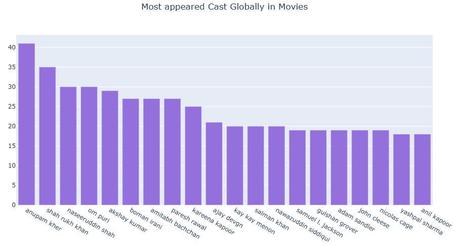
Cast Distributions
Let’s compare most appeared Cast Globally in Movies vs TV Shows
dict1 = {}
dict1 = defaultdict(lambda: 0, dict1)
dict2 = {}
dict2 = defaultdict(lambda: 0, dict2)
data[‘cast’] = data[‘cast’].fillna(‘ ‘)
for i in range(len(data)):
if data[‘type’][i] == ‘Movie’:
val = data[‘cast’][i].split(‘,’)
for j in val:
x = j.lower()
x = x.strip()
if x!=”:
dict1[x]+=1
else:
val = data[‘cast’][i].split(‘,’)
for j in val:
x = j.lower()
x = x.strip()
if x!=”:
dict2[x]+=1
dict1 = collections.OrderedDict(sorted(dict1.items(), key=lambda x: x[1], reverse=True))
dict2 = collections.OrderedDict(sorted(dict2.items(), key=lambda x: x[1], reverse=True))
x1 = list(dict1.keys())[:20]
x2 = list(dict2.keys())[:20]
y1 = list(dict1.values())[:20]
y2 = list(dict2.values())[:20]
fig = go.Figure([go.Bar(x=x1, y=y1, marker_color=’mediumpurple’)])
fig.update_layout(title_text=’Most appeared Cast Globally in Movies’, title_x=0.5)
fig.show()
fig = go.Figure([go.Bar(x=x2, y=y2, marker_color=’lightcoral’)])
fig.update_layout(title_text=’Most appeared Cast Globally in TV Shows’, title_x=0.5)
fig.show()

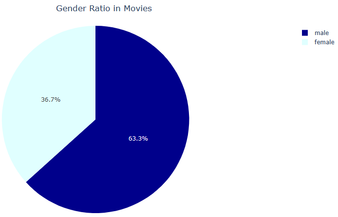
NLTK Classifier
Let’s apply NaiveBayesClassifier to examine the gender ratio in Movies and TV Shows
import nltk
import random
from nltk.corpus import names
def gender_features(word):
return {‘last_letter’: word[-1]}
labeled_names = ([(name, ‘male’) for name in names.words(‘male.txt’)] +
[(name, ‘female’) for name in names.words(‘female.txt’)])
random.shuffle(labeled_names)
featuresets = [(gender_features(n), gender) for (n, gender) in labeled_names]
trainset, testset = featuresets[500:], featuresets[:500]
classifier = nltk.NaiveBayesClassifier.train(trainset)
dict1 = {}
dict1 = defaultdict(lambda: 0, dict1)
dict2 = {}
dict2 = defaultdict(lambda: 0, dict2)
df1 = pd.DataFrame(columns = [‘Gender’, ‘Count’])
df2 = pd.DataFrame(columns = [‘Gender’, ‘Count’])
data[‘cast’] = data[‘cast’].fillna(‘ ‘)
for i in range(len(data)):
if data[‘type’][i] == ‘Movie’:
val = data[‘cast’][i].split(‘,’)
for j in val:
x = j.lower()
x = x.strip()
if x!=”:
if classifier.classify(gender_features(x)) == ‘male’:
df1.loc[len(df1)] = [‘male’, 1]
else:
df1.loc[len(df1)] = [‘female’, 1]
else:
val = data[‘cast’][i].split(‘,’)
for j in val:
x = j.lower()
x = x.strip()
if x!=”:
if classifier.classify(gender_features(x)) == ‘male’:
df2.loc[len(df2)] = [‘male’, 1]
else:
df2.loc[len(df2)] = [‘female’, 1]
fig = px.pie(df1, values=’Count’, names=’Gender’, color=’Gender’,
color_discrete_map={‘female’:’lightcyan’,
‘male’:’darkblue’})
fig.update_layout(title_text=’Gender Ratio in Movies’, title_x=0.5)
fig.show()
fig = px.pie(df2, values=’Count’, names=’Gender’, color=’Gender’,
color_discrete_map={‘female’:’lightcyan’,
‘male’:’darkblue’})
fig.update_layout(title_text=’Gender Ratio in TV Shows’, title_x=0.5)
fig.show()

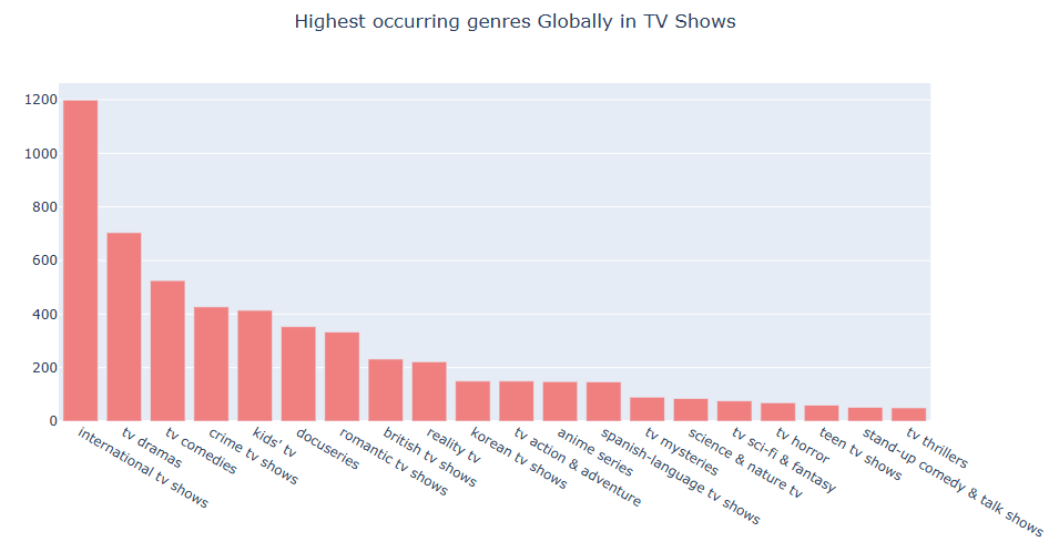
Top Genres
Let’s look at the highest occurring genres Globally in Movies vs TV Shows
dict1 = {}
dict1 = defaultdict(lambda: 0, dict1)
dict2 = {}
dict2 = defaultdict(lambda: 0, dict2)
data[‘listed_in’] = data[‘listed_in’].fillna(‘ ‘)
for i in range(len(data)):
if data[‘type’][i] == ‘Movie’:
val = data[‘listed_in’][i].split(‘,’)
for j in val:
x = j.lower()
x = x.strip()
if x!=”:
dict1[x]+=1
else:
val = data[‘listed_in’][i].split(‘,’)
for j in val:
x = j.lower()
x = x.strip()
if x!=”:
dict2[x]+=1
dict1 = collections.OrderedDict(sorted(dict1.items(), key=lambda x: x[1], reverse=True))
dict2 = collections.OrderedDict(sorted(dict2.items(), key=lambda x: x[1], reverse=True))
x1 = list(dict1.keys())[:20]
x2 = list(dict2.keys())[:20]
y1 = list(dict1.values())[:20]
y2 = list(dict2.values())[:20]
fig = go.Figure([go.Bar(x=x1, y=y1, marker_color=’mediumpurple’)])
fig.update_layout(title_text=’Highest occurring genres Globally in Movies’, title_x=0.5)
fig.show()
fig = go.Figure([go.Bar(x=x2, y=y2, marker_color=’lightcoral’)])
fig.update_layout(title_text=’Highest occurring genres Globally in TV Shows’, title_x=0.5)
fig.show()

Let’s review the overall country-based genre counts
dict2 = {}
dict2 = defaultdict(lambda: 0, dict2)
data2 = data
data2[‘country’] = data2[‘country’].apply(lambda x: x.lower())
data2[‘listed_in’] = data2[‘listed_in’].apply(lambda x: x.lower())
df1 = pd.DataFrame(columns=[‘Country’, ‘Genre’, ‘Count’])
for i in range(len(data2)):
for j in data2[‘country’][i].split(‘,’):
for k in data2[‘listed_in’][i].split(‘,’):
val = j+’,’+k
dict2[val]+=1
dict2 = collections.OrderedDict(sorted(dict2.items(), key=lambda x: x[1], reverse=True))
a, b, c = 0, 0, 0
for k,v in dict2.items():
if k.split(‘,’)[0] == ‘india’ and a<5:
df1.loc[len(df1)] = [k.split(‘,’)[0], k.split(‘,’)[1],v]
a+=1
elif k.split(‘,’)[0] == ‘united states’ and b<5:
df1.loc[len(df1)] = [k.split(‘,’)[0], k.split(‘,’)[1],v]
b+=1
elif k.split(‘,’)[0] == ‘united kingdom’ and c<5:
df1.loc[len(df1)] = [k.split(‘,’)[0], k.split(‘,’)[1],v]
c+=1
df1
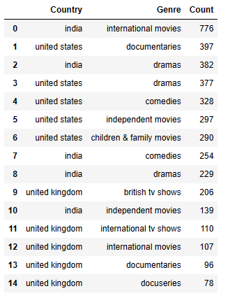
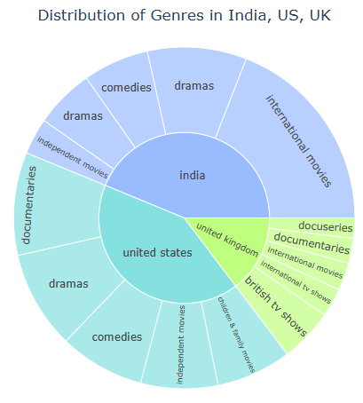
Let’s compare Distribution of Genres in India, US, UK
fig = px.sunburst(df1, path = [‘Country’, ‘Genre’], values = ‘Count’, color = ‘Country’,
color_discrete_map = {‘united states’: ‘#85e0e0’, ‘india’: ‘#99bbff’, ‘united kingdom’: ‘#bfff80’})
fig.update_layout(title_text=’Distribution of Genres in India, US, UK’, title_x=0.5)
fig.show()
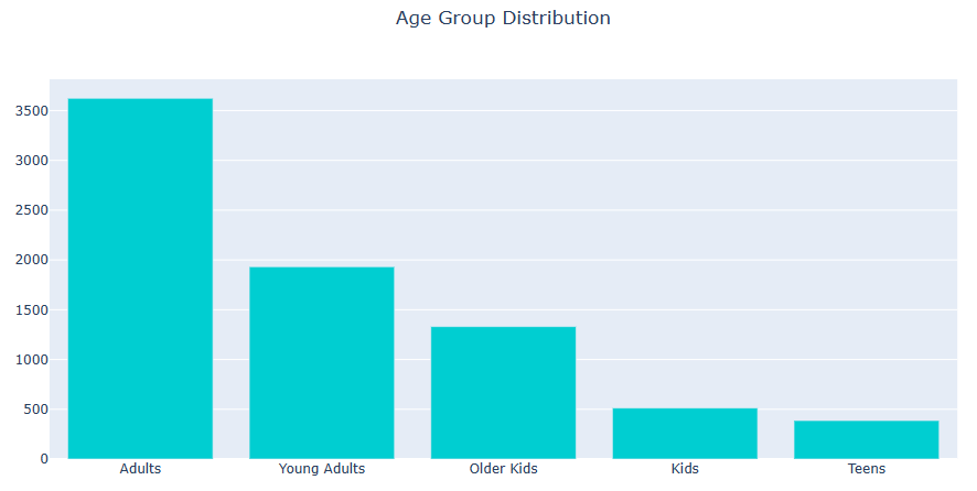
Age Group
Let’s plot Age Group Distribution
data.iloc[67, 8] = ‘R’
data.iloc[2359, 8] = ‘TV-14’
data.iloc[3660, 8] = ‘TV-PG’
data.iloc[3736, 8] = ‘R’
data.iloc[3737, 8] = ‘R’
data.iloc[3738, 8] = ‘R’
data.iloc[4323, 8] = ‘PG-13’
data[‘age_group’] = data[‘rating’]
MR_age = {‘TV-MA’: ‘Adults’,
‘R’: ‘Adults’,
‘PG-13’: ‘Teens’,
‘TV-14’: ‘Young Adults’,
‘TV-PG’: ‘Older Kids’,
‘NR’: ‘Adults’,
‘TV-G’: ‘Kids’,
‘TV-Y’: ‘Kids’,
‘TV-Y7’: ‘Older Kids’,
‘PG’: ‘Older Kids’,
‘G’: ‘Kids’,
‘NC-17’: ‘Adults’,
‘TV-Y7-FV’: ‘Older Kids’,
‘UR’: ‘Adults’}
data[‘age_group’] = data[‘age_group’].map(MR_age)
val = data[‘age_group’].value_counts().index
cnt = data[‘age_group’].value_counts().values
fig = go.Figure([go.Bar(x=val, y=cnt, marker_color=’darkturquoise’)])
fig.update_layout(title_text=’Age Group Distribution’, title_x=0.5)
fig.show()
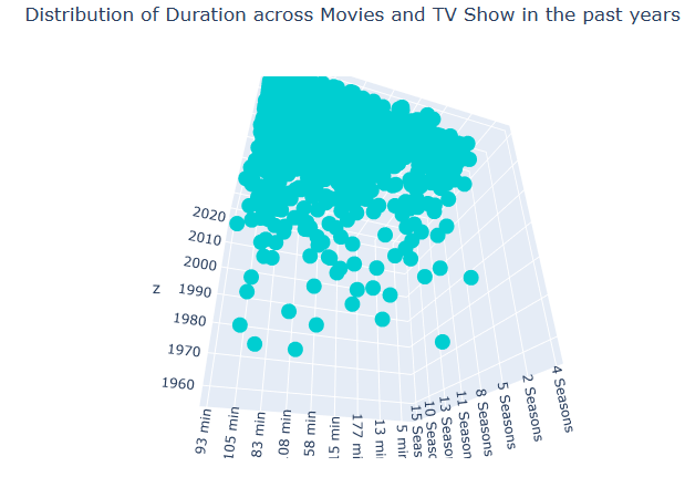
Duration
Let’s plot Distribution of Duration across Movies and TV Show in the past years
data_movie = data[data[‘type’] == ‘Movie’]
data_tv = data[data[‘type’] == ‘TV Show’]
create trace 1 that is 3d scatter
trace1 = go.Scatter3d(
x=data_movie.duration,
y=data_tv.duration,
z=data.release_year,
mode=’markers’,
marker_color=’darkturquoise’
)
data2 = [trace1]
layout = go.Layout(
)
fig = go.Figure(data=data2, layout=layout)
fig.update_layout(title_text=’Distribution of Duration across Movies and TV Show in the past years’, title_x=0.5)
iplot(fig)
Let’s compare duration of movies vs TV shows as boxplots
data_movie = data[data[‘type’] == ‘Movie’]
data_tv = data[data[‘type’] == ‘TV Show’]
trace0 = go.Box(
y = data_movie.duration,
name = “Duration of Movies”,
marker_color=’mediumpurple’
)
trace1 = go.Box(
y = data_tv.duration,
name = “Duration of TV Shows”,
marker_color=’lightcoral’
)
data2 = [trace0,trace1]
iplot(data2)

Link to AWS
This post is linked to the AWS Netflix visualization dashboard in R. It consists of the following 3 steps discussed above:
- Data Preparation
- Creating Visualization
- Trend Detection
In fact, the Netflix data set has a lot of information that could be explored. In this article, several information that has been explored including the growth of the contents over the year, the distribution of contents by countries, the common genres in the selected countries, the age of contents distributions by each countries, and network of casts in the Netflix contents worldwide.
Interestingly, the contents of Netflix platform are dramatically increase from 2015-2019 which also shows the possibility of traction gains of the platform during the periods. The contents themselves were mostly derives from US, India, and UK as three of those countries have a high numbers of contents in the world. Likewise, the common genres and age of contents distributions for each of those countries are varied.
Overall, the visualizations of the data set eases the exploration of the data set which would then be processed for ML purpose. The type of the visualizations would be depended on which of the insights or information that would want to be presented.
Summary
- Entertainment companies today are swamped with data stored and collected from various mediums and sources.
- To gain insights from this data, we use Python EDA and advanced data visualization algorithms and make predictions about future events, and plan necessary strategies.
- Learnings gained through data mining can be used further within prescriptive analytics to drive actions based on predictive insights.
- As a recommendation for this data set, a recommender ML could be deployed here which would classify the contents and movies that have similar context in descriptions, directors, genres, and other variables in the data set.
Explore More
Webscraping in R – IMDb ETL Showcase
ML/AI Prediction of Wine Quality
Textual Genres Analysis using the Carloto’s NLP Algorithm
Embed Socials


Make a one-time donation
Make a monthly donation
Make a yearly donation
Choose an amount
Or enter a custom amount
Your contribution is appreciated.
Your contribution is appreciated.
Your contribution is appreciated.

Leave a comment