
- Powerful earthquake rocks central Morocco
- A 6.8-magnitude earthquake struck in Morocco’s High Atlas mountain range at 11:11 p.m. local time on Friday, Sept. 8 2023
- (Source: USGS)
- The quake is the strongest to hit the nation’s center in more than a century, and its epicenter was not far from popular tourist and economic hub Marrakech.
- At least 2,497 people have been killed in the disaster and 2,476 have been injured, state media said on Monday.
- Earthquakes are commonly caused along the seam where two tectonic plates move against each other, and in Morocco, earthquakes mostly happen where the Africa and Eurasia plates meet.
- In this post, we will invoke several powerful Python libraries to perform data science visualization and a preliminary exploratory analysis of the earthquake USGS data from all recent seismic events over the last seven days, which have a magnitude of 1.0 or greater.
- In addition, we will examine data trends, cycles, durations, ACF, and probabilities.
- We will also look at the Plotly animations of most recent and historical global events to be compared to the available Iris Seismic Monitoring maps.
- Prerequisites: we need to install the Basemap library, which has been used to create maps and plot geographical datasets. Additional Python libraries and historical seismic data will be imported in the sequel.
Clickable Table of Contents
- Basic Installations and Imports
- Download Earthquake Input Data
- Analysis of Earthquake Trends, Cycles, Durations, ACF, and Probabilities
- Automated Earthquake Data Exploratory Analysis (AEEDA)
- Basemap Maps of 1 Week Global Earthquake Activity
- Plotly Interactive Maps of Most Recent Earthquakes
- Plotly Interactive Animations of Most Recent Earthquakes
- Folium Interactive Maps of Historical Felt Earthquakes
- EarthScope Iris Seismic Monitoring
- Summary
- Explore More
- References
- Appendix A: Basic Visualization of
- Input 1 Week Events
Basic Installations and Imports
Let’s set the working directory YOURPATH
import os
os.chdir('YOURPATH')    # Set working directory
os. getcwd()
Let’s install and import the following libraries
!pip install matplotlib basemap pillow
import numpy as np
import pandas as pd
import geopandas as gpd
import matplotlib.pyplot as plt
import seaborn as sns
import folium
from folium import Choropleth
from folium.plugins import HeatMap
import datetime
from mpl_toolkits.basemap import Basemap
import plotly.graph_objects as go
import plotly.express as px
import scipy
from pandas_profiling import ProfileReport
import sweetviz as sv
import matplotlib
Download Earthquake Input Data
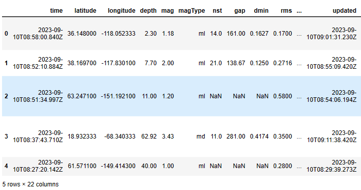
For this project, we’ll use a dataset that contains all seismic events over the last seven days, which have a magnitude of 1.0 or greater:
events = pd.read_csv("1.0_week.csv")
events.head()
Output:
The size of this dataset is
events.shape
(1278, 22)
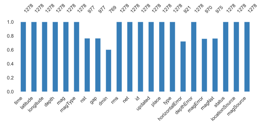
The structure of this dataset is
events.info()
<class 'pandas.core.frame.DataFrame'>
RangeIndex: 1278 entries, 0 to 1277
Data columns (total 22 columns):
 #   Column           Non-Null Count  Dtype
---  ------           --------------  -----
 0   time             1278 non-null   object
 1   latitude         1278 non-null   float64
 2   longitude        1278 non-null   float64
 3   depth            1278 non-null   float64
 4   mag              1278 non-null   float64
 5   magType          1278 non-null   object
 6   nst              977 non-null    float64
 7   gap              977 non-null    float64
 8   dmin             769 non-null    float64
 9   rms              1278 non-null   float64
 10  net              1278 non-null   object
 11  id               1278 non-null   object
 12  updated          1278 non-null   object
 13  place            1278 non-null   object
 14  type             1278 non-null   object
 15  horizontalError  921 non-null    float64
 16  depthError       1278 non-null   float64
 17  magError         970 non-null    float64
 18  magNst           975 non-null    float64
 19  status           1278 non-null   object
 20  locationSource   1278 non-null   object
 21  magSource        1278 non-null   object
dtypes: float64(12), object(10)
memory usage: 219.8+ KB
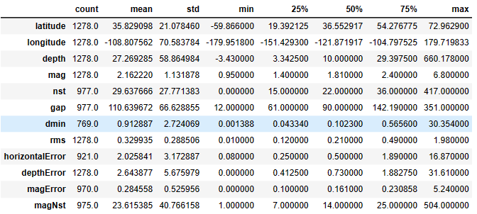
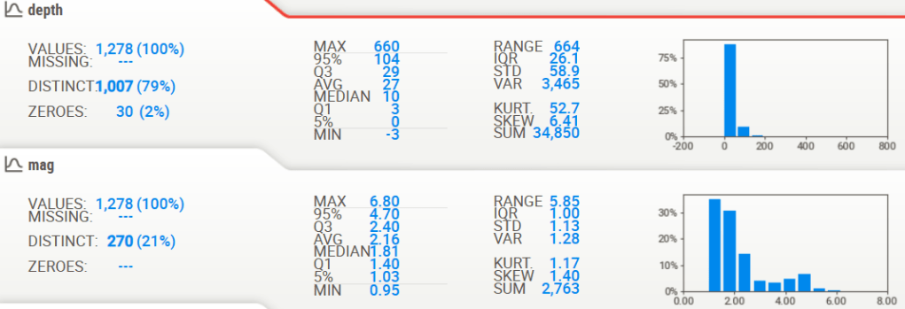
The descriptive statistics of the dataset is
events.describe().T
Various plots of the above input data can be found in Appendix A.
Analysis of Earthquake Trends, Cycles, Durations, ACF, and Probabilities
Let’s examine the above input dataset from the risk engineering point of view:
- Prepare the earthquake data for our time-series analysis
data=events.copy()
data.time = pd.to_datetime(data.time)
data.sort_values("time", inplace=True)
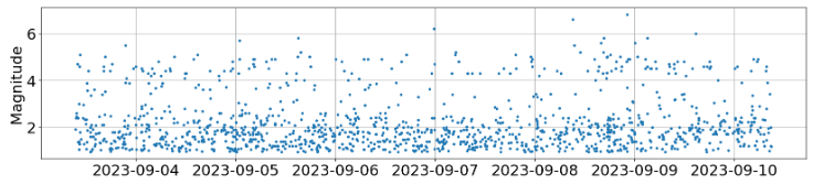
- The Pyplot scatter plot of mag:
fig = plt.figure()
fig.set_size_inches(20, 4)
plt.rcParams.update({'font.size': 22})
plt.plot(data.time, data.mag, ".");
plt.grid()
plt.ylabel("Magnitude");
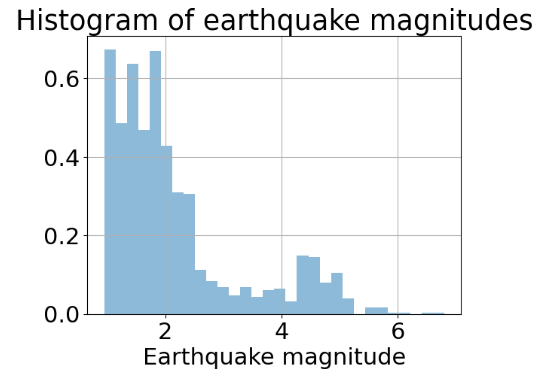
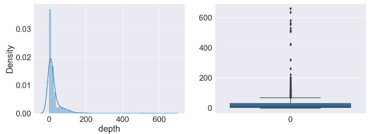
- The Pandas histogram of mag (cf. mag boxplot in Appendix A):
data.mag.hist(density=True, alpha=0.5, bins=30)
plt.xlabel("Earthquake magnitude")
plt.title("Histogram of earthquake magnitudes");
- Temporal event density (average number of events per day)
duration = data.time.max() - data.time.min()
density = len(data) / float(duration.days)
density  # events per day
Output: 213.0
- Duration between events
# calculate the time delta between successive rows and convert into days
import scipy
interarrival = data.time.diff().dropna().apply(lambda x: x / np.timedelta64(1, "D"))
support = np.linspace(interarrival.min(), interarrival.max(), 100)
interarrival.hist(density=True, alpha=0.5, bins=30)
plt.plot(support, scipy.stats.expon(scale=1/density).pdf(support), lw=2)
plt.title("Duration between 5+ earthquakes")
plt.xlabel("Days");

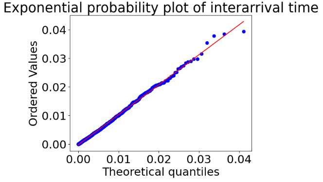
- Exponential probability plot of interarrival time (Q-Q plot)
shape, loc = scipy.stats.expon.fit(interarrival)
scipy.stats.probplot(interarrival,
                     dist="expon", sparams=(shape, loc),
                     plot=plt.figure().add_subplot(111))
plt.title("Exponential probability plot of interarrival time");
- ACF
plt.acorr(interarrival, maxlags=200)
plt.title("Autocorrelation of earthquake timeseries data");

Automated Earthquake Data Exploratory Analysis (AEEDA)
- Let’s create the automated Pandas Profiling HTML Report
from pandas_profiling import ProfileReport
# Define your profile report:
profile = ProfileReport(events, title='Pandas Profile Earthquake Report', html={'style':{'full_width':True}})
# Save your output file in html forma
profile.to_file(output_file='morocco_report.html')
Overview:

Alerts:
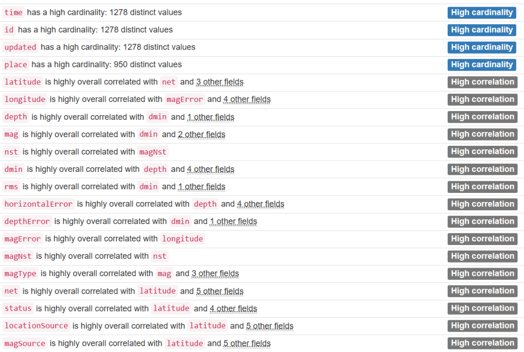
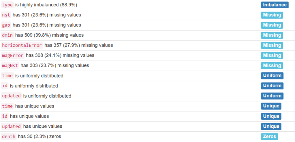
Variables:

- Interactions


Correlations

Missing values
- Similarly, we can create the automated Sweetviz HTML report
# importing sweetviz
import sweetviz as sv
#analyzing the dataset
advert_report = sv.analyze(events)
#display the report
advert_report.show_html('morocco_sweetviz.html')


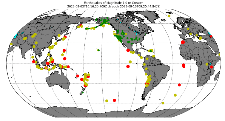
Basemap Maps of 1 Week Global Earthquake Activity
- Let’s plot Earthquakes of Magnitude 1.0 or Greater using Basemap
# --- Build Map ---
# Make this plot larger.
plt.figure(figsize=(16,12))


def get_marker_color(magnitude):
    # Returns green for small earthquakes, yellow for moderate
    #  earthquakes, and red for significant earthquakes.
    if magnitude < 3.0:
        return ('go')
    elif magnitude < 5.0:
        return ('yo')
    else:
        return ('ro')

eq_map = Basemap(projection='robin', resolution = 'l', area_thresh = 1000.0,
              lat_0=0, lon_0=-130)
eq_map.drawcoastlines()
eq_map.drawcountries()
eq_map.fillcontinents(color='grey',lake_color='aqua')
#eq_map.etopo()
eq_map.drawmapboundary()
eq_map.drawmeridians(np.arange(0, 360, 30))
eq_map.drawparallels(np.arange(-90, 90, 30))

min_marker_size = 2.25
for lon, lat, mag in zip(lons, lats, magnitudes):
    x,y = eq_map(lon, lat)
    msize = mag * min_marker_size
    marker_string = get_marker_color(mag)
    eq_map.plot(x, y, marker_string, markersize=msize)

title_string = "Earthquakes of Magnitude 1.0 or Greater\n"
title_string += "%s through %s" % (min(timestrings), max(timestrings))
plt.title(title_string)

plt.show()
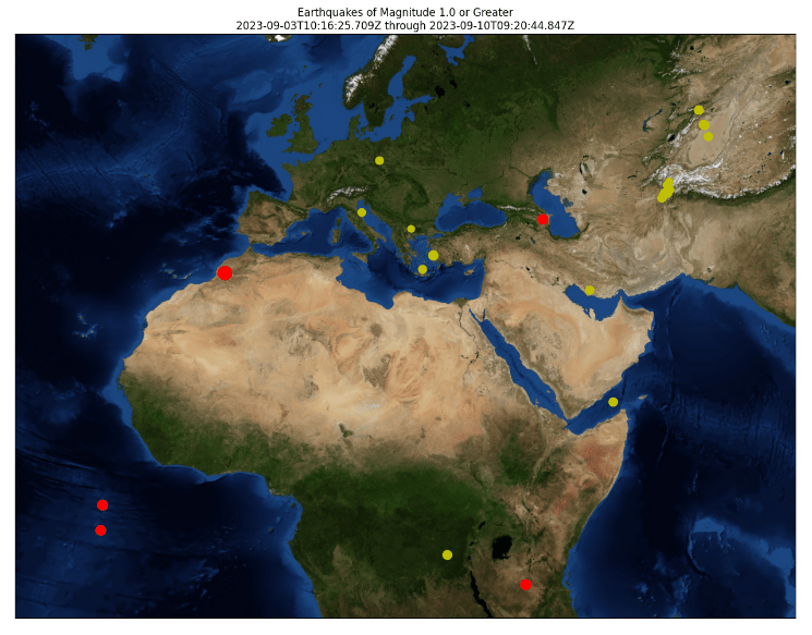
- Similarly, we can create the Basemap plot with blamable() using the Lambert Conformal Projection
plt.figure(figsize=(16,12))

def get_marker_color(magnitude):
    # Returns green for small earthquakes, yellow for moderate
    #  earthquakes, and red for significant earthquakes.
    if magnitude < 3.0:
        return ('go')
    elif magnitude < 5.0:
        return ('yo')
    else:
        return ('ro')

eq_map = Basemap(width=12000000,height=9000000,projection='lcc',
            resolution=None,lat_1=55.,lat_2=25,lat_0=28,lon_0=22)
eq_map.bluemarble()

min_marker_size = 2.25
for lon, lat, mag in zip(lons, lats, magnitudes):
    x,y = eq_map(lon, lat)
    msize = mag * min_marker_size
    marker_string = get_marker_color(mag)
    eq_map.plot(x, y, marker_string, markersize=msize)

title_string = "Earthquakes of Magnitude 1.0 or Greater\n"
title_string += "%s through %s" % (min(timestrings), max(timestrings))
plt.title(title_string)

plt.show()

Plotly Interactive Maps of Most Recent Earthquakes
- The plotly.express map of the above events with the mag color bar
#import plotly.express as px
#import pandas as pd

fig = px.scatter_geo(events, lat='latitude',
                     lon='longitude',size='mag',
                     color="mag"
                )
fig.show()

- The plotly.express map of the above events with the depth color bar and the depth marker size
fig = px.scatter_geo(events, lat='latitude',
                     lon='longitude',size='mag',range_color=(0,50),
                     color="depth"
                )
fig.show()

Plotly Interactive Animations of Most Recent Earthquakes
def fetch_date(time):
    return str(time).split(' ')[0]

def fetch_weekday(time):
    date = fetch_date(time)
    return date + ' - ' + str(time.weekday())

def fetch_hour(time):
    t = str(time).split(' ')
    return t[0] + ' - ' + t[1].split(':')[0]
def subarea_extractor(x):
    return x[0]

def area_extractor(x):
    return x[-1]
def fetch_quakes_data(manner='daily', bbox='Worldwide', mag_thresh=2):
    url_link = 'https://earthquake.usgs.gov/earthquakes/feed/v1.0/summary/{}.csv'

    if (manner == 'weekly'):
        data_link = url_link.format('all_week')
    elif (manner == 'monthly'):
        data_link = url_link.format('all_month')
    else:
        data_link = url_link.format('all_day')

    eqdf = pd.read_csv(filepath_or_buffer=data_link)
    eqdf = eqdf[['time', 'latitude', 'longitude', 'mag', 'place']]

    place_list = eqdf['place'].str.split(', ')
    eqdf['sub_area'] = place_list.apply(func=subarea_extractor)
    eqdf['area'] = place_list.apply(func=area_extractor)
    eqdf = eqdf.drop(columns=['place'], axis=1)

    if isinstance(mag_thresh, int) and (mag_thresh > 0):
        eqdf = eqdf[eqdf['mag'] >= mag_thresh]
    else:
        eqdf = eqdf[eqdf['mag'] > 0]

    if bbox in eqdf['area'].to_list():
        eqdf = eqdf[eqdf['area'] == bbox]
        max_mag = eqdf['mag'].max()
        center_lat = eqdf[eqdf['mag'] == max_mag]['latitude'].values[0]
        center_lon = eqdf[eqdf['mag'] == max_mag]['longitude'].values[0]
    else:
        center_lat, center_lon = [54, 15]

    eqdf['time'] = pd.to_datetime(eqdf['time'])

    if (manner == 'weekly'):
        new_col = 'weekday'
        eqdf[new_col] = eqdf['time'].apply(func=fetch_weekday)
    elif (manner == 'monthly'):
        new_col = 'date'
        eqdf[new_col] = eqdf['time'].apply(func=fetch_date)
    else:
        new_col = 'hours'
        eqdf[new_col] = eqdf['time'].apply(func=fetch_hour)

    eqdf = eqdf.sort_values(by='time')

    return eqdf, center_lat, center_lon
def visualize_quakes_data(manner='daily', bbox='Worldwide', mag_thresh=2):
    eqdf, clat, clon = fetch_quakes_data(manner=manner, bbox=bbox, mag_thresh=mag_thresh)

    if (manner == 'monthly'):
        af = 'date'
    elif (manner == 'weekly'):
        af = 'weekday'
    else:
        af = 'hours'

    zoom = 3 if bbox != 'Worldwide' else 1

    fig = px.scatter_mapbox(
        data_frame=eqdf,
        lat='latitude',
        lon='longitude',
        center=dict(lat=clat, lon=clon),
        size='mag',
        color='mag',
        hover_name='sub_area',
        zoom=zoom,
        mapbox_style='stamen-terrain',
        # color_continuous_scale=px.colors.cyclical.IceFire,
        animation_frame=af,
        title='{} Earthquakes - {}; mag - {}'.format(manner.title(), bbox, mag_thresh)
    )

    fig.update_layout(
        margin=dict(l=0, r=0, t=40, b=0)
    )

    fig.show()
    return None
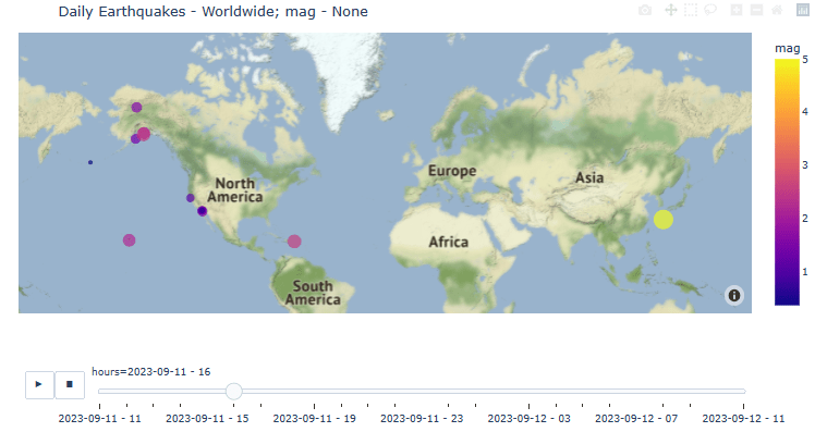
- Daily animation of recent earthquakes without mag threshold
visualize_quakes_data(manner='daily', mag_thresh=None)
- Weekly animation of recent earthquakes without mag threshold
visualize_quakes_data(manner='weekly', mag_thresh=None)

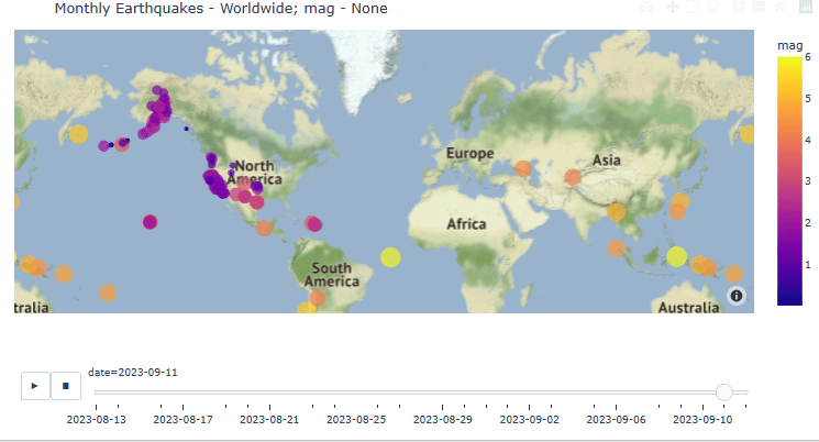
- Monthly animation of recent earthquakes without mag threshold
visualize_quakes_data(manner='monthly', mag_thresh=None)
Folium Interactive Maps of Historical Felt Earthquakes
Let’s consider the Earthquake Visualization with Folium using the open-source database of Significant Earthquakes, 1965-2016 (Date, time, and location of all earthquakes with magnitude of 5.5 or higher):
- Data preparation
#import numpy as np
#import pandas as pd
#import matplotlib.pyplot as plt
#import seaborn as sns
#import folium

sns.set_style('darkgrid')
pd.options.mode.chained_assignment = None
df = pd.read_csv('database.csv')
# Check for correct length, filter out if not 10
df['len_date'] = df.Date.apply(lambda x: len(str(x)))
df = df.query('len_date == 10')
df.drop('len_date', axis=1, inplace=True)

# create a year column and convert to int
df['Year'] = df.Date.apply(lambda x: x[-4:])
df.Year = df.Year.astype('int')
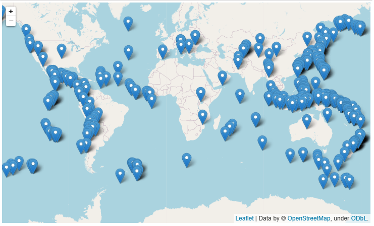
- Folium map with the default layout
# select a year to plot (1965-2106 are valid).
year_select = 2016

# filter by selected year
df_year = df.query('Year == @year_select')

# get mean lat and lon of the selected data to use to center the plot
mean_lat = df_year.Latitude.mean()
mean_lon = df_year.Longitude.mean()

# make arrays for lat, lon, and magnitude
lat = np.asarray(df_year.Latitude)
lon = np.asarray(df_year.Longitude)
mag = np.asarray(df_year.Magnitude)

# create the map
m= folium.Map(location=[mean_lat, mean_lon], zoom_start=2)

# create the default markers for this map by looping through the coords.
for idx in range(len(lat)):
    marker = folium.Marker(location=[lat[idx],lon[idx]])
    marker.add_to(m)

#show the map
m
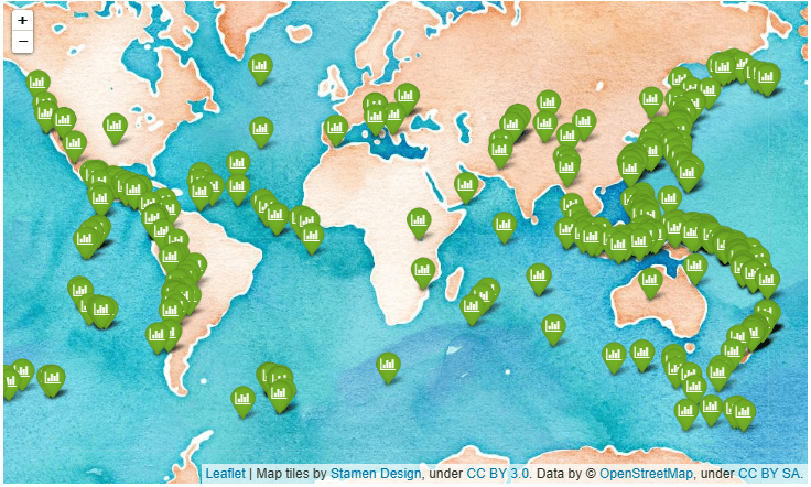
- Folium map with the improved layout
# The icon is also changed to a green color with a small bar chart figure inside
# create the map
m= folium.Map(location=[mean_lat, mean_lon],
              tiles = 'stamenwatercolor',
              zoom_start=2)

# create the default markers for this map by looping through the coords.
for idx in range(len(lat)):
    marker = folium.Marker(location=[lat[idx],lon[idx]],
                          icon=folium.Icon(color='green',icon='bar-chart',prefix='fa'))
    marker.add_to(m)

#show the map
m
- Folium map with the natgeo world map layout
# This is natgeo world map style, which I think looks pretty cool
cust_tiles = 'https://server.arcgisonline.com/ArcGIS/rest/services/NatGeo_World_Map/MapServer/tile/{z}/{y}/{x}'
cust_attr = 'Tiles © Esri — National Geographic, Esri, DeLorme, NAVTEQ, UNEP-WCMC, USGS, NASA, ESA, METI, NRCAN, GEBCO, NOAA, iPC'

# create the map
m= folium.Map(location=[mean_lat, mean_lon],
                tiles = cust_tiles,
                attr = cust_attr,
                zoom_start=2)

# Instead of the default markers, create circle markers whose size is scaled by the magnitude
for idx in range(len(lat)):
    marker = folium.CircleMarker(
        location=[lat[idx],lon[idx]],
        radius=mag[idx]**5/2500,
        color='Red',
        popup=f"lat: {lat[idx]}, lon: {lon[idx]}",
        tooltip=f'Magnitude: {mag[idx]}')
    marker.add_to(m)

# also, this is how to add a title to the map
t = f'Earthquakes in {year_select}'
title_html = '''
             <h3 align="center" style="font-size:16px"><b>{}</b></h3>
             '''.format(t)
m.get_root().html.add_child(folium.Element(title_html))
m

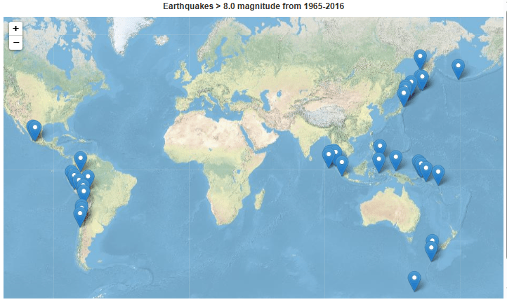
- Folium map with the default layout: the strongest earthquakes M > 8.0 over the whole dataset
# look at just the strongest earthquakes > 8.0 over the whole dataset
df_high_mag = df.query('Magnitude >= 8.0')

# center of the plot on means
mean_lat = df_high_mag.Latitude.mean()
mean_lon = df_high_mag.Longitude.mean()

# make arrays for lat, lon, and magnitude
lat = np.asarray(df_high_mag.Latitude)
lon = np.asarray(df_high_mag.Longitude)
mag = np.asarray(df_high_mag.Magnitude)
year = np.asarray(df_high_mag.Year)

# Check out the arcgis style
cust_tiles = 'https://server.arcgisonline.com/ArcGIS/rest/services/World_Physical_Map/MapServer/tile/{z}/{y}/{x}'
cust_attr = 'Tiles © Esri — Source: US National Park Service'

# create the map
m= folium.Map(location=[mean_lat, mean_lon],
                tiles = cust_tiles,
                attr = cust_attr,
                zoom_start=2)

# Default markers
for idx in range(len(lat)):
    marker = folium.Marker(
        location=[lat[idx],lon[idx]],
        tooltip=f'Year: {year[idx]}, Magnitude: {mag[idx]}')
    marker.add_to(m)

# add a title to the map
t = f'Earthquakes > 8.0 magnitude from 1965-2016'
title_html = '''
             <h3 align="center" style="font-size:16px"><b>{}</b></h3>
             '''.format(t)
m.get_root().html.add_child(folium.Element(title_html))

m
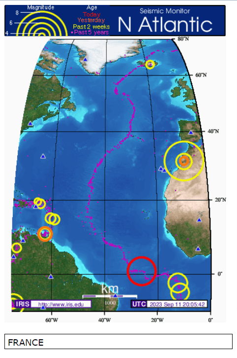
EarthScope Iris Seismic Monitoring
- Iris Seismic Monitor Africa UTC 2023 Sept 11 20:06:27

- Iris Seismic Monitor Europe UTC 2023 Sept 11 20:05:28
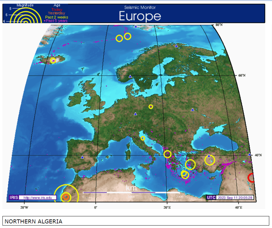
- Iris Seismic Monitor North Atlantic UTC 2023 Sept 11 20:05:42
- Iris Seismic Monitor South Atlantic UTC 2023 Sept 11 20:05:56

Summary
- In support of the people of Morocco affected by the magnitude 6.8 earthquake on September 8, 2023, we have invoked several powerful Python libraries to provide a thorough data science visualization and a preliminary exploratory analysis of the earthquake data recorded by USGS.
- The key focus of this study has been on all recent seismic events over the last seven days, which have a magnitude of 1.0 or greater.
- We have examined relevant data trends, cycles, durations, ACF, location uncertainties, and probabilities linked to seismic hazard and risk engineering.
- We have produced the comprehensive AEEDA HTML reports of 1 week events using Pandas Profiling and SweetViz libraries.
- We have created the Basemap maps of 1 week events and compared them to the Plotly interactive maps and animations.
- We have also plotted and compared historical data, viz. the Earthquake Visualization with Folium using the open-source database of Significant Earthquakes, 1965-2016 (Date, time, and location of all earthquakes with magnitude of 5.5 or higher).
- Finally, we have analyzed selected snapshots of the Iris Seismic Monitor Africa 2023 Sept 11.
Explore More
- Turkey/Syria Earthquake Live Knowledge Update & Charity Guide
- Hands-Off USGS Webscraping of Earthquakes- Worldwide (24 Hours)
References
- M 6.8 – Morocco
- What we know about the Morocco earthquake
- Why do earthquakes happen?
- What caused the rare deadly earthquake in Morocco?
- Death toll from Morocco earthquake continues to climb
- Tectonics of the Anti-Atlas of MoroccoTectonique de l’Anti-Atlas marocain
- Plate tectonics and the intracatonic mountain ranges in Morocco – The Mesozoic – Cenozoic development of the Central High Atlas and the Middle Atlas
- Catalogue of focal mechanisms of Moroccan earthquakes for the period 1959-2007; analysis of parameters
Appendix A: Basic Visualization of
Input 1 Week Events
- The Seaborn scatter plot of latitude-longitude-mag:
plt.figure(figsize=(10, 8))
sb.scatterplot(data=events,
               x='latitude',
               y='longitude',
               hue='mag')
plt.show()

- The Pyplot boxplot of depth:
matplotlib.rc('xtick', labelsize=20)
matplotlib.rc('ytick', labelsize=20)

plt.subplots(figsize=(15, 5))
plt.rcParams.update({'font.size': 22})

plt.subplot(1, 2, 1)
sb.distplot(events['depth'])

plt.subplot(1, 2, 2)
sb.boxplot(events['depth'])

plt.show()
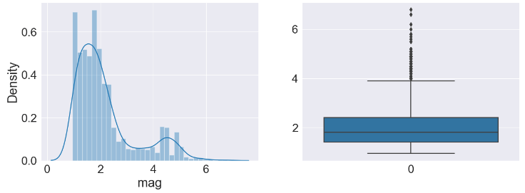
- The Pyplot boxplot of mag:
plt.subplots(figsize=(15, 5))
plt.rcParams.update({'font.size': 22})

plt.subplot(1, 2, 1)
sb.distplot(events['mag'])

plt.subplot(1, 2, 2)
sb.boxplot(events['mag'])

plt.show()
- The Pyplot boxplot of magError:
plt.subplots(figsize=(15, 5))
plt.rcParams.update({'font.size': 22})

plt.subplot(1, 2, 1)
sb.distplot(events['magError'])

plt.subplot(1, 2, 2)
sb.boxplot(events['magError'])

plt.show()

- The Pyplot boxplot of depthError:
plt.subplots(figsize=(15, 5))
plt.rcParams.update({'font.size': 22})

plt.subplot(1, 2, 1)
sb.distplot(events['depthError'])

plt.subplot(1, 2, 2)
sb.boxplot(events['depthError'])

plt.show()

- The Pyplot boxplot of horizontalError:
plt.subplots(figsize=(15, 5))
plt.rcParams.update({'font.size': 22})

plt.subplot(1, 2, 1)
sb.distplot(events['horizontalError'])

plt.subplot(1, 2, 2)
sb.boxplot(events['horizontalError'])

plt.show()

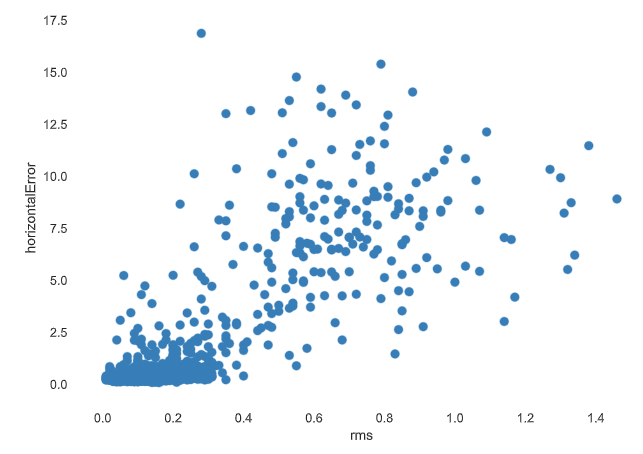
- The Seaborn scatter plot depthError vs horizontal Error:
plt.figure(figsize=(10, 5))
sb.scatterplot(data=events,
            x='depthError',
            y='horizontalError')
plt.show()


Make a one-time donation
Make a monthly donation
Make a yearly donation
Choose an amount
Or enter a custom amount
Your contribution is appreciated.
Your contribution is appreciated.
Your contribution is appreciated.
DonateDonate monthlyDonate yearly
Leave a comment