
In this post, we will compare 1Y ROI/Risk of selected stocks vs ETF using a set of basic stock analyzer functions. The posts consists of the following three parts:
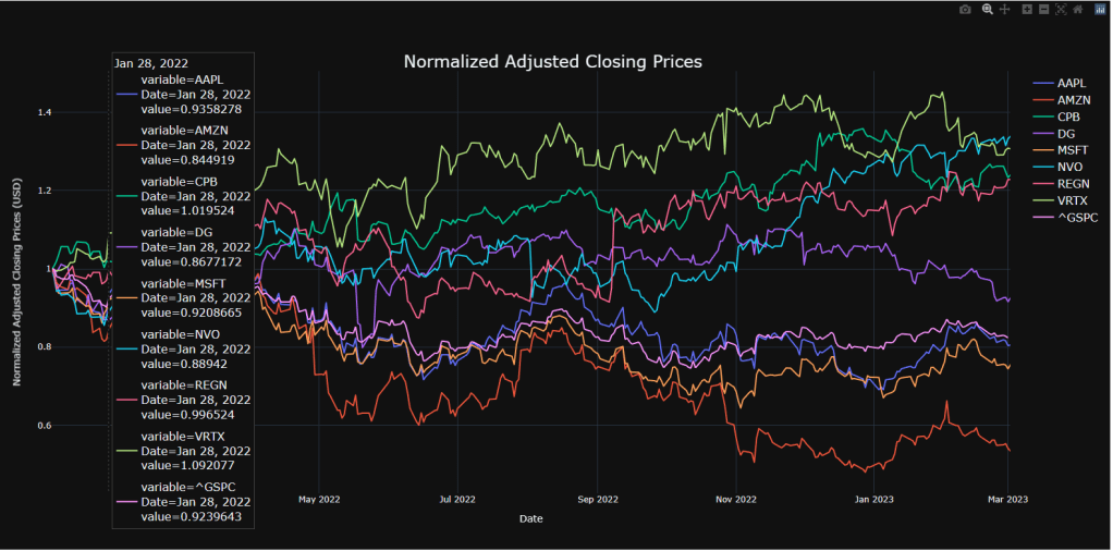
- Comparing normalized prices of selected stocks
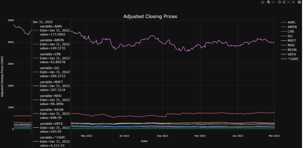
Looking at the closing price of a stock over time is a good way to track its performance
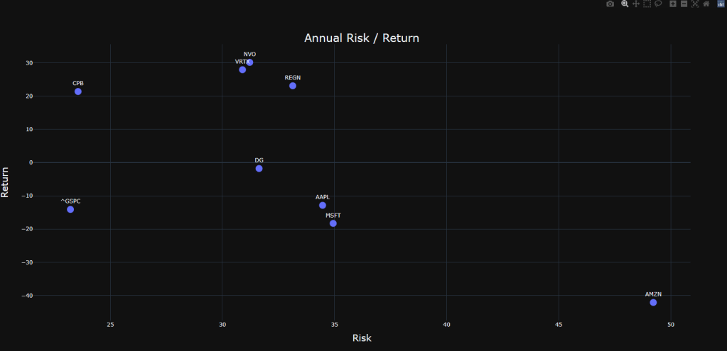
- Visualizing and comparing annual risk and return
We combine the risk and return metrics into a single plot; we define return as the percent change in 1Y closing price and risk will be the corresponding standard deviation (STDV) of daily returns over the period of time.
- Examining correlation matrix of stock returns
We look at the correlation matrix that would give us useful insights into how certain stocks will react under similar market conditions.
Requirements
import os
os.chdir(‘YOURPATH’)
os. getcwd()
import pandas as pd
import plotly.offline as offline
from plotly.offline import download_plotlyjs, init_notebook_mode, plot, iplot
import plotly.express as px
import plotly.graph_objs as go
offline.init_notebook_mode(connected=True)
pd.set_option(‘display.max_rows’, 10)
Input Data
import yfinance as yf
import plotly.express as px
import plotly.io as pio
import numpy as np
import plotly.graph_objects as go
pio.renderers.default = “browser”
tickers=[‘AMZN’,’AAPL’,’MSFT’,’CPB’,’DG’,’^GSPC’,’NVO’,’REGN’,’VRTX’]
start_date=”2022-01-01″
mydf=yf.download(tickers,start=start_date)
[*********************100%***********************] 9 of 9 completed
Price
def close_plot(df, adj = True, normalize = False):
if adj:
    close = df.loc[:,"Adj Close"].copy()
    title = "Adjusted Closing Prices"
else:
    close = df.loc[:,"Close"].copy()
    title = "Closing Prices"

if normalize:
    normclose = close.div(close.iloc[0]) #Normalizes data
    fig = px.line(normclose,
                  x = normclose.index,
                  y = normclose.columns,
                  title = "Normalized " + title,
                  template = 'plotly_dark') # Plotting Normalized closing data
    fig.update_layout(
        legend = dict(title = None, font = dict(size = 16)),
        title={
        'y':0.9,
        'x':0.5,
        'font': {'size': 24},
        'xanchor': 'center',
        'yanchor': 'top'},
        hovermode = "x unified",
        xaxis_title = "Date",
        yaxis_title = "Normalized " + title + " (USD)"
        )
    fig.show()
else:
    fig = px.line(close,
                  x = close.index,
                  y = close.columns,
                  title = title,
                  template = 'plotly_dark') # Plotting Normalized closing data
    fig.update_layout(
        legend = dict(title = None, font = dict(size = 16)),
        title={
        'y':0.9,
        'x':0.5,
        'font': {'size': 24},
        'xanchor': 'center',
        'yanchor': 'top'},
        hovermode = "x unified",
        xaxis_title = "Date",
        yaxis_title = title +  " (USD)"
        )
    fig.show()
close_plot(mydf, adj = True, normalize = False)
close_plot(mydf, adj = True, normalize = True)
Return
def returns_plot(df, adj = True):
if adj:
    close = df.loc[:,"Adj Close"].copy()
else:
    close = df.loc[:,"Close"].copy()

ret = close.pct_change().dropna()
cum_ret  = ((1 + ret).cumprod() -1) * 100
fig = px.line(cum_ret, template = 'plotly_dark')
fig.update_layout(
    legend = dict(title = None, font = dict(size = 16)),
    title={
        'y':0.95,
        'x':0.5,
        'text': "Daily Cumulative Returns",
        'font': {'size': 24},
        'xanchor': 'center',
        'yanchor': 'top'},
    hovermode = "x unified",
    xaxis_title = "Date",
    yaxis_title = "% Returns")

fig.show()
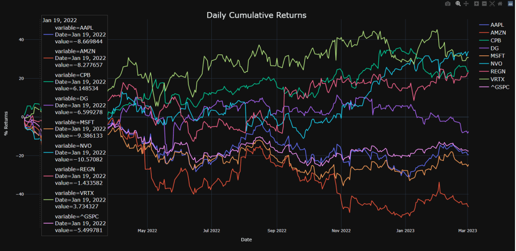
returns_plot(mydf, adj = True)
ROI/Risk
def risk_return(df, adj = True, crypto = False):
if adj:
    close = df.loc[:,"Adj Close"].copy()
else:
    close = df.loc[:,"Close"].copy()

if crypto:
    trading_days = 365
else:
    trading_days  = 252


ret = close.pct_change().dropna().mul(100) #Returns of each stock in terms of percent change
summary = ret.describe().T.loc[:,["mean","std"]]
summary["mean"] = summary["mean"]*trading_days # Multiply by number of trading days
summary["std"]  = summary["std"]*np.sqrt(trading_days) # Multiply by number of trading dayss
summary.rename(columns = {'mean':'Return', 'std':'Risk'}, inplace = True)
fig = px.scatter(summary,
                 x = 'Risk',
                 y = 'Return',
                 title = "Annual Risk / Return",
                 text = summary.index,
                 template = 'plotly_dark')
fig.update_traces(marker={'size': 15},
                  textposition='top center',
                  hoverlabel=dict(font=dict(size=20) ))
fig.update_layout(
    legend = dict(title = None),
    title={
    'y':0.9,
    'x':0.5,
    'font': {'size': 24},
    'xanchor': 'center',
    'yanchor': 'top',},
    xaxis = dict(title = dict(font = dict(size = 20))),
    yaxis = dict(title = dict(font = dict(size = 20)))
    )
fig.show()
risk_return(mydf, adj = True, crypto = False)
Correlations
def ret_corr(df, adj = True, crypto = False):
if adj:
    close = df.loc[:,"Adj Close"].copy()
else:
    close = df.loc[:,"Close"].copy()

if crypto:
    trading_days = 365
else:
    trading_days  = 252

ret = close.pct_change().dropna().mul(100) #Returns of each stock in terms of percent change
summary = ret.describe().T.loc[:,["mean","std"]]
summary["mean"] = summary["mean"]*trading_days # Multiply by number of trading days
summary["std"]  = summary["std"]*np.sqrt(trading_days) # Multiply by number of trading days
summary.rename(columns = {'mean':'Return', 'std':'Risk'}, inplace = True)

fig = px.imshow(ret.corr(), text_auto=True, color_continuous_scale='tempo', template = 'plotly_dark', title = "Returns Correlation")
fig.update_layout(
    legend = dict(title = None),
    title={
    'y':0.9,
    'x':0.5,
    'xanchor': 'center',
    'yanchor': 'top'}
    )
fig.show()
ret_corr(mydf, adj = True, crypto = False)

Summary
Based on the above plots, we select the CPB stock for trading because of:
- Low correlation between CPB and ^GSPC
- High return(CPB) ~20% compared to loss(^GSPC) ~ 13%
- Low risk(CPB) ~ 23% comparable to low risk(^GSPC).
Explore More
Bear vs. Bull Portfolio Risk/Return Optimization QC Analysis
A TradeSanta’s Quick Guide to Best Swing Trading Indicators
Algorithmic Testing Stock Portfolios to Optimize the Risk/Reward Ratio
Stock Portfolio Risk/Return Optimization
Risk/Return QC via Portfolio Optimization – Current Positions of The Dividend Breeder
Risk/Return POA – Dr. Dividend’s Positions


Make a one-time donation
Make a monthly donation
Make a yearly donation
Choose an amount
Or enter a custom amount
Your contribution is appreciated.
Your contribution is appreciated.
Your contribution is appreciated.

Leave a comment