
Featured Photo by Ella Olsson on Pexels
Inspired by the recent TSA e-commerce use-case, this article is a beginner-friendly guide to help you understand and evaluate ARIMA-based time-series forecasting models such as SARIMA and SARIMAX.
Objective: To understand the basic concepts of ARIMA, SARIMA and SARIMAX in terms of Time Series Forecasting QC.
Application: We will focus on an QC-optimized SARIMA(X) model in order to forecast the e-commerce sales of a food delivery company based in Helsinki, Finland.
Insights: We will assume that delivery companies get its revenue from two main sources:
- Up to 30% cut from every order.
- Delivery fees.
The first revenue stream depends upon the order volume and the value of each order. The second revenue is linked to multiple sources such as delivery distance, order size, order value, day of the week, etc.
Concepts:
- ACF, PACF
- Seasonal Decomposition
- Stationarity of time-series
- ADF & KPSS Tests
- Hyper-Parameter Optimization (HPO)
- SARIMA/SARIMAX: Model QC Comparisons
- Evaluation Metrics: AIC, BIC, MSE, SSE, and RMSE
Table of Contents:
- Libraries
- Input Data
- Feature Engineering
- Temporal Patterns
- ADF & KPSS Tests
- ACF & PACF
- SARIMA Model
- SARIMAX Model
- Model Comparison
- Summary
- Explore More
- Embed Socials
- Infographic
You can go through the below articles for more details on ARIMA-related topics:
- Complete Guide To SARIMAX in Python for Time Series Modeling
- Time Series Forecasting with SARIMAX
- Time Series Forecasting with ARIMA , SARIMA and SARIMAX
- ARIMA SARIMA SARIMAX For Beginners
Libraries
Let’s set the working directory YOURPATH
import os
os.chdir(‘YOURPATH’)
os. getcwd()
and import the following libraries
import itertools
import warnings
from datetime import datetime, timedelta
import numpy as np
import pandas as pd
import matplotlib.pyplot as plt
from pandas.plotting import lag_plot
import seaborn as sns
%matplotlib inline
from statsmodels.tsa.seasonal import seasonal_decompose
from statsmodels.tsa.stattools import adfuller, kpss
from statsmodels.graphics.tsaplots import plot_acf, plot_pacf
from statsmodels.tsa.statespace.sarimax import SARIMAX
from statsmodels.tools.sm_exceptions import ConvergenceWarning
Input Data
Let’s load the input dataset
source_df = pd.read_csv(‘orders.csv’)
df = source_df.copy()
df.tail(5)

df.shape
(18706, 13)
df[‘TIMESTAMP’] = pd.to_datetime(df[‘TIMESTAMP’])
df.info()
<class 'pandas.core.frame.DataFrame'>
RangeIndex: 18706 entries, 0 to 18705
Data columns (total 13 columns):
 #   Column                     Non-Null Count  Dtype
---  ------                                                --------------  -----
 0   TIMESTAMP                              18706 non-null  datetime64[ns]
 1   ACTUAL_DELIVERY_MINUTES - ESTIMATED_DELIVERY_MINUTES 18706 non-null  int64
 2   ITEM_COUNT                                      18706 non-null  int64
 3   USER_LAT                                       18706 non-null  float64
 4   USER_LONG                                      18706 non-null  float64
 5   VENUE_LAT                                      18706 non-null  float64
 6   VENUE_LONG                                     18706 non-null  float64
 7   ESTIMATED_DELIVERY_MINUTES                     18706 non-null  int64
 8   ACTUAL_DELIVERY_MINUTES                        18706 non-null  int64
 9   CLOUD_COVERAGE                                 18429 non-null  float64
 10  TEMPERATURE                                    18429 non-null  float64
 11  WIND_SPEED                                     18429 non-null  float64
 12  PRECIPITATION                                 18706 non-null  float64
dtypes: datetime64[ns](1), float64(8), int64(4)
memory usage: 1.9 MB
df.describe().T

We can see that there are no extreme deviations between mean and median values of each column. This suggests that we can expect little skewness in the distributions.
Let’s look at the spatial content of our input data
plt.scatter(df[‘USER_LAT’],df[‘USER_LONG’],c=df[‘ACTUAL_DELIVERY_MINUTES’])
plt.colorbar()
plt.title(“ACTUAL_DELIVERY_MINUTES”)
plt.xlabel(“USER_LAT”)
plt.ylabel(“USER_LONG”)
plt.savefig(‘inputdeliverymin.png’)

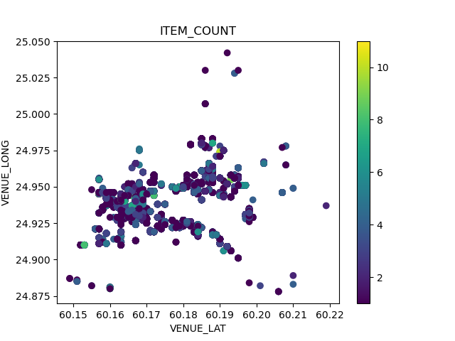
plt.scatter(df[‘VENUE_LAT’],df[‘VENUE_LONG’],c=df[‘ITEM_COUNT’])
plt.colorbar()
plt.title(“ITEM_COUNT”)
plt.xlabel(“VENUE_LAT”)
plt.ylabel(“VENUE_LONG”)
plt.savefig(‘inputvenueitemcount.png’)
Feature Engineering
Let’s plot the sns Pearson correlation heatmap
def correlation_check(df: pd.DataFrame) -> None:
“””
Plots a Pearson Correlation Heatmap.
—
Args:
df (pd.DataFrame): dataframe to plot
Returns: None
"""

# Pretty Name
df.rename(columns={"ACTUAL_DELIVERY_MINUTES - ESTIMATED_DELIVERY_MINUTES": "ACTUAL-ESTIMATED"},
          inplace=True)

# Figure
fig, ax = plt.subplots(figsize=(16,12), facecolor='w')
correlations_df = df.corr(method='pearson', min_periods=1)
sns.heatmap(correlations_df, cmap="Oranges", annot=True, linewidth=.1)

# Labels
ax.set_title("Pearson Correlation Heatmap", fontsize=15, pad=10)
ax.set_facecolor(color='white')
correlation_check(df)
plt.savefig(‘salesheatmap.png’)

We can also check feature correlations via the sns pairplot
sns.pairplot(data=df)
plt.savefig(‘salespairplot.png’)

As with the heatmap, the pair-plot didn’t reveal any underlying, strong relationship between the variables. Exceptions:
- ACTUAL_DELIVERY_MINUTES – ESTIMATED_DELIVERY_MINUTES is strongly correlated with ACTUAL_DELIVERY_MINUTES and ESTIMATED_DELIVERY_MINUTES.
- There are correlations between spatial coordinates.
Temporal Patterns
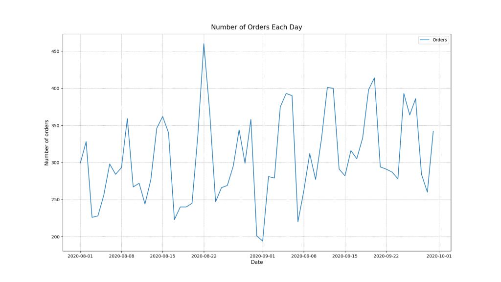
Let’s create a new DataFrame with daily frequency and number of orders
daily_df = df.groupby(pd.Grouper(key=’TIMESTAMP’, freq=’D’)).size().reset_index(name=’ORDERS’)
daily_df.set_index(‘TIMESTAMP’, inplace=True)
daily_df.index.freq = ‘D’ # To keep pandas inference in check!
print(daily_df.head())
print(daily_df.describe())
RDERS
TIMESTAMP
2020-08-01     299
2020-08-02     328
2020-08-03     226
2020-08-04     228
2020-08-05     256
           ORDERS
count   61.000000
mean   306.655738
std     58.949381
min    194.000000
25%    267.000000
50%    294.000000
75%    346.000000
max    460.000000
Let’s plot the number of orders per day
def orders_per_day(df: pd.DataFrame) -> None:
# Figure
fig, ax = plt.subplots(figsize=(16,9), facecolor='w')
ax.plot(df.index, df['ORDERS'])

# Labels
ax.set_title("Number of Orders Each Day", fontsize=15, pad=10)
ax.set_ylabel("Number of orders", fontsize=12)
ax.set_xlabel("Date", fontsize=12)

# Grid & Legend
plt.grid(linestyle=":", color='grey')
plt.legend(["Orders"])
plt.savefig('salesnumberofdays.png')
orders_per_day(daily_df)
plt.savefig(‘salesnumberoforders.png’)
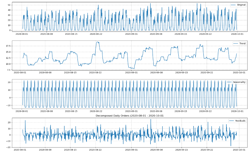
Let’s check the series for trends and seasonality
def decompose_series(df: pd.DataFrame) -> None:
# Decomposition
decomposition = seasonal_decompose(df)
trend = decomposition.trend
seasonal = decomposition.seasonal
residual = decomposition.resid

#Figure
fig, (ax1,ax2,ax3,ax4) = plt.subplots(4,1, figsize=(16,10), facecolor='w')

ax1.plot(df, label='Original')
ax2.plot(trend, label='Trend')
ax3.plot(seasonal,label='Seasonality')
ax4.plot(residual, label='Residuals')

# Legend
ax1.legend(loc='upper right')
ax2.legend(loc='upper right')
ax3.legend(loc='upper right')
ax4.legend(loc='upper right')

ax1.grid(linestyle=":", color='grey')
ax2.grid(linestyle=":", color='grey')
ax3.grid(linestyle=":", color='grey')
ax4.grid(linestyle=":", color='grey')

plt.title('Decomposed Daily Orders (2020-08-01 - 2020-10-01')
plt.tight_layout()
plt.savefig('salesdecomposeseries.png')
decompose_series(daily_df)

- Trend: There is a general rising trend for the given time period. However, it is not constant. Number of orders decreases around 9th of september but then recovers resulting in an approx. 7% overall increase for the observed time period.
- Seasonality: There are clear weekly seasonal patterns. Number of orders is low in the beginning of the week and grows towards the weekend.
- Residuals: No observable patterns left in the residuals.
Let’s plot a heatmap with days of the week and hours of the day vs the number of orders
def orders_weekdays_hours(dataframe: pd.DataFrame) -> None:
# Data
df = dataframe.copy(deep=False)

# Reshaping data for the plot
df["hour"] = pd.DatetimeIndex(df['TIMESTAMP']).hour
df["weekday"] = pd.DatetimeIndex(df['TIMESTAMP']).weekday
daily_activity = df.groupby(by=['weekday','hour']).count()['TIMESTAMP'].unstack()

# Figure Object
fig, ax = plt.subplots(figsize=(10,10), facecolor='w')
yticklabels = ["Mon", "Tue","Wed", "Thu", "Fri", "Sat", "Sun"]
sns.heatmap(daily_activity, robust=True, cmap="Oranges", yticklabels=yticklabels)

# Labeling
ax.set_title("Ordering Patterns", fontsize=15, pad=10)
ax.set_xlabel("Hours of the day (Hours)", fontsize=12, x=.5)
ax.set_ylabel("Day of the week", fontsize=12, y=.5)

plt.savefig('salesorderingpatterns.png')
orders_weekdays_hours(df)

- Each day seems to have two peaks in number of orders.
- Hottest ordering times are slightly different for workdays and weekends.
- During the workdays number of orders peaks at 8am and 16pm with decrease in orders during the lunchtime.
- The weekends exhibit a similar behavior but higher overall number of orders and with different peaks at 10-11am and 15-16pm.
Let’s creating a new DataFrame with hourly frequency number of orders
hourly_df = df.groupby(pd.Grouper(key=’TIMESTAMP’, freq=’1h’)).size().reset_index(name=’ORDERS’)
hourly_df.set_index(‘TIMESTAMP’, inplace=True)
hourly_df.index.freq = ‘H’
print(hourly_df, hourly_df.describe())
                    ORDERS
TIMESTAMP
2020-08-01 06:00:00       3
2020-08-01 07:00:00       6
2020-08-01 08:00:00      15
2020-08-01 09:00:00      20
2020-08-01 10:00:00      26
...                     ...
2020-09-30 16:00:00      42
2020-09-30 17:00:00      26
2020-09-30 18:00:00      19
2020-09-30 19:00:00       8
2020-09-30 20:00:00       1

[1455 rows x 1 columns]             ORDERS
count  1455.000000
mean     12.856357
std      13.733086
min       0.000000
25%       0.000000
50%       8.000000
75%      24.000000
max      53.000000
Let’s plot the number of orders per hour
def orders_per_hour(df: pd.DataFrame, start: datetime, end: datetime ) -> None:
# Figure
fig, ax = plt.subplots(figsize=(16,9), facecolor='w')
ax.plot(df.index, df['ORDERS'])

# Labels
ax.set_title(f"Number of Orders Each Hour ({start.date()} - {end.date()})", fontsize=15, pad=10)
ax.set_ylabel("Number of orders", fontsize=12)
ax.set_xlabel("Date", fontsize=12)

# Axis Limit
ax.set_xlim([start, end])

# Legend & Grid
plt.grid(linestyle=":", color='grey')
plt.legend(["Orders"])
plt.savefig('salesnumberofeachhours.png')
start = datetime(2020, 8, 1)
end = datetime(2020, 8, 15)
orders_per_hour(hourly_df, start, end)

Let’s decompose these time series
decompose_series(hourly_df)
- Trend: There doesn’t seem to be definite upwards or downwards trend. Recall from the daily plot that there is a trend.
- Seasonality: There is very strong daily seasonal pattern. Recall from the daily plot that there is also a weekly seasonality.
- Residuals: No observable patterns left in the residuals.
Let’s plot rolling mean and STD with window=48
def plot_rolling_mean_and_std(dataframe: pd.DataFrame, window: int) -> None:
df = dataframe.copy()
# Get Things Rolling
roll_mean = df.rolling(window=window).mean()
roll_std = df.rolling(window=window).std()
# Figure
fig, ax = plt.subplots(figsize=(16,9), facecolor='w')
ax.plot(df, label='Original')
ax.plot(roll_mean, label='Rolling Mean')
ax.plot(roll_std,  label='Rolling STD')

# Legend & Grid
ax.legend(loc='upper right')
plt.grid(linestyle=":", color='grey')
plt.savefig('salesrollingmean.png')
plot_rolling_mean_and_std(hourly_df, window=48)

- We can see that the mean and the variance of the time series are time-variant.
- Mean and variance seem to follow weekly seasons.
ADF & KPSS Tests
Let’s perform the Augmented Dickey Fuller (ADF) Test:
– The null hypothesis for this test is that there is a unit root.
– The alternate hypothesis is that there is no unit root in the series.
def perform_adf_test(df: pd.DataFrame) -> None:
adf_stat, p_value, n_lags, n_observ, crit_vals, icbest = adfuller(df)

print('\nAugmented Dickey Fuller Test')
print('---'*15)
print('ADF Statistic: %f' % adf_stat)
print('p-value: %f' % p_value)
print(f'Number of lags used: {n_lags}')
print(f'Number of observations used: {n_observ}')
print(f'T values corresponding to adfuller test:')
for key, value in crit_vals.items():
    print(key, value)
We also perform the Kwiatkowski-Phillips-Schmidt-Shin (KPSS) test for stationarity:
– The null hypothesis for the test is that the data is stationary.
– The alternate hypothesis for the test is that the data is not stationary.
def perform_kpss_test(df: pd.DataFrame) -> None:
kpss_stat, p_value, n_lags, crit_vals = kpss(df, nlags='auto', store=False)
print('\nKwiatkowski-Phillips-Schmidt-Shin test')
print('---'*15)
print('KPSS Statistic: %f' % kpss_stat)
print('p-value: %f' % p_value)
print(f'Number of lags used: {n_lags}')
print(f'Critical values of KPSS test:')
for key, value in crit_vals.items():
    print(key, value)
Let’s call these two functions
perform_adf_test(hourly_df)
perform_kpss_test(hourly_df)
Augmented Dickey Fuller Test
---------------------------------------------
ADF Statistic: -3.464712
p-value: 0.008941
Number of lags used: 24
Number of observations used: 1430
T values corresponding to adfuller test:
1% -3.434931172941245
5% -2.8635632730206857
10% -2.567847177857108

Kwiatkowski-Phillips-Schmidt-Shin test
---------------------------------------------
KPSS Statistic: 0.396855
p-value: 0.078511
Number of lags used: 20
Critical values of KPSS test:
10% 0.347
5% 0.463
2.5% 0.574
1% 0.739
- Since ADF Statistic -3.46 < -3.43 and p-value: 0.0089 < 0.05 we can reject the N0 hypothesis in the favor of NA. According to the ADF test, our time series have no unit root.
- Since KPSS Statistic 0.396 < 0.463 and 0.078 > 0.05 we fail to reject the N0 hypothesis. According to the KPSS test, our time series are trend-stationary.
This is consistent with our observation that rolling mean and STD follow a weekly trend.
ACF & PACF
Let’s invoke ACF and PACF to identify the lags that have high correlations
def plot_acf_pacf(df: pd.DataFrame, acf_lags: int, pacf_lags: int) -> None:
# Figure
fig, (ax1, ax2) = plt.subplots(1, 2, figsize=(16,9), facecolor='w')

# ACF & PACF
plot_acf(df['ORDERS'], ax=ax1, lags=acf_lags)
plot_pacf(df['ORDERS'], ax=ax2, lags=pacf_lags, method='ywm')

# Labels
ax1.set_title("Autocorrelation", fontsize=15, pad=10)
ax1.set_ylabel("Number of orders", fontsize=12)
ax1.set_xlabel("Lags (Hours)", fontsize=12)

ax2.set_title("Partial Autocorrelation", fontsize=15, pad=10)
ax2.set_ylabel("Number of orders", fontsize=12)
ax2.set_xlabel("Lags (Hours)", fontsize=12)

# Legend & Grid
ax1.grid(linestyle=":", color='grey')
ax2.grid(linestyle=":", color='grey')

plt.savefig('salesautocorrelation.png')
plot_acf_pacf(hourly_df, acf_lags=72, pacf_lags= 72)
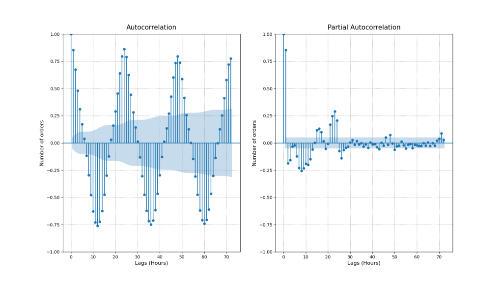
- ACF
- As we already knew our series are seasonal and our ACF plot confirms this pattern. If we plot more lags we will also observe that significance of the lags is gradually declining.
- First significant lag is lag 1. The number of daily orders raises/decreases gradually from hour to hour. Hence the orders during the previous hour might tell us something about orders during the current hour.
- Next important lags are 12 and 24. These are deterministic seasonal patterns connected with day/night cycles. 12 hour lag is negatively correlated because when at 8:00 am number of orders starts to increase at 20:00 pm the number of orders is already decreasing. However, 24 hour lag shows that number of orders made today at 16:00 pm might tell us about the number of orders to be made tomorrow at 16:00 pm.
- PACF
- We can see that lag 1 and 24 have the highest correlations. This means that seasons 24 hours apart are directly inter-correlated regardless of what is happening in between.
We can take a detailed look at the above Lags of interest
def lag_plots(df: pd.DataFrame) -> None:
# Figure
fig, (ax1, ax2, ax3) = plt.subplots(1, 3, figsize=(16,9), facecolor='w')

# Lags
lag_plot(df['ORDERS'], lag=1, ax=ax1, c='#187bcd')
lag_plot(df['ORDERS'], lag=12, ax=ax2, c='grey')
lag_plot(df['ORDERS'], lag=24, ax=ax3, c='#187bcd')

# Labels
ax1.set_title("y(t+1)", fontsize=15, pad=10)
ax2.set_title("y(t+12)", fontsize=15, pad=10)
ax3.set_title("y(t+24)", fontsize=15, pad=10)

# Legend & Grid
ax1.grid(linestyle=":", color='grey')
ax2.grid(linestyle=":", color='grey')
ax3.grid(linestyle=":", color='grey')
lag_plots(hourly_df)

Lags 1, 12, and 24 follow the ACF correlation trends: both high positive linear correlations (Lags 1 and 24) and a strongly negative non-linear correlation (Lag 12) are confirmed.
SARIMA Model
The SARIMA model is specified as follows
(p,d,q) x (P,D,Q)s
where
- Trend Elements are:
- p: Autoregressive order
- d: Difference order
- q: Moving average order
- Seasonal Elements are:
- P: Seasonal autoregressive order.
- D: Seasonal difference order. D=1 would calculate a first order seasonal difference
- Q: Seasonal moving average order. Q=1 would use a first order errors in the model
- s Single seasonal period
We will use the Box–Jenkins method for SARIMA parameter tuning.
Let’s split the input dataframe into train/test sets as 75% / 15%.
def train_test_split(df: pd.DataFrame, train_set, test_set):
train_set = df[df.index <= train_end]
test_set = df[df.index > train_end]
return train_set, test_set
warnings.simplefilter(‘ignore’, ConvergenceWarning)
train_end = datetime(2020,9,15)
test_end = datetime(2020,9,30)
train_df, test_df = train_test_split(hourly_df, train_end, test_end)
Let's set the hyper-parameters
p, d, q = 1, 1, 1
P, D, Q = 2, 1, 1
s = 24
and fit the SARIMA model
sarima_model = SARIMAX(train_df, order=(p, d, q), seasonal_order=(P, D, Q, s))
sarima_model_fit = sarima_model.fit(disp=0)
print(sarima_model_fit.summary())
SARIMAX Results
==========================================================================================
Dep. Variable:                             ORDERS   No. Observations:                 1075
Model:             SARIMAX(1, 1, 1)x(2, 1, 1, 24)   Log Likelihood               -3158.989
Date:                            Sat, 14 Jan 2023   AIC                           6329.979
Time:                                    11:21:55   BIC                           6359.718
Sample:                                08-01-2020   HQIC                          6341.255
                                     - 09-15-2020
Covariance Type:                              opg
==============================================================================
                 coef    std err          z      P>|z|      [0.025      0.975]
------------------------------------------------------------------------------
ar.L1          0.3729      0.027     13.720      0.000       0.320       0.426
ma.L1         -0.9415      0.012    -75.980      0.000      -0.966      -0.917
ar.S.L24       0.1375      0.024      5.666      0.000       0.090       0.185
ar.S.L48      -0.1325      0.025     -5.272      0.000      -0.182      -0.083
ma.S.L24      -0.9997      2.136     -0.468      0.640      -5.186       3.187
sigma2        21.9775     46.728      0.470      0.638     -69.607     113.562
===================================================================================
Ljung-Box (L1) (Q):                   0.64   Jarque-Bera (JB):               317.47
Prob(Q):                              0.42   Prob(JB):                         0.00
Heteroskedasticity (H):               1.27   Skew:                             0.46
Prob(H) (two-sided):                  0.03   Kurtosis:                         5.53
===================================================================================

Warnings:
[1] Covariance matrix calculated using the outer product of gradients (complex-step).
Let’s plot the SARIMA diagnostics
sarima_model_fit.plot_diagnostics(figsize=(16, 9))
plt.savefig(‘salesarimaxdiagplot.png’)

- The standardize residual plot: The residuals over time don’t display any obvious patterns. They appear as white noise.
- The Normal Q-Q-plot: Shows that the ordered distribution of residuals follows the linear trend of the samples taken from a standard normal distribution with N(0, 1). However, the slight curving indicates that our distribution has heavier tails.
- Histogram and estimated density plot: The KDE follows the N(0,1) line however with noticeable differences. As mentioned before our distribution has heavier tails.
- The Correlogram plot: Shows that the time series residuals have low correlation with lagged versions of itself. Meaning there are no patterns left to extract in the residuals.
Let’s compare the test data vs SARIMA predictions
pred_start_date = test_df.index[0]
pred_end_date = test_df.index[-1]
sarima_predictions = sarima_model_fit.predict(start=pred_start_date, end=pred_end_date)
sarima_residuals = test_df[‘ORDERS’] – sarima_predictions
def plot_test_predictions(test_df: pd.DataFrame, predictions) -> None:
# Figure
fig, ax = plt.subplots(figsize=(16,9), facecolor='w')

ax.plot(test_df, label='Testing Set')
ax.plot(predictions, label='Forecast')

# Labels
ax.set_title("Test vs Predictions", fontsize=15, pad=10)
ax.set_ylabel("Number of orders", fontsize=12)
ax.set_xlabel("Date", fontsize=12)

# Legend & Grid
ax.grid(linestyle=":", color='grey')
ax.legend()

plt.savefig('salesarimaxtestpredictions.png')
plot_test_predictions(test_df, sarima_predictions)

Let’s get the SARIMA evaluation data
sarima_aic = sarima_model_fit.aic
sarima_bic = sarima_model_fit.bic
sarima_mean_squared_error = sarima_model_fit.mse
sarima_sum_squared_error=sarima_model_fit.sse
sarima_root_mean_squared_error = np.sqrt(np.mean(sarima_residuals**2))
print(f’Akaike information criterion | AIC: {sarima_aic}’)
print(f’Bayesian information criterion | BIC: {sarima_bic}’)
print(f’Mean Squared Error | MSE: {sarima_mean_squared_error}’)
print(f’Sum Squared Error | SSE: {sarima_sum_squared_error}’)
print(f’Root Mean Squared Error | RMSE: {sarima_root_mean_squared_error}’)
Akaike information criterion | AIC: 6329.978772260314
Bayesian information criterion | BIC: 6359.718044919224
Mean Squared Error | MSE: 23.867974361783705
Sum Squared Error | SSE: 25658.072438917483
Root Mean Squared Error | RMSE: 5.6716207290283
Let’s perform the SARIMA forecast of hourly orders
Forecast Window
days = 24
hours = days * 24
sarima_forecast = sarima_model_fit.forecast(hours)
sarima_forecast_series = pd.Series(sarima_forecast, index=sarima_forecast.index)
Since negative orders are not possible, we can trim them
sarima_forecast_series[sarima_forecast_series < 0] = 0
Let’s plot the test, train and forecast values
def plot_sarima_forecast(train_df: pd.DataFrame, test_df: pd.DataFrame, fc_series: pd.Series) -> None:
fig, ax = plt.subplots(figsize=(16,9), facecolor='w')

# Plot Train, Test and Forecast.
ax.plot(train_df['ORDERS'], label='Training')
ax.plot(test_df['ORDERS'], label='Actual')
ax.plot(fc_series, label='Forecast')

# Labels
ax.set_title("SARIMA Hourly Orders Forecast", fontsize=15, pad=20)
ax.set_ylabel("Number of orders", fontsize=12)
ax.set_xlabel("Date", fontsize=12)

xmin = datetime(2020, 9, 10)
xmax = datetime(2020, 10, 7)
ax = plt.gca()
ax.set_xlim([xmin, xmax])

# Legend & Grid
ax.grid(linestyle=":", color='grey')
ax.legend()

plt.savefig('salesarimahorlyforecast.png')
plot_sarima_forecast(train_df, test_df, sarima_forecast_series)
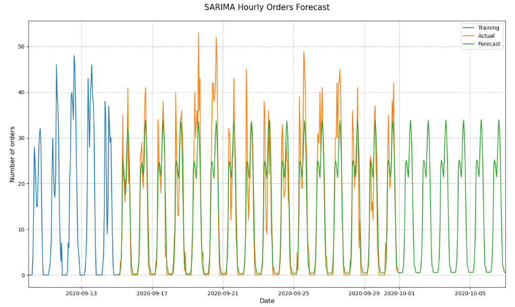
- Our SARIMA model predicts the overall hourly ordering patterns pretty well. It captures the two daily peaks and the lunchtime valley between them.
- However, it fails to predict weekly patterns. Every day in our forecast seem to be the same. If this model was sent to production we would be able to predict the number of orders every hour but that prediction would be based on the assumption that the number of orders is the same every day.
- While this model doesn’t have a great long term predictive power it can serve as a solid baseline for our next models.
SARIMAX Model
Let’s prepare the data
hour_weekday_df = hourly_df.copy()
hour_weekday_df[‘weekday_exog’] = hour_weekday_df.index.weekday
print(hour_weekday_df.head(10))
ORDERS  weekday_exog
TIMESTAMP
2020-08-01 06:00:00       3             5
2020-08-01 07:00:00       6             5
2020-08-01 08:00:00      15             5
2020-08-01 09:00:00      20             5
2020-08-01 10:00:00      26             5
2020-08-01 11:00:00      29             5
2020-08-01 12:00:00      30             5
2020-08-01 13:00:00      21             5
2020-08-01 14:00:00      23             5
2020-08-01 15:00:00      29             5
weekday_exog = hour_weekday_df[(hour_weekday_df != 0).all(1)]
weekday_exog = weekday_exog.groupby(weekday_exog.index.weekday)[‘ORDERS’].mean()
print(weekday_exog.head(7))
TIMESTAMP
1    17.386364
2    18.591241
3    18.628099
4    19.891304
5    21.939597
6    25.715385
Name: ORDERS, dtype: float64
weekday_exog = {key: (weekday_exog[key] / weekday_exog[1]) for key in weekday_exog.keys()}
print(weekday_exog)
{1: 1.0, 2: 1.0693001288106483, 3: 1.0714200831847889, 4: 1.144075021312873, 5: 1.2618853357897968, 6: 1.4790548014077425}
hour_weekday_df.replace({“weekday_exog”: weekday_exog})

1455 rows × 2 columns
Let’s perform a grid search for the SARIMAX HPO
p = range(1, 3)
d = range(1, 2)
q = range(1, 3)
s = 24
pdq = list(itertools.product(p, d, q))
seasonal_pdq = [(x[0], x[1], x[2], s) for x in pdq]
def grid_search_sarimax(train_set: pd.DataFrame) -> None:
# Supress UserWarnings
warnings.simplefilter('ignore', category=UserWarning)

# Grid Search
for order in pdq:
    for seasonal_order in seasonal_pdq:
        model = SARIMAX(train_set['ORDERS'],
                        order=order,
                        seasonal_order=seasonal_order,
                        exog=train_set['weekday_exog']
                        )
        results = model.fit(disp=0)
        print(f'ARIMA{order}x{seasonal_order} -> AIC: {results.aic}, BIC:{results.bic},  MSE: {results.mse}')
train_end = datetime(2020,9,15)
test_end = datetime(2020,9,30)
train_df, test_df = train_test_split(hour_weekday_df, train_end, test_end)
Set Hyper-Parameters
p, d, q = 1, 1, 2
P, D, Q = 2, 1, 2
s = 24
exog = train_df[‘weekday_exog’]
Fit SARIMAX
sarimax_model = SARIMAX(train_df[‘ORDERS’],
order=(p, d, q),
seasonal_order=(P, D, Q, s),
exog=exog)
sarimax_model_fit = sarimax_model.fit(disp=0)
Print the summary report
print(sarimax_model_fit.summary())
          SARIMAX Results
==========================================================================================
Dep. Variable:                             ORDERS   No. Observations:                 1075
Model:             SARIMAX(1, 1, 2)x(2, 1, 2, 24)   Log Likelihood               -3118.452
Date:                            Sat, 14 Jan 2023   AIC                           6254.904
Time:                                    11:29:13   BIC                           6299.513
Sample:                                08-01-2020   HQIC                          6271.818
                                     - 09-15-2020
Covariance Type:                              opg
================================================================================
                   coef    std err          z      P>|z|      [0.025      0.975]
--------------------------------------------------------------------------------
weekday_exog     0.8400      0.138      6.074      0.000       0.569       1.111
ar.L1            0.4934      0.063      7.777      0.000       0.369       0.618
ma.L1           -1.1571      0.080    -14.553      0.000      -1.313      -1.001
ma.L2            0.1576      0.070      2.261      0.024       0.021       0.294
ar.S.L24         0.8878      0.052     17.064      0.000       0.786       0.990
ar.S.L48        -0.2623      0.024    -10.922      0.000      -0.309      -0.215
ma.S.L24        -1.7497      0.052    -33.831      0.000      -1.851      -1.648
ma.S.L48         0.7717      0.051     15.081      0.000       0.671       0.872
sigma2          20.6048      0.887     23.226      0.000      18.866      22.344
===================================================================================
Ljung-Box (L1) (Q):                   0.00   Jarque-Bera (JB):               339.16
Prob(Q):                              0.98   Prob(JB):                         0.00
Heteroskedasticity (H):               1.34   Skew:                             0.54
Prob(H) (two-sided):                  0.01   Kurtosis:                         5.57
===================================================================================

Warnings:
[1] Covariance matrix calculated using the outer product of gradients (complex-step).
Let’s plot the SARIMAX diagnostics
sarimax_model_fit.plot_diagnostics(figsize=(16, 9))
plt.savefig(‘salesarimaxmodelfit.png’)

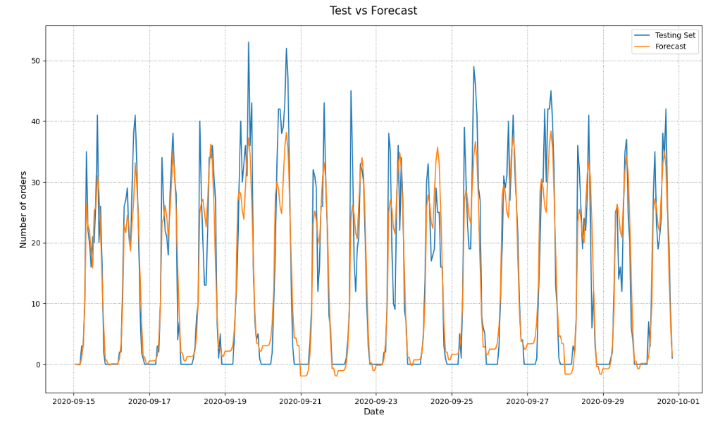
Let’s plot the predictions
pred_start_date = test_df.index[0]
pred_end_date = test_df.index[-1]
exog = test_df[‘weekday_exog’]
predictions = sarimax_model_fit.predict(start=pred_start_date, end=pred_end_date, exog=exog)
residuals = test_df[‘ORDERS’] – predictions
def plot_sarimax_test(test_set: pd.DataFrame, predictions: pd.Series) -> None:
# Figure
fig, ax = plt.subplots(figsize=(16,9), facecolor='w')

ax.plot(test_set['ORDERS'], label='Testing Set')
ax.plot(predictions, label='Forecast')

# Labels
ax.set_title("Test vs Forecast", fontsize=15, pad=15)
ax.set_ylabel("Number of orders", fontsize=12)
ax.set_xlabel("Date", fontsize=12)

# Legend & Grid
ax.grid(linestyle=":", color='grey')
ax.legend()

plt.savefig('salessarimaxtestforecastplot.png')
plot_sarimax_test(test_df, predictions)
Let’s get the SARIMAX evaluation data
sarimax_aic = sarimax_model_fit.aic
sarimax_bic = sarimax_model_fit.bic
sarimax_mean_squared_error = sarimax_model_fit.mse
sarimax_sum_squared_error=sarimax_model_fit.sse
sarimax_root_mean_squared_error = np.sqrt(np.mean(residuals**2))
print(f’Akaike information criterion | AIC: {sarimax_aic}’)
print(f’Bayesian information criterion | BIC: {sarimax_bic}’)
print(f’Mean Squared Error | MSE: {sarimax_mean_squared_error}’)
print(f’Sum Squared Error | SSE: {sarimax_sum_squared_error}’)
print(f’Root Mean Squared Error | RMSE: {sarimax_root_mean_squared_error}’)
Akaike information criterion | AIC: 6254.90400948669
Bayesian information criterion | BIC: 6299.512918475054
Mean Squared Error | MSE: 22.10675398176249
Sum Squared Error | SSE: 23764.760530394677
Root Mean Squared Error | RMSE: 5.132961570576301
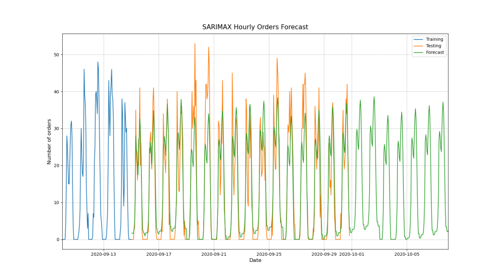
Let’s plot the train, test, and predicted values
Forecast Window
days = 24
hours = (days * 24)+1
exog = pd.date_range(start=’2020-10-01′, end=’2020-10-25′, freq=’1H’)
fc = sarimax_model_fit.forecast(hours, exog=exog.weekday)
fc_series = pd.Series(fc, index=fc.index)
Since negative orders are not possible we can trim them.
fc_series[fc_series < 0] = 0
def plot_sarimax_forecast(train_df: pd.DataFrame, test_df: pd.DataFrame, fc_series: pd.Series) -> None:
# Figure
fig, ax = plt.subplots(figsize=(16,9), facecolor='w')

# Plot Train, Test and Forecast.
ax.plot(train_df['ORDERS'], label='Training')
ax.plot(test_df['ORDERS'], label='Testing')
ax.plot(fc_series, label='Forecast')

# Labels
ax.set_title("SARIMAX Hourly Orders Forecast", fontsize=15, pad=10)
ax.set_ylabel("Number of orders", fontsize=12)
ax.set_xlabel("Date", fontsize=12)

# Axis Limits
xmin = datetime(2020, 9, 10)
xmax = datetime(2020, 10, 8)
ax = plt.gca()
ax.set_xlim([xmin, xmax])

# Legend & Grid
ax.grid(linestyle=":", color='grey')
ax.legend()

plt.savefig('salesarimaxhourlyordersforecast.png')
plot_sarimax_forecast(train_df, test_df, fc_series)
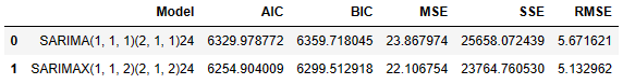
Model Comparison
Let’s compare the two models
model_comparison = pd.DataFrame({‘Model’:[‘SARIMA(1, 1, 1)(2, 1, 1)24′,’SARIMAX(1, 1, 2)(2, 1, 2)24’],
‘AIC’:[sarima_aic, sarimax_aic],
‘BIC’:[sarima_bic, sarimax_bic],
‘MSE’: [sarima_mean_squared_error, sarimax_mean_squared_error],
‘SSE’: [sarima_sum_squared_error, sarimax_sum_squared_error],
‘RMSE’: [sarima_root_mean_squared_error, sarimax_root_mean_squared_error]})
model_comparison.head()
Summary
- SARIMAX performs better than SARIMA in terms of AIC, BIC, MSE, SSE, and RMSE
- There is a general rising trend for the given time period.
- ADF Statistic -3.46 < -3.43 and p-value: 0.0089 < 0.05, so we can reject the null hypophysis N0 in favour of NA, i.e. our series have no unit root.
- Since KPSS Statistic 0.396 < 0.463 and 0.078 > 0.05 we fail to reject the null hypothesis N0, and so our series are trend-stationary.
- ACF confirmed deterministic seasonal patterns connected with day/night cycles.
- PACF shows that lag 1 and 24 have the highest correlation. This means that seasons 24 hours apart are directly correlated regardless of what is happening in between.
- SARIMAX: Log Likelihood -3118.452,
- Ljung-Box (L1) (Q): 0.00
- Prob(Q): 0.98
- Prob(H) (two-sided): 0.01
- Heteroskedasticity (H): 1.34
- Jarque-Bera (JB): 339.23
- Skew: 0.54
- Kurtosis: 5.57
- SARIMA:
- Log Likelihood -3158.989
- Ljung-Box (L1) (Q): 0.64
- Heteroskedasticity (H): 1.27
- Prob(H) (two-sided): 0.03
- Jarque-Bera (JB): 317.41
- Skew: 0.46
- Kurtosis: 5.53
- The log-likelihood value of a regression model is a way to measure the goodness of fit for a model. The higher the value of the log-likelihood, the better a model fits a dataset. In our case, Log Likelihood SARIMA < Log Likelihood SARIMAX.
- Heteroscedasticity is what you have in your data when the conditional variance in your data is not constant. In our case, Heteroskedasticity SARIMAX > Heteroskedasticity SARIMA.
- The Jarque-Bera test is a goodness-of-fit test that determines whether or not sample data have skewness/kurtosis that matches a normal distribution. The test statistic of the Jarque-Bera (JB) test is always a positive number and if it’s far from zero, it indicates that the sample data do not have a normal distribution. In our case, JB SARIMAX > JB SARIMA.
- A two-tailed test, in statistics, is a method in which the critical area of a distribution is two-sided and tests whether a sample is greater than or less than a certain range of values. In our case, Prob(H) (two-sided) SARIMA > Prob(H) (two-sided) SARIMAX.
- Ljung-Box (L1) (Q) SARIMAX << Ljung-Box (L1) (Q) SARIMA. Essentially, it is a test of lack of fit: if the autocorrelations of the residuals are very small, we say that the model doesn’t show ‘significant lack of fit’.
- The Normal Q-Q-plots shows that the ordered distribution of residuals follows the linear trend for both models. However, the slight curving indicates that our distribution has heavier tails.
- Histogram and estimated density plot: The KDE follows the N(0,1) line with slight differences.
- SARIMA: Model succeeded in capturing the underlying hourly ordering patterns with limited accuracy. However, it failed to capture patterns related to days of the week.
- SARIMAX: Model did a better job! It improved the accuracy of the previous model. However, its accuracy is still limited. This model captured the two daily spikes but not when these spikes crossed the mark of 40 orders. Additionally the model predicts orders during the night hours that are very unlikely to occur. It seems that the model would benefit from another exog variable that would apply hourly weights for each hour of the day.
Explore More
Stock Forecasting with FBProphet
S&P 500 Algorithmic Trading with FBProphet
E-Commerce Cohort Analysis in Python
E-Commerce Data Science Use-Case
E-Commerce ML/AI Classification
- Simple E-Commerce Sales BI Analytics
- Brazilian E-Commerce Showcase
- A K-means Cluster Cohort E-Commerce
Embed Socials
Infographic

How do we calculate HQIC information criteria for time series data when we fit SARIMA model?


Make a one-time donation
Make a monthly donation
Make a yearly donation
Choose an amount
Or enter a custom amount
Your contribution is appreciated.
Your contribution is appreciated.
Your contribution is appreciated.
DonateDonate monthlyDonate yearly
Leave a comment