
Featured Photo by Jeremy Waterhouse.
Recently, Dr. Dividend shared his insights into $ASML EUV business. This post is a follow-up based upon the highly interactive Plotly Stock Market Dashboard.
Let’s import/install the key libraries
!pip install pandas_datareader
Successfully installed pandas_datareader-0.10.0
!pip install ta
Successfully installed ta-0.10.2
import numpy as np
import pandas as pd
from pandas_datareader import data as pdr
import yfinance as yf
import datetime as dt
import plotly.graph_objs as go
import plotly
from plotly.subplots import make_subplots
from ta.trend import MACD
from ta.momentum import StochasticOscillator
yf.pdr_override()
Create the input field for $ASML
stock=input(“Enter a stock ticker symbol: “)

Let’ retrieve the stock data frame (df) from yfinance API at an interval of 1m
df = yf.download(tickers=stock,period=’1d’,interval=’1m’)
and add Moving Averages (5day and 20day) to df
df[‘MA5’] = df[‘Close’].rolling(window=5).mean()
df[‘MA20’] = df[‘Close’].rolling(window=20).mean()
print(df)

Let’s declare plotly figure (go)
fig=go.Figure()
fig.add_trace(go.Candlestick(x=df.index,
open=df[‘Open’],
high=df[‘High’],
low=df[‘Low’],
close=df[‘Close’], name = ‘market data’))
fig.update_layout(
title= str(stock)+’ Live Share Price:’,
yaxis_title=’Stock Price (USD per Shares)’)
fig.update_xaxes(
rangeslider_visible=True,
rangeselector=dict(
buttons=list([
dict(count=15, label=”15m”, step=”minute”, stepmode=”backward”),
dict(count=45, label=”45m”, step=”minute”, stepmode=”backward”),
dict(count=1, label=”HTD”, step=”hour”, stepmode=”todate”),
dict(count=3, label=”3h”, step=”hour”, stepmode=”backward”),
dict(step=”all”)
])
)
)
Add 5-day Moving Average Trace
fig.add_trace(go.Scatter(x=df.index,
y=df[‘MA5’],
opacity=0.7,
line=dict(color=’blue’, width=2),
name=’MA 5′))
and add the 20-day Moving Average Trace
fig.add_trace(go.Scatter(x=df.index,
y=df[‘MA20’],
opacity=0.7,
line=dict(color=’orange’, width=2),
name=’MA 20′))
fig.show()
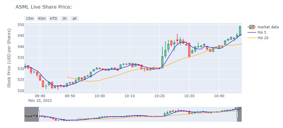
When the MA 5 crosses above the MA 20, it’s a buy signal, as it indicates that the trend is shifting up. This is known as a golden cross. Meanwhile, when the MA 5 crosses below the MA 20, it’s a sell signal, as it indicates that the trend is shifting down. This is known as a dead/death cross.
MACD and Stochastic: A Double-Cross Strategy
Let’s look for and identify a simultaneous bullish MACD crossover along with a bullish stochastic crossover and use these indicators as the entry point to trade.
macd = MACD(close=df[‘Close’],
window_slow=26,
window_fast=12,
window_sign=9)
stoch = StochasticOscillator(high=df[‘High’],
close=df[‘Close’],
low=df[‘Low’],
window=14,
smooth_window=3)
The entire UI block is as follows:
Declare plotly figure (go)
fig=go.Figure()
and add subplot properties when initializing fig variable
fig = plotly.subplots.make_subplots(rows=4, cols=1, shared_xaxes=True, vertical_spacing=0.01, row_heights=[0.5,0.1,0.2,0.2])
fig.add_trace(go.Candlestick(x=df.index,
open=df[‘Open’],
high=df[‘High’],
low=df[‘Low’],
close=df[‘Close’], name = ‘market data’))
fig.add_trace(go.Scatter(x=df.index,
y=df[‘MA5’],
opacity=0.7,
line=dict(color=’blue’, width=2),
name=’MA 5′))
fig.add_trace(go.Scatter(x=df.index,
y=df[‘MA20’],
opacity=0.7,
line=dict(color=’orange’, width=2),
name=’MA 20′))
Plot volume trace on 2nd row
colors = [‘green’ if row[‘Open’] – row[‘Close’] >= 0
else ‘red’ for index, row in df.iterrows()]
fig.add_trace(go.Bar(x=df.index,
y=df[‘Volume’],
marker_color=colors
), row=2, col=1)
Plot MACD trace on 3rd row
colorsM = [‘green’ if val >= 0
else ‘red’ for val in macd.macd_diff()]
fig.add_trace(go.Bar(x=df.index,
y=macd.macd_diff(),
marker_color=colorsM
), row=3, col=1)
fig.add_trace(go.Scatter(x=df.index,
y=macd.macd(),
line=dict(color=’black’, width=2)
), row=3, col=1)
fig.add_trace(go.Scatter(x=df.index,
y=macd.macd_signal(),
line=dict(color=’blue’, width=1)
), row=3, col=1)
Plot stochastics trace on 4th row
fig.add_trace(go.Scatter(x=df.index,
y=stoch.stoch(),
line=dict(color=’black’, width=2)
), row=4, col=1)
fig.add_trace(go.Scatter(x=df.index,
y=stoch.stoch_signal(),
line=dict(color=’blue’, width=1)
), row=4, col=1)
Update layout by changing the plot size, hiding legends & rangeslider, and removing gaps between dates
fig.update_layout(height=900, width=1200,
showlegend=False,
xaxis_rangeslider_visible=False)
Make the title dynamic to reflect whichever stock we are analyzing
fig.update_layout(
title= str(stock)+’ Live Share Price:’,
yaxis_title=’Stock Price (USD per Shares)’)
Update y-axis label
fig.update_yaxes(title_text=”Price”, row=1, col=1)
fig.update_yaxes(title_text=”Volume”, row=2, col=1)
fig.update_yaxes(title_text=”MACD”, showgrid=False, row=3, col=1)
fig.update_yaxes(title_text=”Stoch”, row=4, col=1)
fig.update_xaxes(
rangeslider_visible=False,
rangeselector_visible=False,
rangeselector=dict(
buttons=list([
dict(count=15, label=”15m”, step=”minute”, stepmode=”backward”),
dict(count=45, label=”45m”, step=”minute”, stepmode=”backward”),
dict(count=1, label=”HTD”, step=”hour”, stepmode=”todate”),
dict(count=3, label=”3h”, step=”hour”, stepmode=”backward”),
dict(step=”all”)
])
)
)
fig.show()
Enter a stock ticker symbol: ASML
[*********************100%***********************]  1 of 1 completed
ASML Live Share Price

We can benefit more from pairing the stochastic oscillator and MACD, two complementary indicators.
There are two components to the stochastic oscillator: the %K and the %D. The %K is the main line indicating the number of time periods, and the %D is the moving average of the %K.
- Common triggers occur when the %K line drops below 20—the stock is considered oversold, and it is a buying signal.
- If the %K peaks just below 100 and heads downward, the stock should be sold before that value drops below 80.
- Generally, if the %K value rises above the %D, then a buy signal is indicated by this crossover, provided the values are under 80. If they are above this value, the security is considered overbought.
If the MACD value is higher than the nine-day EMA, it is considered a bullish moving average crossover. A bullish signal is what happens when a faster-moving average crosses up over a slower moving average, creating market momentum and suggesting further price increases.
Finally, we can save our stock chart in the HTML format, which means all the interactive features will be retained in the graph
fig.write_html(r’yourgraph.html’)


Make a one-time donation
Make a monthly donation
Make a yearly donation
Choose an amount
Or enter a custom amount
Your contribution is appreciated.
Your contribution is appreciated.
Your contribution is appreciated.

Leave a comment