Nasdaq, S&P 500, Dow Jones extend losses as markets price in more aggressive Fed.
No matter how long you’ve been putting your money to work in the stock market, it’s been a challenging past five months. Since the year began, the widely followed Dow Jones Industrial Average has dipped as much as 15% from its all-time closing high. The benchmark S&P 500 has fared modestly worse, with a peak-to-trough intraday decline that briefly touched 20%.
But it’s the growth-stock-driven Nasdaq Composite (^IXIC -3.17%) that’s been taken to the woodshed. In the six months following its record-closing high, the Nasdaq declined by as much as 31%, which firmly places the index in a bear market.
Let’s quantify similarities between the current market conditions and the following six historical bear market events in which the stock price fell by 20% or more from its high price:
- 1987 Black Monday
- 1990 Recession
- 2000 Dot-Com Bubble
- 2008 Financial Crisis
- 2020 COVID-19 Pandemic
- 2021-2022 Bear Market
We will analyze historical bear markets using the Nasdaq 100 Index data in Python.
Let’ set the working directory YOURPATH and install/import Python libraries
!pip install fastdtw
import os
import datetime as dt
import itertools
import numpy as np
import pandas as pd
import matplotlib.pyplot as plt
import seaborn as sns
import pandas_datareader.data as web
from sklearn import preprocessing
from sklearn.metrics.pairwise import cosine_similarity
from fastdtw import fastdtw
data_dir = “YOURPATH”
os.makedirs(data_dir, exist_ok=True)
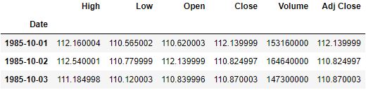
Let’s get the historical data of Nasdaq 100 index(^NDX) from Yahoo Finance and save the data
nasdaq_100 = web.DataReader(‘^NDX’, ‘yahoo’, start=’1980-01-01′, end=’2022-05-28′)
print(nasdaq_100.shape)
nasdaq100_file_path = f”{data_dir}/nasdaq100.csv”
nasdaq_100.to_csv(nasdaq100_file_path)
nasdaq_100 = pd.read_csv(nasdaq100_file_path, index_col=”Date”, parse_dates=True)
nasdaq_100.head(3)
(9241, 6)
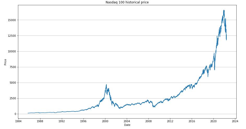
Let’s plot the historical price
fig, ax = plt.subplots(figsize=(15, 8))
ax.plot(nasdaq_100.index, nasdaq_100[“Close”])
ax.grid(axis=”y”)
ax.set_title(“Nasdaq 100 historical price”)
ax.set_xlabel(“Date”)
ax.set_ylabel(“Price”)
plt.show()
We consider the following 6 bear market situations
ts_black_monday = nasdaq_100.loc[“1987-10-05″:”1987-10-26”,
“Close”] / nasdaq_100.loc[“1987-10-05”, “Close”]
ts_1990_recession = nasdaq_100.loc[“1990-07-16″:”1990-10-11”,
“Close”] / nasdaq_100.loc[“1990-07-16”, “Close”]
ts_dotcom = nasdaq_100.loc[“2000-03-27″:”2002-10-07”,
“Close”] / nasdaq_100.loc[“2000-03-27”, “Close”]
ts_financial_crisis = nasdaq_100.loc[“2008-06-05″:”2009-03-09”,
“Close”] / nasdaq_100.loc[“2008-06-05”, “Close”]
ts_covid19_pandemic = nasdaq_100.loc[“2020-02-19″:” 2020-03-20″,
“Close”] / nasdaq_100.loc[“2020-02-19”, “Close”]
ts_current_bear = nasdaq_100.loc[“2021-11-19”: “2022-05-24”,
“Close”] / nasdaq_100.loc[“2021-11-19”, “Close”]
ts_current_bear
Date
2021-11-19    1.000000
2021-11-22    0.988393
2021-11-23    0.983913
2021-11-24    0.987599
2021-11-26    0.966949
                ...
2022-05-18    0.719729
2022-05-19    0.716550
2022-05-20    0.714136
2022-05-23    0.726123
2022-05-24    0.710167
Name: Close, Length: 128, dtype: float64
Let’s plot these events
fig, ax = plt.subplots(figsize=(15, 8))
ax.plot(range(len(ts_black_monday)), ts_black_monday, alpha=1, label=”Black Monday”)
ax.plot(range(len(ts_1990_recession)), ts_1990_recession, alpha=0.5, label=”early 1990s recession”)
ax.plot(range(len(ts_dotcom)), ts_dotcom, alpha=0.5, label=”Dotcom Bubble”)
ax.plot(range(len(ts_financial_crisis)), ts_financial_crisis, alpha=0.5, label=”Financial Crisis”)
ax.plot(range(len(ts_covid19_pandemic)), ts_covid19_pandemic, alpha=1, label=”COVID-19 recession”)
ax.plot(range(len(ts_current_bear)), ts_current_bear, alpha=0.7, label=”current bear market”)
ax.scatter([211.8], [1 – 0.5246], marker=”x”, color=”red”)
ax.grid(axis=”y”)
ax.set_ylim(0, 1)
ax.set_title(“Nasdaq 100 historical bear market”)
ax.set_xlabel(“Duration(in trading days)”)
ax.set_ylabel(“Price”)
ax.legend()
plt.show()
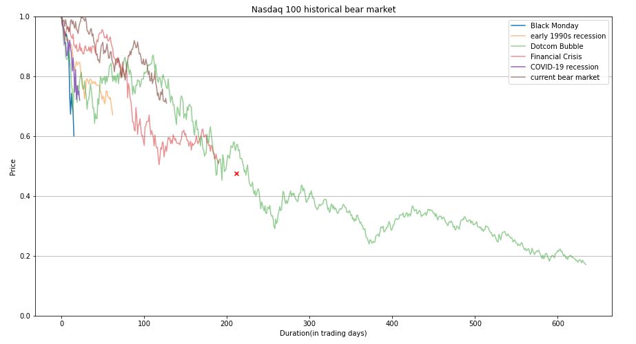
We can see that the average decline was 52.46% and the average duration was 211.8 trading days.
Let’s plot the decline in stock prices in each bear market normalized by its highest price
event_name_list = [“Black Monday”, “Early 1990 Recession”, “Dotcom Bubble”,
“Financial Crirsis”, “COVID19 Pandmic”, “Current Bear”]
def calculate_downside(data):
return 1 – data.min()
decrease_rate = [calculate_downside(ts_black_monday),
calculate_downside(ts_1990_recession),
calculate_downside(ts_dotcom),
calculate_downside(ts_financial_crisis),
calculate_downside(ts_covid19_pandemic),
calculate_downside(ts_current_bear)]
df_feature1 = pd.DataFrame({“Name”: event_name_list, “Decrease Rate”: decrease_rate})
df_feature1

This table shows that Dotcom Bubble had the maximum Decrease Rate (DR) of 83%. The current bear market is clearly closer to the time of the COVID 19 pandemic with DR ~ 28%.
Let’s calculate the Decrease Speed (DS) or slope from the highest to the lowest
def calculate_slope(data):
return (1 – data.min()) / len(data)
decrease_speed = [calculate_slope(ts_black_monday),
calculate_slope(ts_1990_recession),
calculate_slope(ts_dotcom),
calculate_slope(ts_financial_crisis),
calculate_slope(ts_covid19_pandemic),
calculate_slope(ts_current_bear)]
df_feature2 = pd.DataFrame({“Name”: event_name_list, “Decrease Speed”: decrease_speed})
df_feature2

It is clear that the current bear market has DS~0.002 similar to that of the Financial Crisis.
Let’s calculate the duration (DUR) of the bear market event
duration = [len(ts_black_monday),
len(ts_1990_recession),
len(ts_dotcom),
len(ts_financial_crisis),
len(ts_covid19_pandemic),
len(ts_current_bear)]
df_feature3 = pd.DataFrame({“Name”: event_name_list, “Duration”: duration})
df_feature3

We can see that DUR(1990_recession)<DUR(current_bear)<DUR(financial_crisis).
Let’s merge the DUR and DR features
df_feature4 = pd.DataFrame({“Name”: event_name_list, “Decrease Rate”: decrease_rate, “Duration”: duration})
df_feature4

Let’s apply standard scaling of these two features and plot them
decrease_rate_scaled = preprocessing.scale(decrease_rate)
duration_scaled = preprocessing.scale(duration)
fig, ax = plt.subplots(figsize=(8, 8))
for i, event in enumerate(event_name_list):
ax.scatter(decrease_rate_scaled[i], duration_scaled[i], marker=”D”, label=event)
ax.grid(linestyle=”–“)
ax.set_xlim(-2.5, 2.5)
ax.set_ylim(-2.5, 2.5)
ax.set_xlabel(“Decrease Rate”)
ax.set_ylabel(“Duration(trading days)”)
ax.legend()
plt.show()
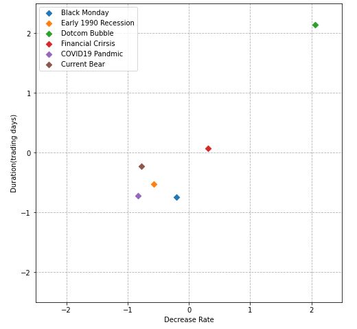
In fact, this X-plot measures the Euclidean distance between our 6 features in terms of (scaled) DR and DUR. It shows that current_bear is closest to 1990_recession and covid19_pandemic.
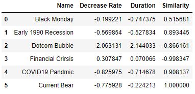
Let’s introduce a different distance metric to calculate the similarity such as the Cosine Similarity (CS)
df_feature4_1 = pd.DataFrame(
{“Name”: event_name_list, “Decrease Rate”: decrease_rate_scaled, “Duration”: duration_scaled})
similarity_list = []
for i in df_feature4_1.index:
cos_sim = cosine_similarity(df_feature4_1.loc[[i], [“Decrease Rate”, “Duration”]], df_feature4_1.loc[[5], [
“Decrease Rate”, “Duration”]])
similarity_list.append(cos_sim[0][0])
df_feature4_1[“Similarity”] = similarity_list
df_feature4_1
Let’s look at the X-plot of scaled DR and DUR features
fig, ax = plt.subplots(figsize=(8, 8))
for i, event in enumerate(event_name_list):
ax.scatter(decrease_rate_scaled[i], duration_scaled[i], marker=”D”, label=event)
ax.plot([0, decrease_rate_scaled[5]], [0, duration_scaled[5]], color=”black”, alpha=0.6)
ax.plot([0, decrease_rate_scaled[4]], [0, duration_scaled[4]], color=”black”, linestyle=”dotted”, alpha=0.6)
ax.grid(linestyle=”–“)
ax.set_xlim(-2.5, 2.5)
ax.set_ylim(-2.5, 2.5)
ax.set_xlabel(“Decrease Rate”)
ax.set_ylabel(“Duration(trading days)”)
ax.legend()
plt.show()
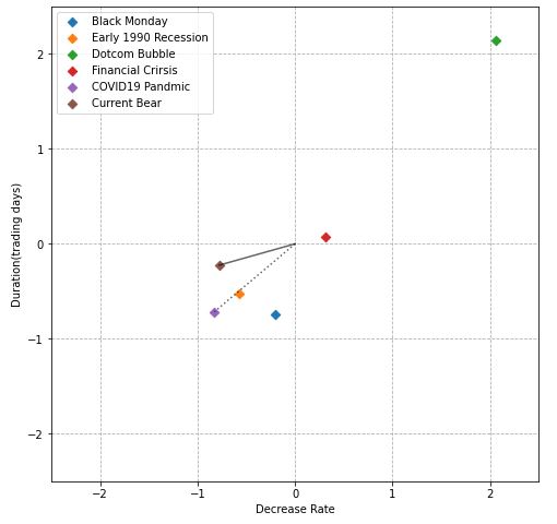
The above table and X-plot show that current_bear is closest to covid19_pandemic and 1990_recession in terms of CS.
We can also calculate the similarity between our time-series data arrays of different lengths using the Dynamic Time Warping (DTW) library
def calc_dtw(l_sr):
dict_dtw = {}
for item1, item2 in itertools.product(l_sr, repeat=2):
distance, path = fastdtw(item1[1], item2[1])
dict_dtw[(item1[0], item2[0])] = distance
return dict_dtw
dict_dtw = calc_dtw(list(zip(event_name_list,
[ts_1990_recession,
ts_black_monday,
ts_dotcom,
ts_financial_crisis,
ts_covid19_pandemic,
ts_current_bear])))
dist_matrix = np.array(list(dict_dtw.values())).reshape(6, 6)
df_dist_matrix = pd.DataFrame(data=dist_matrix, index=event_name_list, columns=event_name_list)
plt.figure(figsize=(8, 6))
sns.heatmap(df_dist_matrix, square=True, annot=True, cmap=’Blues’)
plt.show()

Let’s plot the heatmap of this similarity matrix excluding the outlier (dotcom)
event_name_list_2 = event_name_list[:2] + event_name_list[3:]
dict_dtw_2 = calc_dtw(list(zip(event_name_list_2,
[ts_1990_recession,
ts_black_monday,
ts_financial_crisis,
ts_covid19_pandemic,
ts_current_bear])))
dist_matrix_2 = np.array(list(dict_dtw_2.values())).reshape(5, 5)
df_dist_matrix_2 = pd.DataFrame(data=dist_matrix_2, index=event_name_list_2, columns=event_name_list_2)
plt.figure(figsize=(8, 6))
sns.heatmap(df_dist_matrix_2, square=True, annot=True, cmap=’Blues’)
plt.show()

We can see that covid19_pandemic, black_monday, and 1990_recession are closest to current_bear.
We have discussed the measurement of similarity between various bear markets in real time. This is a kind of pattern analysis method that is applicable to the time series of variable lengths.
The outcome of this study is important for the investment community. Using these results, investors can gain valuable insights about maintaining risk aware market stability during periods of economic crises. In doing so, investors would be able to avoid large losses whilst hedging systemic risk of global events listed above.


Leave a comment