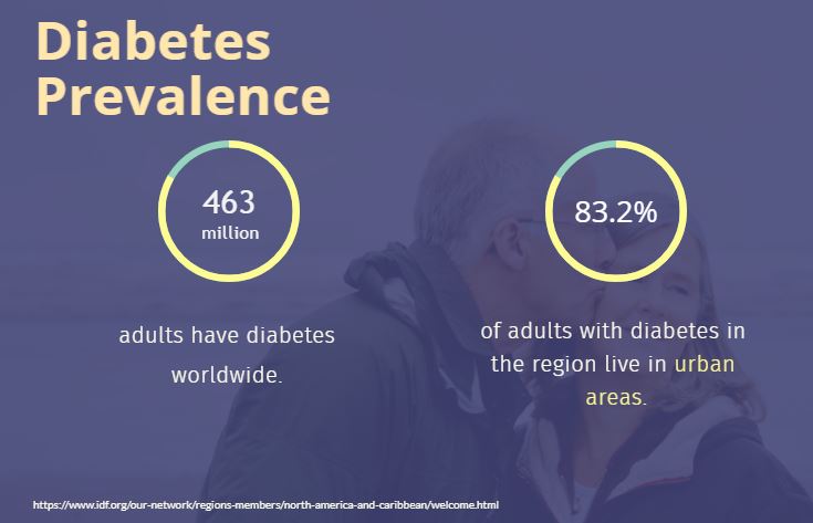
An American is diagnosed with diabetes every 17 seconds.
This is a follow-up contribution to the Diabetes Control and Complications Trial (DCCT), the ongoing Epidemiology of Diabetes Interventions and Complications (EDIC) study, that has continued the earlier pilot.
The objective of this study is to build a supervised machine learning (ML) model to predict whether the patients have diabetes or not.

Contents:
- Introduction
- The ML Workflow
- Importing Data/Libraries
- Read Input Data
- Exploratory Data Analysis (EDA)
- Feature Engineering
- Model Training/Testing
- Comparison of Algorithms
- Performance QC Analysis
- Summary
Introduction
Diabetes is a collection of diseases characterized by elevated blood glucose. There are multiple types of diabetes, but each involves the body’s inability to use glucose for energy. Unfortunately, diabetes is increasingly prevalent in America and around the world.
There are four types of diabetes:
- Type 1 diabetes: An autoimmune attack on pancreas cells stops them from creating insulin, so people with Type 1 need to take insulin shots every day. In most cases, Type 1 diabetes is diagnosed in children and teens, but it can manifest in adults as well.
- Type 2 diabetes (the focus of this study): People with Type 2 can produce insulin, but their bodies resist it. When blood sugar is consistently high, the pancreas continuously pumps out insulin, and eventually, cells become overexposed. Type 2 is by far the most common type of diabetes and one that typically develops in adults; however, the rate of Type 2 diabetes in children is increasing.
- Gestational diabetes: This type only occurs in pregnant women and typically goes away after childbirth; however, half of women who have gestational diabetes will develop Type 2 diabetes later in life. Treatment includes a doctor-recommended exercise and meal plan. Sometimes daily blood glucose tests and insulin injections are necessary.
- Prediabetes: Prediabetes isn’t technically diabetes. It’s more like a precursor. A prediabetic person’s blood glucose is consistently above average, but not high enough to warrant a full diabetes diagnosis. People with prediabetes can help prevent Type 2 diabetes by implementing a healthy diet, increased physical activity, and stress management.
Medical diagnosis is a very essential and critical aspect for healthcare professionals. In particular, classification of diabetics is very complex. An early identification of diabetes is much important in controlling diabetes. A patient has to go through several tests and later it is very difficult for the professionals to keep track of multiple factors at the time of diagnosis process which can lead to inaccurate results which makes the detection very challenging. Due to most advance technologies especially ML algorithms are very beneficial for the fast and accurate prediction of the disease in the healthcare industries.
The main objective of this study is to predict whether a patient has diabetes or not, based on the diagnostic measurements gathered in the Pima Indians database.
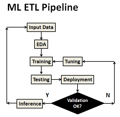
The ML Workflow
The ML workflow consists of the following key steps:
- Install Anaconda for use with Python.
- Import ML libraries and download the Kaggle dataset.
- Exploratory Data Analysis (EDA).
- Feature Engineering and Correlations
- Train and test ML models using scikit-learn.
- Make predictions and evaluate models.
- Optimize parameters and run the workflow.
Importing Data/Libraries
Let’s import key libraries and ste our working directory string YOURPATH
import pandas as pd
import numpy as np
import matplotlib.pyplot as plt
import seaborn as sns
import os
os.chdir(YOURPATH) # Set working directory
Read Input Data
Importing the Kaggle dataset
df = pd.read_csv(‘diabetes.csv’)
df.head()

df.shape
(768, 9)
df.dtypes
Pregnancies                   int64
Glucose                       int64
BloodPressure                 int64
SkinThickness                 int64
Insulin                       int64
BMI                         float64
DiabetesPedigreeFunction    float64
Age                           int64
Outcome                       int64
dtype: object
df.info()
<class 'pandas.core.frame.DataFrame'>
RangeIndex: 768 entries, 0 to 767
Data columns (total 9 columns):
 #   Column                    Non-Null Count  Dtype
---  ------                    --------------  -----
 0   Pregnancies               768 non-null    int64
 1   Glucose                   768 non-null    int64
 2   BloodPressure             768 non-null    int64
 3   SkinThickness             768 non-null    int64
 4   Insulin                   768 non-null    int64
 5   BMI                       768 non-null    float64
 6   DiabetesPedigreeFunction  768 non-null    float64
 7   Age                       768 non-null    int64
 8   Outcome                   768 non-null    int64
dtypes: float64(2), int64(7)
memory usage: 54.1 KB
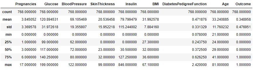
df.describe()
Exploratory Data Analysis (EDA)
Let’s replace NaN with mean values
df[[‘Glucose’,’BloodPressure’,’SkinThickness’,’Insulin’,’BMI’]] = df[[‘Glucose’,’BloodPressure’,’SkinThickness’,’Insulin’,’BMI’]].replace(0,np.NaN)
df[‘Glucose’].fillna(df[‘Glucose’].mean(), inplace=True)
df[‘BloodPressure’].fillna(df[‘BloodPressure’].mean(), inplace=True)
df[‘SkinThickness’].fillna(df[‘SkinThickness’].mean(), inplace=True)
df[‘Insulin’].fillna(df[‘Insulin’].mean(), inplace=True)
df[‘BMI’].fillna(df[‘BMI’].mean(), inplace=True)
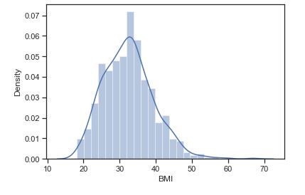
Let’s plot the BMI histogram density plot
sns.distplot(df.BMI)
plt.show()
and the scatter plot BMI vs Glucose
plt.figure(figsize= [10,6])
plt.scatter(df[“BMI”], df[“Glucose”], alpha = 0.5)
plt.title(“Scatter plot analysing BMI vs Glucose\n”, fontdict={‘fontsize’: 20, ‘fontweight’ : 5, ‘color’ : ‘Green’})
plt.xlabel(“BMI”, fontdict={‘fontsize’: 12, ‘fontweight’ : 5, ‘color’ : ‘Black’})
plt.ylabel(“Glucose”, fontdict={‘fontsize’: 12, ‘fontweight’ : 5, ‘color’ : ‘Black’} )
plt.show()

Let’s plot Outcome = 0, 1 as a simple bar chart

or a pie-chart

We can see that the dataset is not imbalanced.
Feature Engineering
Let’s plot the triangle correlation heatmap
plt.figure(figsize=(16, 6))
Define the mask to set the values in the upper triangle to True
mask = np.triu(np.ones_like(df.corr(), dtype=np.bool))
heatmap = sns.heatmap(df.corr(), mask=mask, vmin=-1, vmax=1, annot=True, cmap=’BrBG’)
heatmap.set_title(‘Triangle Correlation Heatmap’, fontdict={‘fontsize’:18}, pad=16);
plt.savefig(‘diabetes_corrmatrix.png’)

This plot suggests that Glucose, BMI and Age have a significant impact on Outcome.
Let’s look at a pairs plot as a matrix of scatterplots that lets you understand the pairwise relationship between different variables in our dataset. The easiest way to create a pairs plot in Python is to use the seaborn. pairplot(df) function.
g=sns.pairplot(df,hue=’Outcome’)
g.fig.set_size_inches(17,13)
import matplotlib.pyplot as plt
#plt.show()
plt.savefig(‘diabetes_pairplot.png’)

The pairs plot builds on two basic figures, the histogram and the scatter plot. The histogram on the diagonal allows us to see the distribution of a single variable: we can see a severe overlap betweeen histograms of our features as functions of Outcome = 0, 1.
The scatter plots on the upper and lower triangles show the relationship (or lack thereof) between two variables. Notice a strong linear correlation trend between BMI and SkinThickness.
A popular diagnostic for understanding the decisions made by a classification algorithm is the decision boundary. This is a plot that shows how a trained ML algorithm predicts a coarse grid across the input feature space:
from mlxtend.plotting import plot_decision_regions
def classify_with_rfc(X,Y):
x = df[[X,Y]].values
y = df[‘Outcome’].astype(int).values
rfc = RandomForestClassifier()
rfc.fit(x,y)
# Plotting decision region
plot_decision_regions(x, y, clf=rfc, legend=2)
# Adding axes annotations
plt.xlabel(X)
plt.ylabel(Y)
plt.show()
#plt.savefig(‘diabetes_decision.png’)
feat = [‘Pregnancies’, ‘Glucose’, ‘BloodPressure’, ‘SkinThickness’, ‘Insulin’,’BMI’, ‘DiabetesPedigreeFunction’, ‘Age’]
size = len(feat)
for i in range(0,size):
for j in range(i+1,size):
classify_with_rfc(feat[i],feat[j])
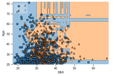
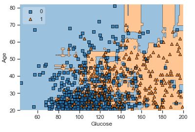
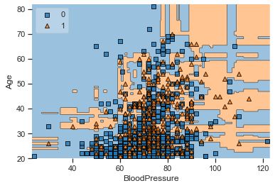

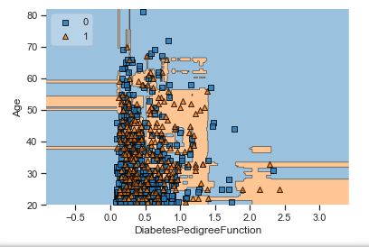


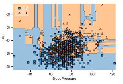

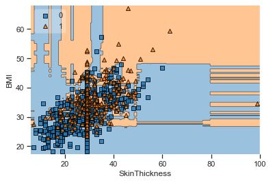


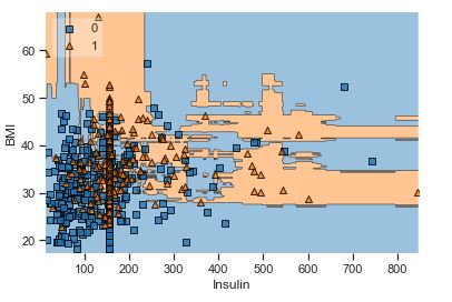


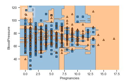
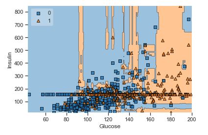

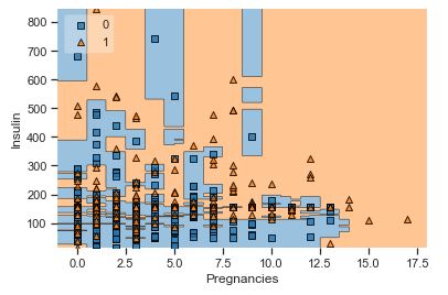

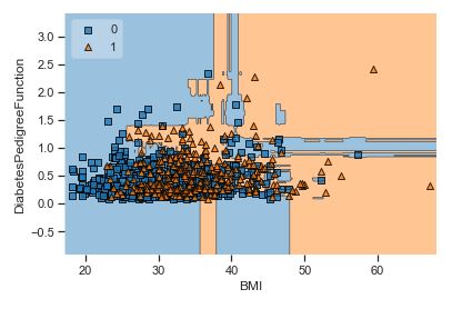


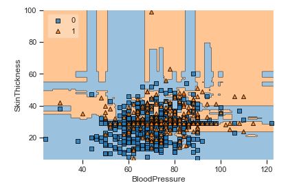

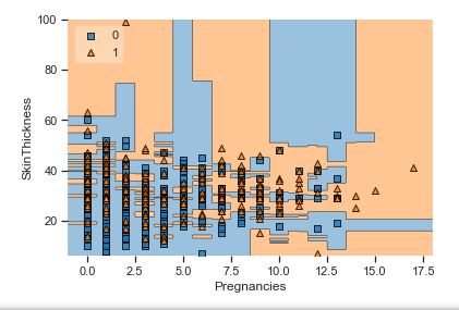
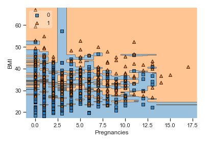


Overall, we can see that there is a severe overlap between the two classes of scatter points associated with Outcome = 0, 1. It would be rather difficult to make a decision boundary in such a way that the separation between the two classes as wide as possible.
Recall that the Logistic Regression has a Linear Decision Boundary, where the tree-based algorithms like Decision Tree and Random Forest create rectangular partitions. The Naive Bayes leads to a linear decision boundary in many common cases but can also be quadratic as in our case. The SVMs can capture many different boundaries depending on the gamma and the kernel. The same applies to the Neural Networks.
Model Training/Testing
Let’s separate the target variable
X=df.drop(‘Outcome’,axis=1)
y=df[‘Outcome’]
X.shape
(768, 8)
Let’s split our dataset into training data (80%) and test data (20%)
from sklearn.model_selection import train_test_split
X_train, X_test, y_train, y_test = train_test_split(X, y,test_size=0.2,random_state=1)
and apply StandardScaler
from sklearn.preprocessing import StandardScaler
scaling_x=StandardScaler()
X_train=scaling_x.fit_transform(X_train)
X_test=scaling_x.transform(X_test)
Let’s apply the RandomForestClassifier
from sklearn.ensemble import RandomForestClassifier
rfc = RandomForestClassifier()
model_rfc=rfc.fit(X_train, y_train)
y_pred_rfc=rfc.predict(X_test)
rfc.score(X_test, y_test)
0.7662337662337663
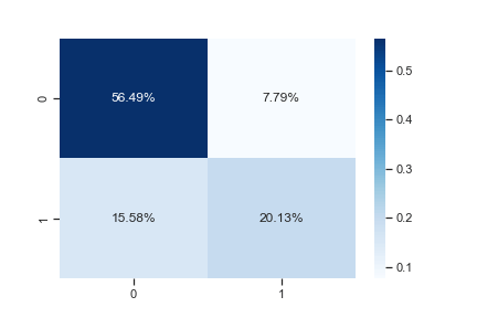
Let’s look at the classification report
from sklearn.metrics import classification_report, confusion_matrix
cf_matrix=confusion_matrix(y_test, y_pred_rfc)
sns.heatmap(cf_matrix/np.sum(cf_matrix), annot=True,
fmt=’.2%’, cmap=’Blues’)
plt.savefig(‘diabetes_confusion.png’)
from sklearn.metrics import accuracy_score,f1_score,recall_score,precision_score
y_pred=y_pred_rfc
print (‘Accuracy: ‘, accuracy_score(y_test, y_pred))
print (‘F1 score: ‘, f1_score(y_test, y_pred))
print (‘Recall: ‘, recall_score(y_test, y_pred))
print (‘Precision: ‘, precision_score(y_test, y_pred))
print (‘\n clasification report:\n’, classification_report(y_test,y_pred))
print (‘\n confussion matrix:\n’,confusion_matrix(y_test, y_pred))
Accuracy:  0.7662337662337663
F1 score:  0.6326530612244898
Recall:  0.5636363636363636
Precision:  0.7209302325581395

 clasification report:
               precision    recall  f1-score   support

           0       0.78      0.88      0.83        99
           1       0.72      0.56      0.63        55

    accuracy                           0.77       154
   macro avg       0.75      0.72      0.73       154
weighted avg       0.76      0.77      0.76       154


 confussion matrix:
 [[87 12]
 [24 31]]
Comparison of Algorithms
Let’s check the SVM algorithm
from sklearn import svm
clf = svm.SVC()
clf.fit(X_train, y_train)
clf.predict(X_test)
clf.score(X_test, y_test)
0.7792207792207793
Let’s run the LogisticRegression algorithm
from sklearn.linear_model import LogisticRegression
lreg = LogisticRegression()
lreg.fit(X_train, y_train)
lreg.predict(X_test)
lreg.score(X_test, y_test)
0.7727272727272727
Let’s look at the XGBClassifier
from xgboost import XGBClassifier
xgb = XGBClassifier()
xgb.fit(X_train, y_train)
xgb.predict(X_test)
xgb.score(X_test, y_test)
0.7401574803149606
Performance QC Analysis
Let’s plot the RFC Learning Curve
import scikitplot as skplt
skplt.estimators.plot_learning_curve(RandomForestClassifier(), X_test, y_pred_rfc,
cv=7, shuffle=True, scoring=”accuracy”,
n_jobs=-1, figsize=(6,4), title_fontsize=”large”, text_fontsize=”large”,
title=”RandomForestClassifier Learning Curve”);

Let’s plot the ROC curve
from sklearn.metrics import roc_curve
y_pred_proba = rfc.predict_proba(X_test)[:,1]
fpr, tpr, thresholds = roc_curve(y_test, y_pred_proba)
plt.plot([0,1],[0,1],’k-‘)
plt.plot(fpr,tpr, label=’Knn’)
plt.xlabel(‘FPR’)
plt.ylabel(‘TPR’)
plt.title(‘RFC ROC curve’)
plt.show()

Let’s estimate the ROC score
from sklearn.metrics import roc_auc_score
roc_auc_score(y_test,y_pred_proba)
0.8544536271808999
Summary
- We applied a ML-based binary classifier that predicts if a patient is diabetic or not, based on Glucose, BMI and Age features that have a significant impact on Outcome (our target variable).
- We implemented the RFC algorithm, evaluated performance QC metrics, compared the accuracy of different classifiers and produced the complete classification report.
- The full python script can be found here in Github.


Leave a comment