
Featured Image by Fazzi Studio via Canva.
- The objective of this project is to apply the Titanic benchmark to hypothesis testing in disaster risk management.
- In principle, it is possible to evaluate several hypotheses (arranged according to whether they belong to what can be called “economic,” “natural,” or “social” factors) that can be tested using the data on who survived and who perished in the Titanic disaster. This is an interesting issue in itself as the probability of survival differs greatly between passengers.
- In this post, we will perform a Machine Learning (ML) analysis of the fatalities on the ship using the Titanic dataset on Kaggle. The main question that we are addressing here is whether there is a statistically significance relation between the death of the person and their passenger class, age, sex and/or port where they embarked their journey.
- We have implemented and tested the comprehensive ML pipeline that consists of the following steps:
- Importing the Input Data
- Input Data QC & Pre-Processing
- Descriptive Statistical Analysis
- Exploratory Data Analysis (EDA)
- DataPrep/SweetViz AutoEDA
- Feature Engineering & Data Preparation
- ML Training, Testing, Tuning, and Prediction
- Model Tuning via Hyperparameter Optimization (HPO)
- Complete ML Performance Validation & Classification Report
- Final SHAP Interpretation of Model Features vs Predictions
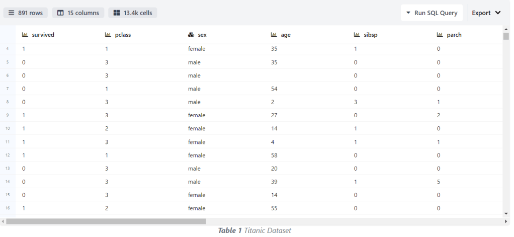
- About the Kaggle dataset : 890 passenger samples were given under the training set, and there were associated labels as to whether the passengers survived or not. Each passenger’s name, sex, age, passenger class, and point of embarkation was provided. In the test data, 418 samples that used the same format were given. The dataset is not complete as, for several samples, one or many fields were empty. All sample points for sex and passenger class were complete.
- Read more details about the data dictionary in the dataset description section
- survival: Survival
- pclass: Ticket class
- sex: Sex
- Age: Age in years
- sibsp: # of siblings / spouses aboard the Titanic
- parch: # of parents / children aboard the Titanic
- ticket: Ticket number
- fare: Passenger fare
- cabin: Cabin number
- embarked: Port of embarkation
- Let’s get started!
Table of Contents
- An Environment Setup
- Input Data Reading & Preparation
- Descriptive Statistics of Input Data
- Exploratory Data Analysis (EDA)
- DataPrep AutoEDA
- SweetViz AutoEDA
- ML Training, Testing & Validation
- Full ML Classification Report
- SHAP Interpretation
- Conclusions
- Explore More
- References
An Environment Setup
- Setting up the working directory YOURPATH
import os
os.chdir('YOURPATH')
os. getcwd()
- Installing packages in Jupyter
!pip install --user plotly , seaborn ,missingo ,dataprep, sweetviz, sklearn, scikitplot, scipy, shap, yellowbrick
- Conversely, installing packages with requirements.txt
!pip install -r requirements.txt
and in the requirements.txt file you put your modules in a list, with one item per line.
- Setting up a Conda Environment (optional)
Creating an environment <env_name> from cmd
conda create --name <env_name>
Activating the environment with
conda activate <env_name>
To deactivate an environment, type: conda deactivate.
- Read more about Conda Environment Best Practices
Input Data Reading & Preparation
- Let’s focus on the Titanic Case – Machine Learning from Disaster using the Kaggle dataset.
- Importing basic libraries
import warnings
warnings.filterwarnings('ignore')

import numpy as np
import pandas as pd
import seaborn as sns
import matplotlib.pyplot as plt
%matplotlib inline

import plotly.express as px
import plotly.graph_objects as go
import plotly.io as pio
pio.templates

Templates configuration
-----------------------
    Default template: 'plotly'
    Available templates:
        ['ggplot2', 'seaborn', 'simple_white', 'plotly',
         'plotly_white', 'plotly_dark', 'presentation', 'xgridoff',
         'ygridoff', 'gridon', 'none']
- Reading the input data
train_data = pd.read_csv("traintitanic.csv")
test_data = pd.read_csv("testtitanic.csv")
gender_data = pd.read_csv("gender_submission.csv")
- Checking the percentage of missing values per column
ddf=train_data.copy()
missing_percentage = ddf.isnull().mean() * 100
print("Percentage of missing values for each column:")
print(missing_percentage)

Percentage of missing values for each column:
PassengerId     0.000000
Survived        0.000000
Pclass          0.000000
Name            0.000000
Sex             0.000000
Age            19.865320
SibSp           0.000000
Parch           0.000000
Ticket          0.000000
Fare            0.000000
Cabin          77.104377
Embarked        0.224467
dtype: float64
- Plotting the percentage of missing values per column using missingo
import pandas as pd
import missingno as msno
msno.bar(ddf)

- Editing, transforming and cleaning the input data
train_data['Embarked'] = train_data.Embarked.fillna(train_data.Embarked.dropna().max())
test_data['Fare'] = test_data.Fare.fillna(test_data.Fare.dropna().mean())
guess_ages = np.zeros((2,3))
guess_ages

combine = [train_data , test_data]

# Converting Sex categories (male and female) to 0 and 1:
for dataset in combine:
    dataset['Sex'] = dataset['Sex'].map( {'female': 1, 'male': 0} ).astype(int)

# Filling missed age feature:

for dataset in combine:
    for i in range(0, 2):
        for j in range(0, 3):
            guess_df = dataset[(dataset['Sex'] == i) & \
                                  (dataset['Pclass'] == j+1)]['Age'].dropna()
            age_guess = guess_df.median()

            # Convert random age float to nearest .5 age
            guess_ages[i,j] = int( age_guess/0.5 + 0.5 ) * 0.5

    for i in range(0, 2):
        for j in range(0, 3):
            dataset.loc[ (dataset.Age.isnull()) & (dataset.Sex == i) & (dataset.Pclass == j+1),\
                    'Age'] = guess_ages[i,j]

    dataset['Age'] = dataset['Age'].astype(int)
# Combine SibSp and Parch became the Relatives Column
data = [train_data, test_data]
for dataset in data:
    dataset['relatives'] = dataset['SibSp'] + dataset['Parch']
    dataset.loc[dataset['relatives'] > 0, 'travelled_alone'] = 'No'
    dataset.loc[dataset['relatives'] == 0, 'travelled_alone'] = 'Yes'

#Changing cateogorcial data to 'string' type categorical data
train_data['Pclass'][train_data['Pclass'] == 1] = 'High Class'
train_data['Pclass'][train_data['Pclass'] == 2] = 'Middle Class'
train_data['Pclass'][train_data['Pclass'] == 3] = 'Low Class'

train_data['relatives'][train_data['relatives'] == 0] = 'Travel Alone'
train_data['relatives'][train_data['relatives'] == 1] = 'brothers'
train_data['relatives'][train_data['relatives'] == 2] = 'sisters'
train_data['relatives'][train_data['relatives'] == 3] = 'wife'
train_data['relatives'][train_data['relatives'] == 4] = 'husband'
train_data['relatives'][train_data['relatives'] == 5] = 'father'
train_data['relatives'][train_data['relatives'] == 6] = 'mother'
train_data['relatives'][train_data['relatives'] == 7] = 'descendants'
train_data['relatives'][train_data['relatives'] == 10] = 'others'


#Changing cateogorcial data to 'string' type categorical data
test_data['Pclass'][test_data['Pclass'] == 1] = 'High Class'
test_data['Pclass'][test_data['Pclass'] == 2] = 'Middle Class'
test_data['Pclass'][test_data['Pclass'] == 3] = 'Low Class'

test_data['relatives'][test_data['relatives'] == 0] = 'Travel Alone'
test_data['relatives'][test_data['relatives'] == 1] = 'brothers'
test_data['relatives'][test_data['relatives'] == 2] = 'sisters'
test_data['relatives'][test_data['relatives'] == 3] = 'wife'
test_data['relatives'][test_data['relatives'] == 4] = 'husband'
test_data['relatives'][test_data['relatives'] == 5] = 'father'
test_data['relatives'][test_data['relatives'] == 6] = 'mother'
test_data['relatives'][test_data['relatives'] == 7] = 'descendants'
test_data['relatives'][test_data['relatives'] == 10] = 'others'

# Dropping Unuseful feature because it has too many missed values:

train_data.drop(columns = ["Cabin"] , inplace = True)
train_data.drop(columns = ["Ticket"] , inplace = True)
train_data.drop(columns = ["SibSp"] , inplace = True)
train_data.drop(columns = ["Parch"] , inplace = True)

test_data.drop(columns = ["Cabin"] , inplace = True)
test_data.drop(columns = ["Ticket"] , inplace = True)
test_data.drop(columns = ["SibSp"] , inplace = True)
test_data.drop(columns = ["Parch"] , inplace = True)

#Select numerical and categorical variables
data_num = train_data.select_dtypes(include=['int64','int32' ,'float64'])
data_cat = train_data.select_dtypes(include=['object'])

#Resetting the index for both types of variables
data_num.mode().iloc[0].reset_index(name= 'Mode')
index	Mode
0	PassengerId	1.00
1	Survived	0.00
2	Sex	0.00
3	Age	25.00
4	Fare	8.05
data_cat.mode().iloc[0].reset_index(name= 'Mode')
index	Mode
0	Pclass	Low Class
1	Name	Abbing, Mr. Anthony
2	Embarked	S
3	relatives	Travel Alone
4	travelled_alone	Yes
Descriptive Statistics of Input Data
- Examining the basic data info with descriptive statistics
train_data.shape
(891, 10)
train_data.info()
<class 'pandas.core.frame.DataFrame'>
RangeIndex: 891 entries, 0 to 890
Data columns (total 10 columns):
 #   Column           Non-Null Count  Dtype
---  ------           --------------  -----
 0   PassengerId      891 non-null    int64
 1   Survived         891 non-null    int64
 2   Pclass           891 non-null    object
 3   Name             891 non-null    object
 4   Sex              891 non-null    int32
 5   Age              891 non-null    int32
 6   Fare             891 non-null    float64
 7   Embarked         891 non-null    object
 8   relatives        891 non-null    object
 9   travelled_alone  891 non-null    object
dtypes: float64(1), int32(2), int64(2), object(5)
memory usage: 62.8+ KB
train_data.head()

- Checking the number of unique values in input columns
for column in train_data.columns:
    num_unique_values = train_data[column].nunique()
    print(f'Number of unique values in {column}: {num_unique_values}')

Number of unique values in PassengerId: 891
Number of unique values in Survived: 2
Number of unique values in Pclass: 3
Number of unique values in Name: 891
Number of unique values in Sex: 2
Number of unique values in Age: 71
Number of unique values in Fare: 248
Number of unique values in Embarked: 3
Number of unique values in relatives: 9
Number of unique values in travelled_alone: 2
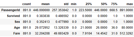
- Checking the descriptive statistics of numerical values
train_data.describe().T
- Counting the total number of null values per column
train_data.isnull().sum()
PassengerId        0
Survived           0
Pclass             0
Name               0
Sex                0
Age                0
Fare               0
Embarked           0
relatives          0
travelled_alone    0
dtype: int64
- Calculating the numerical data variance
data_num.var()
PassengerId    66231.000000
Survived           0.236772
Sex                0.228475
Age              177.591301
Fare            2469.436846
dtype: float64
- Variance-to-STD conversion
np.sqrt(data_num.var())
PassengerId    257.353842
Survived         0.486592
Sex              0.477990
Age             13.326339
Fare            49.693429
dtype: float64
- Computing the IQR for detecting outliers
print('Inter Quartile Range (IQR):')
data_num.quantile(0.75)-data_num.quantile(0.25)
Inter Quartile Range (IQR):
PassengerId    445.0000
Survived         1.0000
Sex              1.0000
Age             15.0000
Fare            23.0896
dtype: float64
Exploratory Data Analysis (EDA)
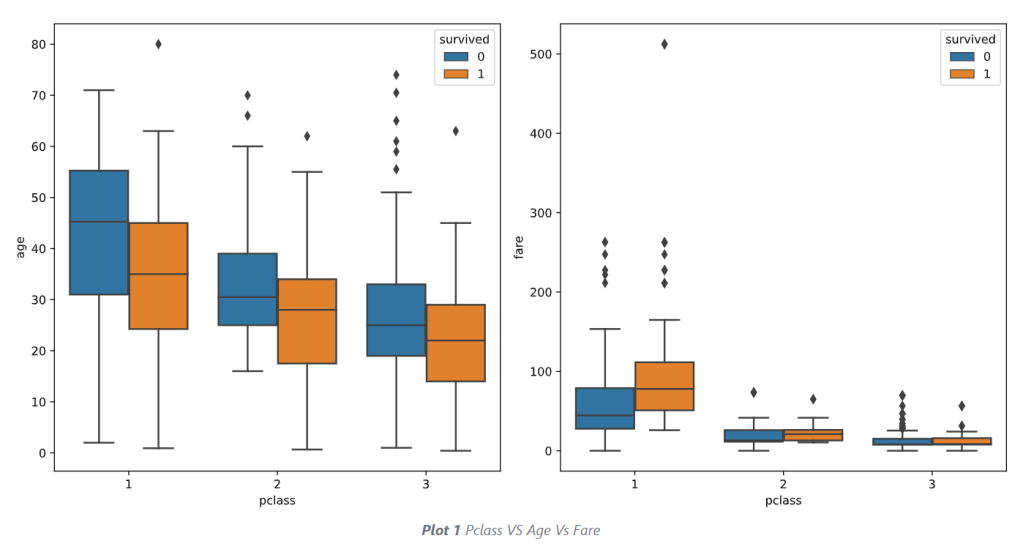
- Examining outliers of numerical values via boxplots
import seaborn as sns
import matplotlib.pyplot as plt
plt.figure(figsize=(8, 6))
sns.boxplot(x=train_data['Age'], color='lightgreen')

import seaborn as sns
import matplotlib.pyplot as plt
plt.figure(figsize=(8, 6))
sns.boxplot(x=train_data['Fare'], color='lightgreen')

- Computing and plotting the correlation matrix of numerical values
traincat=train_data[['Survived','Sex','Age','Fare']]
# Compute correlation matrix
corr_matrix = traincat.corr()
# Generate heatmap
plt.figure(figsize=(10, 6))
sns.heatmap(corr_matrix, annot=False, cmap='coolwarm', square=True)

- Portraying the violin plots of numerical values
# Features of interest
selected_features = ['Sex','Age','Fare']
# Plotting violin plots for selected features
for feature in selected_features:
    plt.figure(figsize=(8, 6))
    sns.violinplot(x='Survived', y=feature, data=traincat, hue='Survived', palette='Blues', inner='quartile', legend=False)
    plt.title(f'Violin Plot for {feature} by Survival Status')
    plt.xlabel('Survival Status')
    plt.ylabel(feature)
    plt.show()


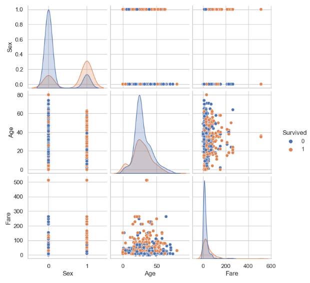
- Looking at the pairplot of numerical features
sns.pairplot(traincat, hue='Survived')
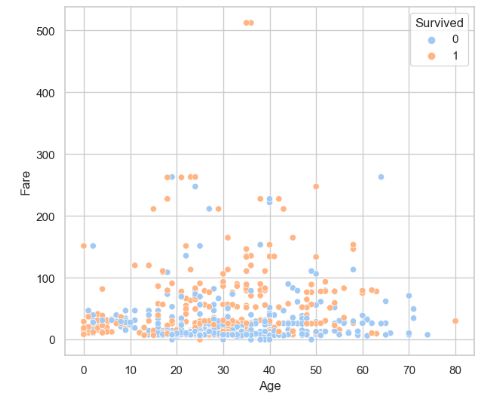
- Looking at the Fare vs Age scatterplot
plt.figure(figsize=(7, 6))
sns.scatterplot(x='Age', y='Fare', data=traincat, hue='Survived', palette='pastel')
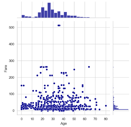
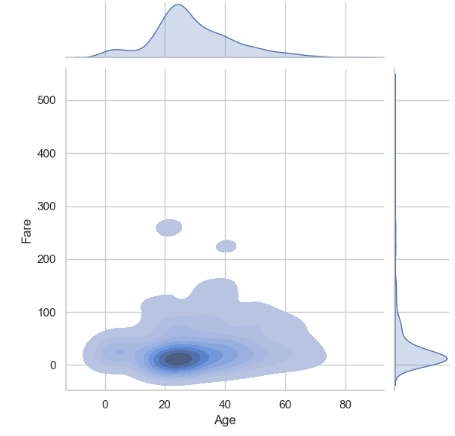
- Comparing it to the Fare vs Age jointplots
sns.jointplot(x='Age', y='Fare', data=traincat,color='darkblue')
plt.show()
sns.jointplot(x = 'Age',  y = 'Fare' , data =traincat,  kind = 'kde', fill = True)
plt.show()
- Let’s get extra insights into the categorical variables using pie plots and the train subset
# Group the data frame by classes in the pclass column, and count the number of occurrences of each group.
df= pd.read_csv('train.csv')
pclass_count = df.groupby('Pclass')['Pclass'].count()
pclass_count
Pclass
1    216
2    184
3    491
Name: Pclass, dtype: int64

plt.figure(figsize=(7,7))
plt.title('Grouped by pclass')
plt.pie(pclass_count.values, labels=['Class 1', 'Class 2', 'Class 3'],
 autopct='%1.1f%%', textprops={'fontsize':13})
plt.show()

# Group the data frame by classes in the pclass column, and count the number of occurrences of each group.
sex_count = df.groupby('Sex')['Sex'].count()
sex_count
Sex
female    314
male      577
Name: Sex, dtype: int64

plt.figure(figsize=(7,7))
plt.title('Grouped by gender')
plt.pie(sex_count.values, labels=['female', 'male'],
 autopct='%1.1f%%', textprops={'fontsize':13})
plt.show()

# Group the data frame by classes in the Embarked column, and count the number of occurrences of each group.
embark_count = df.groupby('Embarked')['Embarked'].count()
embark_count
Embarked
C    168
Q     77
S    644
Name: Embarked, dtype: int64
plt.figure(figsize=(7,7))
plt.title('Grouped by embarkation')
plt.pie(embark_count.values, labels=['Cherbourg', 'Queenstown', 'Southampton'],
        autopct='%1.1f%%', textprops={'fontsize':13})
plt.show()

DataPrep AutoEDA
- Let’s discover DataPrep to make EDA easier in Python:
import dataprep
from dataprep.eda import *
from dataprep.datasets import load_dataset
from dataprep.eda import plot, plot_correlation, plot_missing, plot_diff, create_report

df = load_dataset("titanic")
plot(df)
DataPrep.EDA Report
Stats and Insights
Dataset Statistics
Number of Variables	12
Number of Rows	891
Missing Cells	866
Missing Cells (%)	8.1%
Duplicate Rows	0
Duplicate Rows (%)	0.0%
Total Size in Memory	315.7 KB
Average Row Size in Memory	362.8 B
Variable Types
Numerical: 3
Categorical: 9
Dataset Insights
PassengerId is uniformly distributed	Uniform
Age has 177 (19.87%) missing values	Missing
Cabin has 687 (77.1%) missing values	Missing
Fare is skewed	Skewed
Name has a high cardinality: 891 distinct values	High Cardinality
Ticket has a high cardinality: 681 distinct values	High Cardinality
Cabin has a high cardinality: 147 distinct values	High Cardinality
Survived has constant length 1	Constant Length
Pclass has constant length 1	Constant Length
SibSp has constant length 1	Constant Length
Dataset Insights
Parch has constant length 1	Constant Length
Embarked has constant length 1	Constant Length
Name has all distinct values	Unique
1
2
Number of plots per page:

PassengerId
'hist.bins': 50
Number of bins in the histogram
'hist.yscale': 'linear'
Y-axis scale ("linear" or "log")
'hist.color': '#aec7e8'

etc.
- The content of the titanic-analysis-report.html file is as follows:

Some observations
- The maximum and minimum age for
Pclass 1 > Pclass 2 > Pclass 3.This is understandable because it takes years to accumulate wealth. - The average age of those that survived in all the classes is lower than those that did not survive.
- Passengers that survived in the Pclass 1 paid the highest fare. Which concluded the higher your fare in the Pclass 1 the higher your rate of survival.
SweetViz AutoEDA
- Conducting the second round of AutoEDA by importing the sweetviz library
# importing sweetviz
import sweetviz as sv
#analyzing the dataset
advert_report = sv.analyze(train_data)
#display the report
advert_report.show_html('sweetviz_titanic.html')
- Checking the contents of the above html report


Associations:
[Only including dataset “DataFrame”]
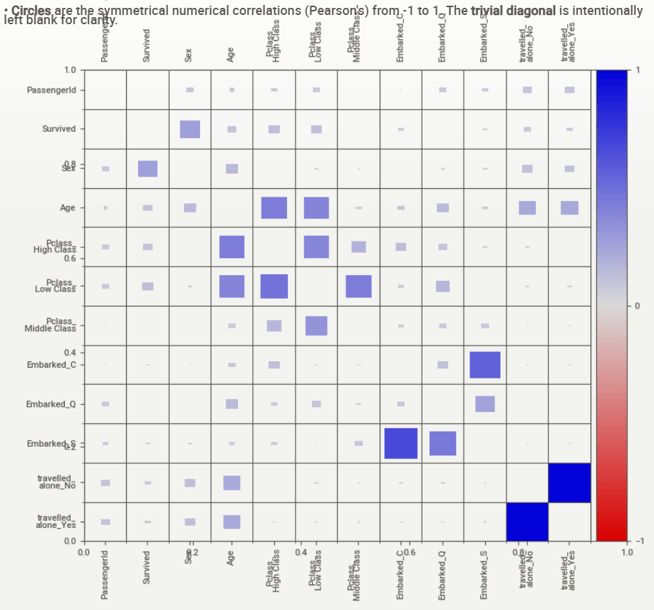
■ Squares are categorical associations (uncertainty coefficient & correlation ratio) from 0 to 1. The uncertainty coefficient is asymmetrical, (i.e. ROW LABEL values indicate how much they PROVIDE INFORMATION to each LABEL at the TOP).
• Circles are the symmetrical numerical correlations (Pearson’s) from -1 to 1. The trivial diagonal is intentionally left blank for clarity.
ML Training, Testing & Validation
- Applying the algorithm to prepare the input dataset for ML training & testing
#Feature Engineering
train_data['Pclass'] = train_data['Pclass'].fillna(train_data['Pclass'].mode()[0])
dummies_Pclass = pd.get_dummies(train_data['Pclass'],prefix='Pclass')
train_data = pd.concat([train_data, dummies_Pclass], axis=1)

train_data['Embarked'] = train_data['Embarked'].fillna(train_data['Embarked'].mode()[0])
dummies_Embarked = pd.get_dummies(train_data['Embarked'],prefix='Embarked')
train_data = pd.concat([train_data, dummies_Embarked], axis=1)

train_data['travelled_alone'] = train_data['travelled_alone'].fillna(train_data['travelled_alone'].mode()[0])
dummies_travel = pd.get_dummies(train_data['travelled_alone'],prefix='travelled_alone')
train_data = pd.concat([train_data, dummies_travel], axis=1)
train_data.drop(['Pclass','Name','Fare', 'Embarked', 'relatives', 'travelled_alone'], axis=1,inplace=True)
Modelling_Train = train_data.iloc[:891,]
Modelling_Test = train_data.iloc[891:,]
X = Modelling_Train.drop(['Survived'],axis=1)
y = Modelling_Test['Survived']

from sklearn.model_selection import train_test_split
X_train, X_test, y_train, y_test = train_test_split(train_data.drop('Survived', 1), train_data['Survived'], test_size = .3)
- Importing the relevant libraries and introducing the ML modeling functions
import scipy.stats as stats
from sklearn.pipeline import Pipeline
from sklearn import metrics
from sklearn.metrics import confusion_matrix,classification_report,accuracy_score,roc_auc_score
from sklearn.model_selection import RandomizedSearchCV,GridSearchCV,train_test_split,cross_val_score
from sklearn.preprocessing import MinMaxScaler,StandardScaler
from scipy.stats import randint
from statsmodels.stats.outliers_influence import variance_inflation_factor

from sklearn.linear_model import LogisticRegression
from sklearn.neighbors import KNeighborsClassifier
from sklearn.svm import SVC
from sklearn.naive_bayes import GaussianNB
from sklearn.tree import DecisionTreeClassifier
from sklearn.ensemble import RandomForestClassifier
import sklearn.metrics as metrics
from sklearn.metrics import precision_score, recall_score, accuracy_score
from sklearn.metrics import roc_curve, auc, roc_auc_score

def models(models):
  results = pd.DataFrame({'accuracy_train':[],'accuracy_test':[],
                          'recall_train':[], 'recall_test':[],
                          'precision_train':[],'precision_test':[],
                          'AUC_train': [], 'AUC_test': [],
                          'f1_score_train':[], 'f1_score_test':[]})


  for model in models:
    model.fit(X_train, y_train)
    y_pred = model.predict(X_test)


    results = results.append({'accuracy_train': accuracy_score(y_train, model.predict(X_train)),
                              'accuracy_test': accuracy_score(y_test, model.predict(X_test)),
                              'recall_train': recall_score(y_train, model.predict(X_train), average='macro'),
                              'recall_test': recall_score(y_test, model.predict(X_test), average='macro'),
                              'precision_train': precision_score(y_train, model.predict(X_train), average='macro'),
                              'precision_test': precision_score(y_test, model.predict(X_test), average='macro'),
                              'AUC_train': roc_auc_score(y_train, model.predict(X_train)),
                              'AUC_test': roc_auc_score(y_test, model.predict(X_test)),
                              'f1_score_train': metrics.f1_score(y_train, model.predict(X_train)),
                              'f1_score_test':  metrics.f1_score(y_test, model.predict(X_test))
                              }, ignore_index=True)


  results['model'] = ['Logistic Regression', 'KNN','SVM','Naive Bayes', 'Decision Tree', 'Random Forest']
  return results
- Running the ML modelling experiment
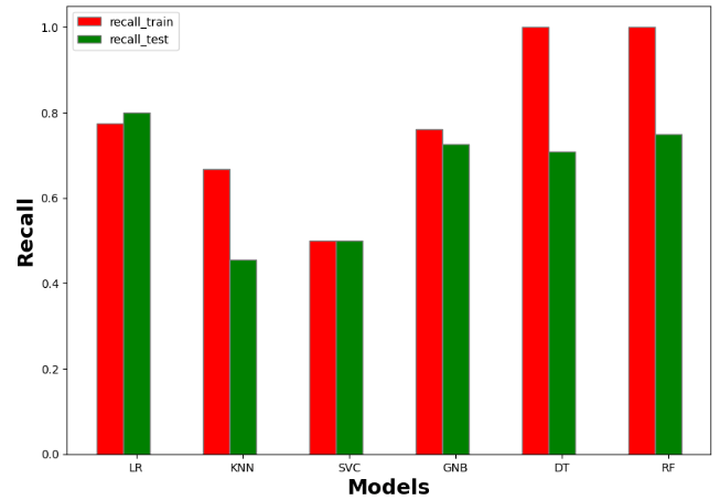
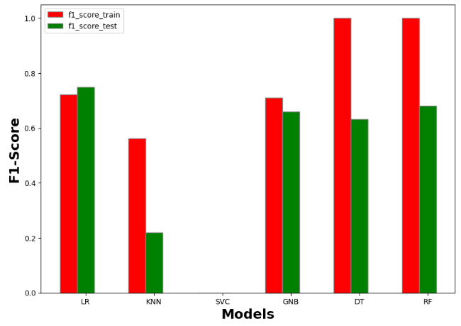
resultmodels=models([LogisticRegression(), KNeighborsClassifier(), SVC(),GaussianNB(), DecisionTreeClassifier(), RandomForestClassifier()])
- Examining the output table resultmodels
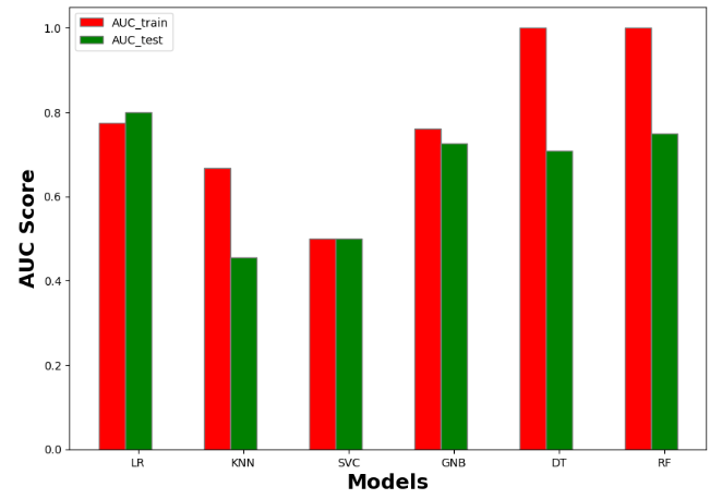
accuracy_train	accuracy_test	recall_train	recall_test	precision_train	precision_test	AUC_train	AUC_test	f1_score_train	f1_score_test	model
0	0.792937	0.820896	0.774484	0.799549	0.783857	0.813683	0.774484	0.799549	0.721382	0.750000	Logistic Regression
1	0.707865	0.522388	0.666822	0.454378	0.695893	0.440418	0.666822	0.454378	0.562500	0.219512	KNN
2	0.613162	0.623134	0.500000	0.500000	0.306581	0.311567	0.500000	0.500000	0.000000	0.000000	SVM
3	0.768860	0.742537	0.761742	0.726893	0.756783	0.726022	0.761742	0.726893	0.709677	0.660099	Naive Bayes
4	1.000000	0.731343	1.000000	0.706172	1.000000	0.713671	1.000000	0.706172	1.000000	0.628866	Decision Tree
5	1.000000	0.776119	1.000000	0.740143	1.000000	0.771281	1.000000	0.740143	1.000000	0.666667	Random Forest
- Plotting the output table resultmodels
#Accuracy
import numpy as np
import matplotlib.pyplot as plt

# set width of bar
barWidth = 0.25
fig = plt.subplots(figsize =(10, 7))

# set height of bar
IT = resultmodels['accuracy_train']
ECE = resultmodels['accuracy_test']

# Set position of bar on X axis
br1 = np.arange(6)
br2 = [x + barWidth for x in br1]

# Make the plot
plt.bar(br1, IT, color ='r', width = barWidth,
        edgecolor ='grey', label ='accuracy_train')
plt.bar(br2, ECE, color ='g', width = barWidth,
        edgecolor ='grey', label ='accuracy_test')

# Adding Xticks
plt.xlabel('Models', fontweight ='bold', fontsize = 18)
plt.ylabel('Accuracy', fontweight ='bold', fontsize = 18)
plt.xticks([r + barWidth for r in range(len(IT))],
        ['LR', 'KNN', 'SVC', 'GNB', 'DT','RF'])

plt.legend()
plt.show()
#Recall
import numpy as np
import matplotlib.pyplot as plt

# set width of bar
barWidth = 0.25
fig = plt.subplots(figsize =(10, 7))

# set height of bar
IT = resultmodels['recall_train']
ECE = resultmodels['recall_test']

# Set position of bar on X axis
br1 = np.arange(6)
br2 = [x + barWidth for x in br1]

# Make the plot
plt.bar(br1, IT, color ='r', width = barWidth,
        edgecolor ='grey', label ='recall_train')
plt.bar(br2, ECE, color ='g', width = barWidth,
        edgecolor ='grey', label ='recall_test')

# Adding Xticks
plt.xlabel('Models', fontweight ='bold', fontsize = 18)
plt.ylabel('Recall', fontweight ='bold', fontsize = 18)
plt.xticks([r + barWidth for r in range(len(IT))],
        ['LR', 'KNN', 'SVC', 'GNB', 'DT','RF'])

plt.legend()
plt.show()
#F1-Score
import numpy as np
import matplotlib.pyplot as plt

# set width of bar
barWidth = 0.25
fig = plt.subplots(figsize =(10, 7))

# set height of bar
IT = resultmodels['f1_score_train']
ECE = resultmodels['f1_score_test']

# Set position of bar on X axis
br1 = np.arange(6)
br2 = [x + barWidth for x in br1]

# Make the plot
plt.bar(br1, IT, color ='r', width = barWidth,
        edgecolor ='grey', label ='f1_score_train')
plt.bar(br2, ECE, color ='g', width = barWidth,
        edgecolor ='grey', label ='f1_score_test')

# Adding Xticks
plt.xlabel('Models', fontweight ='bold', fontsize = 18)
plt.ylabel('F1-Score', fontweight ='bold', fontsize = 18)
plt.xticks([r + barWidth for r in range(len(IT))],
        ['LR', 'KNN', 'SVC', 'GNB', 'DT','RF'])

plt.legend()
plt.show()
#AUC score
import numpy as np
import matplotlib.pyplot as plt

# set width of bar
barWidth = 0.25
fig = plt.subplots(figsize =(10, 7))

# set height of bar
IT = resultmodels['AUC_train']
ECE = resultmodels['AUC_test']

# Set position of bar on X axis
br1 = np.arange(6)
br2 = [x + barWidth for x in br1]

# Make the plot
plt.bar(br1, IT, color ='r', width = barWidth,
        edgecolor ='grey', label ='AUC_train')
plt.bar(br2, ECE, color ='g', width = barWidth,
        edgecolor ='grey', label ='AUC_test')

# Adding Xticks
plt.xlabel('Models', fontweight ='bold', fontsize = 18)
plt.ylabel('AUC Score', fontweight ='bold', fontsize = 18)
plt.xticks([r + barWidth for r in range(len(IT))],
        ['LR', 'KNN', 'SVC', 'GNB', 'DT','RF'])

plt.legend()
plt.show()
Full ML Classification Report
- Selecting the best performing ML algorithm to run hyperparameter optimization (HPO)
rf = RandomForestClassifier()
rf.fit(X_train, y_train)

y_pred = rf.predict(X_test)

scores = cross_val_score(rf, X_train, y_train, cv=5)
print('Cross-Validation Accuracy Scores', scores)
print('Cross-Validation Accuracy Scores', scores.mean())
Cross-Validation Accuracy Scores [0.712      0.8        0.776      0.77419355 0.7983871 ]
Cross-Validation Accuracy Scores 0.7721161290322581
- Running Random Forest HPO
from sklearn.model_selection import GridSearchCV
from scipy.stats import uniform
import numpy as np
%timeit

param_grid = [
{'criterion':['gini', 'entropy'],'n_estimators': [25, 50, 100], 'max_features': ['auto', 'log2'],
'max_depth': [25, 50, 100],
'min_samples_split':[2, 5, 10], 'min_samples_leaf':[4, 8, 16], 'bootstrap': [True, False]}
 ]

rf = RandomForestClassifier(random_state=42)

grid_search_forest = GridSearchCV(rf, param_grid, cv=5)
grid_search_forest.fit(X_train, y_train)

grid_search_forest.best_estimator_
RandomForestClassifier(max_depth=25, max_features='log2', min_samples_leaf=8,
                       n_estimators=25, random_state=42)
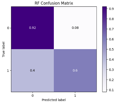
- Running Random Forest (RF) with optimized parameters
rf = RandomForestClassifier(bootstrap=False, criterion='entropy', max_depth=25,
                       min_samples_leaf=16, n_estimators=50, random_state=42)
rf.fit(X_train,y_train)
rf_predicted = rf.predict(X_test)
rf_conf_matrix = confusion_matrix(y_test, rf_predicted)
rf_acc_score = accuracy_score(y_test, rf_predicted)

print("confussion matrix")
print(rf_conf_matrix)
print("\n")
print("Accuracy of Random Forest:",rf_acc_score*100,'\n')
print(classification_report(y_test,rf_predicted))

confussion matrix
[[159  12]
 [ 30  67]]


Accuracy of Random Forest: 84.32835820895522

              precision    recall  f1-score   support

           0       0.84      0.93      0.88       171
           1       0.85      0.69      0.76        97

    accuracy                           0.84       268
   macro avg       0.84      0.81      0.82       268
weighted avg       0.84      0.84      0.84       268
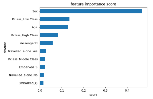
- Plotting the RF feature importance score
feat_importances = pd.Series(rf.feature_importances_, index=X.columns)
ax = feat_importances.nlargest(10).plot(kind='barh')
ax.invert_yaxis()
plt.xlabel('score')
plt.ylabel('feature')
plt.title('feature importance score')
- SciKit-Plot ML diagnostics using binary classification examples
import scikitplot as skplt

import sklearn

from sklearn.model_selection import train_test_split

from sklearn.ensemble import RandomForestClassifier, RandomForestRegressor, GradientBoostingClassifier, ExtraTreesClassifier
from sklearn.linear_model import LinearRegression, LogisticRegression
from sklearn.cluster import KMeans
from sklearn.decomposition import PCA

import matplotlib.pyplot as plt

import sys
import warnings
warnings.filterwarnings("ignore")

print("Scikit Plot Version : ", skplt.__version__)
print("Scikit Learn Version : ", sklearn.__version__)
print("Python Version : ", sys.version)

%matplotlib inline
Scikit Plot Version :  0.3.7
Scikit Learn Version :  1.4.1.post1
Python Version :  3.11.5 | packaged by Anaconda, Inc. | (main, Sep 11 2023, 13:26:23) [MSC v.1916 64 bit (AMD64)]
- RF Classification Learning Curve
skplt.estimators.plot_learning_curve(rf, X_train, y_train,
                                     cv=7, shuffle=True, scoring="accuracy",
                                     n_jobs=-1, figsize=(6,4), title_fontsize="large", text_fontsize="large",
                                     title="RF Classification Learning Curve");

- RF Normalized Confusion Matrix
skplt.metrics.plot_confusion_matrix(y_test, rf_predicted,
                                    normalize=True,
                                    title="RF Confusion Matrix",
                                    cmap="Purples"
                                    );
- RF ROC Curve
y_test_probs = rf.predict_proba(X_test)

skplt.metrics.plot_roc_curve(y_test, y_test_probs,
                       title="RF ROC Curve", figsize=(12,6));

- RF Precision-Recall Curve
skplt.metrics.plot_precision_recall_curve(y_test, y_test_probs,
                       title="RF Precision-Recall Curve", figsize=(12,6));

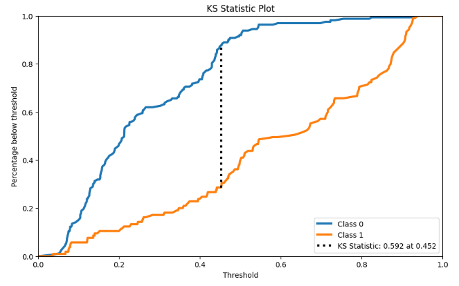
- KS Statistic Plot
y_probas = rf.predict_proba(X_test)

skplt.metrics.plot_ks_statistic(y_test, y_probas, figsize=(10,6));
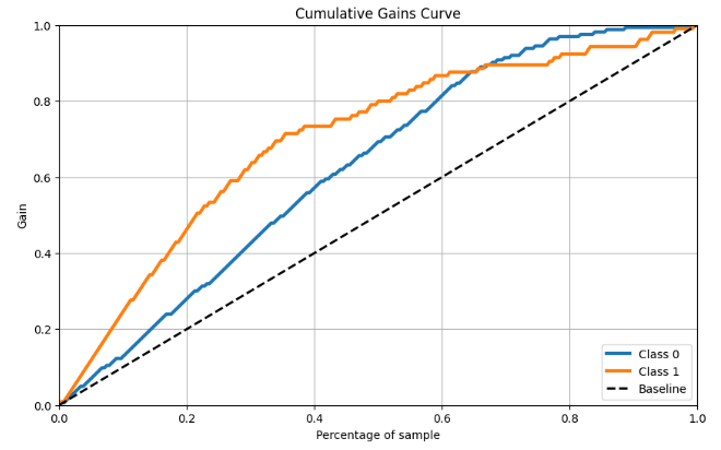
- RF Cumulative Gains Curve
skplt.metrics.plot_cumulative_gain(y_test, y_probas, figsize=(10,6));
- RF Lift Curve
skplt.metrics.plot_lift_curve(y_test, y_probas, figsize=(10,6));

- Trained ML calibration plots
lr_probas = LogisticRegression().fit(X_train, y_train).predict_proba(X_test)
rf_probas = RandomForestClassifier().fit(X_train, y_train).predict_proba(X_test)
gb_probas = GradientBoostingClassifier().fit(X_train, y_train).predict_proba(X_test)
et_scores = ExtraTreesClassifier().fit(X_train, y_train).predict_proba(X_test)

probas_list = [lr_probas, rf_probas, gb_probas, et_scores]
clf_names = ['Logistic Regression', 'Random Forest', 'Gradient Boosting', 'Extra Trees Classifier']
skplt.metrics.plot_calibration_curve(y_test,
                                     probas_list,
                                     clf_names, n_bins=15,
                                     figsize=(12,6)
                                     );

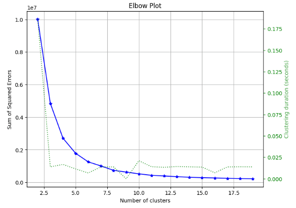
- RF Kmeans Elbow Plot
skplt.cluster.plot_elbow_curve(KMeans(random_state=1),
                               X_train,
                               cluster_ranges=range(2, 20),
                               figsize=(8,6));
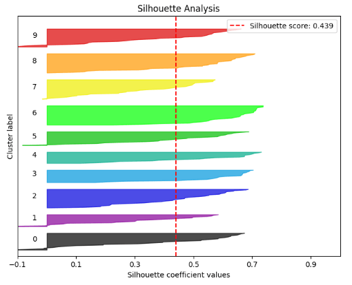
- RF Silhouette Analysis
kmeans = KMeans(n_clusters=10, random_state=1)
kmeans.fit(X_train, y_train)
cluster_labels = kmeans.predict(X_test)
skplt.metrics.plot_silhouette(X_test, cluster_labels,
                              figsize=(8,6));
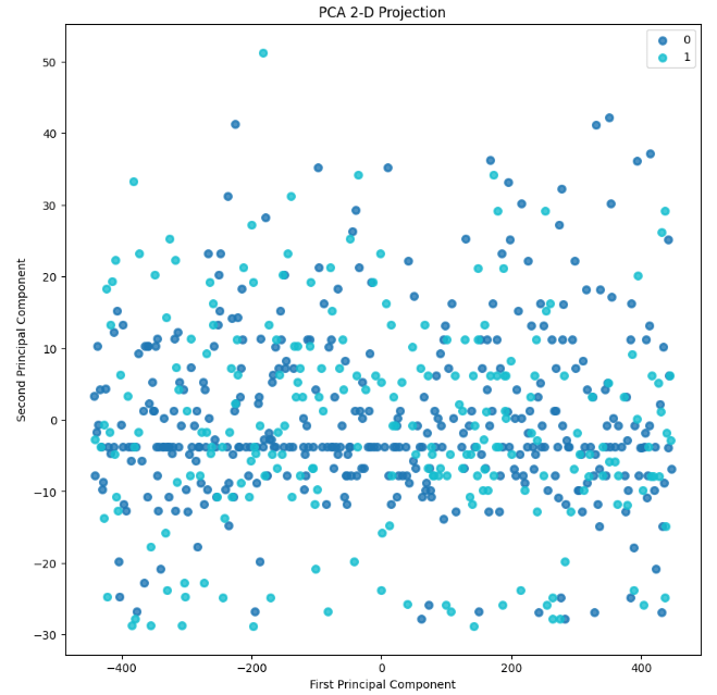
- RF PCA Component Explained Variances
pca = PCA(random_state=1)
pca.fit(X_train)

skplt.decomposition.plot_pca_component_variance(pca, figsize=(8,6));

skplt.decomposition.plot_pca_2d_projection(pca, X_train, y_train,
                                           figsize=(10,10),
                                           cmap="tab10");
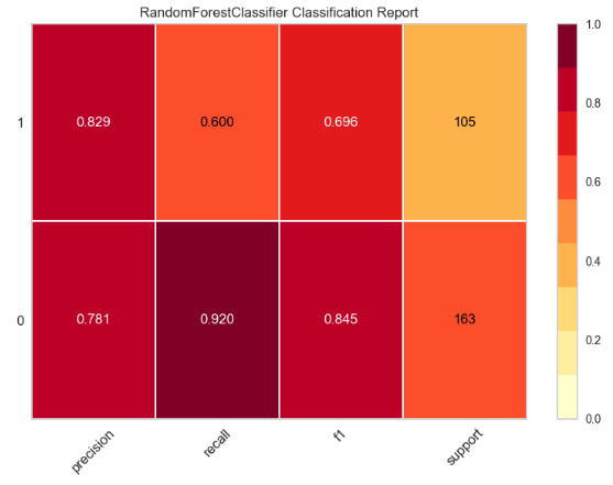
- yellowbrick RF Classification Report
import pandas as pd
import numpy as np

import matplotlib.pyplot as plt
import sklearn
import yellowbrick

pd.set_option("display.max_columns", 35)

import warnings
warnings.filterwarnings("ignore")

from yellowbrick.classifier import ClassificationReport

target_names=['0','1']

viz = ClassificationReport(rf,
                           classes=target_names,
                           support=True,
                           fig=plt.figure(figsize=(8,6)))

viz.fit(X_train, y_train)

viz.score(X_test, y_test)

viz.show();
- RF Class Prediction Error
from yellowbrick.classifier import ClassPredictionError

viz = ClassPredictionError(rf,
                           classes=target_names,
                           fig=plt.figure(figsize=(9,6)))

viz.fit(X_train, y_train)

viz.score(X_test, y_test)

viz.show();

- yellowbrick RF confusion matrix
from yellowbrick.classifier import ConfusionMatrix
from sklearn.ensemble import RandomForestClassifier

rfmodel=RandomForestClassifier(criterion='entropy', max_depth=25, max_features='log2',
                       min_samples_leaf=16, n_estimators=25, random_state=42)

visualizer = ConfusionMatrix(rfmodel, classes=target_names)

visualizer.fit(X_train, y_train)

visualizer.score(X_test, y_test)

visualizer.show();

- RF Discrimination Threshold
from yellowbrick.classifier import DiscriminationThreshold


viz = DiscriminationThreshold(RandomForestClassifier(random_state=123),
             classes=target_names,
             cv=0.2,
             fig=plt.figure(figsize=(9,6)))

viz.fit(X_train, y_train)

viz.score(X_test, y_test)

viz.show();
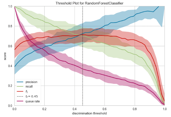
- For those classification problems that have a severe class imbalance, the default threshold of 0.5 can result in poor performance. We can see that the RF optimal threshold as 0.45 (compared to the default of 0.5) that achieves an F-Measure of about 0.7 for class 1.
SHAP Interpretation
- Let’s analyze the SHAP (Shapley Additive explanations) values to compare feature contributions to the RF model.
#SHAP (Shapley Additive explanation)
import shap
feature_names = X.columns.values.tolist()
X_test_df = pd.DataFrame(data=X_test, columns=feature_names)
explainer = shap.TreeExplainer(grid_search_forest.best_estimator_)
shap_values = explainer.shap_values(X_test_df)
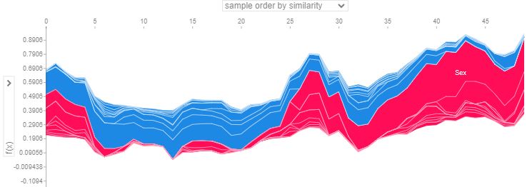
shap.summary_plot(shap_values[1], X_test_df, plot_type="bar")

shap.summary_plot(shap_values[1], X_test_df)

- This plot shows SHAP values for top features for every passenger in the training data. For each feature, the associated SHAP value is plotted on the x-axis. Each point represents a single model decision. The more influential a feature is, the more negative or positive it’s associated SHAP value. A SHAP value of 0 means that feature did nothing to move the decision away from the naive/reference value. In the plot, we see that the Sex feature is highly influential with strong negative and positive SHAP values for many predicted outcomes.
def plot_shap(model, passenger):
explainer = shap.TreeExplainer(model)
shap_values = explainer.shap_values(passenger)
shap.initjs()
return shap.force_plot(explainer.expected_value[1], shap_values[1], passenger)
passenger = X_test_df.iloc[1,:].astype(float)
plot_shap(grid_search_forest.best_estimator_, passenger)
passenger = X_test_df.iloc[2,:].astype(float)
plot_shap(grid_search_forest.best_estimator_, passenger)
passenger = X_test_df.iloc[5,:].astype(float)
plot_shap(grid_search_forest.best_estimator_, passenger)
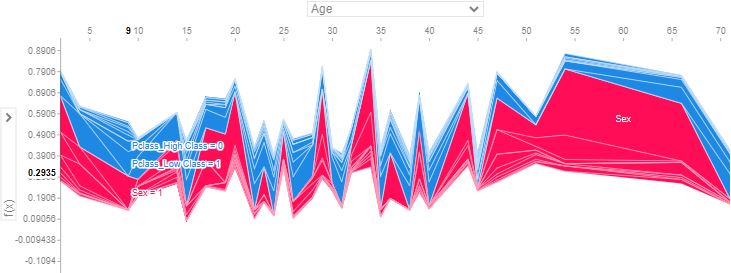
shap_val = explainer.shap_values(X_test)
shap.summary_plot(shap_val, X_test)

- This plot demonstrates the model feature importance ranked by mean absolute SHAP. It shows how important each feature was on average over the passenger population.
shap_values = explainer.shap_values(X_train.iloc[:50])
shap.force_plot(explainer.expected_value[1], shap_values[1], X_test_df.iloc[:50])
- Below is a gallery of the more detailed SHAP plots comparing the most dominant features, viz. Sex, Age, and Pclass

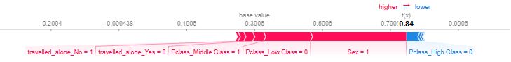
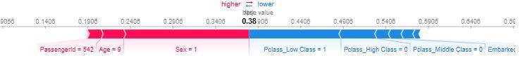
- Explanations for the predicted outcomes of 3 passengers. The features x for each passenger are displayed followed by an additive force layout, which graphically conveys prominent SHAP values that influenced each decision. The term f(x) is the evaluation of the trained model f on the features x, which is the predicted outcome for the corresponding passenger. The base value serves as a reference for the force bars, and is calculated as the average predicted outcome over the training data. Red (blue) force bars represent features that have increased (decreased) the passengers chance for survival, relative to the base value. The wider the force bars are, the more influential the corresponding feature.

- In the above plots, positive SHAP value means positive impact on prediction, leading the model to predict 1 (e.g. Passenger survived the Titanic). Negative SHAP value means negative impact, leading the model to predict 0 (e.g. passenger didn’t survive the Titanic).
Conclusions
- The ultimate aim of this post was to use ML to create a model that predicts which passengers survived the Titanic shipwreck. Apart from elements of luck involved in surviving, it seems some groups of people were more likely to survive than others.
- Specifically, we have addressed the challenge of building a predictive model that answers the question: “what sorts of people were more likely to survive?” using passenger data such as age, gender, socio-economic class, etc.
- The Goal: Predict whether a passenger survived or not. 0 for not surviving, 1 for surviving.
- First and foremost, we have tried to get preliminary insights into the underlying dataset structure, and get familiar with it using descriptive statistics, so we can create more efficient models. This step is important because a lot of the beginners are often confused as to how to get started.
- Next, we have carried out the comprehensive Exploratory Data Analysis (EDA) to uncover underlying patterns, grasp the dataset’s structure, and identify any potential anomalies or relationships between variables.
- EDA is basically used to identify a human error, missing values, or outliers. It extracts useful variables and removes useless variables.
- We have applied two additional rounds of AutoEDA to the input data using DataPrep and sweetviz libraries. DataPrep is a fully automated data analysis for visually exploring, cleaning, and preparing our data for ML. SweetViz is an open-source Python library that generates beautiful, high-density visualizations to perform EDA with just two lines of code.
- By performing the aforementioned 3-step EDA, we have checked the quality of the data. This QC visualization and statistical analysis process ensures that further analysis is based on accurate and insightful information, thereby reducing the likelihood of errors in subsequent stages.
- We have trained and compared the following 5 ML classifiers: LogisticRegression(), KNeighborsClassifier(), SVC(),GaussianNB(), DecisionTreeClassifier(), and RandomForestClassifier().
- It appears that 84.3% ACC Random Forest (RF) Classifier after HPO-type tuning is the best performing model.
- We have compiled the full RF binary classification report: First, the report shows a few standard quality metrics such as Accuracy, Precision, Recall, AUC, and F-1 Score (cf. yellowbrick classification table). Secondly, the reports includes a great variety of ML performance plots such as confusion matrix, feature importance, learning curves, ROC curve, Precision-Recall Curve, KS Statistic Plot, Cumulative Gains Curve, Lift Curve, trained ML calibration plots, Kmeans Elbow Plot, Silhouette Analysis, PCA Component Explained Variances, PCA 2-D Projection, Class Prediction Error, and Discrimination Threshold.
- We have explored SHAP values to discover relationships between model features and ML predictions. This helps debug potential biases, identify data issues, and justify the model’s decisions.
Explore More
- Top 6 Reliability/Risk Engineering Learnings
- Health Insurance Cross Sell Prediction with ML Model Tuning & Validation
- Low-Code AutoEDA of Dutch eHealth Data in Python
- Machine Learning-Based Crop Yield Prediction, Classification, and Recommendations
- Weather Forecasting & Flood De-Risking using Machine Learning, Markov Chain & Geospatial Plotly EDA
- A Comparison of Automated EDA Tools in Python: Pandas-Profiling vs SweetViz
- A Comparison of Binary Classifiers for Enhanced ML/AI Breast Cancer Diagnostics – 1. Scikit-Plot
References
- Predicting the Survival of Titanic Passengers
- Titanic-Machine-Learning-from-Disaster
- Titanic Machine Learning from Disaster
- How I Solved The Kaggle’s Titanic Machine Learning From Disaster Competition?
- Titanic- Machine Learning From Disaster
- Exploratory Data Analysis (EDA) on Titanic Dataset
- Titanic Data Science Solutions
- Titanic survivors, a guide for your first Data Science project
- How to Use Machine Learning to Determine Titanic Survivors
- Visualizing the Titanic Data with Seaborn

Leave a comment