
- Blue chip stocks are the stocks of well-known, high-quality companies that are industry leaders.
- The blue chip stocks’ attractive risk-reward profiles make them among the most popular for conservative investors. But even more risk-tolerant investors should consider buying blue chip stocks to diversify their portfolios better and provide stability during turbulent stock market conditions.
- In portfolio management, we are interested in getting high returns while simultaneously reducing risks; however, the stocks that have the potential of bringing high returns typically carry high risk of losing money.
- Portfolio optimization balances risk and return by combining risky and safe investments in a ratio that matches the investor’s risk tolerance.
- Failure to consider multiple attributes and criteria for portfolio evaluation is one of the most significant drawbacks of conventional technical analysis models.
- In this post, we will overcome these drawbacks by combining several robust trading indicators and risk management algorithms to facilitate the trading decision-making.
- The current focus is on the art of forecasting price movements through the study of chart patterns, trading signals, risk metrics, etc.
- Our ultimate goal is to demonstrate that the proposed integrated approach can help optimize the blue-chip portfolios comprehensively and support traders to execute their trading strategies effectively.
Table of Contents
- AMZN Moving Averages
- AMZN Market Direction
- AMZN Feature Importance
- AAPL Market Capture Ratios
- TSLA Bollinger Bands
- TSLA RSI Trading Signals
- TSLA MACD Signal Line
- Portfolio Returns
- Stock Correlations
- Standard Deviations
- EWA
- $$$ ROI
- Sharpe Ratio
- Evaluation
- Summary
- Explore More
- Appendix: Supply-Demand Levels
AMZN Moving Averages
We begin with moving averages (MA) that help to filter out the noise and act as trend-following indicators. When the price level of a stock rises above MA, traders consider it as an indication to buy. And when the price falls below MA, traders assume it as a signal to sell.
Let’s set the working directory PATH
import os
os.chdir('PATH')     # Set working directory
os. getcwd()
and download the AMZN stock data using yfinance
import yfinance as yf
import pandas as pd

ticker = 'AMZN'
start_date = '2007-01-01'
end_date = '2023-09-29'

stock_data = yf.download(ticker, start=start_date, end=end_date)
Let’s compute and plot MA 5-20-50-200
stock_data['MovingAverage_5'] = stock_data['Adj Close'].rolling(window=5).mean()
stock_data['MovingAverage_20'] = stock_data['Adj Close'].rolling(window=20).mean()
stock_data['MovingAverage_50'] = stock_data['Adj Close'].rolling(window=50).mean()
stock_data['MovingAverage_200'] = stock_data['Adj Close'].rolling(window=200).mean()
stock_data.dropna(inplace=True)
import numpy as np
import pandas as pd
from math import sqrt
import matplotlib.pyplot as plt
symbol=ticker
#series = stock_data['Adj Close']
#series.index = np.arange(series.shape[0])
plt.figure(figsize=(16, 10))
plt.rcParams.update({'font.size': 22})
plt.title(symbol)
plt.xlabel('Days')
plt.ylabel('Prices')
#plt.plot(stock_data['Adj Close'], label=symbol)
pts=stock_data['MovingAverage_5']
plt.plot(pts, label=f'MA5 {symbol}')
pts=stock_data['MovingAverage_20']
plt.plot(pts, label=f'MA20 {symbol}')
pts=stock_data['MovingAverage_50']
plt.plot(pts, label=f'MA50 {symbol}')
pts=stock_data['MovingAverage_200']
plt.plot(pts, label=f'MA200 {symbol}')
plt.legend()
plt.grid()

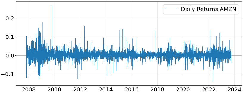
AMZN Market Direction
Let’s compute the AMZN Daily Returns and Market Direction
def create_labels(data, threshold=0.0):
    data['MarketDirection'] = 0
    data.loc[data['DailyReturns'] <= -threshold, 'MarketDirection'] = 1

stock_data['DailyReturns'] = stock_data['Adj Close'].pct_change()

create_labels(stock_data, threshold=0.02)
The Daily Returns AMZN plot is given by
plt.figure(figsize=(16, 6))
pts=stock_data['DailyReturns']
plt.plot(pts, label=f'Daily Returns {symbol}')
plt.legend()
plt.grid()
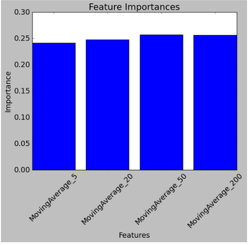
AMZN Feature Importance
Let’s implement the Random Forest Binary Classifier of Market Direction
from sklearn.ensemble import RandomForestClassifier
from sklearn.model_selection import train_test_split

X = stock_data[['MovingAverage_5', 'MovingAverage_20', 'MovingAverage_50', 'MovingAverage_200']]
y = stock_data['MarketDirection']

X_train, X_test, y_train, y_test = train_test_split(X, y, test_size=0.2, random_state=42)
model = RandomForestClassifier(n_estimators=100, random_state=42)

model.fit(X_train, y_train)
from sklearn.metrics import accuracy_score, classification_report
import matplotlib.pyplot as plt

y_pred = model.predict(X_test)

accuracy = accuracy_score(y_test, y_pred)
print(f"Model Accuracy: {accuracy:.2f}")

classification_report_str = classification_report(y_test, y_pred)
print("Classification Report:")
print(classification_report_str)

feature_importances = model.feature_importances_
features = X.columns

plt.figure(figsize=(8, 6))
plt.bar(features, feature_importances)
plt.title('Feature Importances')
plt.xlabel('Features')
plt.ylabel('Importance')
plt.xticks(rotation=45)
plt.show()
Model Accuracy: 0.84
Classification Report:
              precision    recall  f1-score   support

           0       0.88      0.94      0.91       706
           1       0.19      0.09      0.12        97

    accuracy                           0.84       803
   macro avg       0.54      0.52      0.52       803
weighted avg       0.80      0.84      0.82       803
AAPL Market Capture Ratios
One popular tool used to assess a strategy’s behavior versus a benchmark is the market capture ratio, which helps us assess an investment’s ability to capture both upside and downside movements in the market.
Let’s import the basic libraries
import pandas as pd
import numpy as np
import yfinance as yf
and introduce the following market_capture_ratio function
# %% Function

def market_capture_ratio(returns):
    """
    Function to calculate the upside and downside capture for a given set of returns.
    The function is set up so that the investment's returns are in the first column of the dataframe
    and the index returns are the second column.
    :param returns: pd.DataFrame of asset class returns
    :return: pd.DataFrame of market capture results
    """

    # initialize an empty dataframe to store the results
    df_mkt_capture = pd.DataFrame()

    # 1) Upside capture ratio
    # a) Isolate positive periods of the index
    up_market = returns[returns.iloc[:, -1] >= 0]

    # b) Geometrically link the returns
    up_linked_rets = ((1 + up_market).product(axis=0)) - 1

    # c) Calculate the ratio, multiply by 100 and round to 2 decimals to show in percent
    up_ratio = (up_linked_rets / up_linked_rets.iloc[-1] * 100).round(2)

    # 2) Downside capture ratio
    # a) Isolate negative periods of the index
    down_market = returns[returns.iloc[:, -1] < 0]

    # b) Geometrically link the returns
    down_linked_rets = ((1 + down_market).product(axis=0)) - 1

    # c) Calculate the ratio, multiply by 100 and round to 2 decimals to show in percent
    down_ratio = (down_linked_rets / down_linked_rets.iloc[-1] * 100).round(2)

    # 3) Combine to produce our final dataframe
    df_mkt_capture = pd.concat([up_ratio, down_ratio], axis=1)

    df_mkt_capture.columns = ['Upside Capture', 'Downside Capture']

    return df_mkt_capture
Let’s calculate the upside/downside capture ratios of AAPL vs SPY
# %% Retrieve the returns

# Specify the tickers to retrieve using yfinance
tickers = ['AAPL', 'SPY']
start_date = '2018-01-01'
end_date = '2023-09-29'

# Retrieve the historical data for the tickers
df_prices = yf.download(tickers, start=start_date, end=end_date)

# Keep only the adjusted close columns
df_prices = df_prices['Adj Close']

# Resample to month end and calculate the monthly percent change
df_rets_monthly = df_prices.resample('M').last().pct_change().dropna()

# Calculate the market capture ratios
df_mkt_capture = market_capture_ratio(df_rets_monthly)

print(df_mkt_capture)
         Upside Capture    Downside Capture
AAPL          306.46            101.94
SPY           100.00            100.00
- The upside capture ratio of 306% means that the strategy would capture 306% of the positive performance of the benchmark or outperformed during the period. In other words, if the benchmark experienced the 10% gain, our investment would have produced the 30% gain.
- The downside capture ratio of 102% means that our investment underperformed the benchmark during down periods.
- A strategy with ratios of over 100% would normally be indicative of strategies that are more aggressive than the underlying benchmark while ratios under 100% would be indicative of more conservative strategies.
- Ideally, the goal is to create strategies that have upside capture ratios over 100% and downside ratios under 100%.
- Read more here.
TSLA Bollinger Bands
- Bollinger Bands, a technical indicator developed by John Bollinger, are used to measure a market’s volatility and identify “overbought” or “oversold” conditions.
- Consider the TSLA example of using Bollinger Bands (BB) to compute trading signals
import pandas as pd
import yfinance as yf
import matplotlib.pyplot as plt

def generate_bollinger_bands(data):
    data['Middle_Band'] = data['Close'].rolling(window=20).mean()
    data['Upper_Band'] = data['Middle_Band'] + 2 * data['Close'].rolling(window=20).std()
    data['Lower_Band'] = data['Middle_Band'] - 2 * data['Close'].rolling(window=20).std()
    return data

if __name__ == "__main__":
    ticker_symbol = 'TSLA'  # Ticker symbol for Tesla Inc.
    start_date = '2023-01-01'  # Replace with the desired start date
    end_date = '2023-09-26'  # Replace with the desired end date

    # Fetch historical price data from Yahoo Finance
    data = yf.download(ticker_symbol, start=start_date, end=end_date)

    # Generate Bollinger Bands
    data = generate_bollinger_bands(data)

    # Plot Bollinger Bands and Closing Price
    plt.figure(figsize=(12, 6))
    plt.plot(data.index, data['Close'], label='Closing Price', color='orange')
    plt.plot(data.index, data['Upper_Band'], label='Upper Band', color='red')
    plt.plot(data.index, data['Middle_Band'], label='Middle Band', color='blue')
    plt.plot(data.index, data['Lower_Band'], label='Lower Band', color='green')

    plt.title(f'{ticker_symbol} Bollinger Bands')
    plt.xlabel('Date')
    plt.ylabel('Price')
    plt.legend(loc='lower right')
    plt.grid()
    plt.show()
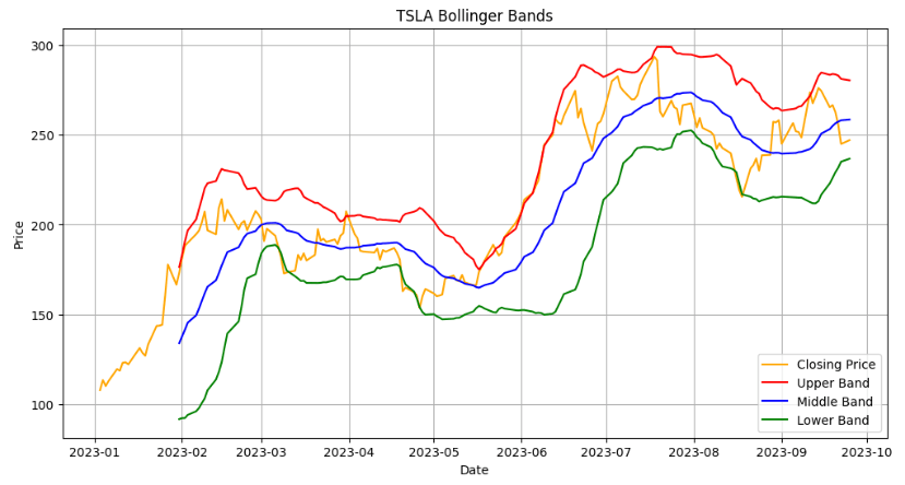
The most basic interpretation of BB is that the channels represent a measure of ‘highness’ and ‘lowness’:
- The upper band shows a level that is statistically high or expensive
- The lower band shows a level that is statistically low or cheap
- The BB width is linked to the stock volatility
- In a more volatile case, BB widen
- In a less volatile case, the bands narrow
TSLA RSI Trading Signals
- Momentum indicators are technical analysis tools used to determine the strength or weakness of a stock’s price. Momentum measures the rate of the rise or fall of stock prices. Common momentum indicators include the relative strength index (RSI) and moving average convergence divergence (MACD).
- Let’s invoke momentum trading indicators such as MACD and RSI to compute TSLA trading signals
import pandas as pd
import numpy as np
import datetime as dt
import matplotlib.pyplot as plt

from pandas_datareader import data as pdr
import yfinance as yf
yf.pdr_override()

# YFinance API Pull

ticker = 'TSLA'

now = dt.datetime.now()
startyear = 2023
startmonth = 1
startday = 2
start = dt.datetime(startyear, startmonth, startday)

df = pdr.get_data_yahoo(ticker, start = "2023-01-01", end = "2023-09-29")

df.tail()

# 14_Day RSI
df['Up Move'] = np.nan
df['Down Move'] = np.nan
df['Average Up'] = np.nan
df['Average Down'] = np.nan
# Relative Strength
df['RS'] = np.nan
# Relative Strength Index
df['RSI'] = np.nan

#Calculate Up Move & Down Move
for x in range(1, len(df)):
    df['Up Move'][x] = 0
    df['Down Move'][x] = 0

    if df['Adj Close'][x] > df['Adj Close'][x-1]:
        df['Up Move'][x] = df['Adj Close'][x] - df['Adj Close'][x-1]

    if df['Adj Close'][x] < df['Adj Close'][x-1]:
        df['Down Move'][x] = abs(df['Adj Close'][x] - df['Adj Close'][x-1])

#Calculate initial Average Up & Down, RS and RSI
df['Average Up'][14] = df['Up Move'][1:15].mean()
df['Average Down'][14] = df['Down Move'][1:15].mean()
df['RS'][14] = df['Average Up'][14] / df['Average Down'][14]
df['RSI'][14] = 100 - (100/(1+df['RS'][14]))

#Calculate rest of Average Up, Average Down, RS, RSI
for x in range(15, len(df)):
    df['Average Up'][x] = (df['Average Up'][x-1]*13+df['Up Move'][x])/14
    df['Average Down'][x] = (df['Average Down'][x-1]*13+df['Down Move'][x])/14
    df['RS'][x] = df['Average Up'][x] / df['Average Down'][x]
    df['RSI'][x] = 100 - (100/(1+df['RS'][x]))

print(df)
               Open        High         Low       Close   Adj Close  \
Date
2023-01-03  118.470001  118.800003  104.639999  108.099998  108.099998
2023-01-04  109.110001  114.589996  107.519997  113.639999  113.639999
2023-01-05  110.510002  111.750000  107.160004  110.339996  110.339996
2023-01-06  103.000000  114.389999  101.809998  113.059998  113.059998
2023-01-09  118.959999  123.519997  117.110001  119.769997  119.769997
...                ...         ...         ...         ...         ...
2023-09-22  257.399994  257.790009  244.479996  244.880005  244.880005
2023-09-25  243.380005  247.100006  238.309998  246.990005  246.990005
2023-09-26  242.979996  249.550003  241.660004  244.119995  244.119995
2023-09-27  244.259995  245.330002  234.580002  240.500000  240.500000
2023-09-28  240.020004  247.550003  238.649994  246.380005  246.380005

               Volume   Up Move  Down Move  Average Up  Average Down  \
Date
2023-01-03  231402800       NaN        NaN         NaN           NaN
2023-01-04  180389000  5.540001   0.000000         NaN           NaN
2023-01-05  157986300  0.000000   3.300003         NaN           NaN
2023-01-06  220911100  2.720001   0.000000         NaN           NaN
2023-01-09  190284000  6.709999   0.000000         NaN           NaN
...               ...       ...        ...         ...           ...
2023-09-22  127024300  0.000000  10.819992    2.771808      3.635013
2023-09-25  104636600  2.110001   0.000000    2.724536      3.375369
2023-09-26  101993600  0.000000   2.870010    2.529926      3.339272
2023-09-27  136597200  0.000000   3.619995    2.349217      3.359323
2023-09-28  116811300  5.880005   0.000000    2.601416      3.119372

                  RS        RSI
Date
2023-01-03       NaN        NaN
2023-01-04       NaN        NaN
2023-01-05       NaN        NaN
2023-01-06       NaN        NaN
2023-01-09       NaN        NaN
...              ...        ...
2023-09-22  0.762530  43.263389
2023-09-25  0.807182  44.665218
2023-09-26  0.757628  43.105140
2023-09-27  0.699313  41.152672
2023-09-28  0.833955  45.473039

[186 rows x 12 columns]
## Chart the stock price and RSI
fig, axs = plt.subplots(2, sharex=True, figsize=(13,9))
fig.suptitle('TSLA Price (top) - 14 day RSI (bottom)')

axs[0].plot(df['Adj Close'])
axs[1].plot(df['RSI'])
axs[0].grid()
axs[1].grid()
## Calculate the buy & sell signals
## Initialize columns

df['Long Tomorrow'] = np.nan
df['Buy Signal'] = np.nan
df['Sell Signal'] = np.nan
df['Buy RSI'] = np.nan
df['Sell RSI'] = np.nan
df['Strategy'] = np.nan

#Calculate the buy & sell signals
for x in range(15, len(df)):

    #calculate "Long Tomorrow" column
    if ((df['RSI'][x] <= 40) & (df['RSI'][x-1]>40) ):
        df['Long Tomorrow'][x] = True
    elif ((df['Long Tomorrow'][x-1] == True) & (df['RSI'][x] <= 70)):
        df['Long Tomorrow'][x] = True
    else:
        df['Long Tomorrow'][x] = False

    #calculate "Buy Signal" column
    if ((df['Long Tomorrow'][x] == True) & (df['Long Tomorrow'][x-1] == False)):
        df['Buy Signal'][x] = df['Adj Close'][x]
        df['Buy RSI'][x] = df['RSI'][x]

    #calculate "Sell Signal" column
    if ((df['Long Tomorrow'][x] == False) & (df['Long Tomorrow'][x-1] == True)):
        df['Sell Signal'][x] = df['Adj Close'][x]
        df['Sell RSI'][x] = df['RSI'][x]

#calculate strategy performance
df['Strategy'][15] = df['Adj Close'][15]

for x in range(16, len(df)):
    if df['Long Tomorrow'][x-1] == True:
        df['Strategy'][x] = df['Strategy'][x-1]* (df['Adj Close'][x] / df['Adj Close'][x-1])
    else:
        df['Strategy'][x] = df['Strategy'][x-1]
## Chart the buy/sell signals

#plt.style.use('_classic_test')
fig, axs = plt.subplots(2, sharex=True, figsize=(13,9))
fig.suptitle('Stock Price (top) & 14 day RSI (bottom)')

## Chart the stock close price & buy/sell signals

axs[0].scatter(df.index, df['Buy Signal'],  color = 'green',  marker = '^', alpha = 1)
axs[0].scatter(df.index, df['Sell Signal'],  color = 'red',  marker = 'v', alpha = 1)
axs[0].plot(df['Adj Close'], alpha = 0.8)
axs[0].grid()

## Chart RSI & buy/sell signals

axs[1].scatter(df.index, df['Buy RSI'],  color = 'green', marker = '^', alpha = 1)
axs[1].scatter(df.index, df['Sell RSI'],  color = 'red', marker = 'v', alpha = 1)
axs[1].plot(df['RSI'], alpha = 0.8)
axs[1].grid()
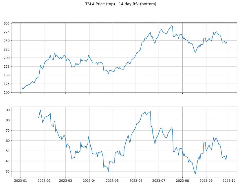

Low RSI levels, below 40, generate buy signals and indicate an oversold or undervalued condition. High RSI levels, above 70, generate sell signals and suggest that a security is overbought or overvalued.
TSLA MACD Signal Line
## Calculate the MACD and Signal Line indicators
## Calculate the Short Term Exponential Moving Average

ShortEMA = df.Close.ewm(span=12, adjust=False).mean()

## Calculate the Long Term Exponential Moving Average

LongEMA = df.Close.ewm(span=26, adjust=False).mean()

## Calculate the Moving Average Convergence/Divergence (MACD)

MACD = ShortEMA - LongEMA

## Calculate the signal line
signal = MACD.ewm(span=9, adjust=False).mean()
#Plot the chart

plt.figure(figsize=(14,8))
plt.style.use('classic')

plt.plot(df.index, MACD, label='MACD', color = 'blue')
plt.plot(df.index, signal, label='Signal Line', color='red')
plt.xticks(rotation=45)
plt.legend(loc='lower left')
plt.show()
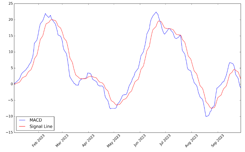
In the above plot, signal line crossovers are the most common MACD signals. A bullish crossover occurs when the MACD turns up and crosses above the signal line. A bearish crossover occurs when the MACD turns down and crosses below the signal line. Crossovers can last a few days or a few weeks, depending on the strength of the move.
Portfolio Returns
Let’s create and optimize the blue-chip portfolio using the trading dashboard.
- Input data
# Import libraries and dependencies
import numpy as np
import pandas as pd
import yfinance as yf
## AAPL DATA

cmg = yf.Ticker("AAPL")

cmg_historical = cmg.history(start="2023-1-1", end="2023-9-29", interval="1d")
cmg_df = cmg_historical.drop(columns=['Open', 'High', 'Low', 'Dividends', 'Stock Splits', 'Volume'])
cmg_df.rename(columns= {'Close':'AAPL'}, inplace=True)
cmg_daily = cmg_df.pct_change()
## JPM DATA

shop = yf.Ticker("JPM")

shop_historical = shop.history(start="2023-1-1", end="2023-9-29", interval="1d")
shop_df = shop_historical.drop(columns=['Open', 'High', 'Low', 'Dividends', 'Stock Splits', 'Volume'])
shop_df.rename(columns= {'Close':'JPM'}, inplace=True)
shop_daily = shop_df.pct_change()
## TSLA DATA

tsla= yf.Ticker("TSLA")

tsla_historical = tsla.history(start="2023-1-1", end="2023-9-26", interval="1d")
tsla_df = tsla_historical.drop(columns=['Open', 'High', 'Low', 'Dividends', 'Stock Splits', 'Volume'])
tsla_df.rename(columns= {'Close':'TSLA'}, inplace=True)
tsla_daily = tsla_df.pct_change()
## PG DATA

panw = yf.Ticker("PG")

panw_historical = panw.history(start="2023-1-1", end="2023-9-29", interval="1d")
panw_df = panw_historical.drop(columns=['Open', 'High', 'Low', 'Dividends', 'Stock Splits', 'Volume'])
panw_df.rename(columns= {'Close':'PG'}, inplace=True)
panw_daily = panw_df.pct_change()
## AMAZON DATA

amzn = yf.Ticker("AMZN")

amzn_historical = amzn.history(start="2023-1-1", end="2023-9-29", interval="1d")
amzn_df = amzn_historical.drop(columns=['Open', 'High', 'Low', 'Dividends', 'Stock Splits', 'Volume'])
amzn_df.rename(columns= {'Close':'AMZN'}, inplace=True)
amzn_daily = amzn_df.pct_change()
## META DATA

fb = yf.Ticker("META")

fb_historical = fb.history(start="2023-1-1", end="2023-9-29", interval="1d")
fb_df = fb_historical.drop(columns=['Open', 'High', 'Low', 'Dividends', 'Stock Splits', 'Volume'])
fb_df.rename(columns= {'Close':'META'}, inplace=True)
fb_daily = fb_df.pct_change()
# Concatenate joining tickers into one DataFrame
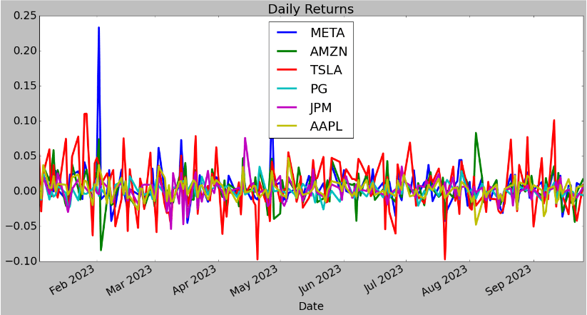
portfolio_df = pd.concat([fb_daily, amzn_daily, tsla_daily, panw_daily, shop_daily, cmg_daily], axis="columns", join="inner")
daily_portfolio = portfolio_df
daily_portfolio.dropna()

- Daily returns
plt.rcParams.update({'font.size': 22})
daily_portfolio.plot(figsize=(20, 10), title="Daily Returns",lw=4)
- Cumulative returns
cumulative_returns = (1 + daily_portfolio).cumprod()
cumulative_returns.plot(figsize=(20, 10), title="Cumulative Returns",lw=4)

The figure compares the cumulative returns of investing $1 in January 2023 until 2023-09-25 for our 6 stocks.
Stock Correlations
Correlation is closely tied to diversification, the concept that certain types of risk can be mitigated by investing in assets that are not correlated.
# Construct a correlation table
corr_df = daily_portfolio.corr()
corr_df.style.background_gradient(cmap="summer")
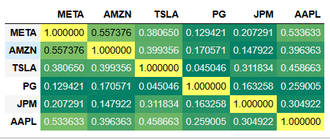
This matrix tells you how strongly each asset in a portfolio is related to the others.
Standard Deviations
Standard deviation (STD) is the most common way to measure market volatility, and traders can use BB to analyze STD. In most cases, when the price of an asset is trending upwards, the standard deviation is usually relatively low.
# Daily Standard Deviations
# Calculate the standard deviation for each portfolio.
daily_portfolio.std()
META    0.027521
AMZN    0.021600
TSLA    0.034879
PG      0.009199
JPM     0.014168
AAPL    0.013388
dtype: float64
# Calculate the annualized standard deviation (252 trading days)
daily_portfolio.std() * np.sqrt(252)
META    0.436883
AMZN    0.342885
TSLA    0.553688
PG      0.146036
JPM     0.224904
AAPL    0.212530
dtype: float64
# Calculate and plot the rolling standard deviation for
# the blue-chip portfolio using a 21 trading day window
daily_portfolio.rolling(window=21).std().plot(figsize=(20, 10), title="21 Day Rolling Standard Deviation",lw=4)

EWA
An exponentially weighted moving average reacts more significantly to recent price changes than a simple moving average (SMA), which applies an equal weight to all observations in the period. This is a technical chart indicator that tracks the price of an investment (like a stock or commodity) over time.
# Calculate a rolling window using the exponentially weighted moving average.
daily_portfolio.ewm(halflife=21).std().plot(figsize=(20, 10), title="Exponentially Weighted Average",lw=4)

$$$ ROI
# Plot returns of the portfolio in terms of money
initial_investment = 10000
cumulative_profit = initial_investment * cumulative_returns
cumulative_profit.plot(figsize=(20, 10),lw=4)

The above plot provides a glimpse of the investment’s prior performance and helps determine if a particular investment has been profitable in 2023.
Sharpe Ratio
The Sharpe ratio compares the return of an investment with its risk. A higher Sharpe ratio is better when comparing similar portfolios. Usually, any Sharpe ratio greater than 1.0 is considered acceptable to good by investors. A ratio higher than 2.0 is rated as very good. A ratio of 3.0 or higher is considered excellent. A ratio under 1.0 is considered sub-optimal.
# Calculate annualized Sharpe Ratios
sharpe_ratios = (daily_portfolio.mean() * 252) / (daily_portfolio.std() * np.sqrt(252))
sharpe_ratios
META    3.000124
AMZN    1.888006
TSLA    2.343991
PG      0.193469
JPM     0.743038
AAPL    2.363905
dtype: float64
# Visualize the sharpe ratios as a bar plot
sharpe_ratios.plot(figsize=(15, 8),kind="bar", title="Sharpe Ratios", color= 'orange')

Evaluation
# Prepare DataFrame for metrics
metrics = [
    'META Annual Return', 'AMZN Annual Return', 'TSLA Annual Return','PG Annual Return','JPM Annual Return', 'AAPL Annual Return',
    'META Annual Volatility','AMZN Annual Volatility','TSLA Annual Volatility','PG Annual Volatility','JPM Annual Volatility','AAPL Annual Volatility',
    'META Sharpe Ratio','AMZN Sharpe Ratio','TSLA Sharpe Ratio','PG Sharpe Ratio','JPM Sharpe Ratio','AAPL Sharpe Ratio']

columns = ['Backtest']

# Initialize the DataFrame with index set to evaluation metrics and column as `Backtest` (just like PyFolio)
portfolio_evaluation_df = pd.DataFrame(index=metrics, columns=columns)
# Calculate annualized return
portfolio_evaluation_df.loc['META Annual Return'] = daily_portfolio['META'].std() * np.sqrt(252)
portfolio_evaluation_df.loc['AMZN Annual Return'] = daily_portfolio['AMZN'].std() * np.sqrt(252)
portfolio_evaluation_df.loc['TSLA Annual Return'] = daily_portfolio['TSLA'].std() * np.sqrt(252)
portfolio_evaluation_df.loc['PG Annual Return'] = daily_portfolio['PG'].std() * np.sqrt(252)
portfolio_evaluation_df.loc['JPM Annual Return'] = daily_portfolio['JPM'].std() * np.sqrt(252)
portfolio_evaluation_df.loc['AAPL Annual Return'] = daily_portfolio['AAPL'].std() * np.sqrt(252)

# Calculate annual volatility
portfolio_evaluation_df.loc['META Annual Volatility'] = daily_portfolio['META'].std() * np.sqrt(252)
portfolio_evaluation_df.loc['AMZN Annual Volatility'] = daily_portfolio['AMZN'].std() * np.sqrt(252)
portfolio_evaluation_df.loc['TSLA Annual Volatility'] = daily_portfolio['TSLA'].std() * np.sqrt(252)
portfolio_evaluation_df.loc['PG Annual Volatility'] = daily_portfolio['PG'].std() * np.sqrt(252)
portfolio_evaluation_df.loc['JPM Annual Volatility'] = daily_portfolio['JPM'].std() * np.sqrt(252)
portfolio_evaluation_df.loc['AAPL Annual Volatility'] = daily_portfolio['AAPL'].std() * np.sqrt(252)

# Calculate Sharpe Ratio
portfolio_evaluation_df.loc['META Sharpe Ratio'] = sharpe_ratios['META']
portfolio_evaluation_df.loc['AMZN Sharpe Ratio'] = sharpe_ratios['AMZN']
portfolio_evaluation_df.loc['TSLA Sharpe Ratio'] = sharpe_ratios['TSLA']
portfolio_evaluation_df.loc['PG Sharpe Ratio'] = sharpe_ratios['PG']
portfolio_evaluation_df.loc['JPM Sharpe Ratio'] = sharpe_ratios['JPM']
portfolio_evaluation_df.loc['AAPL Sharpe Ratio'] = sharpe_ratios['AAPL']


portfolio_evaluation_df.head(18)
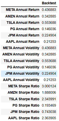
print (portfolio_evaluation_df)
                     index  Backtest
0       META Annual Return  0.436883
1       AMZN Annual Return  0.342885
2       TSLA Annual Return  0.553688
3         PG Annual Return  0.146036
4        JPM Annual Return  0.224904
5       AAPL Annual Return   0.21253
6   META Annual Volatility  0.436883
7   AMZN Annual Volatility  0.342885
8   TSLA Annual Volatility  0.553688
9     PG Annual Volatility  0.146036
10   JPM Annual Volatility  0.224904
11  AAPL Annual Volatility   0.21253
12       META Sharpe Ratio  3.000124
13       AMZN Sharpe Ratio  1.888006
14       TSLA Sharpe Ratio  2.343991
15         PG Sharpe Ratio  0.193469
16        JPM Sharpe Ratio  0.743038
17       AAPL Sharpe Ratio  2.363905
plt.figure(figsize=(16,8))
plt.rcParams.update({'font.size': 16})
plt.bar(portfolio_evaluation_df['index'],portfolio_evaluation_df['Backtest'])
plt.xticks(rotation=90)
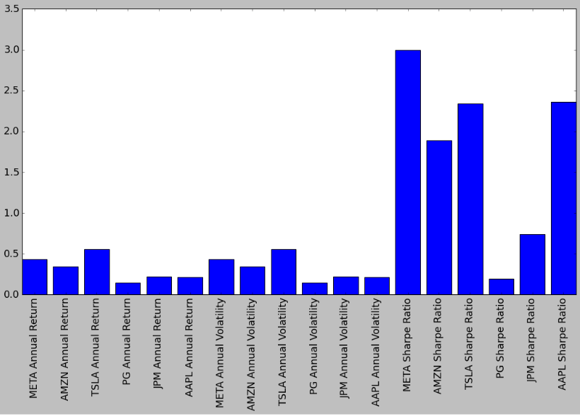
This plot shows the following:
- max/min Return = TSLA/PG
- max/min Volatility = TSLA/PG
- max/min Sharpe Ratio = META/PG
Summary
- In this post, we have tested the integrated multi-attribute technical analysis to optimize blue-chip stock portfolios.
- We have investigated trend reversals of top blue chips (META, AMZN, TSLA, PG, JPM, and AAPL) by comparing various trading indicators (MA, EWA, MACD, RSI, and BB) and stock returns vs volatility measures.
- We have chosen the optimal set of MA using the Random Forest dominance factors.
- As an example, we have assessed the AAPL strategy behavior versus SPY using the market capture ratio.
- We have examined the portfolio correlation matrix closely tied to diversification.
- We have assessed the risk-adjusted performance of our portfolio in terms of the Sharpe ratio.
- In Appendix, we have also examine the support and resistance levels of our portfolio based upon the law of supply and demand.
- Our final stock evaluation metrics are Annual Return, Annual Volatility, and Annual Sharpe Ratio.
Explore More
- Blue-Chip Stock Portfolios for Quant Traders
- Are Blue-Chips Perfect for This Bear Market?
- Inflation-Resistant Stocks to Buy
- Quant Trading using Monte Carlo Predictions and 62 AI-Assisted Trading Technical Indicators (TTI)
- Algorithmic Testing Stock Portfolios to Optimize the Risk/Reward Ratio
- Stock Portfolio Risk/Return Optimization
- Towards Max(ROI/Risk) Trading
- Portfolio max(Return/Risk) Stochastic Optimization of 20 Dividend Growth Stocks
- Risk-Aware Strategies for DCA Investors
Appendix: Supply-Demand Levels
- The common technical analysis is focused on past price actions, usually using candlestick charts, to identify levels where a trend reversal occurred.
- Instead, we will examine the support and resistance levels of our portfolio based upon the law of supply and demand. Following recent studies, we proposes using volatility for forecasting supply and demand zones in a form that isn’t subjective to personal interpretation of a price chart.
- Importing key libraries
# Importing Libraries

# Data Handling
import pandas as pd
import numpy as np

# Financial Data Analysis
import yfinance as yf

# Data Visualization
import plotly.express as px
import plotly.graph_objs as go
import plotly.subplots as sp
from plotly.subplots import make_subplots
import plotly.figure_factory as ff
import plotly.io as pio
from IPython.display import display
from plotly.offline import init_notebook_mode

# Statistics & Mathematics
import scipy.stats as stats
import statsmodels as sm
from scipy.stats import shapiro, skew
import math

# Hiding warnings
import warnings
warnings.filterwarnings("ignore")
- Handling input data
def load_and_preprocess(ticker):
    '''
    This function takes in a ticker symbol, which is used to
    retrieve historical data from Yahoo Finance.
    The attributes 'Returns', and the Adjusted Low, High, and Open
    are created.
    NaNs are filled with 0s
    '''

    df = yf.download(ticker)
    df['Returns'] = df['Adj Close'].pct_change(1)
    df['Adj Low'] = df['Low'] - (df['Close'] - df['Adj Close'])
    df['Adj High'] = df['High'] - (df['Close'] - df['Adj Close'])
    df['Adj Open'] = df['Open'] - (df['Close'] - df['Adj Close'])
    df = df.fillna(0)
    return df
- Selecting AAPL as an example
ticker = 'AAPL'

df = load_and_preprocess(ticker) # Loading and Transforming Dataframe
df.tail()

T = 20 # Time period for computing the standard deviation
df['Annualized_Vol'] = np.round(df['Returns'].rolling(T).std() * np.sqrt(252), 2)
# Creating a line plot to visualize historical volatility
lineplot = go.Scatter(
    x=df.index,
    y=df['Annualized_Vol'] * 100, # Annualized Volatility in %
    mode='lines',
    line=dict(color='darkblue', width=2.5),
    name = 'Annualized Volatility (%)')

layout = go.Layout(
    title={'text': f'<b>Annualized Volatility for {ticker} <br><i><sub></sub></i></b>',
           'x': 0.035, 'xanchor': 'left'},
            yaxis = dict(title = '<b>Annualized Volatility (%) </b>'),
            xaxis = dict(title = '<b>Date</b>'),
    template='seaborn',
    height = 450, width = 1000,
    showlegend=True,
    plot_bgcolor = '#F6F5F5',
    paper_bgcolor = '#F6F5F5',
    xaxis_rangeslider_visible=False)

fig = go.Figure(data=[lineplot], layout=layout)

fig.show()

It is possible to detect in the plot above periods of high volatility where the stock experienced its highest points of fluctuation.
# Yearly forecasting
reference_year = "2022" # Forecasting levels for 2023

High_Band_1std =  df.loc[reference_year]["Annualized_Vol"][-1]*df.loc[reference_year]["Adj Close"][-1] + df.loc[reference_year]["Adj Close"][-1]
Low_Band_1std =  df.loc[reference_year]["Adj Close"][-1] - df.loc[reference_year]["Annualized_Vol"][-1]*df.loc[reference_year]["Adj Close"][-1]

High_Band_2std =  2*df.loc[reference_year]["Annualized_Vol"][-1]*df.loc[reference_year]["Adj Close"][-1] + df.loc[reference_year]["Adj Close"][-1]
Low_Band_2std =  df.loc[reference_year]["Adj Close"][-1] - 2*df.loc[reference_year]["Annualized_Vol"][-1]*df.loc[reference_year]["Adj Close"][-1]

High_Band_3std =  3*df.loc[reference_year]["Annualized_Vol"][-1]*df.loc[reference_year]["Adj Close"][-1] + df.loc[reference_year]["Adj Close"][-1]
Low_Band_3std =  df.loc[reference_year]["Adj Close"][-1] - 3*df.loc[reference_year]["Annualized_Vol"][-1]*df.loc[reference_year]["Adj Close"][-1]
rint(f'\nVolatility-Based Supply and Demand Levels for {ticker} in {int(reference_year) + 1}\n')
print(f'Supply Level 3σ: {High_Band_3std.round(2)}\n')
print(f'Supply Level 2σ: {High_Band_2std.round(2)}\n')
print(f'Supply Level 1σ: {High_Band_1std.round(2)}\n')
print('-' * 65, '\n')
print(f'Demand Level 1σ: {Low_Band_1std.round(2)}\n')
print(f'Demand Level 2σ: {Low_Band_2std.round(2)}\n')
print(f'Demand Level 3σ: {Low_Band_3std.round(2)}\n')
Volatility-Based Supply and Demand Levels for AAPL in 2023

Supply Level 3σ: 241.94

Supply Level 2σ: 204.42

Supply Level 1σ: 166.9

-----------------------------------------------------------------

Demand Level 1σ: 91.86

Demand Level 2σ: 54.34

Demand Level 3σ: 16.82
# Candlestick chart
candlestick = go.Candlestick(x = df.loc[str(int(reference_year) + 1)].index,
open = df.loc[str(int(reference_year) + 1)]['Adj Open'],
high = df.loc[str(int(reference_year) + 1)]['Adj High'],
low = df.loc[str(int(reference_year) + 1)]['Adj Low'],
close = df.loc[str(int(reference_year) + 1)]['Adj Close'],
increasing = dict(line=dict(color = 'red')),
decreasing = dict(line=dict(color = 'black')),
name = 'Candlesticks')
# Defining layout
layout = go.Layout(title = {'text': '<b>AAPL Volatility-Based Supply and Demand Levels<br><sup> <i>Annualized Forecast</i></sup></b>',
'x': .035, 'xanchor': 'left'},
yaxis = dict(title = '<b>Price (USD)</b>',
tickfont=dict(size=16)),
xaxis = dict(title = '<b>Date</b>'),
template = 'seaborn',
plot_bgcolor = '#F6F5F5',
paper_bgcolor = '#F6F5F5',
height = 850, width = 1000,
showlegend=False,
xaxis_rangeslider_visible = False)
# Defining figure
fig = go.Figure(data = [candlestick], layout = layout)
# Removing empty spaces (non-trading days)
dt_all = pd.date_range(start = df.index[0],
end = df.index[-1],
freq = "D")
dt_all_py = [d.to_pydatetime() for d in dt_all]
dt_obs_py = [d.to_pydatetime() for d in df.index]
dt_breaks = [d for d in dt_all_py if d not in dt_obs_py]
fig.update_xaxes(
rangebreaks = [dict(values = dt_breaks)]
)
# Adding Supply and Demans Lines
# 1σ
fig.add_hline(y = High_Band_1std, line_width = 2, line_dash = "dot", line_color = "green")
fig.add_hline(y = Low_Band_1std, line_width = 2, line_dash = "dot", line_color = "red")
# 2σ
fig.add_hline(y = High_Band_2std, line_width = 4, line_dash = "dash", line_color = "green")
fig.add_hline(y = Low_Band_2std, line_width = 4, line_dash = "dash", line_color = "red")
# 3σ
fig.add_hline(y = High_Band_3std, line_width = 6, line_dash = "dashdot", line_color = "green")
fig.add_hline(y = Low_Band_3std, line_width = 6, line_dash = "dashdot", line_color = "red")
# Showing plot
fig.show()
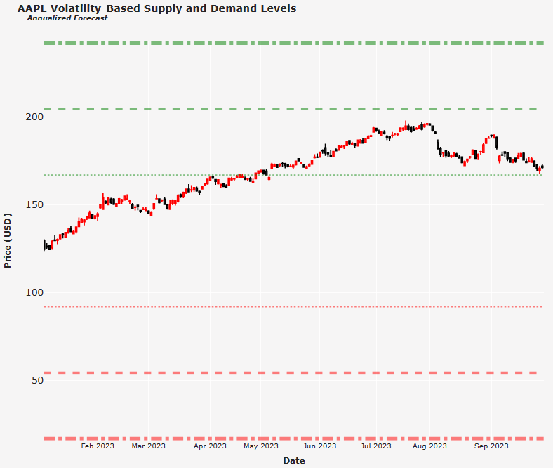
The output cell above gives us the specific supply and demand levels forecasted for the stock in 2023.
In the above plot, dot lines represent one standard deviation, 1σ (68.7% probability); dash lines represent two standard deviations, 2σ (95.4% probability); dash and dot lines represent three standard deviations, 3σ (99.7% probability).
Observe that the stock closed slightly higher than the 1σ supply band and below the 2σ supply band.
- JPM
ticker = 'JPM'
Volatility-Based Supply and Demand Levels for JPM in 2023

Supply Level 3σ: 202.02

Supply Level 2σ: 178.4

Supply Level 1σ: 154.79

-----------------------------------------------------------------

Demand Level 1σ: 107.57

Demand Level 2σ: 83.95

Demand Level 3σ: 60.34

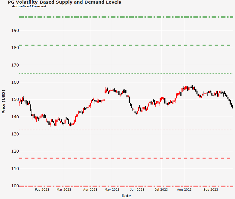
- PG
ticker = 'PG'

Volatility-Based Supply and Demand Levels for PG in 2023

Supply Level 3σ: 197.82

Supply Level 2σ: 181.46

Supply Level 1σ: 165.1

-----------------------------------------------------------------

Demand Level 1σ: 132.38

Demand Level 2σ: 116.02

Demand Level 3σ: 99.66
- TSLA
ticker = 'TSLA'

Volatility-Based Supply and Demand Levels for TSLA in 2023

Supply Level 3σ: 396.64

Supply Level 2σ: 305.49

Supply Level 1σ: 214.33

-----------------------------------------------------------------

Demand Level 1σ: 32.03

Demand Level 2σ: -59.13

Demand Level 3σ: -150.28

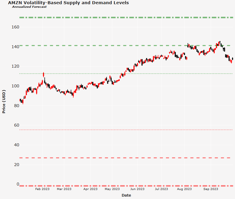
- AMZN
ticker = 'AMZN'

Volatility-Based Supply and Demand Levels for AMZN in 2023

Supply Level 3σ: 169.68

Supply Level 2σ: 141.12

Supply Level 1σ: 112.56

-----------------------------------------------------------------

Demand Level 1σ: 55.44

Demand Level 2σ: 26.88

Demand Level 3σ: -1.68
- META
ticker = 'META'

Volatility-Based Supply and Demand Levels for META in 2023

Supply Level 3σ: 286.41

Supply Level 2σ: 231.05

Supply Level 1σ: 175.7

-----------------------------------------------------------------

Demand Level 1σ: 64.98

Demand Level 2σ: 9.63

Demand Level 3σ: -45.73


Make a one-time donation
Make a monthly donation
Make a yearly donation
Choose an amount
Or enter a custom amount
Your contribution is appreciated.
Your contribution is appreciated.
Your contribution is appreciated.
DonateDonate monthlyDonate yearly
Leave a comment