
This study is dedicated to #BreastCancerAwarenessMonth2022 #breastcancer #BreastCancerDay @Breastcancerorg @BCAction @BCRFcure @NBCF @LivingBeyondBC @breastcancer @TheBreastCancer @thepinkribbon @BreastCancerNow.
- One of the most common cancer types is breast cancer (BC), and early diagnosis is the most important thing in its treatment. Recent studies have shown that BC can be accurately predicted and diagnosed using machine learning (ML) technology.
- Specifically, ML allows the integration or combination of different layers of data, such as those from medical images, laboratory results, clinical outcomes, biomarkers, and biological features for better prognostication and stratification of BC patients.
- Our objective is to compare different supervised ML, deep learning (DL) and data mining techniques for the early detection of BC. The idea is to analyze BC data based on its characteristics and identify the effectiveness of clustering and classification instructions for analyzing and fitting various ML models. We tested the performance of ML models by looking at their accuracies, sensitivities, specificities, and other metrics. Results obtained with the best ML model with most dominant features included showed the highest classification accuracy (~99%), and the proposed approach revealed the enhancement in accuracy performances. These results indicated the potential to open new opportunities in the BC research.
Contents:
- State-of-the-Art
- Scope
- Methodology
- Prerequisites
- Scikit-Learn Dataset
- Feature Boxplots vs X-Plots
- EDA Error Bar QC
- Binary PCA Clusters
- LR vs KNN Decision Boundaries
- FE + HPO + LR + GB Models
- EDA + HPO + 5 Models
- TechVidvan NN Model
- 8 Input Images + LR + SVM + NN Models
- CoderzColumn ML Interpretation
- Lime LR Model Explanation
- Conclusions
- Continue Reading
- References
State-of-the-Art
- Cluster-based data mining (unsupervised ML) is an important step of library discovery where intelligent methods are used to detect patterns.
- MOHAMMAD SHAHID identified most helpful features in predicting malignant or benign cancer from the available Wisconsin Breast Cancer (WBC) dataset and compared different classification ML algorithms to get better performance measures.
- Vishabh Goel compared several binary classification methods (Logistic Regression, Nearest Neighbor, Support Vector Machines, Kernel SVM, Naïve Bayes, Decision Tree Algorithm, and Random Forest Classification). It his study, the Random Forest Classification algorithm yields the best performance for the BC dataset.
- In the related research study, Random Forest has scored the accuracy of 0.97, without applying PCA. K-Neighbors (0.9349) and Logistic regression (0.923) are not far behind either. SVM scores 0.917 in accuracy. Decision Tree (DT) performs the worst among all six resulting in 0.834. Application of PCA declines the accuracy of all the algorithms except DT.
- The advanced BC classification project published by DataFlair invoked the Sequential API to build CancerNet and SeparableConv2D to implement depth-wise NN convolutions. We learned to build a BC classifier on the IDC dataset (with histology images for Invasive Ductal Carcinoma) and created the network CancerNet for the same. We used Keras to implement the same.
Scope
- Download and check open-source BC datasets
- Exploratory Data Analysis (EDA) and Principal Component Analysis (PCA)
- Feature Engineering (FE) – correlations, boxplots and the dominance weights
- Comparison of different BC classifiers – supervised ML and NN algorithms
- Comprehensive ML performance analysis, interpretations and co-visualizations
- Streamlining/summarizing final ML workflows via highly interactive dashboards.
Methodology
The entire ML workflow consists of the following main steps:
- Workspace preparation.
- Input data loading and QC
- Data Pre-Processing, Cleaning and EDA/FE
- Data transformations, editing and splitting for ML
- ML model training, testing and X-validation
- Hyper-Parameter Optimization (HPO)
- Comparison of ML performance metrics
- Output data visualization and model export
- ML project deployment via interactive dashboards.
Prerequisites
We need to install the following libraries:
- Numpy
- Pandas
- Matplotlib
- Seaborn
- Sklearn
- Tensorflow
Also check this link: How to install PyPi packages using anaconda conda command
This is about The Python Package Index (PyPI) – a repository of software for the Python programming language.
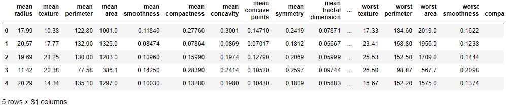
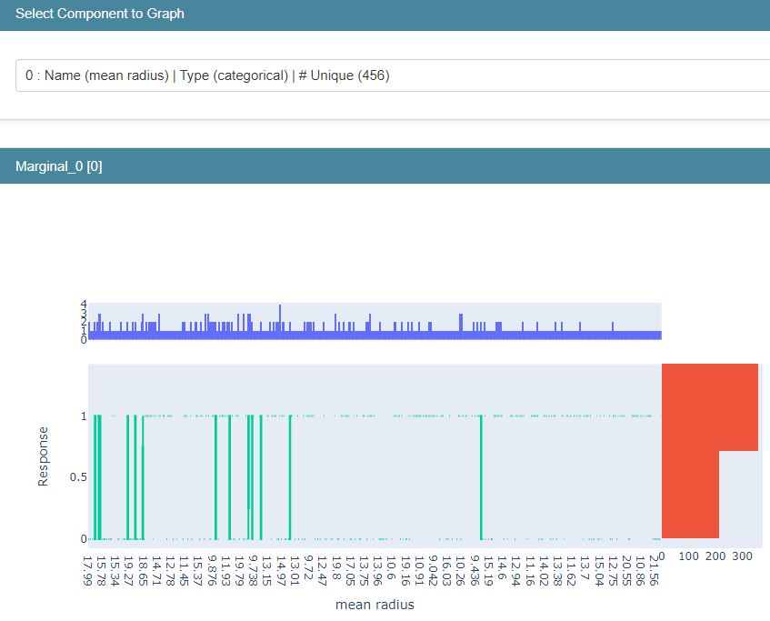
Scikit-Learn Dataset
Let’s load the breast cancer dataset and check its characteristics
import interpret
from interpret import glassbox, blackbox, greybox
import pandas as pd
import numpy as np
import sklearn
from sklearn.datasets import load_breast_cancer
breast_cancer = load_breast_cancer()
for line in breast_cancer.DESCR.split(“\n”)[5:32]:
print(line)
breast_cancer_df = pd.DataFrame(data=breast_cancer.data, columns = breast_cancer.feature_names)
breast_cancer_df[“TumorType”] = [breast_cancer.target_names[cat] for cat in breast_cancer.target]
breast_cancer_df.head()
**Data Set Characteristics:**

    :Number of Instances: 569

    :Number of Attributes: 30 numeric, predictive attributes and the class

    :Attribute Information:
        - radius (mean of distances from center to points on the perimeter)
        - texture (standard deviation of gray-scale values)
        - perimeter
        - area
        - smoothness (local variation in radius lengths)
        - compactness (perimeter^2 / area - 1.0)
        - concavity (severity of concave portions of the contour)
        - concave points (number of concave portions of the contour)
        - symmetry
        - fractal dimension ("coastline approximation" - 1)

        The mean, standard error, and "worst" or largest (mean of the three
        worst/largest values) of these features were computed for each image,
        resulting in 30 features.  For instance, field 0 is Mean Radius, field
        10 is Radius SE, field 20 is Worst Radius.

        - class:
                - WDBC-Malignant
                - WDBC-Benign
Feature Boxplots vs X-Plots
Let’s focus on EDA while loading the input data
from sklearn.datasets import load_breast_cancer
cancer = load_breast_cancer(as_frame=True)
cancer_df = cancer.frame
cancer_df.shape
(569, 31)
Let’s count the 0 and 1 target values
cancer_df.target.value_counts(normalize=True)
1    0.627417
0    0.372583
Name: target, dtype: float64
The list of features is as follows
cancer_features = cancer_df.drop(columns=’target’)
cancer_features.columns
Index(['mean radius', 'mean texture', 'mean perimeter', 'mean area',
       'mean smoothness', 'mean compactness', 'mean concavity',
       'mean concave points', 'mean symmetry', 'mean fractal dimension',
       'radius error', 'texture error', 'perimeter error', 'area error',
       'smoothness error', 'compactness error', 'concavity error',
       'concave points error', 'symmetry error', 'fractal dimension error',
       'worst radius', 'worst texture', 'worst perimeter', 'worst area',
       'worst smoothness', 'worst compactness', 'worst concavity',
       'worst concave points', 'worst symmetry', 'worst fractal dimension'],
      dtype='object')
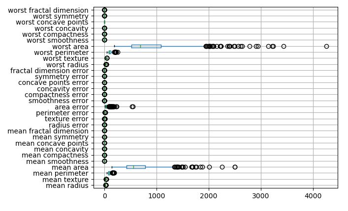
Let’s plot the feature boxplot (true scale)
cancer_features.boxplot(vert=False)
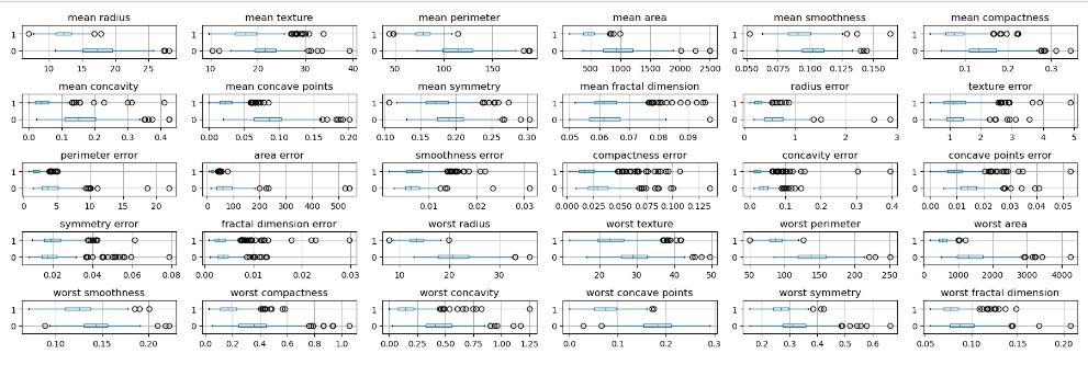
Let’s create a 5×6 grid of boxplots grouped by the target variable
import matplotlib.pyplot as plt
fig, axes = plt.subplots(5, 6, figsize=(18, 6))
for c, ax in zip(cancer_features.columns, axes.ravel()):
cancer_df[[c, 'target']].boxplot(vert=False, by='target', ax=ax)
ax.set_xlabel("")
plt.suptitle(“”)
plt.tight_layout()
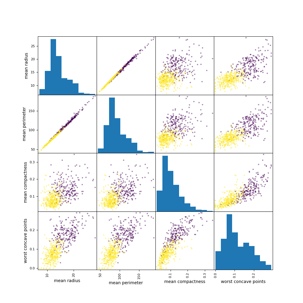
Let’s compare these plots to the conventional X-plots
import pandas as pd
pd.plotting.scatter_matrix(
cancer_features[[‘mean radius’, ‘mean perimeter’, ‘mean compactness’, ‘worst concave points’]],
c=cancer_df.target, figsize=(10, 10));
plt.savefig(“pdxplotscatter.png”)
EDA Error Bar QC
It is tempting to look at whether two error bars overlap or not, and try to reach a conclusion about whether the difference between means is statistically significant.
For example, let’s plot the estimated error bars of Fractal Dimension
import matplotlib.pyplot as plt
attr=[“BENIGN”, “MALIGNANT”]
valu=[0.063, 0.063]
cval=[0.003, 0.004]
plt.errorbar(attr, valu, yerr=cval, fmt=”o”,linewidth=3)
plt.text(“BENIGN”, 0.066, ” FRACTAL DIMENSION”)
plt.grid(True,linestyle=’dashed’)
plt.show()
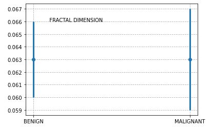
These error bars quantify the scatter among the values. Looking at whether the error bars overlap lets you compare the difference between the mean with the amount of scatter within the groups.
The above plot suggests that the two error bars do overlap. Since the sample sizes are nearly equal, we conclude that the P value for the given feature is (much) greater than 0.05, so the difference is not statistically significant.
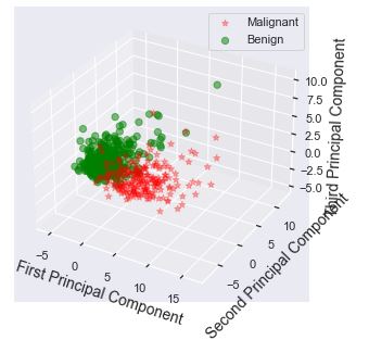
Binary PCA Clusters
Principal component analysis (PCA) is a commonly used dimensionality-reduction technique. This is coupled with clustering in finding natural groups in the data.
Let’s import the key libraries
import numpy as np
import pandas as pd
import matplotlib.pyplot as plt
from mpl_toolkits.mplot3d import Axes3D
from sklearn.datasets import load_breast_cancer
from sklearn.decomposition import PCA
from sklearn import datasets
from sklearn.preprocessing import StandardScaler
%matplotlib notebook
and load the dataset to be scaled using StandardScaler
data = load_breast_cancer()
X = data.data
y = data.target
sc = StandardScaler()
scaler = StandardScaler()
scaler.fit(X)
X_scaled = scaler.transform(X)
Let’s apply the PCA analysis with n_components=3 and plot the result
pca = PCA(n_components=3)
pca.fit(X_scaled)
X_pca = pca.transform(X_scaled)
ex_variance=np.var(X_pca,axis=0)
ex_variance_ratio = ex_variance/np.sum(ex_variance)
ex_variance_ratio
Xax = X_pca[:,0]
Yax = X_pca[:,1]
Zax = X_pca[:,2]
cdict = {0:’red’,1:’green’}
labl = {0:’Malignant’,1:’Benign’}
marker = {0:’*’,1:’o’}
alpha = {0:.3, 1:.5}
fig = plt.figure(figsize=(7,5))
ax = fig.add_subplot(111, projection=’3d’)
fig.patch.set_facecolor(‘white’)
for l in np.unique(y):
ix=np.where(y==l)
ax.scatter(Xax[ix], Yax[ix], Zax[ix], c=cdict[l], s=40,
label=labl[l], marker=marker[l], alpha=alpha[l])
#for loop ends
ax.set_xlabel(“First Principal Component”, fontsize=14)
ax.set_ylabel(“Second Principal Component”, fontsize=14)
ax.set_zlabel(“Third Principal Component”, fontsize=14)
ax.legend()
plt.show()
Let’s create the 2D PCA projection of the above 3D scatter plot
Xax=X_pca[:,0]
Yax=X_pca[:,1]
cdict={0:’red’,1:’green’}
labl={0:’Malignant’,1:’Benign’}
marker={0:’*’,1:’o’}
alpha={0:.3, 1:.5}
fig,ax=plt.subplots(figsize=(7,5))
fig.patch.set_facecolor(‘white’)
for l in np.unique(y):
ix=np.where(y==l)
ax.scatter(Xax[ix],Yax[ix],c=cdict[l],s=40,
label=labl[l],marker=marker[l],alpha=alpha[l])
#for loop ends
plt.xlabel(“First Principal Component”,fontsize=14)
plt.ylabel(“Second Principal Component”,fontsize=14)
plt.legend()
plt.show()

We can see a well-formed set of 2 clusters in terms of their cohesion and separation.
The importance of combining PCA and SVM for feature extraction is clearly supported by the above scatter plots.
LR vs KNN Decision Boundaries
Let’s follow the Kaggle breast cancer prediction project that compares Logistic Regression (LR) and KNeighborsClassifier (KNN) decision boundaries.
Let’s set the working directory YOURPATH
import os
os.chdir(‘YOURPATH’)
os. getcwd()
import the libraries
import pandas as pd
import seaborn as sns # for data visualization
import matplotlib.pyplot as plt # for data visualization
%matplotlib inline
and load the input dataset
df = pd.read_csv(“bcdata.csv”, delimiter=”,”)
df.head()
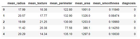
We consider the following columns
df.columns
Index(['mean_radius', 'mean_texture', 'mean_perimeter', 'mean_area',
       'mean_smoothness', 'diagnosis'],
      dtype='object')
Let’s map the target variable
y_target = df[‘diagnosis’]
df[‘target’] = df[‘diagnosis’].map({0:’B’,1:’M’})
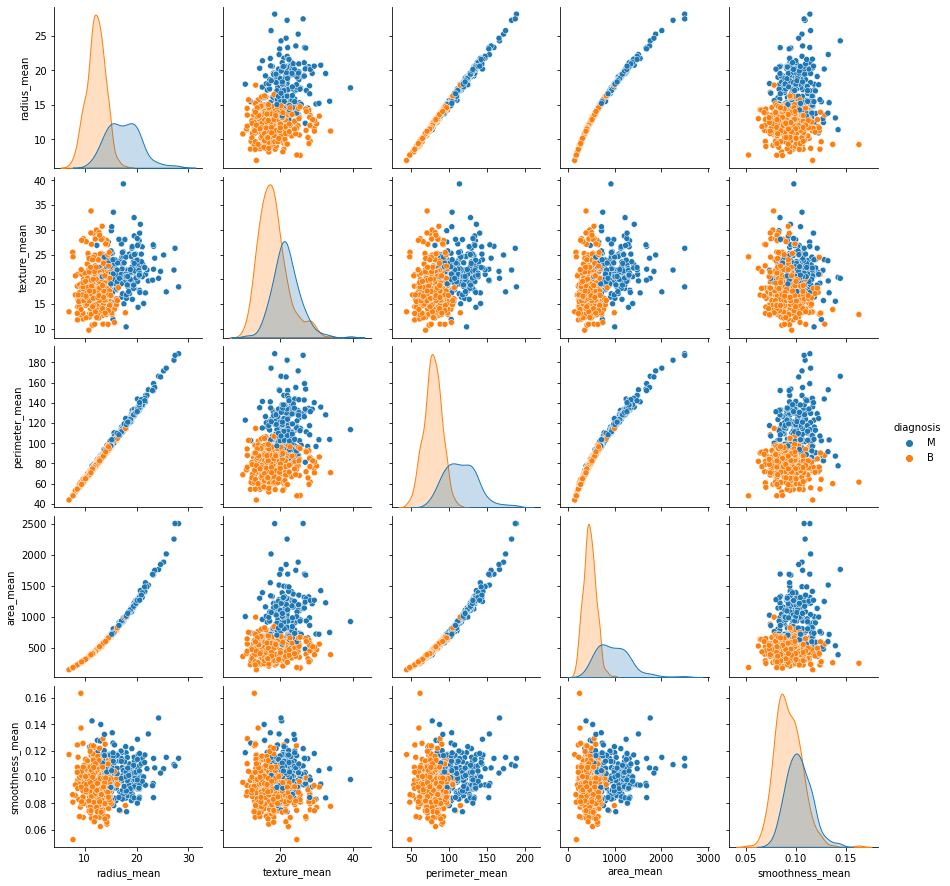
and plot the sns pairplot of model features grouped by diagnosis
g = sns.pairplot(df.drop(‘diagnosis’, axis = 1), hue=”target”, palette=’prism’);
plt.savefig(‘bcdecisionpairplot.png’)

Let’s look at the scatter plot mean_perimeter vs mean_texture grouped by target
sns.scatterplot(x=’mean_perimeter’, y = ‘mean_texture’, data = df, hue = ‘target’, palette=’prism’);
plt.savefig(‘bcdecisionclusters.png’)
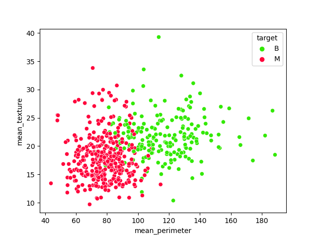
According to the above plot, these are the features of interest
features = [‘mean_perimeter’, ‘mean_texture’]
X_feature = df[features]
Let’s perform train/test data splitting with test_size=0.2
from sklearn.model_selection import train_test_split
X_train, X_test, y_train, y_test= train_test_split(X_feature, y_target, test_size=0.2, random_state = 42)
and fit the Logistic Regression (LR) model
from sklearn.linear_model import LogisticRegression
from sklearn.metrics import accuracy_score
model = LogisticRegression()
model.fit(X_train, y_train)
LogisticRegression()
We need to install the following advanced plotting library
!pip install mlxtend
and import plot_decision_regions
from mlxtend.plotting import plot_decision_regions
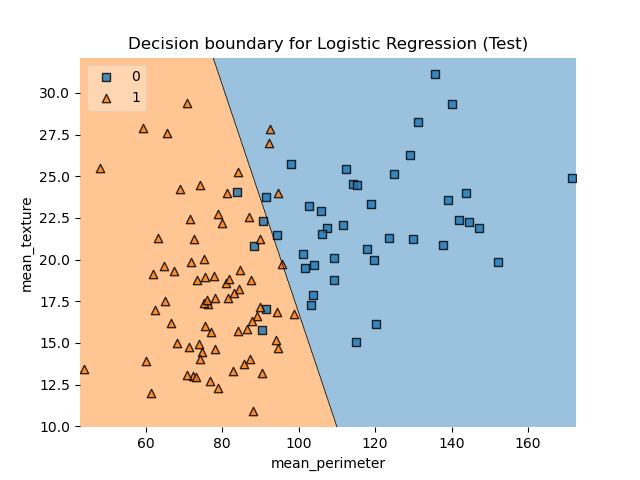
Let’s plot the decision boundary (DB) for the LR training dataset

Let’s apply our test predictions and check their accuracy
y_pred = model.predict(X_test)
acc = accuracy_score(y_test, y_pred)
print(“Accuracy score using Logistic Regression:”, acc*100)
Accuracy score using Logistic Regression: 92.98245614035088
Let’s plot DB LR for X_test
plot_decision_regions(X_test.values, y_test.values, clf=model, legend=2)
plt.title(“Decision boundary for Logistic Regression (Test)”)
plt.xlabel(“mean_perimeter”)
plt.ylabel(“mean_texture”);
plt.savefig(‘bcdecisionlrtest.png’)
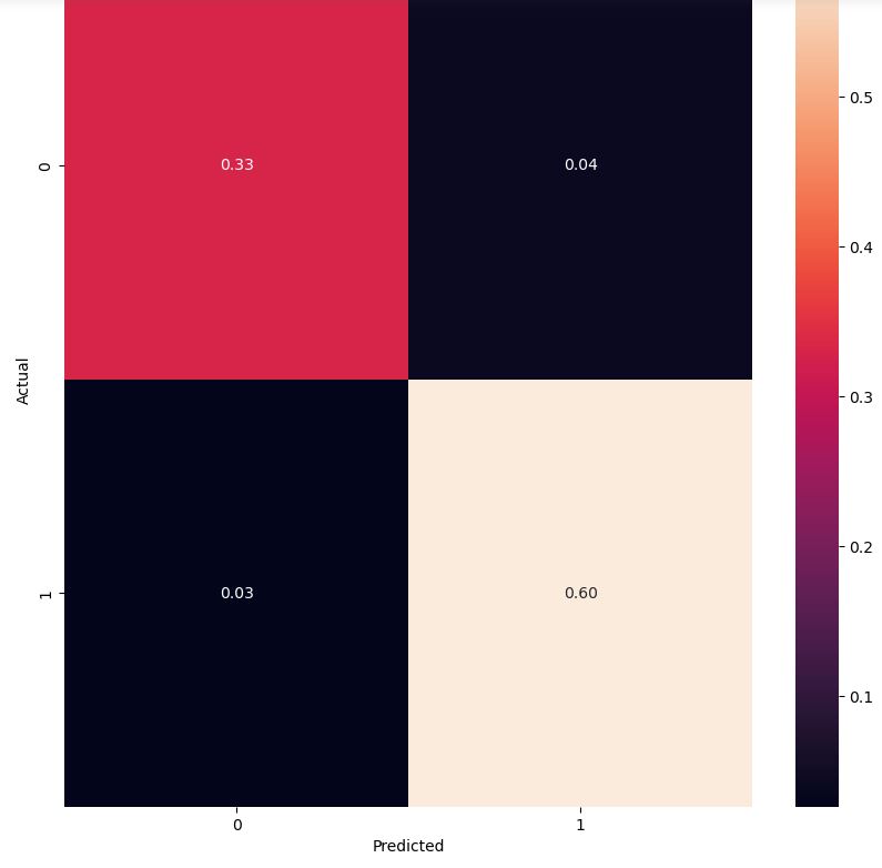
Let’s look at the LR confusion matrix for our test data
from sklearn.metrics import confusion_matrix
conf_mat = confusion_matrix(y_test, y_pred)
conf_mat
array([[38,  5],
       [ 3, 68]], dtype=int64)
import numpy as np
cm = confusion_matrix(y_test, y_pred,normalize=’all’)
fig, ax = plt.subplots(figsize=(10,10))
sns.heatmap(cm, annot=True, fmt=’.2f’)
plt.ylabel(‘Actual’)
plt.xlabel(‘Predicted’)
plt.show(block=False)
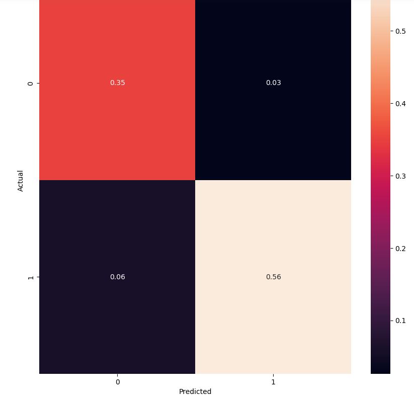
Let’s consider the KNN classifier clf
from sklearn.neighbors import KNeighborsClassifier
clf = KNeighborsClassifier()
clf.fit(X_train, y_train)
y_pred = clf.predict(X_test)
acc = accuracy_score(y_test, y_pred)
print(“Accuracy score using KNN:”, acc*100)
Accuracy score using KNN: 91.22807017543859
The KNN confusion matrix is
cm = confusion_matrix(y_test, y_pred,normalize=’all’)
fig, ax = plt.subplots(figsize=(10,10))
sns.heatmap(cm, annot=True, fmt=’.2f’)
plt.ylabel(‘Actual’)
plt.xlabel(‘Predicted’)
plt.show(block=False)
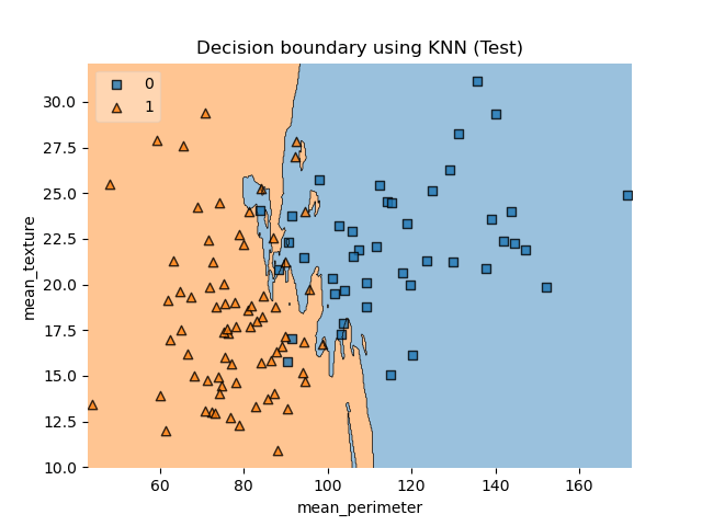
Let’s interpret this plot using DB KNN
plot_decision_regions(X_train.values, y_train.values, clf=clf, legend=2)
plt.title(“Decision boundary using KNN (Train)”)
plt.xlabel(“mean_perimeter”)
plt.ylabel(“mean_texture”);
plt.savefig(‘bcdecisionknn.png’)

and, similarly,
plot_decision_regions(X_test.values, y_test.values, clf=clf, legend=2)
plt.title(“Decision boundary using KNN (Test)”)
plt.xlabel(“mean_perimeter”)
plt.ylabel(“mean_texture”);
plt.savefig(‘bcdecisionknntest.png’)
Finally, let’s look at the additional performance metrics
confusion =confusion_matrix(y_test, y_pred)
TP = confusion[1,1] # true positive
TN = confusion[0,0] # true negatives
FP = confusion[0,1] # false positives
FN = confusion[1,0] # false negatives
The sensitivity of our model is
TP/(TP+FN)
0.9014084507042254
Let us calculate the specificity
TN /(TN+FP)
0.9302325581395349
Let’s calculate false positive rate – predicting cancer when the patient does not have cancer
FP/(TN+FP)
0.06976744186046512
Let’s look at the positive predictive value (precision) – when ML is predicting cancer how precise is it
TP /(TP+FP)
0.9552238805970149
The negative predictive value is
TN / (TN+ FN)
0.851063829787234
Among those who had a negative screening test, the probability of being disease-free was 85.1%.
Let’s import an extra library
import logreg
Let’s check our ability to predict cancer based on the first 10 rows of X_test
model.predict(X_test)[0:10]
model.predict_proba(X_test)[0:10, :]
array([[7.27851104e-02, 9.27214890e-01],
       [9.91177565e-01, 8.82243500e-03],
       [7.06605093e-01, 2.93394907e-01],
       [6.32258801e-02, 9.36774120e-01],
       [1.09519829e-02, 9.89048017e-01],
       [9.99892298e-01, 1.07701618e-04],
       [9.99805786e-01, 1.94213764e-04],
       [8.74892274e-01, 1.25107726e-01],
       [8.88932261e-02, 9.11106774e-01],
       [1.46087848e-01, 8.53912152e-01]])
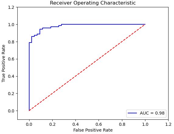
Let’s look at the ROC curve and the roc_auc_score
from sklearn.metrics import roc_auc_score
from sklearn.metrics import roc_curve, auc
import matplotlib.pyplot as plt
import random
%matplotlib inline
Let’s calculates the probability of predicting “1” (cancer) and store the output in probab_cancer
proba_cancer=model.predict_proba(X_test)[:,1]
so that the ROC AUC score is
roc_auc_score(y_test, proba_cancer)
0.9796921061251227
and the ROC curve is given by
false_positive_rate, true_positive_rate, thresholds = roc_curve(y_test, proba_cancer)
roc_auc = auc(false_positive_rate, true_positive_rate)
plt.title(‘Receiver Operating Characteristic’)
plt.plot(false_positive_rate, true_positive_rate, ‘b’,
label=’AUC = %0.2f’% roc_auc)
plt.legend(loc=’lower right’)
plt.plot([0,1],[0,1],’r–‘)
plt.xlim([-0.1,1.2])
plt.ylim([-0.1,1.2])
plt.ylabel(‘True Positive Rate’)
plt.xlabel(‘False Positive Rate’)
plt.show()
FE + HPO + LR + GB Models
EDA + HPO + 5 Models
EDA:
Violin plots: The median of texture_mean for Malignant and Benign looks separated, so it might be a good feature for classification. For fractal_dimension_mean, the medians of the Malignant and Benign groups are very close to each other.
In order to check the correlation between the features, we plotted a correlation matrix. It is effective in summarizing a large amount of data where the goal is to see patterns.
Box plots succinctly compare multiple distributions and are a great way to visualize the IQR.
Machine Learning:
Apply LabelEncoder, Train Test Split the data, apply Robust Scaler, Train the data (LogisticRegression, SVC linear and rbf, DecisionTreeClassifier, Random Forest Classifier)
[0]Logistic Regression Training Accuracy: 0.9794721407624634
[1]Support Vector Machine (Linear Classifier) Training Accuracy: 0.9794721407624634
[2]Support Vector Machine (RBF Classifier) Training Accuracy: 0.9824046920821115
[3]Decision Tree Classifier Training Accuracy: 1.0
[4]Random Forest Classifier Training Accuracy: 0.9912023460410557
Classification Report:
Model 0
precision recall f1-score support
0 0.99 0.99 0.99 143
1 0.99 0.98 0.98 85
accuracy 0.99 228
macro avg 0.99 0.98 0.99 228
weighted avg 0.99 0.99 0.99 228
0.9868421052631579
Model 1
precision recall f1-score support
0 0.97 0.99 0.98 143
1 0.98 0.95 0.96 85
accuracy 0.97 228
macro avg 0.97 0.97 0.97 228
weighted avg 0.97 0.97 0.97 228
0.9736842105263158
Model 2
precision recall f1-score support
0 0.98 0.99 0.98 143
1 0.98 0.96 0.97 85
accuracy 0.98 228
macro avg 0.98 0.98 0.98 228
weighted avg 0.98 0.98 0.98 228
0.9780701754385965
Model 3
precision recall f1-score support
0 0.96 0.90 0.93 143
1 0.85 0.94 0.89 85
accuracy 0.92 228
macro avg 0.91 0.92 0.91 228
weighted avg 0.92 0.92 0.92 228
0.9166666666666666
Model 4
precision recall f1-score support
0 0.96 0.97 0.97 143
1 0.95 0.93 0.94 85
accuracy 0.96 228
macro avg 0.96 0.95 0.95 228
weighted avg 0.96 0.96 0.96 228
0.956140350877193
HPO:
Hyperparameters are crucial as they control the overall behavior of a machine learning model.
The goal was to minimize the misclassifications for the positive class (ie when the tumor is malignant ‘M’). But misclassifications include False Positives (FP) and False Negatives (FN). I was focused more on reducing the FN because tumors which are malignant should never be classified as benign even if this means the model might classify a few benign tumors as malignant! Therefore I used the sklearn’s fbeta_score as the scoring function with GridSearchCV. A beta > 1 makes fbeta_score favor recall over precision.
Best Penalty: l2
Best C: 0.591predictions = best_model.predict(X_test)
print("Accuracy score %f" % accuracy_score(y_test, predictions))
print(classification_report(y_test, predictions))
print(confusion_matrix(y_test, predictions))Accuracy score 0.986742
              precision    recall  f1-score   support

           0       0.99      0.99      0.99       143
           1       0.99      0.98      0.98        85

    accuracy                           0.99       228
   macro avg       0.99      0.98      0.99       228
weighted avg       0.99      0.99      0.99       228

[[142   1]
 [ 2  83]]
See more details here.
TechVidvan NN Model
Let’s set the working directory YOURPATH
import os
os.chdir(‘YOURPATH’)
os. getcwd()
and import the libraries
import numpy as np
import pandas as pd
import matplotlib.pyplot as plt
import seaborn as sns
Let’s read the csv file containing the input dataset
df = pd.read_csv(‘data.csv’)
and view the dataset using head()
df.head(10)
We can count the number of rows and columns in the dataset
df.shape
(569, 33)
and plot the sns pairplot of all features
We can count the number of empty values in each columns
df.isna().sum()
Let’s drop the columns with all the missing values
df = df.dropna(axis = 1)
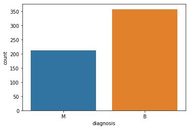
and get the count of the number of Malignant(M) or Benign(B) cells
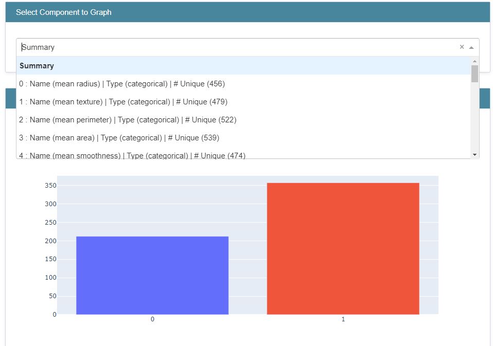
df[‘diagnosis’].value_counts()
B    357
M    212
Name: diagnosis, dtype: int64
Let’s visualize the count:
fig=sns.countplot(df[‘diagnosis’], label = ‘count’)
plt.savefig(“bcdcount.png”)
Let’s look at the data types to see which columns need to be encoded:
df.dtypes
id                           int64
diagnosis                   object
radius_mean                float64
texture_mean               float64
perimeter_mean             float64
area_mean                  float64
smoothness_mean            float64
compactness_mean           float64
concavity_mean             float64
concave points_mean        float64
symmetry_mean              float64
fractal_dimension_mean     float64
radius_se                  float64
texture_se                 float64
perimeter_se               float64
area_se                    float64
smoothness_se              float64
compactness_se             float64
concavity_se               float64
concave points_se          float64
symmetry_se                float64
fractal_dimension_se       float64
radius_worst               float64
texture_worst              float64
perimeter_worst            float64
area_worst                 float64
smoothness_worst           float64
compactness_worst          float64
concavity_worst            float64
concave points_worst       float64
symmetry_worst             float64
fractal_dimension_worst    float64
dtype: object
Let’s rename the diagnosis data to labels
df = df.rename(columns = {‘diagnosis’ : ‘label’})
and define the label values that need to be predicted
y = df[‘label’].values
print(np.unique(y))
['B' 'M']
Let’s perform encoding the label from text(B and M) to integers (0 and 1)
from sklearn.preprocessing import LabelEncoder
labelencoder = LabelEncoder()
Y = labelencoder.fit_transform(y) # M = 1 and B = 0
print(np.unique(Y))
[0 1]
Let’s perform feature scaling/normalization, while dropping ID and label
X = df.drop(labels=[‘label’,’id’],axis = 1)
from sklearn.preprocessing import MinMaxScaler
scaler = MinMaxScaler()
scaler.fit(X)
X = scaler.transform(X)
print(X)
[[0.52103744 0.0226581  0.54598853 ... 0.91202749 0.59846245 0.41886396]
 [0.64314449 0.27257355 0.61578329 ... 0.63917526 0.23358959 0.22287813]
 [0.60149557 0.3902604  0.59574321 ... 0.83505155 0.40370589 0.21343303]
 ...
 [0.45525108 0.62123774 0.44578813 ... 0.48728522 0.12872068 0.1519087 ]
 [0.64456434 0.66351031 0.66553797 ... 0.91065292 0.49714173 0.45231536]
 [0.03686876 0.50152181 0.02853984 ... 0.         0.25744136 0.10068215]]
Let’s split the input data into training and testing subsets with test_size = 0.25
from sklearn.model_selection import train_test_split
x_train,x_test,y_train,y_test = train_test_split(X,Y, test_size = 0.25, random_state=42)
print(‘Shape of training data is: ‘, x_train.shape)
print(‘Shape of testing data is: ‘, x_test.shape)
Shape of training data is:  (426, 30)
Shape of testing data is:  (143, 30)
Let’s proceed with the Keras NN optimization
import tensorflow
from tensorflow.keras.models import Sequential
from tensorflow.keras.layers import Dense, Activation, Dropout
model = Sequential()
model.add(Dense(128, input_dim=30, activation=’relu’))
model.add(Dropout(0.5))
model.add(Dense(64,activation = ‘relu’))
model.add(Dropout(0.5))
model.add(Dense(1))
model.add(Activation(‘sigmoid’))
We compile the NN model
model.compile(loss = ‘binary_crossentropy’, optimizer = ‘adam’ , metrics = [‘accuracy’])
model.summary()
Model: "sequential_4"
_________________________________________________________________
 Layer (type)                Output Shape              Param #
=================================================================
 dense_12 (Dense)            (None, 128)               3968

 dropout_8 (Dropout)         (None, 128)               0

 dense_13 (Dense)            (None, 64)                8256

 dropout_9 (Dropout)         (None, 64)                0

 dense_14 (Dense)            (None, 1)                 65

 activation_4 (Activation)   (None, 1)                 0

=================================================================
Total params: 12,289
Trainable params: 12,289
Non-trainable params: 0
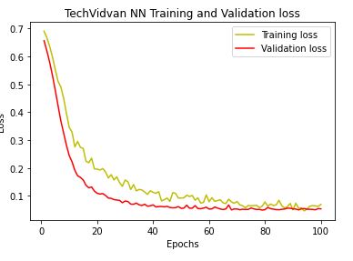
Next, we perform training data model fitting with X-validation on test data
history = model.fit(x_train,y_train,verbose = 1,epochs = 100, batch_size = 64,validation_data = (x_test,y_test))
Let’s plot the training and validation accuracy and loss at each epochs:
loss = history.history[‘loss’]
val_loss = history.history[‘val_loss’]
epochs = range(1,len(loss)+1)
plt.plot(epochs,loss,’y’,label = ‘Training loss’)
plt.plot(epochs,val_loss,’r’,label = ‘Validation loss’)
plt.title(‘TechVidvan NN Training and Validation loss’)
plt.xlabel(‘Epochs’)
plt.ylabel(‘Loss’)
plt.legend()
plt.show()
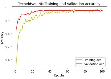
Likewise, we plot NN training and X-validation accuracy
acc = history.history[‘accuracy’]
val_acc = history.history[‘val_accuracy’]
plt.plot(epochs,acc,’y’,label = ‘Training acc’)
plt.plot(epochs,val_acc,’r’,label = ‘Validation acc’)
plt.title(‘TechVidvan NN Training and Validation accuracy’)
plt.xlabel(‘Epochs’)
plt.ylabel(‘Accuracy’)
plt.legend()
plt.show()
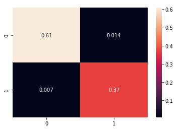
We are ready perform test set predictions
y_pred = model.predict(x_test)
y_pred = (y_pred > 0.5)
and plot the normalized confusion matrix:
from sklearn.metrics import confusion_matrix
cm = confusion_matrix(y_test,y_pred,normalize=’all’)
sns.heatmap(cm, annot = True)
Let’s look at the classification report
from sklearn.metrics import classification_report
target_names = [‘B’, ‘M’]
print(classification_report(y_test, y_pred, target_names=target_names))
precision    recall  f1-score   support

           B       0.99      0.98      0.98        89
           M       0.96      0.98      0.97        54

    accuracy                           0.98       143
   macro avg       0.98      0.98      0.98       143
weighted avg       0.98      0.98      0.98       143
Let’s look at other available model evaluation metrics:
from sklearn.metrics import accuracy_score
accuracy_score(y_test, y_pred, normalize=True)
0.9790209790209791
from sklearn.metrics import cohen_kappa_score
cohen_kappa_score(y_test, y_pred)
0.9555302166476625
from sklearn.metrics import hamming_loss
hamming_loss(y_test, y_pred)
0.02097902097902098
from sklearn.metrics import jaccard_score
jaccard_score(y_test, y_pred)
0.9464285714285714
from sklearn.metrics import log_loss
log_loss(y_test, y_pred)
0.7246008977593886
from sklearn.metrics import matthews_corrcoef
matthews_corrcoef(y_test, y_pred)
0.9556352128340201
8 Input Images + LR + SVM + NN Models
CoderzColumn ML Interpretation
Let’s install the library
!pip install interpret
import interpret
from interpret import glassbox, blackbox, greybox
import pandas as pd
import numpy as np
import sklearn
Let’s load the input data (see above)
from sklearn.datasets import load_breast_cancer
breast_cancer = load_breast_cancer()
Let’s create the explanation histograms
from interpret import data
class_hist = data.ClassHistogram(feature_names=breast_cancer.feature_names)
class_hist
<interpret.data.response.ClassHistogram at 0x2d5644742e0>
hist_explanation = class_hist.explain_data(breast_cancer.data, breast_cancer.target)
hist_explanation
<interpret.data.response.ClassHistogramExplanation at 0x2d5649eeaf0>
Let’s plot the histograms using Plotly.js (v2.13.3)
from interpret import show
show(hist_explanation,bins=20)
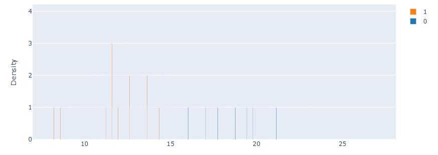
Let’s compare it against the Marginal interactive graph
marginal = data.Marginal(feature_names=breast_cancer.feature_names)
marginal
<interpret.data.response.Marginal at 0x2d50a1f58e0>
marginal_explanation = marginal.explain_data(breast_cancer.data, breast_cancer.target)
marginal_explanation
<interpret.data.response.MarginalExplanation at 0x2d565cd8e80>
show(marginal_explanation)
Let’s split the input data into train/test subsets with train_size=0.80
from sklearn.model_selection import train_test_split
X_breast_cancer, Y_breast_cancer = breast_cancer.data, breast_cancer.target
print(“Dataset Size : “, X_breast_cancer.shape, Y_breast_cancer.shape)
X_train_breast_cancer, X_test_breast_cancer, Y_train_breast_cancer, Y_test_breast_cancer = train_test_split(X_breast_cancer, Y_breast_cancer,
train_size=0.80,
stratify=Y_breast_cancer,
random_state=123)
print(“Train/Test Sizes : “, X_train_breast_cancer.shape, X_test_breast_cancer.shape, Y_train_breast_cancer.shape, Y_test_breast_cancer.shape)
Dataset Size :  (569, 30) (569,)
Train/Test Sizes :  (455, 30) (114, 30) (455,) (114,)
Let’s apply the LBFGS-based linear logistic regression (LR) classifier from glassbox
from interpret import glassbox
glassbox_lr = glassbox.LogisticRegression(feature_names=breast_cancer.feature_names)
glassbox_lr
<interpret.glassbox.linear.LogisticRegression at 0x2d50a1f56d0>
glassbox_lr.fit(X_train_breast_cancer, Y_train_breast_cancer)
Let’s look at the Accuracy score
print(“Train Accuracy : %.2f”%glassbox_lr.score(X_train_breast_cancer, Y_train_breast_cancer))
print(“Test Accuracy : %.2f”%glassbox_lr.score(X_test_breast_cancer, Y_test_breast_cancer))
Train Accuracy : 0.95
Test  Accuracy : 0.96
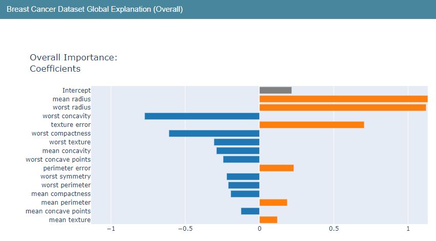
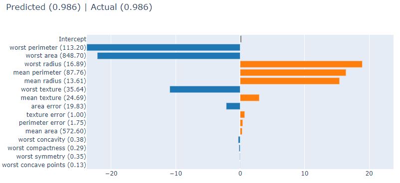
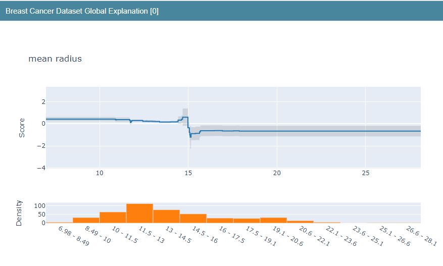
Let’s construct the LR Global Explanation graphs
lr_global_explanation = glassbox_lr.explain_global(name=”Breast Cancer Dataset Global Explanation”)
lr_global_explanation
<interpret.glassbox.linear.LinearExplanation at 0x2d50a9de0a0>
show(lr_global_explanation)
The corresponding Local Explainer is as follows
lr_local_explanation = glassbox_lr.explain_local(X_test_breast_cancer, Y_test_breast_cancer,
name=”Breast Cancer Local Explainer”)
lr_local_explanation
<interpret.api.templates.FeatureValueExplanation at 0x2d50a2a5d60>
show(lr_local_explanation)
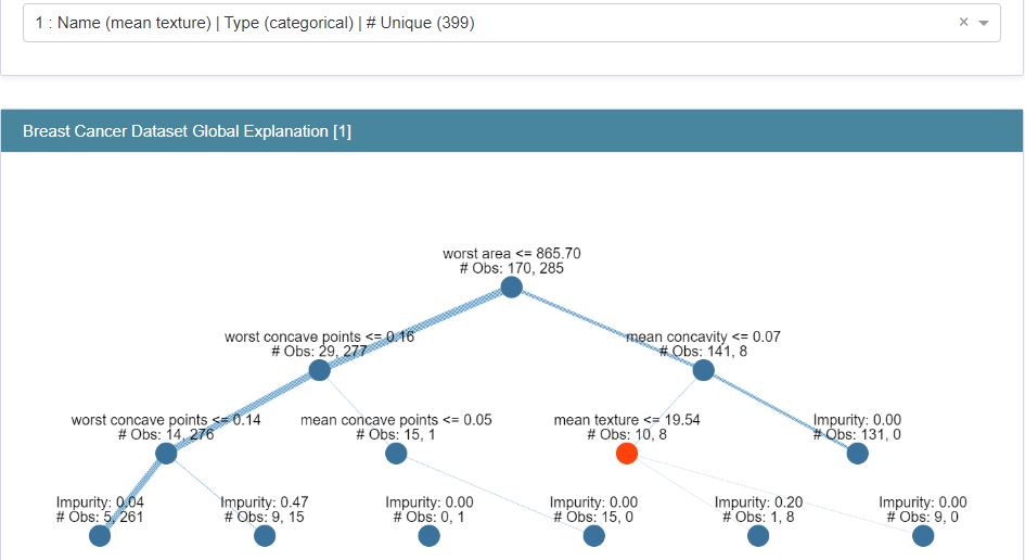
Let’s compare LR against ClassificationTree (CT) from glassbox
from interpret import glassbox
glassbox_classif_tree = glassbox.ClassificationTree(feature_names=breast_cancer.feature_names)
glassbox_classif_tree
glassbox_classif_tree.fit(X_train_breast_cancer, Y_train_breast_cancer)
print(“Train Accuracy : %.2f”%glassbox_classif_tree.score(X_train_breast_cancer, Y_train_breast_cancer))
print(“Test Accuracy : %.2f”%glassbox_classif_tree.score(X_test_breast_cancer, Y_test_breast_cancer))
Train Accuracy : 0.97
Test  Accuracy : 0.96
Let’s construct the Explanation graphs
classif_tree_global_explanation = glassbox_classif_tree.explain_global(name=”Breast Cancer Dataset Global Explanation”)
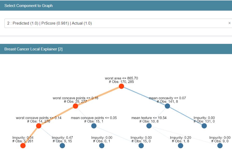
classif_tree_local_explanation = glassbox_classif_tree.explain_local(X_test_breast_cancer, Y_test_breast_cancer,
name=”Breast Cancer Local Explainer”)
show(classif_tree_global_explanation)
show(classif_tree_local_explanation)
Let’s turn our attention to ExplainableBoostingClassifier (EBC) from glassbox
from interpret import glassbox
glassbox_boosting = glassbox.ExplainableBoostingClassifier(feature_names=breast_cancer.feature_names)
glassbox_boosting
glassbox_boosting.fit(X_train_breast_cancer, Y_train_breast_cancer)
print(“Train Accuracy : %.2f”%glassbox_boosting.score(X_train_breast_cancer, Y_train_breast_cancer))
print(“Test Accuracy : %.2f”%glassbox_boosting.score(X_test_breast_cancer, Y_test_breast_cancer))
Train Accuracy : 1.00
Test  Accuracy : 0.97
Let’s plot Global and Local Explanation charts
show(boosting_global_explanation)
show(boosting_local_explanation)
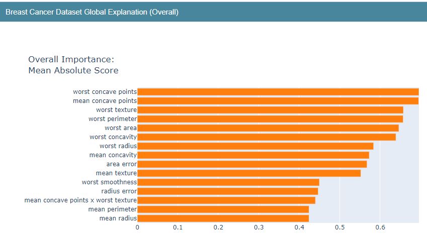

Breast Cancer EBC Local Explainer Predicted (1) PrScore=0.601 | Actual (0) 0.399

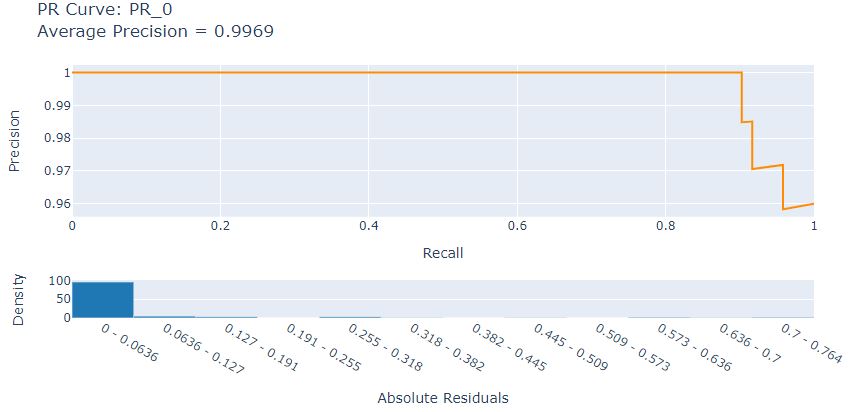
Let’s look at the LR Precision-Recall curve
from interpret import perf
precicion_recall = perf.PR(glassbox_lr.predict_proba, feature_names=breast_cancer.feature_names)
precicion_recall
<interpret.perf.curve.PR at 0x2d50a9de7f0>
pr_explanation = precicion_recall.explain_perf(X_test_breast_cancer, Y_test_breast_cancer)
pr_explanation
<interpret.perf.curve.PRExplanation at 0x2d507d407c0>
from interpret import show
show(pr_explanation)
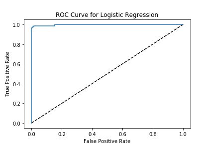
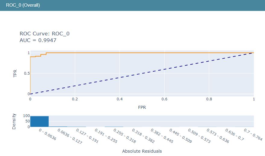
Let’s look at the LR ROC curve
roc = perf.ROC(glassbox_lr.predict_proba, feature_names=breast_cancer.feature_names)
roc
<interpret.perf.curve.ROC at 0x2d50af22670>
roc_explanation = roc.explain_perf(X_test_breast_cancer, Y_test_breast_cancer)
roc_explanation
<interpret.perf.curve.ROCExplanation at 0x2d50aeed7c0>
show(roc_explanation)
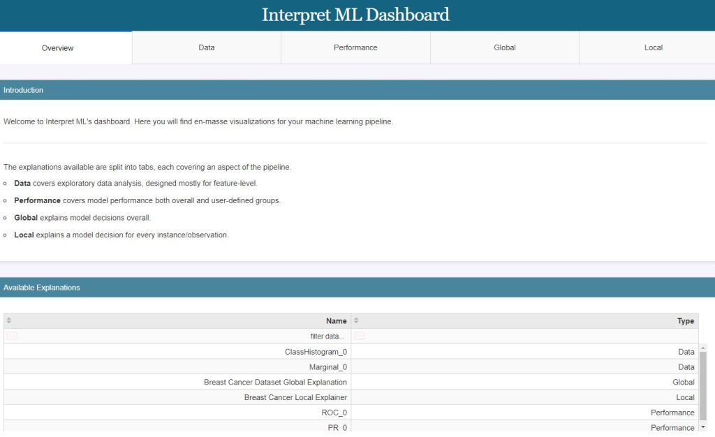
The above LR ML performance graphs can be combined into the single LR ML dashboard
show([hist_explanation, marginal_explanation, lr_global_explanation, lr_local_explanation, roc_explanation, pr_explanation])
Lime LR Model Explanation
Let’s import the key libraries
import lime
import lime.lime_tabular
from sklearn.datasets import load_breast_cancer
from sklearn.metrics import classification_report, confusion_matrix
from sklearn.linear_model import LogisticRegression
Let’s load the data, train/test split the dataset with train_size=0.90, and run Logistic Regression (LR)
breast_cancer = load_breast_cancer()
for line in breast_cancer.DESCR.split(“\n”)[5:32]:
print(line)
X, Y = breast_cancer.data, breast_cancer.target
print(“Data Size : “, X.shape, Y.shape)
X_train, X_test, Y_train, Y_test = train_test_split(X, Y, train_size=0.90, test_size=0.1, stratify=Y, random_state=123)
print(“Train/Test Sizes : “, X_train.shape, X_test.shape, Y_train.shape, Y_test.shape)
lr = LogisticRegression()
lr.fit(X_train, Y_train)
print(“Test Accuracy : %.2f”%lr.score(X_test, Y_test))
print(“Train Accuracy : %.2f”%lr.score(X_train, Y_train))
print()
print(“Confusion Matrix : “)
print(confusion_matrix(Y_test, lr.predict(X_test)))
print()
print(“Classification Report”)
print(classification_report(Y_test, lr.predict(X_test)))
Data Size :  (569, 30) (569,)
Train/Test Sizes :  (512, 30) (57, 30) (512,) (57,)
Test  Accuracy : 0.96
Train Accuracy : 0.96

Confusion Matrix :
[[20  1]
 [ 1 35]]

Classification Report
              precision    recall  f1-score   support

           0       0.95      0.95      0.95        21
           1       0.97      0.97      0.97        36

    accuracy                           0.96        57
   macro avg       0.96      0.96      0.96        57
weighted avg       0.96      0.96      0.96        57
Let’s call LimeTabularExplainer for X_train
explainer = lime.lime_tabular.LimeTabularExplainer(X_train, mode=”classification”,
class_names=breast_cancer.target_names,
feature_names=breast_cancer.feature_names,
)
explainer
<lime.lime_tabular.LimeTabularExplainer at 0x2d50afeaeb0>
Let’s look at explain_instance with the randomly chosen index idx
import random
idx = random.randint(1, len(X_test))
print(“Prediction : “, breast_cancer.target_names[lr.predict(X_test[idx].reshape(1,-1))[0]])
print(“Actual : “, breast_cancer.target_names[Y_test[idx]])
explanation = explainer.explain_instance(X_test[idx], lr.predict_proba,
num_features=len(breast_cancer.feature_names))
explanation.show_in_notebook()
Prediction :  benign
Actual :      benign

Let’s plot explain_instance for X_test[idx], where idx is the random index:
preds = lr.predict(X_test)
false_preds = np.argwhere((preds != Y_test)).flatten()
idx = random.choice(false_preds)
print(“Prediction : “, breast_cancer.target_names[lr.predict(X_test[idx].reshape(1,-1))[0]])
print(“Actual : “, breast_cancer.target_names[Y_test[idx]])
explanation = explainer.explain_instance(X_test[idx], lr.predict_proba)
explanation.show_in_notebook()
Prediction :  malignant
Actual :      benign
Let’s plot the LR weights using barh
import matplotlib.pyplot as plt
with plt.style.context(“ggplot”):
fig = plt.figure(figsize=(8,6))
plt.barh(range(len(lr.coef_[0])), lr.coef_[0], color=[“red” if coef<0 else “green” for coef in lr.coef_[0]])
plt.yticks(range(len(lr.coef_[0])), breast_cancer.feature_names);
plt.title(“Weights”)

It appears that the variables radius, perimeter, area and texture have positive influence while other variables have negative influence on predicted class
WDBC-Malignant
WDBC-Benign
Finally, let’s look at the values of Local/Global Prediction Probabilities
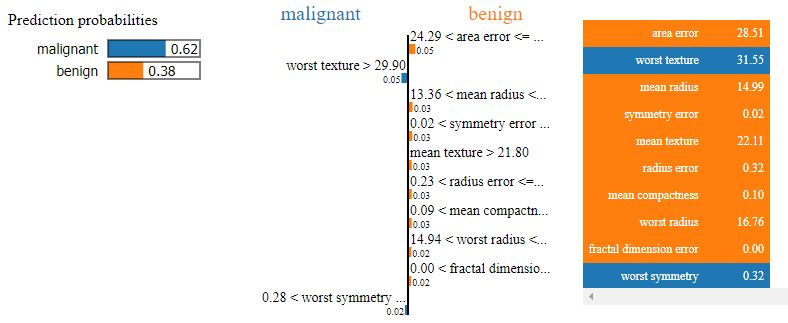
print(“Explanation Local Prediction : “,”malignant” if explanation.local_pred<0.5 else “benign”)
print(“Explanation Global Prediction Probability : “, explanation.predict_proba)
print(“Explanation Global Prediction : “, breast_cancer.target_names[np.argmax(explanation.predict_proba)])
Explanation Local Prediction              :  benign
Explanation Global Prediction Probability :  [0.62063711 0.37936289]
Explanation Global Prediction             :  malignant
Conclusions
- BC is one of the leading causes of mortality among women worldwide and it is important to develop novel approaches to screen, diagnose, and treat BC. This study presents a comparative analysis of available ML workflows for the prediction, diagnosis, and classification of BC.
- We have learned how to use the Keras deep learning library to train a Neural Network for BC classification.
- Several performance metrics implicit in the classification report have been used to figure out the performance of the ML algorithms in this project.
- Our findings are consistent with previous studies listed below.
Continue Reading
Supervised ML/AI Breast Cancer Diagnostics (BCD) – The Power of HealthTech
Supervised ML/AI Breast Cancer Diagnostics – The Power of HealthTech
Python Use-Case Supervised ML/AI in Breast Cancer (BC) Classification
EDA | Breast Cancer Prediction
Muhd-Shahid/Breast-Cancer-Wisconsin
References
An LDA–SVM Machine Learning Model for Breast Cancer Classification, MDPI.
Build Cancer Cell Classification using Python — scikit-learn
Application of Machine Learning Algorithms in Breast Cancer Diagnosis and Classification
Analysis Of Breast Cancer Data Using Machine Learning Techniques
Weighted K-means support vector machine for cancer prediction
Breast Cancer Classification with python
Project in Python – Breast Cancer Classification with Deep Learning
Breast Cancer Classification using Python Programming in Machine Learning
Breast cancer classification with Keras and Deep Learning
Building a Simple Machine Learning Model on Breast Cancer Data
Build Cancer Cell Classification using Python — scikit-learn


Make a one-time donation
Make a monthly donation
Make a yearly donation
Choose an amount
Or enter a custom amount
Your contribution is appreciated.
Your contribution is appreciated.
Your contribution is appreciated.

Leave a comment