
Referring to the Pup’s Weekday Dig #58 (Jun 8, 2022), let’s look at the following top three updated alerts:
- $RRC – Triggered yesterday
- $CCJ – Big move yesterday on news. Shares of uranium companies are trading higher following a report the US is seeking $4.3 billion to buy enriched uranium from domestic sources
- $STNG – an additional target.
Range Resources Corp (RRC) 36.00 -1.02 (-2.76%) 06/08/22 [NYSE]
Previous Close37.02
Volume4,599,400
Avg Vol4,742,895
Stochastic %K90.48%
Weighted Alpha+121.50
5-Day Change+0.76 (+2.16%)
52-Week Range
Range Resources Corporation is a natural gas exploration and production company headquartered in Fort Worth, Texas. It operates in the Marcellus Formation, where it is one of the largest land owners.
Cameco Corp (CCJ) 27.31 +0.31 (+1.15%) 06/09/22 [NYSE]
Previous Close27.00
Volume11,364,700
Avg Vol7,281,920
Stochastic %K77.74%
Weighted Alpha+32.30
5-Day Change+3.03 (+12.48%)
52-Week Range
Cameco Corporation is the world’s largest publicly traded uranium company, based in Saskatoon, Saskatchewan, Canada. In 2015, it was the world’s second largest uranium producer, accounting for 18% of world production.
Scorpio Tankers Inc (STNG)
37.33 +0.67 (+1.83%) 06/08/22 [NYSE]
Previous Close36.66
Volume1,463,400
Avg Vol1,616,785
Stochastic %K93.31%
Weighted Alpha+136.30
5-Day Change+2.51 (+7.21%)
52-Week Range11.02 – 37.71
Scorpio Tankers Inc. is a tanker shipping company founded by Emanuele A. Lauro on 1 July 2009. It is an international provider in the transportation of refined petroleum products. Scorpio Tankers is headquartered in Monaco and trades on the New York Stock Exchange.
In this post, we select these three stocks to discuss the most basic stock price analysis in Python that consists of stock prices, stock volume, market capitalization, 50/200-day moving average, scattered X-plot matrix, and stock volatility or standard deviation as a measure of risk.
Let’s set the working directory YOURPATH
import os
os.chdir(‘YOURPATH’)
and import/install Python libraries of interest
import pandas as pd
import datetime
import numpy as np
import matplotlib.pyplot as plt
from pandas.plotting import scatter_matrix
!pip install yfinance
import yfinance as yf
%matplotlib inline
Let’s import the stock data from Yahoo Finance
start = “2020-06-07”
end = ‘2022-06-07’
tcs = yf.download(‘RRC’,start,end)
infy = yf.download(‘CCJ’,start,end)
wipro = yf.download(‘STNG’,start,end)
[*********************100%***********************]  1 of 1 completed
[*********************100%***********************]  1 of 1 completed
[*********************100%***********************]  1 of 1 completed
Let’s create the stock price chart
tcs[‘Open’].plot(label = ‘RRC’, figsize = (15,7))
infy[‘Open’].plot(label = “CCJ”)
wipro[‘Open’].plot(label = ‘STING’)
plt.title(‘Stock Prices of RRC, CCJ and STNG’)
plt.savefig(“pupstocks3.jpg”)

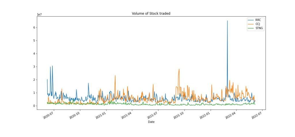
Let’s plot the volume
Let’s look at the market capitalization chart
tcs[‘MarktCap’] = tcs[‘Open’] * tcs[‘Volume’]
infy[‘MarktCap’] = infy[‘Open’] * infy[‘Volume’]
wipro[‘MarktCap’] = wipro[‘Open’] * wipro[‘Volume’]
tcs[‘MarktCap’].plot(label = ‘RRC’, figsize = (15,7))
infy[‘MarktCap’].plot(label = ‘CCJ’)
wipro[‘MarktCap’].plot(label = ‘STNG’)
plt.title(‘Market Cap’)
plt.legend()
plt.savefig(“pupmcap3.jpg”)

Let’s compare moving averages (MAs) for RRC
tcs[‘MA50’] = tcs[‘Open’].rolling(50).mean()
tcs[‘MA200’] = tcs[‘Open’].rolling(200).mean()
tcs[‘Open’].plot(figsize = (15,7))
tcs[‘MA50’].plot(label = “MA50”)
tcs[‘MA200’].plot(label = “MA200”)
plt.title(‘RRC MA50 vs MA200’)
plt.legend()
plt.savefig(“puprrc.jpg”)
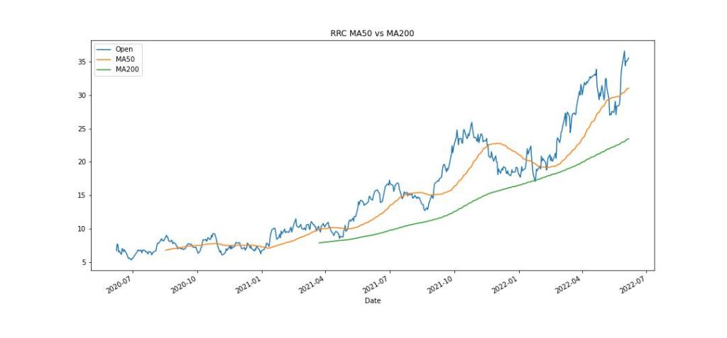
By plotting a 200-day and 50-day moving average on your chart, a buy signal occurs when the 50-day crosses above the 200-day. A sell signal occurs when the 50-day drops below the 200-day.
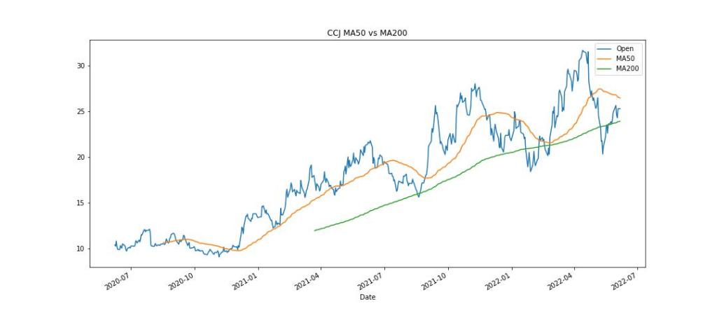
Let’s compare MAs for CCJ
infy[‘MA50’] = infy[‘Open’].rolling(50).mean()
infy[‘MA200’] = infy[‘Open’].rolling(200).mean()
infy[‘Open’].plot(figsize = (15,7))
infy[‘MA50’].plot(label = “MA50”)
infy[‘MA200’].plot(label = “MA200”)
plt.title(‘CCJ MA50 vs MA200’)
plt.legend()
plt.savefig(“pupccj.jpg”)
Let’s compare MAs for STNG
wipro[‘MA50’] = wipro[‘Open’].rolling(50).mean()
wipro[‘MA200’] = wipro[‘Open’].rolling(200).mean()
wipro[‘Open’].plot(figsize = (15,7))
wipro[‘MA50’].plot(label = “MA50”)
wipro[‘MA200’].plot(label = “MA200”)
plt.title(‘STNG MA50 vs MA200’)
plt.legend()
plt.savefig(“pupstng.jpg”)
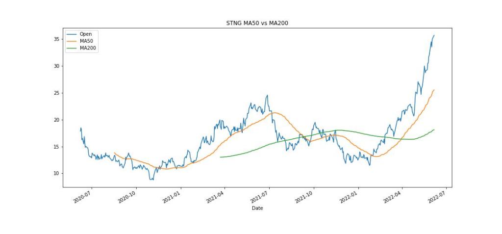
These three MAs plots show a buy signal for RRC/CCJ and a sell signal for STNG.
Let’s look at the scattered matrix X-plot of our 3 stocks
data = pd.concat([tcs[‘Open’],infy[‘Open’],wipro[‘Open’]],axis = 1)
data.columns = [‘RRCOpen’,’CCJOpen’,’STNGOpen’]
scatter_matrix(data, figsize = (14,14), hist_kwds= {‘bins’:150},color=’#e41a1c’)
plt.savefig(“pupxplot.jpg”)
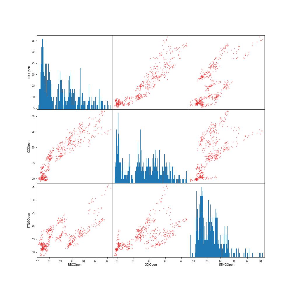
The above graph is the combination of histograms for each stock (3 diagonal charts) and a sequence of X-plot taking two stocks at a time (off-diagonal charts). We can see a linear correlation between RRC and CCJ.
Finally, let’s compare volatility or STDEV of our selected stocks by plotting their histograms
tcs[‘returns’] = (tcs[‘Close’]/tcs[‘Close’].shift(1)) -1
infy[‘returns’] = (infy[‘Close’]/infy[‘Close’].shift(1))-1
wipro[‘returns’] = (wipro[‘Close’]/wipro[‘Close’].shift(1)) – 1
tcs[‘returns’].hist(bins = 100, label = ‘RRC’, alpha = 0.5, figsize = (15,7))
infy[‘returns’].hist(bins = 100, label = ‘CCJ’, alpha = 0.5)
wipro[‘returns’].hist(bins = 100, label = ‘STNG’, alpha = 0.5)
plt.legend()
plt.savefig(“pupstdv3.jpg”)

It is clear that our stocks have the same degree of volatility = STDEV = risk.
The above analysis represents a basic automated decision support workflow that can be used to optimize the Risk-to-Reward Ratio in real time.


Leave a comment