“The simple graph has brought more information to the data analyst’s mind than any other device.” — John Tukey
R is an amazing platform for data analysis, capable of creating almost any type of graph. R is a programming language and software environment for statistical analysis, graphics representation and reporting. R is freely available under the GNU General Public License, and pre-compiled binary versions are provided for various operating systems like Linux, Windows and Mac.
Some realistic public-domain examples are discussed below in conjunction with Exploratory Data Analysis (EDA) used by businesses and analysts to understand the competitive dynamics of an industry.
In order to create the graphs in this guide, you’ll need to install the R package
type = “binary”
install.packages(“ggplot2”, type = “binary”)
library(‘ggplot2’)
This package belongs to the suite of packages tidyverse.
Other packages can also be installed if needed.
Demographics
In this section, we use the geometry parameter in tidycensus functions to download geographic data along with demographic data from the US Census Bureau.
The function
plot(dc_income["estimate"])
returns a simple map showing income variation in Washington, DC. Wealthier areas, as represented with warmer colors, tend to be located in the northwestern part of the District. NA values are represented on the map in white. If desired, the map can be modified further with base plotting functions.
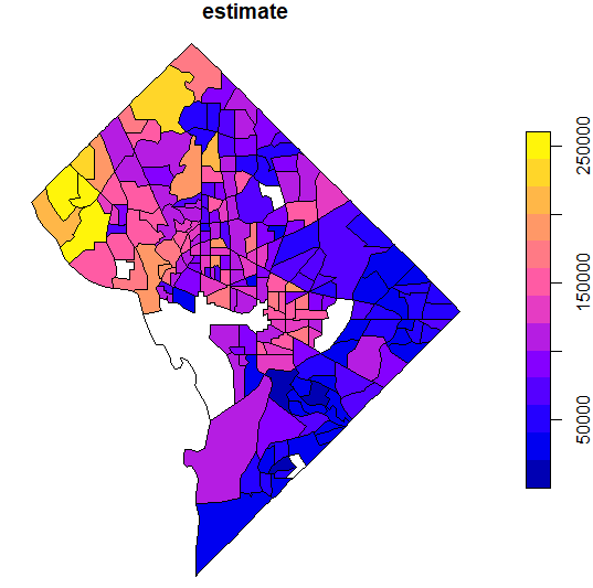
One of the most common ways to visualize statistical information on a map is with choropleth mapping. Choropleth maps use shading to represent how underlying data values vary by feature in a spatial dataset. The income plot of Washington, DC shown above is an example of a choropleth map.
With two lines of ggplot2 code, a basic map of median age by state can be created with ggplot2 defaults
ggplot(data = us_median_age, aes(fill = estimate)) +
  geom_sf()
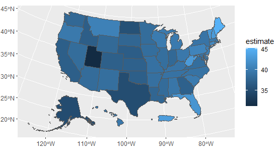
In this case, the ACS estimate of median age is mapped to the default blue dark-to-light color ramp in ggplot2, highlighting the youngest states (such as Utah) with darker blues and the oldest states (such as Maine) with lighter blues.
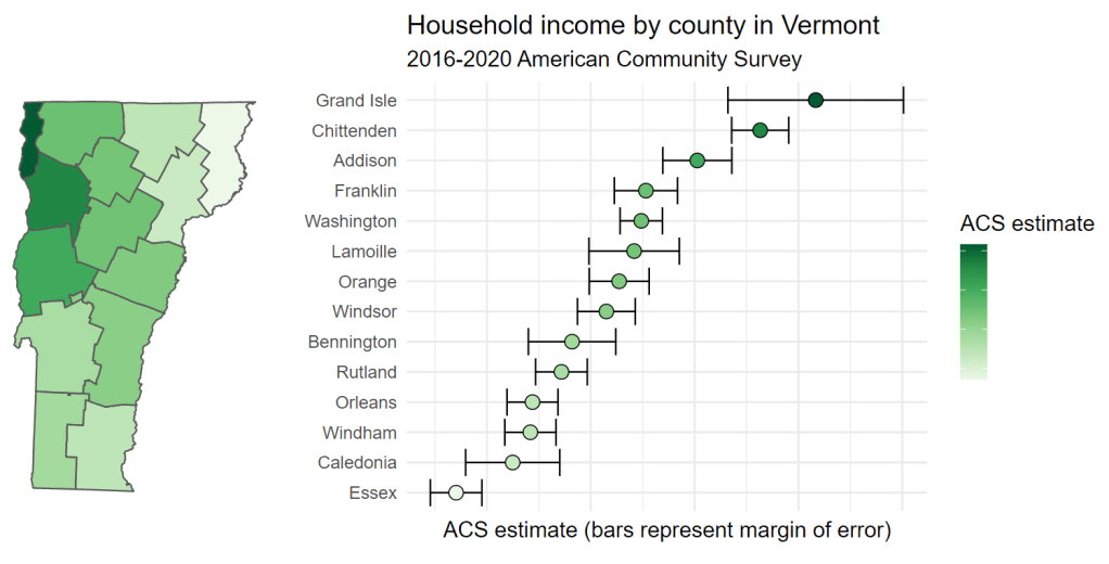
R’s visualization tools offer an alternative approach: interactive linking of a choropleth map with a chart that clearly visualizes the uncertainty around estimates. This approach involves generating a map and chart with ggplot2, then combining the plots with patchwork and rendering them as interactive, linked graphics with ggiraph. The key aesthetic to be used here is data_id, which if set in the code for both plots will highlight corresponding data points on both plots on user hover.
Try hovering your cursor over any county in Vermont on the map – or any data point on the chart – and notice what happens on the other plot. The corresponding county or data point will also be highlighted, allowing for a linked representation of geographic location and margin of error visualization.
library(tidycensus)
library(ggiraph)
library(tidyverse)
library(patchwork)
library(scales)
vt_income <- get_acs( geography = “county”, variables = “B19013_001”, state = “VT”, year = 2020, geometry = TRUE ) %>%
mutate(NAME = str_remove(NAME, ” County, Vermont”))
vt_map <- ggplot(vt_income, aes(fill = estimate)) +
geom_sf_interactive(aes(data_id = GEOID)) +
scale_fill_distiller(palette = “Greens”,
direction = 1,
guide = “none”) +
theme_void()
vt_plot <- ggplot(vt_income, aes(x = estimate, y = reorder(NAME, estimate),
fill = estimate)) +
geom_errorbar(aes(xmin = estimate – moe, xmax = estimate + moe)) +
geom_point_interactive(color = “black”, size = 4, shape = 21,
aes(data_id = GEOID)) +
scale_fill_distiller(palette = “Greens”, direction = 1,
labels = NULL) +
scale_x_continuous(labels = NULL) +
labs(title = “Household income by county in Vermont”,
subtitle = “2016-2020 American Community Survey”,
y = “”,
x = “ACS estimate (bars represent margin of error)”,
fill = “ACS estimate”) +
theme_minimal(base_size = 14)
girafe(ggobj = vt_map + vt_plot, width_svg = 10, height_svg = 5) %>%
girafe_options(opts_hover(css = “fill:cyan;”))
Cars
The data set mtcars is used in the examples below:
#Load the data
data(mtcars)
df <- mtcars[, c(“mpg”, “cyl”, “wt”)]
#Convert cyl to a factor variable
df$cyl <- as.factor(df$cyl)
head(df)
mpg cyl wt
Mazda RX4 21.0 6 2.620
Mazda RX4 Wag 21.0 6 2.875
Datsun 710 22.8 4 2.320
Hornet 4 Drive 21.4 6 3.215
Hornet Sportabout 18.7 8 3.440
Valiant 18.1 6 3.460

The following R code will change the color and the shape of points by groups. The column cyl will be used as grouping variable. In other words, the color/size and the shape of points will be changed by the levels of cyl.
qplot(mpg, wt, data = df, colour = cyl, shape = cyl)

Public Health
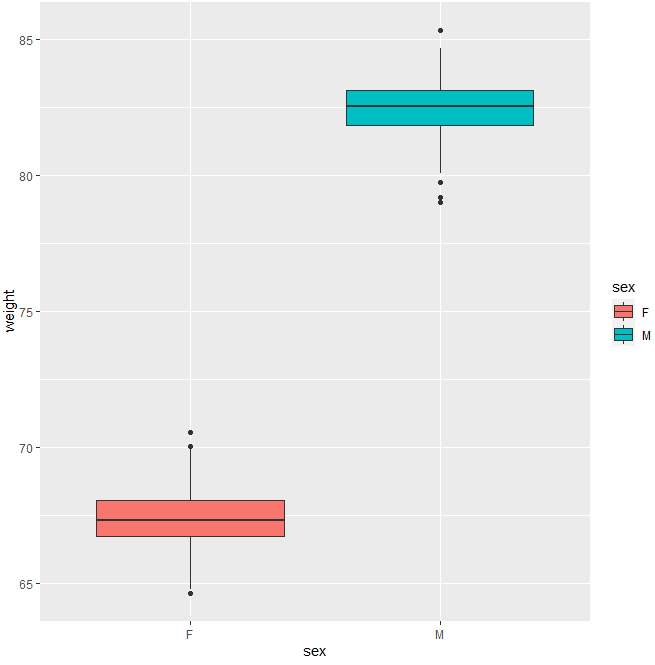
The R code below generates some data containing the weights by sex (M for male; F for female) based upon the average male/female weight (kg) in Germany:
set.seed(1234)
wdata = data.frame(sex = factor(rep(c(“F”, “M”), each=200)),
weight = c(rnorm(200, 67.5), rnorm(200, 82.4)))
head(wdata)
sex weight
1 F 66.29293
2 F 67.77743
3 F 68.58444
4 F 65.15430
5 F 67.92912
6 F 68.00606
The basic box plot from the above dataframe is given by
qplot(sex, weight, data = wdata,
geom= “boxplot”, fill = sex)
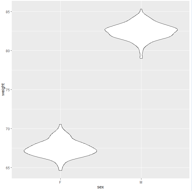
The corresponding violin plot is
#Violin plot
qplot(sex, weight, data = wdata, geom = “violin”)
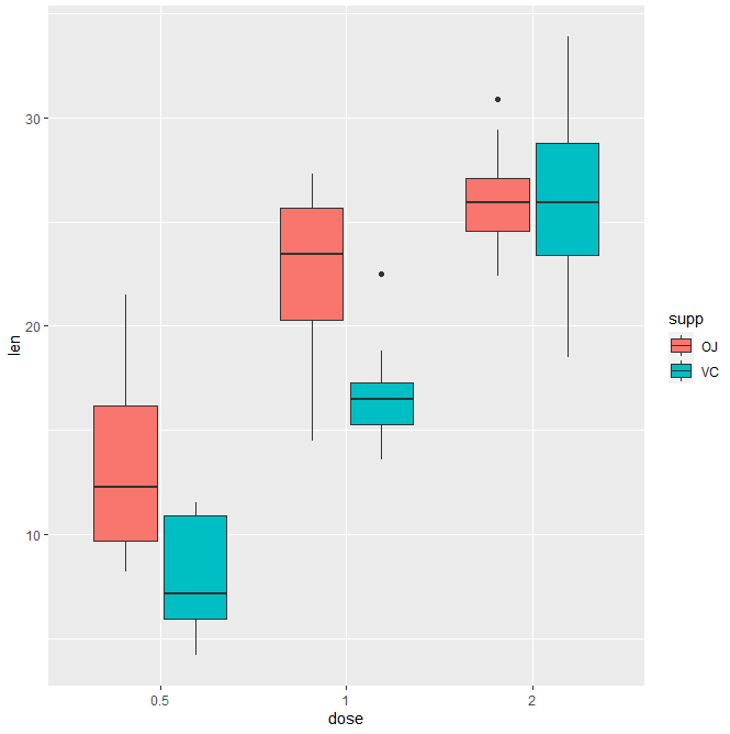
The ToothGrowth data set we’ll be used to plot the continuous variable len (for tooth length) by the discrete variable dose. The following R code converts the variable dose from a numeric to a discrete factor variable
data(“ToothGrowth”)
ToothGrowth$dose <- as.factor(ToothGrowth$dose)
head(ToothGrowth)
len supp dose
1 4.2 VC 0.5
2 11.5 VC 0.5
3 7.3 VC 0.5
4 5.8 VC 0.5
5 6.4 VC 0.5
6 10.0 VC 0.5
We start by creating a plot, named e
e <- ggplot(ToothGrowth, aes(x = dose, y = len))
that we’ll finish belo by adding a layer
- geom_boxplot() for box plot
- geom_violin() for violin plot
- geom_dotplot() for dot plot
- geom_jitter() for stripchart
- geom_line() for line plot
- geom_bar() for bar plot.

Entertainment
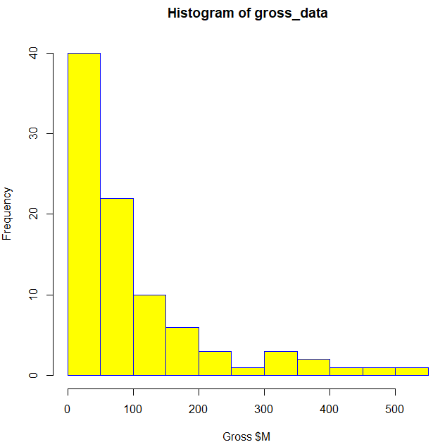
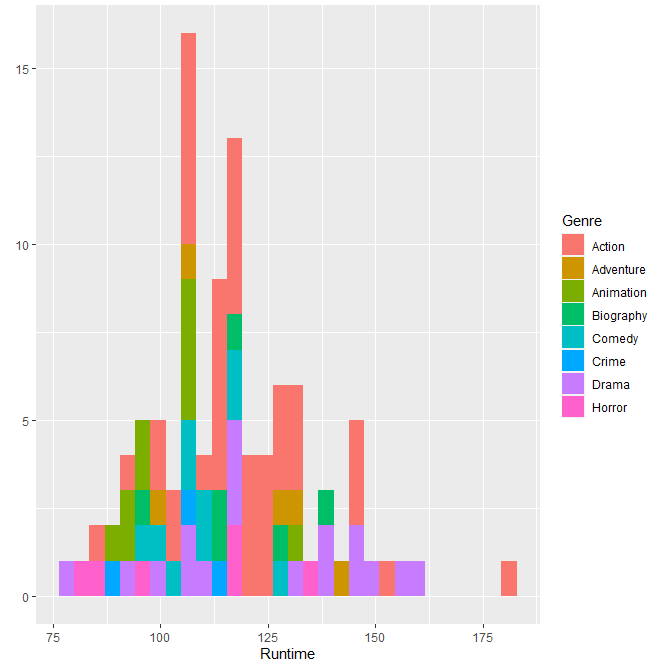
Let’s specify the URL for the desired website IMDb to be scraped – an online database of information related to films, television series, home videos, video games, and streaming content online. We perform webscraping by reading the HTML code from the website, using CSS selectors to scrape the sections of interest (film ranking, genre, title, gross income $M, etc.). We combine these sections into dataframes and plot the content as histograms and scatter plots:


Leave a comment