
- The goal of this post is to compare most popular time series data imputation, interpolation and anomaly detection methods.
- Imputation in statistics refers to the procedure of using alternative values in place of missing data.
- Missing information can introduce a significant degree of bias, make processing and analyzing the data more difficult, and reduce efficiency, which are the three main issues it causes.
- Imputing missing data is a crucial step in time series analysis to avoid losing information and introducing bias. However, imputation can also introduce uncertainty and error in the data, so it’s essential to choose the appropriate method for the data and analysis goals.
- The present study performs 3 data-centric experiments (cf. Parts 1-3) to benchmark state-of-the-art deep imputation, interpolation and anomaly detection methods on both synthetic and real univariate time series data sets.
- Our findings highlight the importance of data-centric selection of imputation methods to optimize data-driven predictive models.
Table of Contents
- Business Case
- State-of-the-Art
- Part 1: Air Quality Dataset
- Part 2: Testing SciPy Interpolation
- Part 3: Synthetic Sales Dataset
- Summary
- Explore More
- References
- Embed Socials
Business Case
- We employ imputation since missing data can lead to the following problems:
- Distorts Dataset: Large amounts of missing data can lead to anomalies in the variable distribution, which can change the relative importance of different categories in the dataset.
- Unable to work with the majority of ML Python libraries.
- Impacts on the Final Model: Missing data may lead to bias in the dataset, which could affect the final model’s analysis.
- Desire to restore the entire dataset: This typically occurs when we don’t want to lose any of the data in our dataset because all of it is crucial.
- It is important to mention that the quality of data for time series forecasting is very important, hence the importance of a robust time series imputation process.
State-of-the-Art
- The following strategies exist to manage missing values
- Deletion: This strategy entails eliminating any rows that contain missing values. Although straightforward to execute, if the missing data isn’t Missing Completely at Random (MCAR), this approach may result in valuable information loss.
- Constant Imputation: This technique substitutes all missing values with a constant. Unless there’s a compelling reason to select a particular constant, this method is usually not recommended.
- Last Observation Carried Forward (LOCF) and Next Observation Carried Backward (NOCB): These methods replace missing values either with the immediately preceding observed value (LOCF) or the subsequent observed value (NOCB). These are potentially useful for time series data, but they may introduce bias if the data isn’t stationary.
- Mean/Median/Mode Imputation: In this approach, missing values are replaced with the mean (for continuous data), median (for ordinal data), or mode (for categorical data) of the available values. While easy to implement, this method could potentially underestimate variance.
- Rolling Statistics Imputation: This method substitutes missing values with a rolling statistic (like mean, median, or mode) over a specified window period. Commonly used in time series data, it assumes that the data points closest in time are more similar. Although this method can handle non-random mussiness and preserve temporal dependence, the choice of window size and statistic can significantly affect the results, making it crucial to select these parameters carefully. This method may not be effective for data with large gaps of missing values.
- Linear Interpolation: Here, missing values are replaced based on a linear equation derived from the available values. This method is appropriate for time series data but presupposes a linear relationship between observations.
- Spline Interpolation: In this method, missing values are replaced based on a spline interpolation of the available values. Spline interpolation employs piecewise polynomials to approximate the data, capturing non-linear patterns. This method is suitable for time series data but assumes a certain smoothness in the data.
- K-Nearest Neighbors (KNN) Imputation: This technique substitutes missing values based on the values of the “k” nearest neighbors.
- STL Decomposition for Time Series: This method breaks down the time series into trend, seasonality, and residuals, then imputes missing values in the residuals before reassembling the components. This could prove useful for time series data with a distinct trend and seasonality.
- The paper provides a review of several studies related to missing values handling methods or techniques especially on time series data.
Part 1: Air Quality Dataset
- Our objective is to address missing values and outliers, which is crucial for effective time series data processing.
- We’ll use the dataset airquality containing measurements of different parameters related to air quality.
- We begin by setting the working directory YOURPATH
import os
os.chdir('YOURPATH')    # Set working directory
os. getcwd()
- Importing basic libraries and reading the input dataset
import warnings
import itertools
import numpy as np
import scipy.stats as stats
import warnings
warnings.filterwarnings("ignore")
import seaborn as sns
import matplotlib.pyplot as plt
import pandas as pd
df = pd.read_csv('airquality.csv')
- Analyzing the input data
df.shape
(153, 7)
df.info()
<class 'pandas.core.frame.DataFrame'>
RangeIndex: 153 entries, 0 to 152
Data columns (total 7 columns):
 #   Column    Non-Null Count  Dtype
---  ------    --------------  -----
 0   rownames  153 non-null    int64
 1   Ozone     116 non-null    float64
 2   Solar.R   146 non-null    float64
 3   Wind      153 non-null    float64
 4   Temp      153 non-null    int64
 5   Month     153 non-null    int64
 6   Day       153 non-null    int64
dtypes: float64(3), int64(4)
memory usage: 8.5 KB
#Counting missing values
missing_values_count = df.isna().sum()
print(missing_values_count)
rownames     0
Ozone       37
Solar.R      7
Wind         0
Temp         0
Month        0
Day          0
dtype: int64

# Calculate the time difference between consecutive data points
time_diff = df.index.to_series().diff()

# Find the most common time difference
most_common_freq = time_diff.mode().iloc[0]

# Display the frequency of the data
print(f"Data Frequency: {most_common_freq}")

Data Frequency: 1.0
- Plotting the input data column Ozone
df['Ozone'].plot(title='Ozone', marker='o', color='blue', figsize=(14, 6))
plt.xlabel('DateTimeIndex')
plt.show()
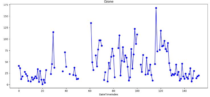
- This plot shows significant gaps and potential outliers in the input data that would require special treatment.
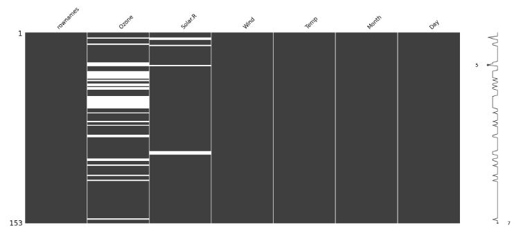
- Using the heatmap visualization technique to discover missing values
import missingno as msno
msno.matrix(df)
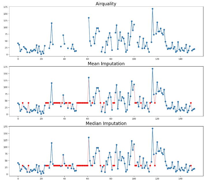
- Replacing missing values Ozone with the single mean
# Create a copy of the DataFrame
mean_imputed = df.copy(deep=True)

# Calculate the mean of the 'Ozone' column
mean_value = mean_imputed['Ozone'].mean()

# Fill missing values with the mean
mean_imputed['Ozone'].fillna(mean_value, inplace=True)

# Plot the imputed DataFrame in red dotted style
mean_imputed['Ozone'].plot(color='red', marker='o', linestyle='dotted', figsize=(14, 6))

# Plot the original air quality DataFrame with title
df['Ozone'].plot(title='Data Imputation with mean value', ylabel='Ozone', marker='o', color='blue', figsize=(14, 6))
plt.xlabel('DateTimeIndex')

- However, there are a few data points that act as outliers. Outliers data points will have a significant impact on the mean and hence, in such cases, it is not recommended to use the mean for replacing the missing values.
- Generally, mean imputation does not preserve the relationships among variables. Mean imputation leads to an underestimate of standard errors in that you’re making type I errors without realizing it.
- Replacing all occurrences of missing values Ozone by the median.
# Impute missing values with the median

# Create a copy of the DataFrame
median_imputed = df.copy(deep=True)

# Calculate the median of the 'Ozone' column
median_value = median_imputed['Ozone'].median()

# Fill missing values with the median
median_imputed['Ozone'].fillna(median_value, inplace=True)

# Plot the imputed DataFrame in red dotted style
median_imputed['Ozone'].plot(color='red', marker='o', linestyle='dotted', figsize=(14, 6))

# Plot the original air quality DataFrame with title
df['Ozone'].plot(title='Data Imputation with median value', ylabel='Ozone', marker='o', color='blue', figsize=(14, 6))
plt.xlabel('DateTimeIndex')
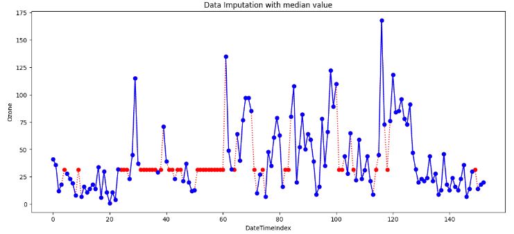
- It is clear that imputing with the median is more robust than imputing with the mean, because it mitigates the effect of outliers. In practice though, both have comparable imputation results. That’s because these two methods do not take into account potential dependencies between rows/columns, which may contain relevant information to estimate missing values.
- Still it’s better to use the median value for imputation in the case of outliers.
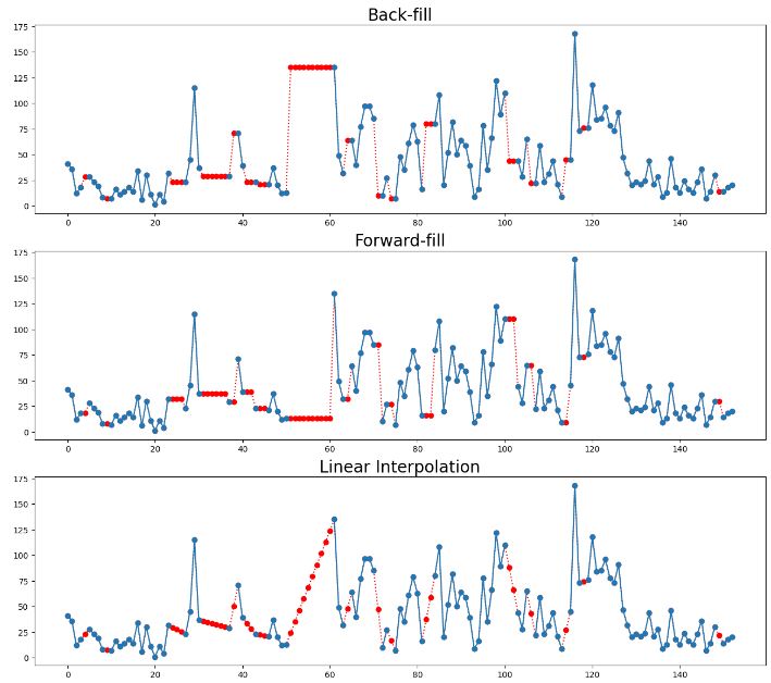
- Forward fill (ffill) imputation
# Forward Fill Imputation

# Create a copy of the DataFrame
ffill_imputed = df.copy(deep=True)

# Impute missing values using forward fill method
ffill_imputed.fillna(method='ffill', inplace=True)

# Plot the imputed DataFrame in red dotted style
ffill_imputed['Ozone'].plot(color='red', marker='o', linestyle='dotted', figsize=(14, 6))

# Plot the original air quality DataFrame with title
df['Ozone'].plot(title='Data Imputation with ffill', ylabel='Ozone', marker='o', color='blue', figsize=(14, 6))
plt.xlabel('DateTimeIndex')
plt.show()
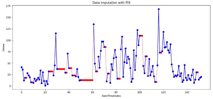
- In data analysis, “forward fill” refers to a method of handling missing or incomplete data by carrying forward the last observed value to fill in the gaps. It is also known as “last observation carried forward” (LOCF).
- LOCF can be useful in time-series data where there is a trend or pattern that continues from one time point to the next.
- LOCF Cons
- It can introduce bias into the data if the assumption of similar adjacent values does not hold.
- It does not consider the possible variability around the missing value.
- It can lead to overestimation or underestimation of the data analysis results if the missing data is not random.
- Backward fill (bfill) imputation
# Backward Fill Imputation

# Create a copy of the DataFrame
bfill_imputed = df.copy(deep=True)

# Impute missing values using backward fill method
bfill_imputed.fillna(method='bfill', inplace=True)

# Plot the imputed DataFrame in red dotted style
bfill_imputed['Ozone'].plot(color='red', marker='o', linestyle='dotted', figsize=(14, 6))

# Plot the original air quality DataFrame with title
df['Ozone'].plot(title='Data Imputation with bfill', ylabel='Ozone', marker='o', color='blue', figsize=(14, 6))
plt.xlabel('DateTimeIndex')
plt.show()
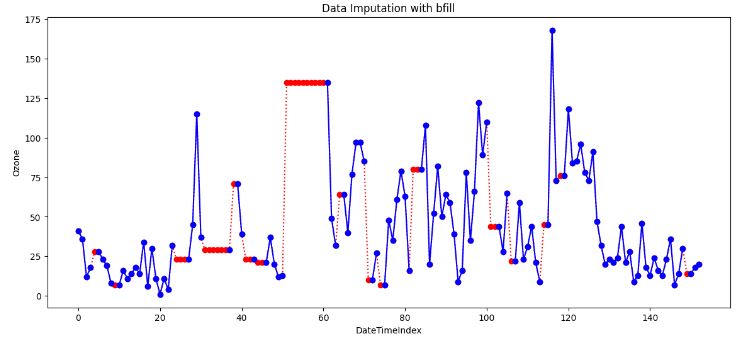
- When applying a backward filling to fill missing values, the next available value after the missing data point replaces the missing value. The backward fill operation propagates the next observed value backwards until encountering the last available data point.
- This method is useful when the time series data is gradually changing over time and the missing values occur at the end of the series.
- If information is missing in a sequence (like dates), you can use the value from the previous (backward fill) observation to fill in the gap.
- Example: If you have daily temperature data, and one day’s data is missing, you can use the temperature from the day before.
- Cons of both ffill and bfill: Sometimes Forward/Backward fill could be far from actuals due to outliers.
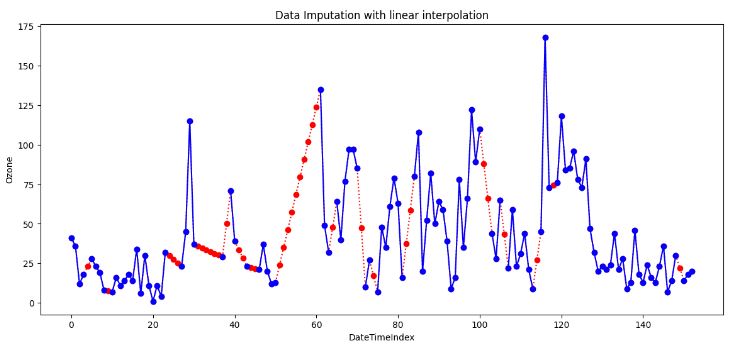
- Linear Interpolation (LI) Imputation
# Linear Interpolation Imputation

# Create a copy of the DataFrame
linear_imputed = df.copy(deep=True)

# Impute missing values using linear interpolation
linear_imputed.interpolate(method='linear', inplace=True)

# Plot the imputed DataFrame in red dotted style
linear_imputed['Ozone'].plot(color='red', marker='o', linestyle='dotted', figsize=(14, 6))

# Plot the original air quality DataFrame with title
df['Ozone'].plot(title='Data Imputation with linear interpolation', ylabel='Ozone', marker='o', color='blue', figsize=(14, 6))
plt.xlabel('DateTimeIndex')

- The simplest form of interpolation is to connect two data points with a straight line, as illustrated in the above plot.
- Indeed, linear interpolation is a robust imputation method that assumes a locally linear relationship between the missing and non-missing values.
- Linear interpolation is suitable when the data shows a linear trend between the observations. It’s not suitable for data that shows a nonlinear trend or seasonal pattern as it will almost distort the seasonal pattern at all.
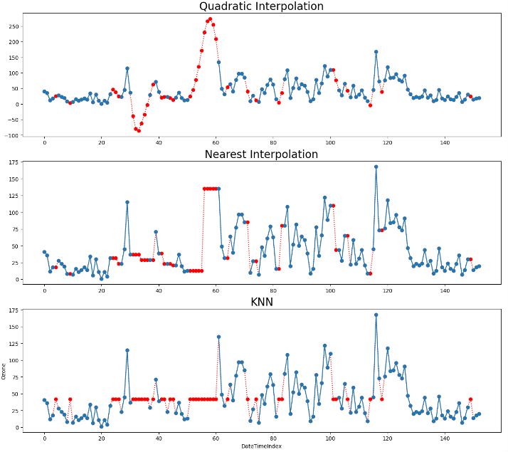
- Quadratic Interpolation Imputation
# Quadratic Interpolation Imputation

# Create a copy of the DataFrame
quadratic_imputed = df.copy(deep=True)

# Impute missing values using quadratic interpolation
quadratic_imputed.interpolate(method='quadratic', inplace=True)

# Plot the imputed DataFrame in red dotted style
quadratic_imputed['Ozone'].plot(color='red', marker='o', linestyle='dotted', figsize=(14, 6))

# Plot the original air quality DataFrame with title
df['Ozone'].plot(title='Data Imputation with quadratic', ylabel='Ozone', marker='o', color='blue', figsize=(14, 6))
plt.xlabel('DateTimeIndex')
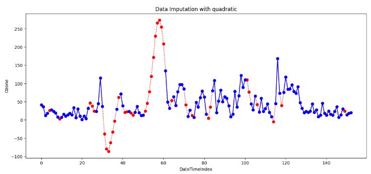
- Quadratic Interpolation (QI) is a technique that estimates missing values by fitting a quadratic function to the neighboring data points. This approach is valuable when the data exhibits nonlinear patterns.
- The above plot shows that QI provides a smoother and more flexible fit than LI. However, it can create unrealistic estimates if the data set is not smooth.
# Nearest Interpolation Imputation

# Create a copy of the DataFrame
nearest_imputed = df.copy(deep=True)

# Impute missing values using nearest interpolation
nearest_imputed.interpolate(method='nearest', inplace=True)

# Plot the imputed DataFrame in red dotted style
nearest_imputed['Ozone'].plot(color='red', marker='o', linestyle='dotted', figsize=(14, 6))

# Plot the original air quality DataFrame with title
df['Ozone'].plot(title='Data Imputation with nearest', ylabel='Ozone', marker='o', color='blue', figsize=(14, 6))
plt.xlabel('DateTimeIndex')
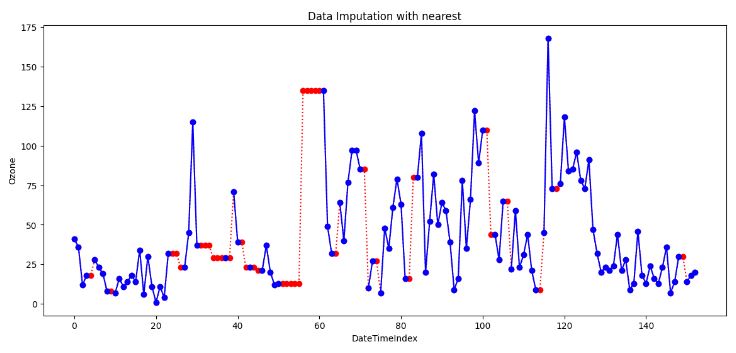
- Nearest interpolation is a method that estimates missing values by taking the value of the nearest neighboring data point. This approach can be valuable when the data exhibits abrupt changes or irregular intervals.
- This method preserves the original values and details of the data, but it also creates sharp discontinuities, which can affect the accuracy and quality of the interpolated curve.
- K-Nearest Neighbors (KNN) imputation
# KNN Imputation
from sklearn.impute import KNNImputer

# Create a copy of the DataFrame for imputation
knn_imput = df.copy(deep=True)

# Column to impute
column_to_impute = 'Ozone'

# Initialize the KNNImputer with the desired number of neighbors
knn_imputer = KNNImputer(n_neighbors=5)  # You can adjust the number of neighbors

# Perform KNN imputation for the specified column
knn_imput[[column_to_impute]] = knn_imputer.fit_transform(knn_imput[[column_to_impute]])

# Plot the original 'Ozone' column
df[column_to_impute].plot(title='Original ' + column_to_impute, marker='o')

# Plot the imputed 'Ozone' column in red dotted style
knn_imput[column_to_impute].plot(title='Imputed ' + column_to_impute, marker='o', color='red', linestyle='dotted',  figsize=(14, 6))

# Plot the original air quality DataFrame with title
df['Ozone'].plot(title='Data Imputation with KNN interpolation', ylabel='Ozone', marker='o', color='blue', figsize=(14, 6))
plt.xlabel('DateTimeIndex')
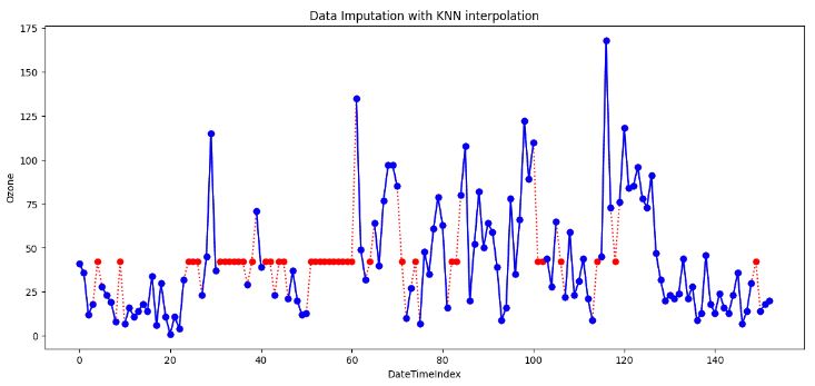
- Generally, KNN is a versatile algorithm used for supervised ML tasks. The above plot shows that it can also be employed for imputing missing values, which is particularly useful when dealing with incomplete datasets.
- An effective approach to data imputing is to use a model to predict the missing values. Specifically, a new sample is imputed by finding the samples in the training set “closest” to it and averages these nearby points to fill in the value.
- However, KNN imputation also has some limitations, such as being sensitive to outliers, noise, and scale, requiring a large and/or representative sample size.
- Summary of 8 data imputation techniques
# Set nrows to 9 and ncols to 1 to accommodate the two new methods

from IPython.core.display import display, HTML
display(HTML("<style>div.output_scroll { height: 144em; }</style>"))
fig, axes = plt.subplots(9, 1, figsize=(16, 44))

# Create a dictionary of interpolations including Mean and Median methods
interpolations = {'Airquality': df,
                  'Mean Imputation': mean_imputed,
                  'Median Imputation': median_imputed,
                  'Back-fill': bfill_imputed,
                  'Forward-fill': ffill_imputed,
                  'Linear Interpolation': linear_imputed,
                  'Quadratic Interpolation': quadratic_imputed,
                  'Nearest Interpolation': nearest_imputed,
                  'KNN': knn_imput
                  }
# Loop over axes and interpolations
for ax, df_key in zip(axes, interpolations):
  # Select and also set the title for a DataFrame
  interpolations[df_key].Ozone.plot(color='red', marker='o',
                                     linestyle='dotted', ax=ax)
  df.Ozone.plot(title=df_key + ' - Ozone', marker='o', ax=ax)
  # Set the title and increase the font size
  ax.set_title(df_key, fontsize=20)
plt.ylabel('Ozone')
plt.xlabel('DateTimeIndex')
plt.show()
- Outliers in time series data are values that significantly differ from the patterns and trends of the other values in the time series. For example, large numbers of online purchases around holidays or high numbers of traffic accidents during heavy rainstorms may be detected as outliers in their time series.
- Let’s focus on the result of linear interpolation imputation
# Linear Interpolation Imputation

# Create a copy of the DataFrame
linear_imputed = df.copy(deep=True)

# Impute missing values using linear interpolation
linear_imputed.interpolate(method='linear', inplace=True)

# Plot the imputed DataFrame in red dotted style
linear_imputed['Ozone'].plot(color='red', marker='o', linestyle='dotted', figsize=(14, 6))

# Plot the original air quality DataFrame with title
df['Ozone'].plot(title='Data Imputation with linear interpolation', ylabel='Ozone',  marker='o', color='blue', figsize=(14, 6))
plt.xlabel('DateTimeIndex')
- IQR-based outlier detection
# Assuming 'Ozone' is the column of interest
X = linear_imputed['Ozone'].values

# Compute the IQR-based bounds
Q1 = df['Ozone'].quantile(0.25)
Q3 = df['Ozone'].quantile(0.75)
IQR = Q3 - Q1
lower_bound = Q1 - 1.5 * IQR
upper_bound = Q3 + 1.5 * IQR

# Identify outlier indices
outlier_indices = df[(df['Ozone'] < lower_bound) | (df['Ozone'] > upper_bound)].index

# Plot the data with outliers marked in red
plt.figure(figsize=(10, 6))

# Plot inliers as a line plot
plt.plot(df.index, X, color='blue', label='Inliers')

# Scatter plot for outliers in red
plt.scatter(outlier_indices, df.loc[outlier_indices, 'Ozone'], color='red', label='Outliers')

# Plot the upper and lower bounds as horizontal lines
plt.axhline(y=lower_bound, color='green', linestyle='--', label='Lower Bound')
plt.axhline(y=upper_bound, color='orange', linestyle='--', label='Upper Bound')
plt.xlabel('Date')
plt.ylabel('Ozone')
plt.title('IQR Outlier Detection')
plt.legend()
plt.show()
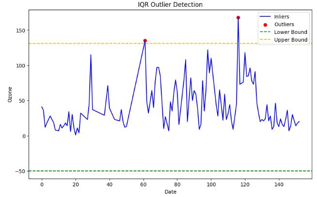
- 2 Interquartile range (IQR) method
- The advantage of this method is that it is robust to outliers and does not depend on the normality assumption.
- The disadvantage is that it can only handle univariate data, and that it can remove valid data points if the data is skewed or has heavy tails.
- Outlier Detection with Isolation Forest
from sklearn.ensemble import IsolationForest

# Assuming 'Ozone' is the column of interest
X = linear_imputed[['Ozone']].values

# Create an Isolation Forest model
# You can adjust the hyperparameters like n_estimators, contamination, etc.
model = IsolationForest(n_estimators=10000, contamination=0.05, random_state=42)

# Fit the model to your data
model.fit(X)

# Predict outliers (-1 for outliers, 1 for inliers)
outliers = model.predict(X)

# Plot the data and mark outliers in red
plt.figure(figsize=(10, 6))

# Plot inliers as a line plot
plt.plot(df.index, X, color='blue', label='Inliers')

# Scatter plot for outliers in red
plt.scatter(df.index[outliers == -1], X[outliers == -1], color='red', label='Outliers')
plt.xlabel('Date')
plt.ylabel('Ozone')
plt.title('Isolation Forest Outlier Detection')
plt.legend()
plt.show()

- Outlier Detection with K-Means
from sklearn.cluster import KMeans

# Assuming 'Ozone' is the column of interest
X = linear_imputed[['Ozone']].values

# Create a KMeans model
# You can adjust the number of clusters (n_clusters) and other hyperparameters
n_clusters = 2  # Adjust as needed
model = KMeans(n_clusters=n_clusters, random_state=42)

# Fit the model to your data
model.fit(X)

# Assign each data point to a cluster
cluster_assignments = model.predict(X)

# Calculate the distance of each data point to its cluster center
cluster_centers = model.cluster_centers_
distances = np.linalg.norm(X - cluster_centers[cluster_assignments], axis=1)

# Define a threshold to identify outliers
threshold = np.percentile(distances, 99)  # Adjust as needed

# Identify outlier indices
outlier_indices = np.where(distances > threshold)[-1]

# Plot the data with outliers marked in red
plt.figure(figsize=(10, 6))
plt.plot(df.index, X, c='blue', label='Inliers')
plt.scatter(df.index[outlier_indices], X[outlier_indices], c='red', label='Outliers')
plt.xlabel('Date')
plt.ylabel('Ozone')
plt.title('K-Means Outlier Detection')
plt.legend()
plt.show()
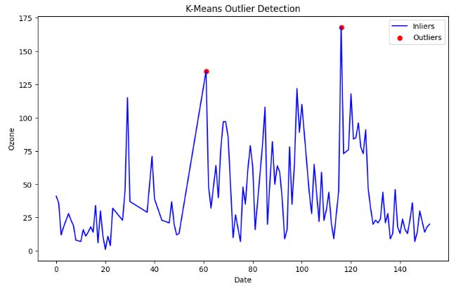
- One of the main advantages of K-means clustering is its simplicity and efficiency. It is easy to implement and can quickly process large datasets. However, K-means clustering has some disadvantages, such as its sensitivity to outliers and the need to specify the number of clusters (K) in advance.
- Outlier Detection with DBSCAN
#DBSCAN
#https://www.kaggle.com/code/sameerudgirkar/anomaly-detection-on-battery-health-nasa-dataset/notebook
import matplotlib.pyplot as plt
import numpy as np
from sklearn.cluster import DBSCAN
from sklearn import metrics
from sklearn.preprocessing import StandardScaler

# Assuming 'Ozone' is the column of interest
X = linear_imputed[['Ozone']].values

X1=StandardScaler().fit(X)
std_df = X1.transform(X)

#model=DBSCAN(eps = 20, min_samples = 30)

#model=DBSCAN(eps = 10, min_samples = 10)

model1=model.fit(std_df)

# Fit the model to your data and predict outlier scores

outlier_scores = model1.fit_predict(X)


from IPython.core.display import display, HTML
display(HTML("<style>div.output_scroll { height: 144em; }</style>"))

# Plot the data and mark outliers in red
plt.figure(figsize=(10, 6))


# Plot inliers as a line plot
plt.plot(df.index, X, color='blue', label='Inliers')

# Scatter plot for outliers in red
plt.scatter(df.index[outlier_scores == -1], X[outlier_scores == -1], color='red', label='Outliers')
plt.xlabel('Date')
plt.ylabel('Ozone')
plt.title('DBSCAN Outlier Detection')
plt.legend()
plt.show()

- Pros of DBSCAN:
-DBSCAN can discover clusters of arbitrary shape, unlike k-means.
-It is robust to noise, as it can identify points that do not belong to any cluster as outliers.
-It does not require the number of clusters to be specified in advance. - Cons of DBSCAN:
-It is sensitive to the choice of the Eps and MinPts parameters.
-It does not work well with clusters of varying densities.
-It has a high computational cost when the number of data points is large.
-It is not guaranteed to find all clusters in the data. - DBSCAN is a useful algorithm for clustering data that has a spatial or density-based structure. It is beneficial for discovering clusters in large, complex datasets where the number of clusters is not known in advance. However, it does have some limitations and its performance can be sensitive to the choice of parameters.
from sklearn.neighbors import LocalOutlierFactor

# Assuming 'Ozone' is the column of interest
X = linear_imputed[['Ozone']].values

# Create a Local Outlier Factor model
# You can adjust the hyperparameters like n_neighbors, contamination, etc.
model = LocalOutlierFactor(n_neighbors=20, contamination=0.05)

# Fit the model to your data and predict outlier scores
outlier_scores = model.fit_predict(X)

# Plot the data and mark outliers in red
plt.figure(figsize=(10, 6))

# Plot inliers as a line plot
plt.plot(df.index, X, color='blue', label='Inliers')

# Scatter plot for outliers in red
plt.scatter(df.index[outlier_scores == -1], X[outlier_scores == -1], color='red', label='Outliers')
plt.xlabel('Date')
plt.ylabel('Ozone')
plt.title('Local Outlier Factor Outlier Detection')
plt.legend()
plt.show()

- Local Outlier Factor (LOF) is a well-known algorithm for detecting outliers on a density-based algorithm.
- LOF technique achieves good detection accuracy at heterogeneous densities without assuming the underlying distribution of the data.
- The disadvantage is that it is sensitive to the shape and scale of the distribution, and that it can remove too many or too few outliers depending on the choice of the threshold.
Part 2: Testing SciPy Interpolation
- In this section, we will discuss how interpolation works in SciPy.
- Let us create some synthetic data and see how this interpolation can be done using the scipy.interpolate package.
- Recall that the simple linear 1D interpolation can be implemented using Numpy as follows:
import numpy as np
x = np.linspace(0, 10, num=11)
y = np.cos(-x**2 / 9.0)
xnew = np.linspace(0, 10, num=1001)
ynew = np.interp(xnew, x, y)
import matplotlib.pyplot as plt
plt.plot(xnew, ynew, '-', label='linear interp')
plt.plot(x, y, 'o', label='data')
plt.legend(loc='best')
plt.show()

- Let’s interpolate data with a piecewise cubic polynomial which is twice continuously differentiable
from scipy.interpolate import CubicSpline
x = np.linspace(0, 10, num=11)
y = np.cos(-x**2 / 9.)
spl = CubicSpline(x, y)

import matplotlib.pyplot as plt
fig, ax = plt.subplots(4, 1, figsize=(5, 7))
xnew = np.linspace(0, 10, num=1001)
ax[0].plot(xnew, spl(xnew))
ax[0].plot(x, y, 'o', label='data')
ax[1].plot(xnew, spl(xnew, nu=1), '--', label='1st derivative')
ax[2].plot(xnew, spl(xnew, nu=2), '--', label='2nd derivative')
ax[3].plot(xnew, spl(xnew, nu=3), '--', label='3rd derivative')
for j in range(4):
    ax[j].legend(loc='best')
plt.tight_layout()
plt.show()
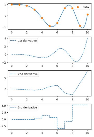
- In this example the cubic spline is used to interpolate a sampled 1D curve. You can see that the spline continuity property holds for the first and second derivatives.
Part 3: Synthetic Sales Dataset
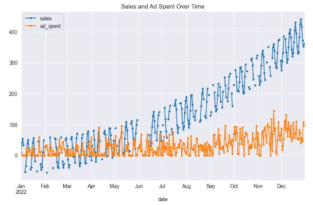
- In this section, we will apply the aforementioned imputation and interpolation approaches to the synthetic sales dataset.
- The dataset comprises daily data spanning one year, featuring two variables: sales and ad_spent. Approximately 25% of the sales data contains missing values, which appear randomly and, in some cases, constitute complete gaps in the data. On the other hand, the ad_spent feature is devoid of any missing values. A notable correlation of about 66% exists between ad_spent and sales.
# Import necessary libraries
import pandas as pd
import numpy as np
from datetime import datetime, timedelta
import random
import matplotlib.pyplot as plt
from sklearn.linear_model import LinearRegression
from statsmodels.tsa.seasonal import STL
from sklearn.impute import KNNImputer
import seaborn as sns

sns.set_style("darkgrid")
# Set the random seed for reproducibility
np.random.seed(0)

# Define the start date
start_date = datetime(2022, 1, 1)

# Generate dates for 365 days
dates = [start_date + timedelta(days=i) for i in range(365)]

# Generate more pronounced trend component (increasing linearly)
trend = np.power(np.linspace(0.1, 20, 365), 2)

# Generate more pronounced seasonal component (sinusoidal pattern) with weekly period
seasonal = 50 * np.sin(np.linspace(0, 2 * np.pi * 52, 365)) # 52 weeks in a year

# Generate random noise
noise = np.random.normal(0, 5, 365)

# Combine components to generate sales data
sales = trend + seasonal + noise

# Create ad_spent feature
# Using a scaled version of sales and adding more noise
ad_spent = 0.2 * sales + np.random.normal(0, 30, 365)  # Increased the noise and decreased the scale factor
ad_spent = np.maximum(ad_spent, 0)  # Making sure all ad_spent values are non-negative

# Create a dataframe
df = pd.DataFrame(
    {
        'date': dates,
        'sales': sales,
        'ad_spent': ad_spent
    }
)

# Set the date as the index
df.set_index('date', inplace=True)

# Generate missing values for a larger gap
for i in range(150, 165):  # A 15-day gap
    df.iloc[i, df.columns.get_loc('sales')] = np.nan

# Randomly choose indices for missing values (not including the already missing gap)
random_indices = random.sample(list(set(range(365)) - set(range(150,165))), int(0.20 * 365))

# Add random missing values
for i in random_indices:
    df.iloc[i, df.columns.get_loc('sales')] = np.nan

# Display the dataframe
display(df.head())

# Print the percentage of missing values
print('% missing data in sales: ', 100*df['sales'].isnull().sum()/len(df))

# Plot the data
df[['sales', 'ad_spent']].plot(style='.-', figsize=(10,6), title='Sales and Ad Spent Over Time')
plt.show()

# Print correlation between sales and ad_spent
print("Correlation between sales and ad_spent: ", df['sales'].corr(df['ad_spent']))

               sales	ad_spent
date
2022-01-01	8.830262	6.593897
2022-01-02	41.116283	2.503652
2022-01-03	53.683909	0.000000
2022-01-04	32.968355	0.000000
2022-01-05	      NaN	0.000000

% missing data in sales:  24.10958904109589
Correlation between sales and ad_spent:  0.6581321364059992
# Create a copy of the dataframe
df_deletion = df.copy()

# Remove rows with missing values
df_deletion.dropna(inplace=True)

# Display the dataframe
display(df_deletion.head())
# plot the data

df_deletion[['sales']].plot(style='.-', figsize=(12, 8), title='Missing Values Deletion ')
plt.show()

- This strategy entails eliminating any rows that contain missing values. Although straightforward to execute, if the missing data isn’t Missing Completely at Random (MCAR), this approach may result in valuable information loss.
- The most common approach to deal with missing data—often used by default by statistical software—is to exclude study subjects with incomplete data for any variable of interest from the analysis. This approach, referred to as deletion or complete case analysis, produces unbiased estimates if the data are MCAR, but it may result in bias when data are MAR or MNAR. The bias and loss of power are minimal when the proportion of missing data is trivial. However, for any nontrivial amount of missing data (say, >5%)―in particular when the MCAR assumption is not plausible―listwise deletion is not recommended.
# Apply the forward fill method
df_imputed = df.fillna(-1)

# Plot the main line with markers
df_imputed['sales'].plot(style='.-', figsize=(12,8), title='Sales with Constant Imputation')

# Add points where data was imputed with red color
plt.scatter(df_imputed[df['sales'].isnull()].index, df_imputed[df['sales'].isnull()]['sales'], color='red')

# Set labels
plt.xlabel('Time')
plt.ylabel('Sales')

plt.show()
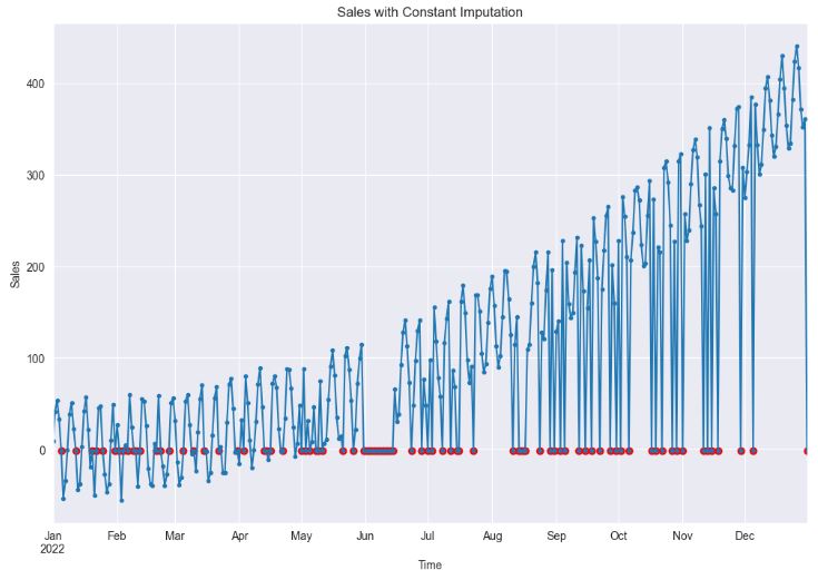
- As we can see, constant imputation can significantly impact statistical analysis and model development by introducing bias and altering the temporal relationships between variables. In this approach, missing values are essentially assumed to be known and equivalent to a constant value.
# Apply the forward fill method
df_imputed = df.fillna(method="ffill")
# Plot the main line with markers
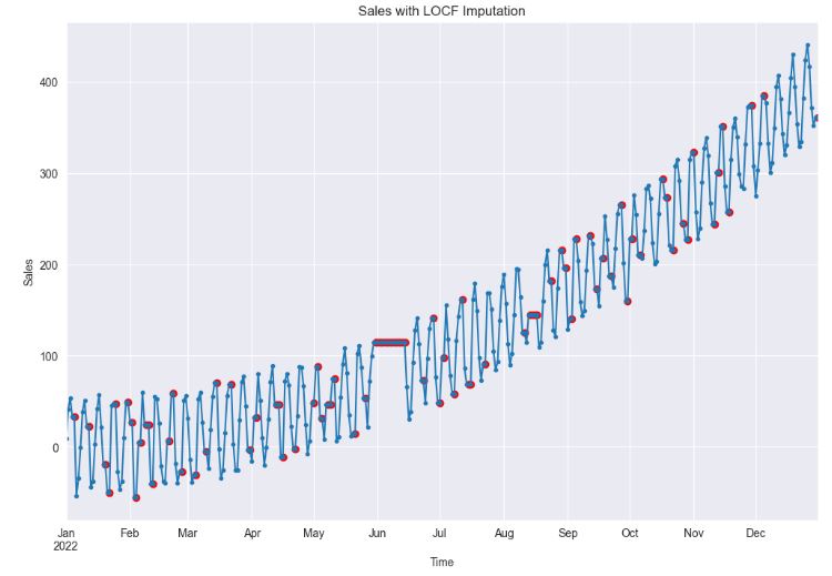
df_imputed['sales'].plot(style='.-', figsize=(12,8), title='Sales with LOCF Imputation')
# Add points where data was imputed with red color
plt.scatter(df_imputed[df['sales'].isnull()].index, df_imputed[df['sales'].isnull()]['sales'], color='red')
# Set labels
plt.xlabel('Time')
plt.ylabel('Sales')
plt.show()
# Apply the backward fill method
df_imputed = df.fillna(method="bfill")

# Plot the main line with markers
df_imputed['sales'].plot(style='.-', figsize=(12,8), title='Sales with NOCB Imputation')

# Add points where data was imputed with red color
plt.scatter(df_imputed[df['sales'].isnull()].index, df_imputed[df['sales'].isnull()]['sales'], color='red')

# Set labels
plt.xlabel('Time')
plt.ylabel('Sales')

plt.show()
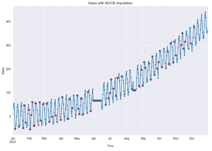
- Clearly, both LOCF (Last Observation Carried Forward) and NOCB (Next Observation Carried Backward) are plausible choices when dealing with random missing values. However, if missing values form continuous gaps, both methods can cause significant distortion in the data, effectively obliterating any temporal dependencies.
# Apply the mean imputation method
df_imputed = df.fillna(df['sales'].mean())

# Plot the main line with markers
df_imputed['sales'].plot(style='.-', figsize=(12,8), title='Sales with Mean Imputation')

# Add points where data was imputed with red color
imputed_indices = df[df['sales'].isnull()].index
plt.scatter(imputed_indices, df_imputed.loc[imputed_indices, 'sales'], color='red')

# Set labels
plt.xlabel('Time')
plt.ylabel('Sales')

plt.show()
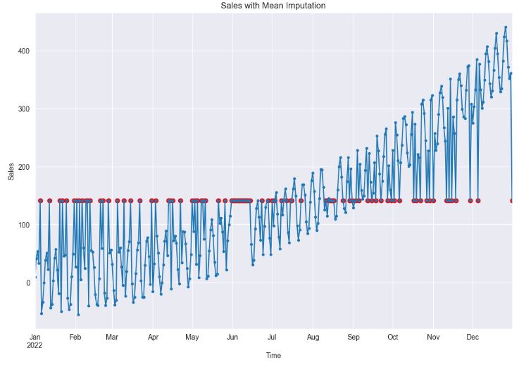
- Clearly, the application of mean imputation significantly distorts the temporal relationships among data points. This is because it fails to account for the time series dependencies inherent in the data, instead, it primarily focuses on the overall mean of the dataset.
# Make a copy of the original DataFrame
df_copy = df.copy()

# Mark the missing values before imputation
imputed_indices = df_copy[df_copy['sales'].isnull()].index


# Apply the rolling mean imputation method
df_copy['sales'] = df_copy['sales'].fillna(df_copy['sales'].rolling(window=4, min_periods=1).mean().shift(1))

# Plot the main line with markers
df_copy['sales'].plot(style='.-', figsize=(12,8), title='Sales with Rolling Mean Imputation')

# Add points where data was imputed with red color
plt.scatter(imputed_indices, df_copy.loc[imputed_indices, 'sales'], color='red')

# Set labels
plt.xlabel('Time')
plt.ylabel('Sales')

plt.show()
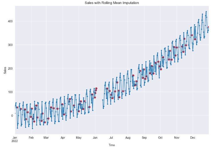
- As we can see, it is important to choose an optimal rolling window size consistent with periodicity of the data. In general, you can use a short rolling window size for data collected in short intervals, and a larger size for data collected in longer intervals. Longer rolling window sizes tend to yield smoother rolling window estimates than shorter sizes.
# Apply the linear interpolation method
df_imputed = df.interpolate(method ='linear', limit_direction ='forward')

# Plot the main line with markers
df_imputed['sales'].plot(style='.-', figsize=(12,8), title='Sales with Linear Interpolation')

# Add points where data was imputed with red color
imputed_indices = df[df['sales'].isnull()].index
plt.scatter(imputed_indices, df_imputed.loc[imputed_indices, 'sales'], color='red')

# Set labels
plt.xlabel('Time')
plt.ylabel('Sales')

plt.show()
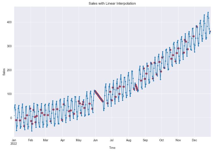
- Using linear interpolation can provide a good estimate for the missing values when the data shows a linear trend, which can help in building a better model. However, if the data does not show a linear trend (cf. sales in June), this method can lead to poor model performance.
# Apply the spline interpolation method
df_imputed = df.interpolate(method='spline', limit_direction='forward', order=2)

# Plot the main line with markers
df_imputed['sales'].plot(style='.-', figsize=(12,8), title='Sales with Spline Interpolation')

# Add points where data was imputed with red color
imputed_indices = df[df['sales'].isnull()].index
plt.scatter(imputed_indices, df_imputed.loc[imputed_indices, 'sales'], color='red')

# Set labels
plt.xlabel('Time')
plt.ylabel('Sales')

plt.show()
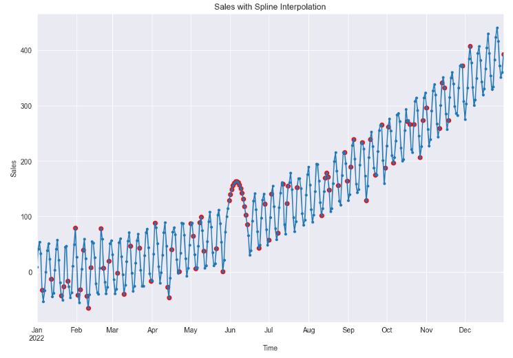
- Spline interpolation can provide a better fit to the data than linear interpolation, which can lead to more accurate models. However, if the data is not smooth, this method can lead to unrealistic estimates and poor model performance.
- As the above plot clearly portrays, the imputation for the missing gap in June seems to be unrealistic.
# Drop missing values to fit the regression model
df_imputed = df.copy()
df_non_missing = df.dropna()

# Instantiate the model
model = LinearRegression()

# Reshape data for model fitting (sklearn requires 2D array for predictors)
X = df_non_missing['ad_spent'].values.reshape(-1, 1)
Y = df_non_missing['sales'].values

# Fit the model
model.fit(X, Y)

# Get indices of missing sales
missing_sales_indices = df_imputed[df_imputed['sales'].isnull()].index

# Predict missing sales values
predicted_sales = model.predict(df_imputed.loc[missing_sales_indices, 'ad_spent'].values.reshape(-1, 1))

# Fill missing sales with predicted values
df_imputed.loc[missing_sales_indices, 'sales'] = predicted_sales

# Plot the main line with markers
df_imputed[['sales']].plot(style='.-', figsize=(12,8), title='Sales with Regression Imputation')

# Add points where data was imputed with red color
plt.scatter(missing_sales_indices, predicted_sales, color='red', label='Regression Imputation')

# Set labels
plt.xlabel('Time')
plt.ylabel('Sales')

plt.show()

- It appears that regression imputation can lead to more accurate models by making use of the relationships between variables. However, it can also lead to an overestimate of the correlation between variables, which can affect the model’s performance.
# Initialize the KNN imputer with k=5
imputer = KNNImputer(n_neighbors=3)

# Apply the KNN imputer
# Note: the KNNImputer requires 2D array-like input, hence the double brackets.
df_imputed = df.copy()
df_imputed[['sales', 'ad_spent']] = imputer.fit_transform(df_imputed[['sales', 'ad_spent']])

# Create a matplotlib plot
plt.figure(figsize=(12,8))
df_imputed['sales'].plot(style='.-', label='Sales')

# Add points where data was imputed
imputed_indices = df[df['sales'].isnull()].index
plt.scatter(imputed_indices, df_imputed.loc[imputed_indices, 'sales'], color='red', label='KNN Imputation')

# Set title and labels
plt.title('Sales with KNN Imputation')
plt.xlabel('Time')
plt.ylabel('Sales')
plt.legend()
plt.show()

- This plot confirms that KNN imputation can introduce bias into the data if the missing data mechanism isn’t random. This is because the KNN algorithm relies on the assumption that similar observations exist in the dataset. If this assumption is violated, the imputed values may be far from the true values, leading to biased estimates in the model-building process.
# Make a copy of the original dataframe
df_copy = df.copy()

# Fill missing values in the time series
imputed_indices = df[df['sales'].isnull()].index
# Apply STL decompostion
stl = STL(df_copy['sales'].interpolate(), seasonal=31)
res = stl.fit()

# Extract the seasonal and trend components
seasonal_component = res.seasonal

# Create the deseasonalised series
df_deseasonalised = df_copy['sales'] - seasonal_component

# Interpolate missing values in the deseasonalised series
df_deseasonalised_imputed = df_deseasonalised.interpolate(method="linear")

# Add the seasonal component back to create the final imputed series
df_imputed = df_deseasonalised_imputed + seasonal_component

# Update the original dataframe with the imputed values
df_copy.loc[imputed_indices, 'sales'] = df_imputed[imputed_indices]

# Plot the series using pandas
plt.figure(figsize=[12, 6])
df_copy['sales'].plot(style='.-',  label='Sales')
plt.scatter(imputed_indices, df_copy.loc[imputed_indices, 'sales'], color='red')

plt.title("Sales with STL Imputation")
plt.ylabel("Sales")
plt.xlabel("Time")
plt.show()
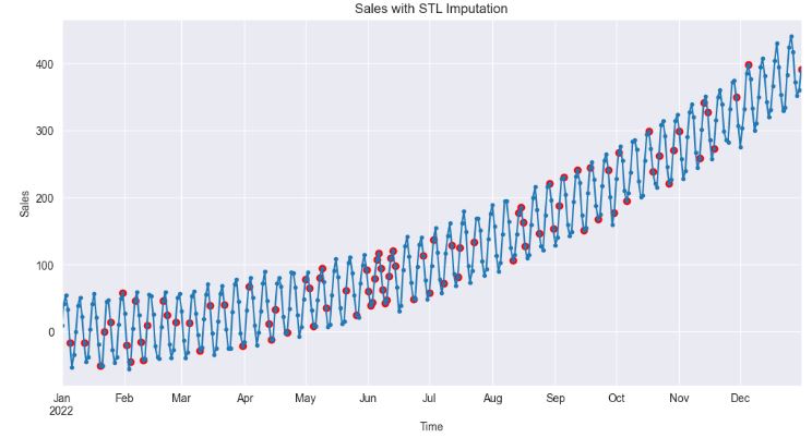
- The above plot shows that STL imputation preserves the overall structure of the time series, particularly its trend and seasonal components. The imputed values are therefore more likely to reflect the actual dynamics of sales.
Summary
- It is common to come across missing values when working with real-world time series data.
- The present study specializes on univariate time series imputation by examining synthetic sales and actual air quality data with missing values.
- We have compared several state-of-the-art imputation and 1D interpolation algorithms for time series missing data.
- Conventional methods such as mean and median imputation, deletion, LOCF/NOCB, nearest neighbor, and other methods are not good enough to handle missing values as those methods can cause bias in the data.
- Estimation or imputation of the missing data with the values produced by some procedures such as linear interpolation, STL and regression can be the best possible solution to minimize the bias effect. This solution is referred to as the Gap Imputing Algorithm (GIA).
- The experimental findings, which were based on both real-world and benchmark datasets, demonstrate that the final GIA framework proposed in this study outperforms standard methods in terms of accuracy.
- Furthermore, the GIA framework is well suited to handling missing gaps with larger distances, and it produces more accurate imputations than rolling mean, spline interpolation and KNN, particularly for datasets with strong periodic patterns and trends.
Explore More
- Kalman-Based Object Tracking with Low Signal/Noise Ratio
- Retail Sales, Store Item Demand Time-Series Analysis/Forecasting: AutoEDA, FB Prophet, SARIMAX & Model Tuning
- 100 Basic Python Codes
- Evaluation of ML Sales Forecasting: tslearn, Random Walk, Holt-Winters, SARIMAX, GARCH, Prophet, and LSTM
- Returns-Volatility Domain K-Means Clustering and LSTM Anomaly Detection of S&P 500 Stocks
- Time Series Forecasting of Hourly U.S.A. Energy Consumption – PJM East Electricity Grid
- Real-Time Anomaly Detection of NAB Ambient Temperature Readings using the TensorFlow/Keras Autoencoder
- Robust Anomaly Detection using the Isolation Forest Algorithm: Financial Transactions vs NYC Taxi Rides
References
- Deep Imputation of Missing Values in Time Series Health Data: A Review with Benchmarking
- 4 Techniques to Handle Missing values in Time Series Data
- Handling Missing Values in Python
- How to deal with missing values?
- 17 Time Series with Missing Data
- DeepFIB: Self-Imputation for Time Series Anomaly Detection
- Mastering Anomaly Detection in Time Series Data: Techniques and Insights
- Imputation-based Time-Series Anomaly Detection with Conditional Weight-Incremental Diffusion Models
- Digging deep into the causes of air pollution in Poland
- Simple techniques for missing data imputation
- Store Sales TS Forecasting – A Comprehensive Guide
- Effective Strategies for Handling Missing Values in Data Analysis
- The Complete Guide to Handling Missing Values in Machine Learning: Strategies, Impact, and Best Practices
Embed Socials


One-Time
Monthly
Yearly
Make a one-time donation
Make a monthly donation
Make a yearly donation
Choose an amount
€5.00
€15.00
€100.00
€5.00
€15.00
€100.00
€5.00
€15.00
€100.00
Or enter a custom amount
€
Your contribution is appreciated.
Your contribution is appreciated.
Your contribution is appreciated.
DonateDonate monthlyDonate yearly
Leave a comment