
- The most frequent natural disaster in the world, flooding affects hundreds of millions of people and kills between 6,000 and 18,000 people annually. Moreover, climatic change has many consequences as surge in frequency of rainfalls potentially enhance the rate of flooding.
- In this environmental science project, we will explore real-time weather data for rainfall forecasting and flood de-risking using Python. The objective is to gain AI-powered insights into various datasets, visualize feature distributions, analyze patterns, apply PCA clustering algorithms, and utilize Markov Chain, Machine Learning (ML) models to predict weather conditions worldwide.
Scope:
- Exploratory Data Analysis (EDA):
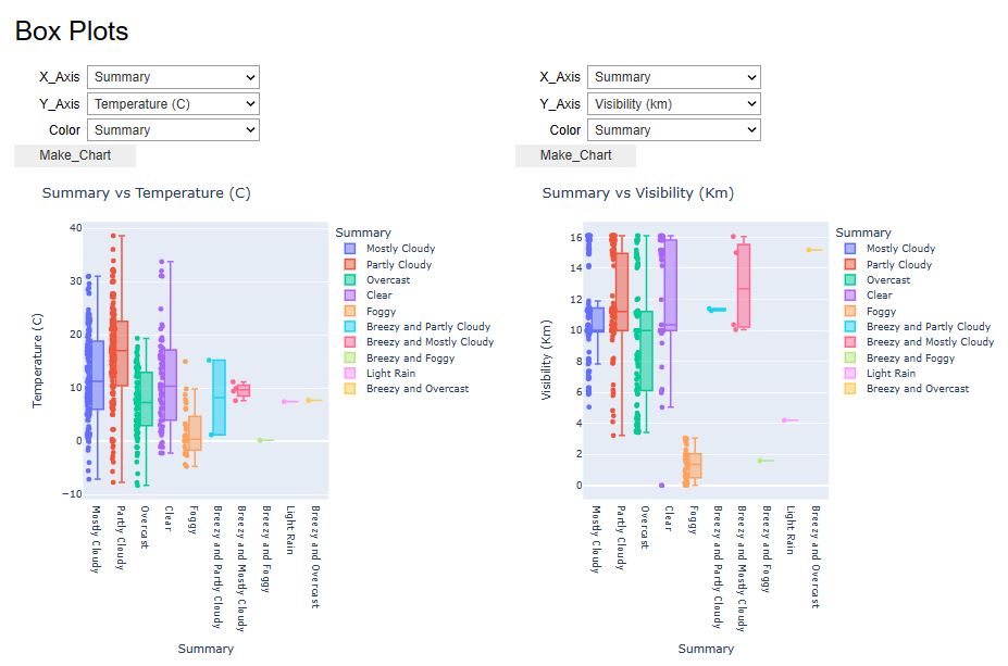
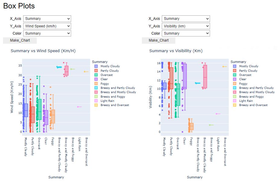
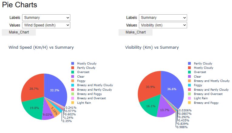
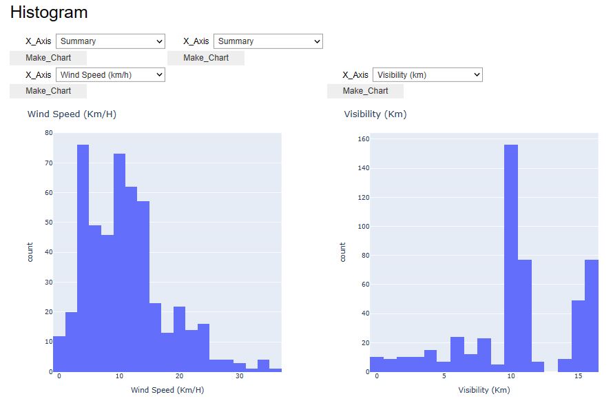
- Use the pywedge library to draw interactive weather EDA plots, Pandas Profiling, and sweetviz HTML reports
- Plotting interactive Plotly maps and K-means clusters of extreme weather conditions (rain, snow, etc.)
- Applying the rasterio-based GIS analysis to retrieve buildings and agricultural plots at risk of flooding.
- Flood Forecasting:
- Forecast weather events using the Markov Chain model
- Train, test and validate several supervised ML binary classification models for rainfall prediction (KNN, LR, SVC, DT, ET, RF, XGB, LGBM, BC, CB, and GNB)
- Complete ML performance validation using using SciKit-Plot and relevant QC metrics.
- Rainfall Impact Assessment:
- Predict and identify the damaged buildings and agricultural plots in the event of a collapsed dyke at a given location.
- Adapt the open-source Python workflow that — given a location — outputs buildings and agricultural plots that would be at risk.
- Perform GIS mapping using 3 datasets throughout the study: a dataset containing a raster of altitude at a resolution of 0.5m (DEM), a dataset with building footprints, and a dataset with agricultural plots. Each dataset is queried from Ellipsis Drive.
- Public Safety – provide early warnings of severe weather conditions.
- Transportation – ensuring safe and efficient transportation.
- Agriculture – make decisions about planting, irrigation, and harvesting crops.
- Energy – plan and manage energy production, helping to ensure a stable supply of energy.
- Planning and Emergency Response – planning for and responding to natural disasters.
Table of Contents
- U.S.A. Weather Forecast
- Australian Rainfall Prediction
- Kerala Flood Prediction
- Rainfall Impact Assessment
- Conclusions
- Explore More
U.S.A. Weather Forecast
- Let’s begin with the pywedge dashboard EDA using the representative weather analysis dataset.
- Setting working directory
import os
os.chdir('YOURPATH')    # Set working directory
os. getcwd()
- Importing Python libraries and reading the input dataset
import pywedge as pw
import pandas as pd
import numpy as np
import matplotlib.pyplot as plt
import seaborn as sns
import warnings
warnings.filterwarnings('ignore')
df_weather= pd.read_csv("weatherHistory.csv")
- Installing the pywedge library to draw interactive weather EDA plots
from IPython.display import display, HTML
display(HTML("<style>.container { width:100% !important; }</style>"))
x=pw.Pywedge_Charts(df_weather,c=None,y="Humidity")
charts=x.make_charts()


- Let’s look at the U.S.A. Weather Events – a countrywide dataset of 8.6 million weather events (2016 – 2022).
- This repository contains a comprehensive collection of weather events data across 49 states in the United States. The dataset comprises a staggering 8.6 million events, ranging from regular occurrences like rain and snow to extreme weather phenomena such as storms and freezing conditions. The data spans from January 2016 to December 2022 and is sourced from 2,071 airport-based weather stations nationwide. For more detailed information about the dataset, refer to the official dataset page.
- Based on the recent case study, our objective is to implement ML clustering and Markov chain prediction models, followed by the Plotly geospatial or GIS EDA.
- Importing libraries and reading the input dataset
import warnings
warnings.filterwarnings('ignore')
import pandas as pd
import numpy as np

import seaborn as sns
from matplotlib import pyplot as plt
import plotly.graph_objects as go
import plotly.express as px
from plotly.subplots import make_subplots
import folium

from sklearn.neighbors import NearestNeighbors
from sklearn.decomposition import PCA
from hmmlearn import hmm
df = pd.read_csv('WeatherEvents_Jan2016-Dec2022.csv')
datetimeFormat = '%Y-%m-%d %H:%M:%S'
df['End']=pd.to_datetime(df['EndTime(UTC)'], format=datetimeFormat)
df['Start']=pd.to_datetime(df['StartTime(UTC)'], format=datetimeFormat)
df['Duration']=df['End']-df['Start']
df['Duration'] = df['Duration'].dt.total_seconds()
df['Duration'] = df['Duration']/(60*60) #in hours
df = df[(df['Duration']< 30*24) & (df['Duration'] != 0)] #remove obvious wrong data
df.tail(3)

print("Overall Duration Summary")
print("--Count", df['Duration'].size)
print("--%miss.", sum(df['Duration'].isnull()))
print("--card.",df['Duration'].unique().size)
print("--min",df['Duration'].min())
print("--lowerBoundary.",df['Duration'].median()-1.5*((df['Duration'].quantile(0.75))-df['Duration'].quantile(0.25)))
print("--1stQrt",df['Duration'].quantile(0.25))
print("--mean",df['Duration'].mean())
print("--median",df['Duration'].median())
print("--3rdQrt",df['Duration'].quantile(0.75))
print("--upperBoundary.",df['Duration'].median()+1.5*((df['Duration'].quantile(0.75))-df['Duration'].quantile(0.25)))
print("--95%Boundary.",df['Duration'].mean()+1.96*df['Duration'].std())
print("--max",df['Duration'].max())
print("--Std.Dev",df['Duration'].std())
Overall Duration Summary
--Count 8626786
--%miss. 0
--card. 4438
--min 0.016666666666666666
--lowerBoundary. -0.7333333333333333
--1stQrt 0.3333333333333333
--mean 1.320261560910402
--median 0.6666666666666666
--3rdQrt 1.2666666666666666
--upperBoundary. 2.0666666666666664
--95%Boundary. 10.193099925509753
--max 718.6666666666666
--Std.Dev 4.526958349285382
df = df[(df['Duration']< 10)]
df['Duration'].size
8530606
- Intermediate data preparation steps (sorting, normalization, etc.)
df2 = df.groupby(['AirportCode','City','State',
                  'LocationLat', 'LocationLng','Type']).agg({'Duration':['sum']}).reset_index()
df2.columns=pd.MultiIndex.from_tuples((("AirportCode", " "),("City", " "),
                                       ("State", " "), ("LocationLat", " "),
                                       ("LocationLng", " "), ("Type", " "), ("Duration", " ")))
df2.columns = df2.columns.get_level_values(0)
df2['Duration'] = df2['Duration']/(24*4*3.65) #yearly percentage
df2 = df2.sort_values(by='Duration')

df_flat = df2.pivot(index='AirportCode', columns='Type', values=['Duration']).reset_index().fillna(0)
df_flat.columns=pd.MultiIndex.from_tuples(((' ', 'AirportCode'),(' ', 'Cold'),(' ', 'Fog'),
            (' ',  'Hail'),(' ', 'Precipitation'),(' ', 'Rain'),(' ', 'Snow'),(' ', 'Storm')))
df_flat.columns = df_flat.columns.get_level_values(1)
#df_flat().tail(3)
uniqueKey = df2[['AirportCode', 'City',
                 'State', 'LocationLat', 'LocationLng']].sort_values(by='AirportCode').drop_duplicates()
weather = pd.merge(df_flat, uniqueKey, how='inner', on='AirportCode')
#weather.tail(3)
- Plotting the National Wide Weather Events Duration – mean of duration % per year vs Type
fig_sum = px.histogram(df2, x='Type', y= 'Duration',  histfunc = 'avg',
                      title = 'National Wide Weather Events Duration')
fig_sum.update_xaxes(categoryorder='mean descending')
fig_sum.update_yaxes(title_text='mean of duration% per year')
fig_sum.update_layout(height=750, width=1000)
fig_sum.update_layout(
    font=dict(
        family="Courier New, monospace",
        size=18,  # Set the font size here
        color="RebeccaPurple"
    )
)
fig_sum.show()

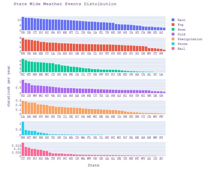
- Plotting the State Wide Weather Events Distribution – duration % per year vs state
fig_state=make_subplots(rows=7, cols=1, shared_yaxes=False, vertical_spacing=0.05)

fig_state.add_trace(go.Histogram(x=weather['State'], y=weather['Rain'], name='Rain', histfunc ='avg'),1,1)
fig_state.add_trace(go.Histogram(x=weather['State'], y=weather['Fog'], name='Fog', histfunc ='avg'),2,1)
fig_state.add_trace(go.Histogram(x=weather['State'], y=weather['Snow'], name='Snow', histfunc ='avg'),3,1)
fig_state.add_trace(go.Histogram(x=weather['State'], y=weather['Cold'], name='Cold', histfunc ='avg'),4,1)
fig_state.add_trace(go.Histogram(x=weather['State'], y=weather['Precipitation'], name='Precipitation', histfunc ='avg'),5,1)
fig_state.add_trace(go.Histogram(x=weather['State'], y=weather['Storm'], name='Storm', histfunc ='avg'),6,1)
fig_state.add_trace(go.Histogram(x=weather['State'], y=weather['Hail'], name='Hail', histfunc ='avg'),7,1)

fig_state['layout']['xaxis7'].update(title="State")
fig_state['layout']['yaxis4'].update(title="duration% per year")
fig_state.update_xaxes(categoryorder='mean descending')
fig_state.update_layout( title_text="State Wide Weather Events Distribution")
fig_state.update_layout(
    autosize=False,
    width=900,
    height=800,
    font=dict(
        family="Courier New, monospace",
        size=14,  # Set the font size here
        color="RebeccaPurple"
    ))
fig_state.show()
- Plotting U.S.A. cities involved in this study
fig_city = px.scatter_geo(weather, lat='LocationLat', lon='LocationLng',
                      hover_name=weather['City'] + ', ' + weather['State'],
                      scope="usa",
                      title ='U.S.A. Cities Involved')
fig_city.update_layout(height=750, width=1000)
fig_city.update_layout(
    font=dict(
        family="Courier New, monospace",
        size=18,  # Set the font size here
        color="RebeccaPurple"
    )
)
fig_city.show()

- Plotting City Wide Rainy Days Percentage 2016-2019
fig_rain = px.scatter_geo(weather, lat='LocationLat', lon='LocationLng',
                      color="Rain",
                      hover_name=weather['City'] + ', ' + weather['State'],
                      color_continuous_scale='dense',
                      range_color = [0,16],
                      scope="usa",
                      title ='City Wide Rainy Days Percentage 2016-2019')
fig_rain.update_layout(height=750, width=1000)
fig_rain.update_layout(
    font=dict(
        family="Courier New, monospace",
        size=18,  # Set the font size here
        color="RebeccaPurple"
    )
)
fig_rain.show()

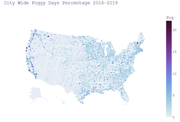
- Plotting City Wide Foggy Days Percentage 2016-2019
fig_fog = px.scatter_geo(weather, lat='LocationLat', lon='LocationLng',
                      color="Fog",
                      hover_name=weather['City'] + ', ' + weather['State'],
                      color_continuous_scale='dense',
                      #range_color = [0,16],
                      scope="usa",
                      title ='City Wide Foggy Days Percentage 2016-2019')
fig_fog.update_layout(height=750, width=1000)
fig_fog.update_layout(
    font=dict(
        family="Courier New, monospace",
        size=18,  # Set the font size here
        color="RebeccaPurple"
    )
)
fig_fog.show()
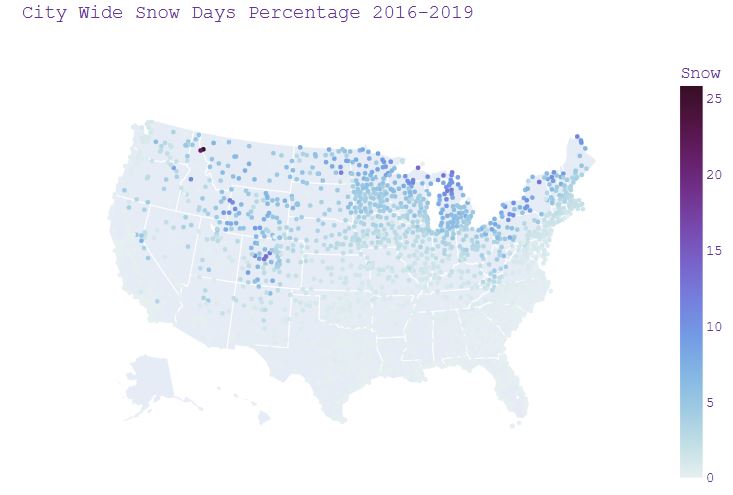
- Plotting City Wide Snow Days Percentage 2016-2019
fig_snow = px.scatter_geo(weather, lat='LocationLat', lon='LocationLng',
                      color="Snow",
                      #size="Snow",
                      hover_name=weather['City'] + ', ' + weather['State'],
                      color_continuous_scale='dense',
                      #range_color = [0,16],
                      scope="usa",
                      title ='City Wide Snow Days Percentage 2016-2019')
fig_snow.update_layout(height=750, width=1000)
fig_snow.update_layout(
    font=dict(
        family="Courier New, monospace",
        size=18,  # Set the font size here
        color="RebeccaPurple"
    )
)
fig_snow.show()
- Plotting City Wide Cold Days Percentage 2016-2019
fig_cold = px.scatter_geo(weather, lat='LocationLat', lon='LocationLng',
                      color="Cold",
                      #size="Snow",
                      hover_name=weather['City'] + ', ' + weather['State'],
                      color_continuous_scale='dense',
                      #range_color = [0,16],
                      scope="usa",
                      title ='City Wide Cold Days Percentage 2016-2019')
fig_cold.update_layout(height=750, width=1000)
fig_cold.update_layout(
    font=dict(
        family="Courier New, monospace",
        size=18,  # Set the font size here
        color="RebeccaPurple"
    )
)
fig_cold.show()

- Implementing K-means clustering
#K means clustering
X = df_flat.drop(['AirportCode','Cold', 'Hail'], axis=1)
#X.tail(3)
from sklearn.cluster import KMeans
kmeans = KMeans(n_clusters=4, random_state=0).fit(X)

df_flat['Cluster'] = (kmeans.labels_).astype(str)
df_cluster = pd.merge(df_flat[['AirportCode','Cluster']], weather.drop(['Cold','Hail'], axis=1),
                      how='inner', on='AirportCode')
#df_cluster.tail(3)
- Plotting the City Wide Weather Cluster Distribution
fig_cluster = px.scatter_geo(df_cluster, lat='LocationLat', lon='LocationLng',
                      hover_name=weather['City'] + ', ' + weather['State'],
                      scope="usa",
                      color_discrete_sequence =['#AB63FA', '#EF553B', '#00CC96','#636EFA'],
                      color = 'Cluster',
                      title ='City Wide Weather Cluster Distribution')
fig_cluster.update_layout(height=750, width=1000)
fig_cluster.update_layout(
    font=dict(
        family="Courier New, monospace",
        size=18,  # Set the font size here
        color="RebeccaPurple"
    )
)
fig_cluster.show()

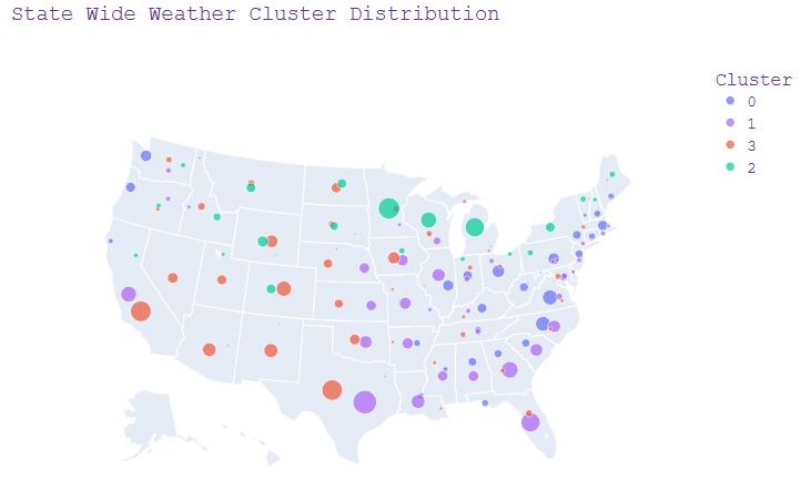
- Plotting the State Wide Weather Cluster Distribution
df_cluster2 = df_cluster.groupby(['State','Cluster']).agg({'Cluster':['count']}).reset_index()
df_cluster2.columns=pd.MultiIndex.from_tuples((("State", " "),("Cluster", " "),("Count", " ")))
df_cluster2.columns = df_cluster2.columns.get_level_values(0)
#df_cluster2.tail(3) #state with each cluster counts

df_loc = df_cluster[['State','Cluster','LocationLat', 'LocationLng']]
df_loc1 = df_loc.groupby(['State','Cluster']).agg({'LocationLat':'mean'}).reset_index()
df_loc2 = df_loc.groupby(['State','Cluster']).agg({'LocationLng':'mean'}).reset_index()
df_loc3 = pd.merge(df_loc1,df_loc2, how='inner', on=['State','Cluster'])
#df_loc3.tail(3) #state with cluster and location

df_clusterS = pd.merge(df_loc3,df_cluster2, how='inner', on=['State','Cluster'])
df_clusterS.tail(3) #state with each cluster count location
fig_clusterS = px.scatter_geo(df_clusterS, lat='LocationLat', lon='LocationLng',
                     color='Cluster',
                     size='Count',
                     color_discrete_sequence=['#636EFA', '#AB63FA', '#EF553B','#00CC96'],
                     hover_name='State',
                     scope="usa",
                     title = 'State Wide Weather Cluster Distribution')
fig_clusterS.update_layout(height=750, width=1000)
fig_clusterS.update_layout(
    font=dict(
        family="Courier New, monospace",
        size=18,  # Set the font size here
        color="RebeccaPurple"
    )
)
fig_clusterS.show()
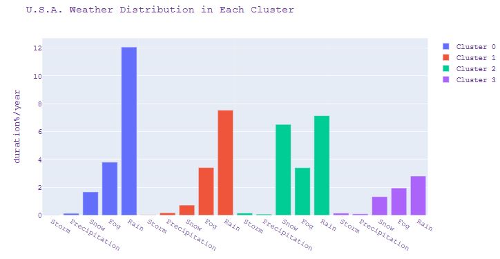
- Plotting the U.S.A. Weather Distribution in Each Cluster
prop = df_cluster[['Cluster', 'Fog',
                   'Precipitation','Rain', 'Snow', 'Storm']].groupby(['Cluster']).mean().reset_index()
prop2 = prop.transpose().reset_index()
prop2 = prop2[(prop2['index'] !='Cluster')].sort_values(by=0)
#prop2
fig_prop=make_subplots(rows=1, cols=4, shared_yaxes=True,horizontal_spacing=0)

fig_prop.add_trace(go.Bar(x=prop2['index'], y=prop2[0], name='Cluster 0'), row=1, col=1)
fig_prop.add_trace(go.Bar(x=prop2['index'], y=prop2[1], name='Cluster 1'), row=1, col=2)
fig_prop.add_trace(go.Bar(x=prop2['index'], y=prop2[2], name='Cluster 2'), row=1, col=3)
fig_prop.add_trace(go.Bar(x=prop2['index'], y=prop2[3], name='Cluster 3'), row=1, col=4)

fig_prop.update_yaxes(title_text="duration%/year", row=1, col=1)
fig_prop.update_layout(title_text="U.S.A. Weather Distribution in Each Cluster")
#fig_prop.update_layout(height=550, width=1000)
fig_prop.update_layout(
    font=dict(
        family="Courier New, monospace",
        size=14,  # Set the font size here
        color="RebeccaPurple"
    )
)
fig_prop.show()
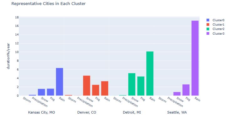
- Plotting the Representative Cities in Each Cluster
df3 = weather[(weather['City']=='Seattle')| (weather['City']=='Detroit')|(weather['City']== 'Kansas City')|(weather['City']== 'Denver')]
#df3
df4 = df3[['Storm', 'Precipitation','Snow', 'Fog','Rain', 'City']].groupby(['City']).mean().reset_index()
df4 = df4.transpose().reset_index()
df4.columns = df4.iloc[0]
df4 = df4[(df4['City'] !='City')]
#df4
fig_city=make_subplots(rows=1, cols=4, shared_yaxes=True,horizontal_spacing=0)

fig_city.add_trace(go.Bar(x=df4['City'], y=df4['Kansas City'], name='Cluster0'), row=1, col=1)
fig_city.add_trace(go.Bar(x=df4['City'], y=df4['Denver'], name='Cluster1'), row=1, col=2)
fig_city.add_trace(go.Bar(x=df4['City'], y=df4['Detroit'], name='Cluster2'), row=1, col=3)
fig_city.add_trace(go.Bar(x=df4['City'], y=df4['Seattle'], name='Cluster3'), row=1, col=4)

fig_city['layout']['xaxis1'].update(title="Kansas City, MO")
fig_city['layout']['xaxis2'].update(title="Denver, CO")
fig_city['layout']['xaxis3'].update(title="Detroit, MI")
fig_city['layout']['xaxis4'].update(title="Seattle, WA")
fig_city.update_yaxes(title_text="duration%/year", row=1, col=1)
fig_city.update_layout(title_text="Representative Cities in Each Cluster")
#fig_city.update_layout(height=550, width=1000)
fig_prop.update_layout(
    font=dict(
        family="Courier New, monospace",
        size=14,  # Set the font size here
        color="RebeccaPurple"
    )
)
fig_city.show()
- Implementing PCA and plotting Explained VAR% vs 3 PCA Components with Mapped Clusters
pca = PCA().fit(X)
pcaX = pca.transform(X)
c0 = []
c1 = []
c2 = []
c3 = []

for i in range(len(pcaX)):
    if kmeans.labels_[i] == 0:
        c0.append(pcaX[i])
    if kmeans.labels_[i] == 1:
        c1.append(pcaX[i])
    if kmeans.labels_[i] == 2:
        c2.append(pcaX[i])
    if kmeans.labels_[i] == 3:
        c3.append(pcaX[i])
c0 = np.array(c0)
c1 = np.array(c1)
c2 = np.array(c2)
c3 = np.array(c3)

fig_pca = make_subplots(rows=1, cols=2, column_widths=[0.3, 0.7], specs=[[{'type':'domain'}, {'type': 'mesh3d'}]])

fig_pca.add_trace(go.Pie(values = pca.explained_variance_ratio_), row=1, col=1)

fig_pca.add_trace(go.Scatter3d(x=c0[:,0], y=c0[:,1], z=c0[:,2],
                               mode='markers', name='Cluster0'),  row=1, col=2)
fig_pca.add_trace(go.Scatter3d(x=c1[:,0], y=c1[:,1], z=c1[:,2],
                               mode='markers', name='Cluster1'),  row=1, col=2)
fig_pca.add_trace(go.Scatter3d(x=c2[:,0], y=c2[:,1], z=c2[:,2],
                               mode='markers', name='Cluster2'),  row=1, col=2)
fig_pca.add_trace(go.Scatter3d(x=c3[:,0], y=c3[:,1], z=c3[:,2],
                               mode='markers', name='Cluster3'),  row=1, col=2)

fig_pca.update_layout(height=750, width=1000, title_text=
          "Explained VAR%(Left) & 3 PCA Components with Mapped Clusters(Right)")

fig_pca.update_layout(
    font=dict(
        family="Courier New, monospace",
        size=14,  # Set the font size here
        color="RebeccaPurple"
    )
)

fig_pca.show()

- Forecast Atlanta’s weather events – focus on the largest airport : Hartsfield-Jackson Atlanta International Airport.
atlanta = df[(df['City']== 'Atlanta')]
print(atlanta['LocationLat'].unique())
print(atlanta['LocationLng'].unique())

[33.6301 33.8784 33.7776]
[-84.4418 -84.298  -84.5246]

import folium
m = folium.Map(location=[33.755238, -84.388115])
folium.Marker(
    location=[33.6301, -84.4418],
).add_to(m)
folium.Marker(
    location=[33.8784, -84.298],
).add_to(m)
folium.Marker(
    location=[33.7776, -84.5246],
).add_to(m)
m

atlanta = atlanta[(atlanta['LocationLng']== -84.4418)]

atlanta_m = atlanta.loc[(atlanta['Start'].dt.month==12) | (atlanta['Start'].dt.month==11)| (atlanta['Start'].dt.month==1)]
atlanta_m = atlanta_m.loc[(atlanta_m['Type']!='Hail')&(atlanta_m['Type']!='Precipitation')]
print(atlanta_m['Type'].unique())
print(atlanta_m['Severity'].unique())
print(atlanta_m['Type'].count())

['Rain' 'Fog' 'Snow']
['Light' 'Moderate' 'Severe' 'Heavy']
1092

# last 5 events were selected as a test dataset
X2 = atlanta_m[['Type', 'Severity']]
X2_test = X2.tail(5)
X2_train = X2.head(675)
print(X2_train.tail())
print(X2_test)
print(X2['Severity'].describe())

         Type  Severity
5479468  Rain  Moderate
5479471   Fog    Severe
5479472   Fog    Severe
5479473  Rain     Light
5479474   Fog    Severe
         Type Severity
5481297  Rain    Light
5481298  Snow    Light
5481299  Snow    Light
5481300  Rain    Light
5481301  Rain    Light
count      1092
unique        4
top       Light
freq        682
Name: Severity, dtype: object

Type = {'Rain':0, 'Fog':1, 'Snow':2}
X2.Type = [Type[item] for item in X2.Type]

Severity = {'Light':0, 'Moderate':1, 'Severe':2, 'Heavy':2}
X2.Severity = [Severity[item] for item in X2.Severity]
X2_test = X2.tail(5)
X2_train = X2.head(675)
print(X2_train.tail())
print(X2_test)

        Type  Severity
5479468     0         1
5479471     1         2
5479472     1         2
5479473     0         0
5479474     1         2
         Type  Severity
5481297     0         0
5481298     2         0
5481299     2         0
5481300     0         0
5481301     0         0
- Forecast weather events using the Markov Chain model – only events from month Nov, Dec and Jan were considered
def transition_matrix(transitions):
    n = 1+ max(transitions) #number of states

    M = [[0]*n for _ in range(n)]

    for (i,j) in zip(transitions,transitions[1:]):
        M[i][j] += 1

    #now convert to probabilities:
    for row in M:
        s = sum(row)
        if s > 0:
            row[:] = [f/s for f in row]
    return M

#test:
t = list(X2_train.Type)
m = transition_matrix(t)
for row in m: print(' '.join('{0:.2f}'.format(x) for x in row))

0.89 0.10 0.02
0.59 0.39 0.02
0.33 0.07 0.60
# The statespace
states = ["Rain","Fog","Snow"]

# Possible sequences of events
transitionName = [["RR","RF","RS"],["FR","FF","FS"],["SR","SF","SS"]]

# Probabilities matrix (transition matrix)
transitionMatrix = [[0.89,0.10,0.02],[0.59,0.39,0.02],[0.33,0.07,0.60]]

# A function that implements the Markov model to forecast the state.
def activity_forecast(days):
    # Choose the starting state
    activityToday = "Fog"
    print("Start state: " + activityToday)
    # Shall store the sequence of states taken. So, this only has the starting state for now.
    activityList = [activityToday]
    i = 0
    # To calculate the probability of the activityList
    prob = 1
    while i != days:
        if activityToday == "Rain":
            change = np.random.choice(transitionName[0],replace=True,p=transitionMatrix[0])
            if change == "RR":
                prob = prob * 0.89
                activityList.append("Rain")
                pass
            elif change == "RF":
                prob = prob * 0.1
                activityToday = "Fog"
                activityList.append("Fog")
            else:
                prob = prob * 0.02
                activityToday = "Snow"
                activityList.append("Snow")
        elif activityToday == "Fog":
            change = np.random.choice(transitionName[1],replace=True,p=transitionMatrix[1])
            if change == "FR":
                prob = prob * 0.59
                activityList.append("Rain")
                pass
            elif change == "FF":
                prob = prob * 0.39
                activityToday = "Fog"
                activityList.append("Fog")
            else:
                prob = prob * 0.02
                activityToday = "Snow"
                activityList.append("Snow")
        elif activityToday == "Snow":
            change = np.random.choice(transitionName[2],replace=True,p=transitionMatrix[2])
            if change == "SR":
                prob = prob * 0.33
                activityList.append("Rain")
                pass
            elif change == "SF":
                prob = prob * 0.07
                activityToday = "Fog"
                activityList.append("Fog")
            else:
                prob = prob * 0.6
                activityToday = "Snow"
                activityList.append("Snow")
        i += 1
    print("Possible states: " + str(activityList))
    print("Probability of the possible sequence of states: " + str(prob))

# Function that forecasts the possible state for the next 4 events
activity_forecast(4)
print('Actual sequence of states: Rain, Fog, Rain, Rain, Rain')

Start state: Fog
Possible states: ['Fog', 'Rain', 'Rain', 'Rain', 'Fog']
Probability of the possible sequence of states: 0.08009780999999999
Actual sequence of states: Rain, Fog, Rain, Rain, Rain

# 2/5 accuracy with 0.08 probability
activity_forecast(4)
print('Actual sequence of states: Rain, Fog, Rain, Rain, Rain')
Start state: Fog
Possible states: ['Fog', 'Rain', 'Fog', 'Rain', 'Fog']
Probability of the possible sequence of states: 0.05294601
Actual sequence of states: Rain, Fog, Rain, Rain, Rain

# 1/5 accuracy with 0.05 probability
- Read more here.
Australian Rainfall Prediction
- Our next goal is to predict the next-day rain in Australia by training classification models on the target variable RainTomorrow.
- Method: We will implement and evaluate 10 supervised ML algorithms (ExtraTreesClassifier, GaussianNB, KNeighborsClassifier, BaggingClassifier, AdaBoostClassifier, XGBClassifier, CatBoostClassifier, LGBMClassifier, RandomForestClassifier, and LogisticRegression).
- We modify the open-source Python code. The corresponding workflow consists of the following steps: data exploration, handling data imbalance, imputation and transformation, correlation matrix, dominant feature selection, ML model training, testing, cross-validation, and final comparisons.
- The dataset contains about 10 years of daily weather observations from numerous Australian weather stations.
- Setting the working directory YOURPATH and reading the input dataset
import os
os.chdir('YOURPATH')    # Set working directory
os. getcwd()

import pandas as pd
df = pd.read_csv('weatherAUS.csv')
df.head()
- Creating the Pandas Profiling (PP) HTML Report
from pandas_profiling import ProfileReport
profile = ProfileReport(df, title='Pandas Profile Flooding Report', html={'style':{'full_width':True}})
profile.to_file(output_file='australia_report.html')
- PP Overview

- PP Alerts
Date has a high cardinality: 3436 distinct values High cardinality
MinTemp is highly overall correlated with MaxTemp and 3 other fields High correlation
MaxTemp is highly overall correlated with MinTemp and 3 other fields High correlation
Evaporation is highly overall correlated with MinTemp and 4 other fields High correlation
Sunshine is highly overall correlated with Humidity9am and 4 other fields High correlation
WindGustSpeed is highly overall correlated with WindSpeed9am and 1 other fields High correlation
WindSpeed9am is highly overall correlated with WindGustSpeed High correlation
WindSpeed3pm is highly overall correlated with WindGustSpeed High correlation
Humidity9am is highly overall correlated with Evaporation and 2 other fields High correlation
Humidity3pm is highly overall correlated with Sunshine and 4 other fields High correlation
Pressure9am is highly overall correlated with Pressure3pm High correlation
Pressure3pm is highly overall correlated with Pressure9am High correlation
Cloud9am is highly overall correlated with Sunshine and 2 other fields High correlation
Cloud3pm is highly overall correlated with Sunshine and 2 other fields High correlation
Temp9am is highly overall correlated with MinTemp and 3 other fields High correlation
Temp3pm is highly overall correlated with MinTemp and 5 other fields High correlation
MinTemp has 1485 (1.0%) missing values Missing
Rainfall has 3261 (2.2%) missing values Missing
Evaporation has 62790 (43.2%) missing values Missing
Sunshine has 69835 (48.0%) missing values Missing
WindGustDir has 10326 (7.1%) missing values Missing
WindGustSpeed has 10263 (7.1%) missing values Missing
WindDir9am has 10566 (7.3%) missing values Missing
WindDir3pm has 4228 (2.9%) missing values Missing
WindSpeed9am has 1767 (1.2%) missing values Missing
WindSpeed3pm has 3062 (2.1%) missing values Missing
Humidity9am has 2654 (1.8%) missing values Missing
Humidity3pm has 4507 (3.1%) missing values Missing
Pressure9am has 15065 (10.4%) missing values Missing
Pressure3pm has 15028 (10.3%) missing values Missing
Cloud9am has 55888 (38.4%) missing values Missing
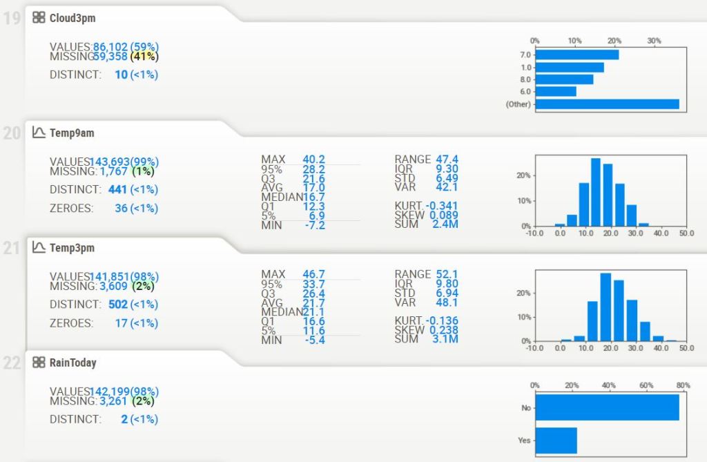
Cloud3pm has 59358 (40.8%) missing values Missing
Temp9am has 1767 (1.2%) missing values Missing
Temp3pm has 3609 (2.5%) missing values Missing
RainToday has 3261 (2.2%) missing values Missing
RainTomorrow has 3267 (2.2%) missing values Missing
Rainfall has 91080 (62.6%) zeros Zeros
Sunshine has 2359 (1.6%) zeros Zeros
WindSpeed9am has 8745 (6.0%) zeros Zeros
Cloud9am has 8642 (5.9%) zeros Zeros
Cloud3pm has 4974 (3.4%) zeros Zeros
- Variables
- PP Interactions

- Correlations

- PP Missing values
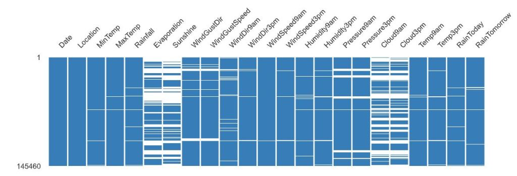
- The correlation heatmap measures nullity correlation: how strongly the presence or absence of one variable affects the presence of another.
- Creating the sweetviz HTML report
# importing sweetviz
import sweetviz as sv
#analyzing the dataset
advert_report = sv.analyze(df)
#display the report
advert_report.show_html('Australia_swetviz_report.html')

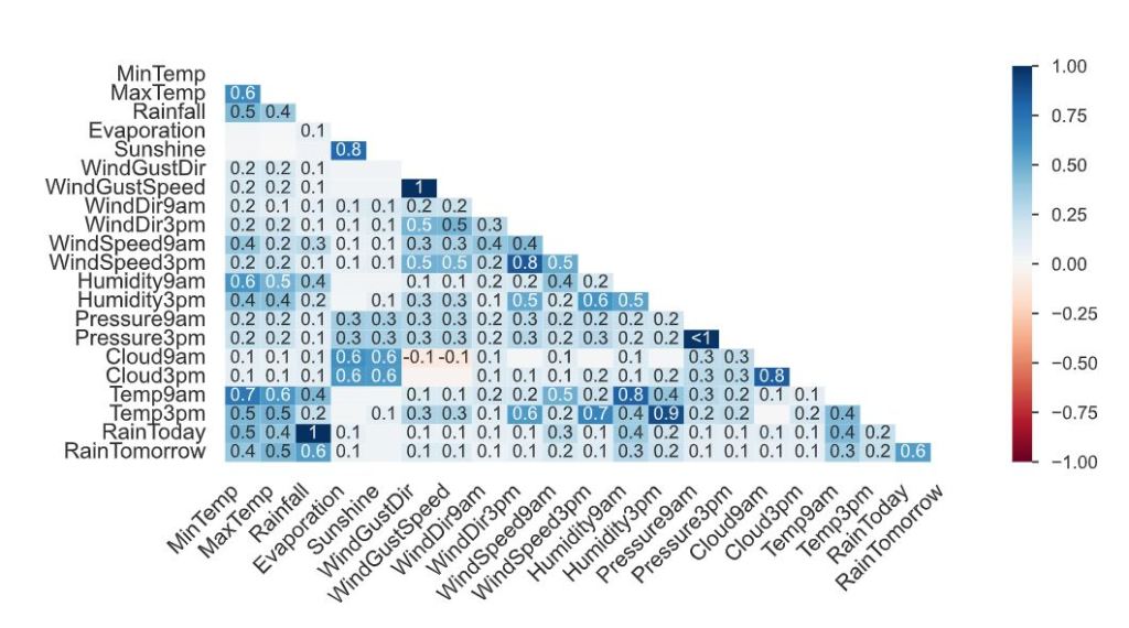
- Associations

- Squares are categorical associations (uncertainty coefficient & correlation ratio) from 0 to 1. The uncertainty coefficient is asymmetrical, (i.e. ROW LABEL values indicate how much they PROVIDE INFORMATION to each LABEL at the TOP).
- Circles are the symmetrical numerical correlations (Pearson’s) from -1 to 1. The trivial diagonal is intentionally left blank for clarity.
- Getting general information about the dataset
df.shape
(145460, 23)
df.info()

<class 'pandas.core.frame.DataFrame'>
RangeIndex: 145460 entries, 0 to 145459
Data columns (total 23 columns):
 #   Column         Non-Null Count   Dtype
---  ------         --------------   -----
 0   Date           145460 non-null  object
 1   Location       145460 non-null  object
 2   MinTemp        143975 non-null  float64
 3   MaxTemp        144199 non-null  float64
 4   Rainfall       142199 non-null  float64
 5   Evaporation    82670 non-null   float64
 6   Sunshine       75625 non-null   float64
 7   WindGustDir    135134 non-null  object
 8   WindGustSpeed  135197 non-null  float64
 9   WindDir9am     134894 non-null  object
 10  WindDir3pm     141232 non-null  object
 11  WindSpeed9am   143693 non-null  float64
 12  WindSpeed3pm   142398 non-null  float64
 13  Humidity9am    142806 non-null  float64
 14  Humidity3pm    140953 non-null  float64
 15  Pressure9am    130395 non-null  float64
 16  Pressure3pm    130432 non-null  float64
 17  Cloud9am       89572 non-null   float64
 18  Cloud3pm       86102 non-null   float64
 19  Temp9am        143693 non-null  float64
 20  Temp3pm        141851 non-null  float64
 21  RainToday      142199 non-null  object
 22  RainTomorrow   142193 non-null  object
dtypes: float64(16), object(7)
memory usage: 25.5+ MB
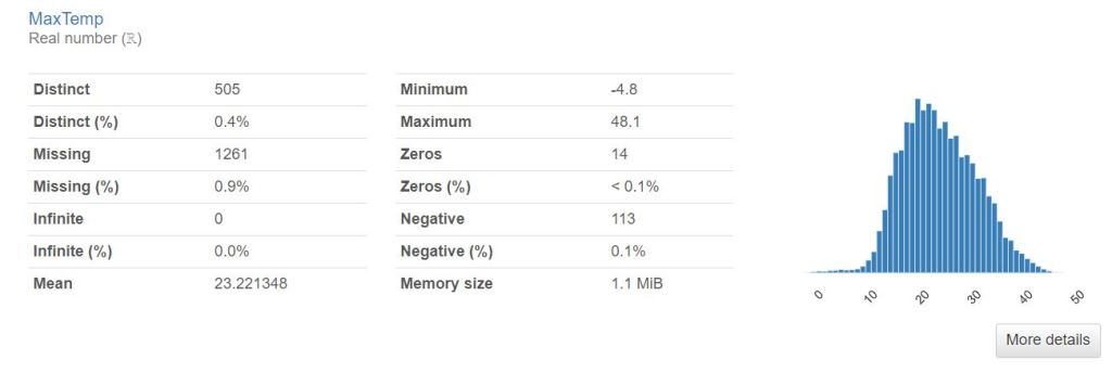
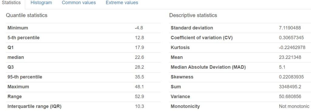
df.describe().T

- Handling the imbalanced dataset
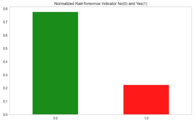
df['RainToday'].replace({'No': 0, 'Yes': 1},inplace = True)
df['RainTomorrow'].replace({'No': 0, 'Yes': 1},inplace = True)
import matplotlib.pyplot as plt
plt.rcParams.update({'font.size': 22})
fig = plt.figure(figsize = (10,6))
df.RainTomorrow.value_counts(normalize = True).plot(kind='bar', color= ['green','red'], alpha = 0.9, rot=0)
plt.title('Normalized RainTomorrow Indicator No(0) and Yes(1)')
plt.grid()
plt.show()
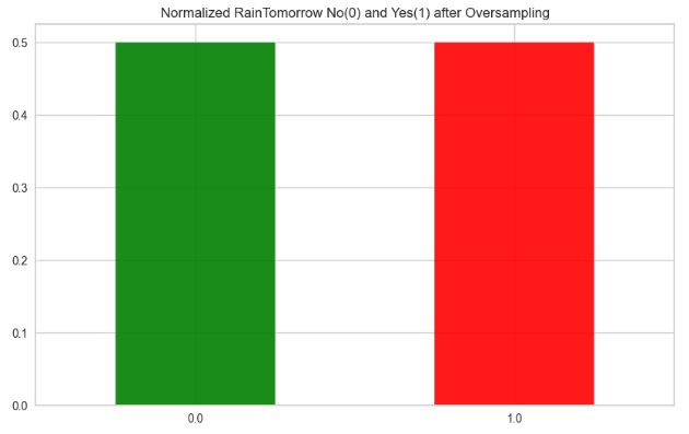
from sklearn.utils import resample
import matplotlib

matplotlib.rcParams.update({'font.size': 22})

no = df[df.RainTomorrow == 0]
yes = df[df.RainTomorrow == 1]
yes_oversampled = resample(yes, replace=True, n_samples=len(no), random_state=123)
oversampled = pd.concat([no, yes_oversampled])

fig = plt.figure(figsize = (10,6))
oversampled.RainTomorrow.value_counts(normalize = True).plot(kind='bar', color= ['green','red'],alpha=0.9,rot=0)
plt.title('Normalized RainTomorrow No(0) and Yes(1) after Oversampling')
plt.rcParams.update({'font.size': 22})
plt.show()
- Preparing the dataset for ML training
# Impute categorical var with Mode
oversampled['Date'] = oversampled['Date'].fillna(oversampled['Date'].mode()[0])
oversampled['Location'] = oversampled['Location'].fillna(oversampled['Location'].mode()[0])
oversampled['WindGustDir'] = oversampled['WindGustDir'].fillna(oversampled['WindGustDir'].mode()[0])
oversampled['WindDir9am'] = oversampled['WindDir9am'].fillna(oversampled['WindDir9am'].mode()[0])
oversampled['WindDir3pm'] = oversampled['WindDir3pm'].fillna(oversampled['WindDir3pm'].mode()[0])
# Convert categorical features to continuous features with Label Encoding
from sklearn.preprocessing import LabelEncoder
lencoders = {}
for col in oversampled.select_dtypes(include=['object']).columns:
    lencoders[col] = LabelEncoder()
    oversampled[col] = lencoders[col].fit_transform(oversampled[col])
import warnings
warnings.filterwarnings("ignore")
# Multiple Imputation by Chained Equations
from sklearn.experimental import enable_iterative_imputer
from sklearn.impute import IterativeImputer
MiceImputed = oversampled.copy(deep=True)
mice_imputer = IterativeImputer()
MiceImputed.iloc[:, :] = mice_imputer.fit_transform(oversampled)
# Detecting outliers with IQR
Q1 = MiceImputed.quantile(0.25)
Q3 = MiceImputed.quantile(0.75)
IQR = Q3 - Q1
print(IQR)

Date             1535.000000
Location           25.000000
MinTemp             9.300000
MaxTemp            10.200000
Rainfall            2.400000
Evaporation         4.120044
Sunshine            5.979485
WindGustDir         9.000000
WindGustSpeed      19.000000
WindDir9am          8.000000
WindDir3pm          8.000000
WindSpeed9am       13.000000
WindSpeed3pm       11.000000
Humidity9am        26.000000
Humidity3pm        30.000000
Pressure9am         8.800000
Pressure3pm         8.800000
Cloud9am            4.000000
Cloud3pm            3.684676
Temp9am             9.300000
Temp3pm             9.800000
RainToday           1.000000
RainTomorrow        1.000000
dtype: float64
# Removing outliers from the dataset
MiceImputed = MiceImputed[~((MiceImputed < (Q1 - 1.5 * IQR)) |(MiceImputed > (Q3 + 1.5 * IQR))).any(axis=1)]
MiceImputed.shape

(170669, 23)
# Correlation Heatmap
import numpy as np
import matplotlib.pyplot as plt
import seaborn as sns
sns.set(font_scale=1.3)
corr = MiceImputed.corr()
mask = np.triu(np.ones_like(corr, dtype=np.bool))
f, ax = plt.subplots(figsize=(20, 20))
plt.rcParams.update({'font.size': 12})
cmap = sns.diverging_palette(250, 25, as_cmap=True)
sns.heatmap(corr, mask=mask, cmap=cmap, vmax=None, center=0,square=True, annot=True, linewidths=.5, cbar_kws={"shrink": .9})

# Standardizing data
from sklearn import preprocessing
r_scaler = preprocessing.MinMaxScaler()
r_scaler.fit(MiceImputed)
modified_data = pd.DataFrame(r_scaler.transform(MiceImputed), index=MiceImputed.index, columns=MiceImputed.columns)
# Feature Importance using Filter Method (Chi-Square)
from sklearn.feature_selection import SelectKBest, chi2
X = modified_data.loc[:,modified_data.columns!='RainTomorrow']
y = modified_data[['RainTomorrow']]
selector = SelectKBest(chi2, k=10)
selector.fit(X, y)
X_new = selector.transform(X)
print(X.columns[selector.get_support(indices=True)])

Index(['Rainfall', 'Sunshine', 'WindGustSpeed', 'Humidity9am', 'Humidity3pm',
       'Pressure9am', 'Pressure3pm', 'Cloud9am', 'Cloud3pm', 'RainToday'],
      dtype='object')
from sklearn.feature_selection import SelectFromModel
from sklearn.ensemble import RandomForestClassifier as rf

X = MiceImputed.drop('RainTomorrow', axis=1)
y = MiceImputed['RainTomorrow']
selector = SelectFromModel(rf(n_estimators=100, random_state=0))
selector.fit(X, y)
support = selector.get_support()
features = X.loc[:,support].columns.tolist()
print(features)
print(rf(n_estimators=100, random_state=0).fit(X,y).feature_importances_)

['Sunshine', 'Humidity3pm', 'Pressure9am', 'Pressure3pm', 'Cloud9am', 'Cloud3pm']
[0.03253427 0.02881107 0.03314079 0.03249158 0.02143225 0.03311921
 0.13843799 0.02077917 0.04263648 0.021398   0.02169729 0.02179529
 0.02339751 0.0344056  0.10634039 0.0483552  0.06129439 0.05797767
 0.13958632 0.03162141 0.03627126 0.01247686]
features = MiceImputed[['Location', 'MinTemp', 'MaxTemp', 'Rainfall', 'Evaporation', 'Sunshine', 'WindGustDir',
                       'WindGustSpeed', 'WindDir9am', 'WindDir3pm', 'WindSpeed9am', 'WindSpeed3pm', 'Humidity9am',
                       'Humidity3pm', 'Pressure9am', 'Pressure3pm', 'Cloud9am', 'Cloud3pm', 'Temp9am', 'Temp3pm',
                       'RainToday']]
target = MiceImputed['RainTomorrow']

# Split into test and train
from sklearn.model_selection import train_test_split
X_train, X_test, y_train, y_test = train_test_split(features, target, test_size=0.2, random_state=42)

# Normalize Features
from sklearn.preprocessing import StandardScaler
scaler = StandardScaler()
X_train = scaler.fit_transform(X_train)
X_test = scaler.fit_transform(X_test)
#Function to plot ROC curve

def plot_roc_cur(fper, tper):
    plt.plot(fper, tper, color='orange', label='ROC')
    plt.plot([0, 1], [0, 1], color='darkblue', linestyle='--')
    plt.xlabel('False Positive Rate')
    plt.ylabel('True Positive Rate')
    plt.title('Receiver Operating Characteristic (ROC) Curve')
    plt.legend()
    plt.show()
# Function to run ML model
import time
from sklearn.metrics import accuracy_score, roc_auc_score, cohen_kappa_score, classification_report
def run_model(model, X_train, y_train, X_test, y_test, verbose=True):
    t0=time.time()
    if verbose == False:
        model.fit(X_train,y_train, verbose=0)
    else:
        model.fit(X_train,y_train)
    y_pred = model.predict(X_test)
    accuracy = accuracy_score(y_test, y_pred)
    roc_auc = roc_auc_score(y_test, y_pred)
    coh_kap = cohen_kappa_score(y_test, y_pred)
    time_taken = time.time()-t0
    print("Accuracy = {}".format(accuracy))
    print("ROC Area under Curve = {}".format(roc_auc))
    print("Cohen's Kappa = {}".format(coh_kap))
    print("Time taken = {}".format(time_taken))
    print(classification_report(y_test,y_pred,digits=5))

    probs = model.predict_proba(X_test)
    probs = probs[:, 1]
#    fper, tper, thresholds = roc_curve(y_test, probs)
 #   plot_roc_cur(fper, tper)

#    plot_confusion_matrix(model, X_test, y_test,cmap=plt.cm.Blues, normalize = 'all')

    return model, accuracy, roc_auc, coh_kap, time_taken
# Logistic Regression
from sklearn.linear_model import LogisticRegression

params_lr = {'penalty': 'l1', 'solver':'liblinear'}

model_lr = LogisticRegression(**params_lr)
model_lr, accuracy_lr, roc_auc_lr, coh_kap_lr, tt_lr = run_model(model_lr, X_train, y_train, X_test, y_test)

Accuracy = 0.7960684361633562
ROC Area under Curve = 0.7904005877630805
Cohen's Kappa = 0.5843508548908707
Time taken = 2.2208056449890137
              precision    recall  f1-score   support

         0.0    0.80231   0.84063   0.82102     18993
         1.0    0.78734   0.74018   0.76303     15141

    accuracy                        0.79607     34134
   macro avg    0.79483   0.79040   0.79203     34134
weighted avg    0.79567   0.79607   0.79530     34134
# Decision Tree
from sklearn.tree import DecisionTreeClassifier

params_dt = {'max_depth': 16,
             'max_features': "sqrt"}

model_dt = DecisionTreeClassifier(**params_dt)
model_dt, accuracy_dt, roc_auc_dt, coh_kap_dt, tt_dt = run_model(model_dt, X_train, y_train, X_test, y_test)

Accuracy = 0.8770434171207594
ROC Area under Curve = 0.878575022962951
Cohen's Kappa = 0.7524582378630167
Time taken = 0.4199988842010498
              precision    recall  f1-score   support

         0.0    0.90959   0.86500   0.88674     18993
         1.0    0.84047   0.89215   0.86554     15141

    accuracy                        0.87704     34134
   macro avg    0.87503   0.87858   0.87614     34134
weighted avg    0.87893   0.87704   0.87733     34134
# Random Forest
from sklearn.ensemble import RandomForestClassifier

params_rf = {'max_depth': 16,
             'min_samples_leaf': 1,
             'min_samples_split': 2,
             'n_estimators': 100,
             'random_state': 12345}

model_rf = RandomForestClassifier(**params_rf)
model_rf, accuracy_rf, roc_auc_rf, coh_kap_rf, tt_rf = run_model(model_rf, X_train, y_train, X_test, y_test)

Accuracy = 0.9324134294252066
ROC Area under Curve = 0.9335407961247045
Cohen's Kappa = 0.8636284899322216
Time taken = 33.43086814880371
              precision    recall  f1-score   support

         0.0    0.95352   0.92355   0.93830     18993
         1.0    0.90774   0.94353   0.92529     15141

    accuracy                        0.93241     34134
   macro avg    0.93063   0.93354   0.93179     34134
# Light GBM
import lightgbm as lgb
params_lgb ={'colsample_bytree': 0.95,
         'max_depth': 16,
         'min_split_gain': 0.1,
         'n_estimators': 200,
         'num_leaves': 50,
         'reg_alpha': 1.2,
         'reg_lambda': 1.2,
         'subsample': 0.95,
         'subsample_freq': 20}

model_lgb = lgb.LGBMClassifier(**params_lgb)
model_lgb, accuracy_lgb, roc_auc_lgb, coh_kap_lgb, tt_lgb = run_model(model_lgb, X_train, y_train, X_test, y_test)

Accuracy = 0.8759887502197222
ROC Area under Curve = 0.8758189993996411
Cohen's Kappa = 0.7494945923464145
Time taken = 1.5784103870391846
              precision    recall  f1-score   support

         0.0    0.89750   0.87732   0.88730     18993
         1.0    0.85033   0.87431   0.86216     15141

    accuracy                        0.87599     34134
   macro avg    0.87392   0.87582   0.87473     34134
weighted avg    0.87658   0.87599   0.87615     34134
#Catboost

import catboost as cb
params_cb ={'iterations': 50,
            'max_depth': 16}

model_cb = cb.CatBoostClassifier(**params_cb)
model_cb, accuracy_cb, roc_auc_cb, coh_kap_cb, tt_cb = run_model(model_cb, X_train, y_train, X_test, y_test, verbose=False)

Accuracy = 0.9465049510751743
ROC Area under Curve = 0.9491703173134678
Cohen's Kappa = 0.8923522155817007
Time taken = 141.13137221336365
              precision    recall  f1-score   support

         0.0    0.97710   0.92555   0.95063     18993
         1.0    0.91241   0.97279   0.94163     15141

    accuracy                        0.94650     34134
   macro avg    0.94475   0.94917   0.94613     34134
weighted avg    0.94840   0.94650   0.94664     34134
# XGBoost
import xgboost as xgb
params_xgb ={'n_estimators': 500,
            'max_depth': 16}

model_xgb = xgb.XGBClassifier(**params_xgb)
model_xgb, accuracy_xgb, roc_auc_xgb, coh_kap_xgb, tt_xgb = run_model(model_xgb, X_train, y_train, X_test, y_test)

Accuracy = 0.9656647331106815
ROC Area under Curve = 0.9672243653822968
Cohen's Kappa = 0.9307211340976744
Time taken = 59.282357931137085
              precision    recall  f1-score   support

         0.0    0.98440   0.95340   0.96865     18993
         1.0    0.94377   0.98104   0.96205     15141

    accuracy                        0.96566     34134
   macro avg    0.96408   0.96722   0.96535     34134
weighted avg    0.96638   0.96566   0.96572     34134
# AdaBoostClassifier

from sklearn.ensemble import AdaBoostClassifier
model_ada = AdaBoostClassifier(n_estimators=100, learning_rate=1.0)
model_ada, accuracy_ada, roc_auc_ada, coh_kap_ada, tt_ada = run_model(model_ada, X_train, y_train, X_test, y_test)

Accuracy = 0.7999648444366321
ROC Area under Curve = 0.7949466767244949
Cohen's Kappa = 0.5927836055020063
Time taken = 16.73294186592102
              precision    recall  f1-score   support

         0.0    0.80843   0.83941   0.82363     18993
         1.0    0.78839   0.75048   0.76897     15141

    accuracy                        0.79996     34134
   macro avg    0.79841   0.79495   0.79630     34134
weighted avg    0.79954   0.79996   0.79938     34134
#BaggingClassifier

from sklearn.ensemble import BaggingClassifier
model_bag = BaggingClassifier()
model_bag, accuracy_bag, roc_auc_bag, coh_kap_bag, tt_bag = run_model(model_bag, X_train, y_train, X_test, y_test)

Accuracy = 0.9463291732583348
ROC Area under Curve = 0.947411678716876
Cohen's Kappa = 0.8916582935655861
Time taken = 19.135340929031372
              precision    recall  f1-score   support

         0.0    0.96474   0.93782   0.95109     18993
         1.0    0.92464   0.95700   0.94054     15141

    accuracy                        0.94633     34134
   macro avg    0.94469   0.94741   0.94582     34134
weighted avg    0.94695   0.94633   0.94641     34134
#KNeighborsClassifier

from sklearn.neighbors import KNeighborsClassifier
model_knn = KNeighborsClassifier()
model_knn, accuracy_knn, roc_auc_knn, coh_kap_knn, tt_knn = run_model(model_knn, X_train, y_train, X_test, y_test)

Accuracy = 0.8471611882580419
ROC Area under Curve = 0.8504639080997493
Cohen's Kappa = 0.693611291088182
Time taken = 6.5144078731536865
              precision    recall  f1-score   support

         0.0    0.89545   0.82120   0.85672     18993
         1.0    0.79684   0.87973   0.83624     15141

    accuracy                        0.84716     34134
   macro avg    0.84615   0.85046   0.84648     34134
weighted avg    0.85171   0.84716   0.84763     34134
from sklearn.naive_bayes import GaussianNB
model_svc = GaussianNB()
model_svc, accuracy_svc, roc_auc_svc, coh_kap_svc, tt_svc = run_model(model_svc, X_train, y_train, X_test, y_test)

Accuracy = 0.7552879826565887
ROC Area under Curve = 0.7531058573288308
Cohen's Kappa = 0.5052270513833625
Time taken = 0.08304166793823242
              precision    recall  f1-score   support

         0.0    0.78446   0.77244   0.77841     18993
         1.0    0.71993   0.73377   0.72679     15141

    accuracy                        0.75529     34134
   macro avg    0.75220   0.75311   0.75260     34134
weighted avg    0.75584   0.75529   0.75551     34134
from sklearn.ensemble import ExtraTreesClassifier
model_mlp = ExtraTreesClassifier()
model_mlp, accuracy_mlp, roc_auc_mlp, coh_kap_mlp, tt_mlp = run_model(model_mlp, X_train, y_train, X_test, y_test)

Accuracy = 0.9697369192007969
ROC Area under Curve = 0.9697182555165565
Cohen's Kappa = 0.9387386389463959
Time taken = 14.548301696777344
              precision    recall  f1-score   support

         0.0    0.97559   0.96988   0.97273     18993
         1.0    0.96250   0.96955   0.96601     15141

    accuracy                        0.96974     34134
   macro avg    0.96904   0.96972   0.96937     34134
weighted avg    0.96978   0.96974   0.96975     34134
- Evaluation of selected ML models using SciKit-Plot
import scikitplot as skplt

import sklearn

from sklearn.cluster import KMeans
from sklearn.decomposition import PCA

import matplotlib.pyplot as plt

import sys
import warnings
warnings.filterwarnings("ignore")

print("Scikit Plot Version : ", skplt.__version__)
print("Scikit Learn Version : ", sklearn.__version__)
print("Python Version : ", sys.version)

%matplotlib inline

Scikit Plot Version :  0.3.7
Scikit Learn Version :  1.3.2
Python Version :  3.9.16 (main, Jan 11 2023, 16:16:36) [MSC v.1916 64 bit (AMD64)]
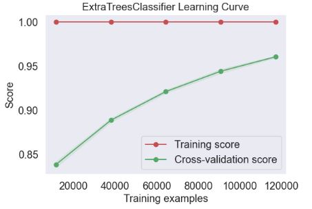
- Plotting ExtraTreesClassifier Learning Curve
skplt.estimators.plot_learning_curve(ExtraTreesClassifier(), X_train, y_train,
                                     cv=7, shuffle=True, scoring="accuracy",
                                     n_jobs=-1, figsize=(6,4), title_fontsize="large", text_fontsize="large",
                                     title="ExtraTreesClassifier Learning Curve");
- Plotting LGBMClassifier Learning Curve
skplt.estimators.plot_learning_curve(model_lgb, X_train, y_train,
                                     cv=7, shuffle=True, scoring="accuracy",
                                     n_jobs=-1, figsize=(6,4), title_fontsize="large", text_fontsize="large",
                                     title="LGBMClassifier Learning Curve");

- Plotting XGBClassifier Learning Curve
skplt.estimators.plot_learning_curve(model_lgb, X_train, y_train,
                                     cv=7, shuffle=True, scoring="accuracy",
                                     n_jobs=-1, figsize=(6,4), title_fontsize="large", text_fontsize="large",
                                     title="XGBClassifier Learning Curve");

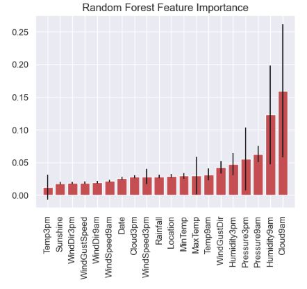
- Plotting Random Forest Feature Importance
feature_names=oversampled.columns.values.tolist()
skplt.estimators.plot_feature_importances(model_rf, feature_names=feature_names,
                                         title="Random Forest Feature Importance",
                                         x_tick_rotation=90, order="ascending");
- Plotting Random Forest Classifier Learning Curve
skplt.estimators.plot_learning_curve(model_rf, X_train, y_train,
                                     cv=7, shuffle=True, scoring="accuracy",
                                     n_jobs=-1, figsize=(6,4), title_fontsize="large", text_fontsize="large",
                                     title="Random Forest Classifier Learning Curve");

- Plotting selected ML calibration curves
lr_probas = model_lgb.fit(X_train, y_train).predict_proba(X_test)
rf_probas = model_rf.fit(X_train, y_train).predict_proba(X_test)
gb_probas = model_xgb.fit(X_train, y_train).predict_proba(X_test)
et_scores = model_mlp.fit(X_train, y_train).predict_proba(X_test)

probas_list = [lr_probas, rf_probas, gb_probas, et_scores]
clf_names = ['LGB', 'RF', 'XGB', 'ET']

skplt.metrics.plot_calibration_curve(y_test,
                                     probas_list,
                                     clf_names, n_bins=15,
                                     figsize=(12,6)
                                     );

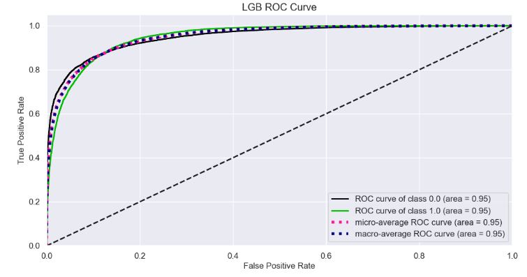
- Plotting LGB ROC Curve
Y_test_probs = model_lgb.predict_proba(X_test)

skplt.metrics.plot_roc_curve(y_test, Y_test_probs,
                       title="LGB ROC Curve", figsize=(12,6));
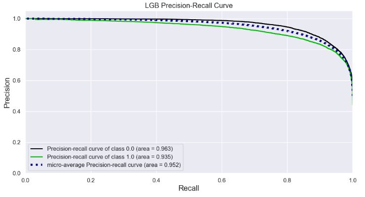
- Plotting LGB Precision-Recall Curve
skplt.metrics.plot_precision_recall_curve(y_test, Y_test_probs,
                       title="LGB Precision-Recall Curve", figsize=(12,6));
- KS Statistic Plot
skplt.metrics.plot_ks_statistic(y_test, Y_test_probs, figsize=(10,6));

- Cumulative Gains Plot
skplt.metrics.plot_cumulative_gain(y_test, Y_test_probs, figsize=(10,6));

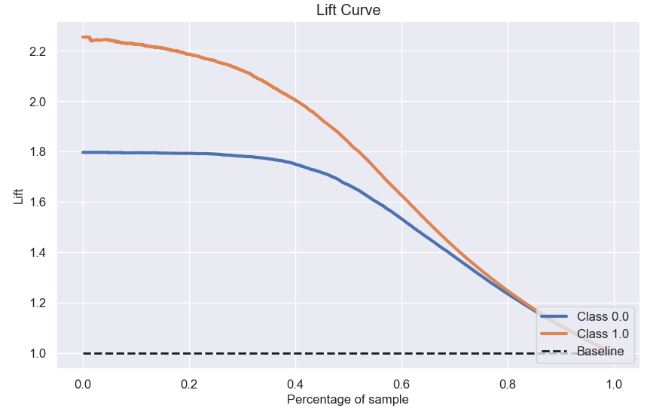
- Lift Curve
skplt.metrics.plot_lift_curve(y_test, Y_test_probs, figsize=(10,6));
- Elbow Plot
skplt.cluster.plot_elbow_curve(KMeans(random_state=1),
                               X_train,
                               cluster_ranges=range(2, 20),
                               figsize=(8,6));

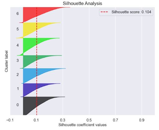
- Silhouette Analysis Plot
kmeans = KMeans(n_clusters=7, random_state=1)
kmeans.fit(X_train, y_train)
cluster_labels = kmeans.predict(X_test)
skplt.metrics.plot_silhouette(X_test, cluster_labels,
                              figsize=(8,6));
- PCA Component Explained Variances
pca = PCA(random_state=1)
pca.fit(X_train)

skplt.decomposition.plot_pca_component_variance(pca, figsize=(8,6));

- PCA 2-D projection
skplt.decomposition.plot_pca_2d_projection(pca, X_train, y_train,
                                           figsize=(10,10),
                                           cmap="tab10");

- Yellowbrick Confusion Matrix
import pandas as pd
import numpy as np

import matplotlib.pyplot as plt
import sklearn
import yellowbrick
from yellowbrick.classifier import ConfusionMatrix

pd.set_option("display.max_columns", 35)

import warnings
warnings.filterwarnings("ignore")
fig = plt.figure(figsize=(7,7))
plt.rcParams.update({'font.size': 22})
ax = fig.add_subplot(111)

target_names=['0','1']

visualizer = ConfusionMatrix(model_lgb,
                             classes=target_names,
                             percent=True,
                             cmap="Blues",
                             fontsize=13,
                             ax=ax)

visualizer.fit(X_train, y_train)

visualizer.score(X_test, y_test)

visualizer.show();

- LGBM Classification Report
from yellowbrick.classifier import ClassificationReport

viz = ClassificationReport(model_lgb,
                           classes=target_names,
                           support=True,
                           fig=plt.figure(figsize=(8,6)))

viz.fit(X_train, y_train)

viz.score(X_test, y_test)

viz.show();

- ROC curves for the LGBM classifier
from yellowbrick.classifier import ROCAUC

viz = ROCAUC(model_lgb,
             classes=target_names,
             fig=plt.figure(figsize=(7,5)))

viz.fit(X_train, y_train)

viz.score(X_test, y_test)

viz.show();

- Precision-Recall curves for the LGBM classifier
from yellowbrick.classifier import PrecisionRecallCurve

viz = PrecisionRecallCurve(model_lgb,
             classes=target_names,
             ap_score=True,
             iso_f1_curves=True,
             fig=plt.figure(figsize=(7,5)))

viz.fit(X_train, y_train)

viz.score(X_test, y_test)

viz.show();

- Discrimination threshold plot for the LGBM classifier
from yellowbrick.classifier import DiscriminationThreshold


viz = DiscriminationThreshold(model_lgb,
             classes=target_names,
             cv=0.2,
             fig=plt.figure(figsize=(9,6)))

viz.fit(X_train, y_train)

viz.score(X_test, y_test)

viz.show();

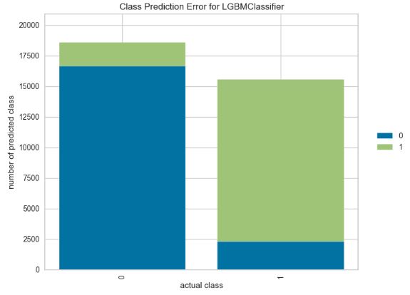
- Class prediction error plot for the LGBM classifier
from yellowbrick.classifier import ClassPredictionError

viz = ClassPredictionError(model_lgb,
                           classes=target_names,
                           fig=plt.figure(figsize=(9,6)))

viz.fit(X_train, y_train)

viz.score(X_test, y_test)

viz.show();
Kerala Flood Prediction
- BBC News 21 August 2018: Floods in the southern Indian state of Kerala have killed more than 350 people since June. Officials and experts have said the floods in Kerala – which has 44 rivers flowing through it – would not have been so severe if authorities had gradually released water from at least 30 dams.
- AI is needed for Flood prediction to optimize the Early Warning System (EWS). Traditional methods used to forecast Floods often deliver inaccurate results because of the non-linear behavior of floods and a great number of errors linked to requirements for more complex and precise modelling.
- In this study, we will employ the supervised Machine Learning (ML) techniques to design EWS for flood forecasting.
- For example, the trained ML model makes use of 5 ML Algorithms (KNN Classification, Logistic Regression, Support Vector Machine, Decision Tree and Random Forest) to get the optimized flood forecast for the public-domain dataset.
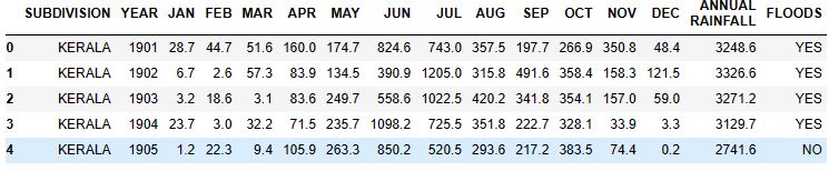
- The Kerala dataset contains data about rainfall over the years in the state of Kerala. It contains the data month-wise and annual rainfall. This data can be used for rainfall prediction and flood prediction.
- Setting the working directory YOURPATH, importing Python libraries and reading the above dataset
import os
os.chdir('YOURPATH')    # Set working directory
os. getcwd()

import pandas as pd
import numpy as np
import matplotlib.pyplot as plt
import seaborn as sns
from sklearn import model_selection
from sklearn.linear_model import LogisticRegression
from sklearn.model_selection import train_test_split
df= pd.read_csv('kerala.csv')
df.head(5)
df.info()

<class 'pandas.core.frame.DataFrame'>
RangeIndex: 118 entries, 0 to 117
Data columns (total 16 columns):
 #   Column            Non-Null Count  Dtype
---  ------            --------------  -----
 0   SUBDIVISION       118 non-null    object
 1   YEAR              118 non-null    int64
 2   JAN               118 non-null    float64
 3   FEB               118 non-null    float64
 4   MAR               118 non-null    float64
 5   APR               118 non-null    float64
 6   MAY               118 non-null    float64
 7   JUN               118 non-null    float64
 8   JUL               118 non-null    float64
 9   AUG               118 non-null    float64
 10  SEP               118 non-null    float64
 11  OCT               118 non-null    float64
 12  NOV               118 non-null    float64
 13  DEC               118 non-null    float64
 14   ANNUAL RAINFALL  118 non-null    float64
 15  FLOODS            118 non-null    object
dtypes: float64(13), int64(1), object(2)
memory usage: 14.9+ KB
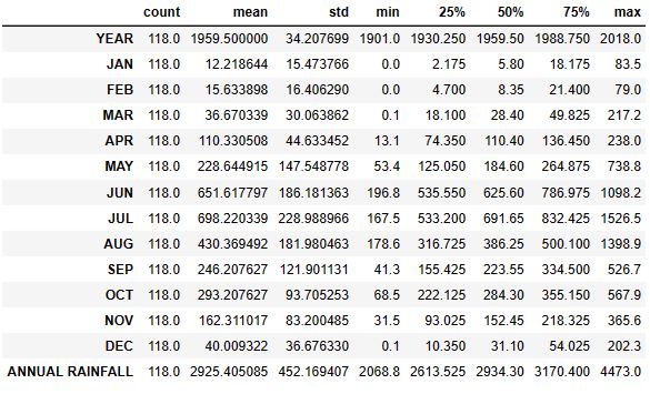
df.shape
(118, 16)
df.describe().T
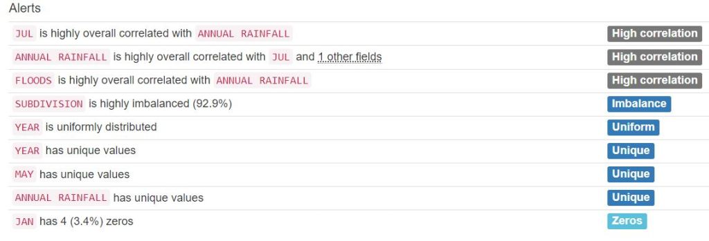
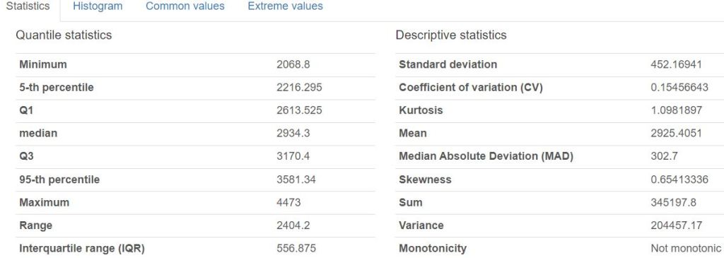
- Creating the Pandas Profiling HTML Report
from pandas_profiling import ProfileReport
profile = ProfileReport(df, title='Pandas Profile Flooding Report', html={'style':{'full_width':True}})
profile.to_file(output_file='kerala_report.html')


- Generating the sweetviz HTML report
# importing sweetviz
import sweetviz as sv
#analyzing the dataset
advert_report = sv.analyze(df)
#display the report
advert_report.show_html('Kerala_swetviz_report.html')


- Associations:
Squares are categorical associations (uncertainty coefficient & correlation ratio) from 0 to 1. The uncertainty coefficient is asymmetrical, (i.e. ROW LABEL values indicate how much they PROVIDE INFORMATION to each LABEL at the TOP).
• Circles are the symmetrical numerical correlations (Pearson’s) from -1 to 1. The trivial diagonal is intentionally left blank for clarity.
- Data preparation
df['FLOODS'].replace(['YES', 'NO'], [1,0], inplace=True)
#df.head(5)

from sklearn.feature_selection import SelectKBest
from sklearn.feature_selection import chi2
X= df.iloc[:,1:14]   #all features
Y= df.iloc[:,-1]   #target output (floods)
best_features= SelectKBest(score_func=chi2, k=3)
fit= best_features.fit(X,Y)
df_scores= pd.DataFrame(fit.scores_)
df_columns= pd.DataFrame(X.columns)
features_scores= pd.concat([df_columns, df_scores], axis=1)
features_scores.columns= ['Features', 'Score']
features_scores.sort_values(by = 'Score')

Features	Score
4	APR	2.498771
2	FEB	2.571626
0	YEAR	2.866463
12	DEC	11.609546
10	OCT	12.650485
3	MAR	21.696518
1	JAN	48.413088
11	NOV	284.674615
5	MAY	656.812145
8	AUG	739.975818
9	SEP	1000.379273
6	JUN	1218.856252
7	JUL	1722.612175

X= df[['SEP', 'JUN', 'JUL']]  #the top 3 features
Y= df[['FLOODS']]  #the target output

X_train,X_test,y_train,y_test=train_test_split(X,Y,test_size=0.4,random_state=42)
- Training and testing the Logistic Regression (LR) model
logreg= LogisticRegression()
logreg.fit(X_train,y_train)
y_pred=logreg.predict(X_test)

from sklearn import metrics
from sklearn.metrics import classification_report
print('Accuracy: ',metrics.accuracy_score(y_test, y_pred))
print('Recall: ',metrics.recall_score(y_test, y_pred, zero_division=1))
print('Precision:',metrics.precision_score(y_test, y_pred, zero_division=1))
print('CL Report:',metrics.classification_report(y_test, y_pred, zero_division=1))

Accuracy:  0.8125
Recall:  0.7916666666666666
Precision: 0.8260869565217391
CL Report:               precision    recall  f1-score   support

           0       0.80      0.83      0.82        24
           1       0.83      0.79      0.81        24

    accuracy                           0.81        48
   macro avg       0.81      0.81      0.81        48
weighted avg       0.81      0.81      0.81        48

y_pred_proba= logreg.predict_proba(X_test) [::,1]
false_positive_rate, true_positive_rate, _ = metrics.roc_curve(y_test, y_pred_proba)
auc= metrics.roc_auc_score(y_test, y_pred_proba)
- Plotting the LR ROC curve
plt.plot(false_positive_rate, true_positive_rate,label="AUC="+str(auc))
plt.title('ROC Curve')
plt.ylabel('True Positive Rate')
plt.xlabel('false Positive Rate')
plt.legend(loc=4)
- Running LR cross-validation tests using SciKit-Plot
import scikitplot as skplt

import sklearn


from sklearn.cluster import KMeans
from sklearn.decomposition import PCA

import matplotlib.pyplot as plt

import sys
import warnings
warnings.filterwarnings("ignore")

print("Scikit Plot Version : ", skplt.__version__)
print("Scikit Learn Version : ", sklearn.__version__)
print("Python Version : ", sys.version)

%matplotlib inline

Scikit Plot Version :  0.3.7
Scikit Learn Version :  1.3.2
Python Version :  3.9.16 (main, Jan 11 2023, 16:16:36) [MSC v.1916 64 bit (AMD64)]
#Plotting the LR Learning Curve
skplt.estimators.plot_learning_curve(LogisticRegression(), X_train,y_train,
                                     cv=7, shuffle=True, scoring="accuracy",
                                     n_jobs=-1, figsize=(6,4), title_fontsize="large", text_fontsize="large",
                                     title="Logistic Regression Learning Curve");

#LR ROC Curve

Y_test_probs = logreg.predict_proba(X_test)

skplt.metrics.plot_roc_curve(y_test, Y_test_probs,
                       title="Logistic Regression ROC Curve", figsize=(12,6));

skplt.metrics.plot_precision_recall_curve(y_test, Y_test_probs,
                       title="Logistic Regression Precision-Recall Curve", figsize=(12,6));

#KS Statistic Plot

skplt.metrics.plot_ks_statistic(y_test,Y_test_probs, figsize=(10,6));
# Cumulative Gains Curve
skplt.metrics.plot_cumulative_gain(y_test, Y_test_probs, figsize=(10,6));

#Lift Curve
skplt.metrics.plot_lift_curve(y_test, Y_test_probs, figsize=(10,6));
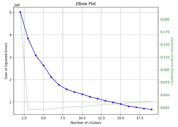
#Elbow Plot

skplt.cluster.plot_elbow_curve(KMeans(random_state=1),
                               X_train,
                               cluster_ranges=range(2, 20),
                               figsize=(8,6));
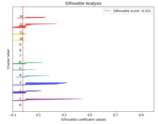
# K-means Silhouette Analysis
kmeans = KMeans(n_clusters=15, random_state=1)
kmeans.fit(X_train, y_train)
cluster_labels = kmeans.predict(X_test)
skplt.metrics.plot_silhouette(X_test, cluster_labels,
                              figsize=(8,6));
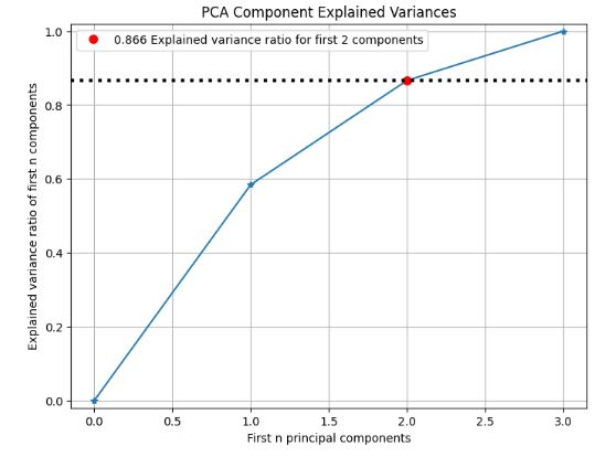
# PCA component explained variances

pca = PCA(random_state=1)
pca.fit(X_train)

skplt.decomposition.plot_pca_component_variance(pca, figsize=(8,6));
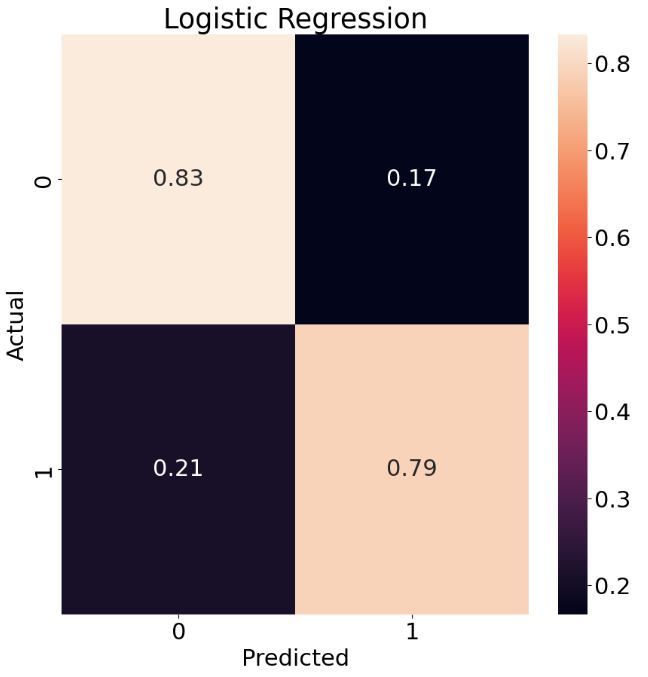
# Plotting the LR Normalized Confusion Matrix
from sklearn.metrics import confusion_matrix
cm = confusion_matrix(y_test, y_pred)
plt.rcParams.update({'font.size': 22})
target_names=['0','1']
cmn = cm.astype('float') / cm.sum(axis=1)[:, np.newaxis]
fig, ax = plt.subplots(figsize=(10,10))
sns.heatmap(cmn, annot=True, fmt='.2f', xticklabels=target_names, yticklabels=target_names)
plt.ylabel('Actual')
plt.xlabel('Predicted')
plt.title('Logistic Regression')
plt.show(block=False)
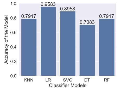
- Let’s perform the final comparison of 5 ML models (with test_size=0.4): LR, KNN, SVC, Decision Tree (DT), and Random Forest (RF)
# Data copy
data=df.copy()
data.isnull().sum() #check null values

SUBDIVISION         0
YEAR                0
JAN                 0
FEB                 0
MAR                 0
APR                 0
MAY                 0
JUN                 0
JUL                 0
AUG                 0
SEP                 0
OCT                 0
NOV                 0
DEC                 0
 ANNUAL RAINFALL    0
FLOODS              0
dtype: int64
# Data covariance matrix
data.cov()
YEAR	JAN	FEB	MAR	APR	MAY	JUN	JUL	AUG	SEP	OCT	NOV	DEC	ANNUAL RAINFALL	FLOODS
YEAR	1170.166667	-119.378632	2.176923	-13.207265	132.625641	-301.126068	-1114.149145	-1749.953846	274.983761	448.915812	-96.876496	-370.360256	-155.123504	-3063.344444	-3.478632
JAN	-119.378632	239.437427	4.979192	36.577053	24.039512	163.062403	545.574281	121.970900	24.434163	-214.094844	-50.812451	-14.205421	-50.968209	830.154092	1.128900
FEB	2.176923	4.979192	269.166362	121.027766	90.585966	-202.129655	165.293580	21.748364	69.442838	132.629654	81.684355	-222.332684	-76.434079	455.913330	-0.294307
MAR	-13.207265	36.577053	121.027766	903.835779	99.315784	-456.721990	106.348567	126.186249	232.033874	527.184758	-64.980285	-81.573089	28.990108	1578.305793	1.309228
APR	132.625641	24.039512	90.585966	99.315784	1992.145044	-754.490185	606.540393	153.070058	-388.591540	70.336859	473.330962	82.464276	-180.710372	2267.590185	0.770679
MAY	-301.126068	163.062403	-202.129655	-456.721990	-754.490185	21770.641812	33.929279	-1571.703571	-3340.586652	2101.892304	2725.149056	1165.417193	-638.978371	20997.420795	17.987223
JUN	-1114.149145	545.574281	165.293580	106.348567	606.540393	33.929279	34663.499937	4047.567071	-492.944239	-1194.576633	20.161145	247.329460	-581.699654	38170.332986	41.365233
JUL	-1749.953846	121.970900	21.748364	126.186249	153.070058	-1571.703571	4047.567071	52435.946420	6436.876865	5846.347194	541.214459	-543.479371	-113.988396	67508.201520	50.904100
AUG	274.983761	24.434163	69.442838	232.033874	-388.591540	-3340.586652	-492.944239	6436.876865	33116.888805	2178.762799	-3094.959423	-1706.808293	948.365073	33987.052721	26.193423
SEP	448.915812	-214.094844	132.629654	527.184758	70.336859	2101.892304	-1194.576633	5846.347194	2178.762799	14859.885839	-369.500828	-280.077350	-49.210243	23610.285602	23.035405
OCT	-96.876496	-50.812451	81.684355	-64.980285	473.330962	2725.149056	20.161145	541.214459	-3094.959423	-369.500828	8780.674386	-187.580256	-134.262978	8722.467910	2.826858
NOV	-370.360256	-14.205421	-222.332684	-81.573089	82.464276	1165.417193	247.329460	-543.479371	-1706.808293	-280.077350	-187.580256	6922.320647	215.801948	5597.319516	9.977256
DEC	-155.123504	-50.968209	-76.434079	28.990108	-180.710372	-638.978371	-581.699654	-113.988396	948.365073	-49.210243	-134.262978	215.801948	1345.153160	712.560721	1.000348
ANNUAL RAINFALL	-3063.344444	830.154092	455.913330	1578.305793	2267.590185	20997.420795	38170.332986	67508.201520	33987.052721	23610.285602	8722.467910	5597.319516	712.560721	204457.172453	176.217051
FLOODS	-3.478632	1.128900	-0.294307	1.309228	0.770679	17.987223	41.365233	50.904100	26.193423	23.035405	2.826858	9.977256	1.000348	176.217051	0.25206
import matplotlib.pyplot as plt
plt.rcParams.update({'font.size': 12})
%matplotlib inline
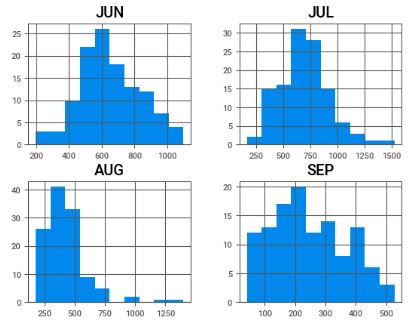
c = data[['JUN','JUL','AUG','SEP']]
c.hist()
plt.show()
# How the rainfall index vary during the rainy season
#Rainfall in Kerala for all Months

ax = data[['JAN', 'FEB', 'MAR', 'APR','MAY', 'JUN', 'AUG', 'SEP', 'OCT','NOV','DEC']].mean().plot.bar(width=0.5,edgecolor='k',align='center',linewidth=2,figsize=(14,6))
plt.xlabel('Month',fontsize=30)
plt.ylabel('Monthly Rainfall',fontsize=20)
plt.title('Rainfall in Kerala for all Months',fontsize=25)
ax.tick_params(labelsize=20)
plt.grid()
plt.ioff()

- ML data preparation
x=data.iloc[:,1:14]
y=data.iloc[:,-1]
# Scaling the data between 0 and 1.
from sklearn import preprocessing
minmax = preprocessing.MinMaxScaler(feature_range=(0,1))
minmax.fit(x).transform(x)

from sklearn import model_selection,neighbors
from sklearn.model_selection import train_test_split
x_train,x_test,y_train,y_test=train_test_split(x,y,test_size=0.4)
#KNN classifier
clf=neighbors.KNeighborsClassifier()
clf.fit(x_train,y_train)
y_predict=clf.predict(x_test)
# Scaling the dataset.
from sklearn.model_selection import cross_val_score,cross_val_predict
x_train_std= minmax.fit_transform(x_train)
x_test_std= minmax.fit_transform(x_test)
knn_acc=cross_val_score(clf,x_train_std,y_train,cv=3,scoring='accuracy',n_jobs=-1)
knn_proba=cross_val_predict(clf,x_train_std,y_train,cv=3,method='predict_proba')

from sklearn.metrics import accuracy_score,recall_score,roc_auc_score,confusion_matrix
print("\nAccuracy Score:%f"%(accuracy_score(y_test,y_predict)*100))
print("Recall Score:%f"%(recall_score(y_test,y_predict)*100))
print("ROC score:%f"%(roc_auc_score(y_test,y_predict)*100))
print(confusion_matrix(y_test,y_predict))

Accuracy Score:79.166667
Recall Score:75.000000
ROC score:79.166667
[[20  4]
 [ 6 18]]
#Logistic Regression
x_train_std=minmax.fit_transform(x_train)
y_train_std=minmax.transform(x_test)

from sklearn.model_selection import cross_val_score,cross_val_predict
from sklearn.linear_model import LogisticRegression
lr=LogisticRegression()
lr.fit(x_train,y_train)
lr_acc=cross_val_score(lr,x_train_std,y_train,cv=3,scoring='accuracy',n_jobs=-1)
lr_proba=cross_val_predict(lr,x_train_std,y_train,cv=3,method='predict_proba')

y_pred=lr.predict(x_test)
from sklearn.metrics import accuracy_score,recall_score,roc_auc_score,confusion_matrix
print("\naccuracy score:%f"%(accuracy_score(y_test,y_pred)*100))
print("recall score:%f"%(recall_score(y_test,y_pred)*100))
print("roc score:%f"%(roc_auc_score(y_test,y_pred)*100))
print(confusion_matrix(y_test,y_pred))

accuracy score:95.833333
recall score:95.833333
roc score:95.833333
[[23  1]
 [ 1 23]]
#SVC
from sklearn.svm import SVC
svc=SVC(kernel='rbf',probability=True)
svc_classifier=svc.fit(x_train,y_train)
svc_acc=cross_val_score(svc_classifier,x_train_std,y_train,cv=3,scoring="accuracy",n_jobs=-1)
svc_proba=cross_val_predict(svc_classifier,x_train_std,y_train,cv=3,method='predict_proba')

y_pred=svc_classifier.predict(x_test)
from sklearn.metrics import accuracy_score,recall_score,roc_auc_score,confusion_matrix
print("\naccuracy score:%f"%(accuracy_score(y_test,y_pred)*100))
print("recall score:%f"%(recall_score(y_test,y_pred)*100))
print("roc score:%f"%(roc_auc_score(y_test,y_pred)*100))
print(confusion_matrix(y_test,y_pred))

accuracy score:89.583333
recall score:100.000000
roc score:89.583333
[[19  5]
 [ 0 24]]
#Decision Tree

from sklearn.tree import DecisionTreeClassifier
dtc_clf=DecisionTreeClassifier()
dtc_clf.fit(x_train,y_train)
dtc_clf_acc=cross_val_score(dtc_clf,x_train_std,y_train,cv=3,scoring="accuracy",n_jobs=-1)
y_pred=dtc_clf.predict(x_test)
from sklearn.metrics import accuracy_score,recall_score,roc_auc_score,confusion_matrix
print("\naccuracy score:%f"%(accuracy_score(y_test,y_pred)*100))
print("recall score:%f"%(recall_score(y_test,y_pred)*100))
print("roc score:%f"%(roc_auc_score(y_test,y_pred)*100))
print(confusion_matrix(y_test,y_pred))

accuracy score:70.833333
recall score:75.000000
roc score:70.833333
[[16  8]
 [ 6 18]]
# Random Forest

from sklearn.ensemble import RandomForestClassifier
rmf=RandomForestClassifier(max_depth=3,random_state=0)
rmf_clf=rmf.fit(x_train,y_train)
rmf_clf_acc=cross_val_score(rmf_clf,x_train_std,y_train,cv=3,scoring="accuracy",n_jobs=-1)
rmf_proba=cross_val_predict(rmf_clf,x_train_std,y_train,cv=3,method='predict_proba')
from sklearn.metrics import accuracy_score,recall_score,roc_auc_score,confusion_matrix
print("\naccuracy score:%f"%(accuracy_score(y_test,y_pred)*100))
print("recall score:%f"%(recall_score(y_test,y_pred)*100))
print("roc score:%f"%(roc_auc_score(y_test,y_pred)*100))
print(confusion_matrix(y_test,y_pred))

accuracy score:70.833333
recall score:75.000000
roc score:70.833333
[[16  8]
 [ 6 18]]
- Final comparison of 5 ML models
#Final Accuracy of our Models
models = []
from sklearn.neighbors import KNeighborsClassifier
from sklearn.svm import SVC
from sklearn.linear_model import LogisticRegression
from sklearn.tree import DecisionTreeClassifier
from sklearn.naive_bayes import GaussianNB
from sklearn.ensemble import RandomForestClassifier
from sklearn.ensemble import GradientBoostingClassifier
models.append(('KNN', KNeighborsClassifier()))
models.append(('LR', LogisticRegression()))
models.append(('SVC', SVC()))
models.append(('DT', DecisionTreeClassifier()))
models.append(('RF', RandomForestClassifier()))

names = []
scores = []
for name, model in models:
    model.fit(x_train, y_train)
    y_pred = model.predict(x_test)
    scores.append(accuracy_score(y_test, y_pred))
    names.append(name)
tr_split = pd.DataFrame({'Name': names, 'Score': scores})
tr_split

Name	Score
0	KNN	0.791667
1	LR	0.958333
2	SVC	0.895833
3	DT	0.708333
4	RF	0.791667

#Plotting this score

import seaborn as sns
sns.set(font_scale=1.5)
axis = sns.barplot(x = 'Name', y = 'Score', data =tr_split )
axis.set(xlabel='Classifier Models', ylabel='Accuracy of the Model')
for p in axis.patches:
    height = p.get_height()
    axis.text(p.get_x() + p.get_width()/2, height + 0.01, '{:1.4f}'.format(height), ha="center")

plt.show()
- Read more:
- Time Series Prediction, Deseasonal, Moving Average
- Kerala-India-Rainfall 1901-2017-EDA NeuralProphet
- Rainfall in Kerala 1901-2017
Rainfall Impact Assessment
- Objective: We would like to predict and identify the damaged buildings and agricultural plots in the event of a collapsed dyke at a given location.
- Method: We will be using the open-source Python workflow that — given a location — outputs buildings and agricultural plots that would be at risk. The final script executes in seconds and can be used in ‘if else’ risk analysis apps.
- We will be using the following 3 datasets throughout the study: a dataset containing a raster of altitude at a resolution of 0.5m (DEM), a dataset with building footprints, and a dataset with agricultural plots. Each dataset is queried from Ellipsis Drive.
- Import the packages and defining a test location
import numpy as np
from scipy import ndimage
import ellipsis as el
from shapely.geometry import Point
import rasterio
import geopandas as gpd


location = (4.71587, 51.7173)
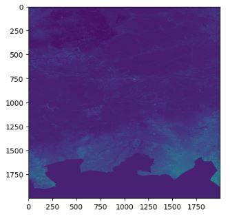
- Retrieving and plotting the elevation profile of the surrounding terrain using the getSampledRaster function
delta = 0.4
extent = {'xMin': location[0] - delta, 'xMax': location[0] + delta, 'yMin': location[1] - delta, 'yMax': location[1] + delta}
width = 2000
height = 2000

pathId = '94037eea-4196-48db-9f83-0ef330a7655e'
timestampId = 'e6b6cc8c-998b-4715-8f39-1e0c9bf4abbe'
res = el.path.raster.timestamp.getSampledRaster(pathId = pathId, timestampId = timestampId, extent = extent, epsg = 4326, width = width, height=height)
r = res['raster']
el.util.plotRaster(r)
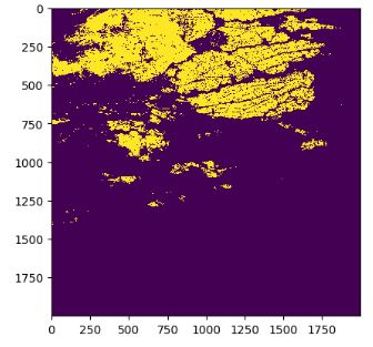
- To identify regions lower than the test location with the altitude loc, we create a logical mask array with integer 1 if the altitude is lower than loc and 0 otherwise.
res = el.path.raster.timestamp.analyse(pathId = pathId, timestampIds = [timestampId], geometry = Point(location))
altitude = res[0]['result'][0]['statistics']['mean']
flood = np.zeros((r.shape[1], r.shape[2]))
flood[ np.logical_and(r[0,:,:] <= altitude + 0.1, r[1,:,:] > 0 )] = 1
el.util.plotRaster(flood)
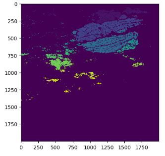
- Let’s extract only regions (labeled images) connected to the breakdown point using the ndimage function from scipy
labeled, nr_objects = ndimage.label(flood)
el.util.plotRaster(labeled)
- Let’s apply the following rasterio-based GIS analysis to retrieve buildings at risk
location_pixel_x = round((location[0] - extent['xMin']) * width / ( extent['xMax']-extent['xMin']))
location_pixel_y = round((location[1] - extent['yMin']) * width / ( extent['yMax']-extent['yMin']))
component_label = labeled[location_pixel_y, location_pixel_y]
connected_component = np.zeros(labeled.shape)
connected_component[labeled ==component_label] = 1
from rasterio import features
transform = rasterio.transform.from_bounds(extent['xMin'], extent['yMin'], extent['xMax'], extent['yMax'], width, height)
maskShape = features.shapes( source= connected_component.astype('uint8'), mask= connected_component.astype('uint8'), transform = transform, connectivity=4)
features=[]
for vec in maskShape:
features.append({'type':'Feature', 'geometry':vec[0], 'properties':{} })
flood_polygon = gpd.GeoDataFrame.from_features({'type':'FeatureCollection', 'features':features})['geometry'].values[0]
floodExtent = {'xMin': flood_polygon.bounds[0], 'xMax': flood_polygon.bounds[2], 'yMin': flood_polygon.bounds[1],'yMax':flood_polygon.bounds[3] }
pathId = '760e4203-19e6-4e58-9b9f-150164dda877'
timestampId = 'bd18f163-cde9-4091-ad24-33210aec06e7'
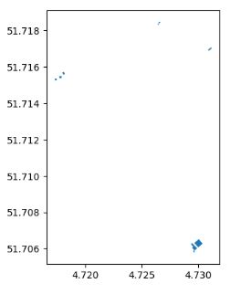
buildings = el.path.vector.timestamp.getFeaturesByExtent(pathId = pathId, timestampId = timestampId, extent = floodExtent, listAll = True)['result']
buildings = buildings[buildings.intersects(flood_polygon)]
buildings = buildings[buildings.intersects(flood_polygon)]
buildings.plot()
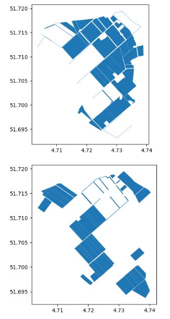
- The same considerations apply to agricultural units
pathId = '2109c37a-d549-45dd-858e-7eddf1bd7c22'
timestampId = '1e8061f0-6c22-4803-8f2c-1b60fa7f7ae6'

plots = el.path.vector.timestamp.getFeaturesByExtent(pathId = pathId, timestampId = timestampId, extent = floodExtent, listAll = True)['result']
plots = plots[plots.intersects(flood_polygon)]
plots.plot()

- These agricultural units at risk consist of Grasland and Bouwland
grassland = plots[plots['CAT_GEWASC'] =='Grasland' ]
grassland.plot()

agriculture = plots[plots['CAT_GEWASC'] =='Bouwland' ]
agriculture.plot()
Conclusions
- U.S.A. Weather Forecast Study
- Designed the pywedge dashboard EDA using the representative weather analysis dataset.
- Tested and validated ML clustering and Markov chain prediction models, followed by the Plotly geospatial or GIS EDA.
- Implemented PCA and Explained VAR% vs 3 PCA Components with Mapped Clusters
- Australian Rainfall Prediction:
- Generated the Pandas Profiling and sweetviz HTML EDA Reports
- Trained and tested 10 supervised ML algorithms (ExtraTreesClassifier, GaussianNB, KNeighborsClassifier, BaggingClassifier, AdaBoostClassifier, XGBClassifier, CatBoostClassifier, LGBMClassifier, RandomForestClassifier, and LogisticRegression).
- Implemented data exploration, handling data imbalance, imputation and transformation, correlation matrix, dominant feature selection, ML model training, testing, cross-validation, and final comparisons.
- The dataset contains about 10 years of daily weather observations from numerous Australian weather stations.
- Kerala Flood Prediction:
- Employed the supervised Machine Learning (ML) techniques for early flood and rainfall forecasting in India.
- The trained ML model was based on 5 ML Algorithms (KNN Classification, Logistic Regression, Support Vector Machine, Decision Tree and Random Forest) to get the optimized flood forecast for the public-domain dataset.
- Rainfall Impact Assessment:
- Implemented the open-source Python workflow that — given a location — outputs buildings and agricultural plots that would be at risk.
- Used the following 3 datasets throughout the study: a dataset containing a raster of altitude at a resolution of 0.5m (DEM), a dataset with building footprints, and a dataset with agricultural plots. Each dataset is queried from Ellipsis Drive.
Explore More
- Machine Learning-Based Crop Yield Prediction, Classification, and Recommendations
- An Implemented Streamlit Crop Prediction App
- Advanced Integrated Data Visualization (AIDV) in Python – 2. Dabl Auto EDA & ML


One-Time
Monthly
Yearly
Make a one-time donation
Make a monthly donation
Make a yearly donation
Choose an amount
€5.00
€15.00
€100.00
€5.00
€15.00
€100.00
€5.00
€15.00
€100.00
Or enter a custom amount
€
Your contribution is appreciated.
Your contribution is appreciated.
Your contribution is appreciated.
DonateDonate monthlyDonate yearly
Leave a comment