
- The main objective of this study is to implement and evaluate the K-means algorithm for ranking/clustering of all S&P 500 stocks based on their average annualized return and average annualized volatility.
- The second goal is to detect anomalies in the best performing S&P 500 stock price 2023 by invoking the Isolation Forest algorithm.
- The third goal is to detect anomalies in the S&P 500 historical stock price time series data with the available LSTM autoencoders, cf. 1, 2, and 3.
- Prerequisites: Python 3.12.0, Jupyter notebook (e.g. within Anaconda IDE), Numpy, Pandas, yfinance, pylab, Matplotlib, Plotly, SciPy, and sklearn. For example, Project Jupyter’s tools are available for installation via the Python Package Index, viz.
pip install jupyterlab
pip install notebook
Table of Contents
- Import Libraries
- S&P 500 2023 Main Clusters
- META Price 2023 Anomaly Detection
- 3D Cluster Analysis of 3 Leading Tech Stocks in 2023
- LSTM Anomalies of S&P 500 Index Historical Prices – Round 1
- LSTM Anomalies of S&P 500 Index Historical Prices – Round 2
- Summary
- References
- Explore More
Import Libraries
Let’s set the working directory YOURPATH
import os
os.chdir('YOURPATH')
os. getcwd()
and import the aforementioned libraries
import numpy as np
import pandas as pd
import pandas_datareader as dr
import yfinance as yf

from pylab import plot,show
from matplotlib import pyplot as plt
import plotly.express as px

from numpy.random import rand
from scipy.cluster.vq import kmeans,vq
from math import sqrt
from sklearn.cluster import KMeans
from sklearn import preprocessing
S&P 500 2023 Main Clusters
- Download the entire S&P 500 stock dataset in 2023
# Define the url
sp500_url = 'https://en.wikipedia.org/wiki/List_of_S%26P_500_companies'

# Read in the url and scrape ticker data
data_table = pd.read_html(sp500_url)
tickers = data_table[0]['Symbol'].values.tolist()
tickers = [s.replace('\n', '') for s in tickers]
tickers = [s.replace('.', '-') for s in tickers]
tickers = [s.replace(' ', '') for s in tickers]

start_date = '2023-01-01'
end_date = '2023-10-24'

# Download prices
prices_list = []
for ticker in tickers:
    try:
        prices = yf.download(ticker, start=start_date, end=end_date)['Adj Close']
        prices = pd.DataFrame(prices)
        prices.columns = [ticker]
        prices_list.append(prices)
    except:
        pass
    prices_df = pd.concat(prices_list,axis=1)
- Stock data manipulations to calculate the annualized Returns and Volatility columns
prices_df.sort_index(inplace=True)

# Create an empity dataframe
returns = pd.DataFrame()

# Define the column Returns
returns['Returns'] = prices_df.pct_change().mean() * 252

# Define the column Volatility
returns['Volatility'] = prices_df.pct_change().std() * sqrt(252)
- Let’s look at the Elbow Curve
# Format the data as a numpy array to feed into the K-Means algorithm
data = np.asarray([np.asarray(returns['Returns']),np.asarray(returns['Volatility'])]).T
X = data
distorsions = []
for k in range(2, 7):
    k_means = KMeans(n_clusters=k)
    k_means.fit(X)
    distorsions.append(k_means.inertia_)
fig = plt.figure(figsize=(10, 5))

plt.rcParams.update({'font.size': 20})

plt.plot(range(2, 7), distorsions,lw=4)
plt.grid(True)
plt.xlabel('Cluster Number')
plt.ylabel('Distortions')
plt.title('S&P 500 Elbow Curve')

- Performing the K-means cluster analysis with K=4
# Computing K-Means with K = 4 (4 clusters)
centroids,_ = kmeans(data,4)

# Assign each sample to a cluster
idx,_ = vq(data,centroids)

# Create a dataframe with the tickers and the clusters that's belong to
details = [(name,cluster) for name, cluster in zip(returns.index,idx)]
details_df = pd.DataFrame(details)

# Rename columns
details_df.columns = ['Ticker','Cluster']

# Create another dataframe with the tickers and data from each stock
clusters_df = returns.reset_index()

# Bring the clusters information from the dataframe 'details_df'
clusters_df['Cluster'] = details_df['Cluster']

# Rename columns
clusters_df.columns = ['Ticker', 'Returns', 'Volatility', 'Cluster']
- Using Plotly for plotting volatility-returns domain K-means clusters of the S&P 500 stocks 2023
# Plot the clusters created using Plotly
#fig.update_traces(marker={'size': 82})
fig = px.scatter(clusters_df, x="Returns", y="Volatility", color="Cluster")
fig.update(layout_coloraxis_showscale=False)
fig.update_traces(marker_size=15)

fig.update_layout(
    title="S&P 500 Stocks K-Means Clusters",
    xaxis_title="Returns",
    yaxis_title="Volatility",
    legend_title="Legend Title",
    font=dict(
        family="Courier New, monospace",
        size=18,
        color="RebeccaPurple"
    )
)


fig.show()

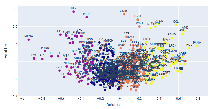
- Plotting the above stock clusters with tickers
# Plot the clusters created using Plotly
fig = px.scatter(clusters_df, x="Returns", y="Volatility", color="Cluster", text="Ticker",hover_data=["Ticker"])
fig.update(layout_coloraxis_showscale=False)
fig.update_traces(marker_size=10)
fig.update_traces(textposition='top center')
fig.show()

- We can identify and remove 3 groups of stock outliers ranked in terms of min/max returns and high volatility
# Identify and remove the outliers of stocks
returns.drop('NVDA',inplace=True) #highest return
returns.drop('TSLA',inplace=True) #high return
returns.drop('META',inplace=True) #high return
returns.drop('CTLT',inplace=True) #high volatility
returns.drop('ZION',inplace=True) #high volatility
returns.drop('CMA',inplace=True) #high volatility
returns.drop('DG',inplace=True) #low return
returns.drop('ENPH',inplace=True) #negative return
returns.drop('SEDG',inplace=True) #negative return
returns.drop('VLTO',inplace=True) #most negative return


# Recreate data to feed into the algorithm
data = np.asarray([np.asarray(returns['Returns']),np.asarray(returns['Volatility'])]).T

# Computing K-Means with K = 4 (4 clusters)
centroids,_ = kmeans(data,4)

# Assign each sample to a cluster
idx,_ = vq(data,centroids)

# Create a dataframe with the tickers and the clusters that's belong to
details = [(name,cluster) for name, cluster in zip(returns.index,idx)]
details_df = pd.DataFrame(details)

# Rename columns
details_df.columns = ['Ticker','Cluster']

# Create another dataframe with the tickers and data from each stock
clusters_df = returns.reset_index()

# Bring the clusters information from the dataframe 'details_df'
clusters_df['Cluster'] = details_df['Cluster']

# Rename columns
clusters_df.columns = ['Ticker', 'Returns', 'Volatility', 'Cluster']

# Plot the clusters created using Plotly
fig = px.scatter(clusters_df, x="Returns", y="Volatility", color="Cluster", text="Ticker",hover_data=["Ticker"])
fig.update(layout_coloraxis_showscale=False)
fig.update_traces(marker_size=10)
fig.update_traces(textposition='top center')
fig.show()
- Plot S&P 500 stock cluster 0
clusters1_df = clusters_df.loc[clusters_df['Cluster'] == 0]
# Plot the clusters created using Plotly
fig = px.scatter(clusters1_df, x="Returns", y="Volatility", text="Ticker",hover_data=["Ticker"])
fig.update(layout_coloraxis_showscale=False)
fig.update_traces(marker_size=10)
fig.update_traces(textposition='top center')
fig.update_traces(marker=dict(color='blue'))
fig.update_layout(
    height=800,
    title_text='S&P500 Stock Cluster 0',font=dict(size=15)
)
fig.update_layout(
yaxis = dict(
tickfont = dict(size=20)))
fig.update_layout(
xaxis = dict(
tickfont = dict(size=20)))
fig.show()

- Plot S&P 500 stock cluster 1
clusters1_df = clusters_df.loc[clusters_df['Cluster'] == 1]
# Plot the clusters created using Plotly
fig = px.scatter(clusters1_df, x="Returns", y="Volatility", text="Ticker",hover_data=["Ticker"])
fig.update(layout_coloraxis_showscale=False)
fig.update_traces(marker_size=10)
fig.update_traces(textposition='top center')
fig.update_traces(marker=dict(color='purple'))
fig.update_layout(
    height=800,
    title_text='S&P500 Stock Cluster 1',font=dict(size=15)
)
fig.update_layout(
yaxis = dict(
tickfont = dict(size=20)))
fig.update_layout(
xaxis = dict(
tickfont = dict(size=20)))
fig.show()

- Plot S&P 500 stock cluster 2
clusters1_df = clusters_df.loc[clusters_df['Cluster'] == 2]
# Plot the clusters created using Plotly
fig = px.scatter(clusters1_df, x="Returns", y="Volatility", text="Ticker",hover_data=["Ticker"])
fig.update(layout_coloraxis_showscale=False)
fig.update_traces(marker_size=10)
fig.update_traces(textposition='top center')
fig.update_traces(marker=dict(color='orange'))
fig.update_layout(
    height=800,
    title_text='S&P500 Stock Cluster 2',font=dict(size=15)
)
fig.update_layout(
yaxis = dict(
tickfont = dict(size=20)))
fig.update_layout(
xaxis = dict(
tickfont = dict(size=20)))
fig.show()

- Plot S&P 500 stock cluster 3
clusters1_df = clusters_df.loc[clusters_df['Cluster'] == 3]
# Plot the clusters created using Plotly
fig = px.scatter(clusters1_df, x="Returns", y="Volatility", text="Ticker",hover_data=["Ticker"])
fig.update(layout_coloraxis_showscale=False)
fig.update_traces(marker_size=10)
fig.update_traces(textposition='top center')
fig.update_traces(marker=dict(color='yellow'))
fig.update_layout(
    height=800,
    title_text='S&P500 Stock Cluster 3',font=dict(size=15)
)
fig.update_layout(
yaxis = dict(
tickfont = dict(size=20)))
fig.update_layout(
xaxis = dict(
tickfont = dict(size=20)))
fig.show()

META Price 2023 Anomaly Detection
- As an example, let’s dive into the META stock price 2023 by applying the anomaly detection algorithm.
- Reading the input data and calculating the Minmax scaled stock daily returns
ticker = 'META'
start_date = '2023-01-01'
end_date = '2023-10-24'

stock_data = yf.download(ticker, start=start_date, end=end_date)['Adj Close']
# Create an empty dataframe
returns = pd.DataFrame()

# Define the column Returns
returns['Returns'] = stock_data.pct_change()
from sklearn.preprocessing import StandardScaler
scaler = StandardScaler()
returns['Returns'] = scaler.fit_transform(returns['Returns'].values.reshape(-1,1))
data=returns.dropna()
data.tail()
             Returns
Date
2023-10-17	0.148736
2023-10-18	-0.999300
2023-10-19	-0.677357
2023-10-20	-0.683911
2023-10-23	0.467614
- Let’s invoke the Isolated Forest anomaly detection algorithm with 5% contamination
from sklearn.ensemble import IsolationForest
model = IsolationForest(contamination=0.05)
model.fit(data[['Returns']])

# Predicting anomalies
data['Anomaly'] = model.predict(data[['Returns']])
data['Anomaly'] = data['Anomaly'].map({1: 0, -1: 1})

# Ploting the results
plt.figure(figsize=(20,5))
plt.plot(data.index, data['Returns'], label='Returns')
plt.scatter(data[data['Anomaly'] == 1].index, data[data['Anomaly'] == 1]['Returns'], color='red')
plt.legend(['Returns', 'Anomaly'])
plt.grid()
plt.show()

- For the sake of comparison, let’s consider the TensorFlow Keras anomaly detection algorithm.
- Loading the input data
fb = yf.Ticker("META")

fb_historical = fb.history(start=start_date, end=end_date, interval="1d")
df = fb_historical.drop(columns=['Open', 'High', 'Low', 'Dividends', 'Stock Splits', 'Volume'])
df1=df.reset_index()
- Importing key libraries
import numpy as np
import tensorflow as tf
import pandas as pd
pd.options.mode.chained_assignment = None
import seaborn as sns
from matplotlib.pylab import rcParams
import matplotlib.pyplot as plt
import plotly.express as px
import plotly.graph_objects as go

%matplotlib inline

sns.set(style='whitegrid', palette='muted')
rcParams['figure.figsize'] = 14, 8
np.random.seed(1)
tf.random.set_seed(1)

print('Tensorflow version:', tf.__version__)
Tensorflow version: 2.10.0
fig = go.Figure()
fig.add_trace(go.Scatter(x=df1.Date, y=df1.Close,
                    mode='lines',
                    name='close'))
fig.update_layout(showlegend=True)
fig.show()

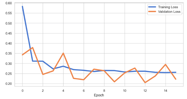
- Preparing the data and training the Keras Sequential LSTM model
df=df1.copy()
train_size = int(len(df) * 0.8)
test_size = len(df) - train_size
train, test = df.iloc[0:train_size], df.iloc[train_size:len(df)]
print(train.shape, test.shape)
(162, 2) (41, 2)
from sklearn.preprocessing import StandardScaler

scaler = StandardScaler()
scaler = scaler.fit(train[['Close']])

train['Close'] = scaler.transform(train[['Close']])
test['Close'] = scaler.transform(test[['Close']])
def create_dataset(X, y, time_steps=1):
    Xs, ys = [], []
    for i in range(len(X) - time_steps):
        v = X.iloc[i:(i + time_steps)].values
        Xs.append(v)
        ys.append(y.iloc[i + time_steps])
    return np.array(Xs), np.array(ys)
time_steps = 30

X_train, y_train = create_dataset(train[['Close']], train.Close, time_steps)
X_test, y_test = create_dataset(test[['Close']], test.Close, time_steps)

print(X_train.shape)
(132, 30, 1)
timesteps = X_train.shape[1]
num_features = X_train.shape[2]
from tensorflow.keras.models import Sequential
from tensorflow.keras.layers import Dense, LSTM, Dropout, RepeatVector, TimeDistributed

model = Sequential([
    LSTM(128, input_shape=(timesteps, num_features)),
    Dropout(0.2),
    RepeatVector(timesteps),
    LSTM(128, return_sequences=True),
    Dropout(0.2),
    TimeDistributed(Dense(num_features))
])

model.compile(loss='mae', optimizer='adam')
model.summary()
Model: "sequential"
_________________________________________________________________
 Layer (type)                Output Shape              Param #
=================================================================
 lstm (LSTM)                 (None, 128)               66560

 dropout (Dropout)           (None, 128)               0

 repeat_vector (RepeatVector  (None, 30, 128)          0
 )

 lstm_1 (LSTM)               (None, 30, 128)           131584

 dropout_1 (Dropout)         (None, 30, 128)           0

 time_distributed (TimeDistr  (None, 30, 1)            129
 ibuted)

=================================================================
Total params: 198,273
Trainable params: 198,273
Non-trainable params: 0
es = tf.keras.callbacks.EarlyStopping(monitor='val_loss', patience=3, mode='min')
history = model.fit(
    X_train, y_train,
    epochs=100,
    batch_size=32,
    validation_split=0.1,
    callbacks = [es],
    shuffle=False
)
plt.rcParams.update({'font.size': 20})
plt.figure(figsize=(10, 5))
plt.plot(history.history['loss'], label='Training Loss',lw=4)
plt.plot(history.history['val_loss'], label='Validation Loss',lw=4)
plt.xlabel('Epoch')
plt.legend();
- Performing model prediction and evaluation
X_train_pred = model.predict(X_train)

train_mae_loss = pd.DataFrame(np.mean(np.abs(X_train_pred - X_train), axis=1), columns=['Error'])
model.evaluate(X_test, y_test)
loss: 0.16311994194984436
- Plotting Train MAE Loss using sns.distplot
ax=sns.distplot(train_mae_loss, bins=50, kde=True);
sns.set(font_scale=2)
sns.set(rc={'figure.figsize':(10,7)})
ax.set(xlabel='Train MAE Loss', ylabel='Density')

- Test data prediction and plotting Test MAE Loss using sns.distplot
X_test_pred = model.predict(X_test)

test_mae_loss = np.mean(np.abs(X_test_pred - X_test), axis=1)
ax=sns.distplot(test_mae_loss, bins=50, kde=True);
ax.set(xlabel='Test MAE Loss', ylabel='Density')

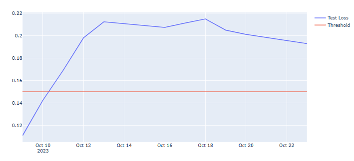
- Let’s look at the test data columns loss, anomaly, and close by applying a constant threshold
THRESHOLD = 0.15

test_score_df = pd.DataFrame(test[time_steps:])
test_score_df['loss'] = test_mae_loss
test_score_df['threshold'] = THRESHOLD
test_score_df['anomaly'] = test_score_df.loss > test_score_df.threshold
test_score_df['close'] = test[time_steps:].Close
fig = go.Figure()
fig.add_trace(go.Scatter(x=test[time_steps:].Date, y=test_score_df.loss,
                    mode='lines',
                    name='Test Loss'))
fig.add_trace(go.Scatter(x=test[time_steps:].Date, y=test_score_df.threshold,
                    mode='lines',
                    name='Threshold'))
fig.update_layout(showlegend=True)
fig.show()
anomalies = test_score_df[test_score_df.anomaly == True]
anomalies.tail()

import seaborn as sns
import matplotlib as mpl
mpl.rcParams['lines.markersize'] = 18
sns.scatterplot(x='Date', y='close', data=anomalies, hue='anomaly')

3D Cluster Analysis of 3 Leading Tech Stocks in 2023
- Let’s compare the following 3 leading tech stocks in terms of their daily returns in 2023
fb = yf.Ticker("META")
fb_historical = fb.history(start=start_date, end=end_date, interval="1d")
fb_df = fb_historical.drop(columns=['Open', 'High', 'Low', 'Dividends', 'Stock Splits', 'Volume'])
fb_df.rename(columns= {'Close':'META'}, inplace=True)
tsla= yf.Ticker("TSLA")
tsla_historical = tsla.history(start=start_date, end=end_date, interval="1d")
tsla_df = tsla_historical.drop(columns=['Open', 'High', 'Low', 'Dividends', 'Stock Splits', 'Volume'])
tsla_df.rename(columns= {'Close':'TSLA'}, inplace=True)
cmg = yf.Ticker("AAPL")
cmg_historical = cmg.history(start=start_date, end=end_date, interval="1d")
cmg_df = cmg_historical.drop(columns=['Open', 'High', 'Low', 'Dividends', 'Stock Splits', 'Volume'])
cmg_df.rename(columns= {'Close':'AAPL'}, inplace=True)
# Concat join tickers into one DataFrame
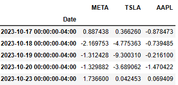
stocks = pd.concat([fb_df, tsla_df, cmg_df], axis="columns", join="inner")
N,d = stocks.shape
delta = pd.DataFrame(100*np.divide(stocks.iloc[1:,:].values-stocks.iloc[:N-1,:].values, stocks.iloc[:N-1,:].values),
columns=stocks.columns, index=stocks.iloc[1:].index)
delta.tail()
- Let’s plot their returns in 3D (cf. Three-Dimensional Plotting in Matplotlib)
import matplotlib.pyplot as plt
%matplotlib inline

fig = plt.figure(figsize=(8,5))
ax = plt.axes(projection='3d')
ax.scatter(delta.META,delta.TSLA,delta.AAPL)
ax.set_xlabel('META',labelpad = 15)
ax.set_ylabel('TSLA',labelpad = 15)
ax.set_zlabel('AAPL',labelpad = -35)
plt.show()

- Calculating the mean and covariance values of returns
meanValue = delta.mean()
covValue = delta.cov()
print(meanValue)
print(covValue)
META    0.491357
TSLA    0.393428
AAPL    0.171355
dtype: float64
          META       TSLA      AAPL
META  7.126712   3.642370  1.879189
TSLA  3.642370  11.984574  2.070569
AAPL  1.879189   2.070569  1.713684
- Introducing the anomaly score of these three stocks and plotting them with varying marker color
from numpy.linalg import inv

X = delta.values
S = covValue.values
for i in range(3):
    X[:,i] = X[:,i] - meanValue[i]

def mahalanobis(row):
    return np.matmul(row,S).dot(row)

anomaly_score = np.apply_along_axis( mahalanobis, axis=1, arr=X)

fig = plt.figure(figsize=(10,6))
ax = fig.add_subplot(111, projection='3d')
p = ax.scatter(delta.META,delta.TSLA,delta.AAPL,c=anomaly_score,cmap='jet')
ax.set_xlabel('META',labelpad = 15)
ax.set_ylabel('TSLA',labelpad = 15)
ax.set_zlabel('AAPL',labelpad = -35)
fig.colorbar(p)
plt.show()

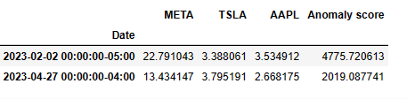
- Let’s compare 2 largest anomaly scores
anom = pd.DataFrame(anomaly_score, index=delta.index, columns=['Anomaly score'])
result = pd.concat((delta,anom), axis=1)
result.nlargest(2,'Anomaly score')
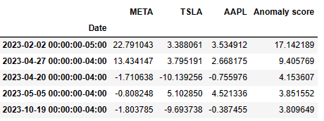
- Let’s define the anomaly score in terms of the KNN distance and plot the result in 3D view
from sklearn.neighbors import NearestNeighbors
import numpy as np
from scipy.spatial import distance

knn = 4
nbrs = NearestNeighbors(n_neighbors=knn, metric=distance.euclidean).fit(delta.values)
distances, indices = nbrs.kneighbors(delta.values)

anomaly_score = distances[:,knn-1]

fig = plt.figure(figsize=(10,6))
ax = fig.add_subplot(111, projection='3d')
p = ax.scatter(delta.META,delta.TSLA,delta.AAPL,c=anomaly_score,cmap='jet')
ax.set_xlabel('META',labelpad = 15)
ax.set_ylabel('TSLA',labelpad = 15)
ax.set_zlabel('AAPL',labelpad = -35)
fig.colorbar(p)
plt.show()

- Examining the top 5 anomaly scores in 2023
anom = pd.DataFrame(anomaly_score, index=delta.index, columns=['Anomaly score'])
result = pd.concat((delta,anom), axis=1)
result.nlargest(5,'Anomaly score')
LSTM Anomalies of S&P 500 Index Historical Prices – Round 1
- We continue evaluating the S&P 500 index in terms of the Anomaly Detection in Time Series with Keras. In doing so, let’s turn our attention to the historical S&P 500 data
df = pd.read_csv('S&P_500_Index_Data.csv', parse_dates=['date'])
df.tail()
            date	close
8187	2018-06-25	2717.07
8188	2018-06-26	2723.06
8189	2018-06-27	2699.63
8190	2018-06-28	2716.31
8191	2018-06-29	2718.37
df.shape
(8192, 2)
fig = go.Figure()
fig.add_trace(go.Scatter(x=df.date, y=df.close,
                    mode='lines',
                    name='close'))
fig.update_layout(showlegend=True)
fig.show()
- Let’s prepare the data and train the model
train_size = int(len(df) * 0.8)
test_size = len(df) - train_size
train, test = df.iloc[0:train_size], df.iloc[train_size:len(df)]
print(train.shape, test.shape)
(6553, 2) (1639, 2)
from sklearn.preprocessing import StandardScaler

scaler = StandardScaler()
scaler = scaler.fit(train[['close']])

train['close'] = scaler.transform(train[['close']])
test['close'] = scaler.transform(test[['close']])
def create_dataset(X, y, time_steps=1):
    Xs, ys = [], []
    for i in range(len(X) - time_steps):
        v = X.iloc[i:(i + time_steps)].values
        Xs.append(v)
        ys.append(y.iloc[i + time_steps])
    return np.array(Xs), np.array(ys)
time_steps = 30

X_train, y_train = create_dataset(train[['close']], train.close, time_steps)
X_test, y_test = create_dataset(test[['close']], test.close, time_steps)

print(X_train.shape)
(6523, 30, 1)
timesteps = X_train.shape[1]
num_features = X_train.shape[2]
from tensorflow.keras.models import Sequential
from tensorflow.keras.layers import Dense, LSTM, Dropout, RepeatVector, TimeDistributed

model = Sequential([
    LSTM(128, input_shape=(timesteps, num_features)),
    Dropout(0.2),
    RepeatVector(timesteps),
    LSTM(128, return_sequences=True),
    Dropout(0.2),
    TimeDistributed(Dense(num_features))
])

model.compile(loss='mae', optimizer='adam')
model.summary()
Model: "sequential_3"
_________________________________________________________________
 Layer (type)                Output Shape              Param #
=================================================================
 lstm_6 (LSTM)               (None, 128)               66560

 dropout_6 (Dropout)         (None, 128)               0

 repeat_vector_3 (RepeatVect  (None, 30, 128)          0
 or)

 lstm_7 (LSTM)               (None, 30, 128)           131584

 dropout_7 (Dropout)         (None, 30, 128)           0

 time_distributed_3 (TimeDis  (None, 30, 1)            129
 tributed)

=================================================================
Total params: 198,273
Trainable params: 198,273
Non-trainable params: 0
es = tf.keras.callbacks.EarlyStopping(monitor='val_loss', patience=3, mode='min')
history = model.fit(
    X_train, y_train,
    epochs=100,
    batch_size=32,
    validation_split=0.1,
    callbacks = [es],
    shuffle=False
)
from matplotlib.pyplot import figure

figure(figsize=(10, 5))
plt.rcParams.update({'font.size': 20})

plt.plot(history.history['loss'], label='Training Loss',lw=4)
plt.plot(history.history['val_loss'], label='Validation Loss',lw=4)
plt.xlabel('Epoch')
plt.legend();

- Performing train/test data predictions and validation
X_train_pred = model.predict(X_train)

train_mae_loss = pd.DataFrame(np.mean(np.abs(X_train_pred - X_train), axis=1), columns=['Error'])
model.evaluate(X_test, y_test)
loss: 0.8965740203857422
- Density plot Train MAE Loss
ax=sns.distplot(train_mae_loss, bins=50, kde=True);
sns.set(font_scale=4)
sns.set(rc={'figure.figsize':(10,7)})
ax.set(xlabel='Train MAE Loss', ylabel='Density')

- Test data prediction
X_test_pred = model.predict(X_test)

test_mae_loss = np.mean(np.abs(X_test_pred - X_test), axis=1)
- Density plot Test MAE Loss
ax=sns.distplot(test_mae_loss, bins=50, kde=True);
sns.set(font_scale=4)
sns.set(rc={'figure.figsize':(10,7)})
ax.set(xlabel='Test MAE Loss', ylabel='Density')

- Applying a constant threshold to Test Loss and plot the result
THRESHOLD = 1.32

test_score_df = pd.DataFrame(test[time_steps:])
test_score_df['loss'] = test_mae_loss
test_score_df['threshold'] = THRESHOLD
test_score_df['anomaly'] = test_score_df.loss > test_score_df.threshold
test_score_df['close'] = test[time_steps:].close
fig = go.Figure()
fig.add_trace(go.Scatter(x=test[time_steps:].date, y=test_score_df.loss,
                    mode='lines',
                    name='Test Loss'))
fig.add_trace(go.Scatter(x=test[time_steps:].date, y=test_score_df.threshold,
                    mode='lines',
                    name='Threshold'))
fig.update_layout(showlegend=True)
fig.show()

- Creating the anomaly score
anomalies = test_score_df[test_score_df.anomaly == True]
anomalies.tail()
           date	loss threshold	anomaly	     close
8187	2018-06-25	1.848737	0.8	True	4.453261
8188	2018-06-26	1.852082	0.8	True	4.467213
8189	2018-06-27	1.854868	0.8	True	4.412640
8190	2018-06-28	1.858325	0.8	True	4.451491
8191	2018-06-29	1.860025	0.8	True	4.456289
- Plotting the anomalies
sns.scatterplot(x='date', y='close', data=anomalies, hue='anomaly')

LSTM Anomalies of S&P 500 Index Historical Prices – Round 2
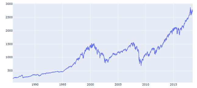
- Let’s have an alternative look at the LSTM model of automated anomaly detection using the closing prices for S&P 500 index from 1986 to 2018, viz.
df = pd.read_csv('S&P_500_Index_Data.csv', parse_dates=['date'])
anomaly_df = df.copy()
fig = plt.figure(figsize=(10,6))
plt.style.use('ggplot')

ax = fig.add_subplot()

ax.plot(anomaly_df['date'],anomaly_df['close'], label='Close Price')

ax.set_title('S&P 500 Daily Prices 1986 - 2018', fontweight = 'bold')

plt.rcParams.update({'font.size': 20})

ax.set_xlabel('Year')
ax.set_ylabel('Dollars ($)')

ax.legend()

- Preparing the data for training the LSTM model
train_size = int(len(anomaly_df) * 0.7)
test_size = len(anomaly_df) - train_size
train, test = anomaly_df.iloc[0:train_size], anomaly_df.iloc[train_size:len(anomaly_df)]
scaler = StandardScaler()
scaler = scaler.fit(train[['close']])

train['close'] = scaler.transform(train[['close']])
test['close'] = scaler.transform(test[['close']])
#Create helper function
def create_dataset(X, y, time_steps=1):
    Xs, ys = [], []
    for i in range(len(X) - time_steps):
        v = X.iloc[i:(i + time_steps)].values
        Xs.append(v)
        ys.append(y.iloc[i + time_steps])
    return np.array(Xs), np.array(ys)

TIME_STEPS = 30

# reshape to [samples, time_steps, n_features]

X_train, y_train = create_dataset(train[['close']], train.close, TIME_STEPS)
X_test, y_test = create_dataset(test[['close']], test.close, TIME_STEPS)
- Training the LSTM model
model = keras.Sequential()

#encoder
model.add(keras.layers.LSTM(
    units=64,
    input_shape=(X_train.shape[1], X_train.shape[2])
))
model.add(keras.layers.Dropout(rate=0.2))

#decoder
model.add(keras.layers.RepeatVector(n=X_train.shape[1]))

model.add(keras.layers.LSTM(units=64, return_sequences=True))
model.add(keras.layers.Dropout(rate=0.2))

model.add(keras.layers.TimeDistributed(keras.layers.Dense(units=X_train.shape[2])))

model.compile(loss='mae', optimizer='adam')
model.summary()
Model: "sequential_6"
_________________________________________________________________
 Layer (type)                Output Shape              Param #
=================================================================
 lstm_12 (LSTM)              (None, 64)                16896

 dropout_12 (Dropout)        (None, 64)                0

 repeat_vector_6 (RepeatVect  (None, 30, 64)           0
 or)

 lstm_13 (LSTM)              (None, 30, 64)            33024

 dropout_13 (Dropout)        (None, 30, 64)            0

 time_distributed_6 (TimeDis  (None, 30, 1)            65
 tributed)

=================================================================
Total params: 49,985
Trainable params: 49,985
Non-trainable params: 0
_________________________________________________________________
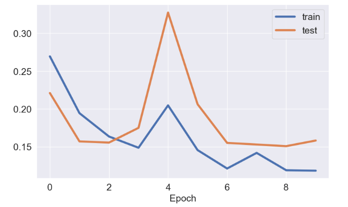
history = model.fit(
    X_train, y_train,
    epochs=10,
    batch_size=64,
    validation_split=0.3,
    shuffle=False
)
fig = plt.figure(figsize=(10,6))
ax = fig.add_subplot()
import matplotlib
#matplotlib.rcParams.update({'font.size': 22})
SMALL_SIZE = 18
MEDIUM_SIZE = 18
BIGGER_SIZE = 18

plt.rc('font', size=SMALL_SIZE)          # controls default text sizes
plt.rc('axes', titlesize=SMALL_SIZE)     # fontsize of the axes title
plt.rc('axes', labelsize=MEDIUM_SIZE)    # fontsize of the x and y labels
plt.rc('xtick', labelsize=SMALL_SIZE)    # fontsize of the tick labels
plt.rc('ytick', labelsize=SMALL_SIZE)    # fontsize of the tick labels
plt.rc('legend', fontsize=SMALL_SIZE)    # legend fontsize
plt.rc('figure', titlesize=BIGGER_SIZE)  # fontsize of the figure title
ax.plot(history.history['loss'], label='train',lw=4)
ax.plot(history.history['val_loss'], label='test',lw=4)
plt.xlabel('Epoch')
ax.legend()
- LSTM Model predictions on train data
X_train_pred = model.predict(X_train)

train_mae_loss = np.mean(np.abs(X_train_pred - X_train), axis=1)
fig = plt.figure(figsize=(10,5))
sns.set(style="darkgrid")
ax = fig.add_subplot()
sns.set(font_scale=2)
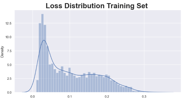
sns.distplot(train_mae_loss, bins=50, kde=True)
ax.set_title('Loss Distribution Training Set ', fontweight ='bold')
- LSTM Model predictions on test data
X_test_pred = model.predict(X_test)

test_mae_loss = np.mean(np.abs(X_test_pred - X_test), axis=1)
fig = plt.figure(figsize=(10,5))
sns.set(style="darkgrid")

ax = fig.add_subplot()
sns.set(font_scale=2)
sns.distplot(test_mae_loss, bins=50, kde=True)

ax.set_title('Loss Distribution Test Set ', fontweight ='bold')

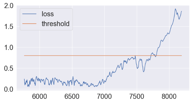
- Applying the constant threshold technique
THRESHOLD = 0.8
test_score_df = pd.DataFrame(index=test[TIME_STEPS:].index)
test_score_df['date'] = test['date']
test_score_df['loss'] = test_mae_loss
test_score_df['threshold'] = THRESHOLD
test_score_df['anomaly'] = test_score_df.loss > test_score_df.threshold
test_score_df['close'] = test[TIME_STEPS:].close
fig = plt.figure(figsize=(10,5))
ax = fig.add_subplot()

ax.plot(test_score_df.index, test_score_df.loss, label='loss')
ax.plot(test_score_df.index, test_score_df.threshold, label='threshold')

ax.legend()
- Plot of test data anomalies vs loss factor
anomalies = test_score_df[test_score_df.anomaly == True]
anomalies.index=test_score_df[test_score_df.anomaly == True].index
anomalies.tail()
date	     loss	threshold	anomaly	     close
8187	2018-06-25	1.848737	0.8	True	4.453261
8188	2018-06-26	1.852082	0.8	True	4.467213
8189	2018-06-27	1.854868	0.8	True	4.412640
8190	2018-06-28	1.858325	0.8	True	4.451491
8191	2018-06-29	1.860025	0.8	True	4.456289
fig = plt.figure(figsize=(14,5))
plt.plot(test['date'],test['close'])
sns.scatterplot(data=anomalies, x="date", y="close", hue="loss",s=170)

Summary
- Anomaly detection involves identifying data points in the data that doesn’t fit the normal pattern. Using AI-powered methods we can automate this process making it more effective especially when large datasets are involved.
- In our approach, we simply ask if the stock price fits the normal pattern by detecting collective outliers.
- We have implemented both unsupervised and supervised ML algorithms that perform clustering and detect anomalies in stock prices.
- The entire workflow was tested on S&P500 data. It consists of the following steps:
- Uploading the input dataset, splitting the dataset into training/testing subsets.
- Data preparation: scale and reshape our data for the model training.
- Create and train the model
- Train/test data predictions and calculation of MAE loss
- Applying the constant threshold technique.
- The LSTM algorithm detects anomalous data points in the test set that exceed the
reconstruction error threshold. - The trained model found that some low and high S&P 500 price anomalies linked to fluctuating bullish and bearish expectations.
References
- Facundo Joel Allia Fernandez, 2023, Clasificación de acciones mediante k-means clustering. Available at SSRN: https://ssrn.com/abstract=4403662
- Stock classification using k-means clustering
- Anomaly Detection on Google Stock Data 2014-2022
- Anomaly Detection
Explore More
- S&P 500 Algorithmic Trading with FBProphet
- Predicting Rolling Volatility of the NVIDIA Stock – GARCH vs XGBoost
- Optimizing NVIDIA Returns-Drawdowns MVA Crossovers vs Simple RNN Mean Reversal Trading Strategies in Python
- IQR-Based Log Price Volatility Ranking of Top 19 Blue Chips
- Blue-Chip Stock Portfolios for Quant Traders
- Risk-Return Analysis and LSTM Price Predictions of 4 Major Tech Stocks in 2023


One-Time
Monthly
Yearly
Make a one-time donation
Make a monthly donation
Make a yearly donation
Choose an amount
€5.00
€15.00
€100.00
€5.00
€15.00
€100.00
€5.00
€15.00
€100.00
Or enter a custom amount
€
Your contribution is appreciated.
Your contribution is appreciated.
Your contribution is appreciated.
DonateDonate monthlyDonate yearly
Leave a comment