
Featured Photo by Nataliya Vaitkevich on Pexels.
- This study seeks to develop an ML-driven e-diagnosis system for detecting and classifying Type 2 Diabetes (T2D) as an IoMT application.
- Through the use of advanced supervised ML algorithms, the system will be able to predict whether a person is at risk for diabetes based on several risk factors, provide doctors with a preliminary diagnosis, and feedback the doctor’s guidance on diet, exercise, and blood glucose testing to patients.
- Indeed, the combination of IoMT and ML can be made available to assist healthcare professionals in the early detection and diagnosis of T2D by providing fully automated predictive e-tools for more efficient and timely decision-making.
- We have implemented the highly reliable ML workflow that consists of the following key steps: Exploratory Data Analysis (EDA), Feature Engineering (FE), ML Model Training, Testing and Performance QC Analysis.
- The Pima Indian Diabetes dataset is employed for this data science project. The Pima Indians in the U.S. reside mainly in the desert regions of Arizona and have the world’s highest recorded prevalence and incidence of T2D.
Table of Contents
- Acknowledgements
- The Pima Dataset
- Data Preparation
- Exploratory Data Analysis (EDA)
- Correlation Analysis
- Missing Values
- Outliers
- Robust Scaling
- Oversampling
- Comparisons
- Performance Analysis
- Summary
- Explore More
Acknowledgements
Smith, J.W., Everhart, J.E., Dickson, W.C., Knowler, W.C., & Johannes, R.S. (1988). Using the ADAP learning algorithm to forecast the onset of diabetes mellitus. In Proceedings of the Symposium on Computer Applications and Medical Care (pp. 261–265). IEEE Computer Society Press.
Diabetes EDA & Prediction|Acc %90.25 & ROC %96.38
The Pima Dataset
The Pima dataset is originally from the National Institute of Diabetes and Digestive and Kidney Diseases. It consist of several medical predictor (independent) variables and one target (dependent) variable, Outcome (1 indicates a positive test result for diabetes, 0 indicates a negative result). Independent variables include the number of pregnancies the patient has had, their BMI, insulin level, age, and so on.
Variables:
- Pregnancies: The number of pregnancies
- Glucose: The plasma glucose concentration in the oral glucose tolerance test after two hours
- Blood Pressure: Blood Pressure (Small blood pressure) (mmHg)
- SkinThickness: Skin Thickness
- Insulin: 2-hour serum insulin (mu U/ml)
- DiabetesPedigreeFunction: This function calculates the likelihood of having diabetes based on the lineage of a descendant
- BMI: Body mass index
- Age: Age (year)
- Outcome: Have the disease (1) or not (0).
Data Preparation
Let’s set the working directory DIABETES3
import os
os.chdir(‘DIABETES3’)
os. getcwd()
and import Python libraries
import pandas as pd
import numpy as np
import seaborn as sns
import matplotlib.pyplot as plt
%matplotlib inline
import plotly.offline as py
import plotly.graph_objs as go
import missingno as msno
from sklearn.model_selection import train_test_split
from sklearn.preprocessing import RobustScaler, StandardScaler, MinMaxScaler
from sklearn.metrics import f1_score, precision_score, recall_score, confusion_matrix, roc_curve, precision_recall_curve, accuracy_score, roc_auc_score
from imblearn.over_sampling import SMOTE
from sklearn.model_selection import GridSearchCV
from sklearn.linear_model import LogisticRegression
from sklearn.ensemble import RandomForestClassifier, GradientBoostingClassifier
from sklearn.tree import DecisionTreeClassifier
from catboost import CatBoostClassifier
from lightgbm import LGBMClassifier
from xgboost import XGBClassifier
from sklearn.ensemble import AdaBoostClassifier
Our display settings are
pd.set_option(“display.width”, 500)
pd.set_option(“display.max_columns”, 25)
Let’s read the input csv file
df_ = pd.read_csv(“diabetes.csv”)
df = df_.copy()
and check the data structure
def check_df(dataframe, head=5):
print(f'{” Info “:-^100}’)
print(dataframe.info())
print(f'{” Head “:-^100}’)
print(dataframe.head(head))
print(f'{” Tail “:-^100}’)
print(dataframe.tail(head))
print(f'{” Quantiles “:-^100}’)
print(dataframe.describe([0.25, 0.50, 0.75, 0.95, 0.99]).T)
check_df(df)
----------------------------------------------- Info ---------------------
<class 'pandas.core.frame.DataFrame'>
RangeIndex: 768 entries, 0 to 767
Data columns (total 9 columns):
 #   Column                    Non-Null Count  Dtype
---  ------                    --------------  -----
 0   Pregnancies               768 non-null    int64
 1   Glucose                   768 non-null    int64
 2   BloodPressure             768 non-null    int64
 3   SkinThickness             768 non-null    int64
 4   Insulin                   768 non-null    int64
 5   BMI                       768 non-null    float64
 6   DiabetesPedigreeFunction  768 non-null    float64
 7   Age                       768 non-null    int64
 8   Outcome                   768 non-null    int64
dtypes: float64(2), int64(7)
memory usage: 54.1 KB
None
----------------------------------------------- Head --------------------
   Pregnancies  Glucose  BloodPressure  SkinThickness  Insulin   BMI  DiabetesPedigreeFunction  Age  Outcome
0            6      148             72             35        0  33.6                     0.627   50        1
1            1       85             66             29        0  26.6                     0.351   31        0
2            8      183             64              0        0  23.3                     0.672   32        1
3            1       89             66             23       94  28.1                     0.167   21        0
4            0      137             40             35      168  43.1                     2.288   33        1
----------------------------------------------- Tail -------------------
     Pregnancies  Glucose  BloodPressure  SkinThickness  Insulin   BMI  DiabetesPedigreeFunction  Age  Outcome
763           10      101             76             48      180  32.9                     0.171   63        0
764            2      122             70             27        0  36.8                     0.340   27        0
765            5      121             72             23      112  26.2                     0.245   30        0
766            1      126             60              0        0  30.1                     0.349   47        1
767            1       93             70             31        0  30.4                     0.315   23        0
-------------------------------------------- Quantiles ------------------
                          count        mean         std     min       25%       50%        75%        95%        99%     max
Pregnancies               768.0    3.845052    3.369578   0.000   1.00000    3.0000    6.00000   10.00000   13.00000   17.00
Glucose                   768.0  120.894531   31.972618   0.000  99.00000  117.0000  140.25000  181.00000  196.00000  199.00
BloodPressure             768.0   69.105469   19.355807   0.000  62.00000   72.0000   80.00000   90.00000  106.00000  122.00
SkinThickness             768.0   20.536458   15.952218   0.000   0.00000   23.0000   32.00000   44.00000   51.33000   99.00
Insulin                   768.0   79.799479  115.244002   0.000   0.00000   30.5000  127.25000  293.00000  519.90000  846.00
BMI                       768.0   31.992578    7.884160   0.000  27.30000   32.0000   36.60000   44.39500   50.75900   67.10
DiabetesPedigreeFunction  768.0    0.471876    0.331329   0.078   0.24375    0.3725    0.62625    1.13285    1.69833    2.42
Age                       768.0   33.240885   11.760232  21.000  24.00000   29.0000   41.00000   58.00000   67.00000   81.00
Outcome                   768.0    0.348958    0.476951   0.000   0.00000    0.0000    1.00000    1.00000    1.00000    1.00
Exploratory Data Analysis (EDA)
Let’s examine the relationship between Outcome and model features
def advance_histogram(df):
plt.figure(figsize=(15, 15))
i = 1
for col_name in df.columns:
plt.subplot(3, 3, i)
sns.histplot(data=df, x=col_name, hue=”Outcome”)
i += 1
plt.savefig(‘histoutcome.png’)
advance_histogram(df)

Let's check the Distribution of our Target Variable (Outcome)
def target_variable_distribution(data):
trace = go.Pie(labels = [‘healthy’,’diabetic’], values = data[‘Outcome’].value_counts(),
textfont=dict(size=15),
marker=dict(colors=[‘lightskyblue’, ‘orange’]))
layout = dict(title =  'Distribution of Target Variable (Outcome)')

fig = dict(data = [trace], layout=layout)
py.iplot(fig)
target_variable_distribution(df)

Target Variable:
The pie chart shows that the input data is imbalanced. The number of non-diabetic is 268 the number of diabetic patients is 500.
Model Features:
- Pregnancies, Skinthickness, Insulin, DBF and Age have skewed distributions.
- Glucose, Blood Pressure, Skin Thickness, Insulin and BMI variables seem to have zero values which is impossible.
Let’s define the function grab_col_names
provides the names of categorical, numerical, and categorical but cardinal variables. Note: Categorical variables with numerical appearance are also included in categorical variables.
Parameters
——
df: Dataframe
The dataframe from which variable names are to be retrieved
cat_th: int, optional
threshold value for numeric but categorical variables
car_th: int, optinal
threshold value for categorical but cardinal variables
Returns
------
    cat_cols: list
            Categorical variable list
    num_cols: list
            Numeric variable list
    cat_but_car: list
            Categorical but cardinal variable list

Examples
------
    import seaborn as sns
    df = sns.load_dataset("iris")
    print(grab_col_names(df))

Notes
------
    cat_cols + num_cols + cat_but_car = total number of variables
    num_but_cat is inside cat_cols.
    The sum of the 3 returned lists equals the total number of variables:
    cat_cols + num_cols + cat_but_car = number of variables
def grab_col_names(dataframe, cat_th=10, car_th=20):
cat_cols = [col for col in dataframe.columns if dataframe[col].dtypes == "O"]
num_but_cat = [col for col in dataframe.columns if dataframe[col].nunique() < cat_th and
               dataframe[col].dtypes != "O"]
cat_but_car = [col for col in dataframe.columns if dataframe[col].nunique() > car_th and
               dataframe[col].dtypes == "O"]
cat_cols = cat_cols + num_but_cat
cat_cols = [col for col in cat_cols if col not in cat_but_car]

# num_cols
num_cols = [col for col in dataframe.columns if dataframe[col].dtypes != "O"]
num_cols = [col for col in num_cols if col not in num_but_cat]

print(f"Observations: {dataframe.shape[0]}")
print(f"Variables: {dataframe.shape[1]}")
print(f'cat_cols: {len(cat_cols)}')
print(f'num_cols: {len(num_cols)}')
print(f'cat_but_car: {len(cat_but_car)}')
print(f'num_but_cat: {len(num_but_cat)}')

return cat_cols, num_cols, cat_but_car
cat_cols, num_cols, cat_but_car = grab_col_names(df)
Observations: 768
Variables: 9
cat_cols: 1
num_cols: 8
cat_but_car: 0
num_but_cat: 1
Missing values check
df.isnull().sum()
Pregnancies                 0
Glucose                     0
BloodPressure               0
SkinThickness               0
Insulin                     0
BMI                         0
DiabetesPedigreeFunction    0
Age                         0
Outcome                     0
dtype: int64
Correlation Analysis
def correlation_analysis(df): matrix = np.triu(df.corr()) fig, ax = plt.subplots(figsize=(14, 10)) sns.heatmap(df.corr(), annot=True, fmt=’.2f’, vmin=-1, vmax=1, center=0, cmap=’coolwarm’, mask=matrix, ax=ax) plt.savefig(‘corrmatrix.png’)
correlation_analysis(df)
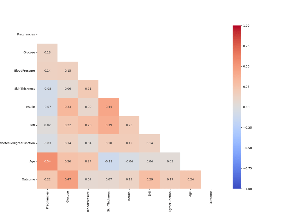
There is a weak correlation between the variables. The highest correlation is between Age and Pregnancies.
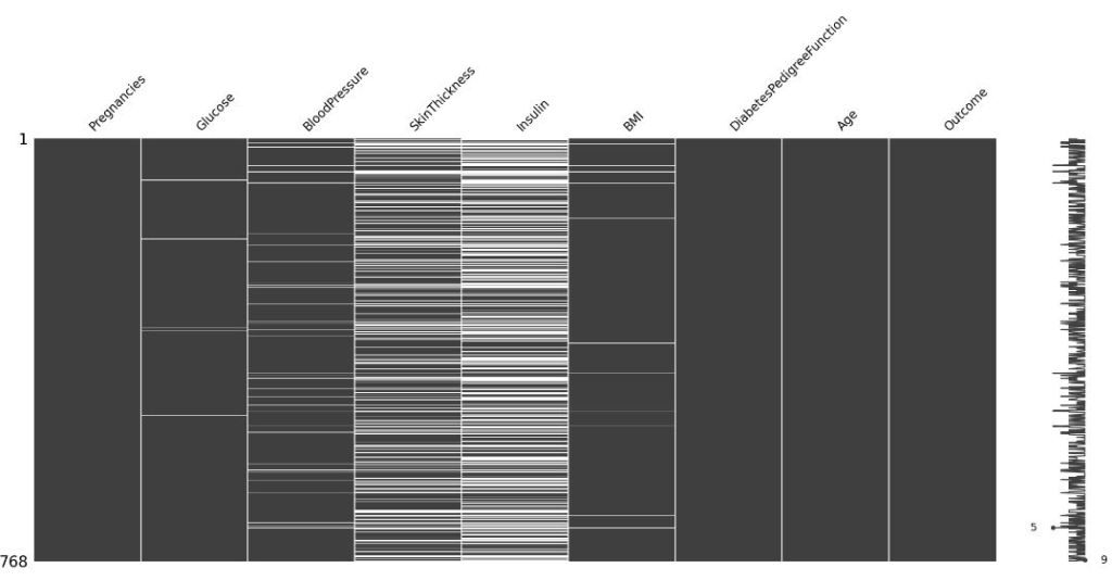
Missing Values
Let’s look at the missing values if any
df[[‘Glucose’, ‘BloodPressure’, ‘SkinThickness’, ‘Insulin’, ‘BMI’]] = df[
[‘Glucose’, ‘BloodPressure’, ‘SkinThickness’, ‘Insulin’, ‘BMI’]].replace(0, np.NaN)
df.isnull().sum()
msno.matrix(df)
plt.savefig(‘missingvalues.png’)
Let’s replace the above missing values with median values as follows
def replace_missing_values(data, column:str):
data.loc[(data[‘Outcome’] == 0 ) & (data[column].isnull()), column] = df.groupby(‘Outcome’)[column].median()[0]
data.loc[(data[‘Outcome’] == 1 ) & (data[column].isnull()), column] = df.groupby(‘Outcome’)[column].median()[1]
return data
nan_columns = [‘Glucose’, ‘BloodPressure’, ‘SkinThickness’, ‘Insulin’, ‘BMI’]
for col in nan_columns:
replace_missing_values(df, col)
df.isnull().sum()
msno.matrix(df)
plt.show()

We filled in all missing data with medians due to skewed distributions.
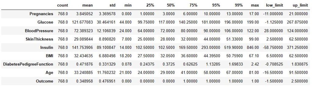
Outliers
Let’s apply the following outlier thresholds
cat_cols, num_cols, cat_but_car = grab_col_names(df)
def outlier_thresholds(dataframe, col_name, q1=0.25, q3=0.90):
quartile1 = dataframe[col_name].quantile(q1)
quartile3 = dataframe[col_name].quantile(q3)
interquantile_range = quartile3 – quartile1
up_limit = quartile3 + 1.5 * interquantile_range
low_limit = quartile1 – 1.5 * interquantile_range
return low_limit, up_limit
low, up = outlier_thresholds(df, df.columns)
df_temp = df.describe([0.25, 0.50, 0.75, 0.95, 0.99]).T
df_temp.assign(**{“low_limit”: low, “up_limit”: up})
Observations: 768
Variables: 9
cat_cols: 1
num_cols: 8
cat_but_car: 0
num_but_cat: 1
Let’s replace the outliers with thresholds
def replace_with_thresholds(dataframe, variable):
low_limit, up_limit = outlier_thresholds(dataframe, variable)
dataframe.loc[(dataframe[variable] < low_limit), variable] = low_limit dataframe.loc[(dataframe[variable] > up_limit), variable] = up_limit
for col in num_cols:
replace_with_thresholds(df, col)
Robust Scaling
Our test show that RobustScaler is superior to MinMaxscaler and StandartScaler
rs = RobustScaler()
df[num_cols] = rs.fit_transform(df[num_cols])
Let’s perform Test-Train Split with test_size = 0.2
random_state = 42
y = df[‘Outcome’]
X = df.drop([‘Outcome’], axis=1)
X_train, X_test, y_train, y_test = train_test_split(X, y,
random_state = random_state,
stratify = y,
test_size = 0.2,
shuffle = True)
Oversampling
The data is imbalanced. Therefore, we use SMOTE with k_neighbors=10 to oversample the data
oversample = SMOTE(random_state=42, k_neighbors=10)
X_smote, y_smote = oversample.fit_resample(X_train, y_train)
X_train, y_train = X_smote, y_smote
y_smote.value_counts()
0    400
1    400
Name: Outcome, dtype: int64
Comparisons
Let’s train/test several ML classifiers and compare their predictions in terms of accuracy, f1- and ROC-scores
def make_classification(X_train, X_test, y_train, y_test):
accuracy,f1,auc,= [],[],[]
random_state = 42

##classifiers
classifiers = []
classifiers.append(DecisionTreeClassifier(random_state=random_state))
classifiers.append(AdaBoostClassifier(DecisionTreeClassifier(random_state=random_state)))
classifiers.append(RandomForestClassifier(random_state=random_state))
classifiers.append(GradientBoostingClassifier(random_state=random_state))
classifiers.append(LogisticRegression(random_state = random_state,solver='lbfgs', max_iter=10000))
classifiers.append(XGBClassifier(random_state = random_state))
classifiers.append(LGBMClassifier(random_state = random_state))
classifiers.append(CatBoostClassifier(random_state = random_state, verbose = False))


for classifier in classifiers:

    #classifier and fitting
    clf = classifier
    clf.fit(X_train,y_train)

    #predictions
    y_preds = clf.predict(X_test)
    y_probs = clf.predict_proba(X_test)

    # metrics
    accuracy.append(((accuracy_score(y_test,y_preds)))*100)
    f1.append(((f1_score(y_test,y_preds)))*100)
    auc.append(((roc_auc_score(y_test,y_probs[:,1])))*100)


results_df = pd.DataFrame({"Accuracy Score":accuracy,
                    "f1 Score":f1,"Roc Score":auc,
                    "ML Models":["DecisionTree","AdaBoost",
                                 "RandomForest","GradientBoosting",
                                 "KNeighboors",
                                 "XGBoost", "LightGBM","CatBoost"]})

results = (results_df.sort_values(by = ['Roc Score','f1 Score'], ascending = False)
              .reset_index(drop =  True))

return classifiers,results
classifiers,results = make_classification(X_train, X_test, y_train, y_test)
results

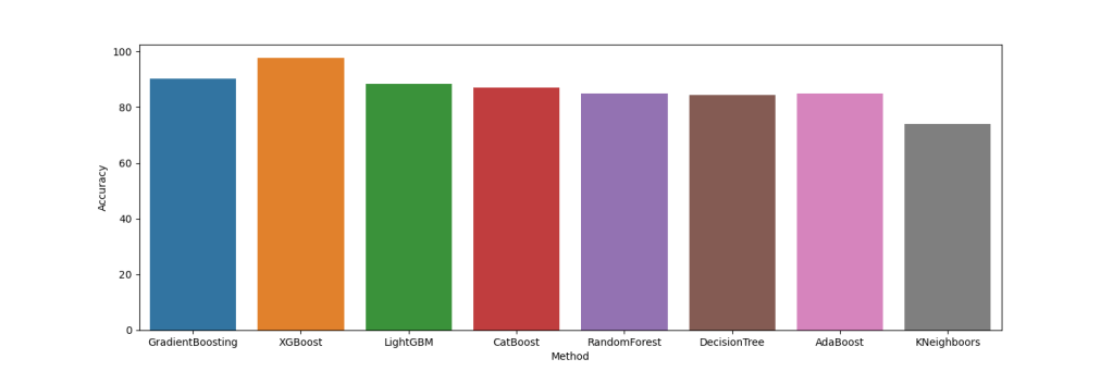
Let’s plot these results
acc = [[‘GradientBoosting’, 90.3], [‘XGBoost’, 97.6], [‘LightGBM’, 88.3],[‘CatBoost’, 87],[‘RandomForest’, 85],[‘DecisionTree’, 84.4],[‘AdaBoost’, 85],[‘KNeighboors’, 74]]
df = pd.DataFrame(acc, columns=[‘Method’, ‘Accuracy’])
plt.figure(figsize=(15,5))
sns.barplot(data=df, x=”Method”, y=”Accuracy”)
plt.savefig(‘accuracybarplot.png’)
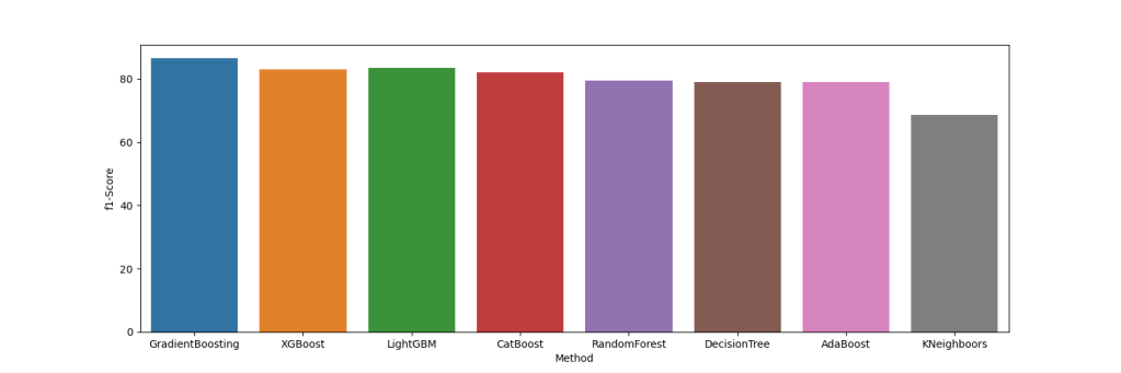
f1 = [[‘GradientBoosting’, 86.5], [‘XGBoost’, 83], [‘LightGBM’, 83.6],[‘CatBoost’, 82],[‘RandomForest’, 79.6],[‘DecisionTree’, 79],[‘AdaBoost’, 84],[‘KNeighboors’, 68.7]]
df1 = pd.DataFrame(f1, columns=[‘Method’, ‘f1-Score’])
plt.figure(figsize=(15,5))
sns.barplot(data=df1, x=”Method”, y=”f1-Score”)
plt.savefig(‘f1scorebarplot.png’)
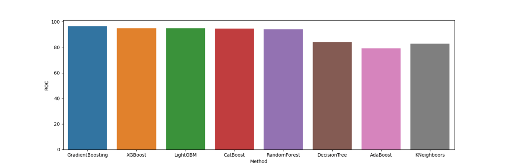
df2 = [[‘GradientBoosting’, 96.3], [‘XGBoost’, 94.7], [‘LightGBM’, 94.7],[‘CatBoost’, 94.5],[‘RandomForest’, 94.1],[‘DecisionTree’, 84.1],[‘AdaBoost’, 79],[‘KNeighboors’, 82.8]]
df2 = pd.DataFrame(f2, columns=[‘Method’, ‘ROC’])
Performance Analysis
Best Model
gbc_model = GradientBoostingClassifier()
gbc_model= gbc_model.fit(X_train, y_train)
gbc_pred = gbc_model.predict(X_test)
print(accuracy_score(y_test, gbc_pred),
f1_score(y_test, gbc_pred),
roc_auc_score(y_test,gbc_model.predict_proba(X_test)[:, 1]))
Feature Importance
feature_imp = pd.Series(gbc_model.feature_importances_,
index=X_train.columns).sort_values(ascending=False)
sns.barplot(x= feature_imp*100, y = feature_imp.index)
plt.xlabel(“Variable Scores”)
plt.ylabel(“Variables”)
plt.title(“Feature Importance”)
plt.show()

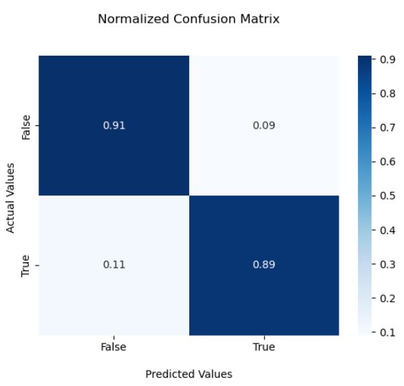
Confusion Matrix
cm = confusion_matrix(y_test, gbc_pred)
cmn = cm.astype(‘float’) / cm.sum(axis=1)[:, np.newaxis]
ax = sns.heatmap(cmn, annot=True, cmap=’Blues’)
ax.set_title(‘Normalized Confusion Matrix\n\n’);
ax.set_xlabel(‘\nPredicted Values’)
ax.set_ylabel(‘Actual Values ‘);
ax.xaxis.set_ticklabels([‘False’,’True’])
ax.yaxis.set_ticklabels([‘False’,’True’])
plt.show()
ROC curve
y_pred_proba = gbc_model.predict_proba(X_test)[:, 1]
fpr, tpr, _ = roc_curve(y_test, y_pred_proba)
plt.plot(fpr,tpr)
plt.ylabel(‘True Positive Rate’)
plt.xlabel(‘False Positive Rate’)
plt.title(‘ROC Curve’)
plt.show()
0.9025974025974026 0.8648648648648649 0.9653703703703703

Summary
- The Gradient Boosting classifier is the best performer.
- Model tuning part did not improve the result.
- In contrast to median values, filling missing values with mean/knn values reduced the accuracy significantly.
- It appears that 25% and 90% were the most optimal thresholds for outliers.
- Adding a new feature has a negative impact on the final score.
Our future work will include developing innovative automated ML/AI processes with IoMT to improve early T2D diagnosis and other non-communicable diseases.
Explore More
- ML/AI for Diabetes-2 Risk Management, Lifestyle/Daily-Life Support
- An AWS Comparison of ML/AI Diabetes-2 Classification Algorithms
- HPO-Tuned ML Diabetes-2 Prediction
- The Application of ML/AI in Diabetes
- Diabetes Prediction using ML/AI in Python
- HealthTech ML/AI Q3 ’22 Round-Up
- HealthTech ML/AI Use-Cases


Make a one-time donation
Make a monthly donation
Make a yearly donation
Choose an amount
Or enter a custom amount
Your contribution is appreciated.
Your contribution is appreciated.
Your contribution is appreciated.

Leave a comment