
Seeking Alpha urged investors to buy AbbVie (NYSE:ABBV), Vertex Pharma (NASDAQ:VRTX), Genmab (GMAB) and a range of other biotechs in 2022 long before those stocks outperformed − sometimes even as the consensus view on Wall Street suggested otherwise.
Let’s examine the ABBV 2022 stock performance using mplfinance, plotly, bokeh, bqplot, and cufflinks libraries in Python.
Let’s set the working directory YOURPATH, import key libraries, and read the ABBV 2022 historical data
import yfinance as yf
import talib as ta
import pandas as pd
fb = yf.Ticker(“ABBV”)
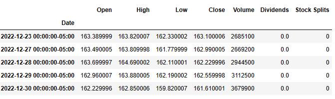
df = fb.history(start=”2022-01-03″)
df.tail()
print(“TA-Lib Version : {}”.format(ta.version))
TA-Lib Version : 0.4.19
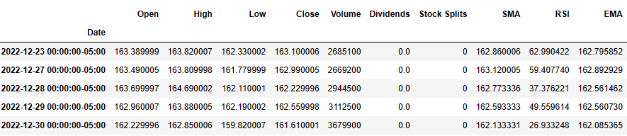
Let’s compute SMA, RSI, and EMA with timeperiod=3
df[“SMA”] = ta.SMA(df.Close, timeperiod=3)
df[“RSI”] = ta.RSI(df.Close, timeperiod=3)
df[“EMA”] = ta.EMA(df.Close, timeperiod=3)
df.tail()
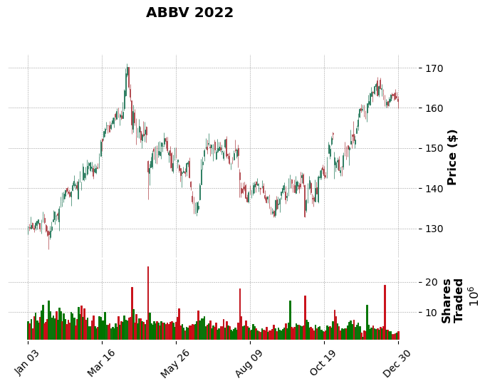
Let’s plot the candlesticks
import mplfinance as fplt
print(“MPLFinance Version : {}”.format(fplt.version))
MPLFinance Version : 0.12.9b7
fplt.plot(
df,
type=’candle’,
style=’charles’,
title=’ABBV 2022′,
ylabel=’Price ($)’,
volume=True,
ylabel_lower=’Shares\nTraded’,
)
Let’s look at the time window and plot MAV=(7,15,22)
setup = dict(type=’candle’,volume=True,mav=(7,15,22),figscale=1.25)
fplt.plot(df.iloc[100:300],setup) fplt.plot(df.iloc[100:300],setup,scale_width_adjustment=dict(volume=0.4,candle=1.35))

Let’s compare SMA and EMA
sma1 = fplt.make_addplot(df[“SMA”], color=”lime”, width=1.5)
sma2 = fplt.make_addplot(df[“EMA”], color=”black”, width=1.5)
fplt.plot(
df,
type=’candle’,
addplot = [sma1, sma2],
style=’charles’,
title=’ABBV 2022 (with SMA)’,
ylabel=’Price ($)’,
)

Let’s compare ABBV 50- and 200-day EMA
import yfinance as yf, datetime as dt
ticker = “ABBV”
df = pd.DataFrame()
start = dt.datetime.today() – dt.timedelta(365)
end = dt.datetime.today()
df[ticker] = yf.download(ticker, start, end)[“Adj Close”]
df.fillna(method=’bfill’, axis=0, inplace=True)
df[‘200-day Exponential MA’] = df.ewm(span=200, adjust=False).mean()
df[’50-day Exponential MA’] = df[ticker].ewm(span=50, adjust=False).mean()
df.plot()
[*********************100%***********************] 1 of 1 completed

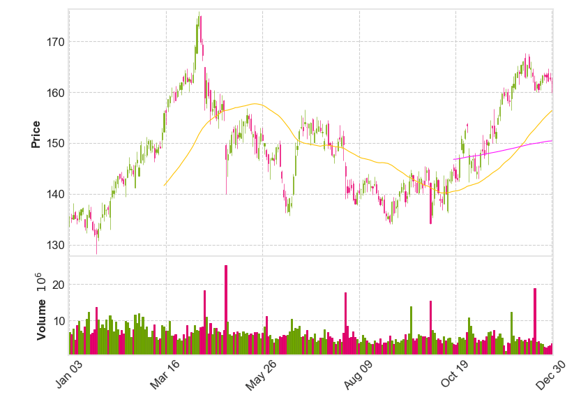
Let’s plot the ABBV candlesticks with mav=(50,200)
import mplfinance as mpf
df = yf.download(ticker, start, end)
mpf.plot(df, volume=True, tight_layout=True, style=”binance”, type=”candle”, mav=(50,200))
[*********************100%***********************] 1 of 1 completed
Let’s read the data via yfin
import pandas
from pandas_datareader import data as pdr
import yfinance as yfin
yfin.pdr_override()
goog = pdr.get_data_yahoo(‘ABBV’,start=’2022-01-03′,end=’2022-12-31′)
print(goog)
[*********************100%***********************]  1 of 1 completed
                  Open        High         Low       Close   Adj Close  \
Date
2022-01-03  135.410004  135.699997  133.509995  135.419998  130.341812
2022-01-04  135.330002  136.220001  134.380005  135.160004  130.091553
2022-01-05  135.000000  138.149994  135.000000  135.869995  130.774918
2022-01-06  136.399994  136.660004  135.160004  135.229996  130.158920
2022-01-07  135.250000  135.839996  134.130005  134.880005  129.822067
...                ...         ...         ...         ...         ...
2022-12-23  163.389999  163.820007  162.330002  163.100006  163.100006
2022-12-27  163.490005  163.809998  161.779999  162.990005  162.990005
2022-12-28  163.699997  164.690002  162.110001  162.229996  162.229996
2022-12-29  162.960007  163.880005  162.190002  162.559998  162.559998
2022-12-30  162.229996  162.850006  159.820007  161.610001  161.610001

             Volume
Date
2022-01-03  6839800
2022-01-04  6298300
2022-01-05  7724900
2022-01-06  4667000
2022-01-07  8630300
...             ...
2022-12-23  2685100
2022-12-27  2669200
2022-12-28  2944500
2022-12-29  3112500
2022-12-30  3679900
[251 rows x 6 columns]
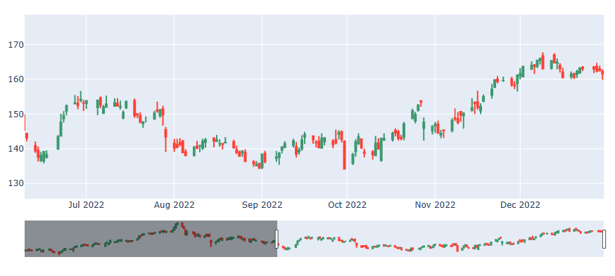
Let’s create the plotly interactive plots
import plotly
import plotly.graph_objects as go
from dash import Dash, dcc, html, Input, Output
candlestick = go.Candlestick(
x=goog.index,
open=goog[‘Open’],
high=goog[‘High’],
low=goog[‘Low’],
close=goog[‘Close’],
name=”OHLC”
)
# create the figure
fig = go.Figure(data=[candlestick])
# plot the figure
fig.show()
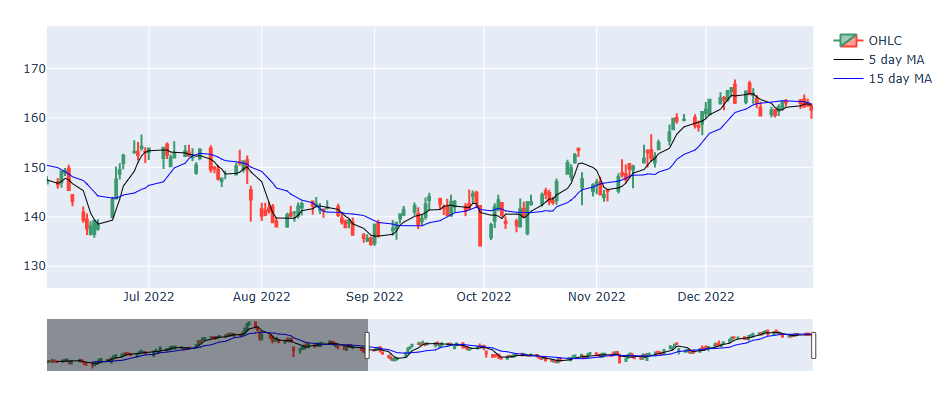
Let’s add MA5 and MA15 to this plot
goog[‘MA5’] = goog.Close.rolling(5).mean()
goog[‘MA15’] = goog.Close.rolling(15).mean()
scatter = go.Scatter(
x=goog.index,
y=goog.MA5,
line=dict(color=’black’, width=1),
name=”5 day MA”
)
scat2 = go.Scatter(
x=goog.index,
y=goog.MA15,
line=dict(color=’blue’, width=1),
name=”15 day MA”
)
fig = go.Figure(data=[candlestick, scatter,scat2])
fig.show()
Let’s get the final plot using plotly
import chart_studio.plotly as py
import plotly.subplots
from plotly.subplots import make_subplots
Create a figure with a secondary axis
fig = plotly.subplots.make_subplots(specs=[[{“secondary_y”: True}]])
fig.add_trace(
candlestick,
secondary_y=False
)
fig.add_trace(
scatter,
secondary_y=False
)
fig.add_trace(
scat2,
secondary_y=False
)
fig.add_trace(
go.Bar(x=goog.index, y=goog[‘Volume’], opacity=0.5, marker_color=’blue’, name=”volume”),
secondary_y=True
)
fig.layout.yaxis2.showgrid=False
fig.show()

Thus, our Python Technical Analysis for BioTech is completed. This analysis supports the recommendation to get BUY alerts on ABBV in 2023.
Explore More
Stock Market ’22 Round Up & ’23 Outlook: Zacks Strategy vs Seeking Alpha Tactics
XOM SMA-EMA-RSI Golden Crosses ’22
The $ASML Trading Strategies via the Plotly Stock Market Dashboard
Basic Stock Price Analysis in Python


Make a one-time donation
Make a monthly donation
Make a yearly donation
Choose an amount
Or enter a custom amount
Your contribution is appreciated.
Your contribution is appreciated.
Your contribution is appreciated.

Leave a comment