
The stochastic oscillator (SO) is a momentum indicator used to signal trend reversals in the stock market. The SO presents the location of the closing price of a stock in relation to the high and low range of the price of a stock over a period of time, typically a 14-day period.
The stochastic oscillator has 2 primary signals that work to build a trading signal. These signals, referred to as the fast and slow signals, oscillate between values of 0 and 100. Within this range, there are certain threshold levels used to describe buying and selling pressure. Typically, these are set to 20 (oversold) and 80 (overbought).
Remember that SO does not contain all of the data necessary for proper analysis of stock price action. It doesn’t factor in Volume at all. Without Volume, you really are analyzing half of the equation. So add a Volume indicator to your indicator set-up, for confirmation of the signals you use in the SO.
Let’s focus on the SO plotting example in Python.
We use yfinance library to request the previous 6-months pricing history for $NVDA
!pip install pandas-datareader
!pip install pandas_ta
!pip install yfinance
import pandas_datareader as pdr
Let’s request data via Yahoo public API
data = pdr.get_data_yahoo(‘NVDA’)
print(data.info())
<class 'pandas.core.frame.DataFrame'>
DatetimeIndex: 1258 entries, 2017-06-07 to 2022-06-03
Data columns (total 6 columns):
 #   Column     Non-Null Count  Dtype
---  ------     --------------  -----
 0   High       1258 non-null   float64
 1   Low        1258 non-null   float64
 2   Open       1258 non-null   float64
 3   Close      1258 non-null   float64
 4   Volume     1258 non-null   float64
 5   Adj Close  1258 non-null   float64
dtypes: float64(6)
memory usage: 68.8 KB
None
import yfinance as yf
We request historical data for the past 5 years
data = yf.Ticker(“NVDA”).history(period=’5y’)
print(data.info())
<class 'pandas.core.frame.DataFrame'>
DatetimeIndex: 1260 entries, 2017-06-05 to 2022-06-03
Data columns (total 7 columns):
 #   Column        Non-Null Count  Dtype
---  ------        --------------  -----
 0   Open          1260 non-null   float64
 1   High          1260 non-null   float64
 2   Low           1260 non-null   float64
 3   Close         1260 non-null   float64
 4   Volume        1260 non-null   int64
 5   Dividends     1260 non-null   float64
 6   Stock Splits  1260 non-null   float64
dtypes: float64(6), int64(1)
memory usage: 78.8 KB
None
import pandas_ta as ta
df = yf.Ticker(‘nvda’)
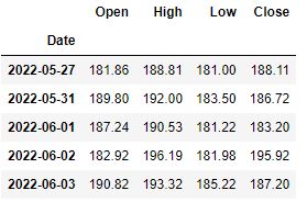
df = df.history(period=’6mo’)[[‘Open’, ‘High’, ‘Low’, ‘Close’]]
df.tail()
Define time periods
k_period = 14
d_period = 3
Add a “n_high” column with max value of previous 14 periods
df[‘n_high’] = df[‘High’].rolling(k_period).max()
Add an “n_low” column with min value of previous 14 periods
df[‘n_low’] = df[‘Low’].rolling(k_period).min()
Use the min/max values to calculate the %k (as a percentage)
df[‘%K’] = (df[‘Close’] – df[‘n_low’]) * 100 / (df[‘n_high’] – df[‘n_low’])
Use the %k to calculates a SMA over the past 3 values of %k
df[‘%D’] = df[‘%K’].rolling(d_period).mean()
Add some indicators
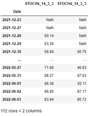
df.ta.stoch(high=’high’, low=’low’, k=14, d=3, append=True)
Let’s plot the final charts
import plotly.graph_objects as go
from plotly.subplots import make_subplots
df.columns = [x.lower() for x in df.columns]
Create our primary chart
the rows/cols arguments tell plotly we want two figures
fig = make_subplots(rows=2, cols=1)
Create our Candlestick chart with an overlaid price line
fig.append_trace(
go.Candlestick(
x=df.index,
open=df[‘open’],
high=df[‘high’],
low=df[‘low’],
close=df[‘close’],
increasing_line_color=’#ff9900′,
decreasing_line_color=’black’,
showlegend=False
), row=1, col=1 # <———— upper chart
)
fig.append_trace(
go.Scatter(
x=df.index,
y=df[‘open’],
line=dict(color=’#ff9900′, width=1),
name=’open’,
), row=1, col=1 # <———— upper chart
)
fig.append_trace(
go.Scatter(
x=df.index,
y=df[‘stochk_14_3_3’],
line=dict(color=’#ff9900′, width=2),
name=’fast’,
), row=2, col=1 # <———— lower chart
)
fig.append_trace(
go.Scatter(
x=df.index,
y=df[‘stochd_14_3_3’],
line=dict(color=’#000000′, width=2),
name=’slow’
), row=2, col=1 # <———— lower chart
)
fig.update_yaxes(range=[-10, 110], row=2, col=1)
Add upper/lower bounds
fig.add_hline(y=0, col=1, row=2, line_color=”#666″, line_width=2)
fig.add_hline(y=100, col=1, row=2, line_color=”#666″, line_width=2)
Add overbought/oversold
fig.add_hline(y=20, col=1, row=2, line_color=’#336699′, line_width=2, line_dash=’dash’)
fig.add_hline(y=80, col=1, row=2, line_color=’#336699′, line_width=2, line_dash=’dash’)
Make it pretty
layout = go.Layout(
plot_bgcolor=’#efefef’,
# Font Families
font_family=’Monospace’,
font_color=’#000000′,
font_size=20,
xaxis=dict(
rangeslider=dict(
visible=False
)
)
)
fig.update_layout(layout)
View our chart in the system default HTML viewer (Chrome, Firefox, etc.)
fig.show()

This plot shows the following:
- A Candlestick chart showing the pricing data over our trading period
- A SO chart showing our %k, %d, and 80/20 lines over that same period.
Remark: There is a data omission on the l.h.s. of the lower chart. This reflects the 14-day period over which our %k value is generated. During that period, we don’t have prior data to generate the %k for so we end up with a NaN value.


Leave a comment