
Featured Image Template via Canva.
- In today’s tutorial, we will be exploring Graph Algorithms (GA) in R, being referred to as GA-R. We’ll begin with an introduction to graph theory. Next, we will learn by example how to implement and run graph R scripts from scratch. Finally, we will delve into details of cloud-based graph database and analytics (SaaS/DBaaS) under the umbrella of Neo4j graph data science.
- Recall that R is a free software environment for statistical computing and graphics.
- Though not specifically designed for it, R has developed into a powerful tool for network analysis:
- R enables reproducible research that is not possible with GUI applications
- R provides robust network analysis tools for building structured/unstructured ETL (Extract-Transform-Load) pipelines.
- There is an ever growing range of packages designed to make R a fully-fledged (cloud-based and on-premise) network analysis product.
- R is commonly used within RStudio, an integrated development environment (IDE) for simplified statistical analysis, visualization and reporting. R applications can be used directly and interactively on the web via Shiny
- The deployment funnel: R can interact with any GraphQL API via a GraphQL client. One can deploy GraphQL API using AWS Lambda and AWS API Gateway.
- Business Value: Graph algorithms are the powerhouse behind the analysis of real-world networks — from identifying fraud rings and optimizing the location of public services to evaluating the strength of a group and predicting the spread of disease or ideas.
- The List of Top Key-Players in the GA Market:
These companies are recognized for their expertise in manufacturing GA and related components. They offer a wide range of products and solutions to cater to the needs of various industries.
- Let’s embark on our short GA-R journey!
Table of Contents
- About Graph Theory & GA-R
- Installing R & RStudio IDE
- Zachary Karate Club Analysis
- The Dijkstra’s Shortest Path
- Supply Chain Network
- Correspondence Graph
- Train Station Network
- London Tube Network
- EU Referendum Sankey Diagram
- Spatial Co-Location of Employees
- LADA Quanteda Networks
- Cloud-Based Graph SaaS/DBaaS
- About Neo4j Graph Data Science
- Conclusions
- References
About Graph Theory & GA-R
- A graph is a data structure that consists of nodes/vertices and a set of edges that connect these vertices to them.
- So, graphs are composed of two elements: nodes and edges. You can think of nodes as data nouns. If a node shares a relationship with another node, they’re connected by an edge. Think of edges as data adjectives that describe the relationship between nodes.
- For example, a social network can be represented as a graph. Nodes represent individuals, and edges represent friendships between individuals. We can see below that A and B are friends. In other words, we’ve represented the pairwise friendship between A and B as a graph.
- Here’s a brief explanation of some of the most used GA:
- Breadth-First Search (BFS) keeps note of all the track of the vertices you are visiting. To implement such an order, you use a queue data structure which First-in, First-out approach. BFS is used to determine the shortest path and minimum spanning tree. It is also used in web crawlers to creates web page indexes. It is also used as powering search engines on social media networks and helps to find out peer-to-peer networks in BitTorrent.
- Depth-First-Search (DFS) keeps note of the tracks of visited nodes, and for this, you use stack data structure. DFS finds its application when it comes to finding paths between two vertices and detecting cycles. Also, topological sorting can be done using the DFS algorithm easily.
- Dijkstra’s shortest path algorithm works to find the minor path from one vertex to another. The sum of the vertex should be such that their sum of weights that have been traveled should output minimum. The algorithm is used in finding the distance of travel from one location to another, like Google Maps or Apple Maps. In addition, it is highly used in networking to outlay min-delay path problems and abstract machines to identify choices to reach specific goals like the number game or move to win a match.
- Cycle detection (SD): A cycle is defined as a path in graph algorithms where the first and last vertices are usually considered. SD algorithms are used in message-based distributed systems and large-scale cluster processing systems. SD is also mainly used to detect deadlocks in the concurrent system and various cryptographic applications where the keys are used to manage the messages with encrypted values.
- Minimum Spanning Tree (MST) is defined as a subset of edges of a graph having no cycles and is well connected with all the vertices so that the minimum sum is availed through the edge weights. It solely depends on the cost of the spanning tree and the minimum span or least distance the vertex covers. MST is popularly used in traveling salesman problems in a data structure. It can also be used to find the minimum-cost weighted perfect matching and multi-terminal minimum cut problems. MST also finds its application in the field of image and handwriting recognition and cluster analysis.
- Topological sorting (TS) of a graph follows the algorithm of ordering the vertices linearly so that each directed graph having vertex ordering ensures that the vertex comes before it. TS covers the room for application in Kahn’s and DFS algorithms. In real-life applications, TS is used in scheduling instructions and serialization of data. TS is also popularly used to determine the tasks that are to be compiled and used to resolve dependencies in linkers.
- Graph coloring follow the approach of assigning colors to the elements present in the graph under certain conditions. The conditions are based on the techniques or algorithms. Hence, vertex coloring is a commonly used coloring technique followed here. It has vast applications in data structures as well as in solving real-life problems. For example, it is used in timetable scheduling and assigning radio frequencies for mobile. It is also used in Sudoko and to check if the given graph is bipartite. Graph coloring can also be used in geographical maps to mark countries and states in different colors.
- Maximum flow covers applications of popular algorithms like the Ford-Fulkerson algorithm, Edmonds-Karp algorithm, and Dinic’s algorithm. In real life, it finds its applications in scheduling crews in flights and image segmentation for foreground and background. It is also used in games like basketball, where the score is set to a maximum estimated value having the current division leader.
- Matching is used in an algorithm like the Hopcroft-Karp algorithm and Blossom algorithm. It can also be used to solve problems using a Hungarian algorithm that covers concepts of matching. In real-life examples, matching can be used resource allocation and travel optimization and some problems like stable marriage and vertex cover problem.
- Bottom Line: GA are considered an essential aspect in the field confined not only to solve problems using data structures but also in general tasks like Google Maps and Apple Maps.
- Example 1: igraph in R demo
install.packages('igraph')

library(igraph) #to start we will just explore the igraph package

graph1 <- graph (edges = c(1,2, 2,3, 3,4, 4,5, 1,5,5,3,3,1), n = 5) #Assign edges and number of vertices
plot(graph1) #Plot the network
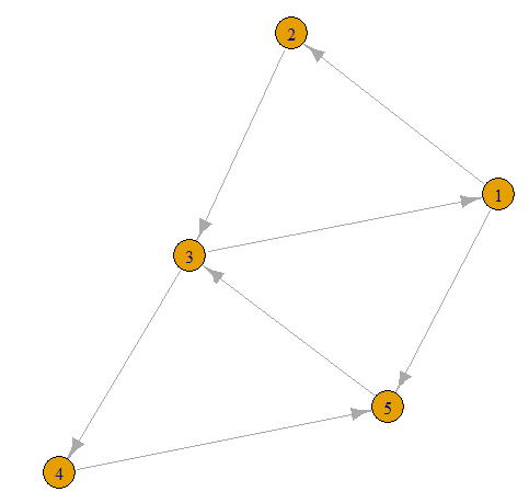
- Now lets take our first graph and add more edges
graph1 <- graph(edges = c(1,2, 2,3, 3,4, 4,5, 1,5, 2,4, 3,5, 5,2, 1,4, 2,4, 3,1), n =5)
plot(graph1)

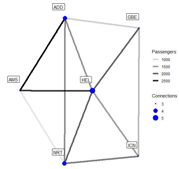
- Example 2a: Weights. Now let’s make up some more interesting data. Assume we are an airline currently serving six airports. We have data on the average amount of monthly passengers on our routes over a year.
install.packages('tidygraph')
install.packages('ggraph')
install.packages('tidyverse')

library("tidygraph")
library("igraph")
library("ggraph")
library("tidyverse")

airports <- tibble(
    name = c("NRT", "ICN", "HEL", "AMS", "GBE", "ADD"),
    continent = c("Asia", "Asia", "Europe", "Europe", "Africa", "Africa"),
    city = c("Narita", "Incheon", "Helsinki", "Amsterdam",
             "Gaborone", "Addis Abeba"))

flights <- tibble(
    from = c("NRT", "NRT", "NRT", "ICN", "ICN", "HEL",
             "HEL", "AMS", "GBE", "GBE", "ADD"),
    to =   c("ICN", "HEL", "AMS", "HEL", "GBE", "AMS",
             "ADD", "ADD", "ADD", "HEL", "NRT"),
    passengers = c(1800, 2100, 900, 1550, 1300, 2450, 1650, 2900, 1100,
                   2100, 1700)
)

aviation <- tbl_graph(nodes = airports,
                      edges = flights, directed = FALSE)


ggraph(aviation, layout = "stress") +
    geom_edge_link(aes(edge_alpha = passengers), width = 2) +
    geom_node_point(colour = "blue", size = 4)+
    geom_node_label(aes(label = name), nudge_y = 0.1, nudge_x = -0.1) +
    theme_graph() +
    labs(edge_alpha = "Passengers")

- Here we have defined the connections based on their name. Now the thing that is new is that our edges have weights. Previously our edges were either present or absent, now they can convey even more information.
- Example 2b: Nodal Degree. While the central airport in our network is kind of obvious, we can nonetheless improve our visualization by adding the nodal degree as Connections, viz.
aviation <- aviation %>%
    activate(nodes) %>%
    mutate(degree = centrality_degree())

ggraph(aviation, layout = "stress") +
    geom_edge_link(aes(edge_alpha = passengers), width = 2) +
    geom_node_point(aes(size = degree), colour = "blue") +
    geom_node_label(aes(label = name), nudge_y = 0.1, nudge_x = -0.1) +
    scale_size(breaks = seq(3, 5, 1)) +
    theme_graph() +
    labs(edge_alpha = "Passengers", size = "Connections")
actors <- data.frame(
  name = c(
    "Alice", "Bob", "Cecil", "David",
    "Esmeralda"
  ),
  age = c(48, 33, 45, 34, 21),
  gender = c("F", "M", "F", "M", "F")
)
relations <- data.frame(
  from = c(
    "Bob", "Cecil", "Cecil", "David",
    "David", "Esmeralda"
  ),
  to = c("Alice", "Bob", "Alice", "Alice", "Bob", "Alice"),
  same.dept = c(FALSE, FALSE, TRUE, FALSE, FALSE, TRUE),
  friendship = c(4, 5, 5, 2, 1, 1), advice = c(4, 5, 5, 4, 2, 3)
)
g <- graph_from_data_frame(relations, directed = TRUE, vertices = actors)
set.seed(123)

# create random layout
l <- layout_randomly(g)

# plot with random layout
plot(g, layout = l)

- Read more simple examples here.
Installing R & RStudio IDE
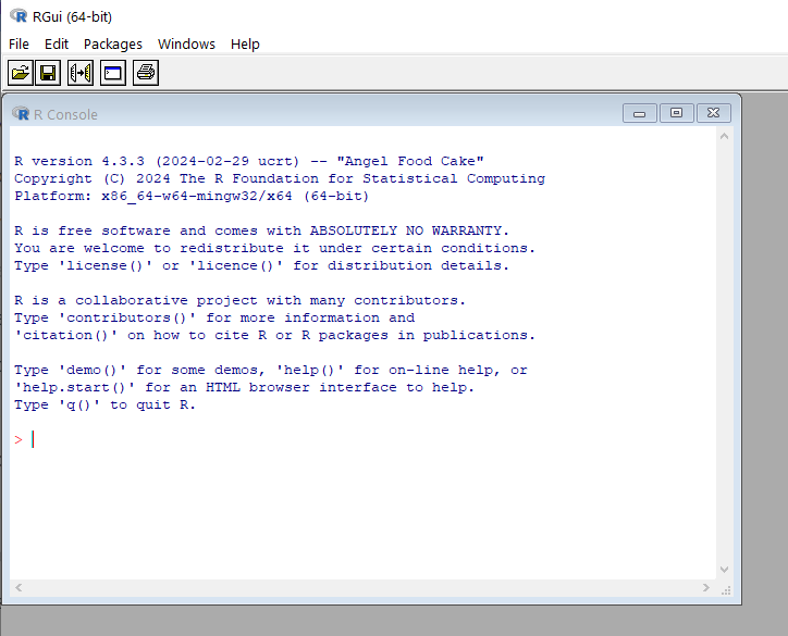
- Both R and RStudio/RGui (64-bit) are free and easy to download.
- Installing R and RStudio on Windows: R is maintained by an international team of developers who make the language available through the web page of The Comprehensive R Archive Network. The top of the web page provides three links for downloading R. Follow the link that describes your operating system – Windows.
- To install R on Windows, click the “Download R for Windows” link. Then click the “base” link. Next, click the first link at the top of the new page. This link should say something like “Download R 4.3.3 for Windows,” except the 4.3.3 will be replaced by the most current version of R. The link downloads an installer program, which installs the most up-to-date version of R for Windows. Run this program and step through the installation wizard that appears. The wizard will install R into your program files folders and place a shortcut in your Start menu.
- You have got the shortcut RGui (64-bit). When you open DGui, the following window appears
- Please see the R FAQ for general information about R and the R Windows FAQ for Windows-specific information.
- This page provides the release notes associated with each release of RStudio.
Zachary Karate Club Analysis
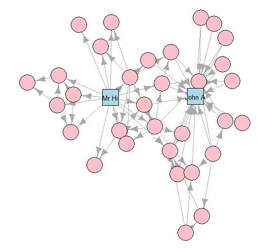
- In this section we will work with a relatively famous graph known as Zachary’s Karate Club.
- This graph is commonly used as an example of a social network in many teaching situations today. The graph contains 34 vertices representing different individuals or actors. The karate instructor is labelled as ‘Mr Hi’. The club administrator is labelled as ‘John A’. The other 32 actors are labelled as ‘Actor 2’ through ‘Actor 33’. Zachary studied the social interactions between the members outside the club meetings, and during his study a conflict arose in the club that eventually led to the group splitting into two: one group forming a new club around the instructor Mr Hi and the other group dispersing to find new clubs or to give up karate completely. In this graph, an edge between two vertices means that the two individuals interacted socially outside the club.
- Let’s load the
karategraph edgelist in R
# get karate edgelist data as dataframe
karate_edgelist <- read.csv("https://ona-book.org/data/karate.csv")
head(karate_edgelist)
   from      to
1 Mr Hi Actor 2
2 Mr Hi Actor 3
3 Mr Hi Actor 4
4 Mr Hi Actor 5
5 Mr Hi Actor 6
6 Mr Hi Actor 7
- Now let’s use our edgelist to create an undirected graph object in
igraph
#https://ona-book.org/viz-graphs.html
kar <- graph_from_data_frame(karate_edgelist, directed = TRUE)

# set seed for reproducibility
set.seed(123)

# create random layout
l <- layout_randomly(kar)

# plot with random layout
plot(kar, layout = l)
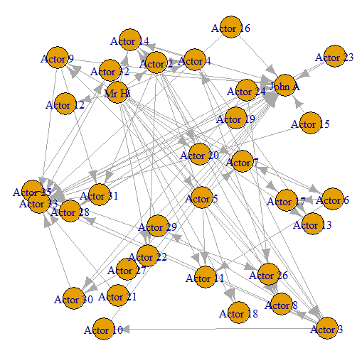
- We can see that we have an undirected graph with 34 named vertices and 78 edges.
- Let’s try to change the vertex labels so that they only display for Mr Hi and for John A.
# only store a label if Mr Hi or John A
V(kar)$label <- ifelse(V(kar)$name %in% c("Mr Hi", "John A"),V(kar)$name,"")

V(kar)$label.color <- "black"
V(kar)$label.cex <- 0.8
V(kar)$label.family <- "arial"

plot(kar, layout = l)

- Let’s also change the size, color and font family of the labels.
# different colors and shapes for Mr Hi and and John A
V(kar)$color <- ifelse(V(kar)$name %in% c("Mr Hi", "John A"),
                          "lightblue",
                          "pink")

V(kar)$shape <- ifelse(V(kar)$name %in% c("Mr Hi", "John A"),
                          "square",
                          "circle")


plot(kar, layout = l)

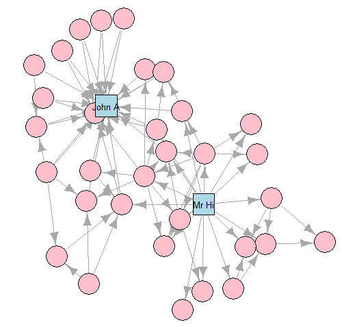
- For Zachary’s Karate Club study, which was a study of connection and community, we can imagine that a force-directed layout would be a good choice of visualization.
- Let’s plot our
karnetwork with the layout generated by the Fruchterman-Reingold (F-R) algorithm
# F-R algorithm
set.seed(123)
fr <- layout_with_fr(kar)
plot(kar, layout = fr)
- K-K layout
# K-K algorithm
set.seed(123)
kk <- layout_with_kk(kar)
plot(kar, layout = kk)
- GEM layout
# GEM algorithm
set.seed(123)
gem <- layout_with_gem(kar)
plot(kar, layout = gem)

- Read more about layouts and other graph plotting options here.
The Dijkstra’s Shortest Path
- Let’s focus on Finding the Shortest Path with Dijkstra’s Algorithm
#https://www.r-bloggers.com/2020/10/finding-the-shortest-path-with-dijkstras-algorithm/

library(igraph)
## Attaching package: 'igraph'
## The following objects are masked from 'package:stats':
##
##     decompose, spectrum
## The following object is masked from 'package:base':
##
##     union
graph <- list(s = c("a", "b"),
              a = c("s", "b", "c", "d"),
              b = c("s", "a", "c", "d"),
              c = c("a", "b", "d", "e", "f"),
              d = c("a", "b", "c", "e", "f"),
              e = c("c", "d", "f", "z"),
              f = c("c", "d", "e", "z"),
              z = c("e", "f"))
weights <- list(s = c(3, 5),
                a = c(3, 1, 10, 11),
                b = c(5, 3, 2, 3),
                c = c(10, 2, 3, 7, 12),
                d = c(15, 7, 2, 11, 2),
                e = c(7, 11, 3, 2),
                f = c(12, 2, 3, 2),
                z = c(2, 2))
# create edgelist with weights
G <- data.frame(stack(graph), weights = stack(weights)[[1]])
set.seed(500)
el <- as.matrix(stack(graph))
g <- graph_from_edgelist(el)
oldpar <- par(mar = c(1, 1, 1, 1))
plot(g, edge.label = stack(weights)[[1]])
par(oldpar)

path_length <- function(path) {
  # if path is NULL return infinite length
  if (is.null(path)) return(Inf)

  # get all consecutive nodes
  pairs <- cbind(values = path[-length(path)], ind = path[-1])
  # join with G and sum over weights
  sum(merge(pairs, G)[ , "weights"])
}

find_shortest_path <- function(graph, start, end, path = c()) {
  # if there are no nodes linked from current node (= dead end) return NULL
  if (is.null(graph[[start]])) return(NULL)
  # add next node to path so far
  path <- c(path, start)

  # base case of recursion: if end is reached return path
  if (start == end) return(path)

  # initialize shortest path as NULL
  shortest <- NULL
  # loop through all nodes linked from the current node (given in start)
  for (node in graph[[start]]) {
    # proceed only if linked node is not already in path
    if (!(node %in% path)) {
      # recursively call function for finding shortest path with node as start and assign it to newpath
      newpath <- find_shortest_path(graph, node, end, path)
      # if newpath is shorter than shortest so far assign newpath to shortest
      if (path_length(newpath) < path_length(shortest))
        shortest <- newpath
    }
  }
  # return shortest path
  shortest
}
find_shortest_path(graph, "s", "z") # via b
[1] "s" "b" "c" "d" "f" "z"

find_shortest_path(graph, "z", "s") # back via a
[1] "z" "f" "d" "b" "a" "s"

Supply Chain Network
- Let’s consider the example of using Tidygraph to map the relationships between suppliers, producers, distributors, and customers.
#https://medium.com/slalom-technology/an-intro-to-graph-theory-and-analysis-using-tidygraph-d5199490963

#install.packages('tidygraph')
#install.packages('tidyverse')

library(tidyverse)
library(tidygraph)

supplier_producer <- data.frame(
  supplier = c('Supp. A', 'Supp. A', 'Supp. B',
               'Supp. B', 'Supp. C', 'Supp. D'),
  producer = c('Manuf. A', 'Manuf. B', 'Manuf. A',
               'Manuf. C', 'Manuf. B', 'Manuf. D')
)
producer_distributor <- data.frame(
  producer = c('Manuf. A', 'Manuf. A', 'Manuf. B',
               'Manuf. B', 'Manuf. C', 'Manuf. D'),
  distributor = c('Dist. A', 'Dist. B', 'Dist. B',
                  'Dist. C', 'Dist. B', 'Dist. C')
)
distributor_customer <- data.frame(
  distributor = c('Dist. A', 'Dist. A', 'Dist. B',
                  'Dist. C', 'Dist. C', 'Dist. C'),
  customer = c('Cust. A', 'Cust. B', 'Cust. C',
               'Cust. C', 'Cust. D', 'Cust. E')
)
network_df <- rbind(
  supplier_producer %>%
    rename(from = supplier, to = producer),
  producer_distributor %>%
    rename(from = producer, to = distributor),
  distributor_customer %>%
    rename(from = distributor, to = customer)
)
network_grph <- as_tbl_graph(network_df)
network_grph

network_grph <- network_grph %>%
  mutate(id = row_number())
network_grph

network_grph <- network_grph %>%
  activate(edges) %>%
  mutate(distance = from + to)
network_grph

library(networkD3)
create_sankey <- function(grph_object, colors){
nodes <- grph_object %>%
    activate(nodes) %>%
    data.frame()

  edges <- grph_object %>%
    activate(edges) %>%
    mutate(source = from - 1,
           target = to - 1) %>%
    data.frame() %>%
    select(source, target, distance)

  network_p <- sankeyNetwork(Links = edges, Nodes = nodes,
                             Source = 'source', Target = 'target',
                             Value = 'distance', NodeID = 'name',
                             fontSize = 14, nodeWidth = 20,
                             sinksRight = FALSE,
                             colourScale = colors
  )
  print(network_p)

}
#please put the colourScale declaration on a single line!!!
colourScale ='d3.scaleOrdinal() .range(["#FDE725FF","#B4DE2CFF","#6DCD59FF",
        "#35B779FF","#1F9E89FF","#26828EFF",
        "#31688EFF","#3E4A89FF","#482878FF","#440154FF"])'
p <- create_sankey(grph_object = network_grph, colors = colourScale)
p
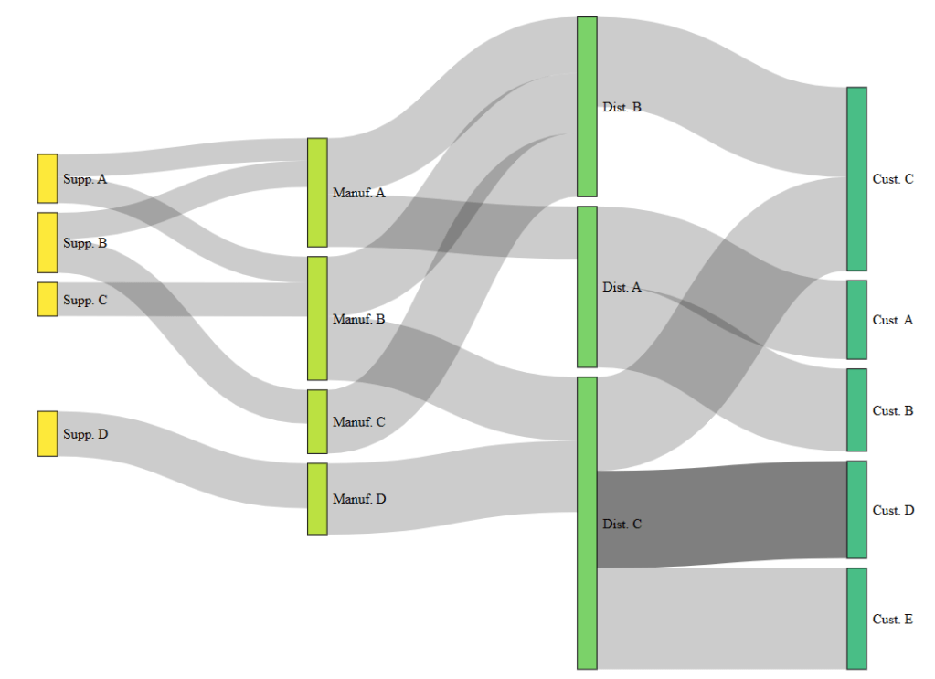
- This plot shows the supply chain Sankey diagram.
- Supply chain is a great example of when to use a Sankey diagram as it naturally contains a set of stages to visualize.
Correspondence Graph
- The example of correspondence between 15 cities illustrates several important interactive network graphs.
library(tidyverse)
letters <- read_csv("correspondence-data-1585.csv")
sources <- letters %>%
  distinct(source) %>%
  rename(label = source)

destinations <- letters %>%
  distinct(destination) %>%
  rename(label = destination)

nodes <- full_join(sources, destinations, by = "label")
nodes <- rowid_to_column(nodes, "id")

per_route <- letters %>%
  group_by(source, destination) %>%
  summarise(weight = n(), .groups = "drop")
edges <- per_route %>%
  left_join(nodes, by = c("source" = "label")) %>%
  rename(from = id)

edges <- edges %>%
  left_join(nodes, by = c("destination" = "label")) %>%
  rename(to = id)

edges <- select(edges, from, to, weight)

library(network)
routes_network <- network(edges,
                          vertex.attr = nodes,
                          matrix.type = "edgelist",
                          ignore.eval = FALSE)
library(igraph)
routes_igraph <- graph_from_data_frame(d = edges,
                                       vertices = nodes,
                                       directed = TRUE)
plot(routes_igraph,
     vertex.size = 30,
     vertex.label.cex = 0.5,
     edge.arrow.size = 0.8)
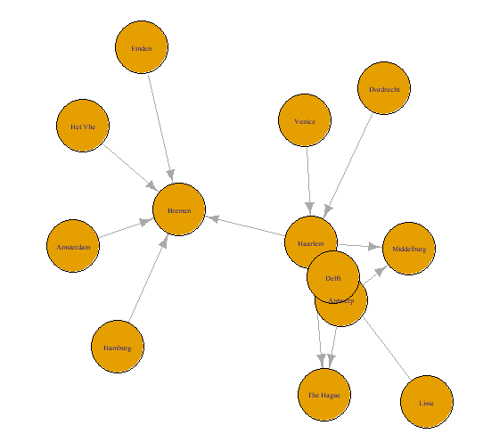
- This is the basic correspondence plot with an igraph object through the plot() function.
library(tidygraph)
library(ggraph)
routes_tidy <- tbl_graph(nodes = nodes,
                         edges = edges,
                         directed = TRUE)
routes_igraph_tidy <- as_tbl_graph(routes_igraph)
ggraph(routes_tidy, layout = "graphopt") +
  geom_node_point() +
  geom_edge_link(aes(width = weight), alpha = 0.8) +
  scale_edge_width(range = c(0.2, 2)) +
  geom_node_text(aes(label = label), repel = TRUE) +
  labs(edge_width = "Letters") +
  theme_graph()

ggraph(routes_igraph, layout = "linear") +
  geom_edge_arc(aes(width = weight), alpha = 0.8) +
  scale_edge_width(range = c(0.2, 2)) +
  geom_node_text(aes(label = label)) +
  labs(edge_width = "Letters") +
  theme_graph()
- Correspondence graph with the variable width of the connecting line according to the weight variable.

- A semi-circular layout of the correspondence graph with the variable width of the connecting line according to the weight variable. Here, we layout the nodes in a horizontal line and have the edges drawn as arcs.
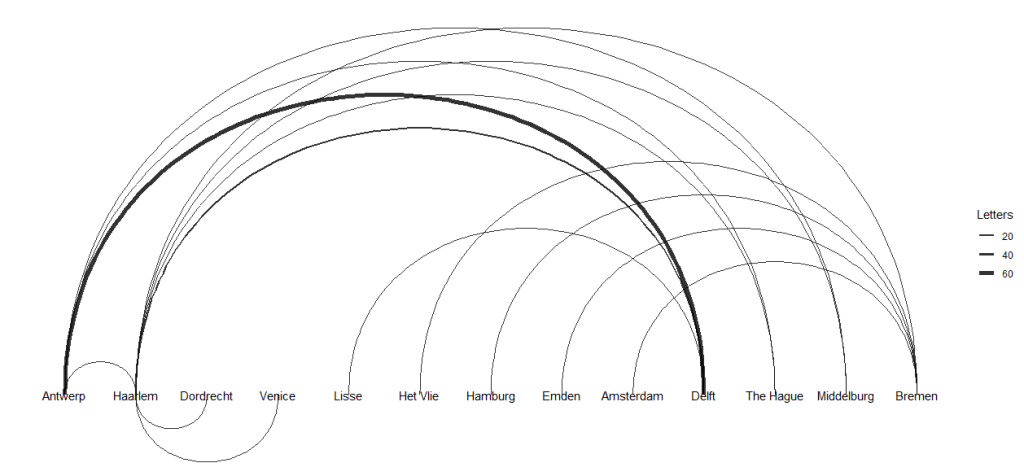
- These two plots indicate a significant difference between the maximum and minimum number of letters sent along the routes.
- Finally, we create the the following 3 interactive network graphs with
visNetworkandnetworkD3
library(visNetwork)
library(networkD3)

edges <- mutate(edges, width = weight/5 + 1)

visNetwork(nodes, edges) %>%
  visIgraphLayout(layout = "layout_with_fr") %>%
  visEdges(arrows = "middle")

nodes_d3 <- mutate(nodes, id = id - 1)
edges_d3 <- mutate(edges, from = from - 1, to = to - 1)

forceNetwork(Links = edges_d3, Nodes = nodes_d3,
             Source = "from", Target = "to",
             NodeID = "label", Group = "id", Value = "weight",
             opacity = 1, fontSize = 16, zoom = TRUE)

sankeyNetwork(Links = edges_d3, Nodes = nodes_d3, Source = "from", Target = "to",
              NodeID = "label", Value = "weight", fontSize = 16, unit = "Letter(s)")
- An interactive graph with variable edge widths.


- One of the main benefits of
networkD3is that it implements a d3-styled Sankey diagram.

- This graph does not require a group argument, and the only other change is the addition of a “unit.” This provides a label for the values that pop up in a tool tip when your cursor hovers over a diagram element.
Train Station Network
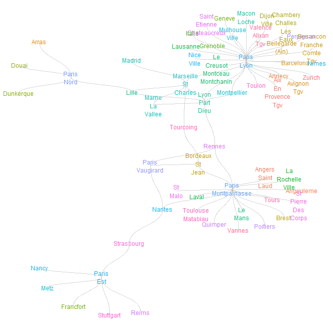
- Let’s apply the tidyverse graph analysis to the most recent data set related to French trains; it contains aggregate daily total trips per connecting stations.
library(readr)
url <- "https://raw.githubusercontent.com/rfordatascience/tidytuesday/master/data/2019/2019-02-26/small_trains.csv"
small_trains <- read_csv(url)
head(small_trains)
# A tibble: 6 × 13
   year month service  departure_station arrival_station        journey_time_avg
  <dbl> <dbl> <chr>    <chr>             <chr>                             <dbl>
1  2017     9 National PARIS EST         METZ                               85.1
2  2017     9 National REIMS             PARIS EST                          47.1
3  2017     9 National PARIS EST         STRASBOURG                        116.
4  2017     9 National PARIS LYON        AVIGNON TGV                       161.
5  2017     9 National PARIS LYON        BELLEGARDE (AIN)                  164.
6  2017     9 National PARIS LYON        BESANCON FRANCHE COMT…            129.
- Data Preparation: we create a new summarized data set routes which contains a single entry for each connected station. It also includes the average journey time it takes to go between stations.
routes <- small_trains %>%
  group_by(departure_station, arrival_station) %>%
  summarise(journey_time = mean(journey_time_avg)) %>%
  ungroup() %>%
  mutate(from = departure_station,
         to = arrival_station) %>%
  select(from, to, journey_time)

routes
# A tibble: 130 × 3
   from                       to                 journey_time
   <chr>                      <chr>                     <dbl>
 1 AIX EN PROVENCE TGV        PARIS LYON                186.
 2 ANGERS SAINT LAUD          PARIS MONTPARNASSE         97.5
 3 ANGOULEME                  PARIS MONTPARNASSE        146.
 4 ANNECY                     PARIS LYON                225.
 5 ARRAS                      PARIS NORD                 52.8
 6 AVIGNON TGV                PARIS LYON                161.
 7 BARCELONA                  PARIS LYON                358.
 8 BELLEGARDE (AIN)           PARIS LYON                163.
 9 BESANCON FRANCHE COMTE TGV PARIS LYON                131.
10 BORDEAUX ST JEAN           PARIS MONTPARNASSE        186.
# ℹ 120 more rows
- The next step is to transform the tidy data set, into a graph table.
- In addition, a list of all the stations is pulled into a single character vector by manipulating the graph table.
library(tidygraph)

graph_routes <- as_tbl_graph(routes)

graph_routes

library(stringr)

graph_routes <- graph_routes %>%
  activate(nodes) %>%
  mutate(
    title = str_to_title(name),
    label = str_replace_all(title, " ", "\n")
    )

graph_routes

# A tbl_graph: 59 nodes and 130 edges
#
# A directed simple graph with 1 component
#
# Node Data: 59 × 3 (active)
   name                       title                      label
   <chr>                      <chr>                      <chr>
 1 AIX EN PROVENCE TGV        Aix En Provence Tgv        "Aix\nEn\nProvence\nTg…
 2 ANGERS SAINT LAUD          Angers Saint Laud          "Angers\nSaint\nLaud"
 3 ANGOULEME                  Angouleme                  "Angouleme"
 4 ANNECY                     Annecy                     "Annecy"
 5 ARRAS                      Arras                      "Arras"
 6 AVIGNON TGV                Avignon Tgv                "Avignon\nTgv"
 7 BARCELONA                  Barcelona                  "Barcelona"
 8 BELLEGARDE (AIN)           Bellegarde (Ain)           "Bellegarde\n(Ain)"
 9 BESANCON FRANCHE COMTE TGV Besancon Franche Comte Tgv "Besancon\nFranche\nCo…
10 BORDEAUX ST JEAN           Bordeaux St Jean           "Bordeaux\nSt\nJean"
# ℹ 49 more rows
#
# Edge Data: 130 × 3
   from    to journey_time
  <int> <int>        <dbl>
1     1    39        186.
2     2    40         97.5
3     3    40        146.
# ℹ 127 more rows


stations <- graph_routes %>%
  activate(nodes) %>%
  pull(title)

stations
[1] "Aix En Provence Tgv"            "Angers Saint Laud"
 [3] "Angouleme"                      "Annecy"
 [5] "Arras"                          "Avignon Tgv"
 [7] "Barcelona"                      "Bellegarde (Ain)"
 [9] "Besancon Franche Comte Tgv"     "Bordeaux St Jean"
[11] "Brest"                          "Chambery Challes Les Eaux"
[13] "Dijon Ville"                    "Douai"
[15] "Dunkerque"                      "Francfort"
[17] "Geneve"                         "Grenoble"
[19] "Italie"                         "La Rochelle Ville"
[21] "Lausanne"                       "Laval"
[23] "Le Creusot Montceau Montchanin" "Le Mans"
[25] "Lille"                          "Lyon Part Dieu"
[27] "Macon Loche"                    "Madrid"
[29] "Marne La Vallee"                "Marseille St Charles"
[31] "Metz"                           "Montpellier"
[33] "Mulhouse Ville"                 "Nancy"
[35] "Nantes"                         "Nice Ville"
[37] "Nimes"                          "Paris Est"
[39] "Paris Lyon"                     "Paris Montparnasse"
[41] "Paris Nord"                     "Paris Vaugirard"
[43] "Perpignan"                      "Poitiers"
[45] "Quimper"                        "Reims"
[47] "Rennes"                         "Saint Etienne Chateaucreux"
[49] "St Malo"                        "St Pierre Des Corps"
[51] "Strasbourg"                     "Stuttgart"
[53] "Toulon"                         "Toulouse Matabiau"
[55] "Tourcoing"                      "Tours"
[57] "Valence Alixan Tgv"             "Vannes"
[59] "Zurich"
- Plotting the train network with nodes, edges, and station names by defining attributes such as
size,color, andalpha.
library(ggplot2)

thm <- theme_minimal() +
  theme(
    legend.position = "none",
     axis.title = element_blank(),
     axis.text = element_blank(),
     panel.grid = element_blank(),
     panel.grid.major = element_blank(),
  )

theme_set(thm)

library(ggraph)

graph_routes %>%
  ggraph(layout = "kk") +
    geom_node_point() +
    geom_edge_diagonal()

graph_routes %>%
  ggraph(layout = "kk") +
    geom_node_text(aes(label = label, color = name), size = 3) +
    geom_edge_diagonal(color = "gray", alpha = 0.4)
London Tube Network
ggraphcan work relatively easily with other graphics layers, allowing you to superimpose a graph onto other coordinate systems. Let’s look at the vertex set as a list of London Tube Stations with anid,nameand geographical coordinateslongitudeandlatitude.
# download and view london tube vertex data
londontube_vertices <- read.csv(
  "https://ona-book.org/data/londontube_vertices.csv"
)
head(londontube_vertices)

id         name latitude longitude
1  1   Acton Town  51.5028   -0.2801
2  2      Aldgate  51.5143   -0.0755
3  3 Aldgate East  51.5154   -0.0726
4  4   All Saints  51.5107   -0.0130
5  5     Alperton  51.5407   -0.2997
6  7        Angel  51.5322   -0.1058

# download and view london tube edge data
londontube_edgelist <- read.csv(
  "https://ona-book.org/data/londontube_edgelist.csv"
)
head(londontube_edgelist)

  from  to          line linecolor
1   11 163 Bakerloo Line   #AE6017
2   11 212 Bakerloo Line   #AE6017
3   49  87 Bakerloo Line   #AE6017
4   49 197 Bakerloo Line   #AE6017
5   82 163 Bakerloo Line   #AE6017
6   82 193 Bakerloo Line   #AE6017

# create a set of distinct line names and linecolors to use
lines <- londontube_edgelist |>
  dplyr::distinct(line, linecolor)

# create graph object
tubegraph <- igraph::graph_from_data_frame(
  d = londontube_edgelist,
  vertices = londontube_vertices,
  directed = FALSE
)

# visualize tube graph using linecolors for edge color
set.seed(123)
ggraph(tubegraph) +
  geom_node_point(color = "black", size = 1) +
  geom_edge_link(aes(color = line), width = 1) +
  scale_edge_color_manual(name = "Line",
                          values = lines$linecolor) +
  theme_void()
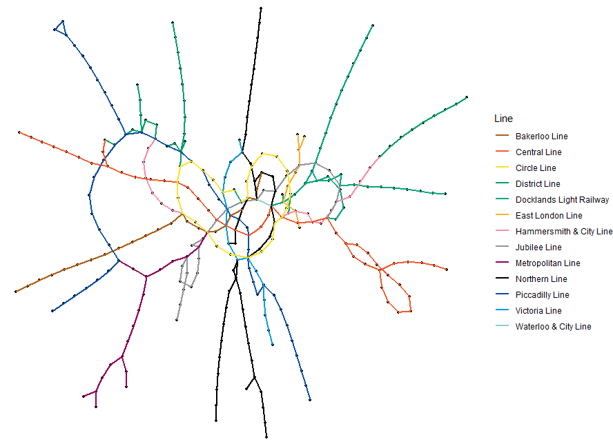
- This plot is a random graph visualization of the London Tube network graph with the edges colored by the different lines.
EU Referendum Sankey Diagram
- As a quick example of using
sankeyNetwork()to visualize data flows, we load theeu_referendumdata set from theonadatapackage.
library(dplyr)
library(networkD3)
library(tidyr)

# get data
eu_referendum <- read.csv(
  "https://ona-book.org/data/eu_referendum.csv"
)

# aggregate by region
results <- eu_referendum |>
  dplyr::group_by(Region) |>
  dplyr::summarise(Remain = sum(Remain), Leave = sum(Leave)) |>
  tidyr::pivot_longer(-Region, names_to = "result",
                      values_to = "votes")

# create unique regions, "Leave" and "Remain" for nodes dataframe
regions <- unique(results$Region)
nodes <- data.frame(node = c(0:13),
                    name = c(regions, "Leave", "Remain"))

# create edges/links dataframe
results <- results |>
  dplyr::inner_join(nodes, by = c("Region" = "name")) |>
  dplyr::inner_join(nodes, by = c("result" = "name"))

links <- results[ , c("node.x", "node.y", "votes")]
colnames(links) <- c("source", "target", "value")

# visualize using sankeyNetwork
networkD3::sankeyNetwork(
  Links = links, Nodes = nodes, Source = 'source', Target = 'target',
  Value = 'value', NodeID = 'name', units = 'votes', fontSize = 12
)

- This plot is an interactive visualization of regional vote flows in the UK’s European Union Referendum in 2016 using
sankeyNetwork()
Spatial Co-Location of Employees
- As an example of using
ggraph, let’s look at a data set collected during a study of workplace interactions in France in 2015. - Let’s modify a basic visualization using
ggraphas follows. First, we can adjust the thickness of the edges to reflect the total number of minutes spent meeting, which seems a reasonable measure of the ‘strength’ or ‘weight’ of the connection. Second, we can color code the nodes by their department.
library(ggraph)

# get edgelist with mins property
workfrance_edgelist <- read.csv(
  "https://ona-book.org/data/workfrance_edgelist.csv"
)

# get vertex set with dept property
workfrance_vertices <- read.csv(
  "https://ona-book.org/data/workfrance_vertices.csv"
)

# create undirected graph object
workfrance <- igraph::graph_from_data_frame(
  d = workfrance_edgelist,
  vertices = workfrance_vertices,
  directed = FALSE
)

ggraph(workfrance, layout = "fr") +
  geom_edge_link(color = "grey", alpha = 0.7, aes(width = mins),
                 show.legend = FALSE) +
  geom_node_point(aes(color = dept), size = 5) +
  labs(color = "Department") +
  theme_void() +
  labs(title = "Spatial co-location of employees in a workplace")
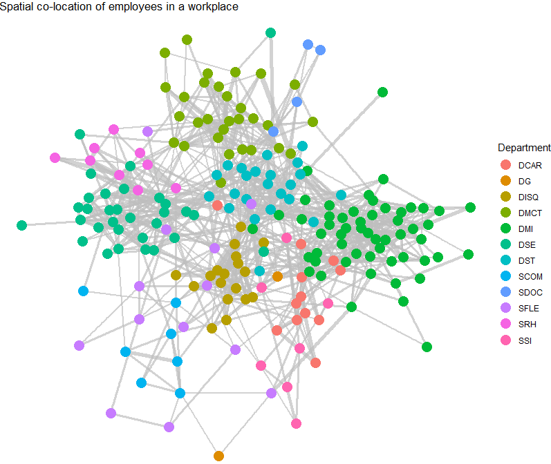
- This graph shows connections of employees in a workplace with edge thickness weighted by minutes spent spatially co-located and vertices colored by department.
- It’s clear that individuals in the same department are more likely to be connected. Community detection is an important topic in Organizational Network Analysis which we will study elsewhere.
LADA Quanteda Networks
- In this section, we’ll generate the LADA network showing the frequency of characters in William Shakespeare’s Romeo and Juliet appearing in the same scene. Our focus is on investigating the networks of personas in Shakespeare’s Romeo and Juliet, and thus, we’ll load this renowned work of fiction.
- Installing R packages
install.packages("flextable")
install.packages("GGally")
install.packages("ggraph")
install.packages("igraph")
install.packages("Matrix")
install.packages("network")
install.packages("quanteda")
install.packages("sna")
install.packages("tidygraph")
install.packages("tidyverse")
install.packages("tm")
install.packages("tibble")
install.packages("quanteda.textplots")
install.packages("gutenbergr")
- Activating R packages
library(flextable)
library(GGally)
library(ggraph)
library(gutenbergr)
library(igraph)
library(Matrix)
library(network)
library(quanteda)
library(sna)
library(tidygraph)
library(tidyverse)
library(tm)
library(tibble)
- Graph Data Preparation
# load data
net_dat <- read.delim("https://slcladal.github.io/data/romeo_tidy.txt", sep = "\t")

net_cmx <- crossprod(table(net_dat[1:2]))
diag(net_cmx) <- 0
net_df <- as.data.frame(net_cmx)

# create a document feature matrix
net_dfm <- quanteda::as.dfm(net_df)
# create feature co-occurrence matrix
net_fcm <- quanteda::fcm(net_dfm, tri = F)
# inspect data
head(net_fcm)

Feature co-occurrence matrix of: 6 by 18 features.
                features
features         BALTHASAR BENVOLIO CAPULET FIRST CITIZEN FIRST SERVANT
  BALTHASAR              1       25      31            11             6
  BENVOLIO              25       39      93            39            27
  CAPULET               31       93      65            42            39
  FIRST CITIZEN         11       39      42             6            10
  FIRST SERVANT          6       27      39            10             3
  FRIAR LAWRENCE        20       53      74            18            17
                features
features         FRIAR LAWRENCE JULIET LADY CAPULET MERCUTIO MONTAGUE
  BALTHASAR                  20     26           31       11       17
  BENVOLIO                   53     87           99       42       55
  CAPULET                    74    131          117       52       65
  FIRST CITIZEN              18     32           36       24       29
  FIRST SERVANT              17     40           42       12       15
  FRIAR LAWRENCE             15     61           72       23       32
[ reached max_nfeat ... 8 more features ]
- Now we generate a network graph using the
textplot_networkfunction from thequanteda.textplotspackage
quanteda.textplots::textplot_network(
  x = net_fcm,                    # a fcm or dfm object
  min_freq = 0.5,                   # frequency count threshold or proportion for co-occurrence frequencies (default = 0.5)
  edge_alpha = 0.5,                 # opacity of edges ranging from 0 to 1.0 (default = 0.5)
  edge_color = "gray",            # color of edges that connect vertices (default = "#1F78B4")
  edge_size = 2,                    # size of edges for most frequent co-occurrence (default = 2)
  # calculate the size of vertex labels for the network plot
  vertex_labelsize = net_dfm %>%
    # convert the dfm object to a data frame
    quanteda::convert(to = "data.frame") %>%
    # exclude the 'doc_id' column
    dplyr::select(-doc_id) %>%
    # calculate the sum of row values for each row
    rowSums() %>%
    # apply the natural logarithm to the resulting sums
    log(),
  vertex_color = "#4D4D4D",         # color of vertices (default = "#4D4D4D")
  vertex_size = 2                   # size of vertices (default = 2)
)
- Let’s define the nodes and we can also add information about the nodes that we can use later on (e.g. frequency information)
# create a new data frame 'va' using the 'net_dat' data
net_dat %>%
  # rename the 'person' column to 'node' and 'occurrences' column to 'n'
  dplyr::rename(node = person,
                n = occurrences) %>%
  # group the data by the 'node' column
  dplyr::group_by(node) %>%
  # summarize the data, calculating the total occurrences ('n') for each 'node'
  dplyr::summarise(n = sum(n)) -> va
va
# A tibble: 18 × 2
   node               n
   <chr>          <int>
 1 BALTHASAR          4
 2 BENVOLIO          49
 3 CAPULET           81
 4 FIRST CITIZEN      4
 5 FIRST SERVANT      4
 6 FRIAR LAWRENCE    49
 7 JULIET           121
 8 LADY CAPULET     100
 9 MERCUTIO          16
10 MONTAGUE           9
11 NURSE            121
12 PARIS             25
13 PETER              4
14 PRINCE             9
15 ROMEO            196
16 SECOND SERVANT     9
17 SERVANT            9
18 TYBALT             9
- We also add a column with additional information to our nodes table.
# define family
mon <- c("ABRAM", "BALTHASAR", "BENVOLIO", "LADY MONTAGUE", "MONTAGUE", "ROMEO")
cap <- c("CAPULET", "CAPULET’S COUSIN", "FIRST SERVANT", "GREGORY", "JULIET", "LADY CAPULET", "NURSE", "PETER", "SAMPSON", "TYBALT")
oth <- c("APOTHECARY", "CHORUS", "FIRST CITIZEN", "FIRST MUSICIAN", "FIRST WATCH", "FRIAR JOHN" , "FRIAR LAWRENCE", "MERCUTIO", "PAGE", "PARIS", "PRINCE", "SECOND MUSICIAN", "SECOND SERVANT", "SECOND WATCH", "SERVANT", "THIRD MUSICIAN")
# create color vectors
va <- va %>%
  dplyr::mutate(type = dplyr::case_when(node %in% mon ~ "MONTAGUE",
                                          node %in% cap ~ "CAPULET",
                                          TRUE ~ "Other"))
# inspect updates nodes table
va
# A tibble: 18 × 3
   node               n type
   <chr>          <int> <chr>
 1 BALTHASAR          4 MONTAGUE
 2 BENVOLIO          49 MONTAGUE
 3 CAPULET           81 CAPULET
 4 FIRST CITIZEN      4 Other
 5 FIRST SERVANT      4 CAPULET
 6 FRIAR LAWRENCE    49 Other
 7 JULIET           121 CAPULET
 8 LADY CAPULET     100 CAPULET
 9 MERCUTIO          16 Other
10 MONTAGUE           9 MONTAGUE
11 NURSE            121 CAPULET
12 PARIS             25 Other
13 PETER              4 CAPULET
14 PRINCE             9 Other
15 ROMEO            196 MONTAGUE
16 SECOND SERVANT     9 Other
17 SERVANT            9 Other
18 TYBALT             9 CAPULET
- Let’s define the edges, i.e., the connections between nodes and, again, we can add information in separate variables that we can use later on.
# create a new data frame 'ed' using the 'dat' data
ed <- net_df %>%
  # add a new column 'from' with row names
  dplyr::mutate(from = rownames(.)) %>%
  # reshape the data from wide to long format using 'gather'
  tidyr::gather(to, n, BALTHASAR:TYBALT) %>%
  # remove zero frequencies
  dplyr::filter(n != 0)

#Now that we have generated tables for the edges and the nodes, we can generate a graph object


ig <- igraph::graph_from_data_frame(d=ed, vertices=va, directed = FALSE)

#We will also add labels to the nodes as follows:

tg <- tidygraph::as_tbl_graph(ig) %>%
  tidygraph::activate(nodes) %>%
  dplyr::mutate(label=name)
- Final Network Visualization
# set seed (so that the exact same network graph is created every time)
set.seed(12345)

# create a graph using the 'tg' data frame with the Fruchterman-Reingold layout
tg %>%
  ggraph::ggraph(layout = "fr") +

  # add arcs for edges with various aesthetics
  geom_edge_arc(colour = "gray50",
                lineend = "round",
                strength = .1,
                aes(edge_width = ed$n,
                    alpha = ed$n)) +

  # add points for nodes with size based on log-transformed 'v.size' and color based on 'va$Family'
  geom_node_point(size = log(va$n) * 2,
                  aes(color = va$type)) +

  # add text labels for nodes with various aesthetics
  geom_node_text(aes(label = name),
                 repel = TRUE,
                 point.padding = unit(0.2, "lines"),
                 size = sqrt(va$n),
                 colour = "gray10") +

  # adjust edge width and alpha scales
  scale_edge_width(range = c(0, 2.5)) +
  scale_edge_alpha(range = c(0, .3)) +

  # set graph background color to white
  theme_graph(background = "white") +

  # adjust legend position to the top
  theme(legend.position = "top",
        # suppress legend title
        legend.title = element_blank()) +

  # remove edge width and alpha guides from the legend
  guides(edge_width = FALSE,
         edge_alpha = FALSE)        # suppress legend title
        legend.title = element_blank()) +

  # remove edge width and alpha guides from the legend
  guides(edge_width = FALSE,
         edge_alpha = FALSE)


dg <- ed[rep(seq_along(ed$n), ed$n), 1:2]
rownames(dg) <- NULL

dg

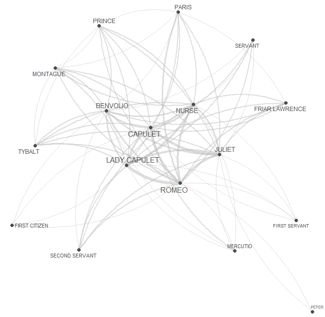
- This is the final LADA network graph using ggraph with the F-R layout.
- Network Statistics
dg <- ed[rep(seq_along(ed$n), ed$n), 1:2]
rownames(dg) <- NULL

dgg <- graph.edgelist(as.matrix(dg), directed = T)
# extract degree centrality
igraph::degree(dgg) %>%
  as.data.frame() %>%
  tibble::rownames_to_column("node") %>%
  dplyr::rename(`degree centrality` = 2) %>%
  dplyr::arrange(-`degree centrality`) -> dc_tbl

dc_tbl
             node degree centrality
1           ROMEO               108
2         CAPULET                92
3    LADY CAPULET                90
4           NURSE                76
5          JULIET                72
6        BENVOLIO                68
7        MONTAGUE                44
8          PRINCE                44
9          TYBALT                44
10          PARIS                42
11 FRIAR LAWRENCE                40
12 SECOND SERVANT                32
13       MERCUTIO                30
14        SERVANT                30
15  FIRST CITIZEN                28
16  FIRST SERVANT                24
17      BALTHASAR                18
18          PETER                18
- Read more about other relevant metrics here.
Cloud-Based Graph SaaS/DBaaS
- Ultipa Cloud offers lightning-fast graph computing experience allowing you to achieve or surpass your innovation goals with lesser cloud resources and in shorter latency. You will be able to process graph data set of any scale in genuine real-time and orders of magnitude faster and deeper than any other graph database vendors.
- TigerGraph, the only scalable graph database for the enterprise, today launched TigerGraph Cloud on Microsoft Azure. TigerGraph Cloud, the industry’s first and only distributed native graph database-as-a-service, helps enterprises harness the power of the graph: Companies can quickly and easily build and run applications that work with highly connected and complex datasets. The company recently announced TigerGraph 3.0, which makes no-code advanced graph analytics easy while delivering core platform capabilities. TigerGraph helps enterprises derive new insights and drive vastly better business outcomes through advanced graph analytics at scale. TigerGraph Cloud allows teams to use the cloud vendor of their choice, offering support for Amazon Web Services (AWS) and now, Microsoft Azure.
- Neo4j Aura is a fast, reliable, scalable, and completely automated graph database as a cloud service, enabling you to focus on your strengths – creating rich, data-driven applications – rather than waste time managing the databases. Aura now makes the power of data relationships available in a cloud-native environment, enabling fast queries for real-time analytics and insights
About Neo4j Graph Data Science
- Neo4j Graph Data Science (GDS) is an analytics and machine learning (ML) solution that analyzes relationships in data to improve predictions and discover insights. It plugs into data ecosystems so data science teams can get more projects into production and share business insights quickly.
- The GDS library provides efficiently implemented, parallel versions of common graph algorithms, exposed as Cypher procedures. Additionally, GDS includes ML pipelines to train predictive supervised models to solve graph problems, such as predicting missing relationships.
- Graph structure makes it possible to explore billions of data points in seconds and identify hidden relationships that help improve predictions. The Neo4j library of graph algorithms, ML modeling, and visualizations help your teams answer questions like what’s important, what’s unusual, and what’s next.
Conclusions
- In this tutorial, the Network Analysis in R has been used to investigate and visualize the inter-relationship between entities (individuals, things, etc.).
- Examples of network structures, include social networks, friendship networks, train networks, etc.
- Network and graph theory are extensively used across different fields, such as finance, social sciences, economics, communication, history, computer science, etc.
- We have learned by example the basics of network analysis and visualization.
- This post has attempted to give a general introduction to creating and plotting network type objects in R. There is a plethora of resources on network analysis in general and in R in particular.
References
- Graph Algorithms in Neo4j: Graph Algorithms in Practice
- Graph Theory
- An Intro to Graph Theory and Analysis using Tidygraph
- Graph analysis using the tidyverse
- Network Analysis and Visualization with R and igraph
- Graphs are fun: A gentle introduction to graphs in R
- igraph (R interface)
- Network Analysis using R
- Construction of (r, g)-Graphs [Graph Theory]
- Graph Algorithms
- Graph Theory


One-Time
Monthly
Yearly
Make a one-time donation
Make a monthly donation
Make a yearly donation
Choose an amount
€5.00
€15.00
€100.00
€5.00
€15.00
€100.00
€5.00
€15.00
€100.00
Or enter a custom amount
€
Your contribution is appreciated.
Your contribution is appreciated.
Your contribution is appreciated.
DonateDonate monthlyDonate yearly
Leave a comment