
- In this post, we will revisit most popular blue-chip stock portfolios using Python fintech libraries.
- Our objective is to optimize currently available quant trading and investing solutions for private DIY self-traders. Our trading approach consists of the following 4 steps:
- Step 1: Examine the AAPL trading signals and support/resistance regression lines.
- Step 2: Compare AAPL vs MSFT in terms of returns, volatility, covariance, and correlations.
- Step 3: Compare MA 10-20-30, daily returns, pair plots, correlations, Monte Carlo simulations, and Sharpe ratios of AAPL, AMZN, MSFT, and TSLA stocks.
- Step 4: Perform the SPY stock price analysis and FB Prophet forecast.
Let’s dive into the details below.
Table of Contents
- AAPL Trading Signals Verified
- AAPL/MSFT Risk vs ROI Analysis
- Popular 4-Stock Portfolio
- Monte-Carlo Predictions
- SPY Return/Volatility
- SPY Prophet Forecast
- Summary
- References
- Explore More
AAPL Trading Signals Verified
Let’s set the working directory YOURPATH
import os
os.chdir('YOURPATH') # Set working directory
os. getcwd()
Let’s import the key libraries and define the following functions
import numpy as np
import pandas as pd
from math import sqrt
import matplotlib.pyplot as plt
import pandas_datareader as web
from scipy.signal import savgol_filter
from sklearn.linear_model import LinearRegression
from pandas_datareader import data as pdr
import yfinance as yfin
yfin.pdr_override()

def pythag(pt1, pt2):
    a_sq = (pt2[0] - pt1[0]) ** 2
    b_sq = (pt2[1] - pt1[1]) ** 2
    return sqrt(a_sq + b_sq)
def regression_ceof(pts):
    X = np.array([pt[0] for pt in pts]).reshape(-1, 1)
    y = np.array([pt[1] for pt in pts])
    model = LinearRegression()
    model.fit(X, y)
    return model.coef_[0], model.intercept_
def local_min_max(pts):
    local_min = []
    local_max = []
    prev_pts = [(0, pts[0]), (1, pts[1])]
    for i in range(1, len(pts) - 1):
        append_to = ''
        if pts[i-1] > pts[i] < pts[i+1]:
            append_to = 'min'
        elif pts[i-1] < pts[i] > pts[i+1]:
            append_to = 'max'
        if append_to:
            if local_min or local_max:
                prev_distance = pythag(prev_pts[0], prev_pts[1]) * 0.5
                curr_distance = pythag(prev_pts[1], (i, pts[i]))
                if curr_distance >= prev_distance:
                    prev_pts[0] = prev_pts[1]
                    prev_pts[1] = (i, pts[i])
                    if append_to == 'min':
                        local_min.append((i, pts[i]))
                    else:
                        local_max.append((i, pts[i]))
            else:
                prev_pts[0] = prev_pts[1]
                prev_pts[1] = (i, pts[i])
                if append_to == 'min':
                    local_min.append((i, pts[i]))
                else:
                    local_max.append((i, pts[i]))
    return local_min, local_max
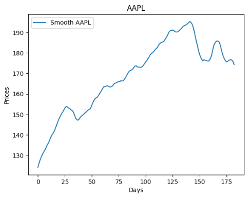
Let’s look at the smoothed version if the above plot
month_diff = series.shape[0] // 30
if month_diff == 0:
    month_diff = 1
month_diff
6
smooth = int(2 * month_diff + 3)
smooth
15
pts = savgol_filter(series, smooth, 3)
plt.title(symbol)
plt.xlabel('Days')
plt.ylabel('Prices')
plt.plot(pts, label=f'Smooth {symbol}')
plt.legend()
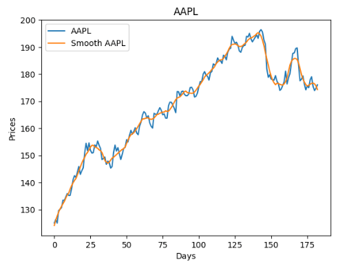
Let’s combine these two curves into the single joint plot
plt.title(symbol)
plt.xlabel('Days')
plt.ylabel('Prices')
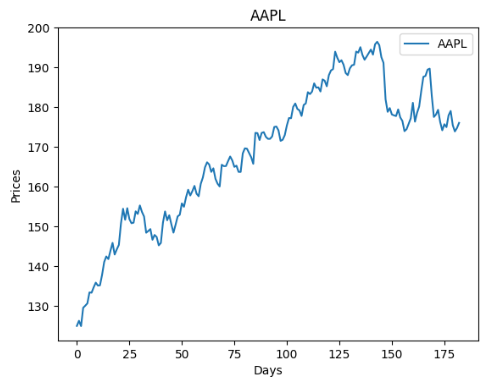
plt.plot(series, label=symbol)
plt.plot(pts, label=f'Smooth {symbol}')
plt.legend()
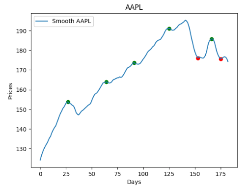
Let’s generate the trading signals using the smoothed price curve
local_min, local_max = local_min_max(pts)
plt.title(symbol)
plt.xlabel('Days')
plt.ylabel('Prices')
plt.plot(pts, label=f'Smooth {symbol}')
for pt in local_min:
    plt.scatter(pt[0], pt[1], c='r')
for pt in local_max:
    plt.scatter(pt[0], pt[1], c='g')
plt.legend()
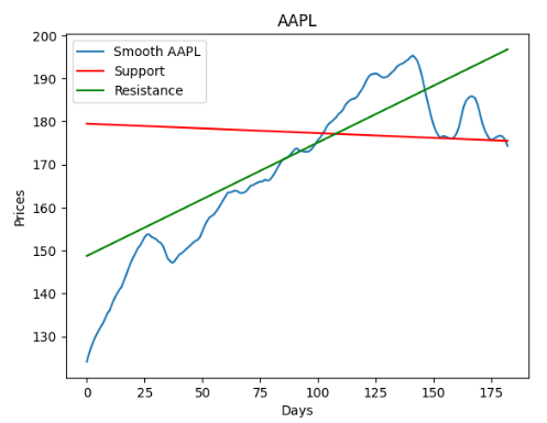
Let’s calculate the local support and resistance lines using the regression_ceof function
local_min_slope, local_min_int = regression_ceof(local_min)
local_max_slope, local_max_int = regression_ceof(local_max)
support = (local_min_slope * np.array(series.index)) + local_min_int
resistance = (local_max_slope * np.array(series.index)) + local_max_int
plt.title(symbol)
plt.xlabel('Days')
plt.ylabel('Prices')
plt.plot(pts, label=f'Smooth {symbol}')
plt.plot(support, label='Support', c='r')
plt.plot(resistance, label='Resistance', c='g')
plt.legend()
plt.title(symbol)
plt.xlabel('Days')
plt.ylabel('Prices')
plt.plot(series, label=symbol)
plt.plot(support, label='Support', c='r')
plt.plot(resistance, label='Resistance', c='g')
plt.legend()

Let’s plot the AAPL Simple Moving Average (SMA) to verify the 5-year MA crossover strategy
# import modules
from datetime import datetime
import yfinance as yf
import matplotlib.pyplot as plt

# initialize parameters
start_date = datetime(2017, 1, 1)
end_date = datetime(2023, 9, 26)

# get the data
df = yf.download('AAPL', start = start_date,
                   end = end_date)
import matplotlib
from pylab import rcParams
matplotlib.rcParams.update({'font.size': 18})
rcParams['figure.figsize'] = 15, 6

simple_ma = df["Close"].rolling(window=100).mean()

plt.figure(figsize=(14,8))
simple_ma.plot(label="Simple Moving Average")
df["Close"].plot(label="Closing Price")
plt.xticks(rotation=0)
plt.title("Moving Average of Closing Price", size=22)
plt.legend()
plt.show(

AAPL/MSFT Risk vs ROI Analysis
Following the quant trading diversification approach, we will show how a trader can reduce the volatility of the portfolio’s returns by choosing just 2 tech stocks such as AAPL and MSFT.
# Import libraries
import pandas as pd
import numpy as np
import yfinance as yf
import statsmodels.api as sm
from statsmodels.regression.rolling import RollingOLS
import matplotlib.pyplot as plt
import plotly.express as px
import plotly.graph_objects as go
from IPython.display import clear_output
#Download data

startdate='2023-01-01'
enddate='2023-09-26'

tickers = ['AAPL', 'MSFT']

price = yf.download(tickers, startdate, enddate)['Close']
price.tail()
[*********************100%***********************] 2 of 2 completed

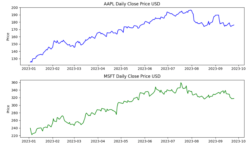
We can plot these two stocks as follows
# AAPL plot
plt.figure(figsize=(10,6))
plt.subplot(2, 1, 1)
plt.plot(price.AAPL, color='b')
plt.ylabel('Price')
plt.title('AAPL Daily Close Price USD')
# MSFT plot
plt.subplot(2, 1, 2)
plt.plot(price.MSFT, color='g')
plt.ylabel('Price')
plt.title('MSFT Daily Close Price USD')
# Use plt.tight_layout() to improve the spacing between subplots
plt.tight_layout()
plt.show()
We can calculate their daily returns
returns = price.pct_change().dropna()
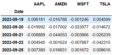
print(returns.tail())
          AAPL      MSFT
Date
2023-09-19  0.006181 -0.001246
2023-09-20 -0.019992 -0.023977
2023-09-21 -0.008889 -0.003866
2023-09-22  0.004945 -0.007887
2023-09-25  0.007380  0.001672
            AAPL	MSFT
count	182.000000	182.000000
mean	0.001970	0.001689
std	0.013394	0.016852
min	-0.048020	-0.043743
25%	-0.006398	-0.008414
50%	0.001838	0.000901
75%	0.009300	0.011763
max	0.046927	0.072435
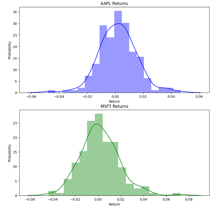
We can plot histograms or probabilities of their daily returns
import seaborn as sns
fig = plt.figure(figsize=(10,10))
# AAPL plot
plt.subplot(2, 1, 1)
sns.distplot(returns.AAPL, color='b');
plt.xlabel('Return')
plt.ylabel('Probability')
plt.title('AAPL Returns')
# MSFT plot
plt.subplot(2, 1, 2)
sns.distplot(returns.MSFT, color='g')
plt.xlabel('Return')
plt.ylabel('Probability')
plt.title('MSFT Returns')
plt.show()
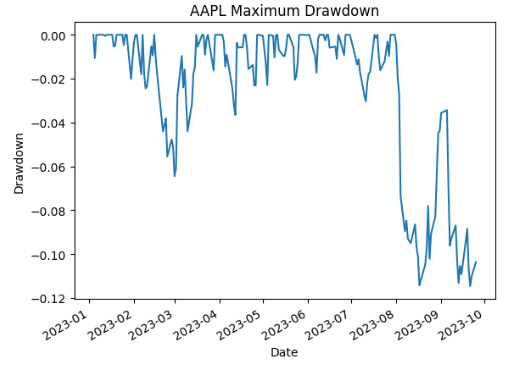
It is very interesting to compare Maximum Drawdown of these 2 stocks
wealth_index = (1+returns['AAPL']).cumprod()
previous_peaks_MSFT = wealth_index.cummax()
drawdowns_MSFT = (wealth_index - previous_peaks_MSFT)/previous_peaks_MSFT
drawdowns_MSFT.plot.line()
plt.ylabel('Drawdown')
plt.title('AAPL Maximum Drawdown')
drawdowns_MSFT.min(), drawdowns_MSFT.idxmin()
wealth_index = (1+returns['MSFT']).cumprod()
previous_peaks_MSFT = wealth_index.cummax()
drawdowns_MSFT = (wealth_index - previous_peaks_MSFT)/previous_peaks_MSFT
drawdowns_MSFT.plot.line()
plt.ylabel('Drawdown')
plt.title('MSFT Maximum Drawdown')
drawdowns_MSFT.min(), drawdowns_MSFT.idxmin()

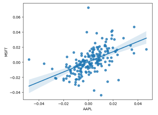
It is worthwhile to look at correlations of their returns
corr = returns[['AAPL', 'MSFT']].corr()
print(corr)
sns.scatterplot(x="AAPL", y="MSFT", data=returns)
sns.regplot(x="AAPL", y="MSFT", data=returns)
       AAPL      MSFT
AAPL  1.000000  0.532946
MSFT  0.532946  1.000000
Then we can calculate their compounded growth and covariance
n_days = returns.shape[0]
compounded_growth = (1+returns).prod()
n_periods = returns.shape[0]
ann_returns =  compounded_growth**(252/n_days)-1
ann_returns
AAPL    0.605810
MSFT    0.477083
dtype: float64
cov = returns.cov()
cov
            AAPL	MSFT
AAPL	0.000179	0.000120
MSFT	0.000120	0.000284
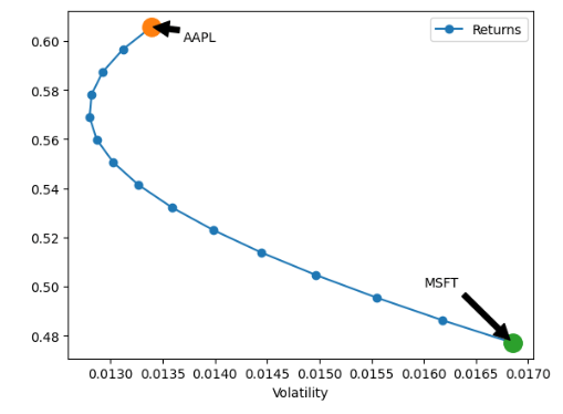
Let’s turn our attention to the efficient frontier of our 2 assets. In doing so, we need to calculate the portfolio return-volatility
# Calculate the portfolio return
def portfolio_return(w, r):

    return w.T @ r
# Calculate the portfolio volatility return
def portfolio_vol(w, covmat):

    return (w.T @ covmat @ w)**0.5
We are now ready to plot the efficient frontier curve
#Plot the efficient frontier of two assets
ax=plt.figure(figsize=(14,6))
n_points = 15
weights = [np.array([w, 1-w]) for w in np.linspace(0, 1, n_points)]
def plot_ef2(n_points, returns, cov):

    weights = [np.array([w, 1-w]) for w in np.linspace(0, 1, n_points)]
    rets = [portfolio_return(w, ann_returns) for w in weights]
    vols = [portfolio_vol(w, cov) for w in weights]
    ef = pd.DataFrame({
        "Returns": rets,
        "Volatility": vols
    })
    return ef.plot.line(x="Volatility", y="Returns", style="o-")
ax = plot_ef2(n_points, ann_returns, cov)

ax.plot([0.013394], [0.605810], 'o',markersize=14)
ax.annotate('AAPL', xy=(0.013394, 0.605810), xytext=(0.0137, 0.60),
            arrowprops=dict(facecolor='black', shrink=0.05))
ax.plot([0.016852], [0.477083], 'o',markersize=14)
ax.annotate('MSFT', xy=(0.016852, 0.477083), xytext=(0.016, 0.5),
           arrowprops=dict(facecolor='black', shrink=0.05))
Popular 4-Stock Portfolio
Our current objectives are as follows:
- Build moving average of selected stocks
- Determine correlations between stock returns
- Create and validate an optimal stock portfolio
- Predict the future behavior of selected stocks
#Import
import numpy as np
import pandas as pd
import matplotlib.pyplot as plt
import seaborn as sns
from pandas_datareader import data
from datetime import datetime
# Setting the begining and ending
today = datetime.now()
year_ago = datetime(today.year-1, today.month, today.day)
# Four company for data extraction
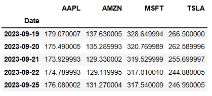
company_list = ['AAPL', 'TSLA', 'MSFT', 'AMZN']
Reading input stock data:
for company in company_list:
    globals()[company] = pdr.get_data_yahoo(company, year_ago, today)
[*********************100%***********************]  1 of 1 completed
[*********************100%***********************]  1 of 1 completed
[*********************100%***********************]  1 of 1 completed
[*********************100%***********************]  1 of 1 completed
price = yf.download(company_list, startdate, enddate)['Close']
price.tail()
[*********************100%***********************] 4 of 4 completed
Let’s calculate MA 10-20-30
MA_days = [10, 20, 30]

for ma in MA_days:
    ma_str = "MA AAPL {}".format(ma)
    price[ma_str] = price.AAPL.rolling(ma).mean()
    ma_str = "MA AMZN {}".format(ma)
    price[ma_str] = price.AMZN.rolling(ma).mean()
    ma_str = "MA MSFT {}".format(ma)
    price[ma_str] = price.MSFT.rolling(ma).mean()
    ma_str = "MA TSLA {}".format(ma)
    price[ma_str] = price.TSLA.rolling(ma).mean()
price.tail()
                AAPL	AMZN	    MSFT	    TSLA	MA AAPL 10	     MA AMZN 10	MA MSFT 10	  MA TSLA 10	MA AAPL 20	MA AMZN 20	MA MSFT 20	MA TSLA 20	MA AAPL 30	MA AMZN 30	MA MSFT 30	MA TSLA 30
Date
2023-09-19	179.070007	137.630005	328.649994	266.500000	177.631001	140.334001	332.945999	264.648001	180.4320	137.736501	329.637001	254.881998	179.340000	137.489334	326.883334	248.060999
2023-09-20	175.490005	135.289993	320.769989	262.589996	176.889001	140.327000	331.734998	265.715001	180.3450	137.788500	329.552501	256.351998	179.196334	137.334334	326.707334	248.490666
2023-09-21	173.929993	129.330002	319.529999	255.699997	176.526001	139.475000	330.696997	266.136000	179.9855	137.479000	329.179001	257.293998	179.054333	137.050334	326.617334	248.940999
2023-09-22	174.789993	129.119995	317.010010	244.880005	176.187001	138.564000	328.970999	265.774001	179.9060	137.343000	329.031001	258.035999	178.948333	136.735667	326.420001	248.925666
2023-09-25	176.080002	131.270004	317.540009	246.990005	175.859001	137.381000	326.931000	263.115002	179.7795	137.243501	328.759001	258.455999	178.891334	136.497667	326.304335	249.070333
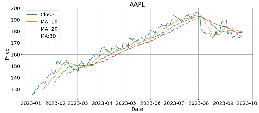
- AAPL MA 10-20-30:
import matplotlib
plt.figure(figsize=(15, 6))
matplotlib.rcParams.update({'font.size': 18})
plt.plot(price['AAPL'])
plt.plot(price['MA AAPL 10'])
plt.plot(price['MA AAPL 20'])
plt.plot(price['MA AAPL 30'])

plt.title('AAPL')
plt.xlabel('Date')
plt.ylabel('Price')

plt.legend(('Close','MA: 10', 'MA: 20', 'MA:30'))
plt.grid()
plt.show()
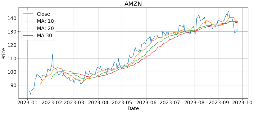
- AMZN MA 10-20-30:
plt.figure(figsize=(15, 6))
matplotlib.rcParams.update({'font.size': 18})
plt.plot(price['AMZN'])
plt.plot(price['MA AMZN 10'])
plt.plot(price['MA AMZN 20'])
plt.plot(price['MA AMZN 30'])

plt.title('AMZN')
plt.xlabel('Date')
plt.ylabel('Price')

plt.legend(('Close','MA: 10', 'MA: 20', 'MA:30'))
plt.grid()
plt.show()
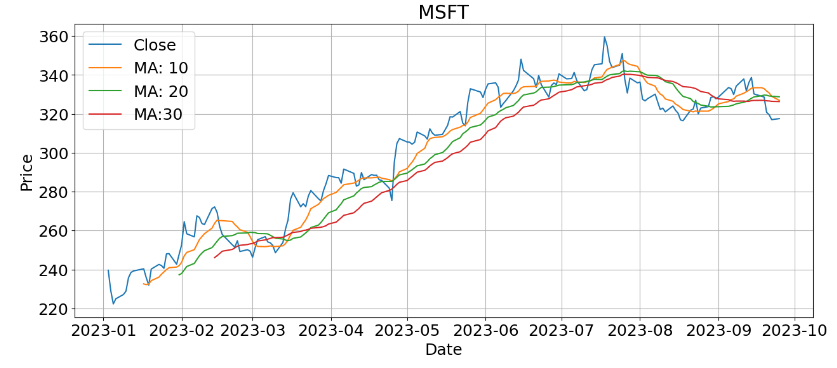
- MSFT MA 10-20-30:
plt.figure(figsize=(15, 6))
matplotlib.rcParams.update({'font.size': 18})
plt.plot(price['MSFT'])
plt.plot(price['MA MSFT 10'])
plt.plot(price['MA MSFT 20'])
plt.plot(price['MA MSFT 30'])

plt.title('MSFT')
plt.xlabel('Date')
plt.ylabel('Price')

plt.legend(('Close','MA: 10', 'MA: 20', 'MA:30'))
plt.grid()
plt.show()
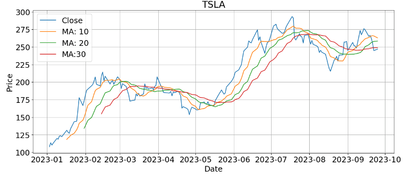
- TSLA MA 10-20-30:
plt.figure(figsize=(15, 6))
matplotlib.rcParams.update({'font.size': 18})
plt.plot(price['TSLA'])
plt.plot(price['MA TSLA 10'])
plt.plot(price['MA TSLA 20'])
plt.plot(price['MA TSLA 30'])

plt.title('TSLA')
plt.xlabel('Date')
plt.ylabel('Price')

plt.legend(('Close','MA: 10', 'MA: 20', 'MA:30'))
plt.grid()
plt.show()
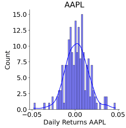
Let’s calculate and plot Daily Returns of our 4 stocks
price['Daily Returns AAPL'] = price['AAPL'].pct_change()
price['Daily Returns AMZN'] = price['AMZN'].pct_change()
price['Daily Returns MSFT'] = price['MSFT'].pct_change()
price['Daily Returns TSLA'] = price['TSLA'].pct_change()
- Daily Returns AAPL
sns.displot(price['Daily Returns AAPL'].dropna(), bins=50, color='blue', kde=True)
plt.title("AAPL")
plt.show()
- Daily Returns AMZN
sns.displot(price['Daily Returns AMZN'].dropna(), bins=50, color='blue', kde=True)
plt.title("AMZN")
plt.show()

- Daily Returns MSFT
sns.displot(price['Daily Returns MSFT'].dropna(), bins=50, color='blue', kde=True)
plt.title("MSFT")
plt.show()

- Daily Returns TSLA
sns.displot(price['Daily Returns TSLA'].dropna(), bins=50, color='blue', kde=True)
plt.title("TSLA")
plt.show()

Let’s prepare the above returns for the stock correlation analysis
stock_returns = pd.DataFrame()
stock_returns['AAPL']=price['Daily Returns AAPL'].dropna()
stock_returns['AMZN']=price['Daily Returns AMZN'].dropna()
stock_returns['MSFT']=price['Daily Returns MSFT'].dropna()
stock_returns['TSLA']=price['Daily Returns TSLA'].dropna()
stock_returns.tail()
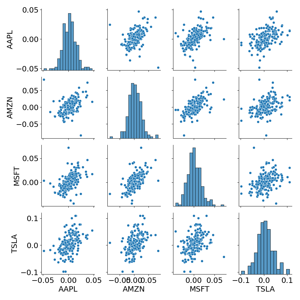
- Pair plot
sns.pairplot(stock_returns)
plt.savefig('pairplot_tech.png')
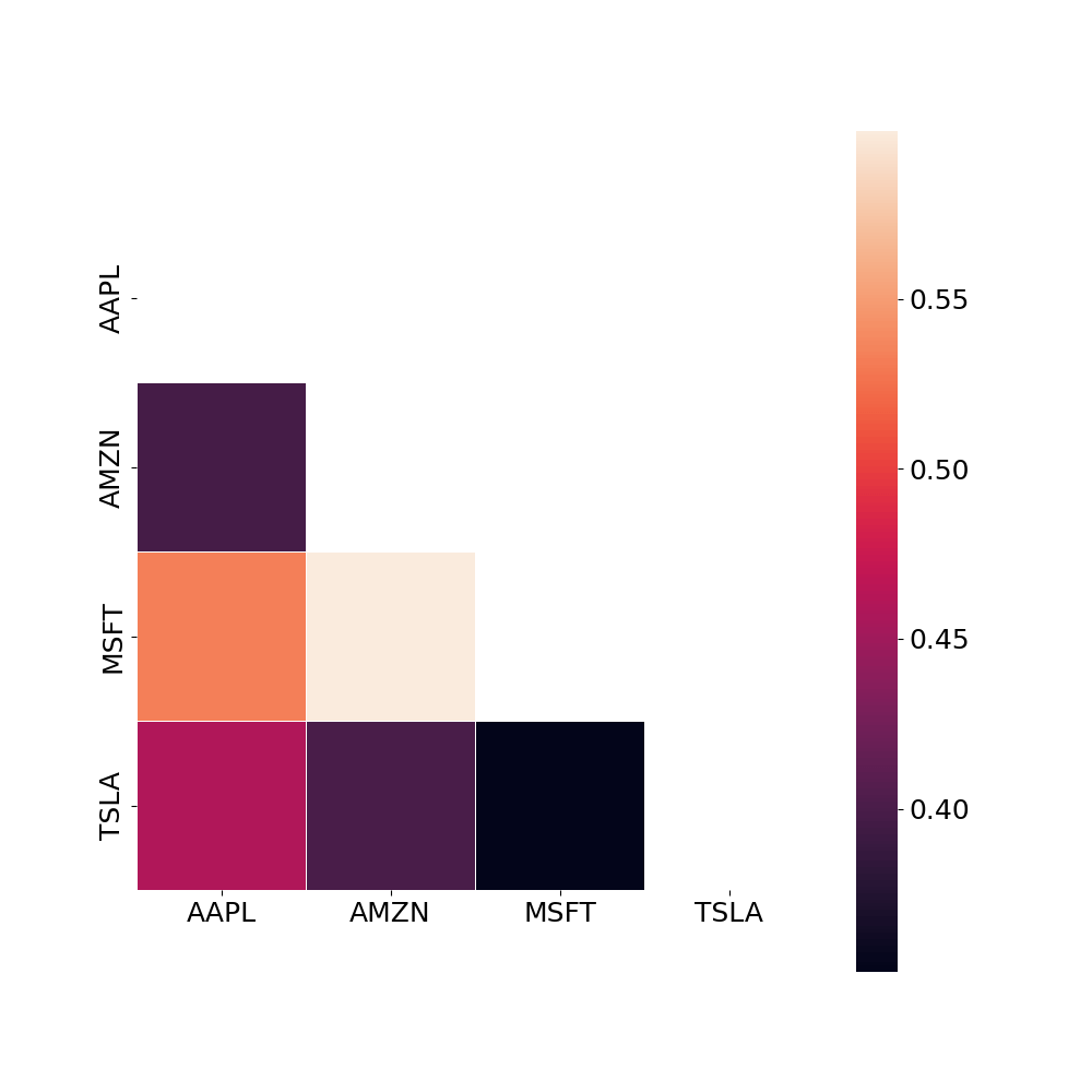
- Correlation matrix
# Build correlation matrix
corr = stock_returns.corr()
mask = np.triu(np.ones_like(corr, dtype=bool))
plt.figure(figsize=(10, 10))
sns.heatmap(corr, mask=mask,  square=True, linewidths=.5, annot=True)
#plt.show()
plt.savefig('corrmatrix_tech.png')
- Joint plot
def draw_jointplot(data):
    grid = sns.PairGrid(data.dropna())
    grid.map_diag(sns.histplot, bins=40, kde=True)
    grid.map_lower(sns.regplot)
    grid.map_upper(sns.kdeplot)
draw_jointplot(stock_returns)
plt.savefig('stockreturns_tech.png')
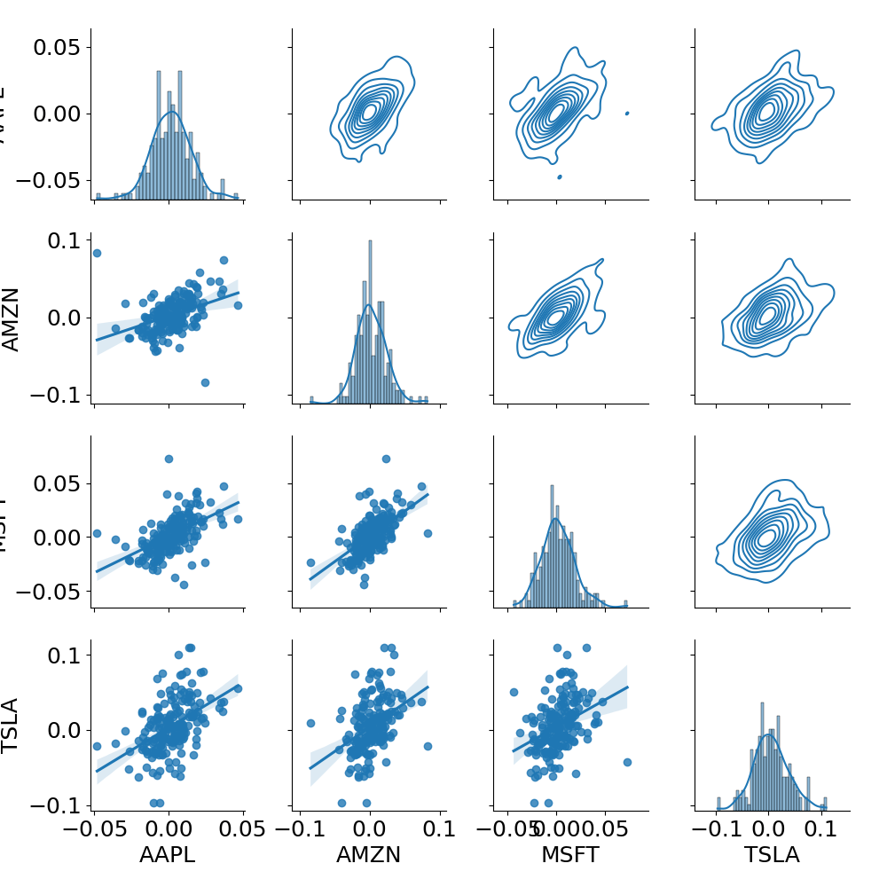
Here, Row 1: AAPL, Row 2: AMZN, Row 3: MSFT, Row 4: TSLA.
Let’s calculate the mean returns and covariance of our stocks
mean_income = stock_returns.mean() # Mean income for each stock
cov_returns = stock_returns.cov() # Covariation
count = len(stock_returns.columns)
print(mean_income, cov_returns, sep='\n')
AAPL    0.001970
AMZN    0.002569
MSFT    0.001689
TSLA    0.005150
dtype: float64
          AAPL      AMZN      MSFT      TSLA
AAPL  0.000179  0.000115  0.000120  0.000215
AMZN  0.000115  0.000467  0.000218  0.000301
MSFT  0.000120  0.000218  0.000284  0.000207
TSLA  0.000215  0.000301  0.000207  0.001217
Let’s find the maximum Sharpe ratio of our portfolio by generating random shares while plotting the efficient frontier curve as an envelope
# Function, that generate random shares
def randomPortfolio():
    share = np.exp(np.random.randn(count))
    share = share / share.sum()
    return share
def IncomePortfolio(Rand):
    return np.matmul(mean_income.values, Rand)


def RiskPortfolio(Rand):
    return np.sqrt(np.matmul(np.matmul(Rand, cov_returns.values), Rand))
combinations = 4000
risk = np.zeros(combinations)
income = np.zeros(combinations)
portfolio = np.zeros((combinations, count))

# Function, which create new combinations of shares
for i in range(combinations):
    rand = randomPortfolio()

    portfolio[i, :] = rand
    risk[i] = RiskPortfolio(rand)
    income[i] = IncomePortfolio(rand)
plt.figure(figsize=(15, 8))

plt.scatter(risk * 100, income * 100, c="b", marker="o",s=20)
plt.xlabel("Risk")
plt.ylabel("Income")
plt.title("Portfolios")
MaxSharpRatio = np.argmax(income / risk)
plt.scatter([risk[MaxSharpRatio] * 100], [income[MaxSharpRatio] * 100], s=140,c="r", marker="o", label="Max Sharp ratio")

plt.legend()
#plt.show()
plt.savefig('efficiencycurve_portfolios.png')

Finally, we can compare the maximum Sharpe ratios of our stocks
best_port = portfolio[MaxSharpRatio]
for i in range(len(company_list)):
    print("{} : {}".format(company_list[i], best_port[i]))
AAPL : 0.5737824378783145
TSLA : 0.1887338094255849
MSFT : 0.033839219286878226
AMZN : 0.2036445334092224
Monte-Carlo Predictions
We will consider the 1Y forecast with the mean and STD values
days = 365
dt = 1 / days
stock_returns.dropna(inplace=True)

mu = stock_returns.mean()
sigma = stock_returns.std()
We need the following function
def monte_carlo(start_price, days, mu, sigma):
    price = np.zeros(days)
    price[0] = start_price

    shock = np.zeros(days)
    drift = np.zeros(days)

    for x in range(1, days):
        shock[x] = np.random.normal(loc=mu * dt, scale=sigma*np.sqrt(dt))
        drift[x] = mu * dt

        price[x] = price[x-1] + (price[x-1] * (drift[x] + shock[x]))

    return price
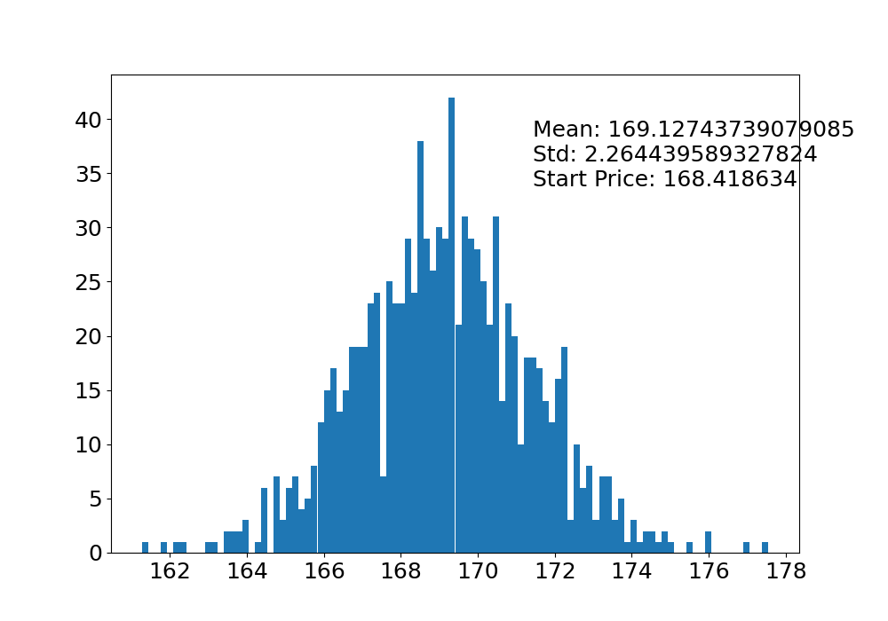
- AAPL
price['AAPL'].describe()
count    183.000000
mean     168.418634
std       17.755754
min      125.019997
25%      153.840004
50%      172.690002
75%      180.955002
max      196.449997
Name: AAPL, dtype: float64
start_price = 168.418634
sim = np.zeros(1000)

plt.figure(figsize=(15, 8))
for i in range(1000):
    result = monte_carlo(start_price, days, mu['AAPL'], sigma['AAPL'])
    sim[i] = result[days - 1]
    plt.plot(result)

plt.xlabel('Days')
plt.ylabel('Price')
plt.title('Monte Carlo Analysis for AAPL')
plt.savefig('monte_aapl.png')

plt.figure(figsize=(10, 7))
plt.hist(sim, bins=100)
plt.figtext(0.6, 0.7, "Mean: {} \nStd: {} \nStart Price: {}".format(sim.mean(), sim.std(), start_price))
#plt.show()
plt.savefig('montehist_aapl.png')
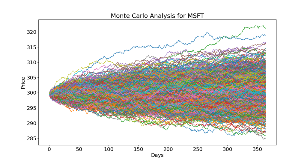
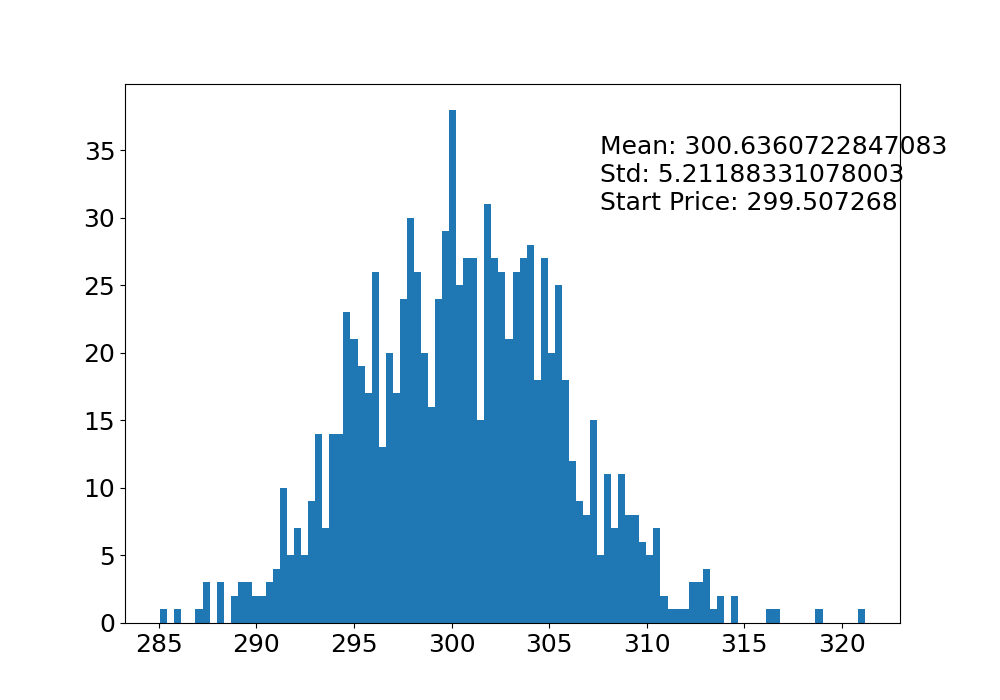
- MSFT
price['MSFT'].describe()
count    183.000000
mean     299.507268
std       36.373372
min      222.309998
25%      267.145004
50%      311.739990
75%      330.964996
max      359.489990
Name: MSFT, dtype: float64
start_price = 299.507268
sim = np.zeros(1000)

plt.figure(figsize=(15, 8))
for i in range(1000):
    result = monte_carlo(start_price, days, mu['MSFT'], sigma['MSFT'])
    sim[i] = result[days - 1]
    plt.plot(result)

plt.xlabel('Days')
plt.ylabel('Price')
plt.title('Monte Carlo Analysis for MSFT')
plt.savefig('monte_msft.png')
plt.figure(figsize=(10, 7))
plt.hist(sim, bins=100)
plt.figtext(0.6, 0.7, "Mean: {} \nStd: {} \nStart Price: {}".format(sim.mean(), sim.std(), start_price))
#plt.show()
plt.savefig('montehist_msft.png')
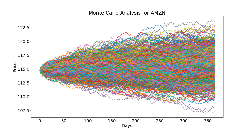
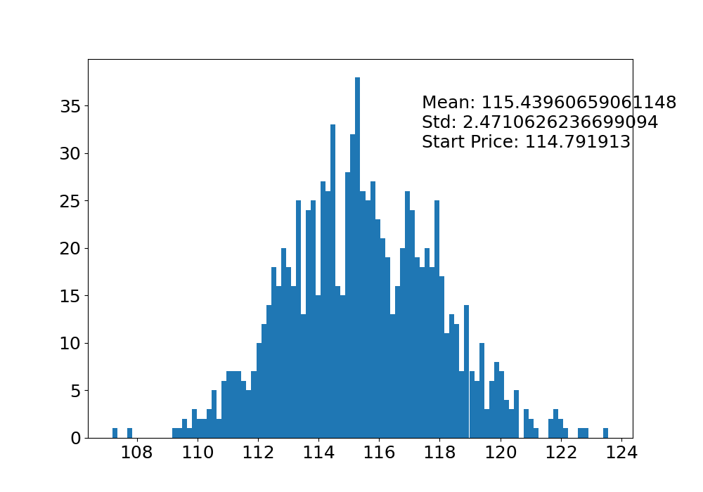
- AMZN
price['AMZN'].describe()
count    183.000000
mean     114.791913
std       17.026834
min       83.120003
25%       99.380001
50%      112.910004
75%      130.184998
max      144.850006
Name: AMZN, dtype: float64
start_price = 114.791913
sim = np.zeros(1000)

plt.figure(figsize=(15, 8))
for i in range(1000):
    result = monte_carlo(start_price, days, mu['AMZN'], sigma['AMZN'])
    sim[i] = result[days - 1]
    plt.plot(result)

plt.xlabel('Days')
plt.ylabel('Price')
plt.title('Monte Carlo Analysis for AMZN')
plt.savefig('monte_amzn.png')
plt.figure(figsize=(10, 7))
plt.hist(sim, bins=100)
plt.figtext(0.6, 0.7, "Mean: {} \nStd: {} \nStart Price: {}".format(sim.mean(), sim.std(), start_price))
#plt.show()
plt.savefig('montehist_amzn.png')
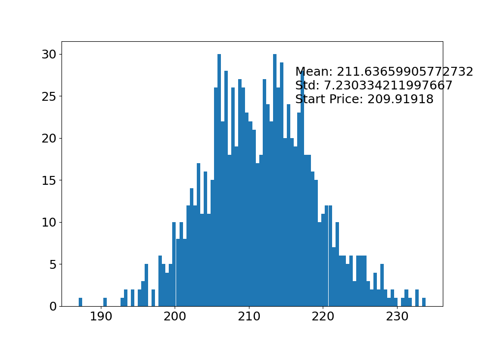
- TSLA
price['TSLA'].describe()
count    183.000000
mean     209.919180
std       45.605744
min      108.099998
25%      180.294998
50%      201.289993
75%      254.904999
max      293.339996
Name: TSLA, dtype: float64
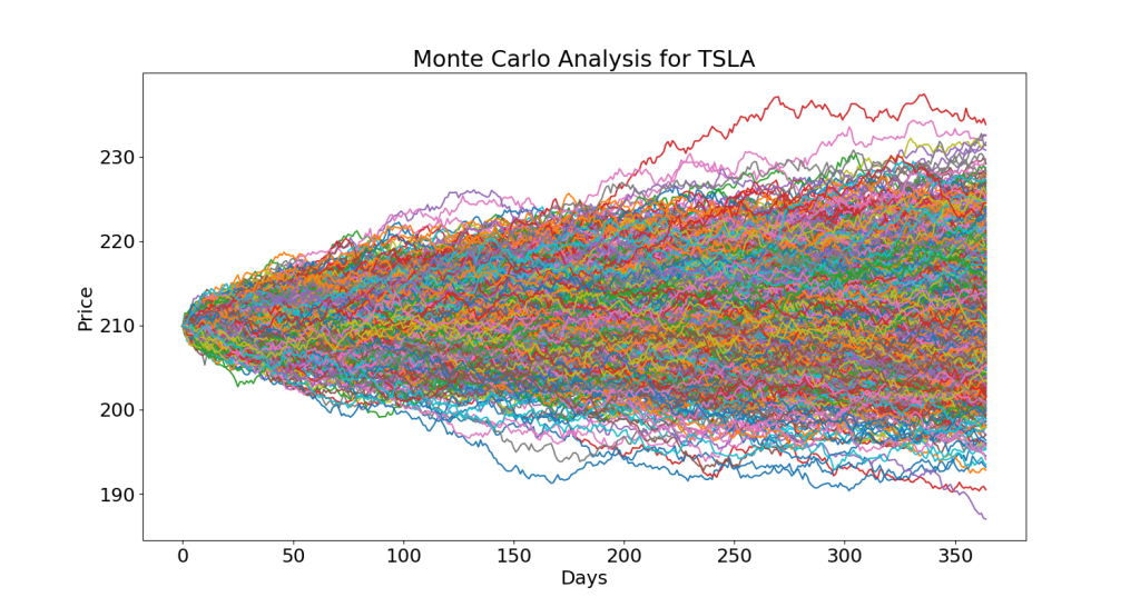
plt.figure(figsize=(10, 7))
plt.hist(sim, bins=100)
plt.figtext(0.6, 0.7, "Mean: {} \nStd: {} \nStart Price: {}".format(sim.mean(), sim.std(), start_price))
#plt.show()
plt.savefig('montehist_tsla.png')
SPY Return/Volatility
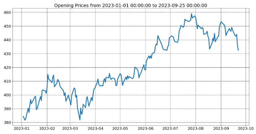
Let’s look at the SPY index in 2023
# import modules
from datetime import datetime
import yfinance as yf
import matplotlib.pyplot as plt

# initialize parameters
start_date = datetime(2023, 1, 1)
end_date = datetime(2023, 9, 25)

# get the data
data = yf.download('SPY', start = start_date,
                   end = end_date)

# display
plt.figure(figsize = (20,10))
plt.title('Opening Prices from {} to {}'.format(start_date,
                                                end_date))
plt.plot(data['Open'],lw=4)
plt.grid(color='k', linestyle='--', linewidth=1)
plt.show()
Let’s calculate the average annual SPY return and volatility
nifty=data.copy()
nifty_returns=(nifty['Close']/nifty['Open'])-1

volatility= np.std(nifty_returns)
trading_days=len(nifty_returns)
mean=nifty_returns.mean()

print('Annual Average SPY return',mean)
print('Annual volatility',volatility*np.sqrt(trading_days))
print('Number of trading days',trading_days)
Annual Average SPY return 0.0006876400629725226
Annual volatility 0.09887050147370505
Number of trading days 182
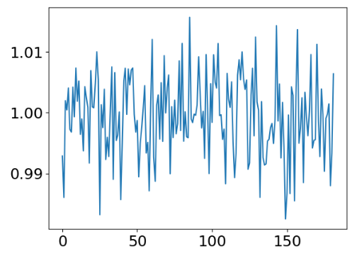
The SPY daily returns are given by
daily_returns=np.random.normal(mean/trading_days,volatility,trading_days)+1

index_returns=[10980]

for x in daily_returns:
    index_returns.append(index_returns[-1]*x)

plt.plot(daily_returns)
plt.show()
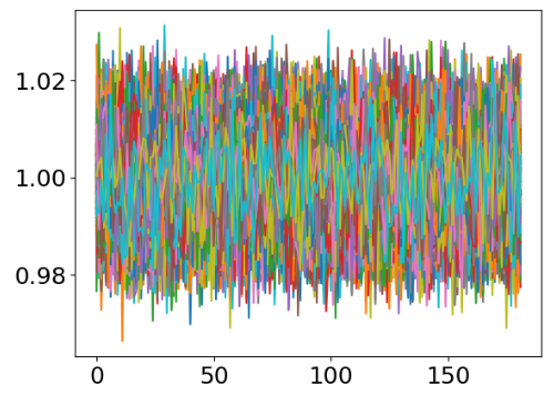
The corresponding 1000 random simulations of daily returns are
for i in range(1000):
    daily_returns=np.random.normal(mean/trading_days,volatility,trading_days)+1

    index_returns=[10980]

    for x in daily_returns:
        index_returns.append(index_returns[-1]*x)

    plt.plot(daily_returns)

plt.show()
SPY Prophet Forecast
Let’s prepare the SPY stock data for the FB Prophet forecast
nifty.reset_index(inplace=True)
nifty['Date']= pd.to_datetime(nifty['Date'])
nifty.rename(columns={'Date':'ds','Open':'y'},inplace=True)
The forecast model is expressed as
from prophet import Prophet
model=Prophet()
model.fit(nifty)

predict_df=model.make_future_dataframe(periods=252)
predict_df.tail()
     ds
429	2024-05-27
430	2024-05-28
431	2024-05-29
432	2024-05-30
433	2024-05-31
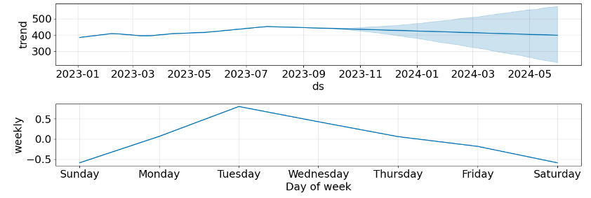
Let’s plot the forecast and its components
forecast=model.predict(predict_df)
fig1=model.plot(forecast)
plt.xticks(fontsize = 15)
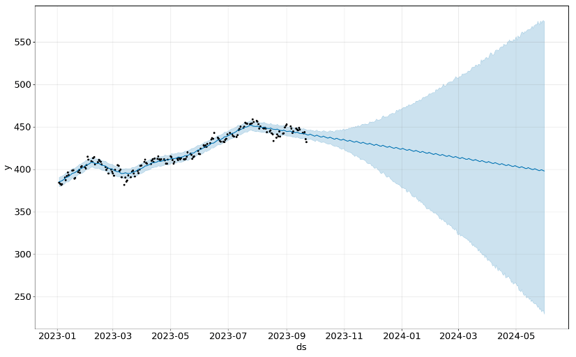
fig2=model.plot_components(forecast,figsize=(14,5))
Summary
- In this post, we have shown how to compute stock volatility in Python and the different measures of risk-adjusted returns based on it.
- While we continue to rank SPY as a long-term hold position, we focused our discussion on rather short-term trading strategies to see how top blue-chip stocks have now again gained positive momentum.
- The AAPL example has explained how quant traders can use various SMA and MA crossovers to identify buy and sell signals. These signals have been verified using regression support and resistance lines.
- The AAPL-MSFT example has illustrated the value of an efficient frontier graph, maximum drawdown curves, correlations of returns, covariance metrics, and the compounded growth.
- The 4-stock portfolio example has demonstrated the importance of comparing and integrating popular trading indicators, correlation plots, and Monte Carlo simulations.
- Finally, we have analyzed the SPY index in terms of volatility and average returns using both historical data and the Prophet forecast model.
- Results produced by this software have been verified by comparison to a number of well known 3rd party trading platforms such as Macroaxis, TradingView, Barchart, etc.
References
- GitHub Rep
- Volatility And Measures Of Risk-Adjusted Return With Python
- Buy and Sell Signals with the Simple Moving Average Crossover
- Scalable Time-Series Forecasting with Spark and Prophet
- How to Download historical stock prices in Python ?
- Monte Carlo Methods
- Predicting Nifty using Monte Carlo, fbprophet
Explore More
- Applying a Risk-Aware Portfolio Rebalancing Strategy to ETF, Energy, Pharma, and Aerospace/Defense Stocks in 2023
- Risk-Aware Strategies for DCA Investors
- Joint Analysis of Bitcoin, Gold and Crude Oil Prices with Optimized Risk/Return in 2023
- Towards Max(ROI/Risk) Trading
- DJI Market State Analysis using the Cruz Fitting Algorithm
- Bear vs. Bull Portfolio Risk/Return Optimization QC Analysis
- A TradeSanta’s Quick Guide to Best Swing Trading Indicators
- Stock Portfolio Risk/Return Optimization
- Risk/Return QC via Portfolio Optimization – Current Positions of The Dividend Breeder
- Portfolio Optimization Risk/Return QC – Positions of Humble Div vs Dividend Glenn
- The Qullamaggie’s TSLA Breakouts for Swing Traders
- The Qullamaggie’s OXY Swing Breakouts
- Algorithmic Testing Stock Portfolios to Optimize the Risk/Reward Ratio
- Quant Trading using Monte Carlo Predictions and 62 AI-Assisted Trading Technical Indicators (TTI)
- Are Blue-Chips Perfect for This Bear Market?
- Track All Markets with TradingView
- S&P 500 Algorithmic Trading with FBProphet
- Stock Forecasting with FBProphet
- Predicting Trend Reversal in Algorithmic Trading using Stochastic Oscillator in Python
- Inflation-Resistant Stocks to Buy
- ML/AI Regression for Stock Prediction – AAPL Use Case
- Macroaxis Wealth Optimization
- Investment Risk Management Study


Make a one-time donation
Make a monthly donation
Make a yearly donation
Choose an amount
Or enter a custom amount
Your contribution is appreciated.
Your contribution is appreciated.
Your contribution is appreciated.
DonateDonate monthlyDonate yearly
Leave a comment