
- Automation is the ultimate solution to eliminate repetitive Excel data processing and visualization tasks.
- In this post, we will demonstrate how to create interactive Excel dashboards in Python.
- As an example, let’s consider the dataset Bike_Sales_Playground.xlsx.
- There are 1026 rows and 13 columns
- ID Marital Status Gender Income Children Education Occupation Home Owner Cars Commute Distance Region Age Purchased Bike
- in the worksheet “bike_buyers”

Table of Contents
- Import Libraries & Input Data
- Input Data Preparation
- Create Excel Dashboard
- Summary
- Acknowledgements
- Explore More
Import Libraries & Input Data
Let’s set the working directory
import os
os.chdir(‘YOURPATH’)
os. getcwd()
and import the following libraries
import pandas as pd
import numpy as np
from openpyxl import load_workbook
from openpyxl.chart import BarChart, Reference,LineChart
from openpyxl.chart.label import DataLabelList
from openpyxl.styles import Alignment
from openpyxl.styles import PatternFill, Font
Reading the Excel file and the sheet name
file_name = ‘Bike_Sales_Playground.xlsx’
bike_df = pd.read_excel(file_name,sheet_name=’bike_buyers’)
bike_df.head()

Let’s create the bike_df.to_excel copy Working_Sheet
with pd.ExcelWriter(file_name,
engine=’openpyxl’,
mode=’a’,
if_sheet_exists=”replace”
) as writer:
bike_df.to_excel(writer, sheet_name='Working_Sheet',index = False)
bike_df = pd.read_excel(file_name,sheet_name=’Working_Sheet’)
Dropping duplicates from the data
bike_df.drop_duplicates(keep=’first’, inplace=True, ignore_index=False)
Replacing M to Married and S to Single in Marital Status column
bike_df[‘Marital Status’] = bike_df[‘Marital Status’].replace(‘M’,’Married’).replace(‘S’,’Single’)
Replacing F to Female and M to Male in Gender column
bike_df[‘Marital Status’] = bike_df[‘Marital Status’].replace(‘M’,’Married’).replace(‘S’,’Single’)
Introducing 3 age brackets
bike_df[‘Age brackets’] = bike_df[‘Age’].apply(lambda x: ‘Less than 30’ if x<=30 else(‘Greater than 55′ if x>55 else ’31 to 55’))
bike_df[‘Age brackets’].unique()
array([’31 to 55′, ‘Greater than 55’, ‘Less than 30’], dtype=object)
Replacing Commute Distance value 10+ Miles to More than 10 Miles
bike_df[‘Commute Distance’] = bike_df[‘Commute Distance’].replace(’10+ Miles’,’More than 10 Miles’)
bike_df[‘Commute Distance’].unique()
array([‘0-1 Miles’, ‘2-5 Miles’, ‘5-10 Miles’, ‘1-2 Miles’, ‘More than 10 Miles’], dtype=object)
Input Data Preparation
Let’s create pivot tables, charts and load modified data into the spreadsheet.
with pd.ExcelWriter(file_name,engine=’openpyxl’,mode=’a’,
if_sheet_exists=”replace”
) as writer:
bike_df.to_excel(writer, sheet_name=’Working_Sheet’,index = False)
avg_gender_income_df = np.round(pd.pivot_table(bike_df,
values = ‘Income’,
index = [‘Gender’],
columns = [‘Purchased Bike’],
aggfunc = np.mean
),2)
with pd.ExcelWriter(file_name,
engine=’openpyxl’,
mode=’a’,
if_sheet_exists=”replace”
) as writer:
avg_gender_income_df.to_excel(writer, sheet_name=’Average_Gender_Income’)
Loading workbook and selecting the sheet
wb = load_workbook(file_name)
sheet = wb[‘Average_Gender_Income’]
chart1 = BarChart()
chart1.type = “col”
chart1.style = 10
chart1.title = “Average Income by Gender and Purchase Data”
chart1.y_axis.title = ‘Gender’
chart1.x_axis.title = ‘Income’
data1 = Reference(sheet, min_col=2, min_row=1, max_row=3, max_col=3)
cats1 = Reference(sheet, min_col=1, min_row=2, max_row=3)
chart1.add_data(data1, titles_from_data=True)
chart1.dataLabels = DataLabelList()
chart1.dataLabels.showVal = True
chart1.set_categories(cats1)
chart1.shape = 4
sheet.add_chart(chart1, “A10”)
wb.save(file_name)
Here is the first work sheet “Average_Gender_Income”

count_age_brackets_purchase_df = pd.pivot_table(bike_df,
values = [‘ID’],
index = ‘Age brackets’,
columns = ‘Purchased Bike’,
aggfunc = ‘count’
)
count_age_brackets_purchase_df = count_age_brackets_purchase_df[‘ID’]
with pd.ExcelWriter(file_name,
engine=’openpyxl’,
mode=’a’,
if_sheet_exists=”replace”
) as writer:
count_age_brackets_purchase_df.to_excel(writer, sheet_name=’Count_Age_Brackets’)
Loading workbook and selecting the sheet
wb = load_workbook(file_name)
sheet = wb[‘Count_Age_Brackets’]
chart2 = LineChart()
chart2.style = 10
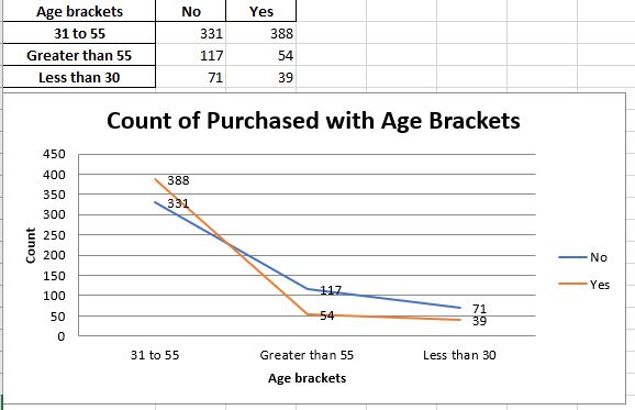
chart2.title = “Count of Purchased with Age Brackets”
chart2.y_axis.title = ‘Count’
chart2.x_axis.title = ‘Age brackets’
data2 = Reference(sheet, min_col=2, min_row=1, max_row=4, max_col=3)
cats2 = Reference(sheet, min_col=1, min_row=2, max_row=4)
chart2.add_data(data2, titles_from_data=True)
chart2.dataLabels = DataLabelList()
chart2.dataLabels.showVal = True
chart2.set_categories(cats2)
chart2.shape = 4
sheet.add_chart(chart2, “A10”)
wb.save(file_name)
Here is the second worksheet “Count_Age_Brackets”
count_commute_distance_purchase_df = pd.pivot_table(bike_df,
values = [‘ID’],
index = ‘Commute Distance’,
columns = ‘Purchased Bike’,
aggfunc = ‘count’
)
count_commute_distance_purchase_df = count_commute_distance_purchase_df[‘ID’]
with pd.ExcelWriter(file_name,
engine=’openpyxl’,
mode=’a’,
if_sheet_exists=”replace”
) as writer:
count_commute_distance_purchase_df.to_excel(writer, sheet_name=’Count_Commute_Distance’)
Loading workbook and selecting the sheet
wb = load_workbook(file_name)
sheet = wb[‘Count_Commute_Distance’]
chart3 = LineChart()
chart3.style = 10
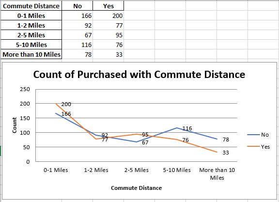
chart3.title = “Count of Purchased with Commute Distance”
chart3.y_axis.title = ‘Count’
chart3.x_axis.title = ‘Commute Distance’
data3 = Reference(sheet, min_col=2, min_row=1, max_row=6, max_col=3)#Including Headers
cats3 = Reference(sheet, min_col=1, min_row=2, max_row=6)#Not including headers
chart3.add_data(data3, titles_from_data=True)
chart3.dataLabels = DataLabelList()
chart3.dataLabels.showVal = True
chart3.set_categories(cats3)
chart3.shape = 4
sheet.add_chart(chart3, “A10”)
wb.save(file_name)
Here’s the third work sheet “Count_Commute_Distance”
Create Excel Dashboard
title_df = pd.DataFrame()
with pd.ExcelWriter(file_name,
engine=’openpyxl’,
mode=’a’,
if_sheet_exists=”replace”
) as writer:
title_df.to_excel(writer, sheet_name=’Dashboard’)
Loading workbook and selecting sheet
wb = load_workbook(file_name)
sheet = wb[‘Dashboard’]
for x in range(1,22):
sheet.merge_cells(‘A1:R4’)
cell = sheet.cell(row=1, column=1)
cell.value = ‘Bike Sales Dashboard’
cell.alignment = Alignment(horizontal=’center’, vertical=’center’)
cell.font = Font(b=True, color=”F8F8F8″,size = 46)
cell.fill = PatternFill(“solid”, fgColor=”2591DB”)
sheet.add_chart(chart1,’A5′)
sheet.add_chart(chart2,’J5′)
chart3.width = 31
sheet.add_chart(chart3,’A20′)
wb.save(file_name)
Here is the final dashboard in Excel

Summary
- Automation is the ultimate solution to optimize the repetitive Excel data analysis.
- This article helps you set up Python Excel Automation.
- By following the aforementioned approach, one can edit Excel data and create pivot tables/charts by incorporating them into interactive dashboards.
- Overall, Python offers an efficient solution for automating Excel reports.
Acknowledgements
References
- Excel Sheet Interactive Dashboard — Python Streamlit
- Automating a Tableau dashboard with Excel, Google Sheets and Python
- Why Automate Excel Reports Using Python?
- Setting Up Python Excel Automation: 5 Easy Steps
- Turn An Excel Sheet Into An Interactive Dashboard Using Python
- Interactive Python Dashboards in Excel


Make a one-time donation
Make a monthly donation
Make a yearly donation
Choose an amount
Or enter a custom amount
Your contribution is appreciated.
Your contribution is appreciated.
Your contribution is appreciated.
DonateDonate monthlyDonate yearly
Leave a comment