
Featured Photo by Andrea Piacquadio on Pexels
The rapid diffusion of COVID-19 and data convenience had enforced the global community to work more vigorously on geospatial analysis of this pandemic.
This is a shining moment for GIS: responding to COVID-19 with maps and data-smart city solutions.
Best Practices:
In New Zealand, residents can stay abreast of changing business hours and other government services using the COVID-19 Public Information Map. The map categorizes each location by service type (e.g., Council Services and Facilities, Emergency Services) and open status. Similarly, the City of Baltimore built the COVID-19 Asset Map to help local residents, particularly those with lower socioeconomic status, find critical resources near them such as youth and senior food distribution sites, primary care facilities for the uninsured, and COVID-19 testing sites.
Following previous studies and above best practices, this post emphasizes the use of GIS and spatial analysis on environmental issues related to COVID-19.
Scope: Covid-19 Geospatial Data Visualization in Python using Plotly Express, Geopandas, and Folium.
Deliverables: Geo scatter Plotly Express plots, the Plotly density plot mapbox, the choropleth maps, the Geopandas world map, and the Folium geographic map.
The Road Ahead: PREDICTIVE COVID-19 ANALYTICS AND PROACTIVE ACTION.
Table of Contents:
- Input Data
- The WHO Regions
- Cumulative Deaths
- Cumulative Cases
- New Cases
- New Deaths
- Folium Map
- Social Impact Summary
- Tutorials
- Explore More
- Embed Socials
Input Data
Let’s set the working directory YOURPATH
import os
os.chdir(‘YOURPATH’)
os. getcwd()
and import the libraries
import plotly
import plotly.express as px
import pandas as pd
import io #to read uploaded files
import geopandas as gpd
import shapely as shp
from shapely.geometry import Polygon, LineString
import folium
from folium.plugins import MarkerCluster
from datetime import datetime
Let’s load the built-in dataset
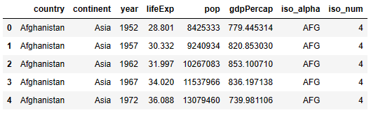
country_data= px.data.gapminder()
country_data.head()
let’s rename the column that matches another column in the dataset
country_data.rename(columns={‘country’:’Country’}, inplace=True)
country_data.head()

Let’ read the WHO document
covid_data=pd.read_csv(‘WHO-COVID-19-global-data-2.csv’)
covid_data.head()

Let’s merge the above two datasets with the Country_code column being the common column
data =covid_data.merge(country_data[[‘Country’,’iso_alpha’]], on=[‘Country’], how=’left’)
data.head()

Let’s read the following document
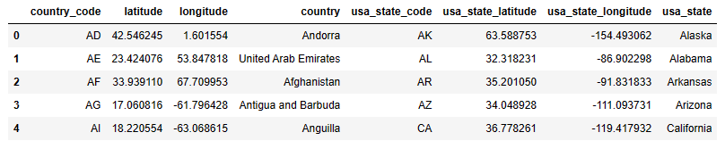
latlong_data=pd.read_csv(‘world_country_and_usa_states_latitude_and_longitude_values.csv’)
latlong_data.head()
Let’s merge the two datasets with the Country_code column being the common column
all_data =data.merge(latlong_data[[‘country’,’latitude’, ‘longitude’]], left_on=[‘Country’], right_on=[‘country’], how=’left’)
all_data.head()

Let’s prepare the final dataframe
df = all_data.groupby([‘Country_code’,’Country’,’WHO_region’,’iso_alpha’, ‘latitude’, ‘longitude’]).sum().reset_index()
df.head()

The WHO Regions
Let’s perform Plotly visualization of the WHO regions around the world using px.scatter_geo
map_fig = px.scatter_geo(df,
locations=’iso_alpha’,
projection = ‘orthographic’,
color = ‘WHO_region’,
opacity = .8,
hover_name = ‘Country’,
hover_data = [‘New_cases’, ‘Cumulative_cases’, ‘New_deaths’, ‘Cumulative_deaths’],
title = “Visualization of the WHO regions around the world”
)
map_fig.show()

- The globe above shows Africa is composed of two WHO regions. AFRO in most of Africa and EMRO on the northern part of Africa.
- North and South America have one region called AMRO
- Europe has one region (EURO)
- Asia and Australia seem to have a mixture of AMRO, WPRO, and SEARO
In the above plot, every dot contains the following information:
Country, WHO_region, iso_alpha, New_cases, Cumulative_cases, new_deaths, and Cumulative_deaths.
Cumulative Deaths
Let’s plot cumulative deaths due to COVID-19 using px.density_mapbox
fig = px.density_mapbox(df, lat=’latitude’, lon=’longitude’,
z = ‘Cumulative_deaths’, radius = 10,
center = dict(lat = 9, lon=9),
zoom = 1,
hover_name = ‘Country’,
mapbox_style = ‘stamen-terrain’,
title = ‘Cumulative deaths due to Covid19’)
fig.show()
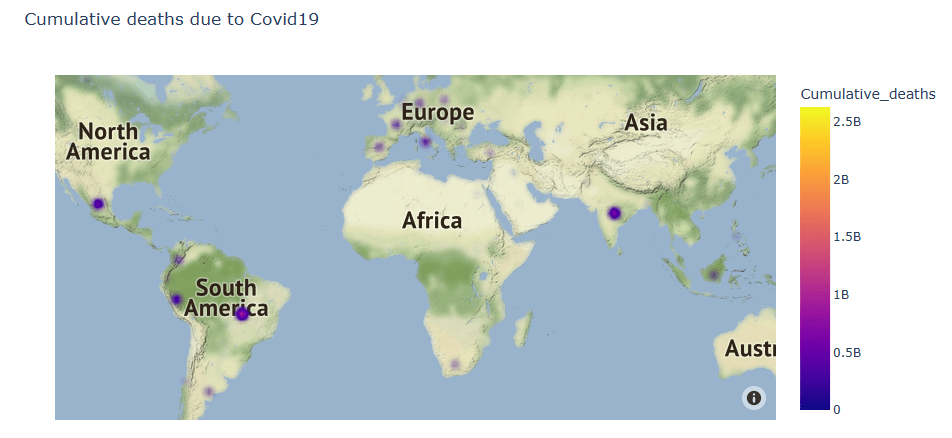
We can get a country specific information by hovering over the country location as follows
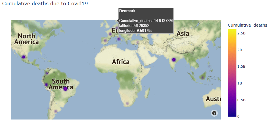
- Africa seems to be in a good position with respect to e.g. South America
- America and Europe exhibit many cumulative deaths due to COVID-19
- Some parts of South and SE Asia are also affected by COVID-19.
Cumulative Cases
Let’s look at cumulative cases
maxcc=df[‘Cumulative_cases’].max()
maxcc
140638479540
mincc=df[‘Cumulative_cases’].min()
mincc
21372156
We can plot the world COVID-19 Cumulative Cases using the Plotly choropleth map
fig = px.choropleth(df,
locations = ‘iso_alpha’,
locationmode = ‘ISO-3’,
scope = ‘world’,
color = ‘Cumulative_cases’,
hover_name = ‘Country’,
hover_data = [‘Country’,’WHO_region’, ‘New_cases’, ‘Cumulative_cases’, ‘New_deaths’, ‘Cumulative_deaths’],
range_color = [20000000,141000000000],
color_continuous_scale=’armyrose’,
title = ‘World Covid19 Cumulative Cases’)
fig.show()

It appears that India has the highest number of cumulative cases.
New Cases
Let’s look at the world plots using Geopandas
world_map = gpd.read_file(gpd.datasets.get_path(‘naturalearth_lowres’))
by reading the built-in country geometry data
world_map.head(2)
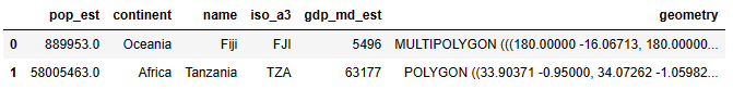
Let’s merge the two datasets with the Country_code column being the common column
geo_data =world_map.merge(df[[‘iso_alpha’, ‘New_cases’,’Cumulative_cases’,’New_deaths’,’Cumulative_deaths’]], left_on=[‘iso_a3’], right_on=[‘iso_alpha’], how=’left’)
geo_data.head()

let’s check the data content
geo_data.columns[geo_data.isnull().any()]
Index(['iso_alpha', 'New_cases', 'Cumulative_cases', 'New_deaths',
       'Cumulative_deaths'],
      dtype='object')
geo_data.info()
<class 'geopandas.geodataframe.GeoDataFrame'>
Int64Index: 177 entries, 0 to 176
Data columns (total 11 columns):
 #   Column             Non-Null Count  Dtype
---  ------             --------------  -----
 0   pop_est            177 non-null    float64
 1   continent          177 non-null    object
 2   name               177 non-null    object
 3   iso_a3             177 non-null    object
 4   gdp_md_est         177 non-null    int64
 5   geometry           177 non-null    geometry
 6   iso_alpha          114 non-null    object
 7   New_cases          114 non-null    float64
 8   Cumulative_cases   114 non-null    float64
 9   New_deaths         114 non-null    float64
 10  Cumulative_deaths  114 non-null    float64
dtypes: float64(5), geometry(1), int64(1), object(4)
memory usage: 16.6+ KB
geo_data = geo_data.dropna(how=’any’,axis=0)
geo_data.info()
<class 'geopandas.geodataframe.GeoDataFrame'>
Int64Index: 114 entries, 3 to 175
Data columns (total 11 columns):
 #   Column             Non-Null Count  Dtype
---  ------             --------------  -----
 0   pop_est            114 non-null    float64
 1   continent          114 non-null    object
 2   name               114 non-null    object
 3   iso_a3             114 non-null    object
 4   gdp_md_est         114 non-null    int64
 5   geometry           114 non-null    geometry
 6   iso_alpha          114 non-null    object
 7   New_cases          114 non-null    float64
 8   Cumulative_cases   114 non-null    float64
 9   New_deaths         114 non-null    float64
 10  Cumulative_deaths  114 non-null    float64
dtypes: float64(5), geometry(1), int64(1), object(4)
memory usage: 10.7+ KB
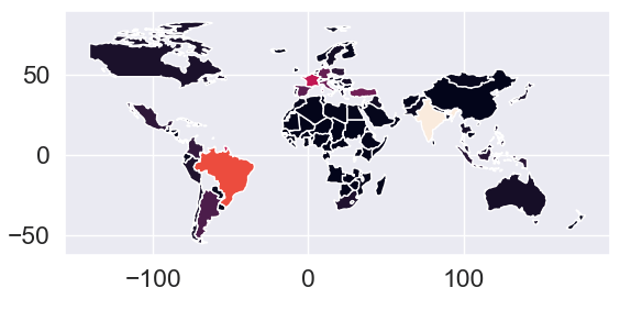
Let’ plot the world map using the above Geopandas dataframe
geo_data.plot(column=’New_cases’)
New Deaths
Let’s check whether our dataframe is truly a Geopandas dataframe
type(geo_data)
geopandas.geodataframe.GeoDataFrame
and check details of the dataframe in the first two rows
geo_data.head(2)

Let’s plot the World COVID-19 New Deaths using px.choropleth_mapbox
fig = px.choropleth_mapbox(geo_data,
geojson = geo_data,
color = ‘New_deaths’,
locations = ‘name’,
featureidkey = ‘properties.name’,
center = {‘lat’:0, ‘lon’:0},
mapbox_style = ‘carto-positron’,
zoom =1,
title = ‘World Covid19 New Deaths’,
opacity = .3,
color_discrete_map = {
‘Beregon’:’cyan’,
‘Joly’:’magenta’,
‘Coderre’:’Yellow’
}
)
fig.show()

Folium Map
Finally, let’s invoke the base Folium OpenStreetMap
m = folium.Map(location=[0,0],tiles=’OpenStreetMap’, zoom_start = 2)
m

Let’s get the first/last recorded date
max=data[‘Date_reported’].max()
min=data[‘Date_reported’].min()
and get the difference between the dates
d1 = datetime.strptime(min, “%d/%m/%Y”)
d2 = datetime.strptime(max, “%d/%m/%Y”)
dataset_days = abs((d2 – d1).days)
dataset_days
251
We can now calculate the cases of new deaths per day
df[‘New_deaths_per_day’] = df[‘New_deaths’]/dataset_days
df.head(2)

let’s print the lowest/highest number of recorded deaths in a day
print(df[‘New_deaths_per_day’].max())
print(df[‘New_deaths_per_day’].min())
30205.673306772907
0.7171314741035857
Let’s get the final Folium map
for i, row in df.iterrows():
lat = df.at[i, ‘latitude’]
lng = df.at[i, ‘longitude’]
info = ‘Country: ‘ + df.at[i, ‘Country’] + ‘
‘ + \
‘New_cases: ‘ + df.at[i, ‘New_cases’].astype(str) + ‘
‘ + \
‘Cumulative_cases: ‘ + df.at[i, ‘Cumulative_cases’].astype(str) + ‘
‘ + \
‘New_deaths: ‘ + df.at[i, ‘New_deaths’].astype(str) + ‘
‘ + \
‘Cumulative_deaths: ‘ + df.at[i, ‘Cumulative_deaths’].astype(str)
if df.at[i, ‘New_deaths_per_day’] > 100:
color = ‘red’
else:
color = ‘green’
folium.Marker(location=[lat,lng], popup=info,
icon = folium.Icon(color=color)).add_to(m)
m


Most African countries recorded the lowest number of deaths per day as compared to other parts of the world.
Social Impact Summary
- Using the highly interactive maps discussed above, everyday citizens can calculate the COVID-19 risk they are exposing themselves or others to.
- Governments can use our maps not just for emergency preparedness and response services, but also for communicating with, and targeting messages to, residents.
- Results demonstrated how the geospatial content can help residents understand the challenges faced by their neighbors and helps to inspire a sense of shared responsibility to protect one another.
- As users hover over the geospatial maps, they can see how many residents live in those neighborhoods with other pre-existing conditions that put them at higher risk of adverse outcomes from COVID-19.
- Additionally, with COVID-19 patients taking priority, other patients with unrelated medical issues have been forced to wait prolonged periods of time for treatment or forgo treatment altogether. This poses a great risk to their health and the health of the public.
- Following the Northern Ireland best practices, we are currently working to monitor hospital wait times for non-COVID related medical needs. This geospatial map can be used by the public to determine which hospital is the best to go to in the event of a medical issue to reduce wait times and the accompanying exposure to the virus.
Tutorials
Mapping with Matplotlib, Pandas, Geopandas and Basemap in Python
Best Covid-19 Courses & Certifications [2023] – Coursera
Explore More
50 Coronavirus COVID-19 Free APIs
Interactive Global COVID-19 Data Visualization with Plotly
Comparing 4 Python Libraries for Interactive COVID-19 Data Science Visualization
How is Asia doing against the Covid-19?🦠[Bokeh]
DateSliders in Visualization of Covid-19 cases by Zipcodes with Python/Bokeh
Embed Socials


Make a one-time donation
Make a monthly donation
Make a yearly donation
Choose an amount
Or enter a custom amount
Your contribution is appreciated.
Your contribution is appreciated.
Your contribution is appreciated.
DonateDonate monthlyDonate yearly
Leave a comment